Sketches toward the commission

I work a couple of sketches similar to the commissioned pieces.
trying strokes for leaves, sky variations, whatever I need to play with!
The two small studies of bungalows in NW Portland
(below) turned out okay for test subjects!!
They are for sale on my website for $17 each shipped; or both for $27 shipped.
If my shipping is not yet working on my new site you can contact me at dbdcat at aol.com.

.

To hear about classes, follow me on Facebook or
check out my new and improved dkatiepowellart.com and sign up for my newsletter!

©D. Katie Powell.
My images/blog posts may be reposted; please link back  to dkatiepowellart.

Posted in architecture, art, commission, making a living, pen & ink, virtual sketching, watercolor | Tagged , , , , , , , , , , , , , , | Leave a comment

Walnut Park, Portland, Oregon Commission

A commission to create a painting from photographs
for an intern leaving for the next leg of her journey landed on my desk.
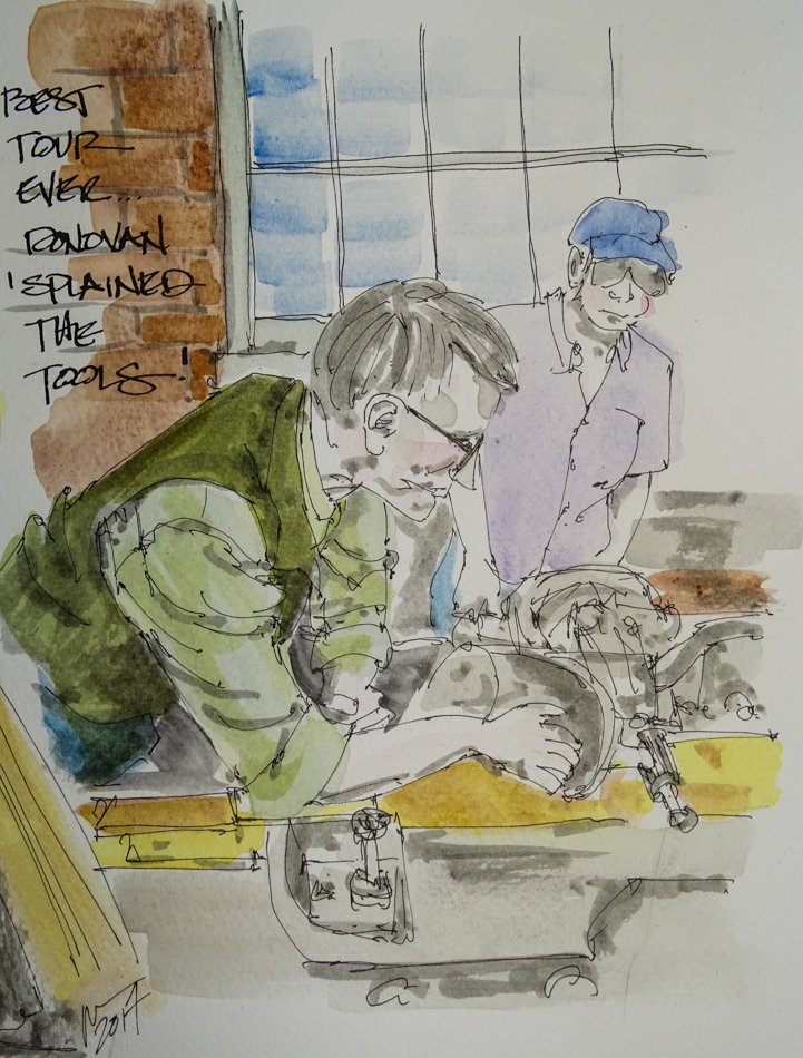
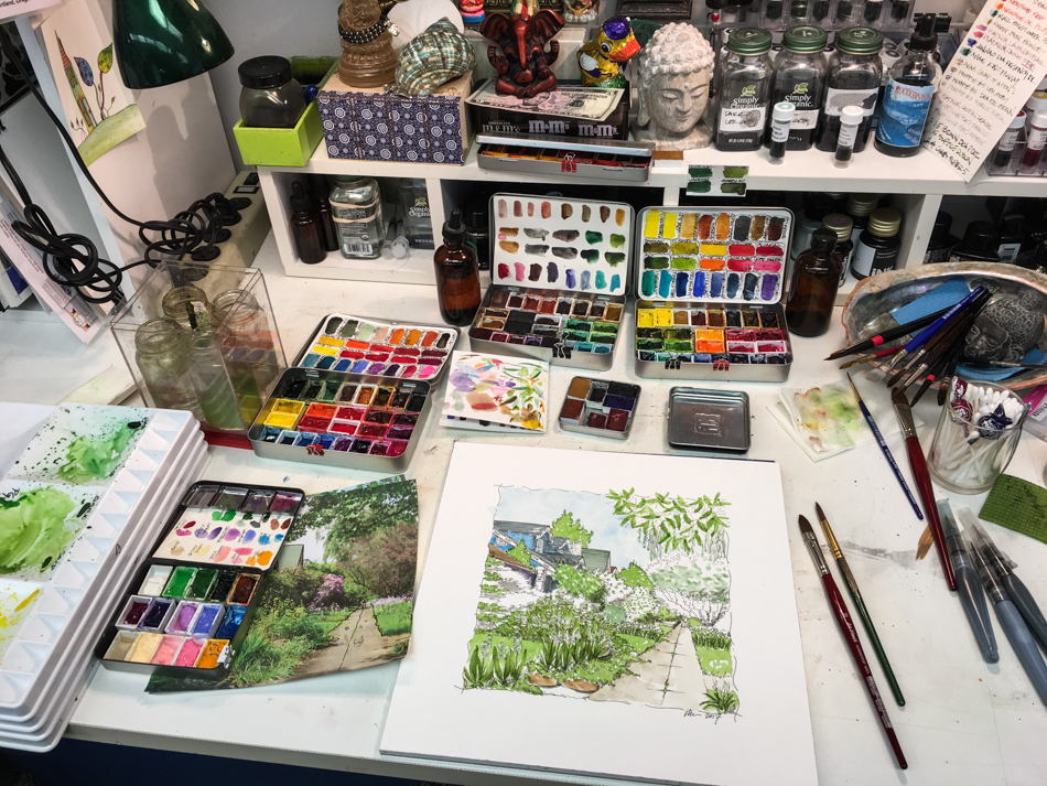
I typically work on several images at the same time;
it relieves the pressure in case one goes awry when a deadline is involved.
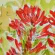
The two photographs that appealed to me most are shown below.

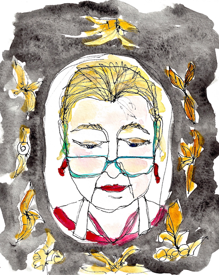
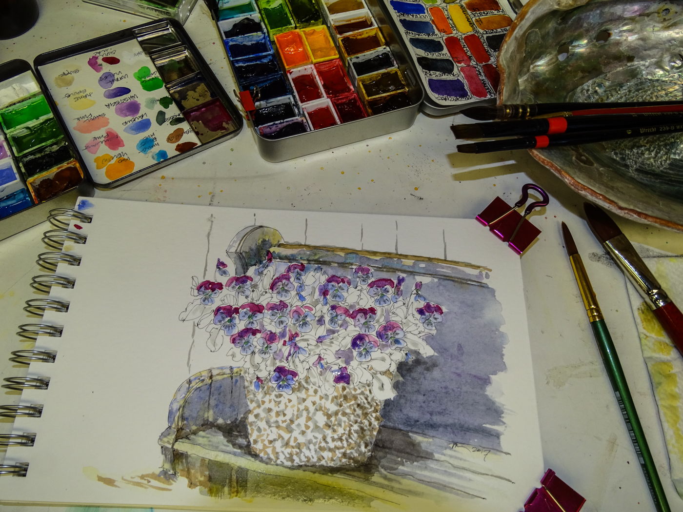
*the image above is for the studio voyeurs, of which I am one*

I never intended for them to be replications but interpretations of the images.
The joy of owning a painting instead of snapshot is the artist’s interpretation.

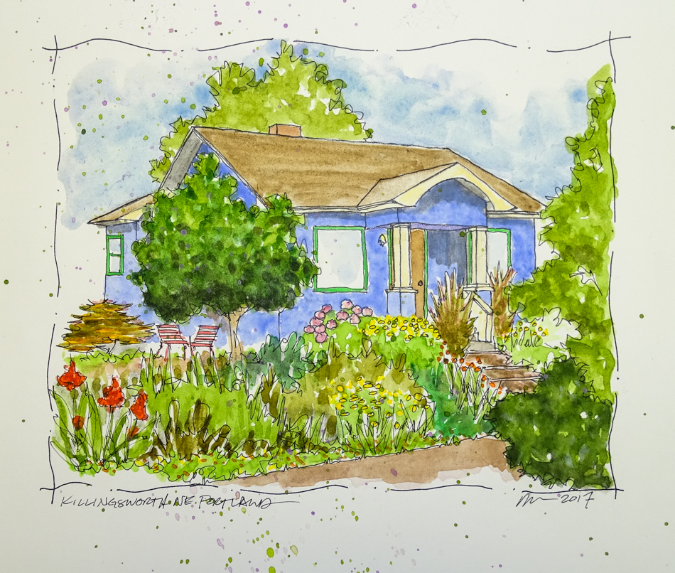
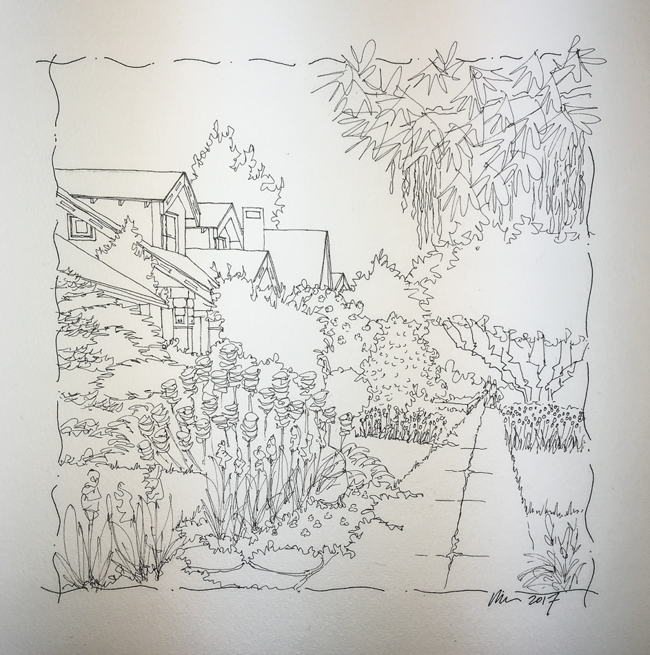
Above, the first image, with the addition of a mid-century modern car, sketch to final.
Below, steps from inked sketch to finished watercolor on the second image.

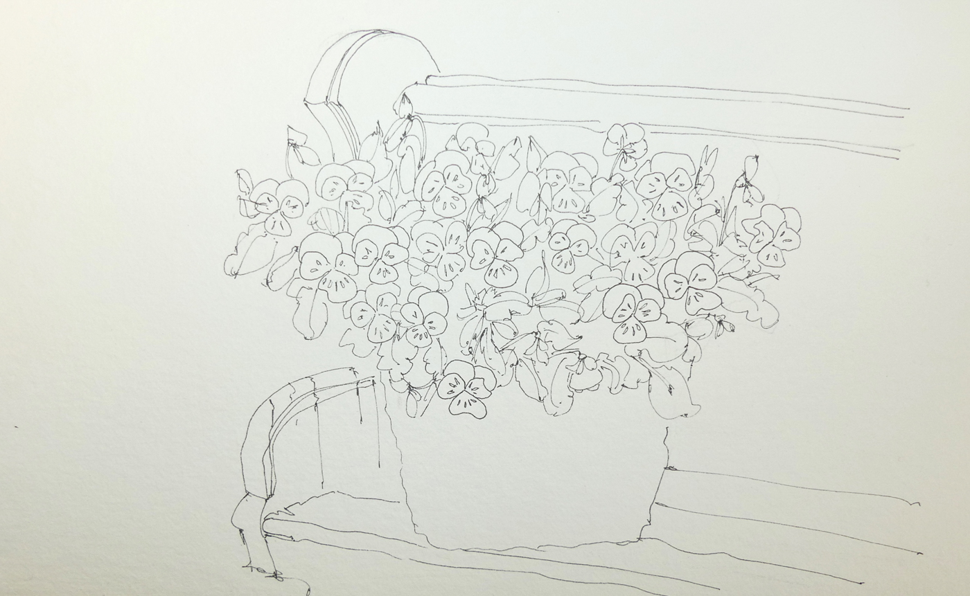
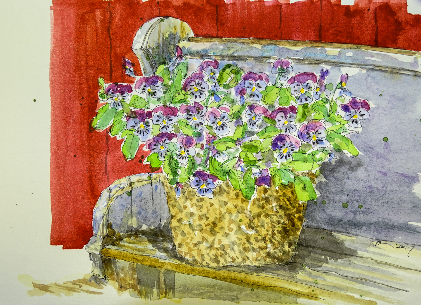
My sketch is not used quite like a coloring book; I don’t intend to stay in the lines!

I began with masking fluid.  I could be very very careful,
but why, when I can mask off the areas and splash around freely?
Tiny flowers, window frames, car lights (in the first image above.)

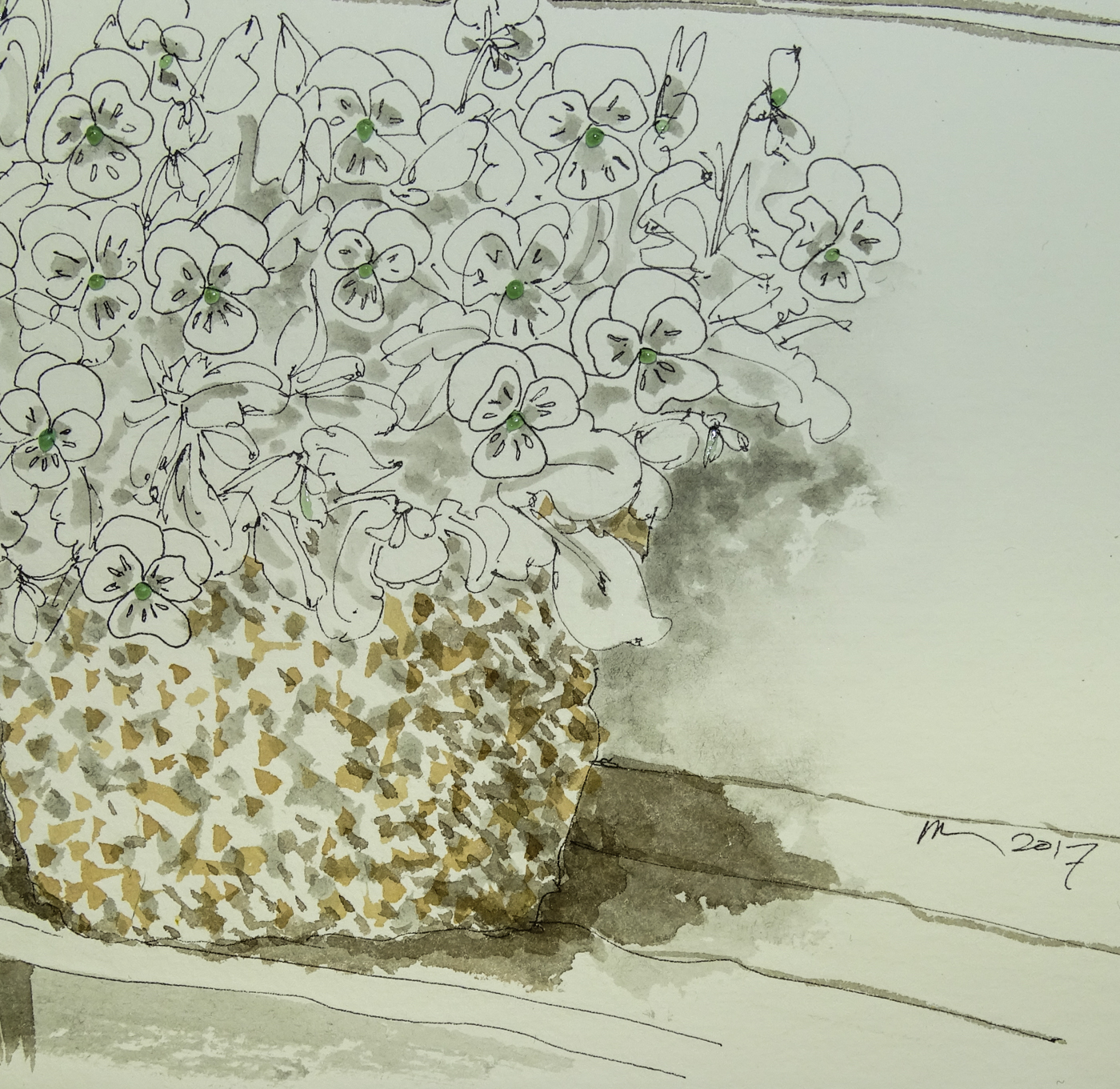
Next come the underlayers:
Grisaille, this time in the form of grey ink for shadows, window panes, rooftops;
Brunaille, the underlayer of brown in inks and paint for sidewalk and rooftop; and
Verdaille, in this case used as underlayers of green, both the bright shown and a grey-green not shown, both of which allows a tie in of the other greens as they are applied.

Beginning colors that will not interfere with the overwhelming greens in the image
were next: blues and purples and browns.  So many of the houses are colorful;
I decided to paint these homes in typical colors of the neighborhood.

Once I got started I forget to stop for process shots!
I worked greens for several layers, and overworked one area which you will see I later lifted and softened by balancing darks.  Reds and additional browns were added last.

Above are details of the succession of masked areas
before removal, after removal, and with the additional painted colors onto the
masked areas.  Not all were painted; white left adds to the painting!

Here the final painting, with the softened and balanced overworked tree,
and the final pops of color, including the family in the image.

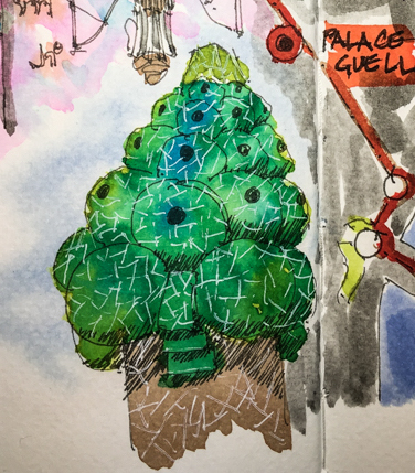
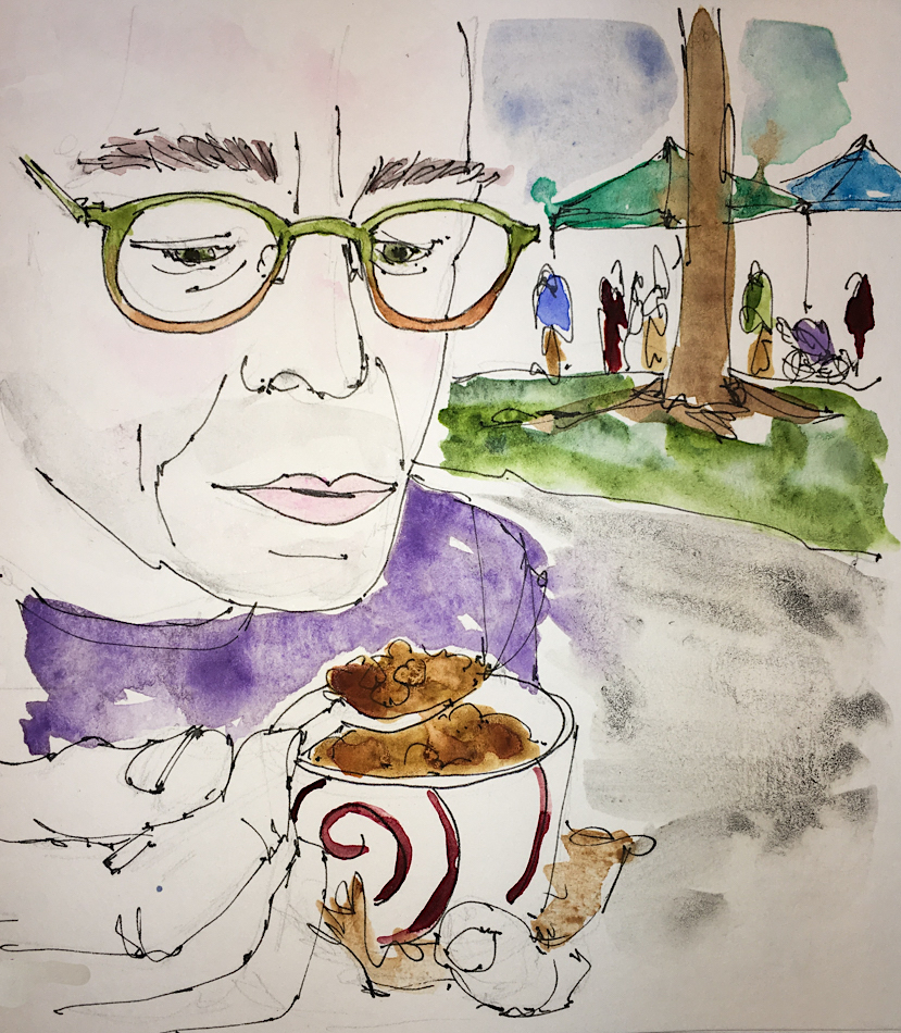
Two differences in an urban sketch:
not so much layered paint as one broad stroke of paint color in an area; and
the time is not taken to articulate the leaves… they become a color, a suggestion,
whereas in a painting I am likely to detail leaves in my own suggestive manner.

To hear about classes, follow me on Facebook or
check out my new and improved dkatiepowellart.com and sign up for my newsletter!

©D. Katie Powell.
My images/blog posts may be reposted; please link back  to dkatiepowellart.

Posted in architecture, art, commission, making a living, painting, pen & ink, process, virtual sketching, watercolor | Tagged , , , , , , , , , , , , , , | 15 Comments

VSW: Barcelona, 3, Palace Guell

The rooftop chimney skins in the Palace Guell
are so beautiful — like sculpture gardens.
When the families lived in this palace,
I wonder how often they used the rooftop sculpture garden and for what —
did they have lunch on top or was this a
place for the servants and children?
The iconography is whimsical, and a wonder if Disney saw these sculptures?  They are far more colorful than expected seeing the rest of the palace, upside-down ice cream cones and magical trees, or triangular mountains with giant lizards.

To hear about classes, follow me on Facebook or
check out my new and improved dkatiepowellart.com and sign up for my newsletter!

Posted in architecture, art journal, challenge, ink painting, pen & ink, process, virtual sketching, watercolor | Tagged , , , , , , , , , , , , , , , , , , , , , | Leave a comment

VSW: Barcelona, 2, Map


Made a map of our walk, starting at the World Trade center at the wharf.
Heading up to the Palace Guell, Casa Batllo, and the Casa Mila!

To hear about classes, follow me on Facebook or
check out my new and improved dkatiepowellart.com and sign up for my newsletter!

Posted in architecture, art journal, challenge, ink painting, pen & ink, process, virtual sketching, watercolor | Tagged , , , , , , , , , , , , , , , , , , , , | 4 Comments

Tools, 8, Testing Nemosine Inks

Inks on sale at Goulet prompted a few new colors to miraculously land on my desk.  I’d sampled Nemosine Aeolis Palus Red + Solar Storm (orange).   Right, I played with the orange in both the Pilot medium nib Metropolitan and by brush.  I inked on the Hahnemühle Post Cards both on clean paper and over inks.
I doubled back and went in wet twice with the brush.  This ink performs nicely!

No feathering, though it does tend to make that splotchy look when you double back on it, wet-on-wet.  In both I used only Diamine or Super5 inks as the secondary inks, just so I knew what I was mixing.  The Nemosine seems to play well with the Diamine.  One thing, the Nemosine moves with the slightest touch of water — completely dissolves.   I spilled some water on this postcard so decided to let the rain happen… Wow! Wildy Splotchy colors!

Inks behave completely differently than watercolors, a post for another day!

To hear about classes, follow me on Facebook
or check out my new, improved dkatiepowellart.com

Posted in creativity, drawing, ink painting, painting, pen & ink, watercolor | Tagged , , , , , , | 14 Comments

Art Journal of a High and Low Week

This was a week of highs and extreme lows.
I am glad I started the journaling again last week because sanity prevailed,
if for no other reason than I had a page to write in instead of laying it all on Mitchell.
*we take it pretty good for each other but it is still nice to have another outlet*

Last week I sent several surprises out,
and one huge high was having the recipients share their squeals with me.
It is fun to give for no reason other than you thought of someone.
My mom taught me to thank people for gifts, and
I know the thanking is about sharing the pleasure of pleasuring someone else!

Then on the flip side, a complete dissing from a good friend.
I just don’t get it — blindsided.

I did a LOT of breathwork this week, from the hurt feelings to the heat and
how it must be effecting those who are homeless to stresses caused by things in business.
Breathing in those problematic situations and sending out the antidote.

Must. Do. Gratitude.
Having a bad week always reminds me of the importance of gratitude.
Trying something new this time, which is setting up a couple of pages where I can jot down the things each day as they come to me.  This is a very good way of inducting highs.

Savitri and Yamantaka were spayed/neutered and this was the lowest low…
They had an adverse reaction to the anesthesia that made them
completely crazed fearful little beings as they were coming out of it.
No sleep for us, as we held them or tried to calm them all night.
The painkillers they gave didn’t help, and the next day we asked for a sedative for them
*and shoulda gotten one for us thank you*
and the damn sedative had the same reaction, though not as bad.  Still not much sleep.

Then we stopped all drugs and simply put them in the bathroom for the night.
We checked on them — and damn, they slept like they were on sedatives.
So did we.

*thank the god/dess*

Thankfully a new day, new weekend.
The fricking heat and smoke from fires has been unbearable but we had a bit of a beak from both and made it to PSU early to pick up our fresh foods.  Yum.

I love that image of my Mitchell.   Sweet memory.

*i sometimes participate in Linda Hill’s Stream of Consciousness Saturday.
you can to… it s a friendly crowd!*

To hear about classes, follow me on Facebook  or check out my new,
improved dkatiepowellart.com

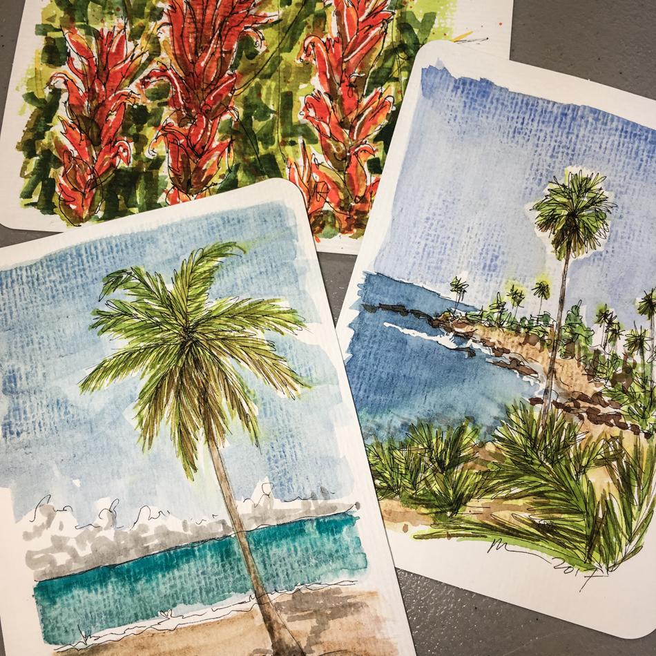
Hahnemühle Nostalgie Sketchbook, Pentalic HB woodless pencil,
liquid watercolors and inks in Pentel Aquash waterbrushes
: Platinum Cassis Black inkPlatinum Citrus Black ink,
Noodler’s Lexington Grey InkSuper5 Frankfurt, and Super5 Dublin inks,
De Atramentis Document Brown ink, Robert Oster Jade ink,
Pilot Metropolitan with Platinum Cassis Black ink,
Lamy Al-Star with Platinum Citrus Black ink,
Lamy LX pen with De Atramentis Tobacco ink,
Pilot Preppy pen with Noodler’s Lexington Grey Ink,
gave up on Noodler’s Ahab pen with a Goulet stub nib and and Super5 Dublin inks,
Platinum Carbon pen with De Atramentis Document Brown ink,
Lamy Al-Star with De Atramentis Document Black ink,
Platinum Carbon Pen with Platinum Carbon ink waterproof cartridges, White Uniball Signo, Sennelier, Holbein, Primatek watercolors and Daniel Smith Watercolors.

Posted in art journal, journal, meditation, memory, sketchbook, writing | Tagged , , , , , , , , , , , , , , , , , , | 12 Comments

VSW: Barcelona, 1, Looking for Gaudi

This month on our virtual walk we are looking for Antonio Gaudi…

Admittedly, by the time I landed in Barcelona I was burned out on travel,
and spent more time eating and shopping for boots before returning home…
However, Gaudi was everywhere (though not in this image), and I did fall in love.

To hear about classes, follow me on Facebook or
check out my new and improved dkatiepowellart.com and sign up for my newsletter!

Posted in architecture, art journal, challenge, ink painting, memory, pen & ink, virtual sketching, waterbrush, watercolor | Tagged , , , , , , , , , , , , , , , , , | 6 Comments

Hahnemühle Post Cards, 7, Palms

A tropical island, one place I go that is my happy place…
Not too hot, Pacific Ocean, breezes.
Brunaille and grisaille underpainting.  Sent!

Laguna Beach iconic view — from one of many photos I’ve taken over the years.
Brunaille and grisaille underpainting.  Sent!

This palm is going on my wall to remind me that you should push forth when you hate what is happening with an image and see where it takes you.
All ink, it wasn’t behaving and I HATED it… but then I figured what the hell?
I hate it already so I will play with it.  I kept layering more ink and watching the happy accidents (runs where I didn’t expect them) and now I kinda like it!

I had no idea when I began playing with the Hahnemühle Post Cards
that I would love them so much!

To hear about classes, follow me on Facebook!

Posted in creativity, drawing, ink painting, memory, painting, pen & ink, process, waterbrush, watercolor | Tagged , , , , , , , , , , , , , , , , , , , , | 4 Comments

USk: Yama Sushi

Yama Sushi, named after Yamantaka, apparently!
First time was for our anniversary.
Discovered just before we found the kitties.  A sign.

Amazing sushi, clean, fresh fish, good sushi man, and a woman sushi chef (wow a first!)
No more having to put up with two discordant melodies while we eat a Sinju…

I am sure I have soul ties to China and Japan because both foods
I could eat morning noon and night… yup, even sushi, even sashimi!

To hear about classes, follow me on Facebook!

Moleskin Watercolor journal, Pentalic HB woodless pencil,
Noodler’s Lexington Grey Ink, De Atramentis Document Brown ink,
Super5 Frankfurt and Dublin inks,
Lamy Al-Star with De Atramentis Document Black ink,
Platinum Carbon Pen with Platinum Carbon ink waterproof cartridges,
Sennelier, Holbein, DS Primatek watercolors, and Daniel Smith Watercolors.


©D. Katie Powell.
My images/blog posts may be reposted; please link back  to dkatiepowellart.

Posted in architecture, art journal, drawing, journal, process, sketchcrawl, urban sketchers, watercolor | Tagged , , , , , , , , , , , , , | Leave a comment

New Art Journal

I’ve been so busy getting my new website live
and cleaning my studio and sorting art
*and then that pesky thing, making a living at our business*
on top of managin to keep up with World Watercolor Month,
that I stopped journaling for about six weeks.

I missed it.

Thursday afternoon at Dr. Qin’s I was having the strange experience
of seeing me write down the thoughts I was having in my journal.
*whoa, that’s a new one… i’ve dreamed of journaling before…
means I need to get up and write something down…
you can read about the thoughts from laying on my back on the pages*

I came right home and pulled out a journal so I could write about
needles in my limbs and the insanity that ensues when I am unable to move.
Stream of consciousness writing is what I do in my journal.
All the things I saw in color went onto the paper until Mitchell interrupted.
*its okay, he had to, business and all that*

When I don’t journal thoughts ping-pong around in my head.
My monkeymind could drive anyone crazy with the nagging…
*mine is worse than YOURS*
let alone making me loco in the cabeza!
*gads it makes me talk like my mom*

Also, I’ve not quite fully shared my journal with you guys.
*not nice of me to hold back, I know, but there it is*
Now I am getting ideas for art journaling classes online.
*did I mention i taught creative writing?*
The teacher in me is seeing my journaling though teacher’s eyes, with the idea of passing on the information of how I do what I do, the pep talks I give myself, and timing.
*gads it is confusing in my head sometimes*
With watercolors and colored inks it is so much more fun to keep a journal!

*i sometimes participate in Linda Hill’s Stream of Consciousness Saturday.
you can to… it s a friendly crowd!*

To hear about classes, follow me on Facebook  or check out my new,
improved dkatiepowellart.com

Posted in art journal, creativity, drawing, ink painting, journal, painting, pen & ink, process, sketchbook, watercolor, writing | Tagged , , , , , , , , , , , , , | 4 Comments

USk: Cargo Portland

Picking up an old Fabriano Watercolor journal that I really don’t like
*but will finish off in some way, like the 100 faces challenge* 
I came across an old drawing of the building in the Pearl that originally housed Cargo, sketched before their move.  I left it penciled and partially inked.
*who knows why?*
I finished it Saturday and combined two photos to create this colorful version —
one with the Happy banners all around it and another, much earlier, when the graffiti of the red birds on the lavender blocks was still in place.
*why someone scrubbed them i don’t know… some graffiti should be left in place*

Cargo in-the-Pearl was a happy place for us through some awful times.
The curios shop was huge, having just the right mix of silly Chinese
(paper hanging decorations and wind-up toys)
to serious possible purchases (buddhas, ganeshas, huge columns, furniture.)
*you never know when you might need a piece of an old column*
We would take a few dollars mad money and sometimes spend it there,
or walk to one of the nearby restaurants and try their Happy Hour menu.

During the time my baby brother was dying, we took my niece and older brother there during part of our wanderings around town, and played silly.
I took a photo of Mitchell in a paper crown,
*mitchell has the capacity to play like a kid and i love that about him*
as well as some of the only good pics of my niece (camera shy)
and my serious brother in animated conversation.
*good memories in bad times*

To hear about classes, follow me on Facebook or   
check out my new and improved dkatiepowellart.com
and sign up for my newsletter!

Fabriano Watercolor journal (don’t recommend), Pentalic HB woodless pencil,
Noodler’s Lexington Grey Ink, De Atramentis Document Brown ink,
Super5 Frankfurt and Dublin inks,
Lamy Al-Star with De Atramentis Document Black ink,
Platinum Carbon Pen with Platinum Carbon ink waterproof cartridges,
Sennelier, Holbein, DS Primatek watercolors, and Daniel Smith Watercolors.


©D. Katie Powell.
My images/blog posts may be reposted; please link back  to dkatiepowellart.

Posted in architecture, art journal, drawing, journal, memory, process, sketchcrawl, urban sketchers, watercolor | Tagged , , , , , , , , , , , , , | 10 Comments

NEW dkatiepowellart.com Site!

New dkatiepowellart.com site is up and running!

This is far improved from my old site in that it is easier to  negotiate buying and selling
of originals and prints on my own site (once I get the kinks worked out),
show commission work and illustration, and find classes as I post them.

Blog is staying here.  I posted several posts on my new site and in the end,
I like my  options here better…

I hope I have the kinks worked out, but please tell me if you find one.

Shipping is not up and running for heavier or oversized items,
but will be as soon as I can make heads-or-tails out of the program!!
I will be posting items as I go!
It is a big deal for me.  I put it off forever because of the work,
and happy dance that I am done!

YaY!


Posted in art, making a living | Tagged , , , , , | 8 Comments

I’ve been Doodlewashed!

YaY!  I’m the guest artist for Doodlewash!
If you don’t know Doodlewash,  you should become a member today —
Great blog, great guest artists, great product reviews!

*i really am so excited*


Posted in art journal | Tagged , , | 16 Comments

Hahnemühle Post Cards, 6

I had no idea when I began playing with the Hahnemühle Post Cards
that I would love them  so much!  Trading postcards, sending an actual watercolor,
and now, gifting them to Patreons! Now I am comfortable with the ribbed rough paper, and use it to add to the textural quality of the finished images.

Most of these are done late at night when I can’t sleep,
but this group was created on a day off.  Pussy-willows.


Layers of waterproof inks begin most postcards now.
Amazingly these cards take a huge amount of water.  Indian Paintbrush.

I clip the postcards to a rigid surface to make them lay flat when painting!
A single rose bud.

These inks feathered, no fault to the cards… some inks feather!
In the end I made it work for me.

To hear about classes, follow me on Facebook!

Posted in creativity, drawing, ink painting, painting, pen & ink, watercolor | Tagged , , , , , , , , , , , , , , , , , , , , , | Leave a comment

Tools: Hahnemühle Carnet de Voyage (Bamboo)

Today I played with the Hahnemühle Carnet de Voyage (the Bamboo Journal).
First off, I love the cover!  Hahnemühle uses lovely pieces of art for all their covers,
and if I were to use this as an actual journal,
after removing the information tag I’d have a pretty cover to write on.

I tend to personally like bound journals, and as this is a sturdy spiral bound journal
I’d be more likely to use as a sketchbook from where I might sell or gift images.
Fifteen sheets of 265 gms/125 lb paper sized roughly 6×10-inches
is 90% bamboo and 10% rag in a natural white.
I love Hahnemühle’s green policies,
which can now be seen by the Green Rooster on the cover,
indicating they both run the company on green policies but also donate to green causes.

I picked an image wherein I was going to use several materials that I often use,
just to see what this paper could take:
masking fluids, inks in line-work and as grisaille/brunaille, and layers of watercolor!
Winna from our Virtual Sketchwalk Facebook group page provided the image
(our group is doing favorite objects this month!)


I began with an extra fine line ink sketch and the paper performed well with the nib!


Masking fluid was added where I want a pop of yellow later, and then three layers of inks built up to give me the under-painting I wanted:
Noodler’s Polar Brown for the “brunaille” dappled effect of the container;
Super5 Frankfurt for the deep wet tones in the image;
Finally, Noodler’s Lexington Grey for shadow.
The latter was used both full strength and in a very wet wash, two layers.
At this point four layers of wet were added.  No feathering or lifting of fibers.  Yay!


After the inks dried, I began building up the purples and browns and
even Buff Titanium (which I rarely use) of the flowers and the bench.


Finally, more ink over watercolor where needed,
the bright red (porch?) wall (two layers of red),
quin gold for the container, two shades for the leaves,
and then patiently wait for the piece to dry before popping off the masking fluid —
and dropping bright Daniel Smith Quinophthalone Yellow into the center!

I LOVE this paper!  Love it!  I used it all through the 1-week-100 people challenge,
and here is a sampling of the images, above!

Hahnemühle bamboo journals are currently sold online at Wet Paint and Hyatt’s:
https://wetpaintart.com/bamboo-carnet-de-voyage-6×10/
https://www.hyatts.com/art/hahnemuhle-bamboo-mixed-media-travel-journal-B10995
and Blicks is selling the paper (no journal) in pads of twenty-five sheets of several sizes.

To hear about classes, follow me on Facebook!

Posted in art journal, challenge, journal, pen & ink, process, review, virtual sketching, watercolor | Tagged , , , , , , , , , , , , , , , , , | 2 Comments

VSW: Bear’s Tee Pee


A study in shadows, quick quick before I had much time to think
from our virtual walk on favorite object, one of Bear’s.
Leaving a swath of white helped I think!

To hear about classes, follow me on Facebook!

Aquabee Super Deluxe Journal, with a Pentalic HB woodless pencil,
Noodler’s Lexington Grey Ink,  Super5 Frankfurt, Platinum Citrus Black ink,
Platinum Carbon Pen with Platinum Carbon ink waterproof cartridges,
Sennelier, Holbein, and DS Primatek watercolors, and Daniel Smith Watercolors.

Posted in architecture, art journal, challenge, pen & ink, virtual sketching | Tagged , , , , , , , , , , , , , | 2 Comments

USk: PAG Trip to Monitor

This shows you how busy I’ve been!
April 29th PAG took a field trip to Donovan Harding’s amazing woodworking shop, Monitor Millworks.  He creates doors and windows the way they did them in the late 19th century.  He was kind enough to share the studio and the machinery and hand tools with the gang of artisans.  Wow!  I sketched some onsite, finished inking at home,
then MUCH later added color (this week!).

It was impossible to sketch everything, so I chose the memorable items.
Dog greeting us and following us around was sweet.
Loved the foliage outside, including the stream.

I like this image of Donovan showing us one of the machines.
Thankfully he spent enough time for me to sketch and take some pics.

The farmland around Mount Angel is so beautiful.
I don’t feel I did justice to the inside, when Donovan was reviewing the rules
and general history of his business.  For one thing, he is 8 feet tall!

To hear about classes, follow me on Facebook!

   Gads still finishing off the Fabriano A4 watercolor book, Pentalic HB woodless pencil,
Noodler’s Lexington Grey Ink, De Atramentis Document Brown ink,
Super5 Frankfurt and Dublin inks,
Lamy Al-Star with De Atramentis Document Black ink,
Platinum Carbon Pen with Platinum Carbon ink waterproof cartridges,
Sennelier, Holbein, DS Primatek watercolors, and Daniel Smith Watercolors.


©D. Katie Powell.
My images/blog posts may be reposted; please link back  to dkatiepowellart.

Posted in architecture, art journal, drawing, journal, process, sketchcrawl, urban sketchers, watercolor | Tagged , , , , , , , , , , , , , , , | 4 Comments

Masking Fluid

You know when you are about to write a blog post because you’ve just discovered everything you think you know about something then someone else does it and does it better?  BTW, I swear by Fineline Masking Fluid.

Using masking fluid with watercolours can add much needed contrast to your paintings. The master of the masking fluid, Rob Dudley, reveals his nine steps to success

masking fluid

I have always enjoyed the challenge of painting in watercolour. The way that a wash runs down a sheet of stretched paper to resemble reflections in a moorland river, or the merging of two granulated colours that conveys the simple beauty of wet estuarine mud, excites me. My method of painting is to allow the colour to flow and mix on the paper and from that to add detail and structure as the painting develops. I use a great deal of water, sometimes pouring colour onto the paper from a small jar and then responding to its progress with further washes as it begins to dry. The use of masking fluid to reserve areas of untouched paper allows me to work in this dynamic way. Indeed, masking fluid has become so much part of my painting process that not to use it would seem almost unnatural to me.

Go read the rest… it is good!  I learned something new!

Posted in art journal | Tagged | 2 Comments