Fire, Wind, Rain: and Photography Exposures

I’ve been upset about the first, then they were topped by worry for friends in Texas and Florida…  Painting images loosely from photos that stayed in my mind helped.

In these, more than most, I noticed the exposure (flash or not, and lighting)
changed the feeling of a sketch… do you see that or is it me?

I was trying for loose… feel like I did that in the hurricane sketch.

I think the lalaland fire sketch muddied up, but M tells me he think it fits the subject.
What do you think?

To hear about classes, follow me on Facebook
or check out my new, improved dkatiepowellart.com

Posted in art journal, journal, landscape, painting, pen & ink, sketchbook, watercolor | Tagged , , , , , , , , , , , , , | 8 Comments

My other job….

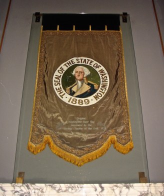
I am also a conservator, and we have the charge to recreate the first flag of the
State of Washington.  I will be creating the painted medallion on the flag, and doing the hand stitching (endless), and Mitchell is recreating the pattern for the flag.
I thought you all might like to see the other painting I do!
From our MPF Conservation blog:
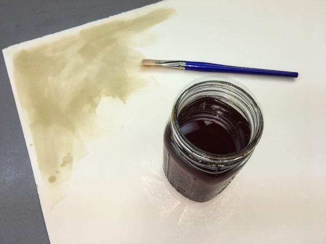
I created test sheets for oil versions of George.
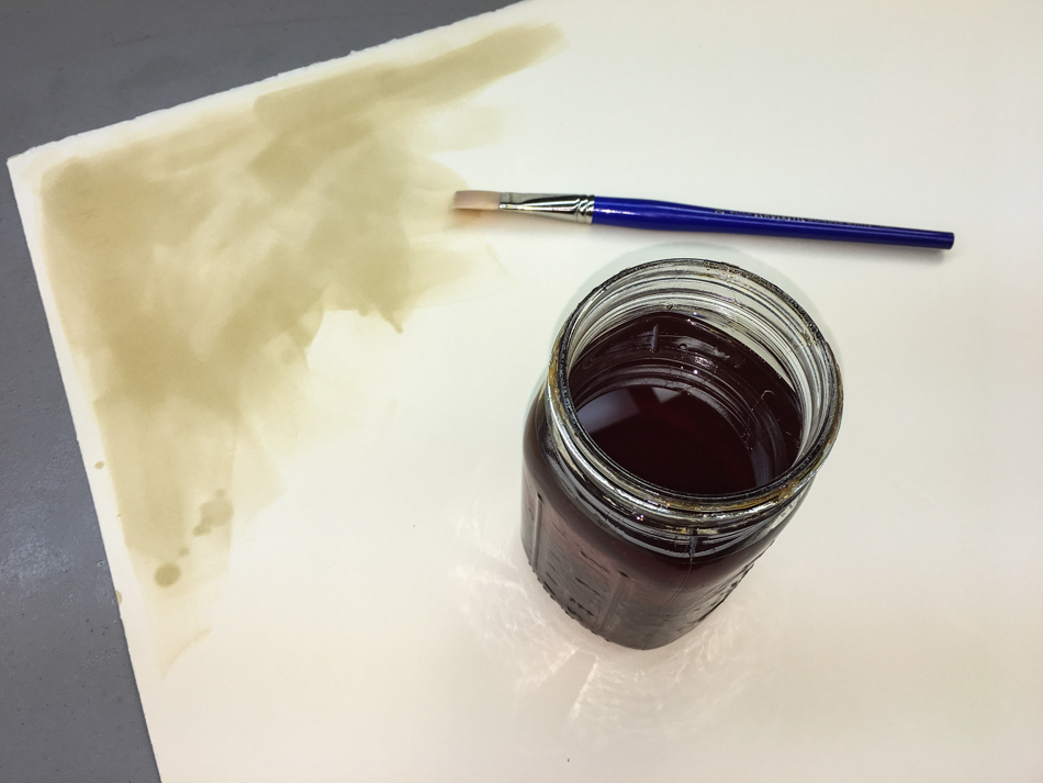
Two coats of shellac seals the paper for the oil paint.
It is nice to use old shellac which can no longer be used on furniture!

Phthalo Green and Chromium Oxide Green mixed match the green silk.
I want to paint the paper I am doing trials on green, because paints will change considerably when painted on bright white, cream, or the lovely green of the silk.

I also painted a sheet to go behind my mixing tray.  I tore the rectangular sheets  so
they created the squares on which I would paint George’s face, leaving me test papers.

I am mixing the paints today, and they will completely dry before I venture close
to the historic flag with the sample sheets.  NO chances are taken, ever!
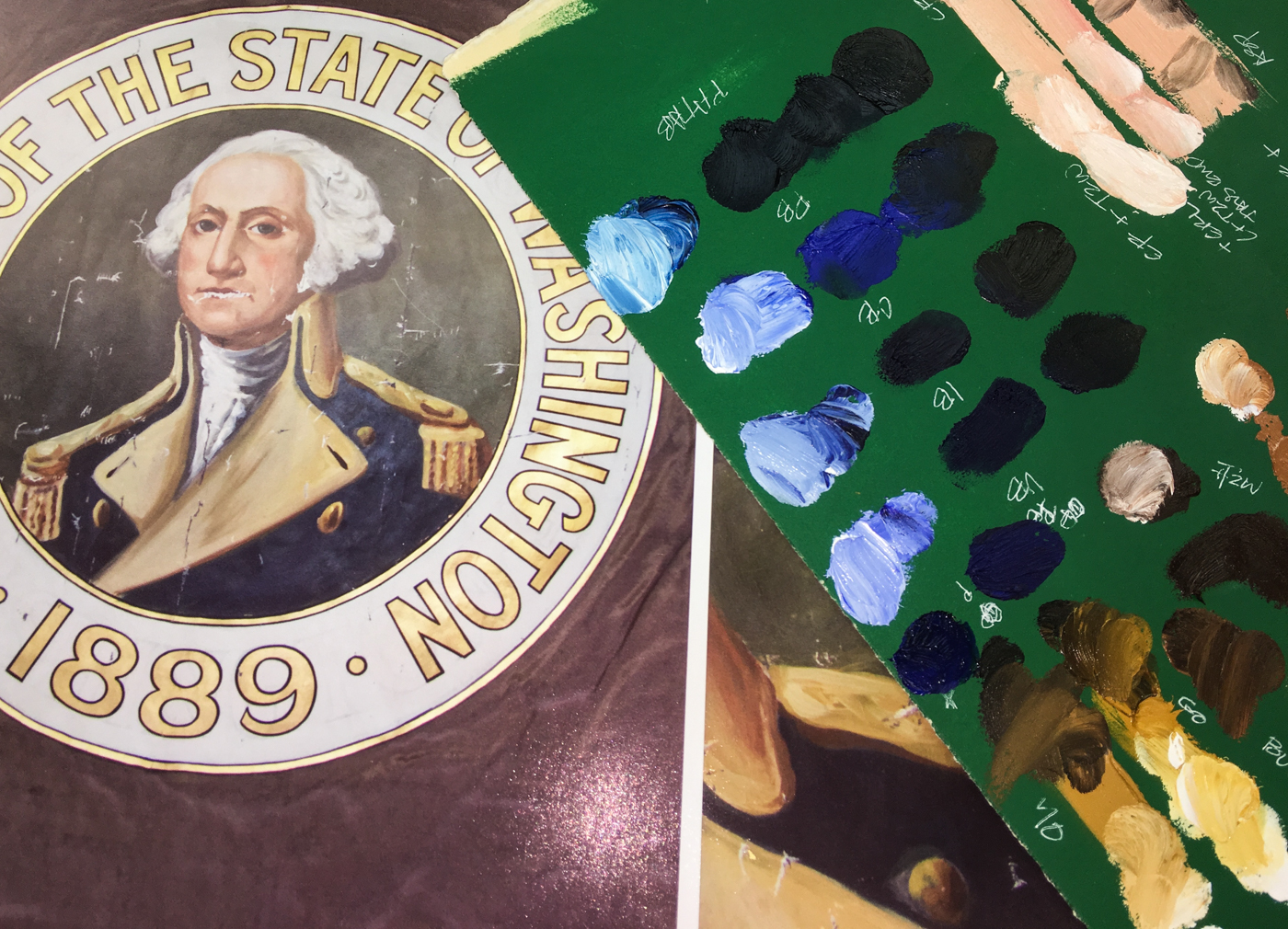
It appears the darker colors will be the ones I want to double-check
against the historic flag, because the darker blues and greens and browns
tend to change radically when a flash hits them, shown above,
and I am mixing against images, not the historic.

A side note: I had a color blind friend who decided that he wanted to please himself in his apartment, instead of having someone else pick paint colors for his friends to see.
I won a bet against my whole tribe of architectural buddies that I could match exactly the hideous salmon pink paint color he painted his kitchen!  This is to say I am fairly confident I will come close in these colors, to blending the right mixes for George.

I have a few zones of color to explore in matching and blending:
coat (collar and body, buttons and epaulets); hair; skin; background, which is a green
that changes over the body of the medallion from a greyed-green to a blue-green.

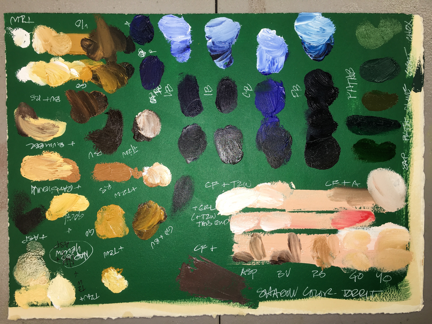
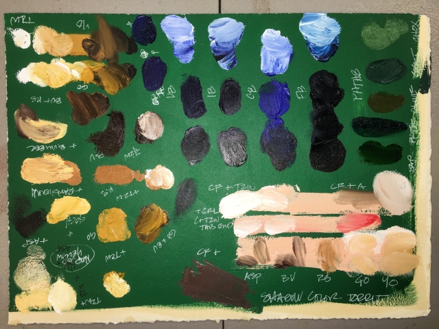
The collar is a blend of Naples Yellow, moving to a creamier version with the Titanium-Zinc White, and going darker with Raw Sienna, Asphaltum, or Burnt Umber.  I will want to hold up the darker mixtures to double-check them against the original flag.
The buttons and epaulets demand brilliance with added Gold Ochre.
(Gold Ochre is the second from the bottom; Yellow Ochre below is too dull.)
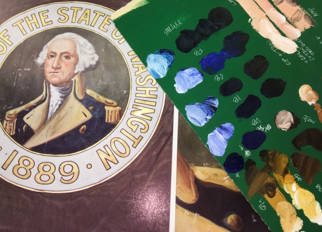
The blues were hard to see when looking at the images.
I see the body of the uniform as an Indanthrone or Prussian base,
with Cobalt Blue added to either to mix.  The blue is not one color,
but changes across the uniform as the light and shadow play.

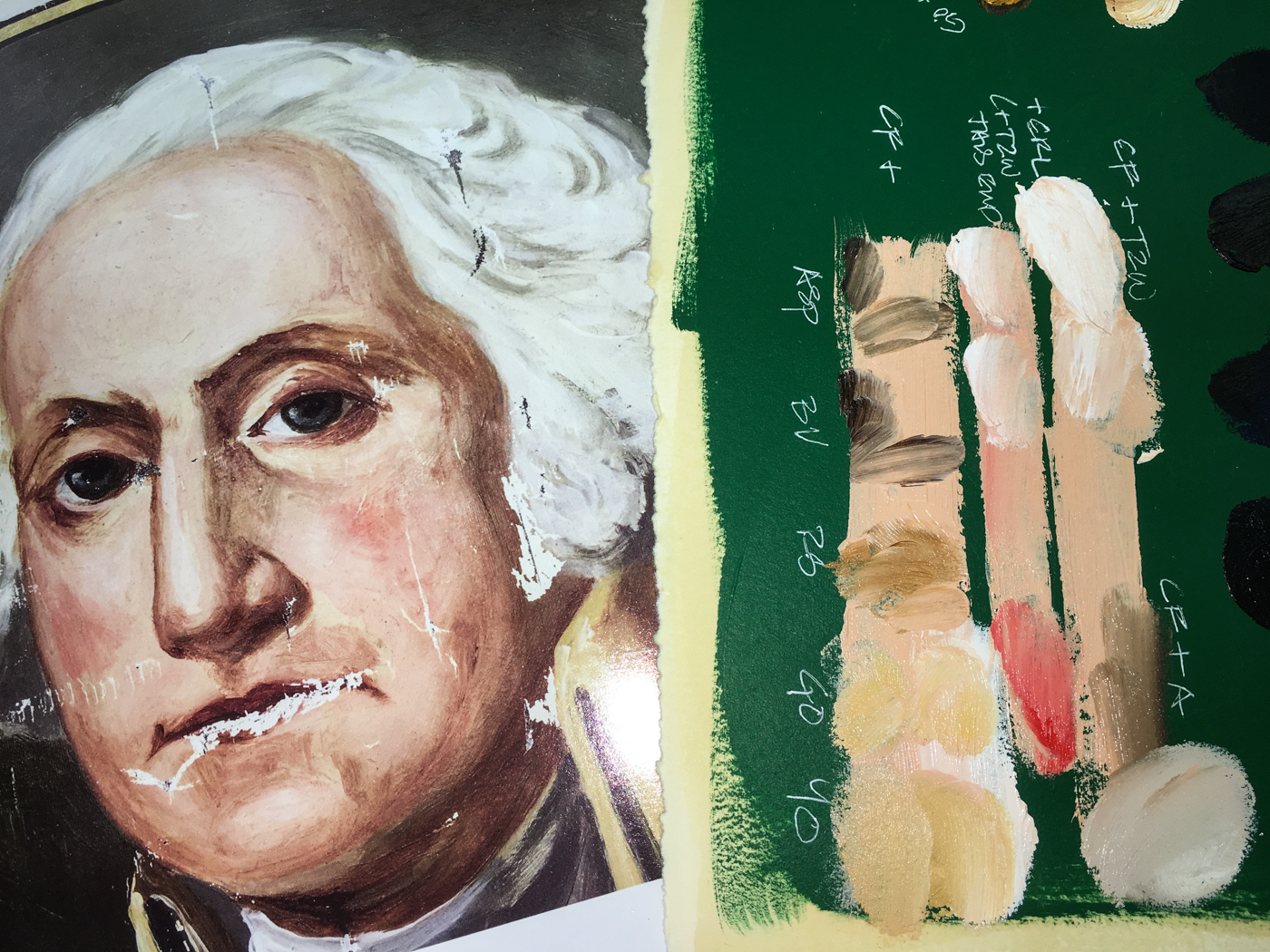
I was prepared to mix George’s skin tones, but Gamblin’s Caucasian Flesh was a
such a good base match from which to mix.  George’s face is a challenge to reproduce, because I am not adept at portraits, and his is full of color!  I am looking it not as if it is a face, but a landscape to reproduce.  For the slight blush or ruddy skin tone it will be Cadmium Red Light or Medium.  Gold Ochre plays into areas around the eyes
and just above the eyebrow.  I played with the d=shadow, adding Asphaltum,
Burnt Umber, and Raw Sienna… none were quite right.  I remembered Robert Gamblin talking about Torrit Grey, and squished all my palette paint leftovers together,
and mixed them into a grey — THAT GREY looks like the right shadow color!

The green background moves from a darkened Phthalo Green (slightly blue)
to Chromium Oxide Green highlighting his face, lifting your eyes up.
The greens chosen to mix (bottom of the blues) are the second, fourth, and fifth —
with a little Naples Yellow thrown in!

George’s hair is not pure white, though he has a good deal of white in it.
I see touches of grey, and Gamblin’s Warm Grey or a blend of Naples Yellow and Titanium-Zinc White.  In shadow at the bottom of the curls is Paynes Grey.

I cannot hope to create an exact replica, but I am attempting to recreate
the painted medallion with the types of strokes and colors and looseness
the original artist used when s/he painted George.
To begin at the beginning, visit Washington State Flag, 1.

MPFC will be posting from time to time as we make interesting progress to share;
sign-up for posts if you are interesting in following the progress.

Visit our next post, Washington State Flag 9, when published!

©MPF Conservation.  May be printed for your own use.
May be reposted if our url + copyright is used as reference.

Posted in art, color, history, oil paint | Tagged , , , , , | 8 Comments

Eagle Creek Fire Rain

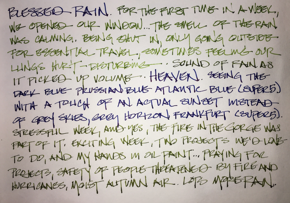
The evening the rains came after the Eagle Creek fire, I felt so blessed.
Skies which were grey with smoke and ash falling, suddenly had the blue of night.
Actual color, yellow from the setting sun and the green of the West Hills, was discernible.
The air smelled like wet city and trees outside our window.

I’m heartbroken by this fire, by fleeing animals in the city, from trees practically screaming, from humans fleeing not knowing if their homes businesses would burn,
fear for the firefighters.  The fire effected us so much — depressed us stressed us,
made us feel trapped too.  Days I could not breathe.

To hear about classes, follow me on Facebook
or check out my new, improved dkatiepowellart.com

Posted in art journal, creativity, ink painting, journal, landscape, memory, pen & ink, sketchbook, urban sketchers, writing | Tagged , , , , , , , , , , , , , , , , | 10 Comments

Tools: Da Vinci Watercolors

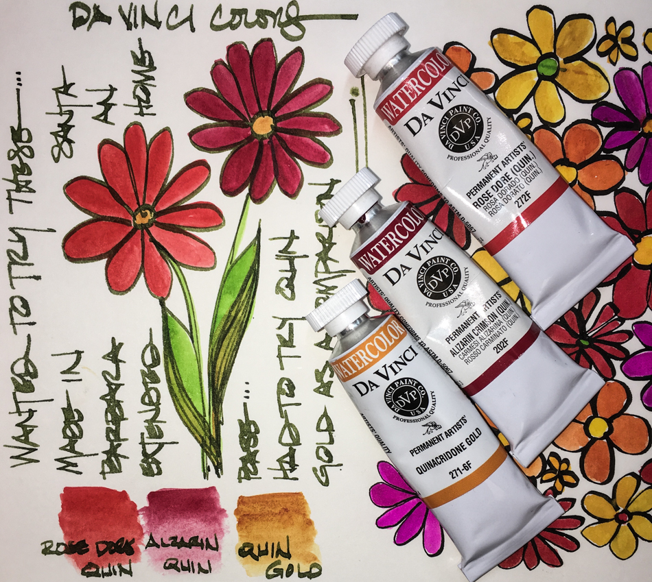
I was able to buy a couple of Da Vinci watercolors half-off with free shipping.

*i wanted to see if i liked them… nooo, not quite truthful…
i am a watercolor tube addict and could not stop myself…
i am going to Santa Barbara sometime soon and hope to score a tour!

i feel better now being honest with you.*

I picked three quinacridones because it is by far my favorite pigment.
Right out of the tube I played a bit to see the colors on a back page.  Very nice.

Their Alizarin Crimson is supposed to be amazing in that it is a light-fast alizarin.
It is a lovely color, used here with Matteo Grilli‘s Carmine for the deeper bloody red.
Da Vinci handled beautifully for the trial, and I layered it for deeper colors.

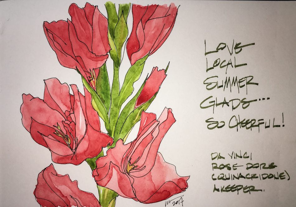
The Rose Dore is a keeper.  A beautiful coral color that layers beautifully.
I don’t have this color in any tube without mixing, and that is a boon,
especially as I become addicted to flower sketches in the
middle-of-the-night and don’t use white hardly ever.

All this made me want to look at the Quinacridone Gold
in comparison to other QG’s in my palette, and some that mimic QG.
They are not all keepers, and I like them for different reasons.
Holbein’s QG is by far my favorite, as it is creamy and smooth,
and works wonderfully in skin tones mixed with peach or pink (like the two shown above).
Constantly replacing tubes….

Daniel Smith’s QG and QG Burnt Orange are both keepers,
but they are granular by comparison and I don’t use them often.
Aussie Gold, which I was seduced into buying
*remember i am an addict and i was vulnerable in bed sick at the time*
is a mixture of PY 83 Diarylide Yellow, PR 101 Transparent Red Oxide,
PV 19 Quinacridone Red.  A keeper, though frivolous, because of its brilliance!
QoR QG Deep is a meh pigment, especially for the price,
and is in the Burnt Sienna family visually.
I’d reach for DS QG Burnt Orange, Sennelier’s 211 or Daniel Smith’s Pompeii instead.
Da Vinci’s QG is a keeper.  Smooth, lovely color, less yellow than Holbien’s.
I always have room for a good Quin Gold!

To hear about classes, follow me on Facebook
or check out my new, improved dkatiepowellart.com

Posted in art journal, painting, review, sketchbook, tools, watercolor, writing | Tagged , , , , , , , , , , , , , , | 15 Comments

Alizarin Gladioli

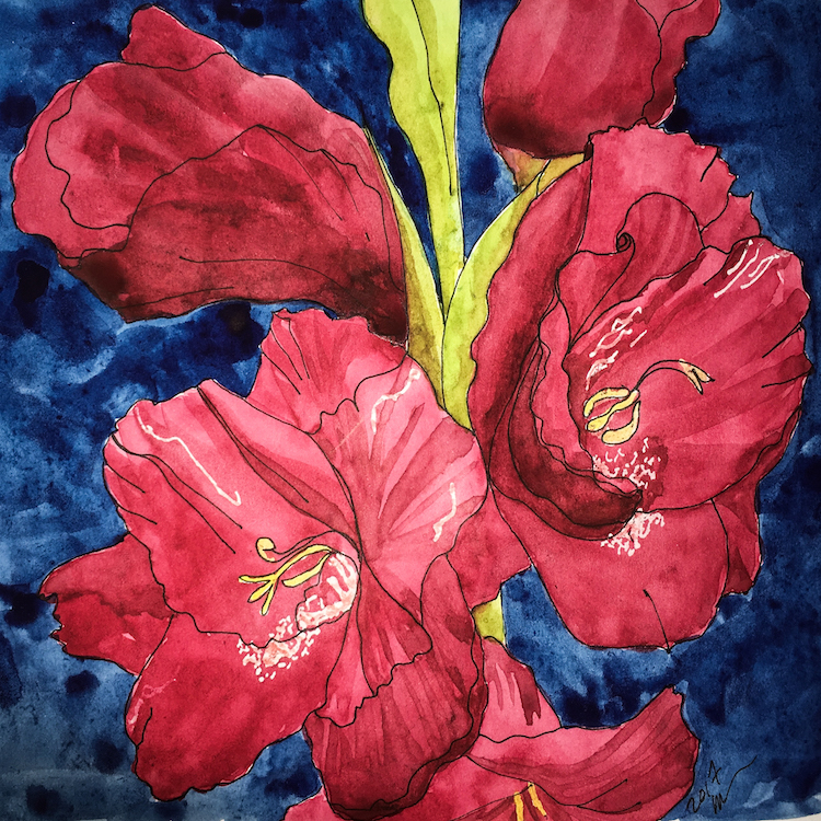
Middle-of-the-night, deep inky-maroon gladioli challenged me!
The Da Vinci Alizarin Crimson is semi-transparent, but the secondary top color had to be quite opaque, and i don’t like nor work well with opaque paints.
I painted them in my Nostalgie journal, and it is amazing the amount of wet paint the journal take — I had not realized how much water I’d use when I started in it!
Not quite what I wanted, but happy middle-of-the-night painter!

I love country… RIP Don Williams.

To hear about classes, follow me on Facebook  or
check out my new, improved dkatiepowellart.com

Posted in art journal, journal, painting, pen & ink, process, sketchbook, watercolor, writing | Tagged , , , , , , , , , , , , , , | 5 Comments

Peach Glads

Can you spot the mistake? (I corrected it by now….)

Middle-of-the-night, I took on the peach gladioli Mitchell gave me earlier in the week.
I tried one of the new DaVinci watercolors, Rose Dore, a quinacridone paint.

Such a pretty color!  I’m a sucker for the quins!

To hear about classes, follow me on Facebook  or
check out my new, improved dkatiepowellart.com

Posted in art journal, journal, painting, pen & ink, process, sketchbook, watercolor, writing | Tagged , , , , , , , , , , , | 5 Comments

Fire

It is a pitiful drawing, altogether too cheery,
but it was the middle-of-the-night and I had only my watercolor-filled pens.
I was horrified about what I’d read in the Oregonian.
*yeah i know i should not be reading puter in the middle-of-the-night*
They are pushing for leniency and have a “kids-will-be kids” attitude,
regarding the teenagers that tossed the firecrackers into the gorge.

NO!

I’m not on the side of the death penalty, but to write that these “children”
(oops, 15 is not quite a child…. more a minor) should not be charged
with a crime as an adult and do time because they
DIDN’T UNDERSTAND THE CONSEQUENCES is insanity?
Any one of my friends would have understood the consequences at 12, let alone 15.
We knew this was an evil, destructive, malicious act, just like
firing a gun at someone, beating up on someone, rape, or lighting a cat’s tail on fire.

Do people raised with a computer and games
between their fingers not understand real life?
Does this mean they are mentally ill?  (Not having a grip on reality is mentally ill.)
How could anyone not evil (and do NOT tell me teens can’t be evil) do such a thing?
And for those of you who don’t know, there are signs all along the trails about
fire and firecrackers and other ways fires can start.

*view from our studio window last night*

This morning the Eagle Creek fire has met the Indian Creek fire and is a force of
20,000 burning acres.  At our studio an hour away (40 miles as the crow flies),
we can’t see far, and outside you can’t breathe.  Falling ash.

 The cops caught the kid (all of them), fleeing.
They talked to him, they had an eye witness who identified him.
They let him go. The Feds or the State Police must charge him (them).
Then there will be a trial and they should do time, the ones tossing doing the most time —
But, like bullies, those that watch are complicit.

I fell asleep early last night, and so, just after the full moon, I woke.
Middle-of-the-night I spent angst-ridden over the losses: the animals, the trees, the human casualties (we don’t know yet), the human losses in dollars, jobs, homes, buildings.

I had nowhere to go with my sorrow but to do a gratitude post.

A special thanks to all who are fighting fires!

*the last image is of my home fire station, laguna beach*

To hear about classes, follow me on Facebook

or check out my new, improved dkatiepowellart.com

Posted in art journal, commentary, ink painting, journal, painting, pen & ink, sketchbook, watercolor, writing | Tagged , , , , , , , , , , , , , , | 4 Comments

A visit to Gamblin Paints

Mary Weisenburger and Dave Bernard in front of the color squares at the new factory.

NOTE: This is from our MPF Conservation website but thought that some of you might enjoy!  I am reproducing the first Washington State Flag for the DAR.

I might’ve struggled through and trail and error and testing
on many phases, but thankfully, we are fortunate to share Portland
as our home base with Gamblin Artist Colors,
home to both the best oil paints and also, home to Gamblin Conservation Colors.

As with the NPS Mason Monterey project, Gamblin saved me money and time
on trial and error, this time offering me advice toward painting on silk.
Dave Bernard helped me choose or validated my choices on several paint colors,
especially as it came to the way the colors are produced,
and how the various ingredients will present on silk over time.
And also, those times when conservators I spoke with discouraged me from the project,
he became my cheering section, saying, “Of course this can be done!”
(He is shown above with Mary Weisenburger, who,  along with Dave,
who answered questions on the Silver Circus Ball.
I never work with metallic paints!)

I drove out to pick up our order to their new location.
The new place is giving them a lot more space, and is ordered properly for a
company that knows what it needs to operate!  I went on a tour of the new digs…
which is why you are being given a behind-the-scenes at Gamblin tour.

Lauren and Kaitlin say hey from their new desks!

When I walked in I was so sad that the color swatch wall was gone!
My first visit to Gamblin to discuss the Monterey project, I’d run my hands over the squares, and said,
“This color!  And this color!”
Being able to see the paints large made my initial choices so easy!  Thankfully, they are not gone, but now brighten the wall next to the warehouse entry and the door to Pete Cole’s office (CEO.)  Looking through his door, see that art on the wall?  You will recognize it from the
various swatches on their site.

We started in the farthest corner, which is where boxes and containers  of raw ingredients come into the facility and stored.  The flow chart of the layout makes sense from the raw ingredients entering (farthest) to the shipping area (nearest the offices.)

Mark and Phil are closest to the raw ingredients because they work with them…
Pulling them and measuring the formulas for the paint into the buckets for mixing.

I just missed a batch being mixed by Matt — which I’ve seen before and it is so cool.
(Image right, shamelessly stolen off the Gamblin site.)  Green was the color of the day, appropriate for a day I was picking up the Washington Flag paints.  The raw ingredients are ground over and over on the machine until silky smooth, then loaded into the 5 gallon bucket, center.

When the machine is cleaned between colors,
the white goop on the table, above right, is used, which draws pigment to itself.

Once the paint is mixed, it looks like smooth plastic (phthalo green I believe.)
Tom is lining the tub of green paint up on the tubing machine (my name), which was bought used from a toothpaste company and modified for paints.
Each 5 gallon tub will make approximately 500 37ml and 125 of the larger 150ml tubes.
Gamblin could do this faster using a mechanized option,
but the downside is that more air is trapped in the tubes during a mechanized fill.
I’ve received tubes of acrylics or watercolors when the air made the contents harden.

Tubes are boxed, and then go into wholesale boxes, ready for shipping.
A look back at the large warehouse with the big fans (we were about to go into a heat wave) and said goodbye to my favorite wall!

BTW, a great reference page for oil painters is here.

To begin at the beginning, visit Washington State Flag, 1.

©MPF Conservation.  May be printed for your own use.
May be reposted if our url + copyright is used as reference.

Posted in oil paint | Tagged , , , , , , , , | Leave a comment

USk: Labor Day in the Finish Studio

Labor Day weekend and we are laborers so we are working…
I have new A/C and a new lease on life in my newly cleaned and reorganized studio!
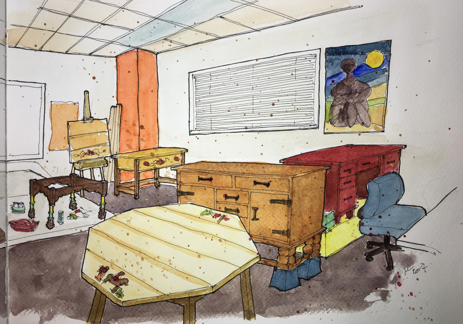
I sat close to the door and tried to draw the entire room.

AAACK!

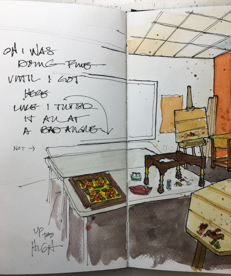
I use pencil to lay out perspective but that thing is, something went wrong.
When a drawing is wrong there is little color will do to fix it… but I persevered.
Damn I am a master at perspective but this is not wonky, it is just wrong!.

Cropping helped…  On this page it just looks wonky.
The Del Rey table is starting to walk out the door!

I have lots of Mason Monterey and Del Rey Monterey-style in my studio right now.
I took liberties as the desk in red is going to BE Spanish Red,
but now it is an extremely damaged Desert Dust.

Oh gads here is where the rails came off.
Everything is levitating…
Thank goddess this is not so or I’d have broken lovely California tiles….

I realize that by their rules this doesn’t qualify as an urban sketch…
but is someone else walked in to sketch our conservation studio it sure would!

To hear about classes, follow me on Facebook or
check out my new and improved dkatiepowellart.com and sign up for my newsletter!

“Memory is more indelible than ink.” Anita Loos, Gentlemen Prefer Blondes.
“I think not….”  Me.

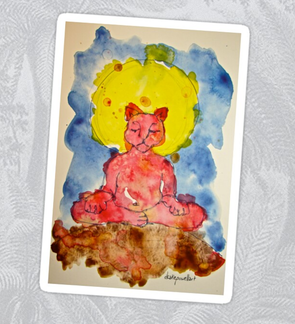
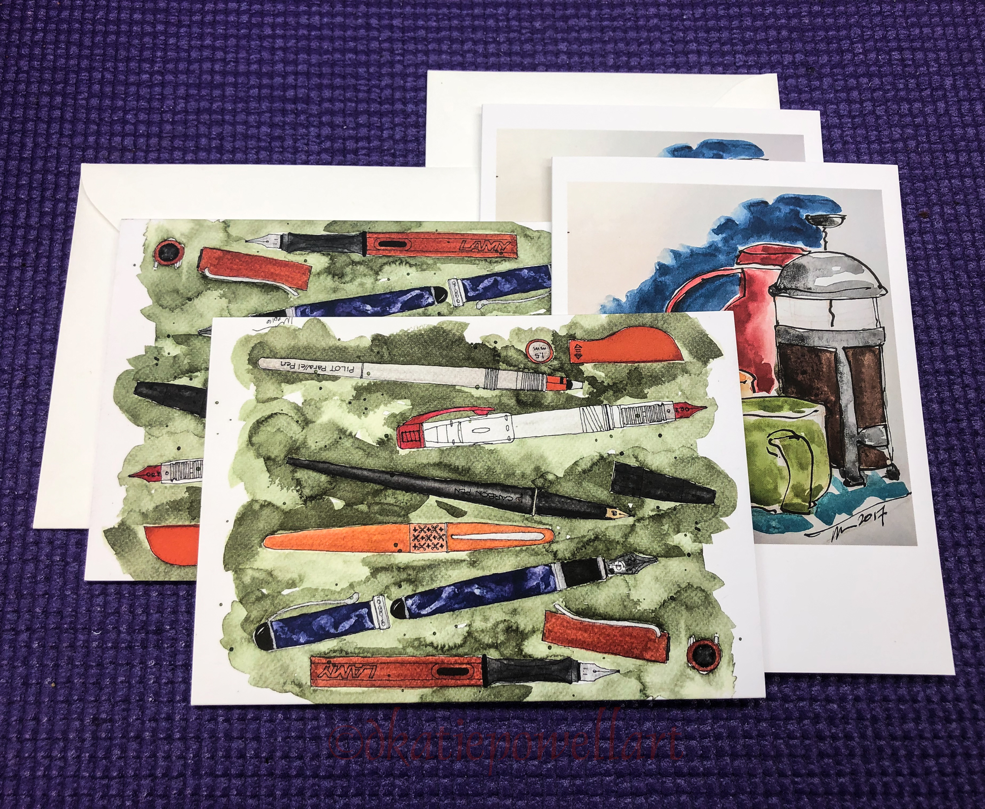
   w16-9-24-pens-color-3-sq    w14-2-sick-buddha-faces-0-sq 

Posted in art journal, furniture, journal, memory, pen & ink, urban sketchers, watercolor | Tagged , , , , , , , , , , , , , , , , , , , , , , , , , , , , | 9 Comments

Hahnemühle Post Cards, 10, Palms

A lot to want to ESCAPE from this last couple weeks…
Sad angry politics, riots, and my MAC is a lemon and screwed with my reports.

So I go to my happy spot… doodling Palm Trees and Daisies and Stars
(only palms shown here).

This one I hate, and kept screwing with until I gave up.
Mitchell tells me, “Don’t hate on the doodles!”

To hear about classes, follow me on Facebook!

Posted in cards, creativity, drawing, memory, painting, pen & ink, watercolor | Tagged , , , , , , , , , , | 10 Comments

Ganesha and Matteo Grilli’s Paints

Sometimes I try small handmade paint companies.
I took a chance on Aussie painter and paintmaker
MatteoGrilliArt handmade paints! and liked his so much I ordered more!
LOOK AT THOSE COLORS!!!!
Intense pigment, beautiful, not as creamy smooth as a manufactured
but smoother than a few handmade I’ve tried — and I am okay with some texture.

☾ ☾ ☾

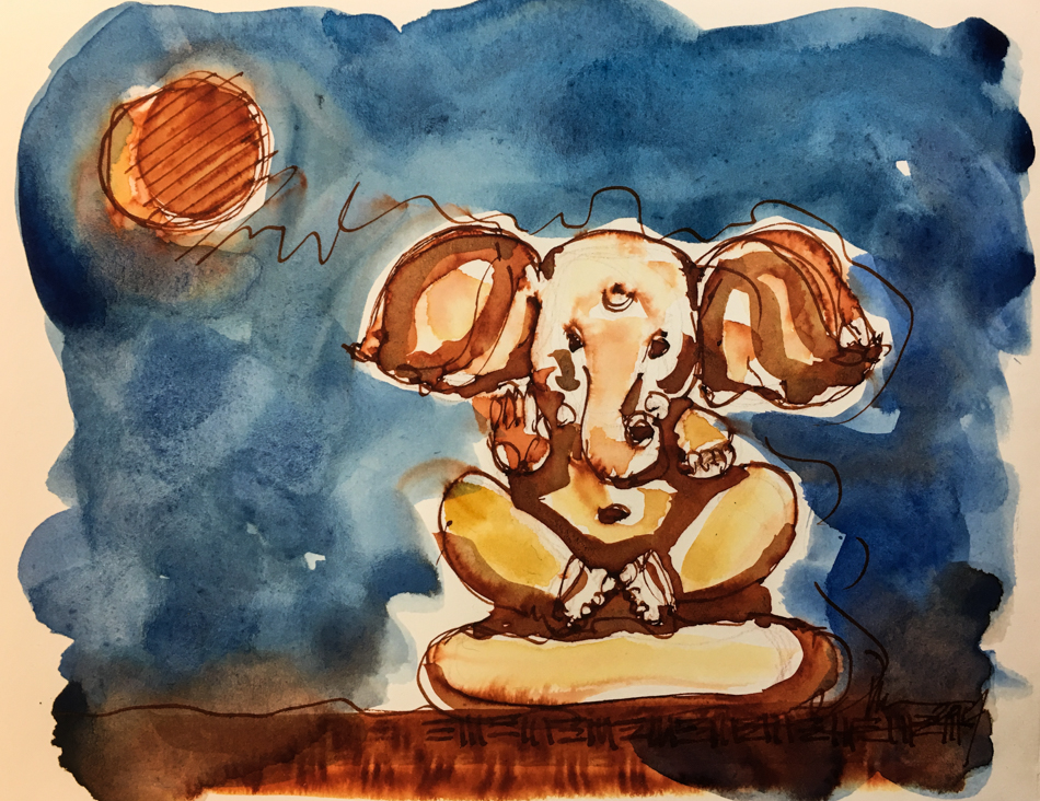
We are having more fires in the PNW, the air is smokey cinnamon, difficult to breathe.
This is all very sad for me… and this went into my Nostalgie journal.

The moon has looked like it was on fire the last few nights.
I sketched Ganesha in one of my favorite splashy inks, Diamine Ancient Copper ink
(not waterproof) then used De Atramentis Document Brown ink to give some bold shadows, wondering if it might keep the copper ink in place a bit.
NOPE, but the effect was still lovely, when I hit the paper with Grilli’s lovely paint.

Amazing that the Hahnemuhle Nostalgie journal can take a wet juicy wash like this!
I DO clip the corners but still… I was a bit afraid when I looked at the sweet painting
I’d done for Mitchell on the back it’d be a mess, but it was nice and dry.
What the Nostalgie doesn’t do that Hahnemuhle Watercolor journal does beautifully is allow any second coats or moving around of paint… It just is not thick enough!

☾ ☾ ☾  Jai Jai Ganesha!  ☾ ☾ ☾

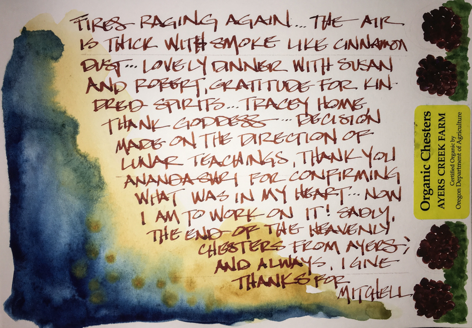
If you are in Portland and you hear people at the grocery store asking, “Any more Chesters coming?”, it is a heavenly blackberry from Ayers Creek Farm.  Sadly, the end of the Chesters was Monday, but I have nibbled them plain and heaven is the word!

Hahnemühle Nostalgie Sketchbook, watercolor pencils,
Lamy Al-Star with Diamine Ancient Copper ink,
Pentel Aquash waterbrush with De Atramentis Document Brown ink,
MatteoGrilliArt handmade paints!

©D. Katie Powell.
My images/blog posts may be reposted; please link back  to dkatiepowellart.

Posted in animals, art journal, Buddha, color, gods and goddesses, journal, process, ritual, sketchbook, tools, watercolor | Tagged , , , , , , , , , , | 7 Comments

A Change in Posting

As I move along for the next couple of months my posting habits will change:

I have a PAINTING project in our business that is in oil paint.
The DAR is commissioning a formal reproduction of the Washington State Flag.
Yuppers, I have to paint George Washington’s portrait as it is on the historical flag, because the first flag of the State of Washington needs to go into storage.
I will be posting about this for the DAR.

The other reason is that I am writing what may become a book,
using my Nostalgie journal for notes and raw writing because I can create the little watercolor sketches that I will do later on watercolor paper.
I am not ready to share… as a creative I often don’t like to share an idea half-hatched!.
So middle of the night sketches, and the occasional sketch, and a bit less posting!

To hear about classes, follow me on Facebook
or check out my new, improved dkatiepowellart.com

Posted in art journal, creativity, drawing, ink painting, journal, oil paint, painting, watercolor, writing | Tagged , , , , , , , , , , , , | 14 Comments

Hahnemühle Post Cards, 11, Stuff for Friends


When I wake in the middle of the night I can’t sleep I need something to do…
I reach for a Hahnemühle Post Card and a stack of images I keep by the bed…
Friends prompt middle-of-the-night postcards…
silly comments or an exchange or an image.

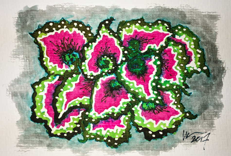
Rex begonias lead to testing psychedelic inks… Seriously, I was not on acid just sleepy.

Rexting! She calls it!
hahahahahaha

A friend in Florida or Germany sends a message
in a dark nighttime bottle
and I turn the light on and pick up my pencil….
Then it gets posted!  How cool is it to get a surprise!

☾

Because I  journal and do morning stream of consciousness exercises,
I am again trying to participate in Linda Hill’s Stream of Consciousness Saturday. 
I write to a timer, 15 minutes, no editing except spelling, and of course I add my art!
You can do it too!

To hear about classes, follow me on Facebook!

Posted in cards, memory, painting, pen & ink, watercolor | Tagged , , , , , , , , , , , | 8 Comments

WATWB: Longreads Candace Rardon

A celebration of creativity to lift us. One thing that I think soothes the soul
is taking the time to drop into something wonderful and say “ah!”

We are all searching for “home”.  It is not 500 words (oops) but sometimes to find peace
you have to give it more than a nanosecond.
From the people at Longreads (I support financially)
and the wonderful Candace Rardon.
Sit for the read….

Home is a Cup of Tea

Sketch artist and writer Candace Rose Rardon tells the story of her search for home through the different teas she has discovered while traveling.

Candace Rose Rardon | Longreads | July 2017 | 10 minutes (2,882 words)

Let’s play a game. It’s called, “Being You, Right Now.” Perhaps you’re reading this on your way to work, defending your corner of the train with a well-placed elbow. Or are you at home? If so, please, put the kettle on. Yes, right now. I’ll wait.
The thing is, this story goes really well with tea — be it ginger, Moroccan mint, or Assam. Okay, back? Ready to continue? Now — take a long, slow look around you. Is it the home you once envisioned for yourself?
Well, maybe that’s a bit deep. We are only getting started here. Let’s begin with something a bit easier — like, bookshelves. Are there bookshelves? How about windows? Is there a fire crackling in a wood-burning stove? I’ve always wanted my own wood-burning stove. Nothing quite compares to the scents of cedar and woodsmoke wafting through the air. The story you’re reading right now is the story of how I came to find, and redefine, home. As you read along — at home or on the train, but always, I hope, with a cup of tea in hand — perhaps you’ll feel compelled to do the same. For the next few minutes, take everything you thought home was or should be and put it on hold. The results just might surprise you.

I was born in the state of Virginia, where my parents had also lived since they were children. We moved only once in my childhood, into the house my dad built for us when I was 7. There, on Cedar Creek Lane, home was family dinners around the worn kitchen table. Home was the wood-burning fireplace in our living room.Home was the pot of English breakfast tea my mother always had brewing, and the tea chest she kept by the stove. I loved dreaming of the home I would have one day — the family dinners I would host and the cups of tea I would serve. But at the same time, a part of me wanted to see the world. So after graduating from college, I decided to live abroad for a while, beginning with six months in England.

Go make yourself a cup of tea
and enjoy the rest of this read…

☾

There are more stories like this out there.
You have to open your eyes and heart.

☾

Interested in lifting the vibration in th world with stories of compassion and positivity?  Sign up in the
WE ARE THE WORLD Linky List below to
join us and be visited on the last Friday when you post your article!  Please help spread the word via
the hashtag #WATWB.

Click here to enter your link on this Linky Tools list…

Posted in art, meditation, memory, writing | Tagged , , , , , | 19 Comments

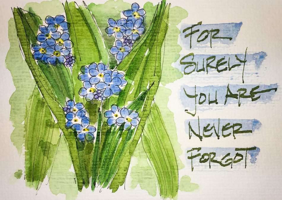
Hahnemühle Post Cards, 9, FORGOT

“For surely you are never forgot!”

I’ve been going a bit crazy trying to find the rest of this poem about forget-me-nots.
Literally got me out of bed going through books at 2am searching for likely places I’d have it…  Tried the internet.  Maybe it was something that Mimi said to me and damn I can’t remember…. but that one line has always stayed with me.

This is for Linda Hill’s one-liner Wednesday.

To hear about classes, follow me on Facebook!

Posted in cards, memory, painting, pen & ink, watercolor | Tagged , , , , , , , , | 10 Comments

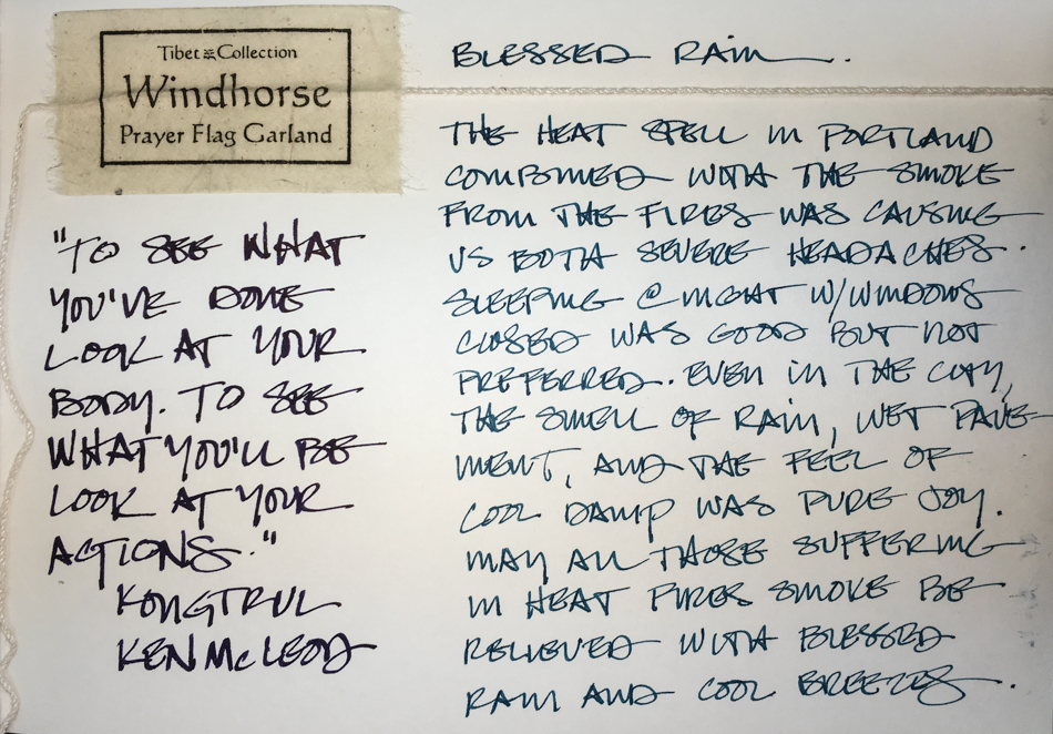
Thankful for Cooling Rains and more

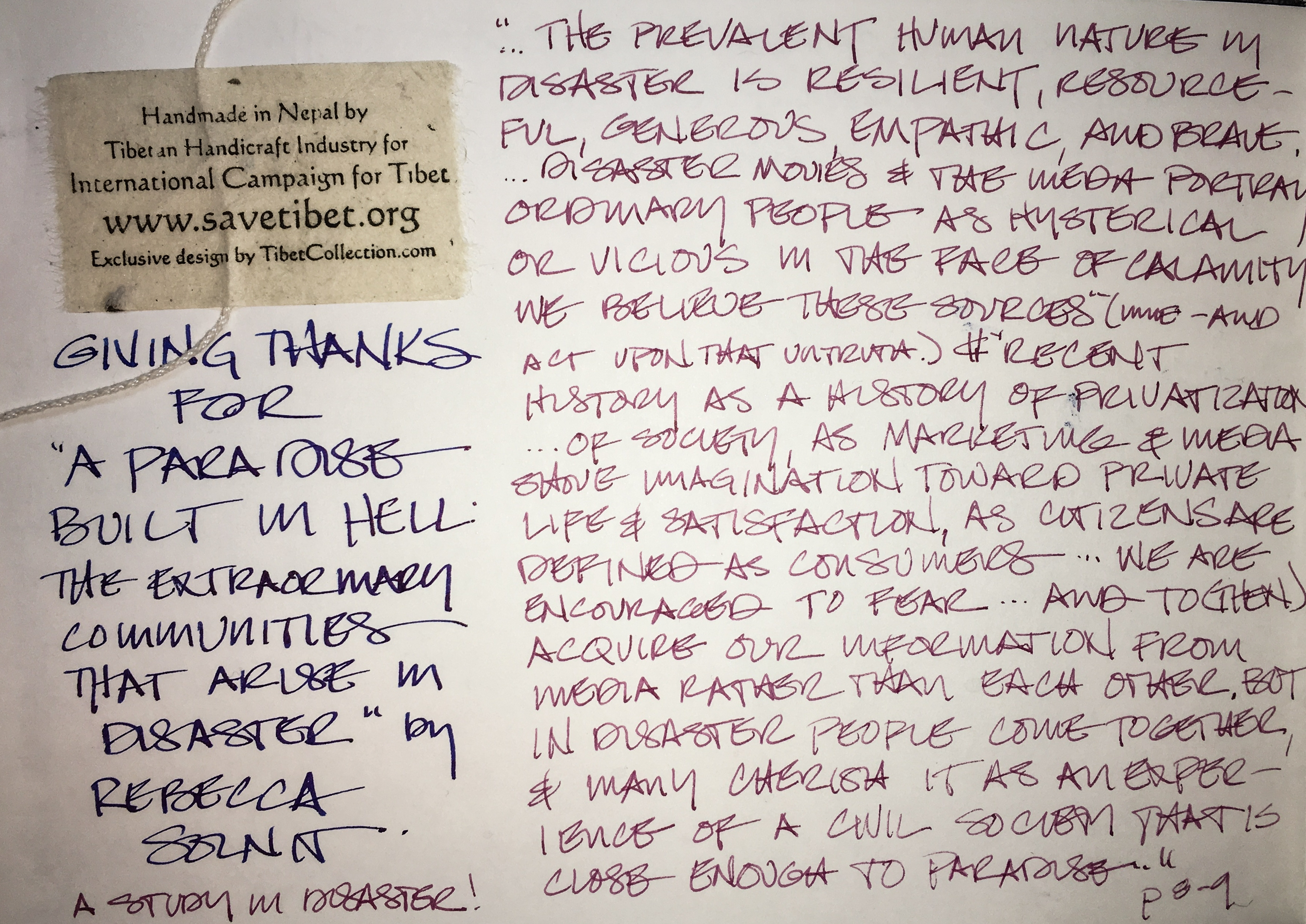
Tibetan Windhorse Flags from my donations to Save Tibet organized my
gratitude entries this week… nice to be back in my hand-sized journal….

Cooling Rains.

I’ve always been a fan of rain, and the heat wave breaking with cool rains was pure joy.

Tough week.

I was thinking about the filters we see our world through as I watched
the terrorism at Charlottesville and Barcelona.  Horrifying, unbelievable.
I think that is why I chose the tiny Buddhist flags this week as a base for my gratitude.

Elle Reeve.  Remember that name.

In this time of nearly non-existent MSM reporting, I am grateful for the work of Elle Reeve, the brave young woman who embedded with the Alt-Right in Charlottesville.
Without truth good people can’t make the right choices.
Her video is hard to watch (see the end of this post), but once watched,
you can see what we are up against in the USA.

Forgiveness.

I’ve been very sad about a friendship, hurt feelings (mine), and being silent.
Especially as it seems people don’t come back to work on friendships anymore, and missteps happen in the best of friendships.  Relationships are important to of my life.
A huge weight lifted because when I spoke to this friend about my hurt feelings
over her actions, she owned it, felt it, did not deflect.  I heard that.
I listened to her reasoning and we came together to continue friendship.

Caring people.

In the heat wave there were people in Portland, good Samaritans,
who made sure the homeless had water.  Gave out of their own pockets.
Seeing humanity give when government will let them die gives me hope.

I think without doing gratitude
during this week I’d be a puddle of tears….

On to Thanks for Dreams…  Intentions…
Dare I say Hope?

I give thanks for that and the little bit of hope I have that we will stop this direction the USA is heading —  pollution, greed, hatred, racism — and do more than just survive.  We have the ability to do so much more than that. and this idea of lack is what the MSM has put into our heads to fulment fear and push us to hold on and not trust our neighbors.

I give thanks for the book  I am reading,
A Paradise Built in Hell: The Extraordinary Communities That Arise in Disaster,
by Rebecca Solnit.  It dispels myths about disasters, government interference, and speaks to building community… I haven’t finished it, but am loving it.  It offers grounded hope,
and a very different world view to consider.

Mitchell and I are trying to find cool frames for our new eyeglasses,
and in the search found a nice place to eat, Las Primas.  Nothing fancy, a good eatery…
and I drew it, of course!  Opaque paints and me are not best friends, but these are the colors on the wall… what to do?  So streaky gouache-like paints it is!

To a better week after the Eclipse!

To hear about classes, follow me on Facebook  or check out my new,
improved dkatiepowellart.com

Hahnemühle Nostalgie Sketchbook, Pentalic HB woodless pencil,
White Uniball Signo, liquid watercolors and inks in Pentel Aquash waterbrushes,
De Atramentis Document Brown ink, Robert Oster Jade ink,
Pilot Preppy pen with Noodler’s Lexington Grey Ink,
Lamy Al-Star with De Atramentis Document Black ink,
Platinum Carbon Pen with Platinum Carbon ink waterproof cartridges,
Sennelier, Holbein, Primatek watercolors and Daniel Smith Watercolors.

Posted in art journal, journal, meditation, memory, sketchbook, urban sketchers, watercolor, writing | Tagged , , , , , , , , , , , , , , , , , , , , , | 4 Comments

Ganesha New Moon Eclipse

Ganesha is calling again.

☾

Pentalic Nature Sketch Journal, with a Pentalic HB woodless pencil,
Platinum Carbon Pen with Platinum Carbon ink waterproof cartridges,
Sennelier, Holbein, and DS Primatek watercolors, and Daniel Smith Watercolors


Posted in art journal, gods and goddesses, graphite, painting, pen & ink, sketchbook, watercolor | Tagged , , , , , , , , , , , , | 3 Comments

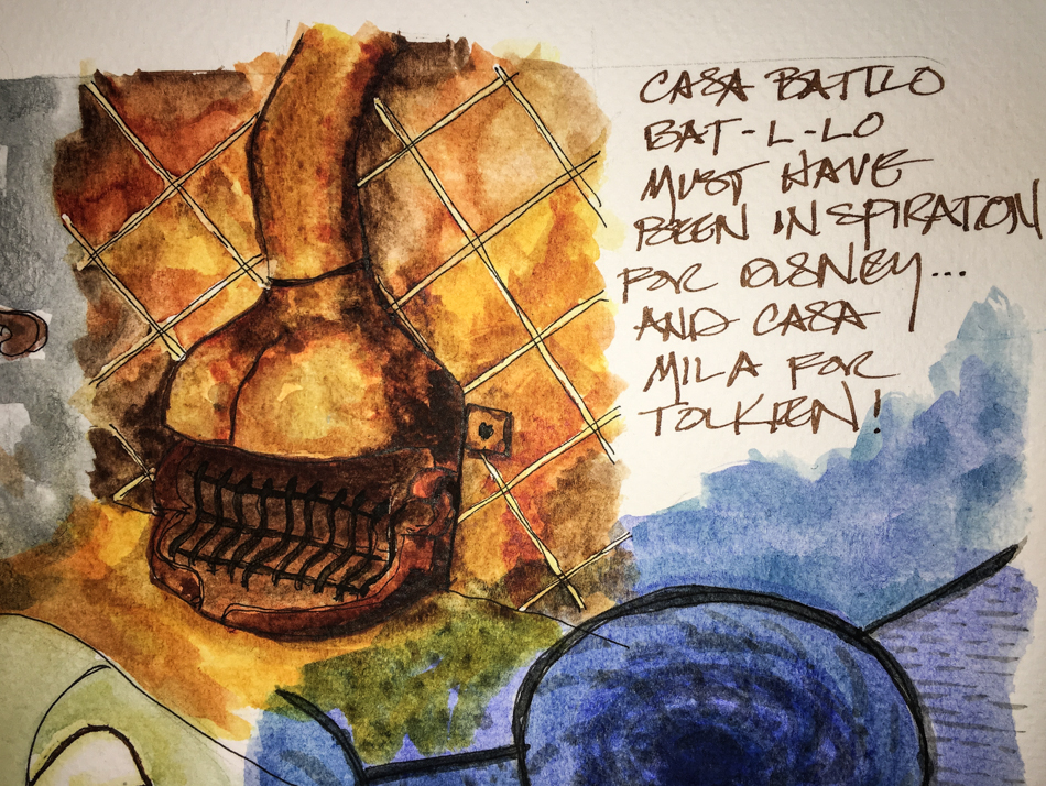
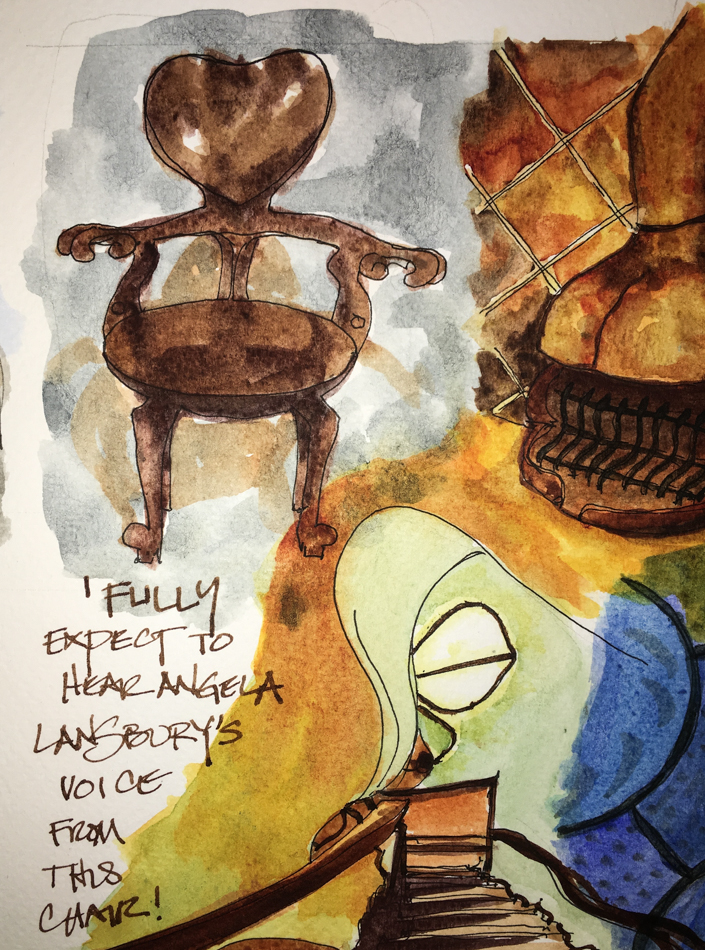
VSW: Barcelona, 5, Casa Batllo

Finishing off the two-page layout for our Gaudi walk, I tackled the fireplace I desire!

I keep seeing this sweet heart-shaped chair breaking into song
and dance in Angela Lansbury’s voice!.

The final layouts finished by the collage of four images from Casa Batllo.
If I have time I will also do a sketch of Casa Mila!

To hear about classes, follow me on Facebook or
check out my new and improved dkatiepowellart.com and sign up for my newsletter!

☾

☾

Posted in architecture, art journal, challenge, ink painting, pen & ink, process, virtual sketching, watercolor | Tagged , , , , , , , , , , , , , , , , , , , , , , , | 12 Comments