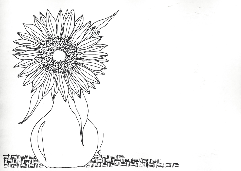
Inktober, 10 Sunflower

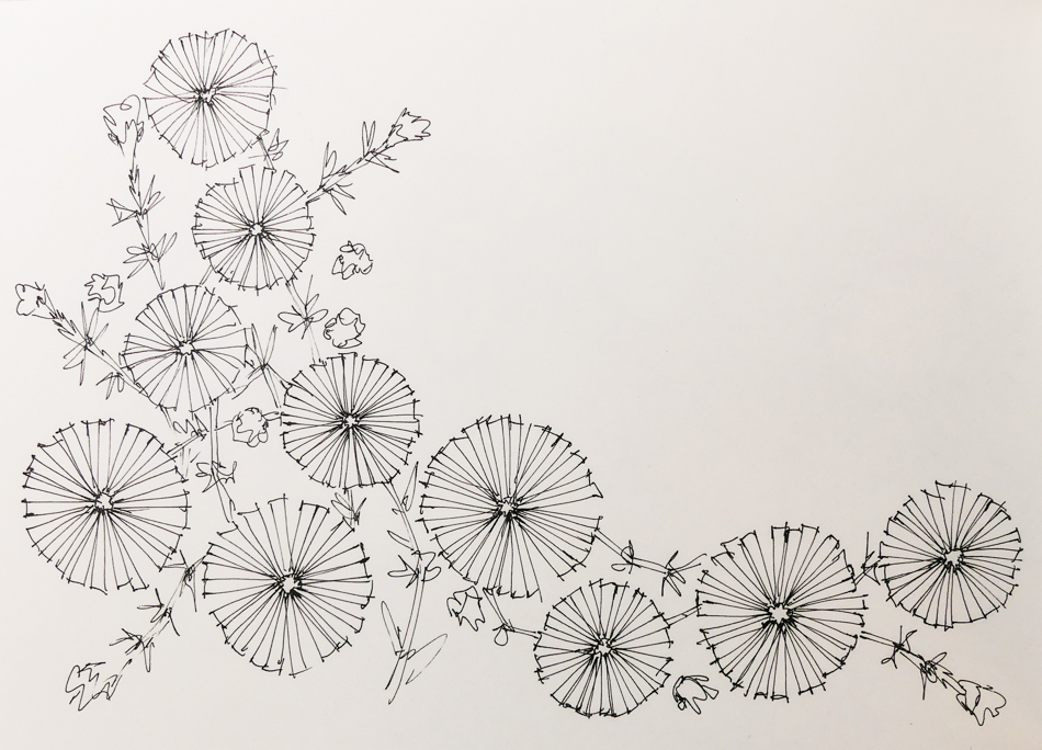
I thought to add watercolor but may not… I like the linework!

(Though the contrast of bright yellow and cobalt blue is enticing….).

 To hear about classes, follow me on Facebook
or check out my new, improved dkatiepowellart.com

Posted in art journal, challenge, creativity, drawing, ink painting, journal, pen & ink, process, sketchbook, virtual sketching | Tagged , , , , , , , | 4 Comments

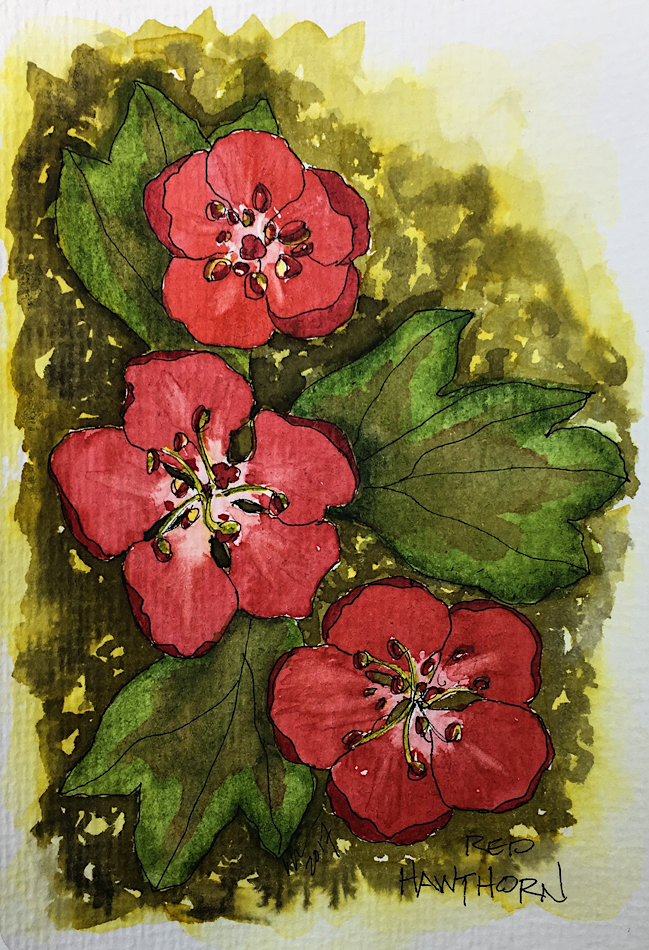
Inktober, 9 Red Hawthorn

I never noticed Hawthorns until we moved to Portland,
though my Mom insists we grew up with them all around.
Maybe the ocean was too dazzling for me to notice them.
They are everywhere, and gorgeous!  Now I look for them!

To hear about classes, follow me on Facebook
or check out my new, improved dkatiepowellart.com

Posted in art journal, challenge, creativity, drawing, ink painting, journal, pen & ink, process, sketchbook, virtual sketching | Tagged , , , , , , , , , , , | 4 Comments

Tools: Watercolors, 9, Mayan

“Mayan” watercolors began appearing as a fad name a few years ago.  Loving Primateks, I wanted to try them…
Cut to the chase, I was disappointed.

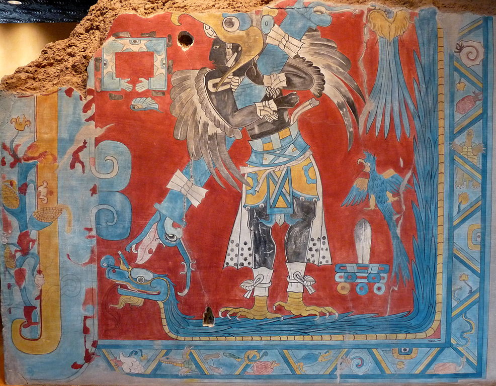
Originally Mayan blue was developed by the Maya people, who ruled Mesoamerica from 290 to 900 C.E.  Blue was the color of the Mayan Sky Gods, and so it was used for ritual objects and murals, a bold, beautiful and durable pigment.  It is a remarkably stable pigment created from indigo  embedded in a special clay mineral called palygorskite.

The blue is perhaps the most striking color used by Maya artists, a color so extraordinary that it generated much research and debate among scientists for more than 50 years. Despite long exposure to light and high humidity for centuries, it hardly fades. It defies exposure to alkalies, acids and chemical solvents.

Scientists speculate the Mayans developed a preparative technique that was not limited
to Maya blue and preceded the future modern syntheses of organic–inorganic hybrid materials.  They surmise the hue depends on how long the Maya heated their formulation, allowing the pigment to variations of the addition compound formed by the indigo compounds and the mineral. The researchers further conjecture that the Maya were also able to produce yellow and green pigments from indigo-based pigments.  The yellows were based on both ochre and also a yellow derived from the indigo plant during preparation.  The red is an iron oxide.  All were mixed with palygorskite.

Today’s “Mayan” pigments, depending upon the manufacturer, are a mixture of both inorganic (paylgorskite clay) and organic (blue dye) elements — however, no known organic pigments today can come close to the stability of the original Mayan Blue.

So why the disappointment with regards to the “Mayan” paints?

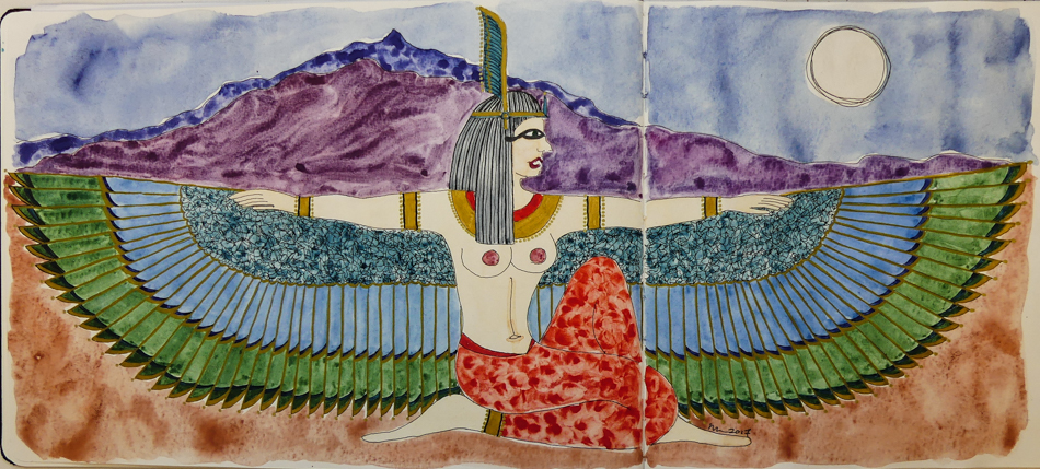
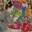
To use them to their fullest capacity it is best to use them out of the tube as a thick mixture… almost like an acrylic.  With acrylic paints, you have to learn to use them in ways that creates washes by using additives — otherwise, they are a thick matte or glossy paint out of the tub.  Watercolors, on the other hand, are rarely used in a thick manner, such as shown in the first image left, in the lips (Mayan Red) and the necklace (Mayan Orange.)

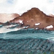
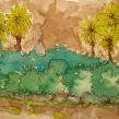
“Mayan” watercolors are very hard to move, unlike the primateks.  They don’t suspend in a wash and drop in a lovely manner on the paper even if you don’t try to manipulate them (see the sky, Lapis Primatek, and the earth, Minnesota Pipestone Primatek, above.)  With no tricks, the two Primateks fail into a pleasing pattern on the rippling wet paper.  The “Mayan” paints, on the other hands, take a lot of manipulation if you don’t use them thick out of the tube… note the streaky Mayan Violet mountains, and her Mayan Orange pants.

IF I wanted the thick colors, I would go back to acrylics.

Finally, it is a bit of a gimmick.  Many opaque paints react in much the same way.
French Ochre, Iron Oxide, Vermilion, WN Caput Mortem — all are very claylike watercolors.  The difference is, while I may prefer transparent watercolors for their brilliance, I can manipulate these paints easier than the “Mayan” paints.

Perhaps those of you who enjoy opaque watercolors will enjoy them —
I will pass.  Mine are up for sale!  Interested parties email me!

Daniel Smith made the Mayan Violet (very pinkish), Orange, Yellow, and Blue.
Greenleaf & Blueberry made the bluer Mayan Violet and Mayan Red.

Ancient Maya Dyes is an interesting blog post about the Mayan dyes.  From their post, I’ve found pictures in Wikipedia (I like seeing the actual plants and minerals) below.  It is a great post!

To hear about classes, follow me on Facebook or
check out my new and improved dkatiepowellart.com and sign up for my newsletter!

☾

Greenleaf & Blueberry, DS Primatek watercolors, and Daniel Smith Watercolors.

w16-watercolor-sq w16-8-10-pentalic-middle-night-03-sq w15-inks-sq w16-9-24-pens-color-3-sq w15-ds-paints-sq

Posted in review | Tagged , , , , , , | 2 Comments

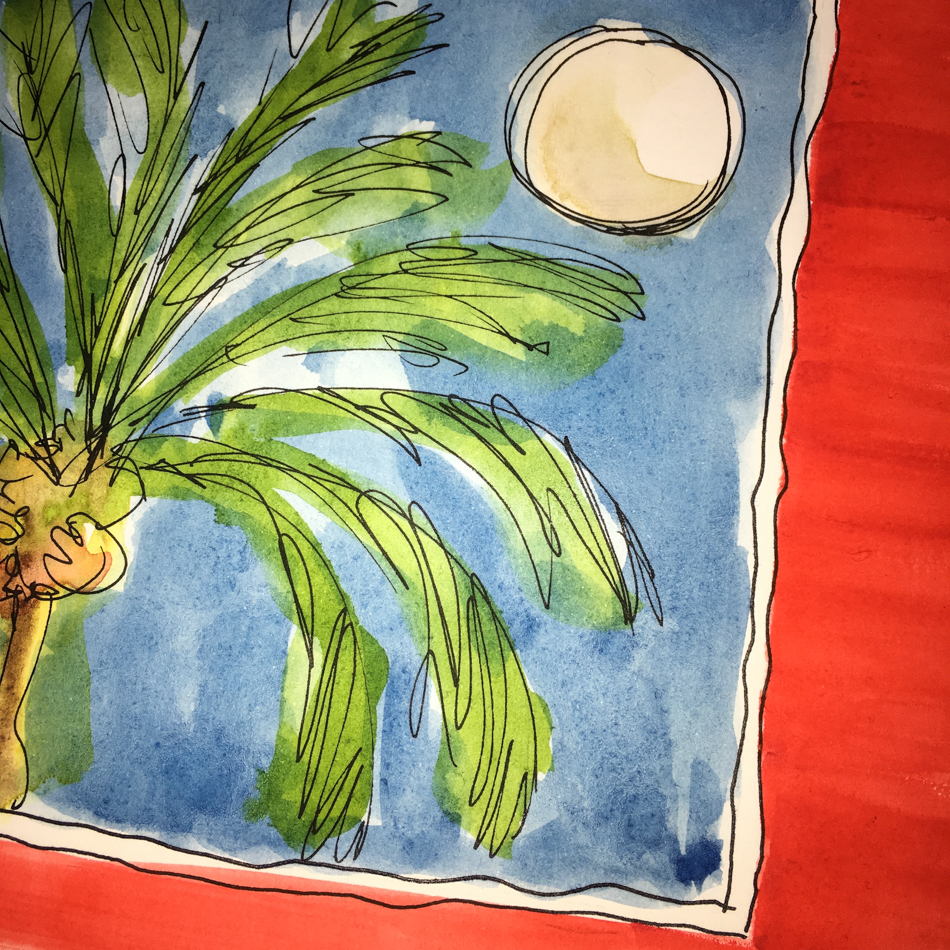
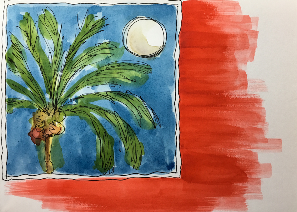
Inktober, 7 Palm Window

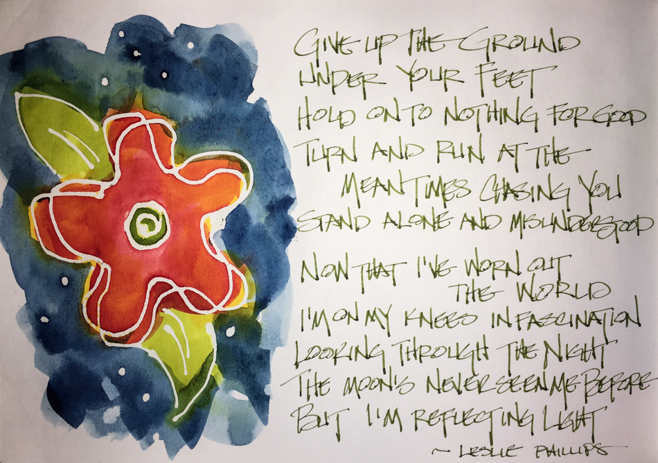
I don’t know where I caught the snippet of a poem which was a song not a poem
but it has rolled around in my head for weeks, these few lines:
“Now that I’ve worn out
I’ve worn out the world
I’m on my knees in fascination
Looking through the night
And the moon’s never seen me before
But I’m reflecting light.”

It became a visual in my head too, which became middle-of-the-night sketching.
Maybe if I paint this enough I will have this window in my life again…

My drawing of ink only was blurry!

I went to find out who wrote this, and am confused, Leslie Phillips or Sam Phillips?
And I don’t know why the ballet dancer…

I rode the pain down
Got off and looked up
Looked into your eyes
The lost open windows
All around
My dark heart lit up the skies

Now that I’ve worn out
I’ve worn out the world
I’m on my knees in fascination
Looking through the night
And the moon’s never seen me before
But I’m reflecting light

Give up the ground
Under your feet
Hold on to nothing for good
Turn and run at the mean dogs
Chasing you
Stand-alone and misunderstood

Now that I’ve worn out
I’ve worn out the world
I’m on my knees in fascination
Looking through the night
And the moon’s never seen me before
But I’m reflecting light

To hear about classes, follow me on Facebook
or check out my new, improved dkatiepowellart.com

Posted in art journal, drawing, journal, memory, painting, pen & ink, sketchbook, watercolor, writing | Tagged , , , , , , , , , , , , , , , , , , | Leave a comment

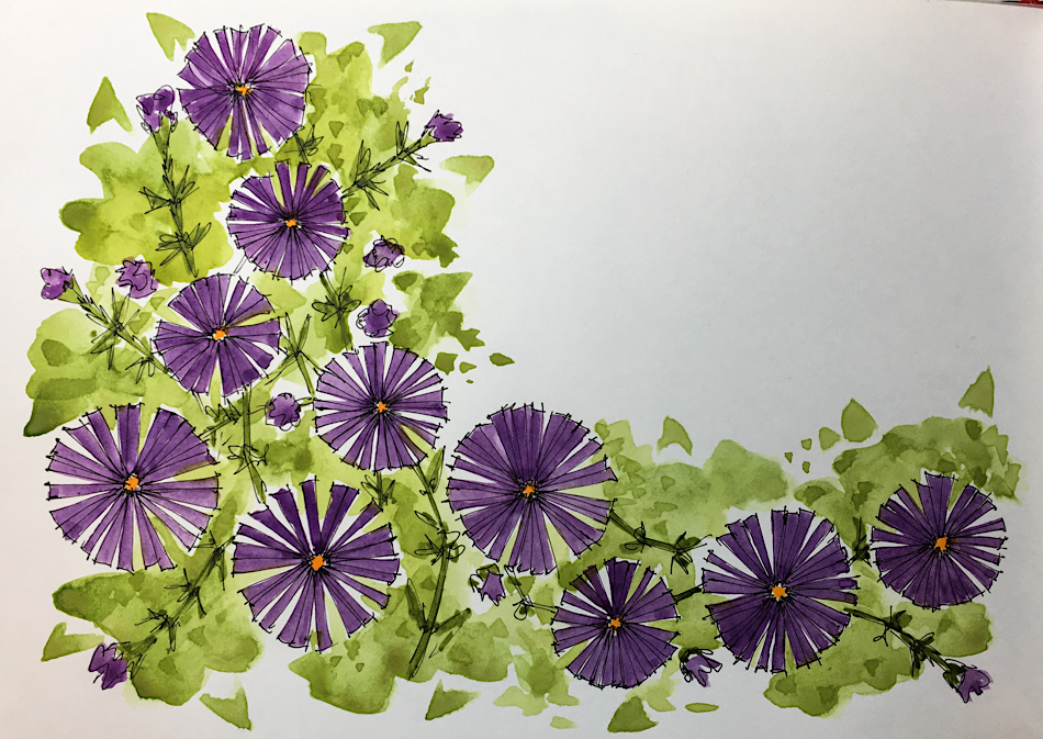
Inktober, 6 Purple Posies

These lovely purple daisies, a ground-cover, also found on our walk to breakfast…

so sweet, hardy, covering an entire small yard of a painted lady.

 To hear about classes, follow me on Facebook
or check out my new, improved dkatiepowellart.com

Posted in art journal, challenge, drawing, ink painting, pen & ink, sketchbook, virtual sketching | Tagged , , , , , , , , , , , , , | 6 Comments

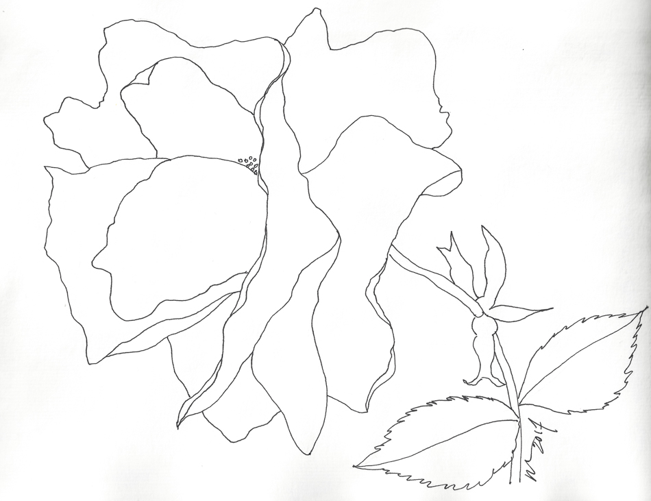
Inktober, 5 Rose

A memory from our walk to the Standing Stone for breakfast.
Nothing beats spending time with Mitchell.  We saw Autumn straggling cheery street roses.  I  don’t know how they survive in poor light under the trees!

I love my Nostalgie Journal, but I have to stop pushing it with many-layered juicy  washes… It is 90 lbs not 200 lbs!  Still, it takes a LOT of water.  What it doesn’t like too much is when the many layers have a Primatek base.  I think I saved it tho…
when backgrounds go splotchy make more splotches, deliberately!

 To hear about classes, follow me on Facebook
or check out my new, improved dkatiepowellart.com

Posted in art journal, challenge, drawing, pen & ink, sketchbook, watercolor | Tagged , , , , , , , , , , , , | 6 Comments

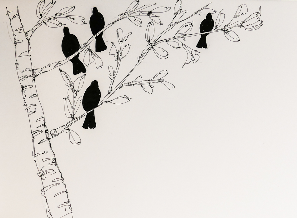
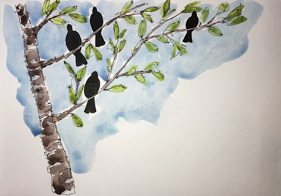
Inktober, 4 Crows for Mitchell

Mitchell loves crows… our crows love him too.
He talks to them when he is taking the trash to the dumpster,
or parking the car at the studio, or out the studio window, and they know him.

Of course, color.  I am going to come back and write quotes on these pages,
but for now, they are waiting for the just-right quote.

 To hear about classes, follow me on Facebook
or check out my new, improved dkatiepowellart.com

Posted in art journal, challenge, creativity, drawing, pen & ink, sketchbook | Tagged , , , , , , , , , , , | 10 Comments

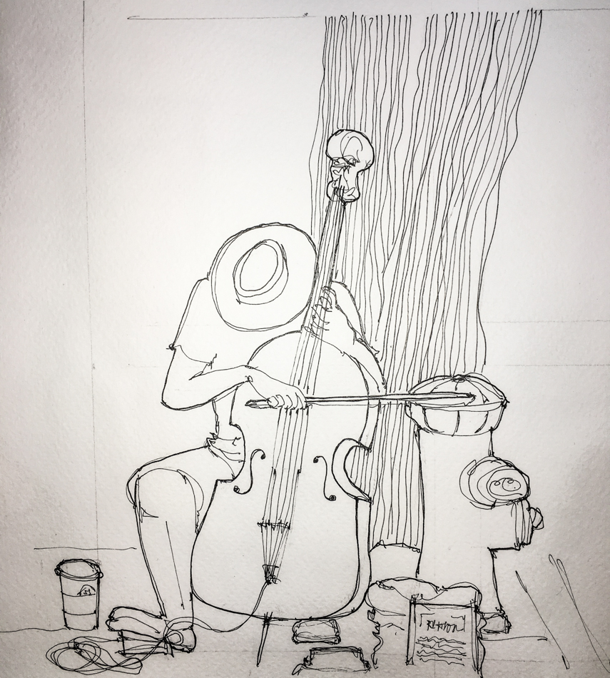
Inktober, 3 Cello Man

Cello Man plays at the entrance to PSU Saturday Market.
We enjoy him, and have often given him money.
I think there is an unwritten rule or agreement about the musicians,
because rarely does one drown out another or move into the other’s territory…
There is a lovely symbiosis to how you move through the large college market, listening to the cell then a lovely drum then Hawaiian ukulele then violin.

Until late August.

An obnoxious dad set up his precocious 6 year old keyboard talent at the entrance,
and proceeded to turn the volume waaaaay up.  He not only drowned out Cello Man,
but blasted us all and could be heard all over the park.  I was offended,
and I think other people were too… He tried it again a week later,
and Cello Man disappeared — but then so did the 6 year old, finally, blessedly.

We did not know why Cello Man did not return.
He was not at PSU.  We missed him.
We asked the market info stand about him.
So odd that they didn’t know what happened to him, “the Busker?”
He sat across from them every week!

Martin Watkinson and Gaea
lost their house in a fire. 
We’ve bought two of their downloadable albums here.
You can also donate (crowdfunding) here;
what has happened is bad, he has medical issues,
and they need so much help.

I need to track him down now that I’ve done his portrait.
His playing is so lovely.

I was planning on adding watercolors
to the sketch, but think not…

To hear about classes, follow me on Facebook
or check out my new, improved dkatiepowellart.com

Posted in art journal, challenge, creativity, drawing, journal, pen & ink, sketchbook, urban sketchers | Tagged , , , , , , , , , , , | 3 Comments

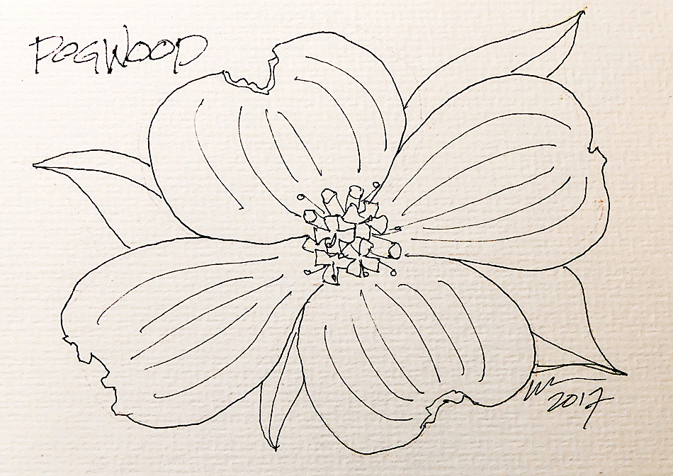
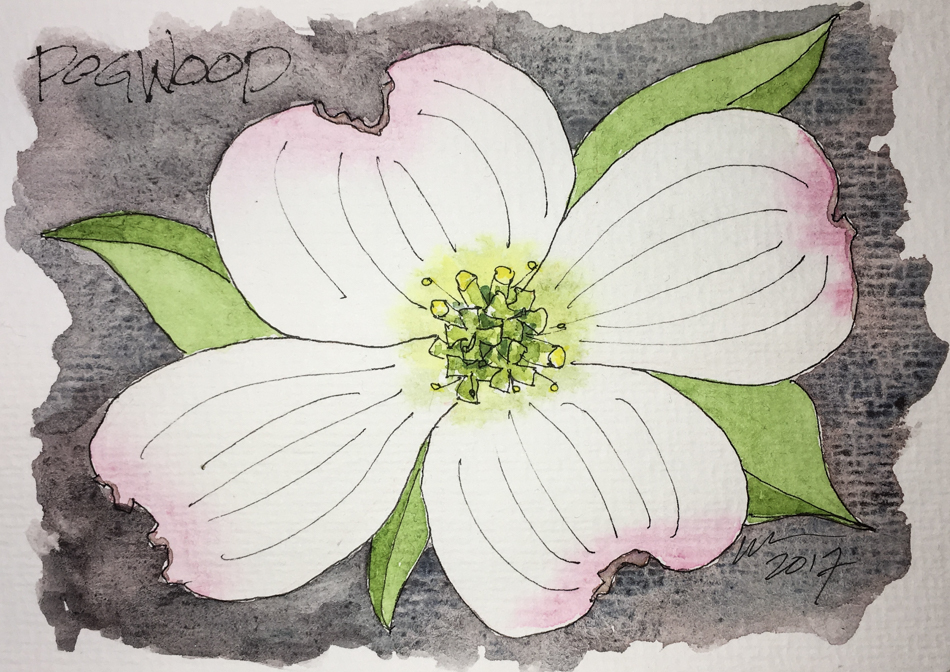
Inktober, 2 Dogwood

Dogwood always reminds me of my Grandmother, Lyle Genevieve, or Mimi,
and driving through the mountains around Grass Valley area where their ranch was…
Even though we see it all over Oregon it reminds me of the California mountains.

I may have inked first, but I love color….
This is Da Vinci’s Alizarin Crimson but used sparingly.
Hematite (I think) and Prussian Blue create the background.


To hear about classes, follow me on Facebook
or check out my new, improved dkatiepowellart.com

Posted in art journal, challenge, creativity, drawing, ink painting, journal, pen & ink, process, sketchbook, virtual sketching, watercolor | Tagged , , , , , , , , , , , , , , , | 6 Comments

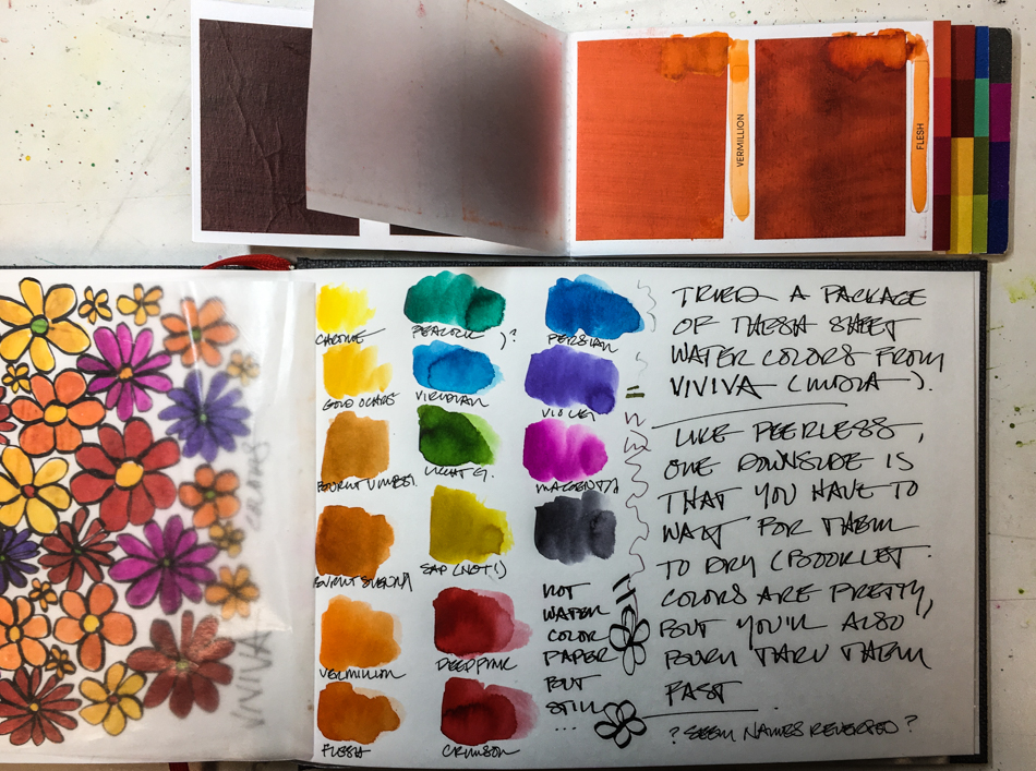
Tools: Viviva Colorsheets and Hello Inktober

Viviva is a new watercolor “sheet” out of India.
I bought them through their Indiegogo campaign.
Watercolor sheets are meant to travel with a waterbrush, so that you simply touch the wet brush to the colored paper and the color transfers to your brush, then to paper.

*telling you my bias up-front, i like to mix colors and i like wet watercolors,
so paper travel colors have not been my thang… that said…*

I like the booklet.  Peerless makes a sheet format and most people tend to cut their
sheets up and tape them into a palette for travel. That is a lot of work for paints where
the selling point is convenience!   This is nice because the book can be thrown
into your purse or pocket, and stays intact, color-tabbed for convenience.

I sampled the colors over their names so I would not have to look at a palette behind the book. Wax paper sits between the color so that no transference of colors is possible.

They’ve thought this through, and I like that.

The colors are brilliant, best for doodles — or graphically inclined artists.
The palette also might make a good city palette… and I want more greens and browns!
Portland is still a green (trees) and brick and grey city.
I have no idea if they are colorfast… but I see them for sketchbooks at any rate!

Again, as I am a wet watercolorist, these paints are at a disadvantage with me.
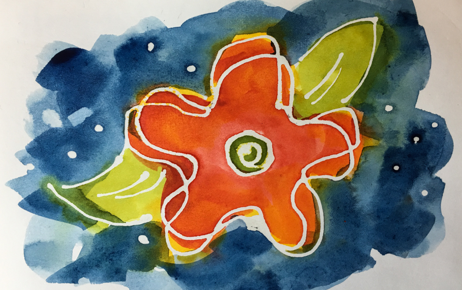
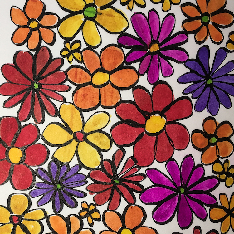
I think with a little practice the doodle below would not be streaky, but I went back in twice on the large orange and pink and yellow flower, seeing the intensity, and ended up with some streaks.  On all the trials I found that I had to move pretty quickly or
it was potentially streaky.  I found they worked best when I did not try to take just
a tiny bit of color, so I didn’t have to go back in for a second brushstroke.

I bought the two-for package, and am throwing one into my purse to take along
with my waterbrush, so I think you will see more sketches with them.
The booklets fits into the envelope at the back of my sketchbook!

Viviva Colorsheets are available on Indiegogo in their InDemand section
(igg.me/at/viviva-colorsheets), and after November on their website, vivivacolors.com.

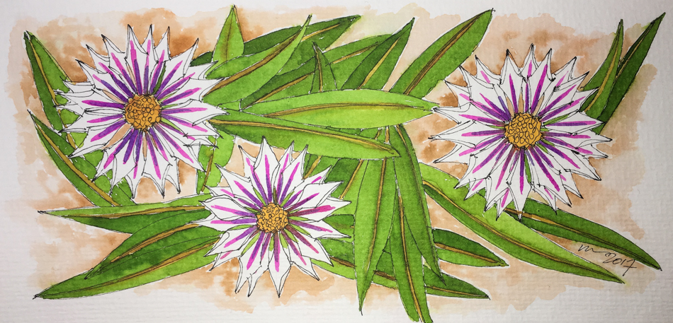
As it is Inktober, here is an initial drawing of CC’s posies:

CC offered up an intriguing floral image…
Middle-of-the-night.  I don’t know what these are.  Posies.
I like the way the petals are curling up turning them into stars.

Trying them out on the rough watercolor paper of Hahnemühle Post Cards.  They worked well.  Short on a good warm brown, and I had to work with pink and purple, no maroon.
I found I could change the leaf color slightly by the amount of paint I picked up and the amount of water — ALL the leaves are one green (other than the yellow-green stripe.)

Bottom line:

I found mixing colors difficult because they dry out quickly —
so no mixing other than dipping into one color then swashing over the next.
I like my paints clean so my persnickety nature about clean colors is problematic.
But I also can see these are great throw-it-in-your bag with a waterbrush and an impossibly small sketchbook so you’d NEVER be without paint!

* sssh… or stocking stuffers!*

☾ ☾ ☾

To hear about classes, follow me on Facebook  or
check out my new, improved dkatiepowellart.com

Posted in art journal, journal, painting, review, sketchbook, tools, watercolor | Tagged , , , , , , , , , , , , , , , , | 10 Comments

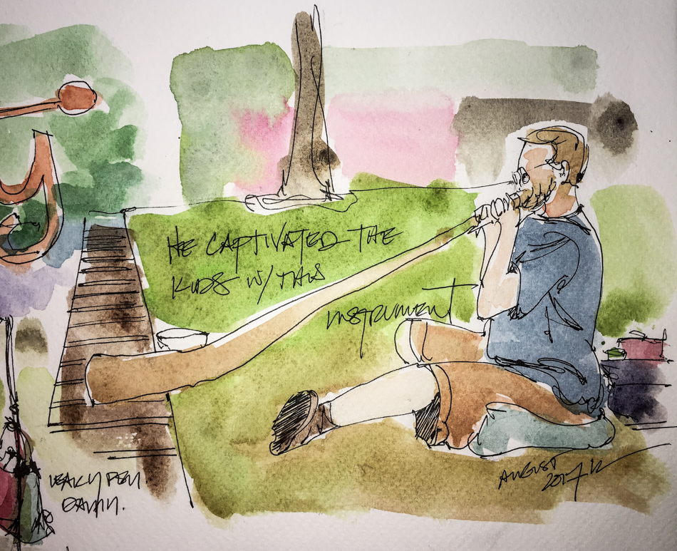
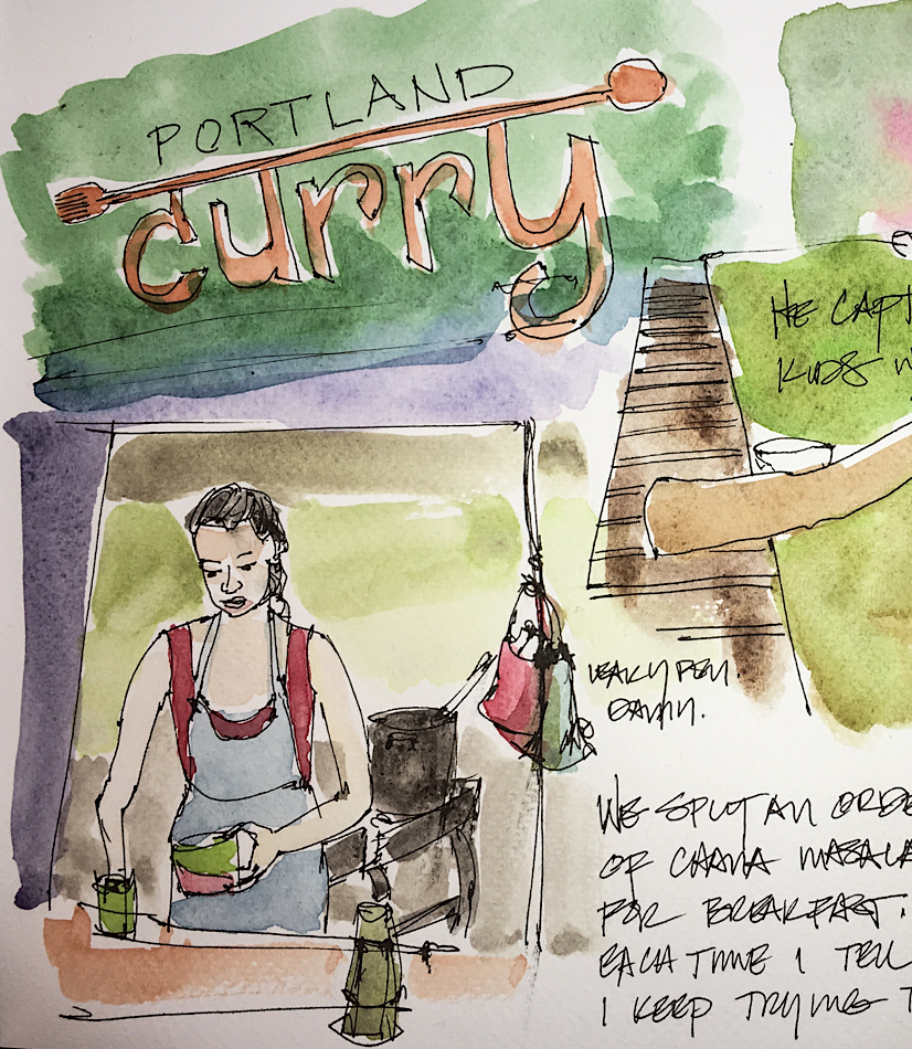
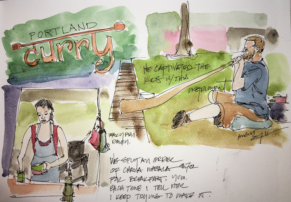
USk: Autumn at PSU Market

Gads the children were enthralled by his playing!

We often eat breakfast at
Portland Curry — Chana Masala, Yum!

To hear about classes, follow me on Facebook or
check out my new and improved dkatiepowellart.com and sign up for my newsletter!

☾

Fabriano Watercolor journal (don’t recommend),
Lamy Al-Star with De Atramentis Document Black ink,
Platinum Carbon Pen with Platinum Carbon ink waterproof cartridges,
Holbein and Daniel Smith Watercolors.

☾

W16 7 21 USK PSU BERRY FESTIVAL 02 SQ  

©D. Katie Powell.
My images/blog posts may be reposted; please link back  to dkatiepowellart.

Posted in art journal, sketchbook, urban sketchers, watercolor | Tagged , , , , , , , , , , , , , , , , , | Leave a comment

Wendell Berry Palm

Obsessed with palms in my sketchbook these days;
I’ve always doodled them but I am working on bamboo furniture,
which is palm-ish and so, more palms.

This quote caught me, from where I don’t know, and dashed it on a post-it.

Then I had to find it… Bill Moyers.  The pages go together in my sketchbook.

“It is hard to have hope. It is harder as you grow old, for hope must not depend on feeling good and there’s the dream of loneliness at absolute midnight. You also have withdrawn belief in the present reality of the future, which surely will surprise us, and hope is harder when it cannot come by prediction anymore than by wishing. But stop dithering. The young ask the old to hope. What will you tell them? Tell them at least what you say to yourself. Because we have not made our lives to fit our places, the forests are ruined, the fields eroded, the streams polluted, the mountains overturned. Hope then to belong to your place by your own knowledge of what it is that no other place is, and by your caring for it, as you care for no other place… This knowledge cannot be taken from you by power or by wealth. It will stop your ears to the powerful when they ask for your faith, and to the wealthy when they ask for your land and your work. … Be still and listen to the voices that belong to the stream banks and the trees and the open fields. … Find your hope, then, on the ground under your feet. Your hope of Heaven, let it rest on the ground underfoot…. The world is no better than its places. Its places at last are no better than their people while their people continue in them. When the people make dark the light within them, the world darkens.”

To hear about classes, follow me on Facebook
or check out my new, improved dkatiepowellart.com

Posted in art journal, creativity, drawing, ink painting, journal, painting, pen & ink, sketchbook, writing | Tagged , , , , , , , , , , , , , | 18 Comments

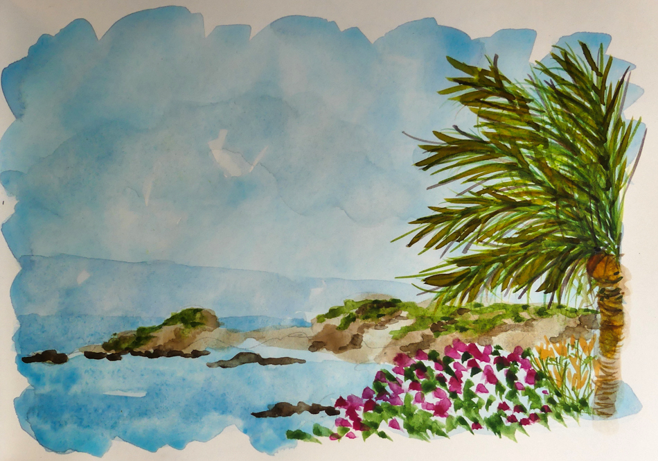
When Palms are Bad

This one is simply overworked.  It doesn’t have the feeling of air coming through
the palm leaves.  I am okay with the ocean, flowers, etc.

This should have been beautiful… Randy Boyd’s photo was gorgeous!
I tried it again…..

In this one. it still is too spindly… doesn’t look like a palm to me.
I know what I wanted, and this is not even CLOSE.

I think showing my duds is good for others who see nothing but gorgeous amazing watercolors.  I know these are not horrid (you can tell what this is after all)
but it is not what I wanted, even close.  Therein lies the problem for me.

What was I going for versus what happened.
For most of us, this is the problem.  Expectations.

A great photo that took my breath away from Randy Boyd, and I just could not loosen up!

 To hear about classes, including how to screw up and go on painting,
follow me on Facebook or check out my new, improved dkatiepowellart.com

Posted in art journal, creativity, landscape, painting, process, sketchbook, virtual sketching, watercolor | Tagged , , , , , , , , , , , , | 10 Comments

USk: Roasted Sugar Chilies

Picked up 40 pounds of Roasted Sugar Chilies last Saturday,
and 20 lbs of Roasted Poblanos this Saturday.
That is what we eat in a year!
Making Pepper Pesto with them.  Totally yummy.

To hear about classes, follow me on Facebook or
check out my new and improved dkatiepowellart.com and sign up for my newsletter!

☾

   Fabriano Watercolor journal (not my favorite),
Lamy Al-Star with De Atramentis Document Black ink,
Platinum Carbon Pen with Platinum Carbon ink waterproof cartridges,
Sennelier, Holbein, and Daniel Smith Watercolors.

W16 7 21 USK PSU BERRY FESTIVAL 02 SQ  

©D. Katie Powell.
My images/blog posts may be reposted; please link back  to dkatiepowellart.

Posted in art journal, sketchbook, urban sketchers, watercolor | Tagged , , , , , , , , , , , , , , | 2 Comments

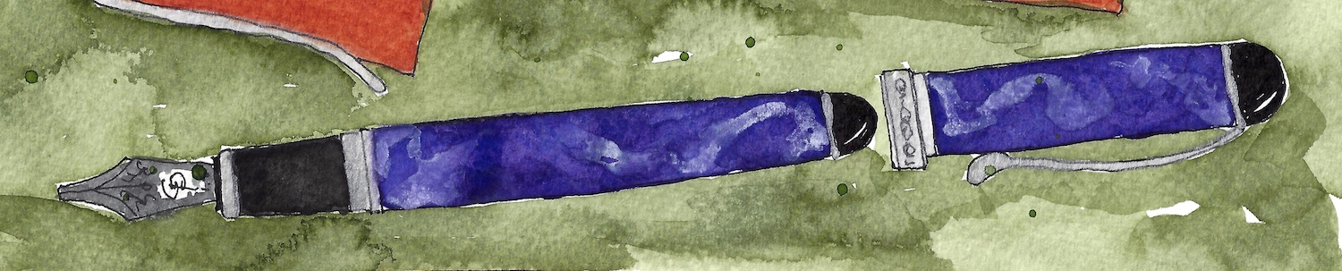
Rooked

My second pen show (way back in summer) was a lesson in buyer beware.
Last time, my virgin voyage, I had great luck and
was gifted (Mitchell bought it for me) with the loveliest Jinhao,
made better with tweaks and a stub nib.

This time I was rooked!  I am happy that it was under $40
(gads to be taken on a couple hundred dollars would be a disaster for us) and it was by someone well-known in the pen industry… who I will never buy from again.
They saw me coming… I did NOT have a light and a magnifying glass!
I don’t think that is the way most pen dealers are…  They want to make a sale,
but they also want you to buy from them again, so they talk about problems if asked.

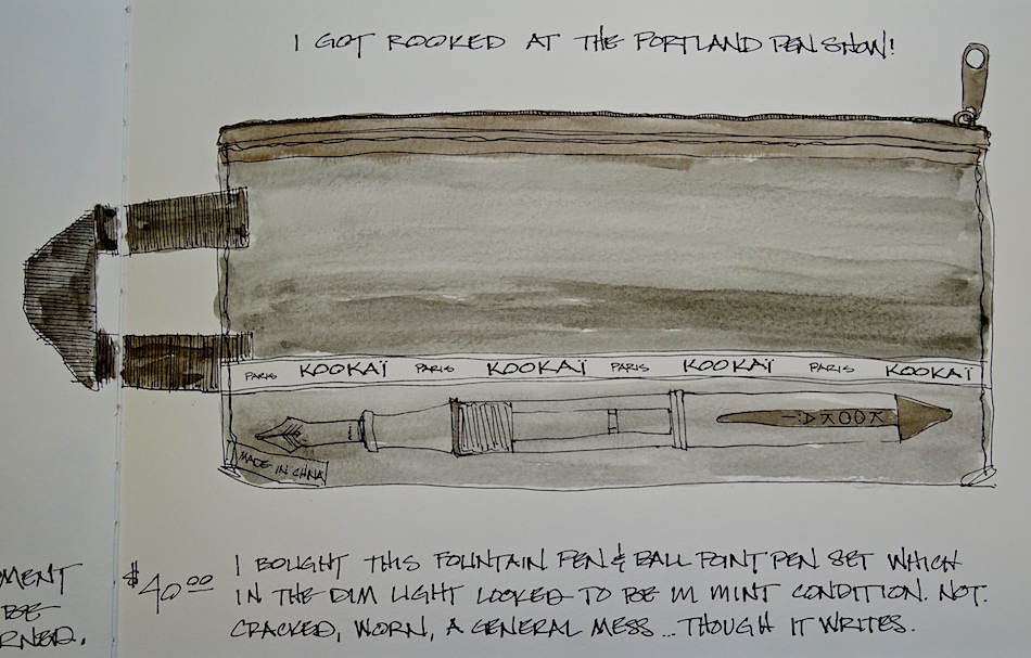
Mine was a set of Kookai pens, fountain and ballpoint, in their original case.
They are not expensive pens, but these looked older, and a set.
The lighting was dim (next year, a flashlight). I assumed that being big dealers
and online distributors of pens they would be reputable.  They said mint condition.
NOT to both.
I didn’t see the cracked cowlings in the dim light…
They told me the pens worked and I took their words at it.
The ball point is dead, and it took me a lot to get the fountain pen to work.
The cap does not fit well, (cracked) and it dries the ink out quickly.
A learning experience…  BUYER BEWARE!
Meeting peeps was fun, made nice connections, and will go AND BUY, again.
With caution!

We had a great lunch at the Lucky Labrador… any day exploring with Mitchell is fun!

*Regarding the idea of where-to-buy-from:
I only buy from Goulet or JetPens unless I happen to know the seller personally,
(I have not tried a couple other sites) and I absolutely do not buy from eBay.
I only lost about $10 when I bought a couple Jinhaos that didn’t work off eBay,
but they wanted me to send it to them in China at my cost for the refund.
Goulet or Jetpens are hassle free about standing behind their ink and pens.
This means I am NEVER ripped off by a bad pen.
AND
I want Goulet to keep informing me of everything-I-need-to-know-about-pens,
and so if I pay a dollar more with them it keeps them making pen videos.*

w16-watercolor-sq   w16-8-10-pentalic-middle-night-03-sq  w15-inks-sq  w16-9-24-pens-color-3-sq  w15-ds-paints-sq

©D. Katie Powell.
My images/blog posts may be reposted; please link back  to dkatiepowellart.

Posted in art, pen & ink, tools | Tagged , , | 6 Comments

Tools: Watercolors, 8, Primateks

When I painted with acrylics (above)
I was in love with the textural qualities of
Golden Acrylics: ground hematite, sand, metallics.  I mixed and pushed them to create textural patterns on both huge canvases and small paper sketches.  It was natural, therefore, when I saw Daniel Smith’s Genuine Hematite 3 years ago, a favorite mineral, I bought the tube before I had a grasp on watercolors at all!
It lead me to the entire palette of “Primateks” — ground minerals suspended in a watercolor medium — and I  bought
all but the sparkley minerals!

I was hooked.  They have their own tin palette,
though I kept adding and recently outgrew this tin.

I bought several before I had a full palette of normal watercolors.
The first ones were Lapis, Serpentine, Yavapei… I had to have more…
I had no idea that this was new to many watercolorists.
Granular, textural, pushing and mixing, I played.

I use them to make bold gestures of texture, but also create juicy mixes with transparent watercolor pigments that allow them to simply add to the beauty of a simple sketch.

When I get a new Primatek I mix it with every other color in my main palette.
I am amazed at the unusual mixtures I find!

Using Primateks in the various ways I play with them is a matter of picking up a LOT of Primatek pigment with water and moving it, or a little Primatek pigment, making a wash with another color, and pushing it around.  Pushing it around quickly is something that one has to get used to, along with allowing it to do its thing, especially with a few pigments, such as Serpentine, Green Apatite, Diopside, and the Hematites.

I love knowing the stones from which the pigments are ground.
(Images below from Wikipedia.)

Always, along with my chosen travel palette, I have a small tin of the pigments above:
Amazonite, Lapis, Diopside Green, Green Apatite, Yavapei, Piemonite, and Hematite.
Their color and/or qualities make them invaluable for my Oregon palette.

Below are the colors I own (other than Mayan) which I consider “primateks.”
Not all the colors listed are Daniel Smith Primateks…
I use the name Primatek loosely, as a family, grainy ground pigments,
so there are paints made by Greenleaf & Blueberry Watercolors
(Cote D’Azur or Caput Mortem, Shungite and Magnetite, below).

Sadly, I love the color of Genuine Garnet, but the smell is obnoxious,
and has given me a massive headaches!  I returned three tubes before I gave up.

DS Graphite is not considered by DS to be a Primatek, but I think it a lovely grainy color.
I included MGraham’s Nickel Quinacridone Gold as well… but I am on the fence.

Two of mine sparkle — I’m not fond of them — Kyanite and Fuchsite —
though I’ve heard some add them to water scenes.  I sometimes use them for car colors.
I also own some metallic colors, but am not including them here.
Frankly, it is why I don’t own all the Primateks — I stay away from sparkling paints!
I don’t use them right now…

I am discounting the Mayan line here, because I am not fond of them and while many think they are Primatek, I’m not sure — so another post on the Mayan colors I own.

Greenleaf & Blueberry, M.Graham, DS Primatek watercolors,
and Daniel Smith Watercolors.

  To hear about classes, follow me on Facebook or
check out my new and improved dkatiepowellart.com and sign up for my newsletter!

w16-watercolor-sq w16-8-10-pentalic-middle-night-03-sq w15-inks-sq w16-9-24-pens-color-3-sq w15-ds-paints-sq

Posted in color, painting, process, watercolor | Tagged , , , , , , | 9 Comments

Color is Not Enough

Sometimes I start with color…
I think color will be enough, because I am mad for color…

But color is never enough.
There is the line, and it has a lot to say.

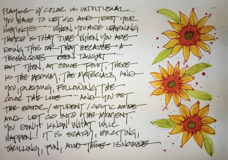
Because you can’t read my handwriting:
Playing with color is intuitional.
You have to let go and trust your instincts.
When you are learning there is that time when you are doing this or that
because a techniques been taught, but then at some point,
there is the medium, the materials, and you playing
following the color the line….
And you set the editor / student / critic aside
and let go into that moment.
You don’t know what will happen.
It is scary, exciting, thrilling, fun, and time is no where.

To hear about classes, follow me on Facebook
or check out my new, improved dkatiepowellart.com
Posted in art journal, color, creativity, drawing, ink painting, journal, painting, pen & ink, process, sketchbook, watercolor, writing | Tagged , , , , , , , , , , , , | 27 Comments

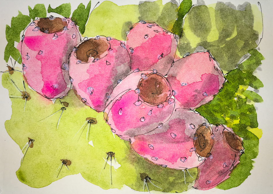
Hahnemühle Post Cards, NOT, 12, Prickley Pear

It was an honest mistake.
I paint on Hahnemühle Post Card so often I just assumed that I’d grabbed one in the middle-of-the-night… so sad after finishing to send off that it wasn’t a postcard!
I wondered why the watercolor paper was lifting… duh!

Still, I love this one!  From a photo by Mary Lou McCambridge.

To hear about classes, follow me on Facebook!

Posted in memory, painting, pen & ink, watercolor | Tagged , , , , , , , , , | 2 Comments