I sketched about thirty
people this week. Amazing because I had one of the
worst weeks ever in our
business. Despite that,
I achieved my goals for the challenge and actually had FUN sketching PEEPS! YaY!
Goals were:
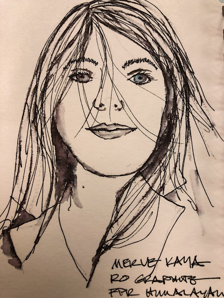
better likenesses;
correct my ear positioning;
try my hand at babies (argh) and old folks (like me).
and have a little style reflecting fun energy
my artwork!
One takeaway is dipping
into Sktchy or Pexel to grab
an image of people to
sketch is much more freeing at the end of a tense day
than trying to choose an image to which I am
invested, say, of Mitchell,
cats, or our lives. Thinking
of creating a lovely watercolor of something I care about is harder; pulling an unknown
face as an exercise is more relaxing, easier. I actually sketched more, even though
it was a tense week.
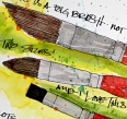
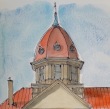
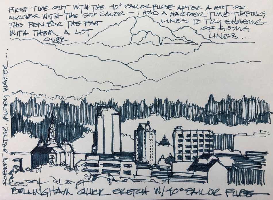
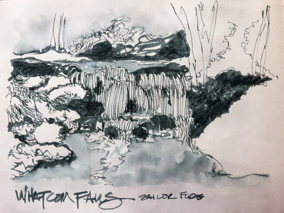
I had fun with watercolor, but probably had the most fun with inks (top two images).
I guess I will forever be an in-my-sketchbook only person because inks are not lightfast —
I love my sketchbooks, and being a sketchbook artist, so maybe I need to explore
concertinas and other unusual ways of making them more an art form
than my playbooks — at least some of the time??


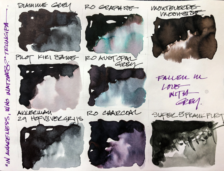
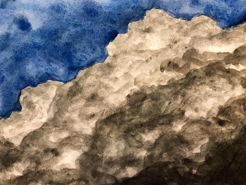
Things I need to work on? Brown/black skin tones, watercolor washes that work!
I had success in part, but then not… brown/blue/reds?

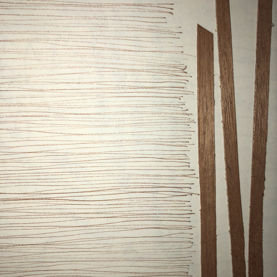
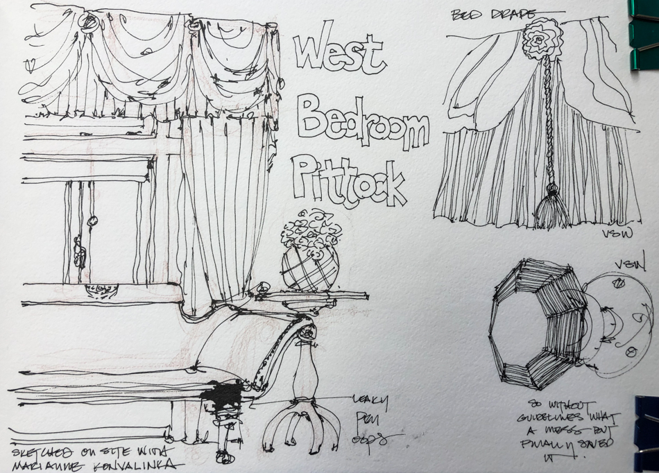
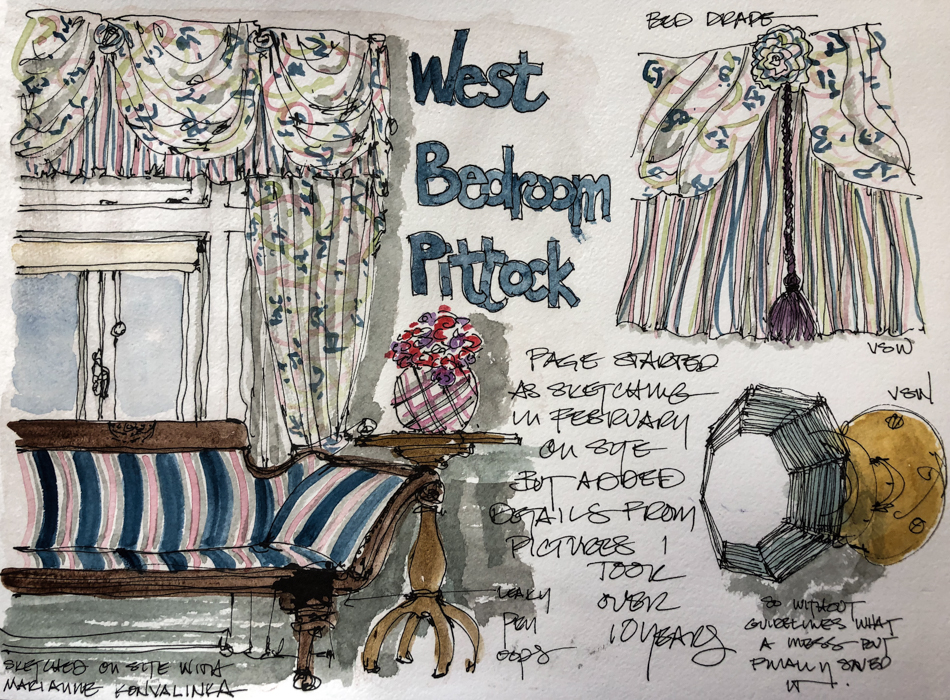
It gave me a chance to test the parameters of the Hahnemühle Carnet de Voyage (bamboo) journal with ink washes, ink drawing, and watercolors.
Mostly, I enjoyed working with this journal — but it is not as fountain pen friendly
as the Hahnemühle Watercolour Journal or
the Hahnemühle Nostalgie Sketchbook, which was made for fountain pens!
Hahnemühle journals are currently sold online
at Wet Paint and Merriartist (though no bamboo paper yet).


 To hear about classes, follow me on Facebook
or check out my new, improved dkatiepowellart.com
“Memory is more indelible than ink.”
Anita Loos, Gentlemen Prefer Blondes.
“I think not….”
Me… why I journal!
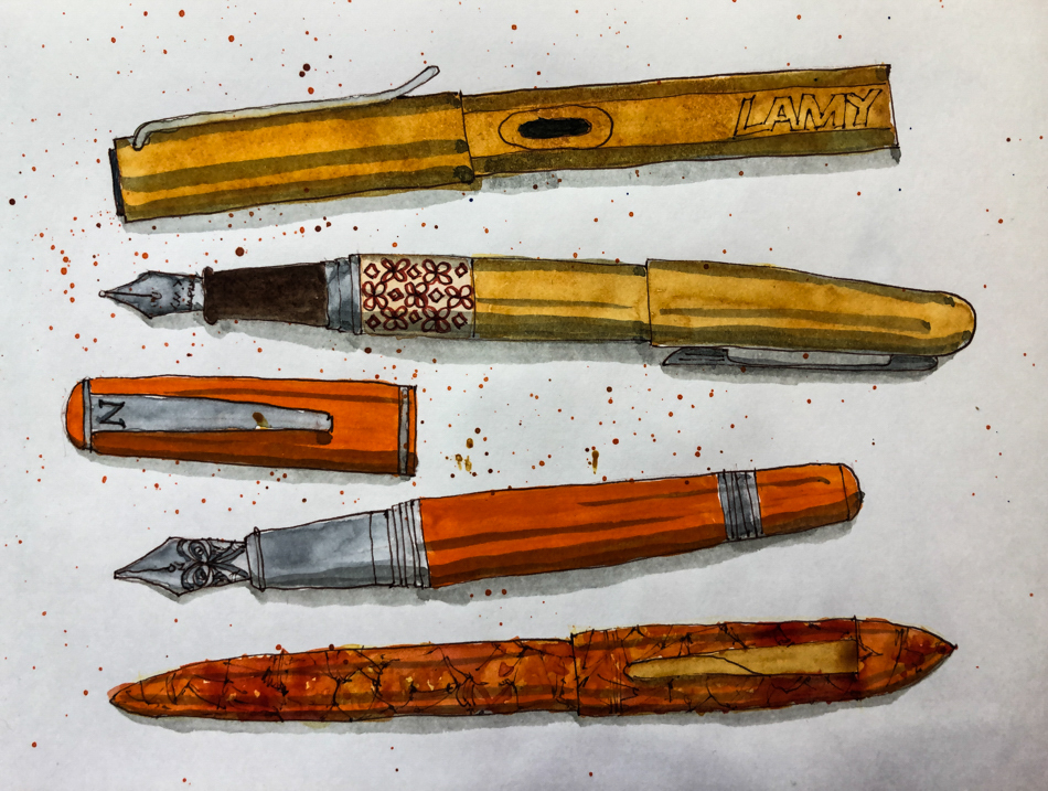
Hahnemühle Carnet de Voyage (Hahnemühle Bamboo Journal),
with a Pentalic HB woodless pencil,
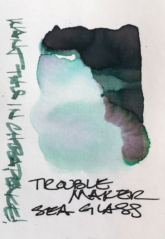
Noodler’s Lexington Grey Ink, Super5 Frankfurt ink in Pentel Aquash waterbrushes,
De Atramentis Document Brown ink,
Platinum Carbon Pen with Platinum Carbon ink waterproof cartridges,
Lamy Al-Star with Pilot Yama-Budo,
Lamy Vista with Robert Oster Thunderstorm ink,
Jinhao 750 with JoWo nib and Super5 Darmstadt ink
FPR Himalayan with Robert Oster Melon Tea,
FPR Himalayan with Birmingham Tarnished Nickel ink,
Sennelier, Holbein, and DS Primatek watercolors, and Daniel Smith Watercolors..


©D. Katie Powell.
My images/blog posts may be reposted; please link back to dkatiepowellart.
☾
 As my Patreon supporter, you will have
access to some content not on this website,
sneak previews, goodies, discounts on classes.
I teach architectural sketching,
art journaling (art+writing), creativity, watercolors.
That annoying loud-mouth editor/critic in your head? GONE! How great would that be?