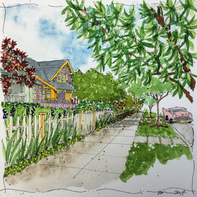
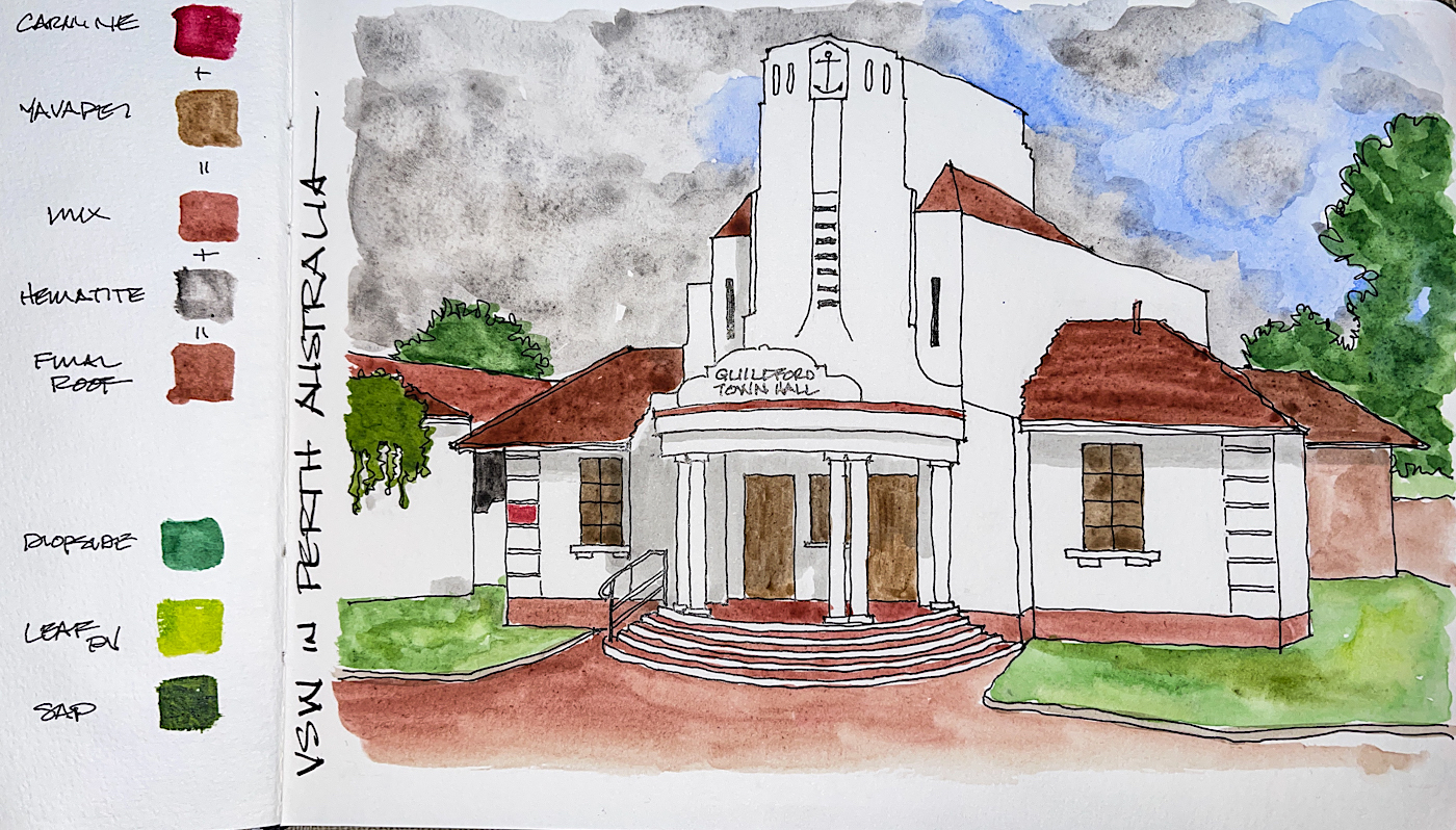
I forgot to take a picture of the bare line drawing….
And it was such a nice drawing of this lovely Art Deco building in Perth AU!
Guildford Town Hall, part of our Virtual Sketchwalk in our FB group around Perth, AU; we are always open to new members.
I finally am starting to record some of my favorite mixes on the opposite page;
roof tiles are one of those that I use so often… no more rethinking! I may even make a mix in a palette square for real ease!
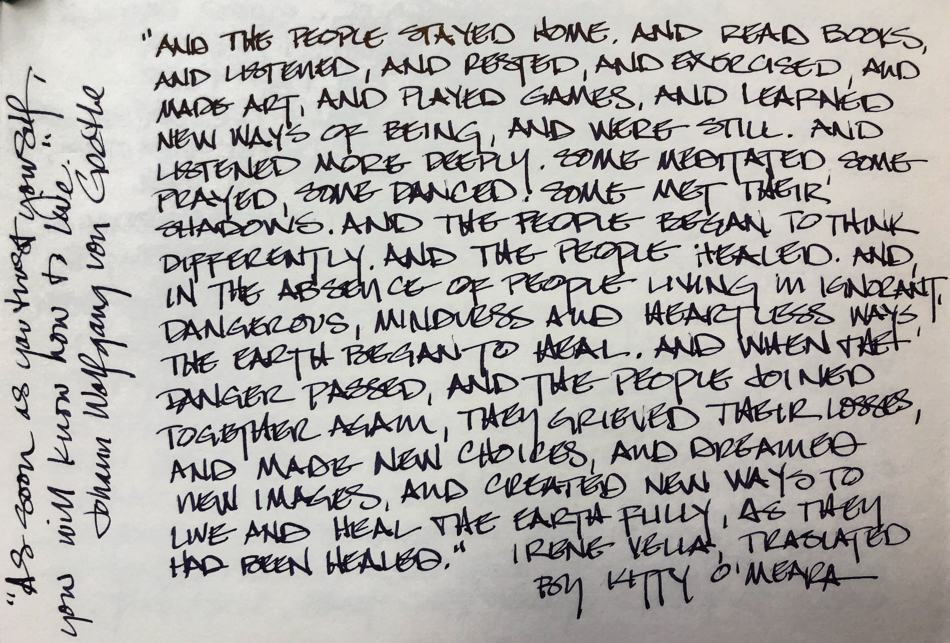
“Memory is more indelible than ink.” Anita Loos, Gentlemen Prefer Blondes. “I think not….” Me… why I journal!
☾
As my Patreon supporter, you will have
access to some content not on this website,
sneak previews, goodies, discounts on classes.
I teach architectural sketching,
art journaling (art+writing), creativity, watercolors.
That annoying loud-mouth editor/critic in your head? GONE! How great would that be?
I'd love it if you shared this; please mention my blog name!
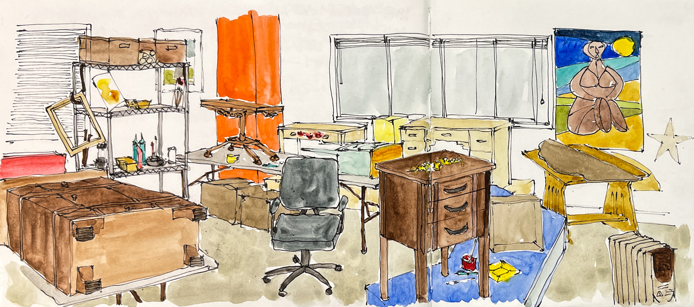
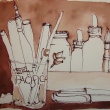
Every so often I
like to sketch
our studio rooms.
This is primarily
my finish room, where
I work conserving objects.
I use our own mixed
shellac and (primarily oil)
paints to bring
back dead finishes.
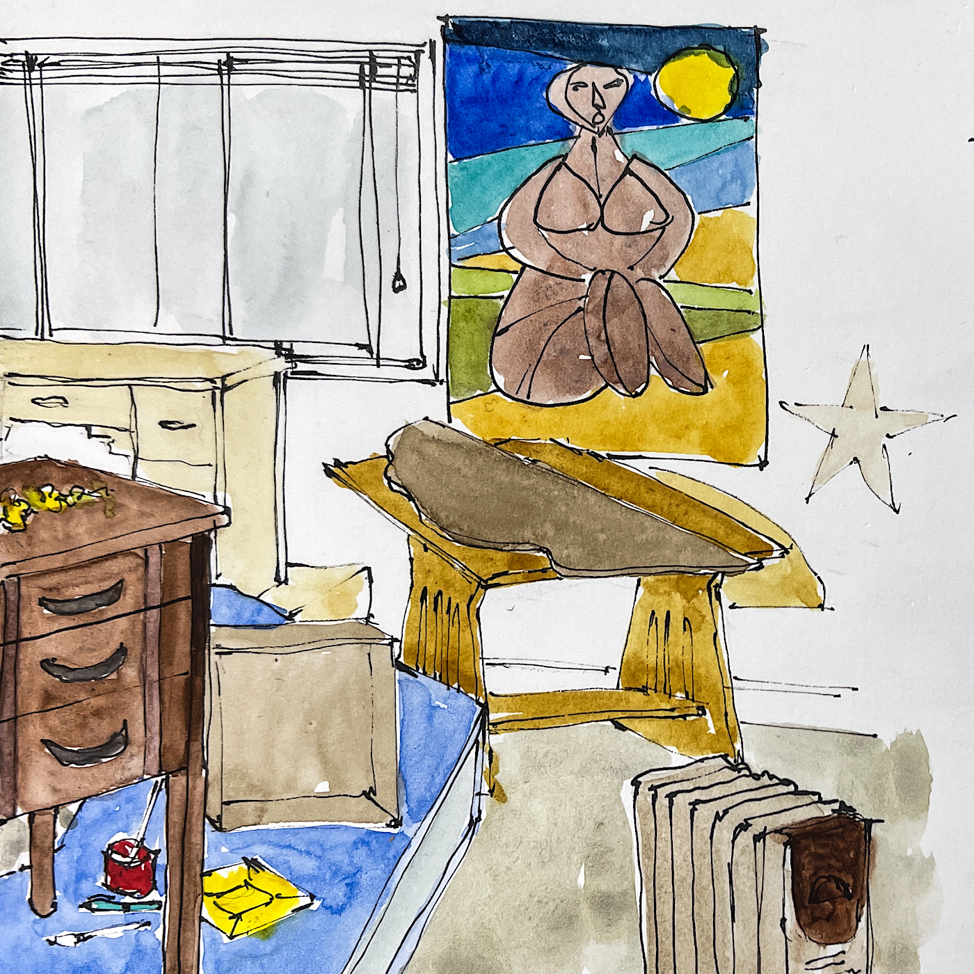
You can see one of the first sketches I did of my then “new” finish room,
from 2014 right! I’ve loosened and gain confidence!
Images I painted of my family members a couple of decades ago are on the walls,
so my California ancestors (fourth generation) keep me company.
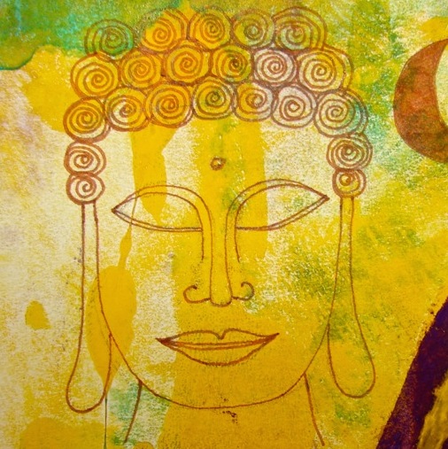
And the occasional goddess, either Buddhist or early mother-Celtic goddess.
I am shellacking a tabletop under my painting, above,
and the small bedside table to the left had water damage to flower decals
on the tabletop from a leaking room , which I restored using oil paints.
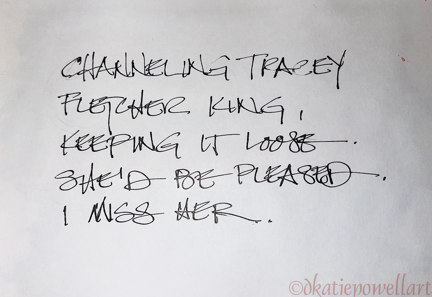
They were pleased, which is always so nice.
Now I sketch looser, faster, but still have lots of detail in my images,
though I could have kept going and maybe everything should have been drawn…
But this was on a break while shellacking, so there you are.
I was shellacking my own family’s Eastlake table above,
and the cabinet on its back is a Buddhist altar from a client.
Pieces of colorful Mason Monterey are around the room.
Look back to the last time I sketched this room: USk: Labor Day in the Finish Studio is from 2017, and I sketched roughly the same view…
I had lots of painted Monterey furniture in the studio then
and still do, though different pieces!
Now the table in this sketch sits outside my studio door.
The old sketch showed the furniture levitating! AAACK!
“Memory is more indelible than ink.” Anita Loos, Gentlemen Prefer Blondes. “I think not….” Me… why I journal!
☾
As my Patreon supporter, you will have
access to some content not on this website,
sneak previews, goodies, discounts on classes.
I teach architectural sketching,
art journaling (art+writing), creativity, watercolors.
That annoying loud-mouth editor/critic in your head? GONE! How great would that be?
I'd love it if you shared this; please mention my blog name!
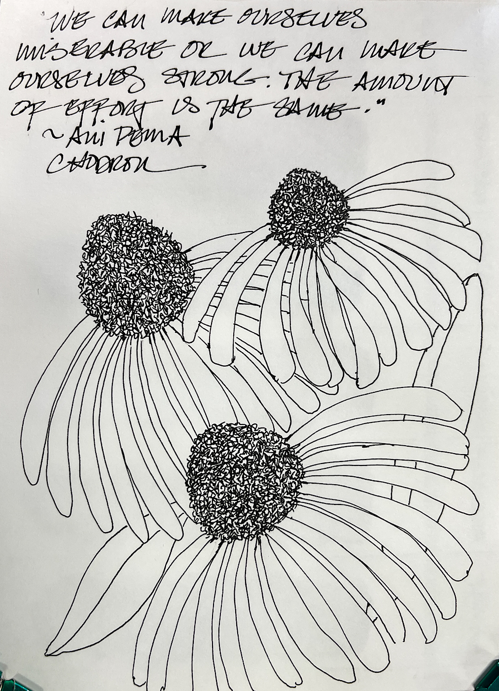
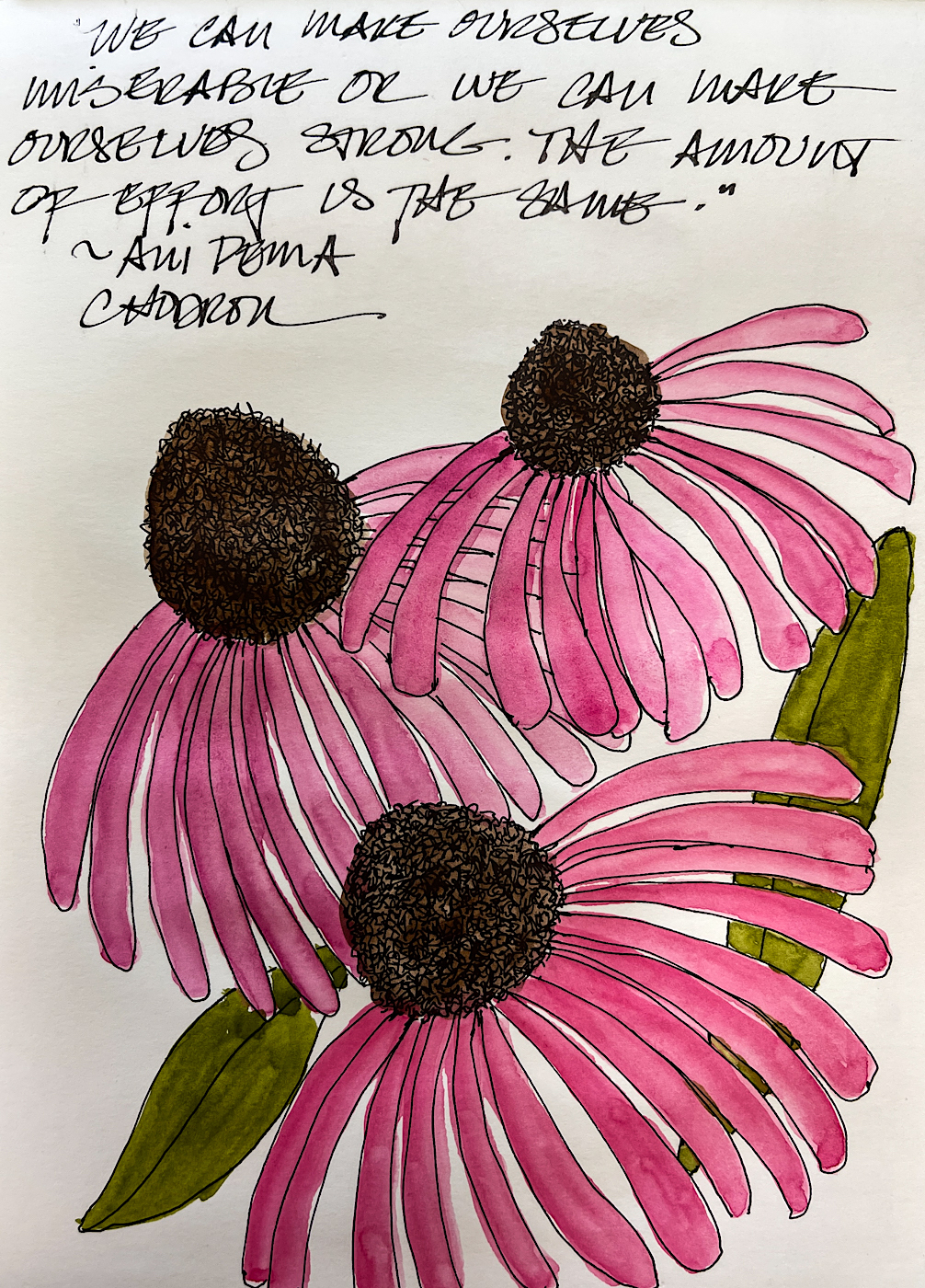
And a lovely quote to remember from Ani Pema Chodron:
“We can make ourselves miserable or we can make ourselves strong.
The amount of effort is the same.”
We can also make ourselves and others happy!
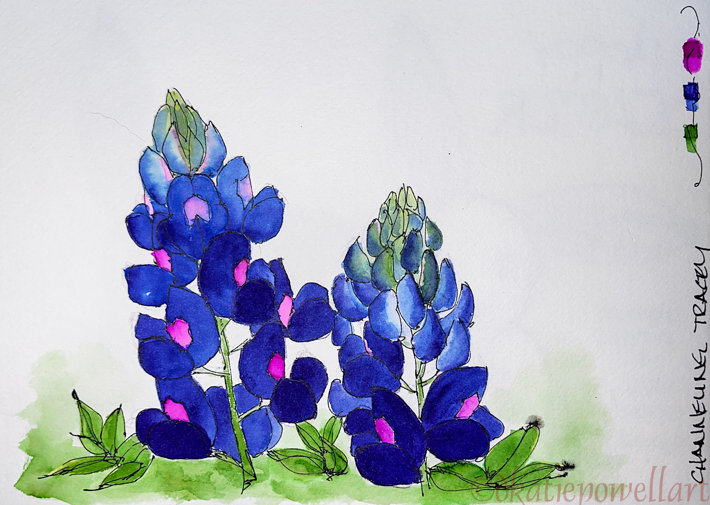
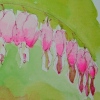
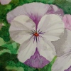
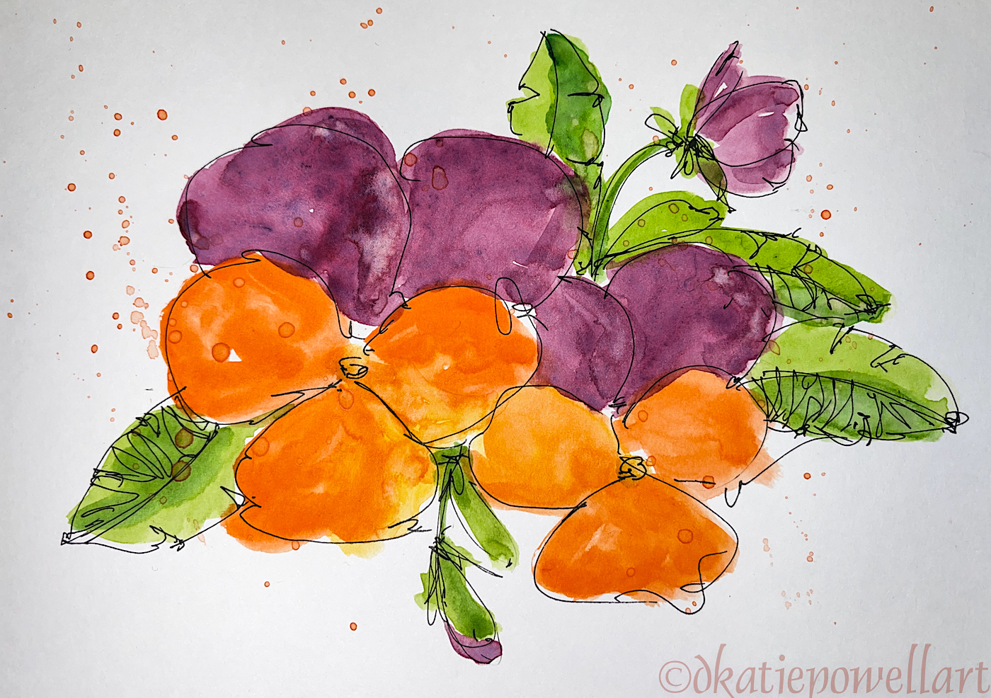
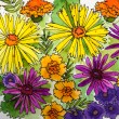
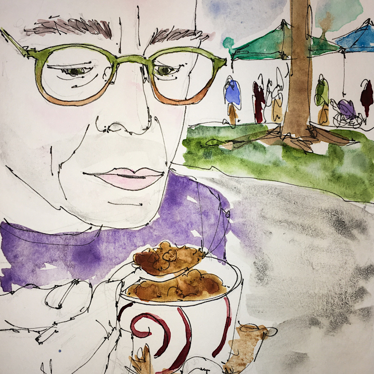
I LOVE sketching flowers!
PS someone said my images were BIG but here is the thing, I don’t like it when artists post teeny tiny images and I can’t see any detail ‘cuz the devil is in the detail, as my Mimi used to say!
As my Patreon supporter, you will have
access to some content not on this website,
sneak previews, goodies, discounts on classes.
I teach architectural sketching,
art journaling (art+writing), creativity, watercolors.
That annoying loud-mouth editor/critic in your head? GONE! How great would that be?
I'd love it if you shared this; please mention my blog name!
This new moon is also a Black Moon, meaning the second New Moon in a month.
There is also a solar eclipse, so I think it is safe to say the heavens will be
ready for whatever wuju you want to throw in the skies today!
Make it positive, make it good.
New Moon New Journal!
Also, this New Moon I am starting a New Journal.
Ir doesn’t happen all the time and when it does,
I always see it as an auspicious sign.
Older images of the New Moon
at the bottom of this post…
Also, this Dark of the moon I get to be in relative silence for a few days.
I adore silent stretches,
when Mitchell and I and the cats snuggle in and unplug the phones,
minimize business for a few days, reading and writing.
Be safe, take care of you and yours,
go within, be kind.
Follow your intuition for yourself. Take time for silence, which most of us don’t do often enough for our souls.
My images/blog posts may be reposted; please link back to dkatiepowellart.
☾
As my Patreon supporter, you will have
access to some content not on this website,
sneak previews, goodies, discounts on classes.
I teach architectural sketching,
art journaling (art+writing), creativity, watercolors.
That annoying loud-mouth editor/critic in your head? GONE! How great would that be?
I'd love it if you shared this; please mention my blog name!
☾
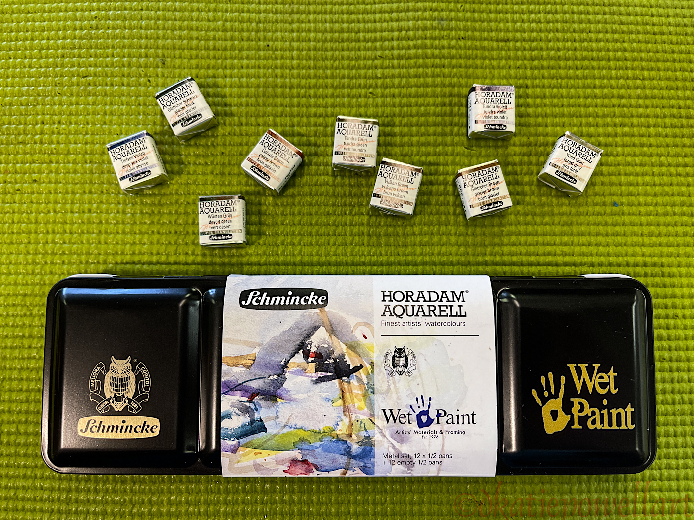
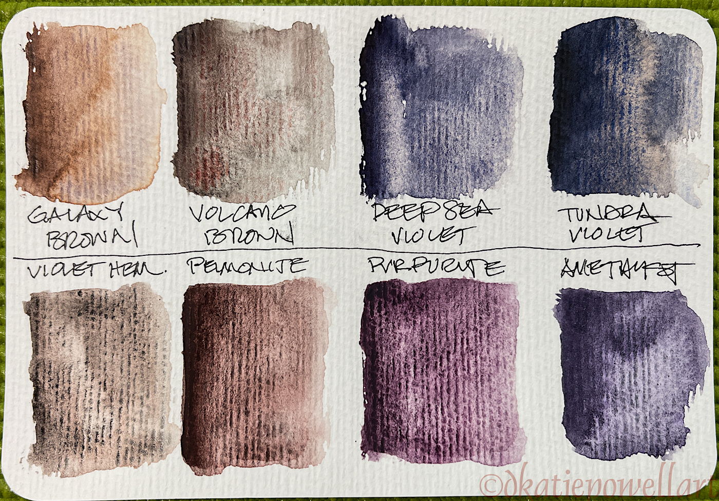
I wanted to try Schminke’s Supergranulating paints. I liked the idea of two or more pigments that separate through granulation when painted.
I bought nine of them, along with Schminke’s pan set “Wintertide”
of 10 basic colors, plus two pearlescent paints, White Gold and Blue Pearl
(neither of the latter are being reviewed here), but I will say
both pearlescent paints are nice “come-withs” in the Wintertide palette.
(You will see them on several images below.)
☾
Unboxing, I have to admit I toss the metal holder thangy (technical term)
because I like to add many more half and full pans of paints to a travel set;
you can see the final palette at the bottom of this post.
I rarely buy half-pans, but as I was already buying a set of Schminke half-pan paints,
I decided to save myself money and purchase the Supergranulating paints in half-pans.
Normally I buy tubes, but the tubes are $19.59 a tube,
and as they were an untried product, I’m glad I bought the pans,
as I could purchase more colors at $9.31/half-pan, and see if I like them.
☾
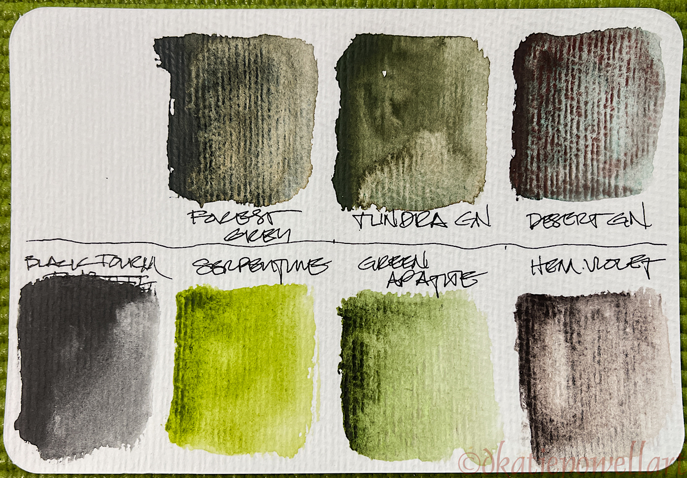
These are in my pan, and all are Schminke but for the three glittery colors top left, above.
Both the Blue Pearl and White Gold, bottom left, are gorgeous!
This was the first time getting them wet, and the top row from #964 to #983, above,
are the Supergranulating colors. I was disappointed.
☾
I took a page and slopped a on good amount of paint to see how they worked on the smooth paper in a Hahnemühle Nostalgie Sketchbook, which is my go-to everyday sketchbook. More disappointment, though the Desert Green (top left) was interesting. Tundra Violet (top right) had a little bit of possibility, but really, “meh”! They granulated, but I had chosen colors which, as they said, were made
of two pigments which would separate nicely… I hardly see that!
On the Green test card, above, the toothy paper allowed the Forest Grey
to work a bit better though the “two colors” are weak visually,
whereas the Desert Green really lives up to its sales pitch.
☾
On the Hahnemühle Post Cards, the Volcano Brown is a bit more interesting, but both browns are weak in pigment compared to the Violet Hematite and Peimonite from Daniel Smith. Tundra Violet was much more interesting on the toothy watercolor paper.
☾
The four shown here all performed a bit better on the toothy paper. The color separation was nicer, except for the Glacier Black. On the other hand, the Primateks which are shown below the line are lovely paints, and equally interesting.
Below, I offer additionally my original reviews of Daniel Smith Primateks,
of Hahnemühle Post Cards and a video Wet Paint offered
for the Wintertide palette paints on their website.
Finally, this is the way my “Schminke” palette looks today.
It will probably become a bedside palette, where I have lots of little colors to play with,
and can further test the Supergranulating colors.
When I produce some sketches using mostly those paints I’ll share!
As my Patreon supporter, you will have
access to some content not on this website,
sneak previews, goodies, discounts on classes.
I teach architectural sketching,
art journaling (art+writing), creativity, watercolors.
That annoying loud-mouth editor/critic in your head? GONE! How great would that be?
I'd love it if you shared this; please mention my blog name!
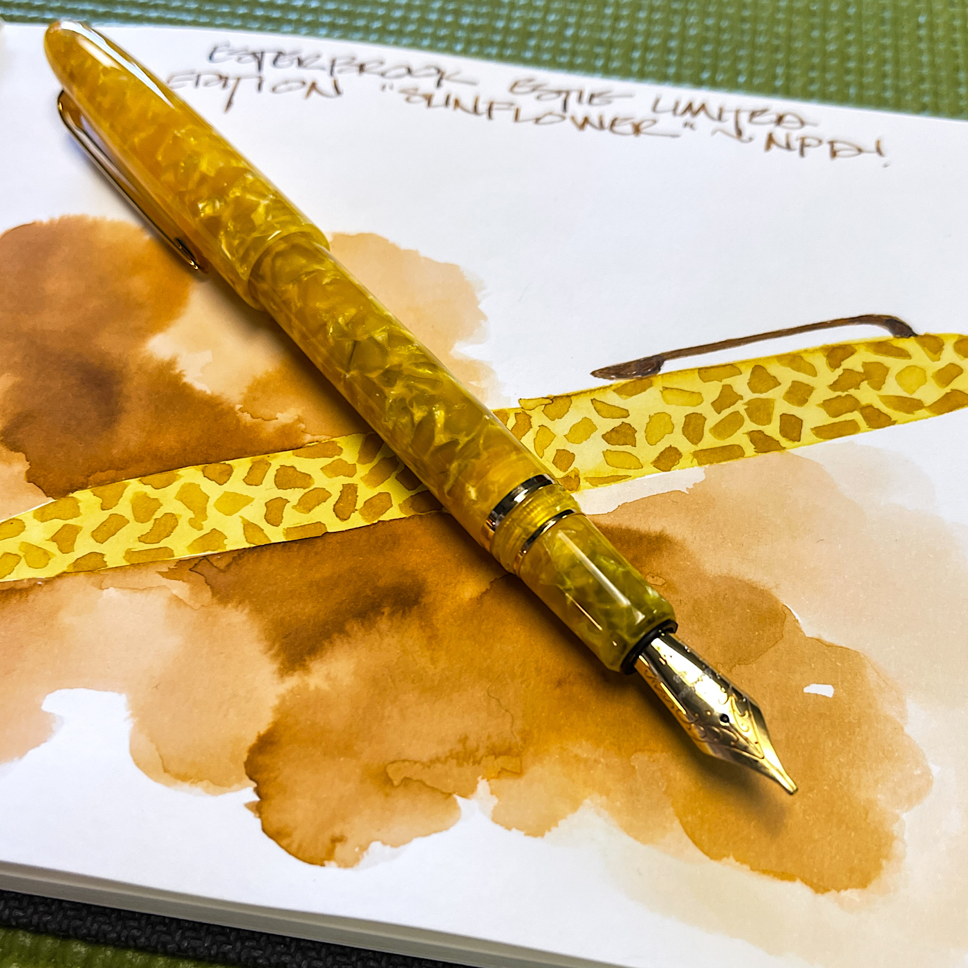
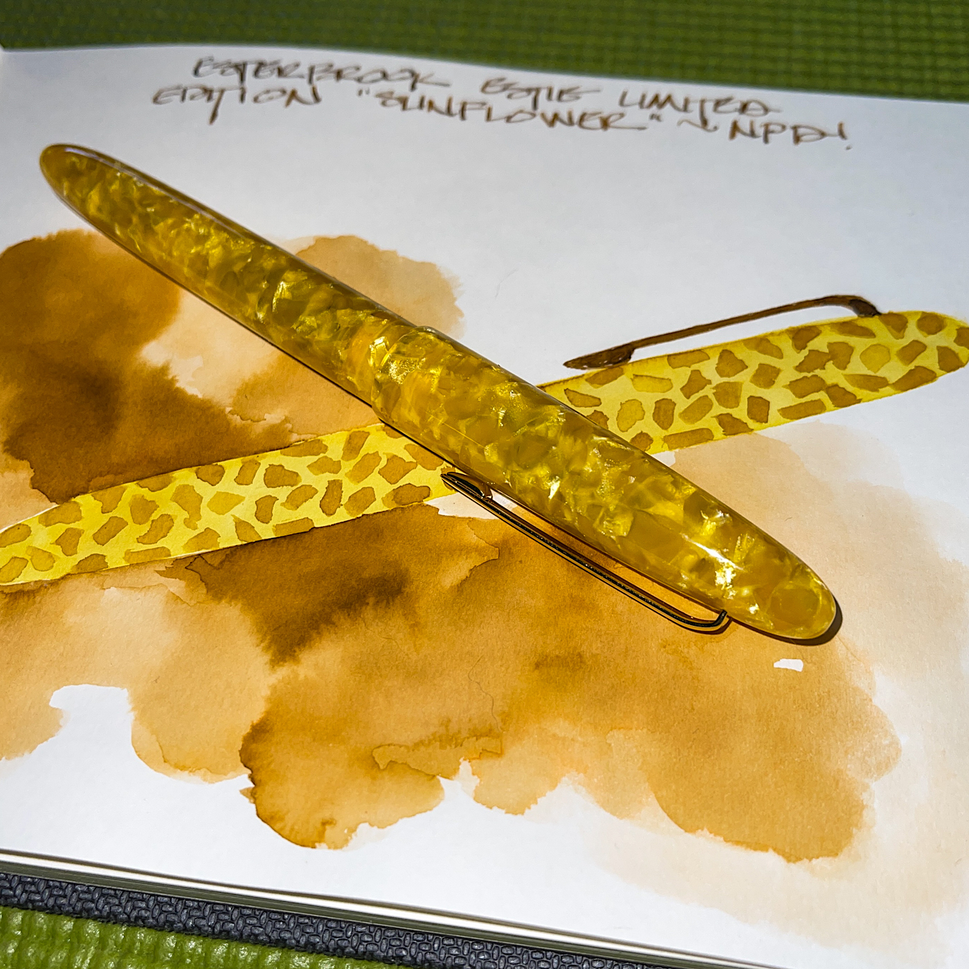
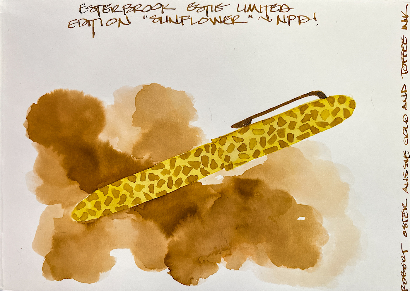
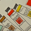
Loving sunflowers and knowing how lovely the Esterbrook pens are,
I had to purchase the beautiful Esterbrook “Estie” Sunflower pen from Penchalet.
I ordered the 1.1 stub nib, my favorite nib for sketching and writing.
I am convinced the stub nib saves my handwriting from being the worst ever!
And of course I had to record my purchase in my journal!
Keeping inks from running amok when painting with them is not easy…
in this case I started with a very watery layer, then added
quick darker layers to look a bit like a smokey background.
Keeping it from running into the gold inked pen was tricky.
As my Patreon supporter, you will have
access to some content not on this website,
sneak previews, goodies, discounts on classes.
I teach architectural sketching,
art journaling (art+writing), creativity, watercolors.
That annoying loud-mouth editor/critic in your head? GONE! How great would that be?
I'd love it if you shared this; please mention my blog name!
Another test of the Hahnemühle 100% Cotton Watercolour Book.
I layered Sennelier Shellac ink over the page, and painted the basic flower with gouache. It felt toothy enough that I tried layering colored pencils over that…
I’ve never had that much luck with colored pencils over a painted surface without adding a texturizing (maybe a made up word) agent, but they took to the gouache!
It is great paper, presenting the colors far more brilliant than a normal watercolor book.
Close up details of the layering below.
As my Patreon supporter, you will have
access to some content not on this website,
sneak previews, goodies, discounts on classes.
I teach architectural sketching,
art journaling (art+writing), creativity, watercolors.
That annoying loud-mouth editor/critic in your head? GONE! How great would that be?
I'd love it if you shared this; please mention my blog name!
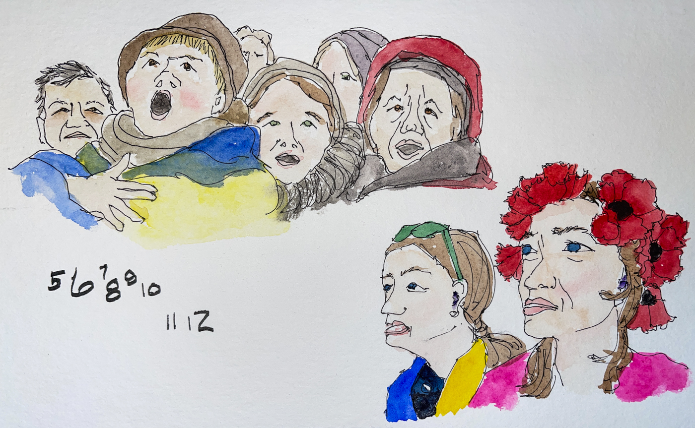
The war in Ukraine bothers me so…
Sketching the lovely faces on the internet is a way to connect
when I feel so unempowered to do anything, and marks this wartime.
I cannot comprehend why we are again walking through a Hitler-like assault and pray this is over for the Ukrainian people and they are kept safe Putin is driven from their country.
I did it during the 100 Faces challenge, which I am not into this year, but it prompted the idea.
As my Patreon supporter, you will have
access to some content not on this website,
sneak previews, goodies, discounts on classes.
I teach architectural sketching,
art journaling (art+writing), creativity, watercolors.
That annoying loud-mouth editor/critic in your head? GONE! How great would that be?
I'd love it if you shared this; please mention my blog name!
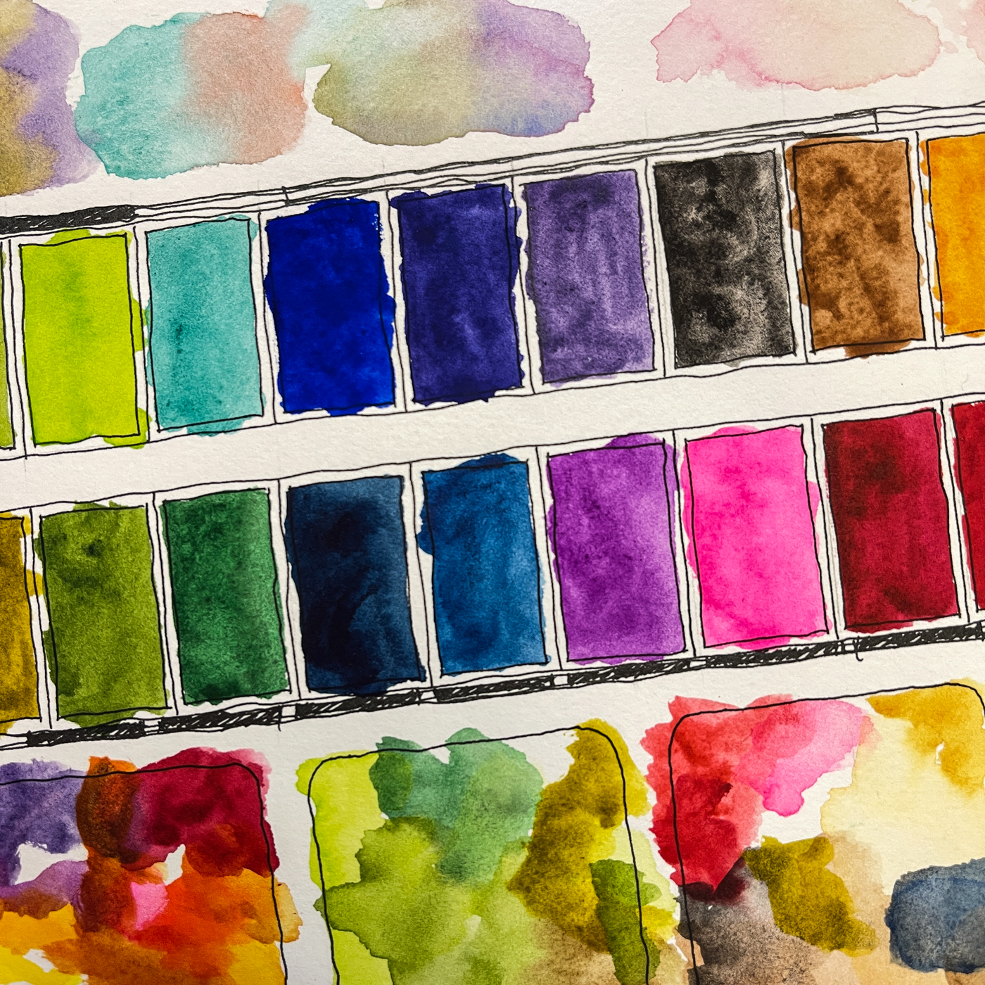
Whenever I start a new journal, I always record my current main watercolor palette.
I have a few palettes for specific tasks, but this is the largest main palette with a mix of a few Daniel Smith Primateks and many great clear transparent colors.
The new journal is an A5 landscape Hahnemühle 100% Cotton Watercolour Book,
and it is not only a new journal, it is a new brand from Hahnemühle!
AND I LOVE IT!
The intense and beautiful colors I am seeing in this all-cotton watercolor book has me placing an order from Wet Paint when they gt them back in stock for a few more.
The paper is thick and so so gorgeous.
Detailed review to follow in a bit… I am playing now throwing everything I can at it!
As my Patreon supporter, you will have
access to some content not on this website,
sneak previews, goodies, discounts on classes.
I teach architectural sketching,
art journaling (art+writing), creativity, watercolors.
That annoying loud-mouth editor/critic in your head? GONE! How great would that be?
I'd love it if you shared this; please mention my blog name!
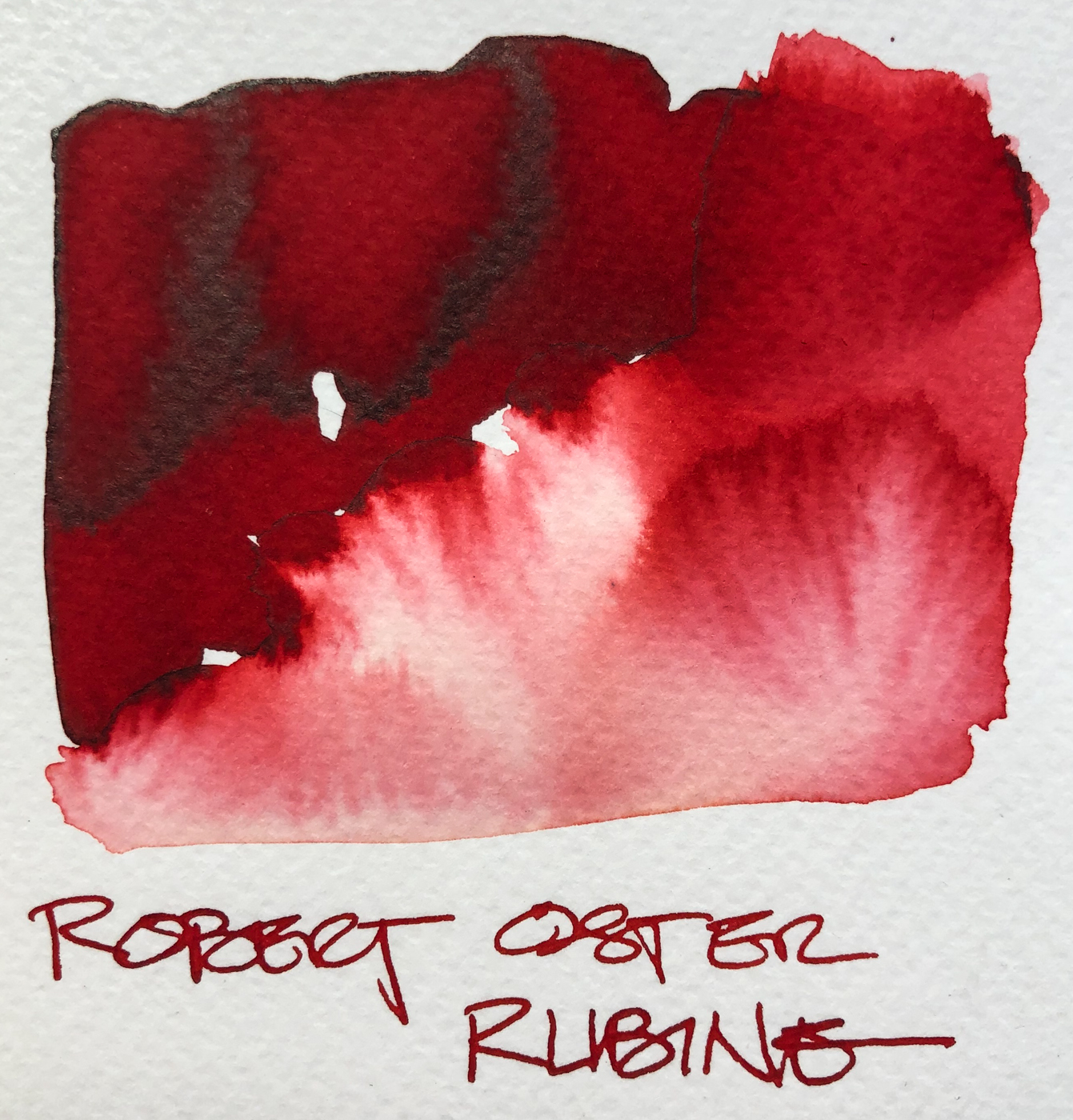
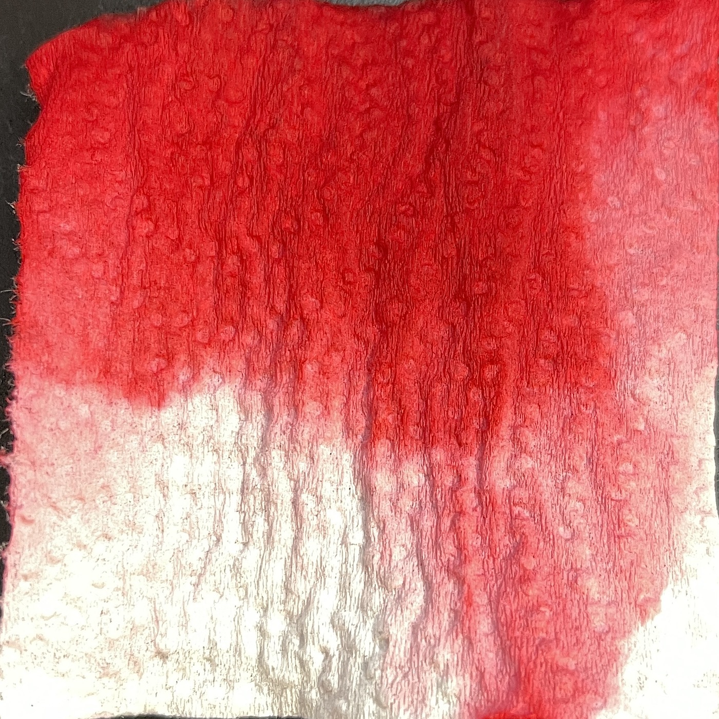
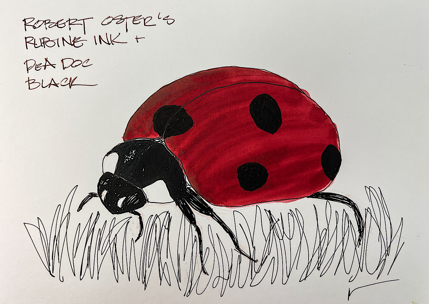
Robert Oster Rubine is a favorite red, and has found a permanent home in my red Pilot Metropolitan. It leans just ever so slightly into a blue-red. I usually do match pen to ink, mostly because I have many pens inked for drawing, and by matching I am more likely to pull the right color ink.
Remember that others review these inks just for writing; I am also interested in how they are used for ink-painting!
This ink is well-behaved, crisp and does not feather on any of the papers I normally use at work, even Post-its. I consider it a medium ink, neither wet nor dry, and it evaporates quickly with a medium nib. It does not smear easily when sketching. I see a light charcoal-colored sheen, and as you can see, the ink is pure red color leaning just a little blue, no separations! When hit with water it moves easily with no resistance or ghosting.
It is not water resistant.
*Above, watercolors that are comparable.*
I was asked why I show watercolor matches.
Simply, sometimes you want to use an ink to sketch and then fill the object with the matching watercolor, and this gives artists a possible match.
On smoothHahnemühlepaper I created a sketch of
the amaryllis in Robert Oster Rubine, above and detail right,
drawn with a Pilot Metropolitan with an medium nib
on Hahnemühlecold press watercolor paper.
The lines were touched with water using a Pentel Aquash waterbrush,
which also was dipped into the pen to pick up more color. The lines do not stay visible but quickly lose themselves in wet color and
so were added back in after the water moved the ink and dried!
I added Rubine to the top of a sallow watercolor on the same Nostalgie paper, left, to make it pop as the actual shell was colored deeply and watercolors did not do it justice.
Below, showing Rubine next to several similar Robert Oster reds for comparison.
RO is experimenting and testing lightfast properties…
MOST water soluble ink companies do not yet pay attention to these properties because most artists who use ink are making prints of their work.
His non-toxic inks come in 50ml plastic bottles that are environmentally friendly, using recycled plastic. They can be tippy, so I usually put them in a more solid container to decant. The ink bottle mouth is wide, and all my pens fit easily into the bottle opening to fill.
As my Patreon supporter, you will have
access to some content not on this website,
sneak previews, goodies, discounts on classes.
I teach architectural sketching,
art journaling (art+writing), creativity, watercolors.
That annoying loud-mouth editor/critic in your head? GONE! How great would that be?
I'd love it if you shared this; please mention my blog name!
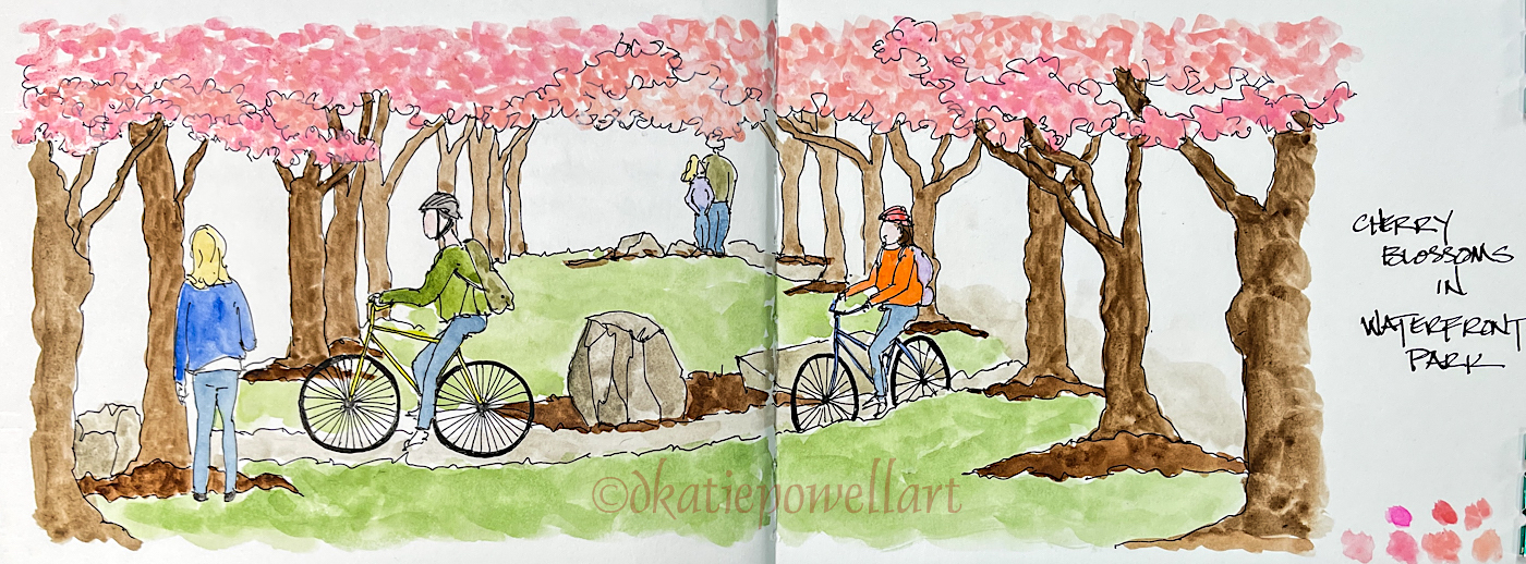
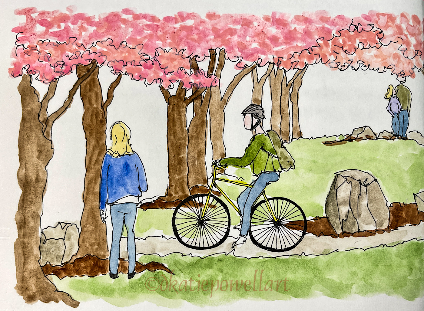
Very late in posting… The cherries are nearly ripe! (Not really.)
The thing about the cherry blossoms in the park is that they are not only
a feast for the eyes but sometimes you can smell their fragrance…
Also, they should bloom at Easter if they were thinking clearly!
Happy Chocolate Easter Bunny
Happy Spring and all that!
Having this bad cold kept me from working as I was fuzzy headed so these are LATE
in posting on my blog. Thankfully less fuzzy headed now!
As my Patreon supporter, you will have
access to some content not on this website,
sneak previews, goodies, discounts on classes.
I teach architectural sketching,
art journaling (art+writing), creativity, watercolors.
That annoying loud-mouth editor/critic in your head? GONE! How great would that be?
I'd love it if you shared this; please mention my blog name!
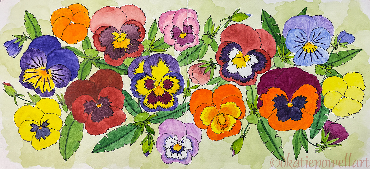
Today I am taking you through what the architect in me paints!
Seriously, there are two artists battling it out daily, and one is a very precise architect who creates phenomenal presentation drawings (examples above, from another life) and the other is the artist I struggle to be, which is much looser and spontaneous.
I hope someday I grow up to land somewhere in the middle, with some precision along with the lovely loose/spontaneous lines I love most.
But this is the architect sketching, above!
I like the line drawings, and have ideas of making a coloring book!
(Whaddya think?)
From these line drawings, I began to add watercolor.
I pause here to show a
HUGE mistake I made, a rookie mistake, and how I fixed it… One of the violas I wanted to paint was this odd pinky-red, the only “red” I’ve seen in the viola family.
I mixed the paint, first picture, and it took a couple tries as I had to get the right green to mix with the red. (Sap Green with Perylene Red for those who want to know, though I may have added a bit of Carmine at the last minute.) I started painting the big viola, and AAAACK!
This not-at-all-correct brown emerged, second image, above.
After I calmed down the person who was screaming (me), I realized I had not cleaned my brush completely after adding a bit more Sap Green, third image.
I cleaned it up, and this may have been where I added a bit of Carmine to the original mix, cleaned my brush again, and tested it… Perfect!
Then I set about dabbing the image to remove the surface paint as best I could.
The brown paint stained the paper a bit, so this one pansy is quite made up, with the brighter red-brown being the correct color.
Detailed images above.
My flower images are going into a very nice square watercolor
Hand Book journal, not at all my normal journal but it has nice paper.
As my Patreon supporter, you will have
access to some content not on this website,
sneak previews, goodies, discounts on classes.
I teach architectural sketching,
art journaling (art+writing), creativity, watercolors.
That annoying loud-mouth editor/critic in your head? GONE! How great would that be?
I'd love it if you shared this; please mention my blog name!
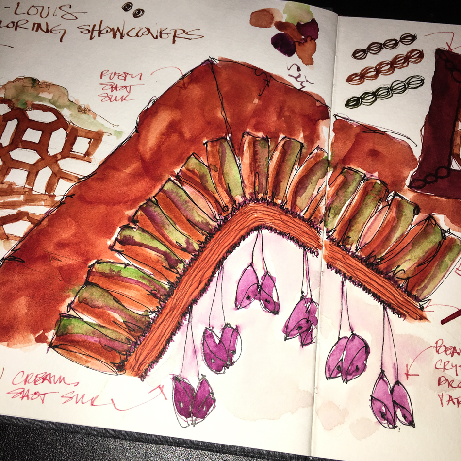
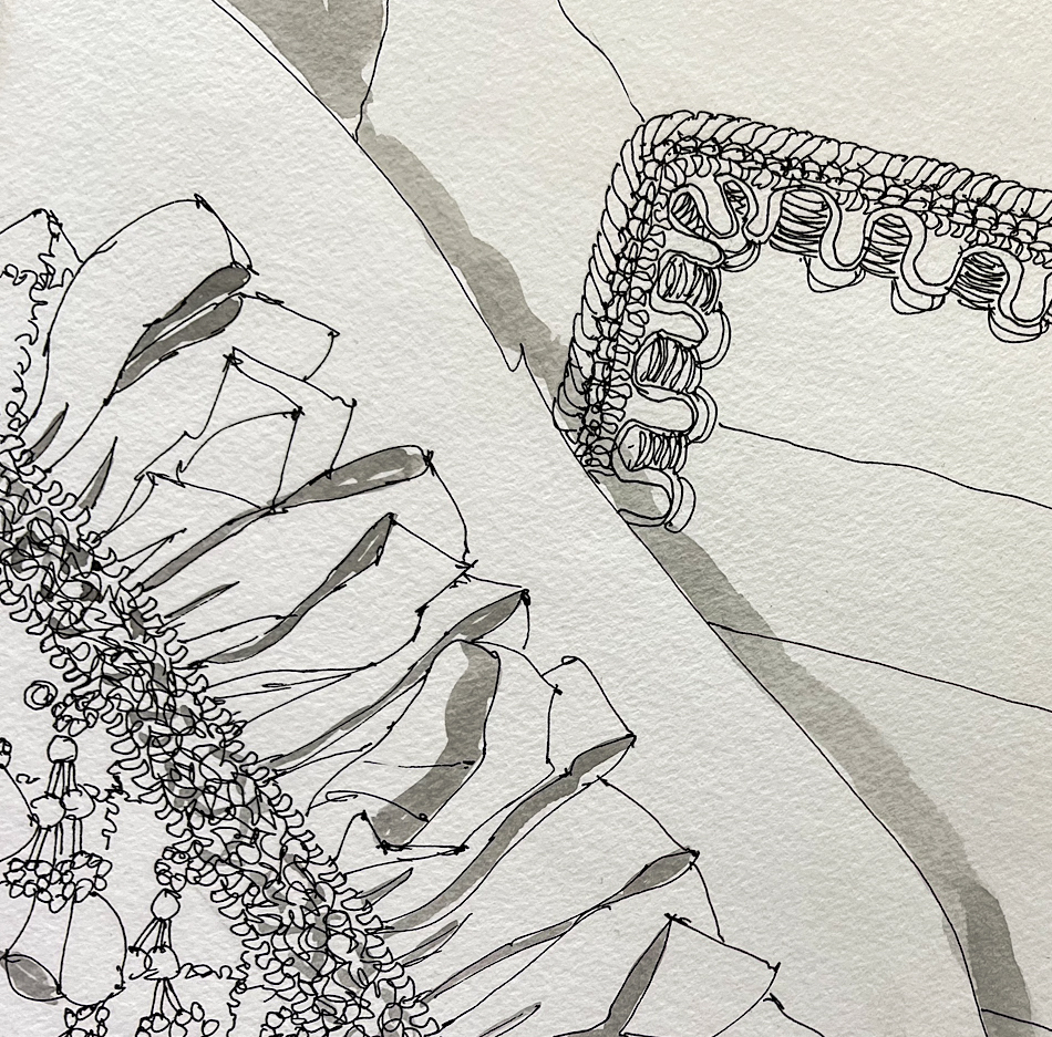
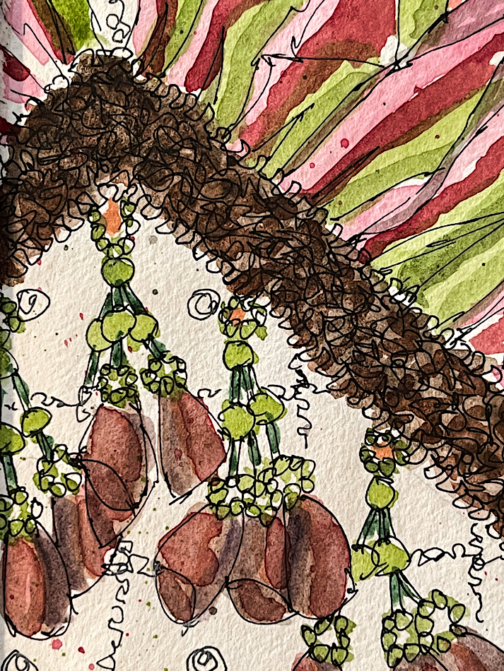
I LOVE documenting our studio life in my sketchbooks, and some projects are so sketch-worthy with their baubles and trims and bright colors!
I also use my sketchbook as a way to communicate with our clients from time to time, showing them what trims might look like on their pieces. The sketches above showed our client what our intentions were for the sofa and loveseat (both family pieces with sentimental value), and the pillows she was having us custom design. These were presented to her along with samples, and we were able to choose the final design with her.
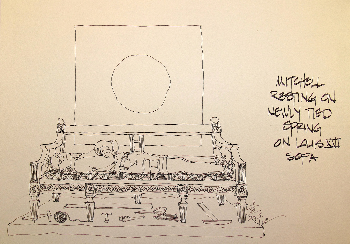
Once the project was in the studio, I sketched Mitchell with the piece when he took a break in an odd position! He did not see me sketching him!
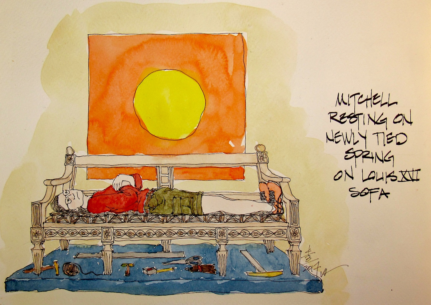
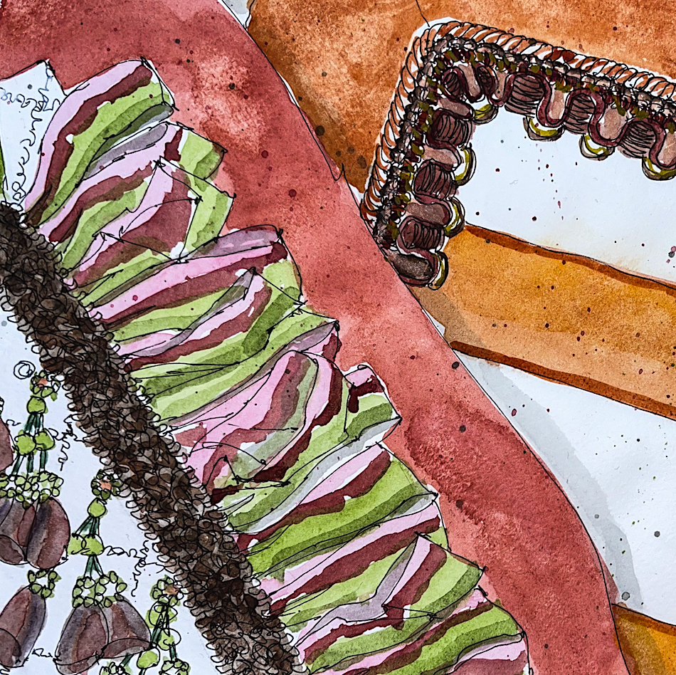
It may not be obvious, but the final design changed. I recorded the final choices and design elements in my sketchbook. My process is as below: line drawing to shading to adding color!
Showing the whole spread, I start simply with line drawings. I typically use a fine point, either a Platinum Carbon pen or a Lamy Joy, with Platinum Carbon in or DeAtramentis DOCUMENT Ink, black. There are time I deviate from that for effect, and use bright colors, but not in my everyday sketching.
I use a waterproof ink for shadows, and often do this before I begin watercolors. I emphasize water PROOF, because anything less moves when watercolor is added. My two favorite waterproof inks are DeAtramentis Document inks and Super5 inks, though this happens to be the one truly waterproof ink from Noodlers, Lexington Grey, and it is diluted for the shading in a waterbrush.
Finally, the watercolors! I use all brands, but never student grade, as the pigments are diminished in student grade paints. These were mostly Daniel Smith and Sennelier and Holbien. I mix as I go, working from pans, and layer colors (quickly so the layer below does not move), as you can see from the details below.
I sketch, daily, even when not posting.
Nothing earth-shattering, often from a photo late at night when I am not yet sleepy.
During the day I am usually too busy with work.
I haven’t been posting because I got sick — not Covid just a really irritating cold
— and had no energy to do the processing that it takes to post on the blog.
As my Patreon supporter, you will have
access to some content not on this website,
sneak previews, goodies, discounts on classes.
I teach architectural sketching,
art journaling (art+writing), creativity, watercolors.
That annoying loud-mouth editor/critic in your head? GONE! How great would that be?
I'd love it if you shared this; please mention my blog name!


 To hear about classes, follow me on Facebook
 As my Patreon supporter, you will have