
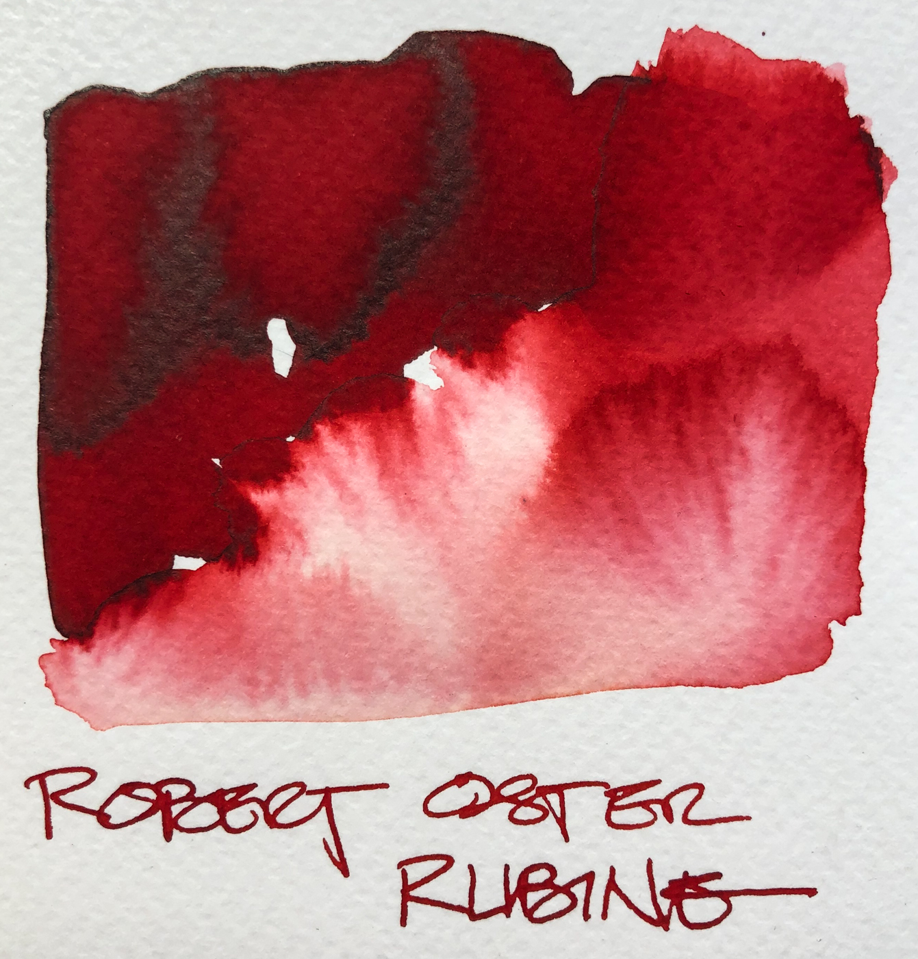
 Robert Oster Rubine is a favorite red, and has found a permanent home in my red Pilot Metropolitan. It leans just ever so slightly into a blue-red. I usually do match pen to ink, mostly because I have many pens inked for drawing, and by matching I am more likely to pull the right color ink.
Remember that others review these inks just for writing;
I am also interested in how they are used for ink-painting!
Properties of Robert Oster’s Rubine:
 This ink is well-behaved, crisp and does not feather on any of the papers I normally use at work, even Post-its. I consider it a medium ink, neither wet nor dry, and it evaporates quickly with a medium nib. It does not smear easily when sketching. I see a light charcoal-colored sheen, and as you can see, the ink is pure red color leaning just a little blue, no separations! When hit with water it moves easily with no resistance or ghosting.
It is not water resistant.


*Above, watercolors that are comparable.*
I was asked why I show watercolor matches.
Simply, sometimes you want to use an ink to sketch and then fill the object with the matching watercolor, and this gives artists a possible match.


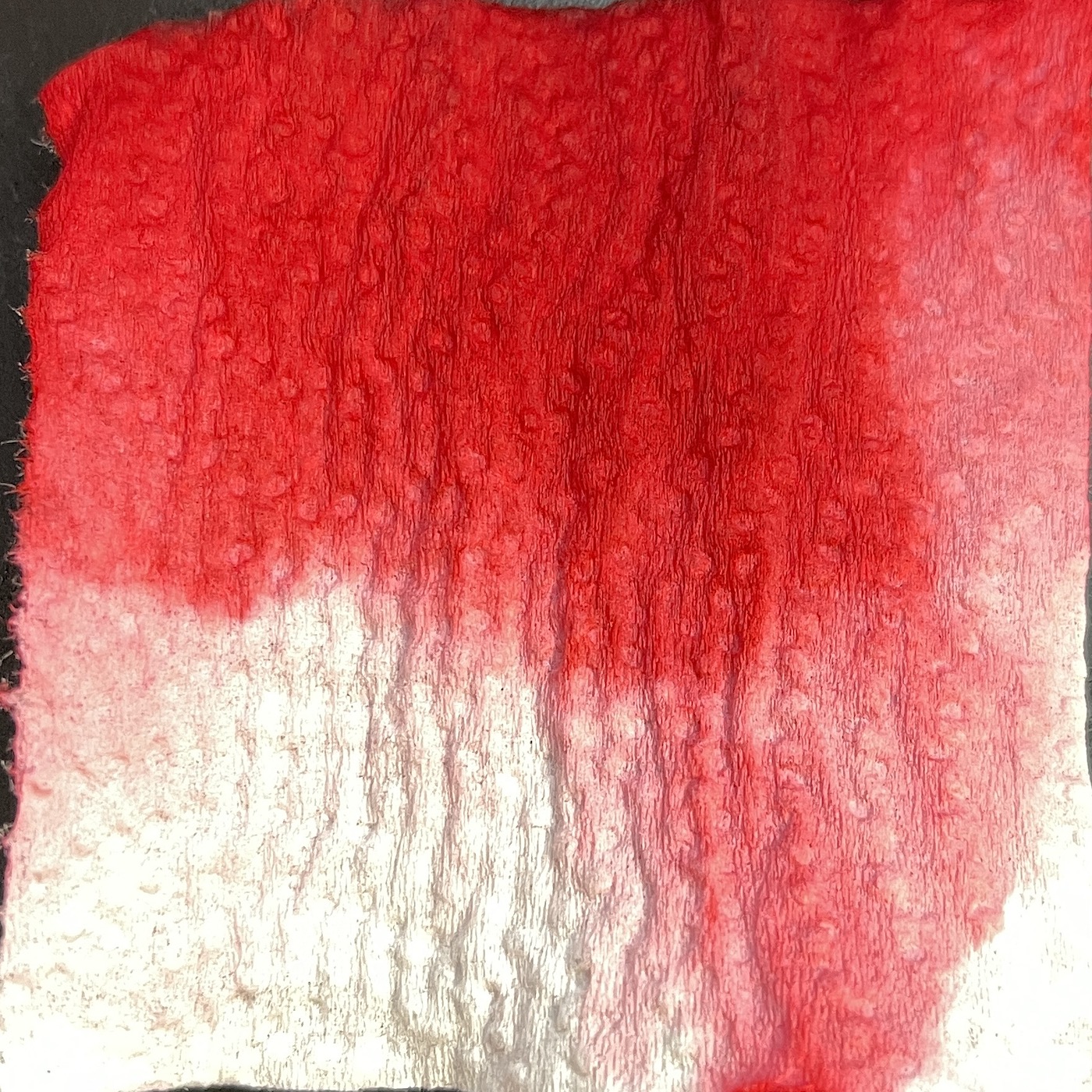
On smooth Hahnemühle paper I created a sketch of
the amaryllis in Robert Oster Rubine, above and detail right,
drawn with a Pilot Metropolitan with an medium nib
on Hahnemühle cold press watercolor paper.
The lines were touched with water using a Pentel Aquash waterbrush,
which also was dipped into the pen to pick up more color.
The lines do not stay visible but quickly lose themselves in wet color and
so were added back in after the water moved the ink and dried!
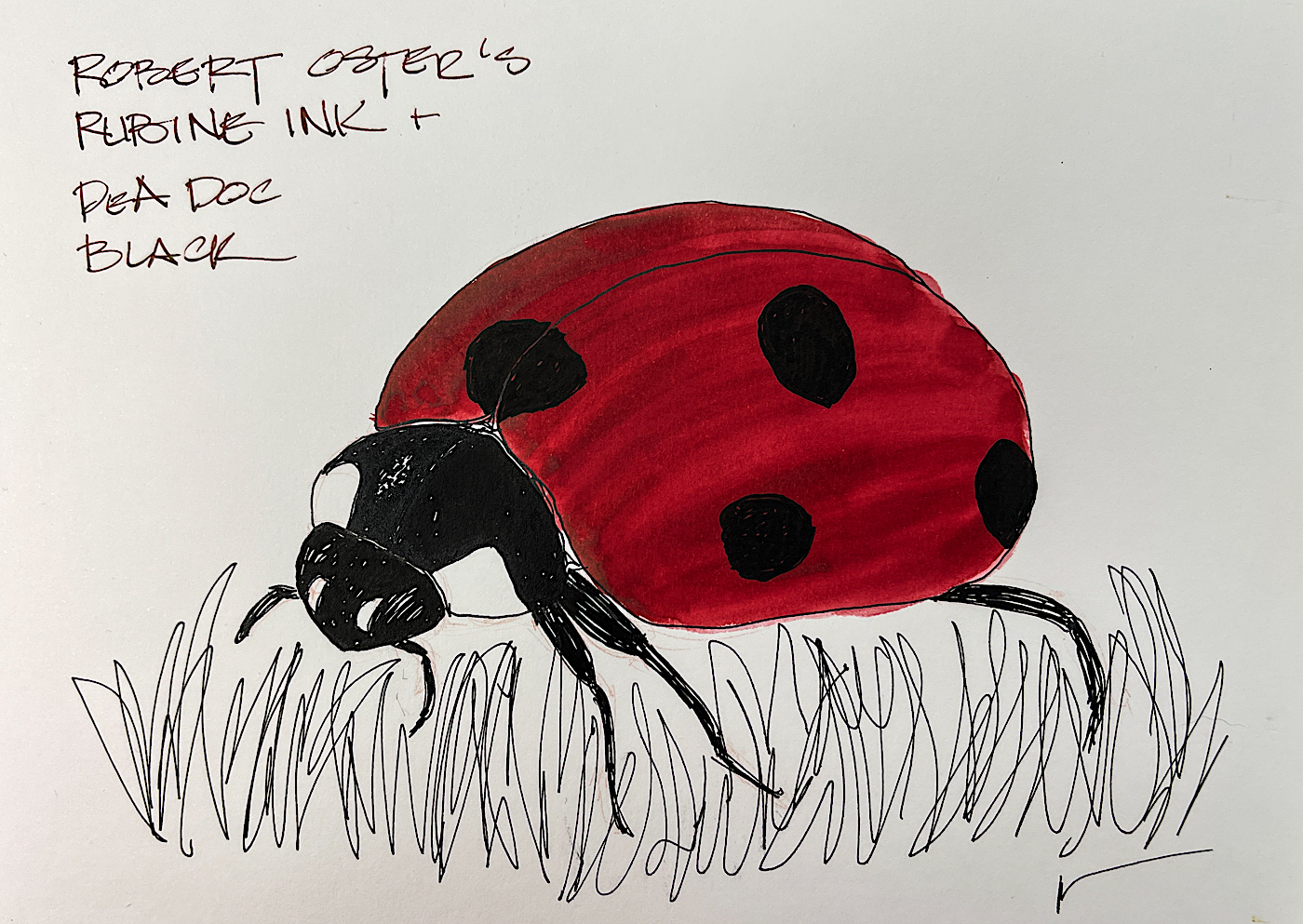
 Robert Oster Rubine is a perfect color for a Ladybug in the grass! Drawn on a smooth Hahnemühle Nostalgie journal.
I added Rubine to the top of a sallow watercolor on the same Nostalgie paper, left, to make it pop as the actual shell was colored deeply and watercolors did not do it justice.
Below, showing Rubine next to several similar Robert Oster reds for comparison.


Other Robert Oster Inks reviewed in this manner to date can be seen here.
 RO is experimenting and testing lightfast properties…
MOST water soluble ink companies do not yet pay attention to these properties because most artists who use ink are making prints of their work.
His non-toxic inks come in 50ml plastic bottles that are environmentally friendly, using recycled plastic. They can be tippy, so I usually put them in a more solid container to decant. The ink bottle mouth is wide, and all my pens fit easily into the bottle opening to fill.
I bought Robert Oster Rubine at JetPens.


 To hear about classes, follow me on Facebook
or check out my new, improved dkatiepowellart.com
“Memory is more indelible than ink.”
Anita Loos, Gentlemen Prefer Blondes.
“I think not….”
Me… why I journal!
Hahnemühle journals, Pentel Aquash waterbrush,
Pilot Metropolitan with Robert Oster Rubine.


©D. Katie Powell.
My images/blog posts may be reposted; please link back to dkatiepowellart.
☾
 As my Patreon supporter, you will have
access to some content not on this website,
sneak previews, goodies, discounts on classes.
I teach architectural sketching,
art journaling (art+writing), creativity, watercolors.
That annoying loud-mouth editor/critic in your head? GONE! How great would that be?


This is one gorgeous color!
LikeLike
A true favorite! Bold and complicated… what I strive to be!
LikeLike