Garuda with Washes, Three

W15 2 19 GARUDA WASH MIK IMAGE 018

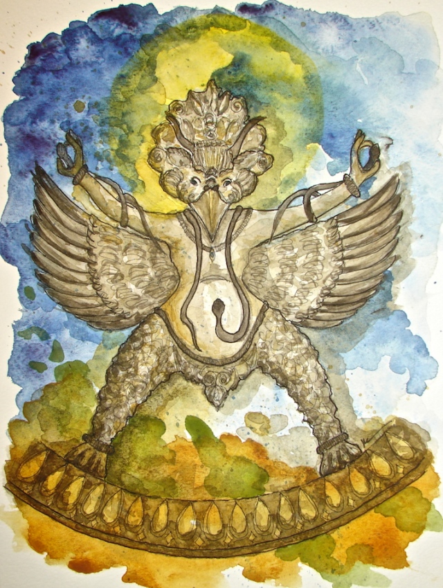
On this final (for now) Garuda, here is the story of Mitchell’s Garuda.

Mitchell and I were buying statues from a Tibetan man in Nepal
(long story, another time) and had never met him nor spoken with him.
An anthropologist from University of Chicago carried messages.
The first time he carried messages to him about the interesting statues we wanted to buy the Tibetan artist said he could do that, and he also had a gift for Mitchell.

W15 2 8 GARUDA 5Earlier that year Mitchell had enjoyed
a drumming group intended to induce trances.
He experienced a large bird-man spread
his wings in front of him.
Mitchell had never seen anything quite like him.

When we opened the gift for Mitchell, this statue
was the bird-man he had seen that day!

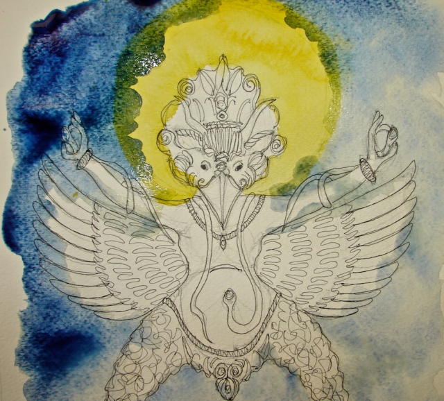
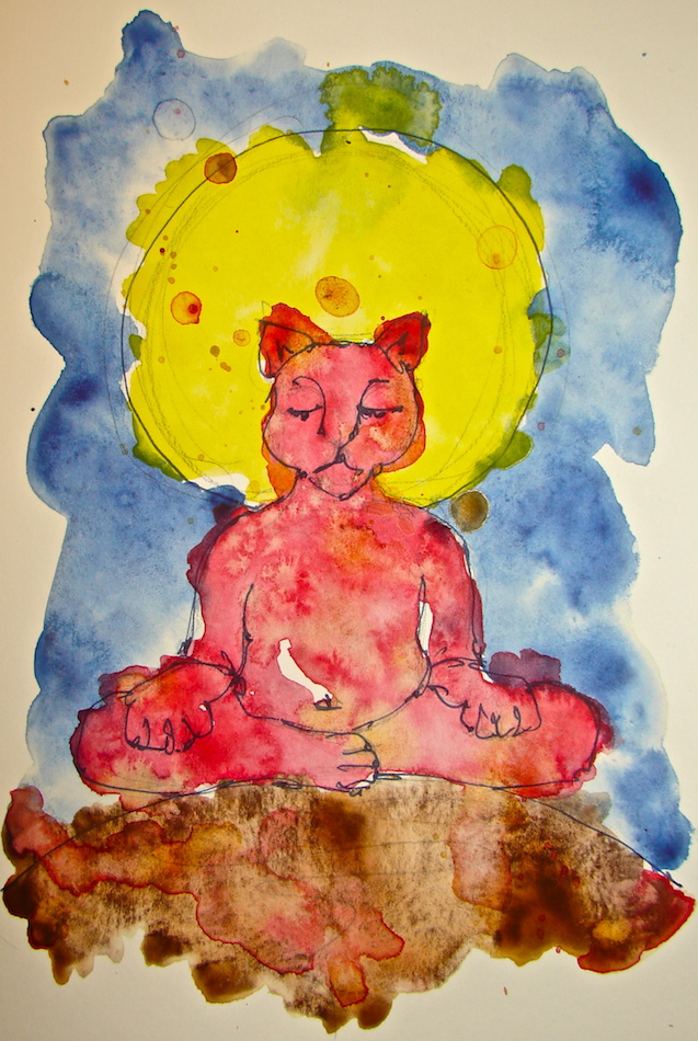
This is my rendering of the Garuda as
Mitchell saw him, with bright ruby and
cobalt wings  spread, coming out of darkness.

W15 2 19 GARUDA WASH MIK IMAGE 003

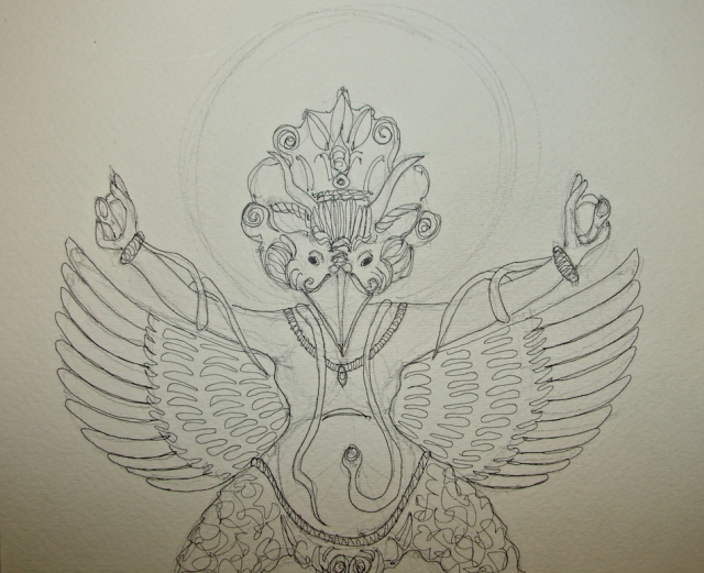
I began with a pencil sketch in Pentalic 2B,
then inked him with blue De Artramentis Document Ink.
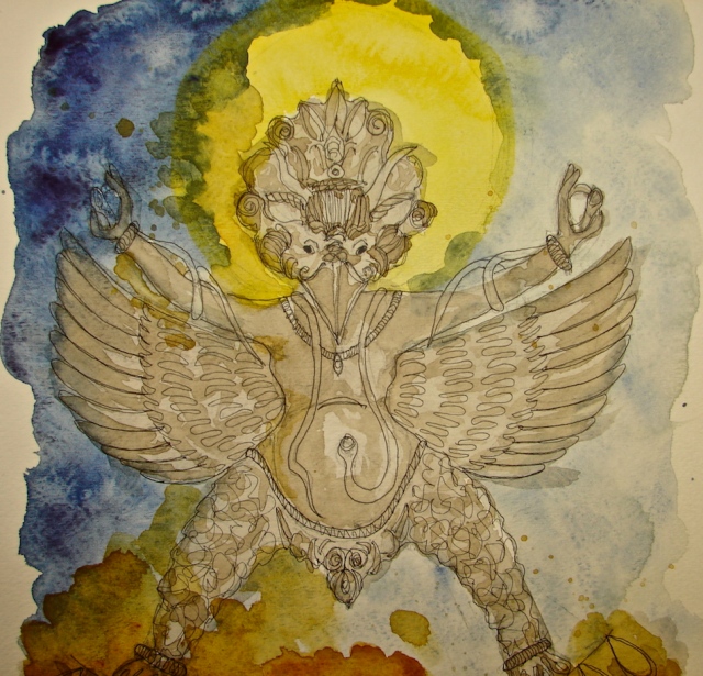
I began again with the yellow ball behind his head and a general background of Quinacridone Gold (Holbien has a very soft creamy version) and Primatek Yavapei.

W15 2 19 GARUDA WASH MIK IMAGE 005

A buildup of French Ultramarine and Quinacridone Coral and
Quinacridone Gold was applied to his body, with the wonderful
Quinophthalone Yellow deepening the ball on the background.

W15 2 19 GARUDA WASH MIK IMAGE 007

Layers of wonderful Primatek Green Apatite and Primatek Peimonite
with a mix of Quinophthalone Yellow and an unknown orange leftover for the ball.
Layers were never completely dry on the background, as I kept dropping color to deepen.

W15 2 19 GARUDA WASH MIK IMAGE 009

W15 2 19 GARUDA WASH MIK IMAGE 010
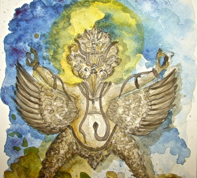
I needed to deepen the body colors
and delineate feathers.
It is not easy to paint
what is in someone else’s head.
I added more detail to his body
with the ink pen.
Mitchell kept describing as I added color,
this time darker French Ultramarine.
I almost always let the body dry
between buildup because I did not want a
splishy-splashy look,
but detail to begin to be seen.
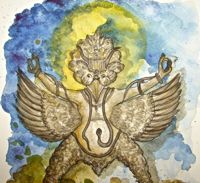
Right is a detailed area.

W15 2 19 GARUDA WASH MIK IMAGE 012

I added a darker semi-opaque stripe of feather in Perylene Red.
Primatek Hematite and Primatek Peimonite began to give him a base,
while Mayan Blue and Daniel Smith Quinacridone Gold darkened the sky.
I wanted a vortex effect.

W15 2 19 GARUDA WASH MIK IMAGE 014

More layers of French Ultramarine and Quinacridone Coral and Quinacridone Gold.

W15 2 19 GARUDA WASH MIK IMAGE 017

Finally, details: Primatek Hematite and Primatek Peimonite with Sepia,
French Ultramarine and Quinacridone Coral and Quinacridone Gold.

Done!

This slideshow requires JavaScript.

 Garudas to date!

Strathmore journals, with a Pentalic 2B woodless pencil,
Platinum Preppie Pen, De Artramentis Document ink,
and Daniel Smith and Holbien watercolor paints.


I agree to Creative Commons Attribution-Non-Commercial 4.0 International License, which you can learn more about by visiting the site, or,
visit my web page for a more user-friendly summary on my terms.
My images/blog posts may be reposted; please link back to dkatiepowellart.

Posted in art, art journal, Buddha, gods and goddesses, graphite, journal, painting, process, sketchbook, watercolor | Tagged , , , , , , , , , , | 6 Comments

USk: Nick’s Italian Cafe, McMinnville

W15 2 13 USK Nick's McMinnville 005

W15 2 13 USK Nick's McMinnville 001
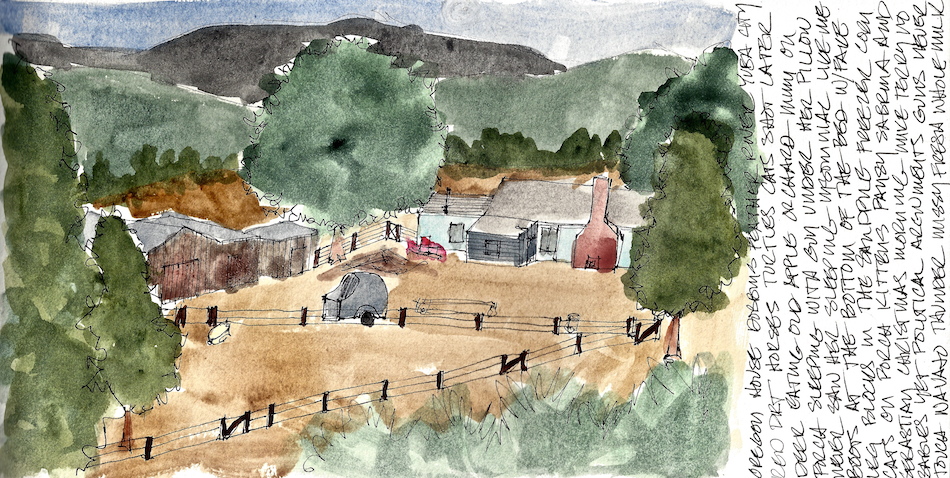
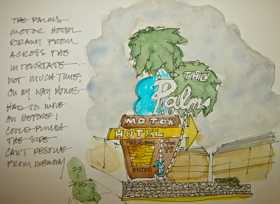
McMinnville Oregon is a sleepy
town with great places to eat, and a wonderful art store (Merriartist) which is staffed by people who either know the products or say they don’t, a refreshing change from overly huge chain stores
that teach the employees to say things that make them sound stupid if you know anything at all about the products.  We had not heard do of Nick’s Italian Cafe, but it was the only place still open other than McMenamins.  The restaurant was elegant, simple, feeling a bit NYC-ish.  The design statement was the undulating wall of cut barrels that created the wood treatment, and simple white tablecloths with a single red rose on each tabletop.

W15 2 13 USK Nick's McMinnville 002
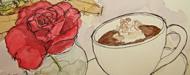
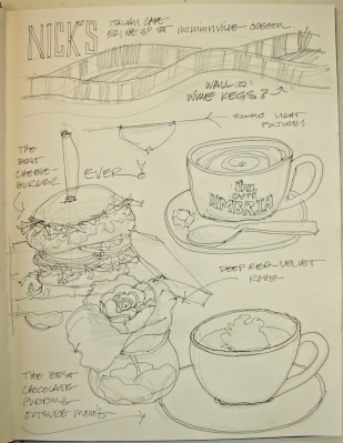
Mitchell craved a cheeseburger.   I am
not a big fan and they never are very good out.  I ordered a pear/Gorgonzola/caramelized onion thin crust pizza and a Caesar’s salad.  We decided to split everything, to taste.  OMIGOD!  I said that about the very good salad and pizza with wood-fired crust.  Then I said it like a mantra over the cheeseburger.  Again and again.  Beef ground in-house, and the meat perfectly prepared.  Heaven!  The reason you eat beef is the flavor should be as good as anything you top it with.  No salt + pepper on the table which I often find pretentious but not here, nope, no need.  Thin sliced onions, tomato, lettuce and goop all added up to perfection.

I want it for my birthday dinner.  I sketched and lightly inked while they twisted our arms to try chocolate pudding and a latte.  Watercolors and detailed ink added in my studio.

W15 2 13 USK Nick's McMinnville 003

Drawn in an Strathmore Mixed Media journal with Pentalic graphite pencil,
various pens including the Platinum Carbon Pen + ink, and with De Artramentis Document ink (black), and Daniel Smith watercolors.


I agree to Creative Commons Attribution-Non-Commercial 4.0 International License, which you can learn more about by visiting the site, or,
visit my web page for a more user-friendly summary on my terms.
My images/blog posts may be reposted; please link back to dkatiepowellart.

Posted in art journal, drawing, painting, pen & ink, sketchbook, urban sketchers, watercolor | Tagged , , , , , , , , , , , | 6 Comments

Garuda with Washes, Second

W15 2 12 GARUDA WASH 14
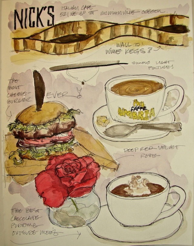
I am really happy with the Garuda above!
I wanted him to come alive, and not be a statue on a dais
as he is shown in my post from earlier this week.

W15 2 12 GARUDA WASH 1 copy

I began with a pencil sketch in Pentalic 2B. . .

W15 2 12 GARUDA WASH 6

and inked over that with a Platinum Carbon pen.

W15 2 12 GARUDA WASH 7

I was determined to be patient with my wash layers.
I began with the yellow ball behind his head.
I let that thoroughly dry, then applied layers of blue together.

W15 2 12 GARUDA WASH 10

I didn’t let that completely dry, because I wanted just a bit of run,
when I added a very pale Hematite/Sepia wash and Quinacridone Gold.

I let that completely dry (patience, patience, not my virtue) before coming in with a darker hue of the Hematite/Sepia wash, adding a little Quin Gold as I played the edges.
Mitchell looked over my shoulder and said the moon was distracting
(drew the eye) so I also softened the bright yellow with Quin Gold.

W15 2 12 GARUDA WASH 12

I let the him dry completely, then added many layers of basically the
same colors in varying depth, except for the green wash created from
Sap Green/Serpentine and whatever was left in the trough.

One of the things I’ve learned from listening to so many good watercolorists is not to worry about purity of a color, but to let other pigments mix in these deep washes for interest.

Splish-splash, I loved him.  But he needed to pop!
I added DeArtramentis Document ink for just a bit of definition.

W15 2 12 GARUDA WASH 15

A slide show from statue to final Garuda, below.

Strathmore journals, with a Pentalic 2B woodless pencil,
Platinum Carbon pen, Platinum Preppie Pen, De Artramentis Document ink,
and Daniel Smith, Holbien, and QoR watercolor paints.


I agree to Creative Commons Attribution-Non-Commercial 4.0 International License, which you can learn more about by visiting the site, or,
visit my web page for a more user-friendly summary on my terms.
My images/blog posts may be reposted; please link back to dkatiepowellart.

Posted in art journal, Buddha, drawing, gods and goddesses, graphite, journal, painting, process, sketchbook, watercolor | Tagged , , , , , , , , , , , , | 7 Comments

Garuda with Washes, The First

W15 2 8 GARUDA 2

W15 2 8 GARUDA 5

I continue to work the various levels in washes,
learning as I go.  I worked with one of
Mitchell’s favorite statues (right) which has a
lovely history, which I will tell you all about in
one of these posts when I have a bit more time.

This one, in my art journal, is the first and
I enjoyed the process.  I think he is a bit dark,
and have started on another already.

Strathmore journals, with a Pentalic 2B woodless pencil, Platinum Carbon pen, Pentel Brush pen,
and Daniel Smith and QoR watercolor paints.

W15 2 8 GARUDA 1

Thanks to Marc Taro Holmes “Tea Milk Honey” which I am trying to own as a technique!


I agree to Creative Commons Attribution-Non-Commercial 4.0 International License, which you can learn more about by visiting the site, or,
visit my web page for a more user-friendly summary on my terms.
My images/blog posts may be reposted; please link back to dkatiepowellart.

Posted in art journal, Buddha, drawing, gods and goddesses, painting, sketchbook, watercolor | Tagged , , , , , , , , , | 1 Comment

Roz Stendahl

This is similar to a re-blog.

Roz Stendahl is a favorite artist for me to watch.  She shares all and that is something I admire.  Helps me tremendously by saving me from buying things I don’t really  want by explaining IN DETAIL how she uses tools and materials.  Follow her blog!

I also will be participating in her Fake Journal month in April.


Posted in art journal, creativity, process | Tagged , , | 3 Comments

Syn Studio Classwork: Demo Two: Cast Drawing

Marc Taro Holmes is my inspiration on trying to get this watercolor thang down to my liking. Here is his “famous” “Tea, Milk, Honey” demo. He shows us this in several ways on his blog, but being a Ganesha fan I had to share this one. Tomorrow, I will share my Garuda images.

Posted in art | 3 Comments

Zen Cats and Watercolor Washes

W15 2 8 ZAZEN CAT PURPLE 2

After my frustration at Kiva Tearoom, I decided I needed to go back and just play with washes.  Middle of the night I read suggestions from several watercolor books on washes.  I sketched the Zazen Cats, fun images I come back to occasionally.

The Purple Zazen Cat was a good trial — I like the way the colors play but I think I tried too many colors at once.  I am by nature impatient.

W15 2 8 ZAZEN CAT RED 2

Red Zazen Cat I took more time, and let the colors completely dry,
each one,
before the next wash was applied.  I dribbled and dabbed paints into the washes as they were drying.  In short, I had fun and it showed.  (I still wish I didn’t have to wait so long.)  THIS is what I wanted to do with Kiva Tearoom!

I think Red Cat will become a card on Redbubble!

W15 2 8 ZAZEN CAT RED 4

Aquabee Super Deluxe OR Stillman & Birn Beta Series (red cat) journals,
with a Pentalic 2B woodless pencil, Platinum Carbon pen, Pentel Brush pen,
and Daniel Smith and QoR watercolor paints.


I agree to Creative Commons Attribution-Non-Commercial 4.0 International License, which you can learn more about by visiting the site, or,
visit my web page for a more user-friendly summary on my terms.
My images/blog posts may be reposted; please link back to dkatiepowellart.

Posted in art, art journal, Buddha, color, creativity, gods and goddesses, graphite, journal, painting, pen & ink, pencil, process, sketchbook, watercolor | Tagged , , , , , , , , , , , , , , , , | Leave a comment

The Question of Light: Tilda Swinton’s speech at the Rothko Chapel

Amazing.
“We come. We take it home with us. We never really leave.

The Rothko Chapel is a sacred space because of precisely this capacity it has to re-bind, to re-balance, to re-store, to re-inspire the spirit in its simple and essential gesture of darkness held in light. Of art held in spirit. Of spirit held in life and the living of life. It is a truly humane space for humans to find themselves in.
Glamour is a word derived from the Scots, meaning ‘dangerous magic.’
The Rothko Chapel is glamorous beyond any glamour known to any Highland witch. It is a light that never goes out.”

Conner Habib's avatarConner Habib

tildaBelow is the only place to read Tilda Swinton’s moving and radiant speech at the Rothko Chapel in Texas.

Why do I have it?  A brief explanation.

Last year, actress Tilda Swinton was presented with the Rothko Chapel Visionary Award at the The Rothko Chapel, which is home to fourteen of Mark Rothko’s paintings.  It’s also a spiritual and human rights center whose mission is “to inspire people to action through art and contemplation, to nurture reverence for the highest aspirations of humanity, and to provide a forum for global concerns.”

One of her friends (writer William Middleton, mentioned in the unabridged version of the speech) sent the speech along to me and my boyfriend.  We read it aloud to each other, we paused, we marveled at the wisdom: art and light and compassion.  Then we read it again, inspired by its unfolding grace.  

When I tried to locate…

View original post 1,293 more words

Posted in art | 2 Comments

USk: Kiva Tearoom, NW Portland

W15 2 7 USK KIVA TEAROOM PDX 12
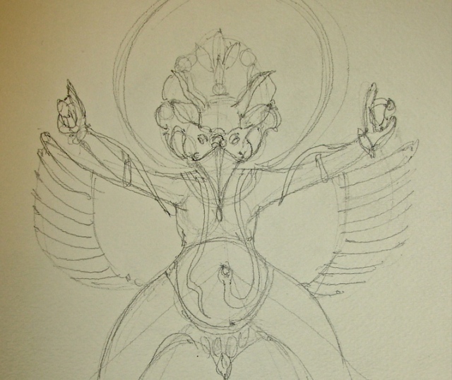
I braved another day of sketching with the intention to sketch people in a crowded place.
There were few people in today — what? — Saturday in Portland?

This post is a big deal for me because I am posting what I don’t like,
my ugly children.  I love them because they are part of my process but really, I don’t think most of what I did today was good.  So why post?  Everyone always posts the sketches
they LIKE and that is intimidating to people who are trying and falling short of
what they see in their head.  I am still struggling with watercolors and the only
way to get through it is to DO it — and this is one of those
really-really-really didn’t like my attempts but oh well. . . I tried, and THAT is the point!

I started with two sketches to loosen up, one of the couple sitting in front of me (the man kept eyeing me as I eyed him, geesh) and the second of my smoothie and tea.
Both took only a few minutes each; I was in the tearoom one hour total.

W15 2 7 USK KIVA TEAROOM PDX 7
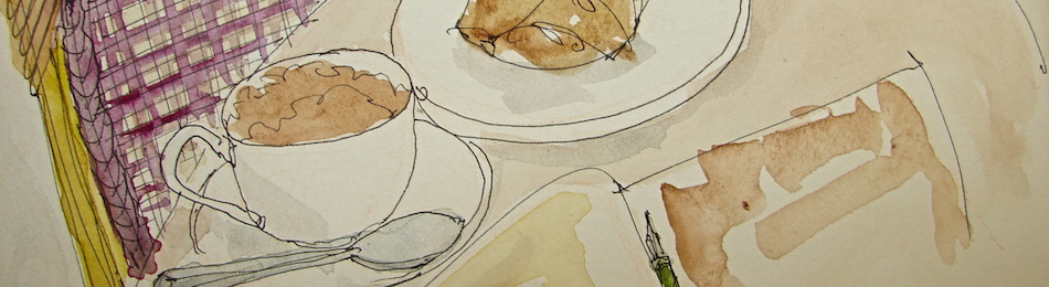
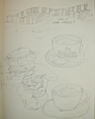
My overall sketch of the counter
was fine (image taken from a
slightly different angle),
done quickly with the idea that watercolors would carry the
depth and detail.  I was looking
for outline, shapes, not bold lines;
frankly I am very good with
line-workand trying to loosen up
and let the watercolor have a great influence over what is portrayed.

W15 2 7 USK KIVA TEAROOM PDX 8 W15 2 7 USK KIVA TEAROOM PDX 9

This is where things went terribly wrong, above.

That is to say, what I see in my mind’s eye, what I want to do on the paper,
are two very different images from what happened.  It looks overworked but it wasn’t overworked — meaning I didn’t keep coming in and trying to “fix’ anything.
Still somehow, it looks to me like a coloring book!
I still have not got the watercolor techniques down to what I see in my mind’s eye.

And therein lies the rub.  For lots of people this is a good watercolor sketch but it is not what I wanted -sigh- SO, this means I don’t give up but try again, same tearoom, same view or close to it, and see if I can loosen up sufficiently to do what I want.

Then I made a shift and tried three quick details before I left.
I was looking for a win here!
No set-up, just a fast sketch.  I am happy with the two above;
the Standing Buddha at the end of the hall (seen in the first image),
not so much, due to the watercolor techniques again.

W15 2 7 USK KIVA TEAROOM PDX 10

Drawn in an Strathmore Mixed Media journal with watercolor pencils,
various pens including the Platinum Carbon Pen + ink, and with De Artramentis Document ink (black), and Daniel Smith / QoR watercolors.


I agree to Creative Commons Attribution-Non-Commercial 4.0 International License, which you can learn more about by visiting the site, or,
visit my web page for a more user-friendly summary on my terms.
My images/blog posts may be reposted; please link back to dkatiepowellart.

Posted in architecture, art journal, journal, painting, pen & ink, process, sketchbook, urban sketchers, watercolor | Tagged , , , , , , , , , , , , , , , | 7 Comments

USk: St. Honoré, Lake Oswego

W15 2 3 USK ST HONORE PDX 6I risked my weight loss diet and spent 90 minutes at St. Honoré Boulangerie to
sketch while Mitchell went to a client’s home.  (Yes I did “break it — but only a tiny bit with a teeny chaussen aux pommes and small chai latte.)  Finally tackled a few people — not many.  I am far more comfortable sketching models (they hold still) or “stuff.”

I took the time  to do a setup, studying the overhead lighting to see how it aligned
with the front counter and how the odd angles aligned with the counters.
This assisted in showing me I needed to flatten the lighting in back a bit and saved my
proportions overall.  Later I used the set-up to test mixed watercolors.

W15 2 3 USK ST HONORE PDX 5

The waitress took an inordinate amount of cleaning (several times) at the
condiment stand next to me and finally admitted she was making excuses to watch me
and could she simply look over my shoulder.  No problem with that for me.  The set-up also allowed me to take some notes on colors so I could add color in my studio — and I took images with my old phone but have NO idea how to remove them.  Hardly worth it;
I have an exacting eye for color.  The paint is the color of yellow split peas.

I wrapped up about the time Mitchell was to pick me up.  I decided to move to the bar and sketch the big oven.  No set-up — no time!  Finished the rough sketch in about 15 minutes.

They were just starting to fill the coffee eclairs in front of me when Mitchell called!  Yeow!
I added my meal.  I really do not like white plates!  Boring!

W15 2 3 USK ST HONORE PDX BANNERDrawn in an Strathmore Mixed Media journal with
a Platinum Carbon pen, A Sailor Pen (55 degree angle), a Hero pen
(new pens, getting used to), with De Artramentis Document ink (black),
and Daniel Smith / QoR watercolors.


I agree to Creative Commons Attribution-Non-Commercial 4.0 International License, which you can learn more about by visiting the site, or,
visit my web page for a more user-friendly summary on my terms.
My images/blog posts may be reposted; please link back to dkatiepowellart.

Posted in art | Tagged , , , , , , , , , , , , , , , , | 6 Comments

Happy Imbolc

W15 2 2 IMBOLC 1The groundhog saw his shadow; more snow, which is a GOOD thing.

Prayers to Brigit should be said at sunset.  Brigit is the patroness of poetry,
blacksmithing, cattle, sacred wells, and the arrival of early spring

May I become at all times, both now and forever:
A protector for those without protection
A guide for those have lost their way
A ship for those with oceans to cross
A bridge for those with rivers to cross
A sanctuary for those in danger
A lamp for those without light
A place of refuge for those who lack shelter
And a servant to all in need.
Fourteenth Dalai Llama

Aquabee Super Deluxe 9×9-inch journal with a Carbon pen, a Hero pen (aaaah, new pens, such fun) with DeArtramentis Document ink (black) and Daniel Smith watercolor paints.


I agree to Creative Commons Attribution-Non-Commercial 4.0 International License, which you can learn more about by visiting the site, or,
visit my web page for a more user-friendly summary on my terms.
My images/blog posts may be reposted; please link back to dkatiepowellart.

Posted in art journal, pen & ink, sketchbook, watercolor | Tagged , , , , , , , , , , , , , | 17 Comments

USk: Drawing Around Portland

W15 USK I5 SOUTHI haven’t had much time to paint anything this week but found moments in the car.
Being back in a city is overwhelming in terms of the cacophony of lines and layers, rhythms and patterns.   (Yes I spelled that wrong — I always forget that extra “h.”)
It really annoys me when I find myself avoiding scenes, and the areas near Swan Island (an industrial area whose name should be changed as there are NO longer swans)
are so rich with activity and also so layered and busy.  Busy is hard to convey,
especially without the structure of a language of lines, example shown below,
an architectural rendering of Arco Towers Long Beach.  I could do these in my sleep.

web arco axoAnnoyed, I finally decided to try layering the cacophony all at once without thought to shapes to see how that would work, and gave myself 15 minutes.  No what’s in front and what’s in back; no set-up and figuring.  Just draw a giant gesture of the crazy jumble of lines.  I started with the gentle arch of the bridge and then the tall arches, then moved to anchor each side of the page.  It totally worked to loosen me up and relax me.
Getting even one of these complicated scenes down was a coup.

I think I am on to something.  Got me over the hump, anyhow.

W15 1 17 USK LESSON SKETCHCRAWL 2the piece above is a five minute sketch where I was showing Mitchell how to SEE
instead of drawing what his mind thinks makes sense in perspective.
Yes, reality is an illusion!

I am retiring this Mixed Media book.  I learned a lesson — NEVER buy a soft-cover book with a spine.  I often buy ring journals and didn’t think of it but it is annoying.  I am going to use it in my weight-loss journal which I will blog about once a week at katwritesfood!
Yes, of course with pictures + recipes when I find good ones!

Drawn in an Strathmore Mixed Media journal with Uniball pens or Noodler’s
Polar Brown and Lexington Grey ink, and Daniel Smith watercolors.
Note: Normally those inks do not run, but they bleed a bit in this journal.


I agree to Creative Commons Attribution-Non-Commercial 4.0 International License, which you can learn more about by visiting the site, or,
visit my web page for a more user-friendly summary on my terms.
My images/blog posts may be reposted; please link back to dkatiepowellart.

Posted in art journal, creativity, journal, painting, sketchbook, urban sketchers, watercolor | Tagged , , , , , , , , , , , , , , , | 8 Comments

What’s Inside the Traveling Studio of an 18th Century Miniature Portrait Artist?

This is a lovely post! Enjoy!

Laurie Benson's avatarLaurie Benson's Cozy Drawing Room

Miniature Portrait Painter's Box. Probably United States ca. 1790s. Mahogany with brass fittings. Miniature Portrait Painter’s Box. Probably United States ca. 1790s. Mahogany with brass fittings.

This late eighteenth century artist’s box is like a portable portrait studio. It’s believed to have belonged to an unknown American traveling artist and contains all the tools and materials they would need to paint portrait miniatures on ivory with either powdered color or watercolor. I came upon this treasure when I went to see the Metropolitan Museum of Art’s collection of portrait miniatures. It’s an area of the museum that isn’t very big, but I could spend a great deal of time there simply admiring the faces of the past.

Miniature Portrait Painter's Box

Inside this artist’s box are two palettes, one in ivory and one in porcelain. There are gums for binding pigments or glazing, and brushes that have quill ferrules and bone handles. Also housed within the drawers are slivers of ivory cut into ovals and squares, pieces…

View original post 186 more words

Posted in art | 5 Comments

Mimi and Pa’s Ranch

W14 6 7 Swartout Ranch  copyI wish my grandfather had not sold their ranch in California.
I have all good memories there of family and being a kid and critters and holidays and making things and first riding a horse and shooting a rifle and boots and plaid wool and Stetsons and horny toads and snakes and getting over fears.  In fact it would have been a great place for the entire family to share as a getaway place.

Might have changed our lives to have that ranch.

Sketched it based on memory and this photo below.
Yup that’s me pointing!

RANCH DEB 4_2


I agree to Creative Commons Attribution-Non-Commercial 4.0 International License, which you can learn more about by visiting the site, or,
visit my web page for a more user-friendly summary on my terms.
My images/blog posts can be reposted; please link back to dkatiepowellart.

Posted in art journal, history, journal, memory, painting, sketchbook, watercolor, writing | Tagged , , , , , | 21 Comments

Honu Turtle Doodle

W14 11 19 HANU MOON 2Just a doodle.  My grandma loved turtles and I love sea turtles.

BTW, some of my turtles are for sale in my Redbubble shop!

Aquabee Super Deluxe 9×9-inch journal with a Platinum Preppy fountain pen,
Noodler’s Heart of Darkness ink (it runs a bit), and various watercolor paints.


I agree to Creative Commons Attribution-Non-Commercial 4.0 International License, which you can learn more about by visiting the site, or,
visit my web page for a more user-friendly summary on my terms.
My images/blog posts may be reposted; please link back to dkatiepowellart.

Posted in art, art journal, drawing, pen & ink, watercolor | Tagged , , , , , , , , , | 7 Comments

An Open Letter To WordPress

About the new changes that are continually happening now on WP, here is a good post that saved me the bother! I have written and written until now they just stopped answering. I HATE the beep stuff — stupid and not easier and less functional. I threw a hissy fit over the new admin bar and the constant changing of names. I asked them to add to the bar, not take away and change things . . . AND, I wrote one letter where I substituted lemon for admin bar and peanut for webmaster and so aon and it was a hoot but not answered because, like their stupid innovations, they are not understandable. I want to write not play with WP.

goldfish's avatarFish Of Gold

Dear WordPress,

I am loath to write yet another letter to you, since I typically prefer to spend my time writing actual blog posts, but I’ve been bitching on Twitter and in your forums to no avail, so maybe you’ll pay attention to a blog post. It’s not likely, but hey, you never know.

Please, stop. Just put down whatever you’re working on and stop with the futzing. You have been tinkering under my hood long enough and you know what? None of the “improvements” you’ve made are actually improvements.

Below, you will find explanations as to why your improvements aren’t improvements sorted conveniently by feature.

Post Editor

Let’s talk about this “Beep beep boop” post editor nightmare with less than half the functionality of the old editor. Thankfully, you haven’t taken away the old editor yet. However, I fully expect that one day, I will go to write a…

View original post 914 more words

Posted in art | 2 Comments

The current palette and brush

Shari Blaukoft is one of my favorite painters to follow. Here is a recent posting of her current palette on her new blog post, and also links to Parkablogs, which is another great blog to follow if you are a painter (or like reading about them!)

Shari Blaukopf's avatarShari Blaukopf's Sketchbook

I’ve been looking forward to writing a more detailed post about the colours on my palette after Parkablogs asked the question a few weeks ago. It’s grey and damp in Montreal (January thaw) so instead of getting out to sketch, I made a little schematic of what I am currently using.

This comes with a few disclaimers:
1: There are no rights and wrongs with colour. Colour choices can be very personal and different people have success with different pigments. For example, I rarely use Phthalo or Prussian blue because they just don’t work for me. Or rather I can’t make them work. Other people use them to great success. Have a look at how successful Alvaro Castagnet is with reds or Milind Mulick is with pale greens.

2. Value is more important than colour, so if you can get the right value with whatever colour you are using, you will have a higher success…

View original post 712 more words

Posted in art, urban sketchers, watercolor | Tagged , | Leave a comment

USk: Palm Motor Hotel

W15 1 23 USK PALM MOTEL 2Whenever I drive by the Palm Motor Hotel I get a little surge of home energy.
It looks like motels I remember staying in when visiting Santa Barbara and Los Angeles.
I’ve always loved these Mid-Century Modern signs.

Today I finally was alone and had about 15 minutes before tests at Kaiser and gave sketching the sign a go.  Not much time, mind you — so instead of setting up
I went for it with Heart of Darkness ink which tends to run (I did not know I left
that pen in my bag.) Spontaneous, head on, and not much time.

I thought I could do better with setup and more time.

W15 1 23 USK PALM MOTEL2Then I was out early from the tests and decided to come around and try my hand again.  Other direction, across Interstate, and I had about 45 minutes, or so I thought.
I used setup lines with a grey watercolor pencil and this time reached for Lexi Grey —
duh — I want to be able to dash watercolors later without it bleeding.
Then a guy creeped me out and so I moved on after about 25 minutes.
I am sorry I could not finish the side and could not from memory.

In the second I was more careful about proportions and oddly, think they are off
(squatty body) while the first is much more accurate.  I like the pop of the black ink despite the bleeding of the colors.  I like the spontaneous one best.  This style begs to have bright colors and a crisp line.  Sometimes your first approach is the best approach . . .

Drawn in an Strathmore Mixed Media journal Noodler’s inks,
Grey watercolor pencil, and Daniel Smith watercolors.


I agree to Creative Commons Attribution-Non-Commercial 4.0 International License, which you can learn more about by visiting the site, or,
visit my web page for a more user-friendly summary on my terms.
My images/blog posts may be reposted; please link back to dkatiepowellart.

Posted in architecture, art, art journal, drawing, journal, painting, pencil, sketchbook, urban sketchers, watercolor | Tagged , , , , , , , , , , , , , | 2 Comments