IFJM 1: Sleeplessness

April Fool’s Day 2015

W15 4 1 IFJM 003ver went to sleep, not really.  Laid down but could not sleep and so, I stayed up.  Too excited about the trip, plus I had to connect one last time with Jai and the kids before we left.  We are both upset about us going, but thankfully Ruthie is here to stay for the month.W15 4 1 IFJM 002

“Nothing ever goes away until it has taught us what
we need to know.”
  Ani Pema Chodron

And so, I just kept drawing.  I sorted through my art supplies again.  In doing so, I realized that I’d probably have my ink bottles confiscated.  I went online and found a pen shop in Rome.  Repacking my carry-on began.

W15 4 1 IFJM 007

“Weapons will do you no good in that cave, Luke.
You will find only what you bring with you.”
  Yoda

W15 4 1 IFJM 009
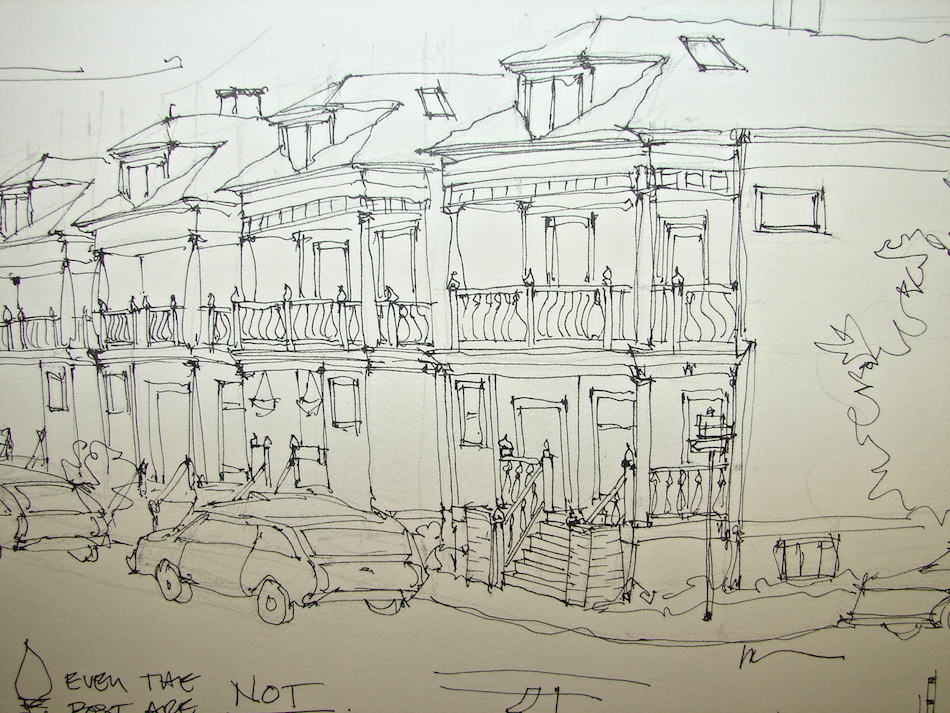
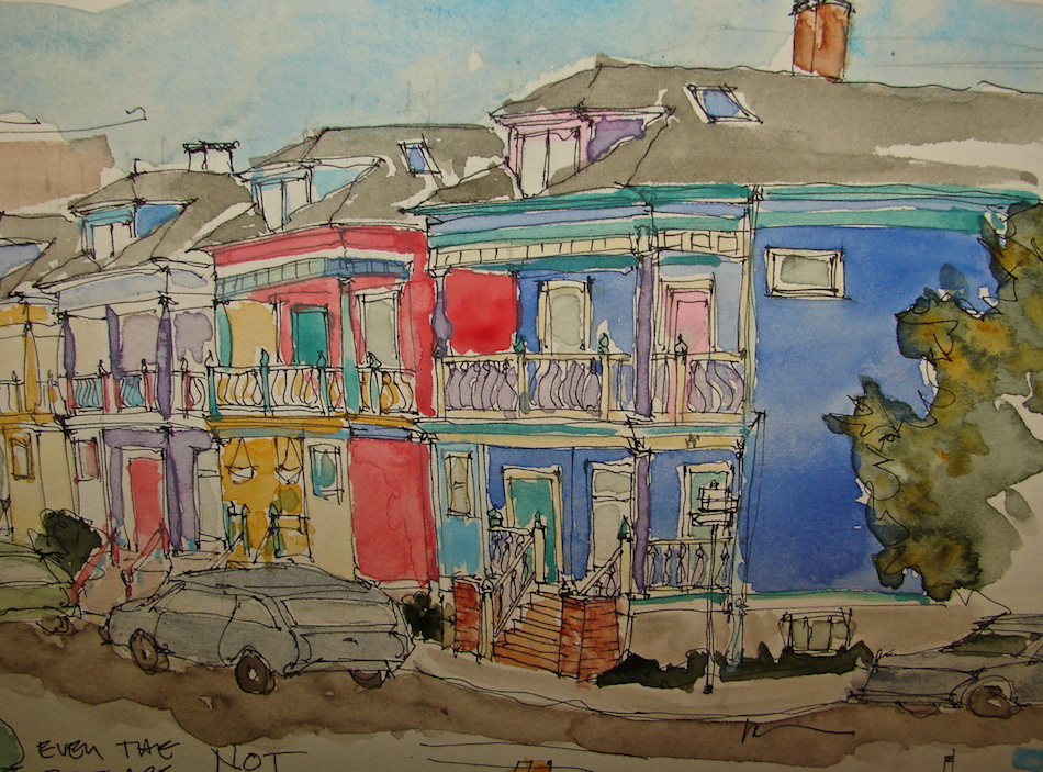
I also rethought the whole brush pen thing.  I haven’t used Roz Stendhal’s suggestion of brush pens though I bought them.  But maybe this is a good time to try.  It would be good to step up my watercolors to illustrate where Elisabetta and Miguel travel.

“Life itself is the proper binge.”  Julia Child

W15 4 1 IFJM 011Waking Mik up, sleepy man.  Off we go, our first overseas adventure for the book!

NELIPOT IFJM NELIPOT IFJM NELIPOT IFJM

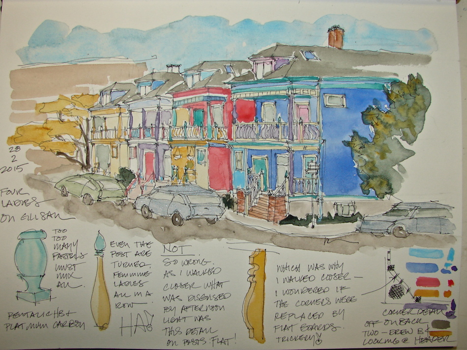
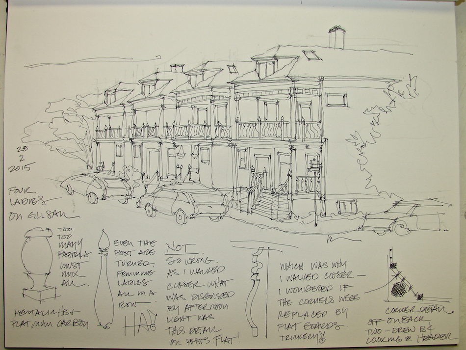
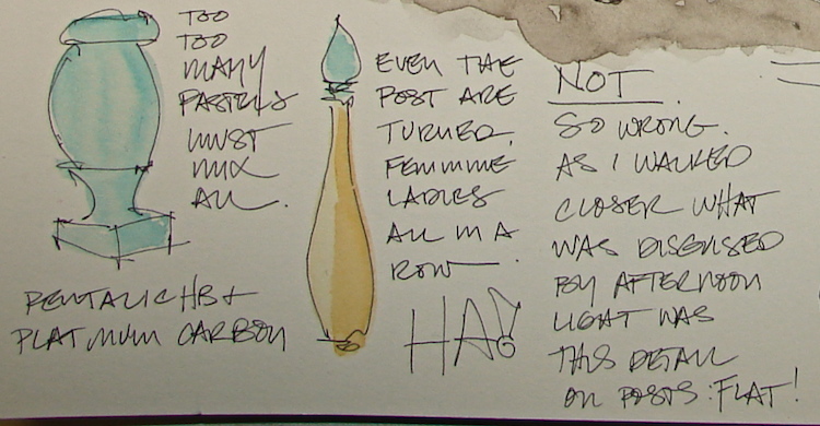
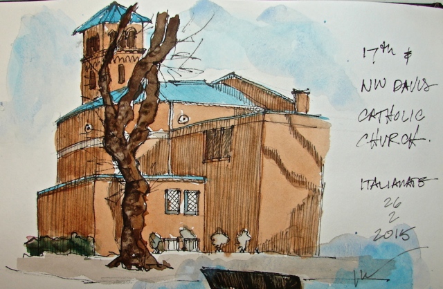
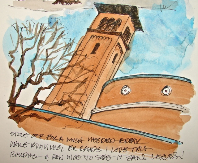
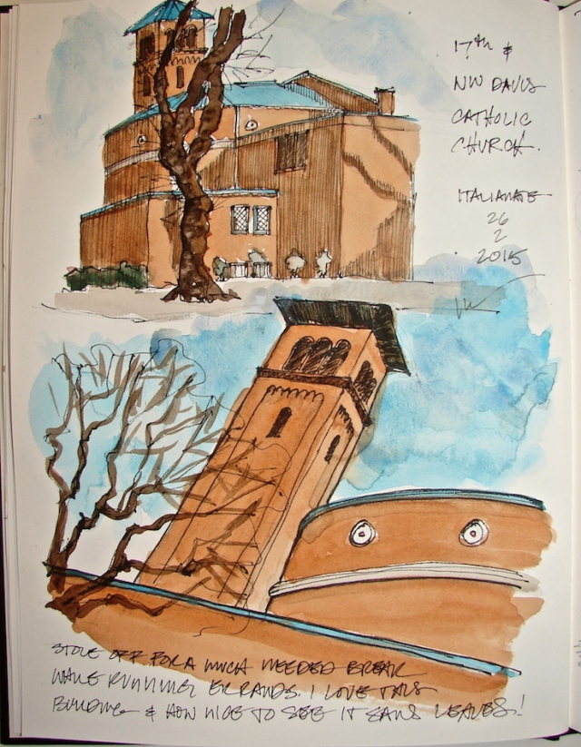
Moleskin 8×11 watercolor journal, Pentalic HB woodless pencil,
De Artramentis Document ink, and Daniel Smith, Holbien and QoR watercolors.

To follow the IFJM posts from the start, go here.

All my International Fake Journal Month posting are copyrighted.
It is unusual for me to not do Creative Commons but there is a reason.
My images/blog posts may be reposted; please link back to dkatiepowellart.

Posted in art journal, creativity, journal, painting, pen & ink, sketchbook, writing | Tagged , , , , , , | 15 Comments

Red Cat Buddha on RedBubble

ZAZEN RED CAT RB 001I have Red Zazen Cat Buddha
up on RedBubble!

And a handsome husband
who is willing to model
his shirts for me!

We have men’s, women’s,
tanks, and hoodies —
and other products as well!

DSC00006

Posted in making a living | Tagged , , , , | 2 Comments

Ganesha

W15 3 19 GANESHA RESINGanesha is calling again.  Maybe it is spring, new beginning?

If you want to know how far you can get by regularly practicing watercolor,
take a look at my favorite small resin Ganesha in February 2014 and in July 2014!
Getting closer to what I want to see!

Pentalic Nature Sketch Journal, and BTW, this is not the same as the more expensive watercolor book from Pentalic.  I’ve enjoyed this sketchbook, 130lb drawing paper, and the only thing that stops me from buying more of them is that I love the Aquabee better!
Created with a Pentalic 2B woodless pencil, Platinum Preppie Pen,
and Daniel Smith and Holbein watercolor paints.


I agree to Creative Commons Attribution-Non-Commercial 4.0 International License, which you can learn more about by visiting the site, or,
visit my web page for a more user-friendly summary on my terms.
My images/blog posts may be reposted; please link back to dkatiepowellart.

Posted in art journal, gods and goddesses, graphite, painting, pen & ink, sketchbook, watercolor | Tagged , , , , , , , , , , , , , | 2 Comments

April is International Fake Journal Month

BostonFAKERectangle200If Roz Stendahl has taught me anything it is that
you can make up a Thing for  Month and declare it
and before long people will believe It Is So.
April is International Fake Journal Month
(IFJM, for the cool kids.)

This is my first year participating.  Last year I was well into the A to Z challenge and found Roz and wished
I’d seen this, because it is right up my alley.
For one month, I will be journaling as another character doing something completely FAKE. The only way you will know is the beginning of my blog posts will be labeled:

“IFJM: April Fool’s Day” (or whatever day it is).

After that, there will be no clue — I will write and make art as if I am that person
doing THAT thing!  You can do it too.  It’s not too late.  You can do art or write
(so no pressure if you are not an artist), and for those of you who want to do A to Z you can also incorporate this into that!  Find out all about IFJM!  Don’t be intimidated just because some folks are artists — some are not and they have a blast!  You writers can doodle if you think you can’t make art (I’m thinking of Sammy and Daniel . . . )  Come play with us!

BTW, if you don’t have a blog you can also post through Facebook on the IFJM page!

2015_IFJM_Button3_200The theme or catch phrase this year is:considered truths

I will be using a moleskin, my first moleskin (so good for travel) and using a Pentalic  woodless pencil, Platinum Carbon pens, other pens with whatever ink I can find along the road, and Daniel Smith watercolors — when I can.  It’s hard traveling with all that gear!  (HINT.  HINT.)

Eventually my entire month will be put onto a separate page, but for now the pages will stand alone as if it were me.  Which it is.  Kinda sorta!  I am out the door to buy my tickets!  (HINT.  HINT.)

Gads this is like playing as a child! SO FUN!

Note: Roz Stendahl’s normal blog is Roz Wound Up.
You should visit.  She’s a great blogger!

NELIPOT IFJM NELIPOT IFJM NELIPOT IFJM

All my International Fake Journal Month posting are copyrighted.
It is unusual for me to not do Creative Commons but there is a reason.
My images/blog posts may be reposted; please link back to dkatiepowellart.

Posted in art journal | 10 Comments

USk: Glisan’s Painted Ladies

W15 2 28 GLISAN LADIES 4I drive by these painted ladies several times a week, always thinking I should give them a go.  The complicated details and the colors were a challenge for me to do loosely and not too “architectural.”   I wanted them to look like a watercolor, not a building drawing.

W15 2 28 GLISAN LADIES 2I stationed myself across the street.  I started with guidelines in pencil, and let go of a
two point perspective and let it be as if all the buildings were eye level as they go back.
If you enlarge the drawing you can see that I drew quite a few guidelines before
I began inking.  I was concerned primarily with giving a place for the details of the
houses to sit, and this lack of paying attention got me into a bit of trouble, below.

Screen Shot 2015-03-15 at 1.06.04 PM copyI admit I assumed that all the
houses were the same except in color.
A LESSON IN LOOKING.  They are of two flipped designs, which I saw clearly as I began drawing details but too late.
(See a detail from Google maps.)
Next time!  And there will be a
next time, soon, because these houses
have everything that challenges
me: complicated detail,
variables, even the Easter colors!

W15 2 28 GLISAN LADIES 7Another surprise which I caught while drawing the details was the bannister posts.
Due to the sun and shadows at first they appeared to be turned posts, which I made note of above.  However, as I was drawing the first corners with the columns behind the angled bannister, I noticed that the posts may have been replaced, as they were not turned.
Then as I went a bit further I noticed they appeared board-flat on all the corners.  I walked over to look closely.  What appeared turned posts from afar were actually posts cut on one side only to give the illusion of turned posts, below — a cost-saving measure, I am sure.

W15 2 28 GLISAN LADIES 6I mostly inked on site, then added watercolor in the studio.  I had to mix many colors.

I’ve been asked about adding watercolors to a good drawing and “ruining” it —
but this is my interest.  I can draw in several styles, and from any perspective:
worm’s eye, bird’s eye, exploding axonometrics, you name it!
I was the go-to girl in the office for complicated inked drawings!  However, I am interested in learning watercolors, and so I do “ruin” the occasional drawing.  This one is a bit blotchy, and as I am finding styles and trying not to paint like a coloring book I also had to choose when to let white paper show, and in both of these cases I was not always spot on.  I have learned not to try to go back in and correct — I’ll do this again sometime soon!
Still I like it and see that I’ve come rather far in this year of practice!

W15 2 28 GLISAN LADIES 3 W15 2 28 GLISAN LADIES 9Drawn in an Strathmore Mixed Media journal with Pentalic HB woodless pencil,
Platinum Carbon pens and Daniel Smith, Holbein and Sennelier watercolors.


I agree to Creative Commons Attribution-Non-Commercial 4.0 International License, which you can learn more about by visiting the site, or,
visit my web page for a more user-friendly summary on my terms.
My images/blog posts may be reposted; please link back to dkatiepowellart.

Posted in architecture, art journal, drawing, graphite, painting, pen & ink, pencil, sketchbook, urban sketchers, watercolor | Tagged , , , , , , , , , , , , , , , | 7 Comments

Good Question of the Week: Desert Island Brush Choice

I have favorite acrylic brushes, but as I am only one year into watercolors I haven’t a favorite watercolor brush. Truth be told, I haven’t spent money on brushes YET. But Marc has shared his thought on favorite brushes, and here is his “Desert Island Brush Choice” — food for thought!

Marc Taro Holmes's avatarCitizen Sketcher

A person taking my Craftsy.com People in Motion class recently asked a classic question in a creative way.

“Hi Marc. I’m enjoying your course and so great to see you demonstrating your techniques after following your blog. If I can please ask you. if I had only one brush (to take to a desert island) what size and kind would it be?”

Short Answer: This is a great question – and very hard to answer. But considering you are asking about travel – I’m going say it would be a #10 Da Vinci Maestro Series 1503 Travel Brush

The thing I love about a good sable brush – it has both a super sharp point, and at the same time, holds enough water to lay on it’s side and make a big shape. You can do an entire painting with this brush, from biggest shapes to smallest detail –…

View original post 313 more words

Posted in class, paint brush, watercolor | Tagged | 1 Comment

Review: Pentalic Field Book

W15 3 9 THAI BUDDHA 001

I did a quick sketch to try out my new Pentalic Field Book.  140lb. Acid Free;
Cold Pressed; Exceptional wet strength; Professional grade watercolor paper.

I love their pencils — my favorite — and they are an Oregon company:
I wanted to love this book.  I’m not fond of the paper, however.
I admit I didn’t do a lick of investigation, just bought two books on sale from NYC.  Ooops!
I Searched for other reviews this morning and found two:  Amazon, and Roz Stendahl reviewed three Pentalic journals, and none of the reviews were good.
(You can search for Pentalic in her search feature.)

W15 3 9 THAI BUDDHA 002

I used the same techniques of adding watercolor on top of slightly damp paper, and
then dry paper.  It is the same layering technique I used in the deities below on a less expensive paper, an Aquabee Super Deluxe Journal, which is only 93lb drawing paper.  Yet the Aquabee (and also Strathmore’s watercolor journals) can take several layers of paint without washing out and rejecting the pigment.  Possibly sizing?

I like his face, but I was unable to get the buildup and depth of color —
the paper kept either streaking, rejecting, or moving the paint oddly.
Finally I just went to town and had my way, splish-splash all over.

W15 3 10 THAI BUDDHA 001W15 3 10 THAI BUDDHA 002I did another test where
I “washed” the paper before
I began building color.
I’ve never done that before — but thought to try that.
I did a quick pen sketch
and started splashing color, Thai Buddha #3,
above and right.
The pigment does not adhere
to the paper at all!
Every layer washes it up
and pushes it around.

Further, usually when you begin washing a paper with watercolor, as long as it is a bit damp, the wet paint does not lay on top of the paper.  On this Pentalic paper it continued to sit on the top of the paper and puddle — so easily, or worse, streaked immediately!

pentalic tests

I tried other pens and inks in it, as well as one of my watercolor pencils and the Neocolor watercolor sticks.  Many inks feather; this is really  not a good journal for anything I use.

I will stick this journal by the side of the bed for midnight sketches
and color swatches, and that is not an indication of a journal I value.
Use it up and move it OUT!

DSC03731

Created in a Pentalic Field Book with Pentalic HB pencil,
various pens including the Platinum Carbon Pen + ink and Daniel Smith watercolors.


I agree to Creative Commons Attribution-Non-Commercial 4.0 International License, which you can learn more about by visiting the site, or,
visit my web page for a more user-friendly summary on my terms.
My images/blog posts may be reposted; please link back to dkatiepowellart.

Posted in art journal, Buddha, gods and goddesses, journal, painting, paper, pen & ink, pencil, process, review, sketchbook, watercolor | Tagged , , , , , , , , , , , , , , , | 2 Comments

USk: Montavilla Sewing Center and DEQ

W15 2 MONTAVILLA 001

Mitchell sews on machines;
I do not.  I used to follow him around
for a while at the sewing centers
and drive him crazy behaving
like a five-year-old, then go sit with the
husbands waiting for their wives.
Now I have a new choice.
I take my sketchbook and sketch away.
I still had time to follow him around
and behave like a five-year-old
(I don’t want him to feel neglected)
then sketch one of the men working at the desk repairing an overlocking machine.
YES, the sewing repair desk walls are
bright cobalt blue and the desk is
purple with a bright yellow lamp!

First time using watercolors onsite.  Not so easy, and messy-messy.
I still like inking onsite better, and not having to deal with messy watercolors.

W15 3 USK DEQ 001

Running errands and waiting is
also not so problematic anymore.
I always have a sketchbook with me
and so I am never bored.
I may be a journal snob,
but I think engaging the world
around me is better than sitting
with my nose in a smart phone.
I can’t believe the number of people
who never look up anymore —
not in lines, not over breakfast out,
not even with their mates or kids,
not walking and not while driving!

Drawn in an Strathmore Mixed Media journal with Pentalic graphite pencil,
De Artramentis Document ink, and Daniel Smith watercolors.


I agree to Creative Commons Attribution-Non-Commercial 4.0 International License, which you can learn more about by visiting the site, or,
visit my web page for a more user-friendly summary on my terms.
My images/blog posts may be reposted; please link back to dkatiepowellart.

Posted in art journal, drawing, graphite, journal, painting, pen & ink, sketchbook, urban sketchers, waterbrush, watercolor | Tagged , , , , , , , , , , , | 2 Comments

USk: 17th and NW Davis

W15 2 26 CATHOLIC CHURCH 002

I’ve approached these buildings, which are part of the St. Mary’s Cathedral of the Immaculate Conception complex, dozens of times.  Needing a break from bidding I stole away to sit in the car (easier to lay watercolors out) and do two sketches.
It was nice to be able to see the buildings without the tree leaves!
A little bit of Italy in Oregon . . .

W15 2 26 CATHOLIC CHURCH 004

Next time I will take the time to tackle giving the brickwork texture.
I admit to having never seen the church entrance.
I like the tower and the round shape of the building next to it.

W15 2 26 CATHOLIC CHURCH 001

Drawn in an Strathmore Mixed Media journal with Pentalic HB pencil,
various pens including the Platinum Carbon Pen + ink, and with De Artramentis Document ink (black), and Daniel Smith watercolors.


I agree to Creative Commons Attribution-Non-Commercial 4.0 International License, which you can learn more about by visiting the site, or,
visit my web page for a more user-friendly summary on my terms.
My images/blog posts may be reposted; please link back to dkatiepowellart.

Posted in art | Tagged , , , , , , , , , , , , , | 4 Comments

Turkish Tea and Art (Aydın Toprak Apaydın)

Turkish Tea and Art (Aydın Toprak Apaydın)

Love this!  Yes he did all these watercolors!

Posted in art journal | Leave a comment

Green Tara, One

W15 3 2 GREEN TARA 008

She is based on our Ganges River clay version of Green Tara.
A challenge for me, she is very colorful and detailed, AND,
I am still pushing for a loose wash effect.
Not completely happy with her but not bad for a first try.
She got a bit dark fast, and then I tried laying in a gold pen after.
If I am going to use gold (which is traditional) then I need a finer pen.
She shimmers in the right light.

W15 2 19 GARUDA WASH MIK IMAGE 001I have to admit choosing her
to paint was partly because I
just bought more amazing
Daniel Smith Primatek paints.
In addition to Amazonite
(in the turquoise green family) and Serpentine, I bought Diopside, Jadeite,
and the most compelling,
right, Green Apatite!
It has the most dramatic range
of separating colors ever!

I love green.  And I really need to move on to buying another color!

W15 3 2 GREEN TARA 006

How she looks without flash (above) and with flash (below) are dramatic.

W15 3 2 GREEN TARA 005

Aquabee Super Deluxe Journal, with a Pentalic 2B woodless pencil,
Platinum Preppie Pen, De Artramentis Document ink,
and Daniel Smith and Holbien watercolor paints.
Pilot Gold Marker, Extra Fine.


I agree to Creative Commons Attribution-Non-Commercial 4.0 International License, which you can learn more about by visiting the site, or,
visit my web page for a more user-friendly summary on my terms.
My images/blog posts may be reposted; please link back to dkatiepowellart.

Posted in art, art journal, Buddha, color, journal, process, sketchbook, watercolor | Tagged , , , , , , , , , , , , , , , , | 1 Comment

USk: 26th Street, WHAT IF?

W15 3 22 26th ST 001

Took a walk and sketched in our studio’s neighborhood, buildings I look at all the time.
I was able to sketch both of them, and it was a bit like old times, architectural sketches.
They are both shades of grey: ESCO’s is a dove grey, and Rejuvenation’s is a charcoal grey.
You can see the teeny swatches of the colors they actually are, above.

And below is the way I might have painted them below (Photoshopped in greys!)

W15 3 22 26th ST ESCO 004 BW W15 3 22 26th ST REJUVINATION 008 BW

BUT WHAT IF?

I am always painting buildings in Portland different colors in my mind.
This time I took my “what if” musings and decided to fool with the sketches
and paint them as I see them in my mind’s eye!

W15 3 22 26th ST ESCO 002 W15 3 22 26th ST ESCO 004

The shape of ESCO’s building is actually very modern.
Transport it to Venice Beach and paint it like it is above
(or perhaps another bright set of colors or white with a touch of red)
and someone would mistake it for a Sci-Arch project!.

W15 3 22 26th ST REJUVINATION 006W15 3 22 26th ST REJUVINATION 008

Rejuvenation (yes spelled wrong and apparently I did not know that!)
should paint their building a better color, for after all they are a company
that cares about design and they have this wonderful Art Deco warehouse building!
I tried it out in that lovely flamingo pink, but it would be equally gorgeous in
Miami blue or please even white.  It is a lead weight in that hematite color
(and I am a fan of that color, but please, not on that building!)

If I were Queen . . .

Drawn in an Strathmore Mixed Media journal with Pentalic HB woodless pencil,
various pens and with Lexington Grey Noodlers ink and Daniel Smith watercolors.


I agree to Creative Commons Attribution-Non-Commercial 4.0 International License, which you can learn more about by visiting the site, or,
visit my web page for a more user-friendly summary on my terms.
My images/blog posts may be reposted; please link back to dkatiepowellart.

Posted in architecture, art journal, color, creativity, journal, pen & ink, sketchbook, urban sketchers, watercolor | Tagged , , , , , , , , , , , , , , , | 5 Comments

Thai Buddha, One

W15 3 4 THAI BUDDHA 007

He is an unassuming little black resin Thai Buddha.
I see him in color, looking so sweet.

W15 3 4 THAI BUDDHA 006

Aquabee Super Deluxe Journal, with a Pentalic 2B woodless pencil,
Platinum Preppie Pen, De Artramentis Document ink,
and Daniel Smith and Holbien watercolor paints.


I agree to Creative Commons Attribution-Non-Commercial 4.0 International License, which you can learn more about by visiting the site, or,
visit my web page for a more user-friendly summary on my terms.
My images/blog posts may be reposted; please link back to dkatiepowellart.

Posted in art journal, color, drawing, journal, painting, pen & ink, process, sketchbook, watercolor | Tagged , , , , , , , , , | 4 Comments

Late Night: Cozy Catz and Lettering

2015 2 27 LETTERING PRACTICE 002
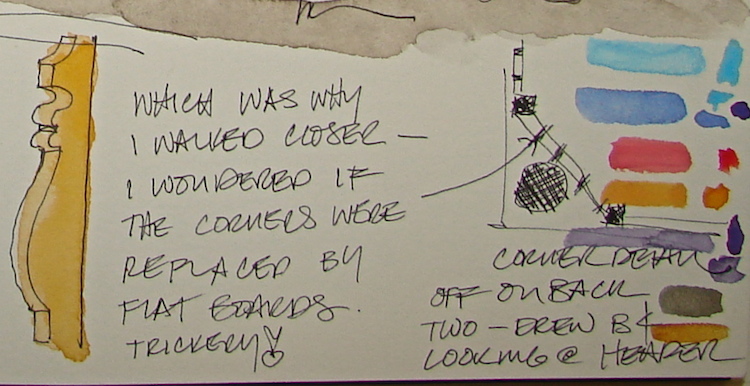
I am dissatisfied with my lettering.
I hear my mother’s voice telling me I used to have such nice lettering!
I know I never quite mastered architectural lettering, and now all of a sudden I care.  Geesh.  So I am practicing, calligraphy.  I have a Hero pen that makes it look easy!
I found fonts I love and made a cheat sheet to copy: BradleyHand, Jappaneese, The Cowboy Font.  Does anyone ever share their practice pages800px-NormsRestaurant_LaCienega?

I think I will give up on the “Googie” inspired George Jetson font, “Holiday Hardcore”.  It reminds me of college and late night munching at Norm’s
and the Holiday Bowl,
both designed by
Armét & Davis in 1957-1958.  Still, my version of the lettering is really awful.

2015 2 27 LETTERING PRACTICE 003

Bored with lettering, because really I am just trying to meet a goal and that is not too interesting — it feel like work, frankly, I turned to our sleeping mates.

I love our catz but cannot draw them well.
Tonight I tried to channel Roz Stendahl to get me started.
It’s not that I always want to copy her style, but sometimes I find you can break a stuckness by copying a style.  And since most of us can never really do another artist well, that style will eventually evolve into YOUR style!  I had some success.

W15 3 1 KAMALA WATCHING MRP 002

Kamala is the most difficult one to draw because she is a wild gurl and never holds still.
If she is sleeping and I decide to draw her somehow her sixth sense
picks it up and she moves her behind toward me.
Tonight I caught her watching her man, the one I happen to be married to.

W15 3 1 JAI SLEEPING 002W15 3 1 JAI SLEEPING 004

Jai is an old man, and I love him so — he has taken over the bed, and likes to get under covers.  I’m happiest with the last drawing of the night, of him.

And, the end to this sketchbook.  I love Stillman & Birn, but don’t like small hardbound sketchbooks.  Glad to say good-bye on a sweet note!

Stillman & Birn Alpha journal, with a Pentalic 2B woodless pencil,
Pentel Brush pen, Luma watercolor inks in brush pens, Platinum Preppie Pen, De Artramentis Document ink, and Daniel Smith watercolor paints.


I agree to Creative Commons Attribution-Non-Commercial 4.0 International License, which you can learn more about by visiting the site, or,
visit my web page for a more user-friendly summary on my terms.
My images/blog posts may be reposted; please link back to dkatiepowellart.
Norm’s image courtesy of Wikipedia.

Posted in architecture, art journal, calligraphy, drawing, memory, painting, sketchbook, watercolor | Tagged , , , , , , , , , , , , , | 4 Comments

The Audubon Society has blown my mind

Screen Shot 2015-02-26 at 5.55.30 AMThe Audubon Society has blown my mind with high-resolution images, hundreds of them, for us to see.  This is what all museums and societies should be doing, turning us on with the power of the internet through by opening their “doors” and letting us see what is in the back rooms.  Amazing images.  You must go see!


Posted in art | 6 Comments

The Cats of Richard Swarbrick

Thank You Ruthie!  Must see drawing animation, too kewl!

Posted in animation, art, creativity, drawing, watercolor | Tagged , , | 2 Comments

Red Zazen Cat on RedBubble

ZAZEN RED CAT RB 001

I put a few new item up on my RedBubble page
I needed a break from the bidding wars of our mainstream business!
Zazen Red Cat went up to satisfy a client!
Men and women’s clothing, totes, note cards, coffee accoutrements, etc.
Shameless advertising!
Must buy new sketchbooks!

IPHONE

IPHONE

TOTE

TOTE


Posted in Buddha, gods and goddesses, making a living | Tagged , , , , , , , , , , | 3 Comments

Ira Glass on Creativity

Applies to all the Creative Arts.

W15 2 8 ZAZEN CAT RED BANNER

Posted in creativity | Tagged | Leave a comment