
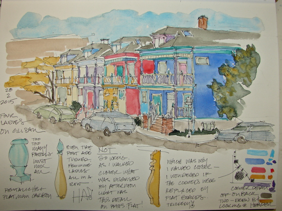
 I drive by these painted ladies several times a week, always thinking I should give them a go. The complicated details and the colors were a challenge for me to do loosely and not too “architectural.” I wanted them to look like a watercolor, not a building drawing.
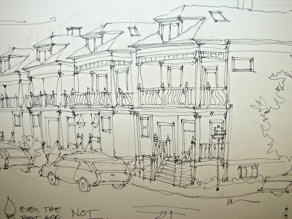
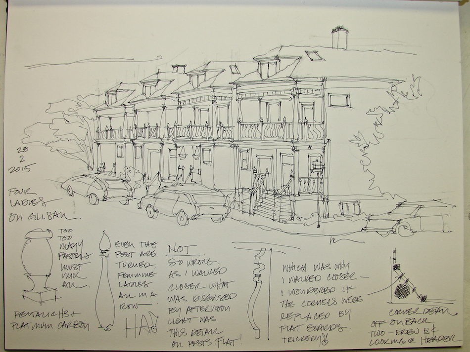 I stationed myself across the street. I started with guidelines in pencil, and let go of a
two point perspective and let it be as if all the buildings were eye level as they go back.
If you enlarge the drawing you can see that I drew quite a few guidelines before
I began inking. I was concerned primarily with giving a place for the details of the
houses to sit, and this lack of paying attention got me into a bit of trouble, below.
 I admit I assumed that all the
houses were the same except in color.
A LESSON IN LOOKING. They are of two flipped designs, which I saw clearly as I began drawing details but too late.
(See a detail from Google maps.)
Next time! And there will be a
next time, soon, because these houses
have everything that challenges
me: complicated detail,
variables, even the Easter colors!
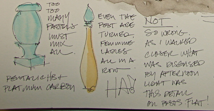 Another surprise which I caught while drawing the details was the bannister posts.
Due to the sun and shadows at first they appeared to be turned posts, which I made note of above. However, as I was drawing the first corners with the columns behind the angled bannister, I noticed that the posts may have been replaced, as they were not turned.
Then as I went a bit further I noticed they appeared board-flat on all the corners. I walked over to look closely. What appeared turned posts from afar were actually posts cut on one side only to give the illusion of turned posts, below — a cost-saving measure, I am sure.
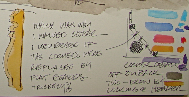 I mostly inked on site, then added watercolor in the studio. I had to mix many colors.
I’ve been asked about adding watercolors to a good drawing and “ruining” it —
but this is my interest. I can draw in several styles, and from any perspective:
worm’s eye, bird’s eye, exploding axonometrics, you name it!
I was the go-to girl in the office for complicated inked drawings! However, I am interested in learning watercolors, and so I do “ruin” the occasional drawing. This one is a bit blotchy, and as I am finding styles and trying not to paint like a coloring book I also had to choose when to let white paper show, and in both of these cases I was not always spot on. I have learned not to try to go back in and correct — I’ll do this again sometime soon!
Still I like it and see that I’ve come rather far in this year of practice!
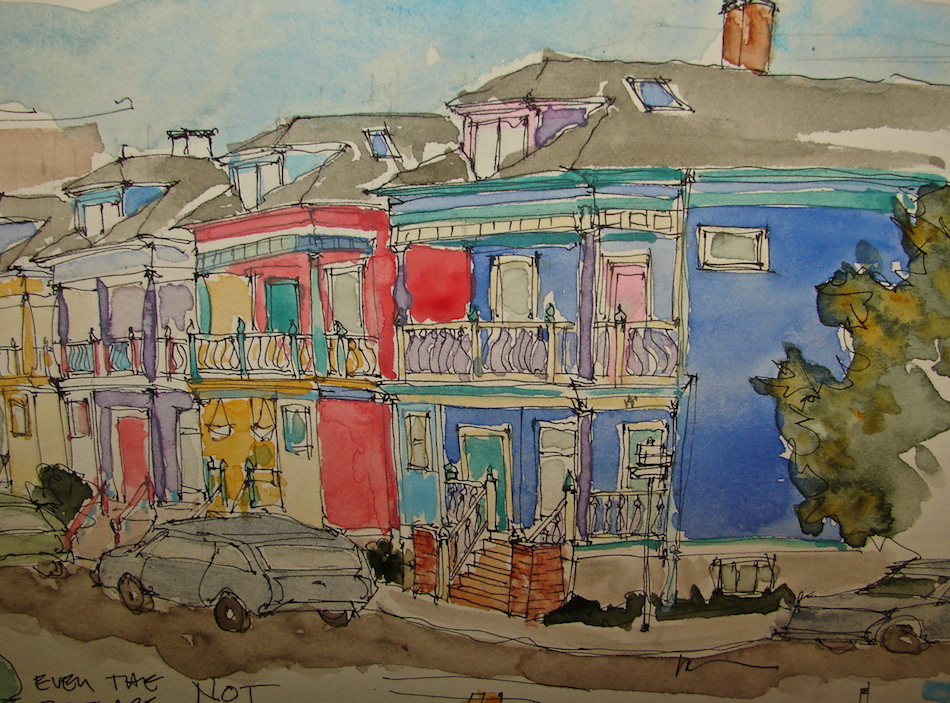 Drawn in an Strathmore Mixed Media journal with Pentalic HB woodless pencil,
Platinum Carbon pens and Daniel Smith, Holbein and Sennelier watercolors.

I agree to Creative Commons Attribution-Non-Commercial 4.0 International License, which you can learn more about by visiting the site, or,
visit my web page for a more user-friendly summary on my terms.
My images/blog posts may be reposted; please link back to dkatiepowellart.


I hate to keep recycling the same (or similar) comment but I find your ability to do this amazing. What a great way to document your world.
LikeLike
I never get tired of hearing compliments! I notice you are capturing my flickr posts — is it possible you’ve been bitten by the bug? Want to try sketching? I know Sammy is thinking about it!
LikeLike
Please come draw some of San Francisco’s painted ladies. 😀
LikeLike
Do you have a pull-out sofa? 🙂
LikeLiked by 1 person
Sadly, no. We live in a loft, and we don’t even have a closet. We’ve thought about moving now that our son is heading into the tween years, but the city is thwarting our attempts to find anything with rooms that is just as affordable as what we have. The mass exodus to Portland continues as the Bay Area cost of living skyrockets.
LikeLike
I so understand. We share a house with friends. Well if you move (or visit) Portland let’s meet!
LikeLiked by 1 person
Pingback: Tools: Watercolors | D.Katie Powell Art