This post is about taking
a sketch to a finished watercolor,
or an idea to a commissioned piece.
Sheree, a friend from high school, posted a photo of her banana tree, above left.


I was intrigued by the color, especially the many reds in the leaves.
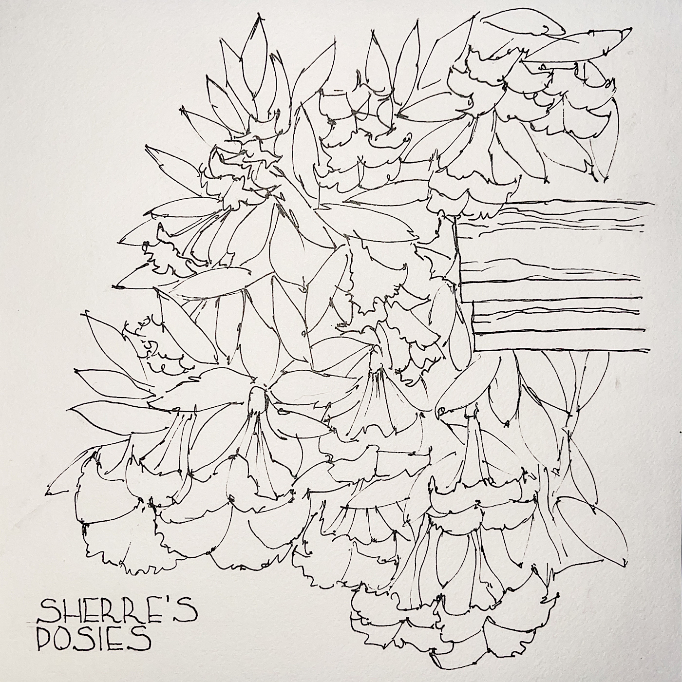
I created a VERY fast sketch in my Nostalgie sketchbook, which, while it is not specifically made for watercolors, does nicely when I am thinking about a piece.
I posted that in my personal feed.
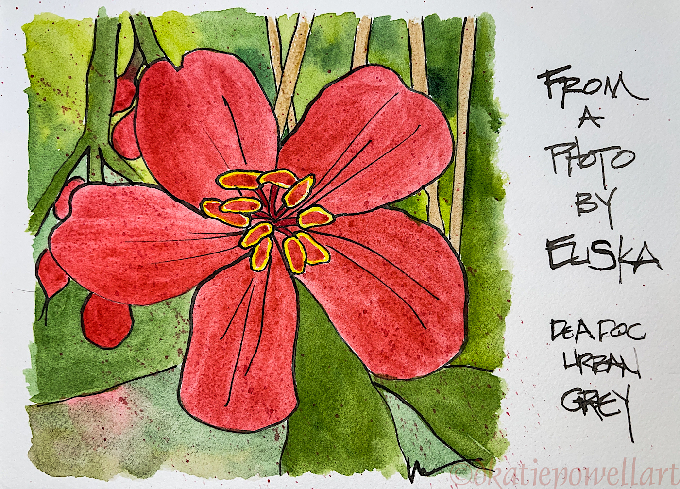
Sheree was going to make a print of the images for her new home, but I wanted to do a nicer one for her, and send the originals.


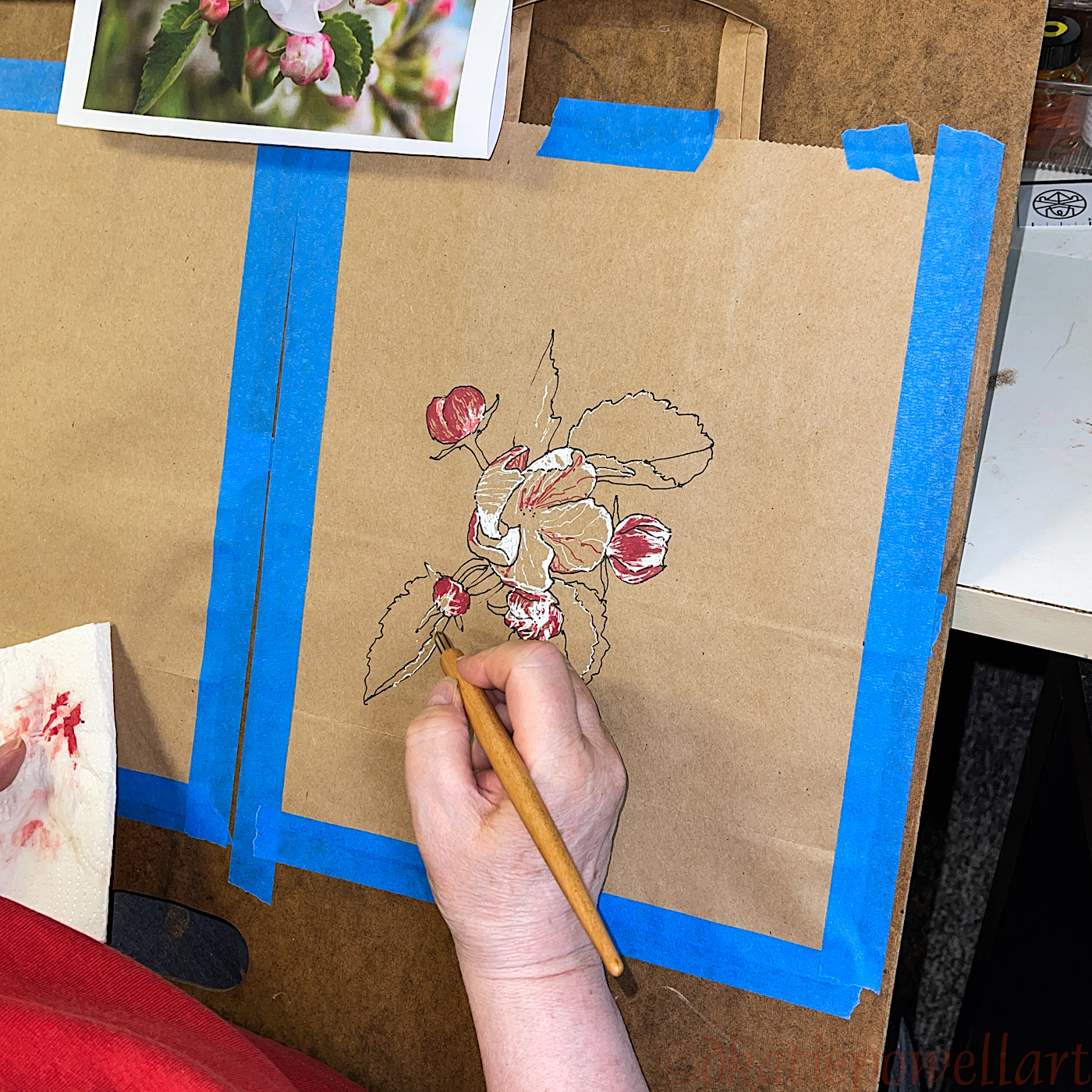
Started again with a watercolor pencil sketch, above. I used a rusty brown because it would be fine if it moved into the greens or the reds of the image.
I used my new Kakimori dip pen for the line work, above, and Super5 Australia ink. I love the Super5 inks as they are “off colors” meaning not a clear brown or ultramarine blue or perfect red. I find them more interesting to use in sketches. The Australia ink reminds me of the purple-reds in the Australian landscape.
The Kakimori nib allowed me to have fatter or skinnier lines depending on how I hold the pen: Straight up for thin lines, and adjusting down to achieve the fatter lines. (BTW, now that I’ve fallen in love with this brass version, I want the stainless steel version, as I understand that the lines can be even finer.)
I used a diluted waterproof brown ink in a waterbrush to lay in some of the areas where I would want shadow, below left.


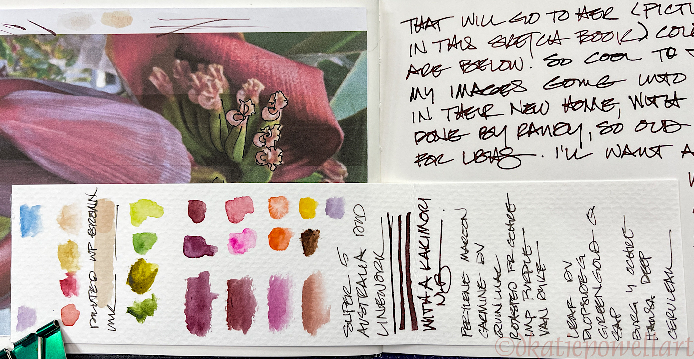
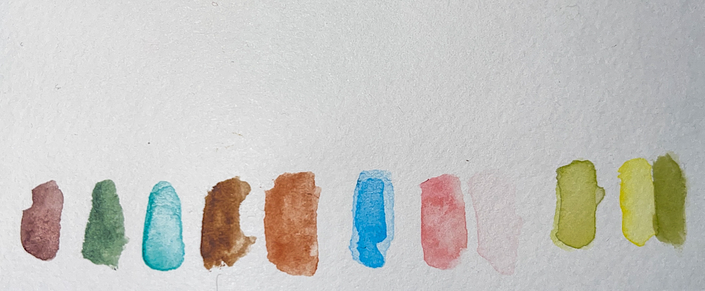
Then the watercolors began, and frankly, I cannot stop and shoot pics of the watercolors as easily. I need to move fast when they are wet if I want to use several colors in an area and have them blend — and I leave them to do that as they may, without trying to control them. If you look closely at the image and details you will see the many colors I used, plus I had a length of watercolor scrap paper above the image and placed dots of the colors as I used them, above.
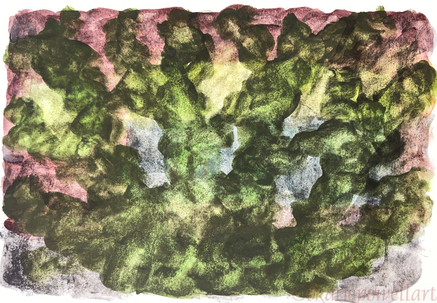
This image is leaving so I am placing notes with a photo in my sketchbook, above.

The colors change with the light, as you can
see from the one above and the one below.
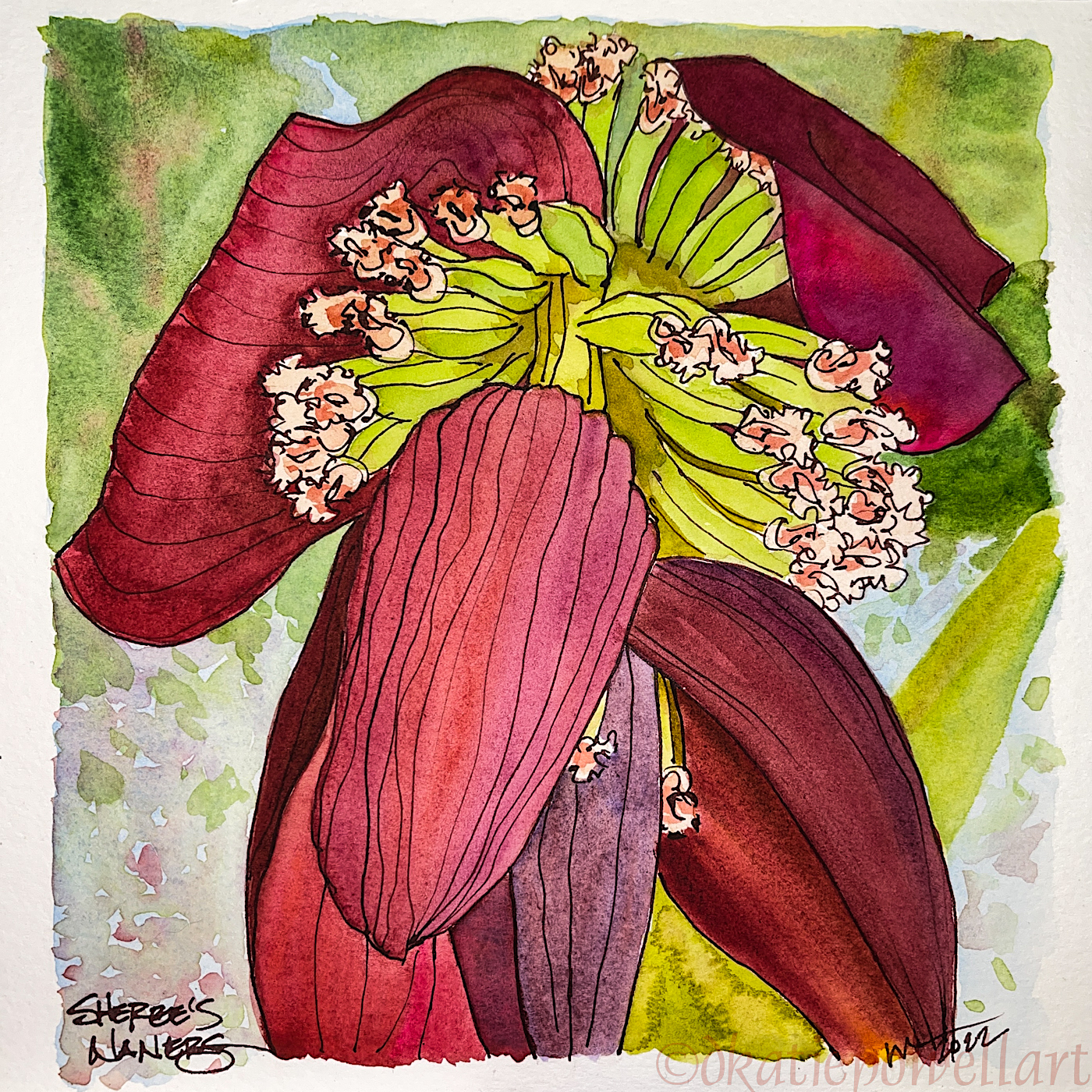


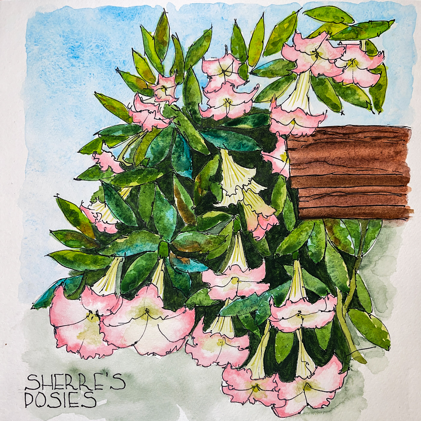
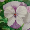
Sheree is putting this image along with the image Sheree’s Posies, below, on her wall in her new home. Another friend, Randy Boyd, a talented designer is doing their interiors. It is old home week for Laguna Beach grads!
I am available for commissions!
(Damn. If only I’d spelled Sheree’s name correctly on the floral image below! I had NO idea anyone but me would see these and I am horribly dyslexic — and if you understand dyslexia you will know you can’t SEE a mistake easily. So there you go…)
The post on the first image of the trumpet flowers can be found here.


☾
 To hear about classes, follow me on Facebook
or check out my new, improved dkatiepowellart.com
“Memory is more indelible than ink.”
Anita Loos, Gentlemen Prefer Blondes.
“I think not….”
Me… why I journal!
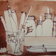
Hahnemühle Nostalgie Sketchbook, Fluid Watercolor block,
Brass Kakimori nib dipped in Super5 Australia ink,
De Atramentis Document Brown ink in Pentel Aquash waterbrushes,
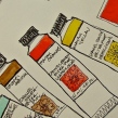
Sennelier, Holbein and Daniel Smith Watercolors.


©D. Katie Powell.
My images/blog posts may be reposted; please link back to dkatiepowellart.
Note: As an Amazon Associate I earn from qualifying purchases.
☾
 As my Patreon supporter, you will have
access to some content not on this website,
sneak previews, goodies, discounts on classes.
I teach architectural sketching,
art journaling (art+writing), creativity, watercolors.
That annoying loud-mouth editor/critic in your head? GONE! How great would that be?