Lojong: All Dharma Agree

I’ve studied through the slogans a dozen times in my life;
these are my musings on the slogan currently, not a formal interpretation.
For that reason they are less about straight Buddhist teachings,
and I think able to be shared with most practitioners of other faiths or no faith
(unless yours doesn’t allow you to read any other tradition.) 

If you have time and the inclination, I published the WHOLE  thang here!


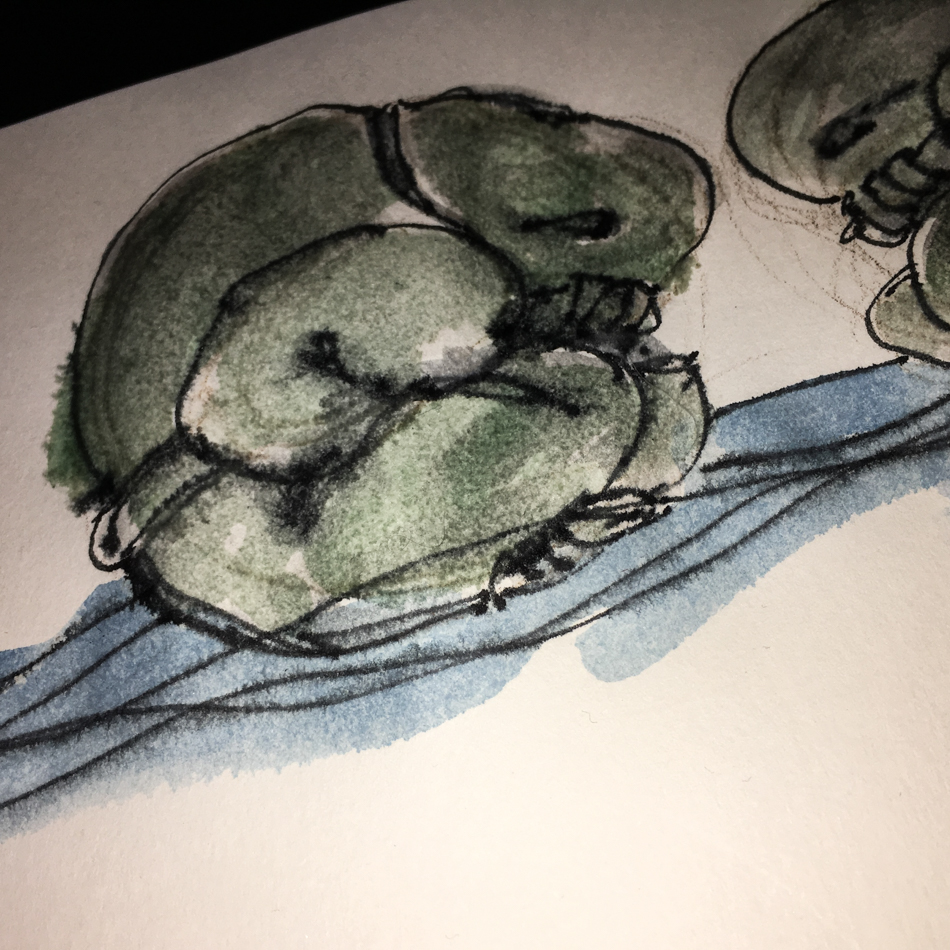
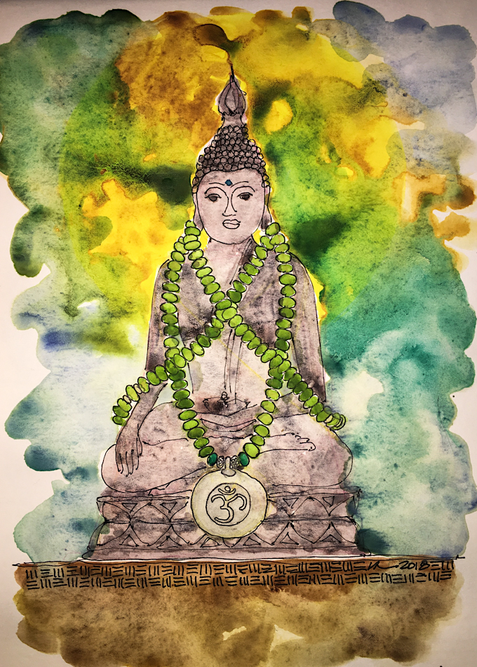
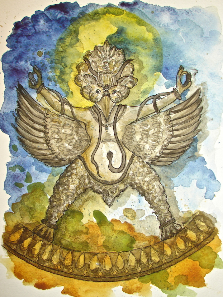
I thought I might want to let go of drawing my Buddha Ball
*for those of you new here I mean that affectionately*
but I think I have more studies to make… now i wish I had great paper!

“19: All Dharma agree at one point.”

I’m no master and letting go of ego-clinging seems overwhelming.

I can, however, observe the manifestations of my ego-clinging and these I can work with…
They are the various situations that I cling to for comfort, believing that if they were as they should be then all would be alright in the world.  Ego knows best!  Hah!

If you don’t believe me I was thinking about the big one, money, because really,
who doesn’t agree that money solves some of the very real needs in our life and
can make our lives better especially if we are not rich… and I use rich because of the thinking I’ve done about this since I wrote the entry a couple days ago.

  We are not rich, and since the Great Recession, nearly losing our business
(everyone stopped projects or backed away for a long time)
we are uncomfortable in not having our deep backups of savings.
This caused me no end of worry because I am the one looking at the bank account
and paying the bills in our business… and anyone would feel that way if
they were living on the edge, with no savings (okay, except a young person
who is just starting out) so this seems so reasonable, right?

 But the thing is, that even then worrying didn’t help the situation
and gave me sleepless nights and a lot of stress.
Worrying did not bring clients to the door.
And the odd thing, is that after the scare, we always had exactly what we needed…
After cutting back and downsizing (practical actions) we met our bills…
We found our way to an excellent space that was better than before…
We sometimes laughed our heads off at living and working like kids again…
(this is the wealth of a great life with a great mate  even in dire times)
Projects started coming because I did the marketing and kept at it and
didn’t let fear make me hide under the covers (though times I wanted to do exactly that).

I want you to know that through it all Mitchell said,
“We will be taken care of, trust the Universe.”.

Now here is the kicker… We are doing well now, still not rich.
We are booked out for the year and are lining up jobs as we speak for next year.
And I still run fear and lack at least once a day…
I have to fight the clinging that starts running that we haven’t enough,
that the savings has not been replaced, the what-ifs, the fear fear fear…  argh!
I talk myself down from the ledge reminding myself that we are wealthy,
that we are taken care of, and this is now not the future and
be here now for this fabulous life…

More examples can be read in my journal entry!

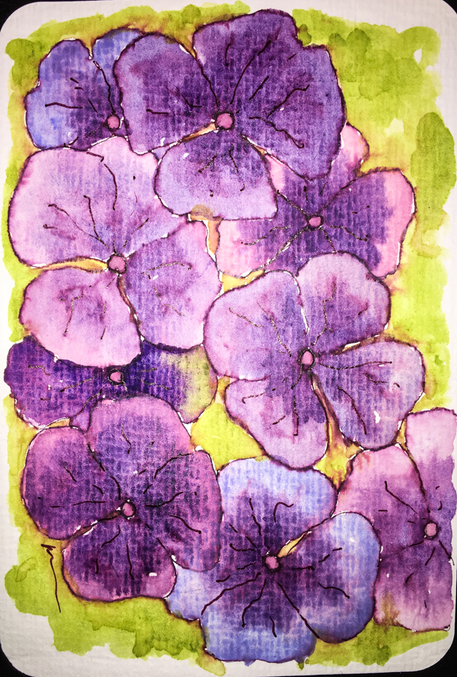
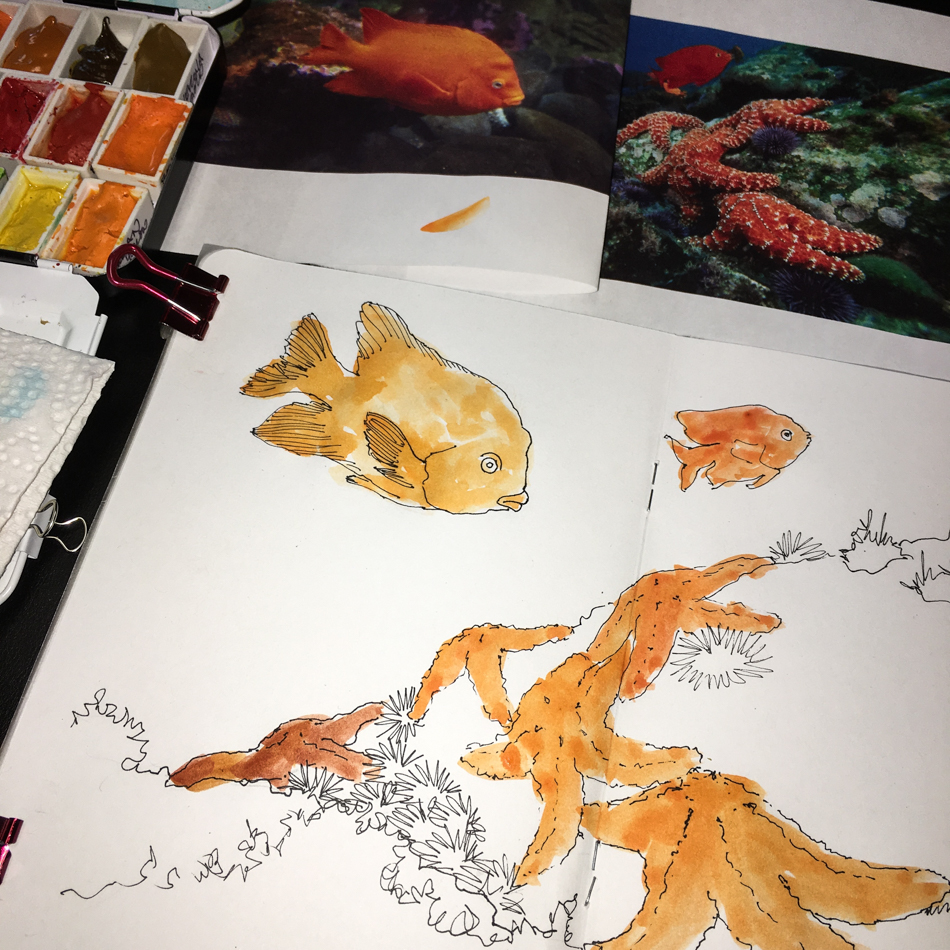
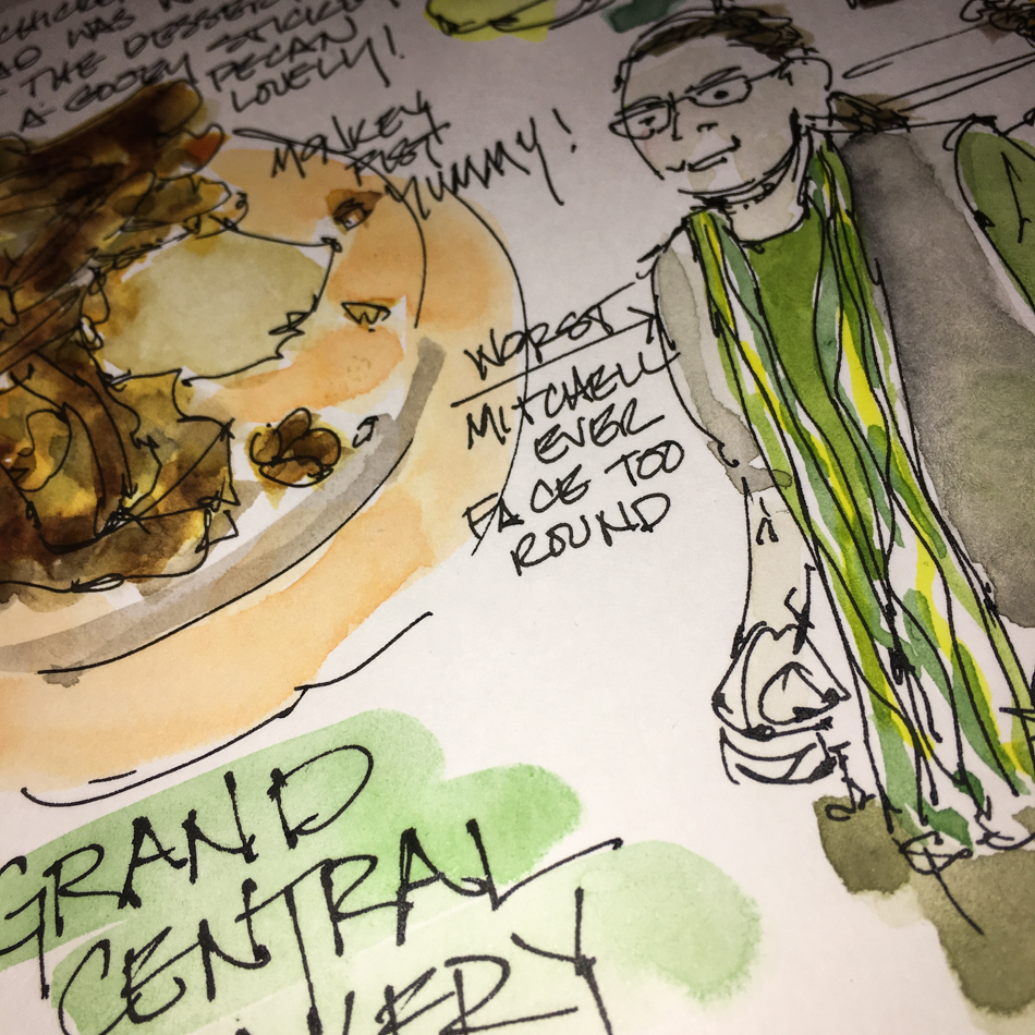
Okina Journal, with pen and ink, and watercolor.

Posted in art, Buddha, journal, lojong, meditation, pen & ink, ritual, tonglen, watercolor | Tagged , , , , , , , , , , , | 4 Comments

Shells


Middle of the night Shells; ink and watercolor.

To hear about classes, follow me on Facebook
or check out my new, improved dkatiepowellart.com

Posted in art journal, creativity, drawing, ink painting, journal, painting, pen & ink, sketchbook, watercolor | Tagged , , , , , , , , , , , , | Leave a comment

Pink and Orange Posies


New Nostalgie Journal… at the new moon I played with pen and a wet brush
and moved the Nemosine inks around…
After they dried I added watercolor to deepen.
Made up flowers are posies!  I try to do SOMETHING daily!

I like the cropped squares better than the original!
All this playing around is teaching me things…
*and makes pages in my written journal so pretty*
I still don’t have the hang of mixing the Da Vinci Leaf Green
with other colors… it does odd things!!

To hear about classes, follow me on Facebook
or check out my new, improved dkatiepowellart.com

Posted in art journal, color, ink painting, journal, painting, pen & ink, sketchbook, watercolor | Tagged , , , , , , , , , , , , , , , , , , | 6 Comments

Hahnemühle Post Cards, 8, Hydrangeas

Hydrangeas are on my mind;
my mom loves them and the post cards cheer her!


I made these to send to her.
This one was watercolors and Platinum Lavender ink,
which runs just a little when touched with water.


This one used Diamine Regency Blue, which is a purple-blue,
and moves when touched by a wet brush so is lovely to paint with.
I added DS Imperial Purple, Quin Pink, and the background is DV Leaf.

I found out from Hahnemühle there are dealers in the US that
sell the post cards but do not list them on their websites.
Silly people… I’ve been buying from Jackson’s in the UK!
I invite everyone to contact those dealers and ask them to list it on their websites:
ARCH SUPPLIES – San Francisco, CA- Ph 415-433-2724,
ARTISAN / SANTA FE INC – Ph 505-954-4179
CALIFORNIA ART SUPPLY – San Mateo, CA – Ph 650-350-1990
FLAX ART & DESIGN – San Mateo, CA – Ph 510-867-2324
JERRY’S ARTARAMA – NJ – Ph 973-669-0995
LENZ ARTS, INC – Santa Cruz, CA 831-423-1935

To hear about classes, follow me on Facebook!

Posted in art, cards, ink painting, painting, pen & ink, watercolor | Tagged , , , , , , , , , | Leave a comment

Lojong: How to Live and Die

For most of you these postings will be a departure from my normal artful posts,
but for some who follow zenkatwrites, they will be familiar.
This is an unfinished lojong (Buddhist) journal I was in the middle of when
work and committing to learning watercolors took center stage.
I still practiced tonglen (breathwork) and read a lojong slogan every day,
but I wasn’t taking the time to write once a week, going a bit deeper.
Now I am ready to commit to that again, and will post (usually) on Thursday.

I’ve studied the slogans a dozen times in my life;
these are my musings on the slogan currently, not a formal interpretation.
For that reason they are less about strict dharma teachings,
and I think able to be shared with most practitioners of other faiths or no faith.

If you have time and the inclination, I published the WHOLE thang here!


I had a belly laugh at the irony of starting back and this being the slogan
up for today, as it is all about how to live and how to die.
This month we’ve learned of many deaths,
some close to us, some partners/family of business associates.
And there were near misses, and that news was joyfully celebrated!

The slogan is:
#18: The Mahayana instruction for ejection of
consciousness at death is the five strengths.” 

or, and Pema Chodron says:
“Heart instructions on how to live and how to die.”

The five strengths are (and you can read more on each at the end, here):
1) strong determination (an “appetite for enlightenment”);
2) familiarization;
3) seeds of virtue (a tremendous yearning toward wakefulness);
4) reproach (as in reproaching your ego); and
5) aspiration (Boddhisatva vow).

My writing for today is a reflection on the timeliness of the slogan.
I don’t know if you can read my handwriting, here it is:

“There are no accidents.  I’ve not done formal study for months,
though I practice the breath*.   I felt an urge to return as we are hit with the
news of Lisa’s death, and the threat of death looms around us in near misses,
and the news — a virulent form of the flu and global catastrophe. 
Mitchell and I are concurrently discussing death in the form of wills and life insurance… coincidence?  Is it in the stars?  Slogan #18 is about preparing for death as a way to live, and it is!  I know!  My former husband died suddenly in the midst of my p’howa and tonglen studies, and the lessons of impermanence (experienced) never faded, but are part of my daily thought, effecting my actions.  If I fall asleep next to Mitchell without saying goodnight, when I wake a bit later and he is asleep, I stoke his arm and tell him how much I love him, a small gesture that has ritual force because of love and intention.”

To expand a bit, I think without some form of strong practice in mindfulness,
when a loved one dies suddenly you do not remember that each day may be your last with every person.  That soon fades into the background because for most people they think it is morbid to be aware.  It is not.  I don’t feel depressed knowing that it might happen, anymore than talking to my mom about her death (she is 95) feels morbid.  It just is part of my consciousness now, and it allows me not to be an ass for long if I lose my temper.
I come back, because I don’t want that to be my last words to anyone ever.
I wish I were so masterful as to never be an ass, but I’m not there yet!

*Note: Lojong is the written text, the slogans;
the breath is Tonglen, a meditation practice.

Okina Journal, with pen and ink, this week Super5 Australia in a Conklin stub pen.

Posted in art, Buddha, journal, lojong, meditation, pen & ink, ritual, tonglen, watercolor | Tagged , , , , , , , , , , | 4 Comments

Sketchbook Project: My Prayer for our Ocean


Last night I mailed in my submission to the Sketchbook Project,
the project out of Brooklyn whereby people from all over the world buy a small sketchbook, fill it, choose to have it imaged or not, and it becomes part of the museum and/or travels the country! My subject is Underwater, a topic near and dear to my heart.

I grew up in Laguna Beach, California.
My relationship with the ocean was formed in an area that spanned from
Doheny State Park (before they ruined it with that damn marina) to Balboa Island.
Water, swimming, shells, and sea creatures occupied my life from 9 to 20.

A blessed life!

I am SO upset about what is happening to our oceans…
The sadness has been building for years.  Somehow current political events are making me lose hope that “we” will never wake up.  I don’t know why people think that fouling their waters is a good idea… My brother Patrick was a hiker and taught me never to pee in the woods within sight of a body of water precisely because that same water could be your drinking water.  If it makes sense to a 5-year-old hiking with her brother then it should make sense to grownups the world over.  I thought that maybe people had to hear my  story, and maybe a fire would be lite to stop abusing the ocean (and the planet!)

This is my Prayer for our Ocean; click through to see it larger.


Places where you can find ways to help:
www.greenpeace.org
www.theoceancleanup.com
https://seaturtles.org
https://coralrestoration.org
http://oceana.org
http://the farmproject.com

Things you can do to help our oceans:
I include a good list of what needs to be done to change where we are headed.
And lest you think you can’t do what has to be done, it is only a matter of how much of a polite pain in the backside you want to become.  It is not enough to choose wisely, you need to talk about your choices so that becomes an important conversation you have with others.  Supermarkets do listen… be the squeaky wheel.  And while being polite, say these things so others can overhear them… Then they become interested.  I believe MOST people (not politicians but normal people) will do the right thing given the chance.

I’ve been battling our local chain for years for to make a choice about Certified  Humane meats, which are also usually organic (or lower impact) and sustainably raised.
I talked to the various meat workers about it, even if they rolled their eyes (but not when the lines were deep) and gave them information on what I wanted them to buy.  I wrote letters.  This month, they are finally dropping Draper’s (bruised chickens = tortured chickens) and moving to Smart Chicken, which is Certified Humane, and affordable.
I didn’t say cheap, but $3/lb for organic humane chicken is not bad…
We eat less meat now anyway than we used to eat, make it stretch into other
bean and rice dishes, and so two chickens can make six days worth of meals..
You can make a difference… but you have to get fired up.
Reduce your carbon footprint!
Protect endangered species and other animals in your area!

The sketchbook: I set myself design parameters, that is, I worked with the
poor paper and made it sing as best I could, and used only a few other items tipped in or pasted in, mostly because of the writing going straight through the thin paper.


To hear about classes, follow me on Facebook
or check out my new, improved dkatiepowellart.com

Posted in art journal, creativity, journal, memory, painting, pen & ink, process, sketchbook, watercolor, writing | Tagged , , , , , , , , , , , , , , , , , , , , , , , , , , , | 21 Comments

Nostalgie Journal 10-2017

This journal started in Diwali, and continued to just after the New Year.
I anticipated that it would be about light and ritual and women…
There was instead a good deal of unanticipated loss.
I withheld many pages from this public forum
(though I have no problem with friends flipping through my journals)
because I documented the struggle of personal losses and deaths.

My antidote, however, is to paint cheerful things.
That is the story my journal reveals.
Colorful items, beloved memories — a visual gratitude defying the
sadness and craziness of our country and the horror of the stories.
If I didn’t practice gratitude I do not know how I’d make it.

I didn’t write about ritual, I created ritual.
Click through and see the full image!

 To hear about classes, follow me on Facebook
or check out my new, improved dkatiepowellart.com

Posted in art journal, creativity, drawing, history, ink painting, journal, memory, painting, pen & ink, process, ritual, sketchbook, watercolor, writing | Tagged , , , , , , , , , , , , , , , , , , , , | 6 Comments

Thai Buddha

Like my Quan Yin posted previously,
recently I’ve been adorning
my Thai Buddha with
my gaspeite and Hill Tribe OM necklace.
I’m not sure why I do this…
It isn’t necklace storage.
I like the play of the green on
the black wooden Buddha.
It feel like an OM offering,
like the marigolds lei in India.

I started my sketch with
watercolor penciled geometric shapes,
Making sure heads don’t fall off the page,
and planning how the beads draped.
What is nice about watercolor pencils
is the lines disappear when
watercolor hits the paper.


From that point I inked using the Platinum Carbon fine point.


When completed, I started the buildup with the watercolors.


The finished product, though I may add a bit more color to his body.

To hear about classes, follow me on Facebook
or check out my new, improved dkatiepowellart.com

Posted in art journal, drawing, journal, meditation, painting, pen & ink, process, ritual, sketchbook, watercolor, writing | Tagged , , , , , , , , , , , , , , , , , , , , , , , | 4 Comments

Quan Yin and Mimi’s Clock Pins


My grandmother left me an odd stash of
ten little clock pins with mother-of-pearl faces.
I don’t know why she had ten.
I don’t know why she had them at all as they
don’t look like something she would’ve worn.
She wore flowery things and pearls and metals, but this is so modern!
Perhaps they were for a group she was part of, the Grange or some such thing?
Symbolic of an event?  I’ll never know.

I sold many of them finally, but kept one and
strung it on matte black hematite beads with tiny
Karan Tribe sterling beads for myself.


They eventually were draped on my resin Quan Yin statue,
which sits on a small altar in my studio.


I am able to remember my Mimi and OM when I gaze upon her!
Rituals are  important in these trying times; this brings joy to my heart.
What rituals do you do that lift your heart?

To hear about classes, follow me on Facebook
or check out my new, improved dkatiepowellart.com

Posted in art journal, journal, lojong, meditation, memory, painting, pen & ink, ritual, sketchbook, watercolor | Tagged , , , , , , , , , , , , , , , , , , , , , | 5 Comments

Mason Monterey Cuppa


I’m not sure if I like painting them best or
playing with the camera with them…

but the cuppas are becoming a thing to do at night!

They make me smile seeing them as if dancing…
maybe that is how the talking
teapot and cups got started?
Or was it Tom Robbins traveling Can O’Beans?!


This cup reminds me of Mason Monterey furniture.

To hear about classes, follow me on Facebook
or check out my new, improved dkatiepowellart.com

Posted in art journal, creativity, journal, painting, sketchbook, watercolor, writing | Tagged , , , , , , , , , , | 8 Comments

South of the Border Cuppa

Our South of the Border mugs,
reminding us of a wonderful time we had
in spite of a bad beginning to a trip!

To hear about classes, follow me on Facebook
or check out my new, improved dkatiepowellart.com

Posted in art journal, journal, painting, pen & ink, series, sketchbook, watercolor | Tagged , , , , , , , , , , , , , , | 4 Comments

Tools: Studio Palette, Two

Continued from Big Changes in My Travel Palette

 After the travel palette sort, and after successfully trading some paints I didn’t want,
I began to look at the paints that have ended up on the sidelines, and wondered about my ability to handle those now that I’ve played with watercolor paints three years.
Wow, only 3 years!  Come a long way with near daily practice!

I bought many pretty opaque watercolors
early on which
I ended up hating!


These musings lead to an evening where
I pulled pans out I never used and began sorting
*why does this happen late at night?*
I emptied my last two Hahnemühle Postcard  tins of their postcards
and turned them ALL into palettes!

As I was brushing colors and playing with the old new colors,
this of course led me to notice strange things about what I owned.
Like notice the various shades of Indian Yellow above?
Yellow, oranger, orangest….

Playing with the opaques I found I handle some,
like the Perinome Orange which I hated before….
So while I prefer transparent, I can handle semi-opaque.


As I sorted, tested and played,
I noticed there were huge
differences in various brands of
the “same” single pigment colors.
I’m not just talking about
variations in pigmented color
paints due to heating a pigment
(Burnt Umber versus Raw Umber),
or various formulas for Quin Gold, (which is another story).

Look at the row of Prussian, Indanthrone, and Indigo above.
MatteoGrilli’s Prussian is saturated pigment compared to Holbein,
which I love and use all the time.
Da Vinci’s Indanthrone is a richer pigment content than Daniel Smith.
Ultramarines on the bottom row: the one by MatteoGrilli is intense pigment,
creamy and gorgeous, whereas Daniel Smith is meh by comparison!
*all paints were equally moistened prior to swatching*

*this is making me reconsider whether i will reach for daniel smith all the time…
hmmm…more on that and paint quality later…*


So many quinacridones!
I am addicted!  I will buy them all!  Just say the name quinacridone,
whether in the pink/purple tones right, or the gold tones left,
and I want them!
Lovely transparent, brilliant!
*btw, i think one
of my pale pinks is also
a quin with titanium…*

I’m starting to buy the occasional purple, but I am so not a purple gurl.


Early on I was seduced by Daniel Smith’s descriptions of Italian and Southwestern earth colors… They all look quite similar to me, and thankfully, now I read pigments!

The Hahnemuhle Postcard  tins are perfect for me… I love the postcards
and have no trouble buying them and stealing the tin immediately.
I can also stack them in a small space when I want to clear my desktop for some other activity… Which is better than having a big wheel for me.
*btw, i don’t buy them from Amazon because
I often find things I want from Jackson’s and with a certain amount
there is a reduction in overseas shipping
— but they do sell them at Amazon… and so far no where else in the states!
HINT HINT!*


My Primateks, are still in the same pan.
However, I bought Purpurite and when it gets here then I will have to deal with that too!
I also have had to reschuffle and add a tin because I did some massive trades
and have more Da Vinci paints! It only took a couple more to put me over! 


Then, of course, I had to paint ALL the colors…
It hangs above my studio desk!

Finally, or at least with this  post today,
I was thinking of doing a post on how to use dot cards
but someone sent me this video, below, from Hajra Meeks.
When it is done perfectly why redo it?
I am also following her videos — a new perspective!
I give you a (long) perfect explanation of dot cards use!

To hear about classes, follow me on Facebook or
check out my new and improved dkatiepowellart.com and sign up for my newsletter!

Da Vinci, MatteoGrilliArt, Sennelier, Holbein,
MGraham, DS Primatek and Daniel Smith Watercolors.

w16-watercolor-sq w16-8-10-pentalic-middle-night-03-sq w15-inks-sq w16-9-24-pens-color-3-sq w15-ds-paints-sq

Posted in color, review, watercolor | Tagged , , , , , , , , , , , , , , , , | 11 Comments

Usk: Sellwood

Wednesday we made a day of buying eyeglass frames,
lunch out, and shopping in Sellwood.
Apparently in my mind today Mitchell has a round face!  AAACK!
The Monkey Fist was yummy
*when is brown sugar, cinnamon and pecans ever NOT yummy?*
But wow the chicken curry salad was good — not great — it was way overpriced!
So I didn’t draw it!

Frames were much more exciting when I was in my 20’s and 30’s…
*we tried on every frame in the store and heather was a champ about our finicky tastes*
I finally found a few fun colors in a shape that fits my face
and they will arrive for sampling!
Mitchell likes interesting and colorful glasses and may have found winners!

I drew on location, and did the colorwork back at the studio.

To hear about classes, follow me on Facebook
or check out my new, improved dkatiepowellart.com

Posted in art journal, journal, memory, painting, pen & ink, sketchbook, urban sketchers, watercolor, writing | Tagged , , , , , , , , , , , , , , , , , , | 2 Comments

Green Cuppa

Fooling with the cuppas is different each time…
This one, line work with the Platinum pen,
then Masking fluid “painted”, then watercolors.

I may have to do 100… such fun!

To hear about classes, follow me on Facebook
or check out my new, improved dkatiepowellart.com

Posted in art journal, journal, painting, pen & ink, series, sketchbook, watercolor, writing | Tagged , , , , , , , , , , , , , , , , , | 15 Comments

Sketchbook Project: Underwater, 2018

    
I am again participated in the Sketchbook Project, the project out of Brooklyn
whereby people from all over the world buy a small sketchbook, fill it,
choose to have it imaged or not, and it sits in the museum and/or travels the country!
My subject is Underwater, a topic near and dear to my heart.


I grew up in Laguna Beach, California.
My relationship with the ocean was formed in an area that spanned from
Doheny State Park (before they ruined it with that damn marina) to Balboa Island.
Water, swimming, shells, and sea creatures occupied my life from 9 to 20.

A blessed life!


The project topic was timely for me because I am
so so SO upset about what is happening to our oceans…
I have been for years… but somehow events are now making me
see that maybe “we” will never wake up.
Stay tuned for the entire journal to be scanned and posted!

In the meantime, a few vignettes…

Materials:  I wish the Sketchbook Project would offer good paper —
the paper is basically like copy paper!
Their response is to change it yourself!
I don’t want to make a book, thank you, and it is easy to do this
when you are ordering yours made (gads charge more for those who want it)!
At least this year I knew about it going in,
so I had an idea of how I might handle the poor quality paper…
I do a wash that is quick and do not double back or it is awful!
I will be writing in the book too, but this is a teaser of the watercolors!

To hear about classes, follow me on Facebook
or check out my new, improved dkatiepowellart.com

Posted in art journal, creativity, journal, memory, painting, pen & ink, process, sketchbook, watercolor, writing | Tagged , , , , , , , , , , , , , , , , , , , , , , , , , | 8 Comments

Rose Dore Teacup

The time off has been splendliferous, even if I had to make up for being sick
and sleeping my way into every day for a long time.  From January 3 across from this,
is a note about still sleeping my time away instead of being productive:


Anyone who knows me knows it is
hard for me not to be productive…


My favorite “Rose Dore” teacup cheers me!

To hear about classes, follow me on Facebook
or check out my new, improved dkatiepowellart.com

Posted in art journal, creativity, journal, painting, sketchbook, watercolor, writing | Tagged , , , , , , , , , , , , , , , | 21 Comments

Tools: My First Schminke Palette

Getting new paints, for an artist, is like being 5-years-old on Christmas morning.
It is THAT exciting.
You unwrap the paints, ooh and aah, play with each one,
and discover everything you can do with each color!

My disappointment in the newest Schminke anniversary palette is huge. After I wet each one in the back of my  Nostalgie journal, I didn’t go back to play. Also, palettes are usually specific mixes (beginner’s palettes, primary palettes, etc.) Most of these colors, all new to Schminke, are colors that MOST people would not order unless they had many paint colors and wanted it for a reason.

Or ever…

Case in point, I loved Daniel Smith’s Caput Mortem.
I found it a most excellent mixing color…
but apparently no one else did, because they discontinued it!
No one elses version is close — They are often much more like
Schminke’s Potter’s Pink, a darkish mauve from the 70’s —
or an even darker purple-mauve… excuse me, blech.

BTW, I am willing to trade
or buy DS Caput Mortem from you! Please!

The colors are dull and lifeless,
and many were muddy.  One literally!
You never have to look further than
one color to paint a mud puddle now… Schminke’s Mahogany Brown is
exactly “mud puddle brown!” >>>

In case you are thinking of a Schminke
palette, this is the one I bought,
paint colors above:

  • Mahogany Brown (Opaque, basically mud)
  • Perylene Dark Red Semi-Opaque
  • Perylene Violet Opaque
  • Potter’s Pink (mauve from the 70’s)
  • Saturn Red (an Orange, okay)
  • Yellow Orange (a little like an Indian Yellow but doesn’t  have the same mixing qualities)
  • Rutile Yellow (a mostly-Opaque pale yellow, meh)
  • Phthalo Sapphire Blue (nice)
  • Cobalt Azure (which is a nice name, pretty color, very close)
  • Viridian
  • Perylene Green Opaque (gads please no opaques)
  • Hematite Black (an Umber Green, and oddly, Hematite usually tends to go reddish purple not green… I’ll keep this one)

So a couple of weeks later when
I was in fact so addle-brained, head
stuffed with a cold, and lacked
any creative spunk, I decided to
play with the Schminke paints.
Palettes are not my favorite thing to do —
I am more a messy-mixer of certain
colors (see below).  But I did a palette
with all but the Mahogany Brown
and “Potter’s Pink” — or the mud
and mauve.  I see that this is a
mixing palette, interesting, but still, meh.

The way I tend to “mix” which is only what I am interested in mixing.

I also compared their Hematite with the Daniel Smith Primatek Hematite;
No comparison to the way it mixes.  The Schminke is fine and
the granulation is not what I am looking for in this type of paint —
but some may prefer the fine granulation, so look closely!

Finally, two images done mostly with Schminke, above,
on Hahnemühle postcards, versus other paints on the same paper, below.
There is a dullness or flat quality to the paints that makes me uninterested in choosing them…  though perhaps it is the particular colors in that palette.
I also found going in deeper with a second coat difficult on
the Schminke oranges, (flower) above; perhaps I am not used to these paints?


Schminke also sent me a pan of a color they thought I’d like, above,
after I told them I wasn’t happy with the paints I purchased
but was not asking for a replacement on those, just the bent metal palette.
It is lovely, and I have it in with my Da Vinci palette to see how I like it.
It tells me I may have to swap full pans of a couple of other pigments I love to
see how the paints really play out.  Meantime, comments welcome.

Finally, about the palette debacle (warped and chipped, which means eventual rusting).
Schminke made good on this with me, sending me an empty replacement palette.
Always report damages to a company — good companies will do right by you.

To hear about classes, follow me on Facebook or
check out my new and improved dkatiepowellart.com and sign up for my newsletter!

w16-watercolor-sq w16-8-10-pentalic-middle-night-03-sq w15-inks-sq w16-9-24-pens-color-3-sq w15-ds-paints-sq

Posted in color, review, watercolor | Tagged , , , , , , , | 5 Comments

Tools: Taking Another Artist’s Palette Advice

Continued from Big Changes in My Travel Palette… An aside…

Recently I took the advice of a
USk sketcher I admire and bought a series of
Holbein’s Antique “IRIDORI” Watercolors pigments…
AAACK, bad paints!
Be glad if you didn’t buy them before they discontinued them (I think everywhere).

Cracked into itty bitty pieces in the pan, and dull.
Huge waste of resources (meaning my money!)

Which brings me to this topic: taking another artist’s advice.
*yesh i see the irony in this but take this advice!*

Above are just two of the many colors I bought on a popular artists’ advice —
Cobalt Teal and Buff Titanium.  They don’t work for me.

In the case of Cobalt Teal, it is milky and opaque, and while the color is pretty,
I love — no require — transparent or semi transparent.
I’ve had CT in my palette for a long time trying to work with it,
mostly mixing it with Lapis for skies (it was so thick and dull for oceans) and finally dumped it for a Phthalo or Manganese in my travel palette… both more transparent.
Amazonite is more transparent, a bit sparkly, and mixes in the loveliest manner!

Buff Titanium became the rage (all the hip kids were buying it) and I bought it.
PHFFFT!  What a why-bother color!?
*buff reminds me of navajo white house paint — sorry you either get that joke or not*

I was starting to mix colors in the city and it
was discussed as a great mixing color for urban sketching.
*everyone bought some*
The thing is, for mixing I can still have transparent
and/or have a great color in your palette —
one I might even want to use on its own!
I love Verona Gold, which is semi-transparent,
and the Primateks Goethite and Yavapei,
shown right, which granulate and mix and
settle into such gorgeous patterns.

So here is my caution: If an artist who writes well or has popularity or is
your teacher tells you that this or that color is a necessity in your palette, do two things:
1) Look at their work and see if they paint in a manner to which you aspire!
Bright color palette? Muddy? Realism? Graphic?  Portraits? Landscapes?
We are not talking good or bad art, but their style —
do their colors and style appeal to your creative impulses?
2) Look at the other options in that color range to see if there is one that has
more appeal for you, as there is rarely a gotta-have-that-one-pigment!.

Thankfully I learned this before buying Potter’s Pink!
Gads talk about a color I would never ever use and is easy to mix!
I have at least a dozen tubes of paint I would not have bought had I heeded this advice.
That is some good supply money!  They are not bad colors, just not right for me.
There are painters who would not want my palette — bright transparent pigments!

PS: Beware of Daniel Smith’s so-called designation of “Semi-Transparent”
and ask art friends who like transparent pigments for their recommendations
and look at handprint.com (which you should begin to get to know anywho).
Both Buff and Cobalt Teal are categorized as S-T and I think they are Semi-Opaque.

More in the continuing palette saga to come!

To hear about classes, follow me on Facebook or
check out my new and improved dkatiepowellart.com and sign up for my newsletter!

Da Vinci, MatteoGrilliArt, Sennelier, Holbein,
MGraham, DS Primatek and Daniel Smith Watercolors.

w16-watercolor-sq w16-8-10-pentalic-middle-night-03-sq w15-inks-sq w16-9-24-pens-color-3-sq w15-ds-paints-sq

Posted in color, creativity, review, watercolor | Tagged , , , , , , , , , , , , , | 8 Comments