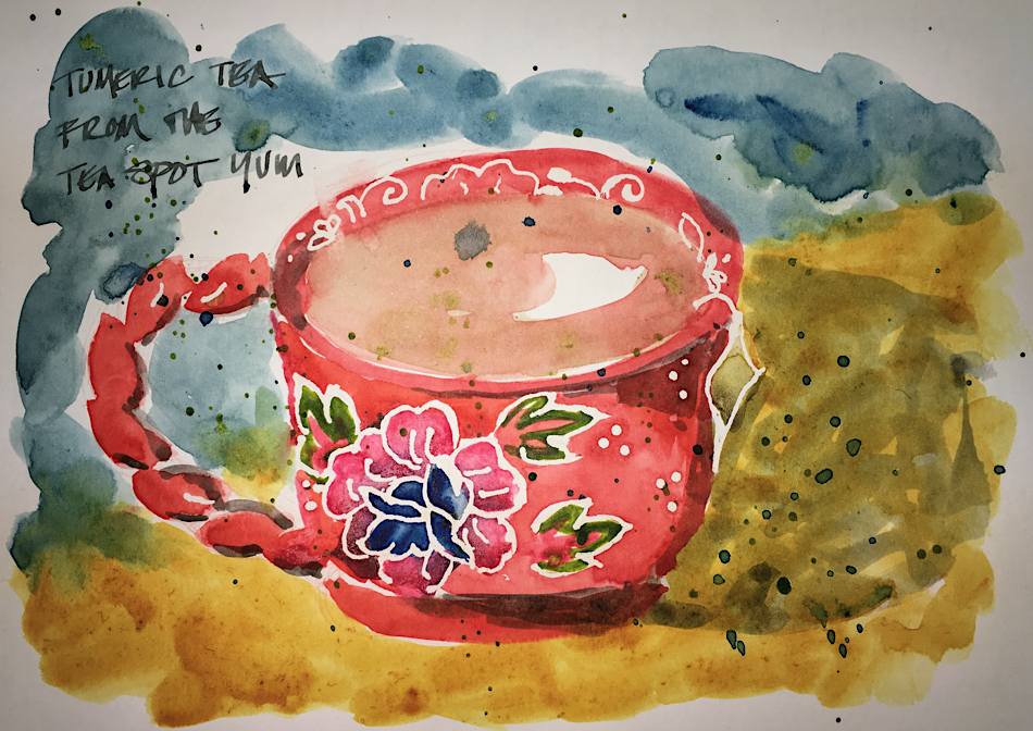
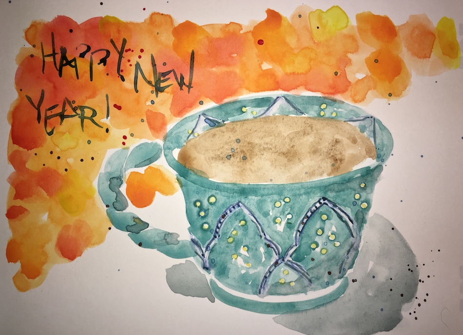
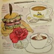
Rose Dore Teacup

The time off has been splendliferous, even if I had to make up for being sick
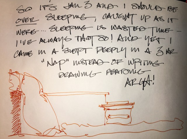
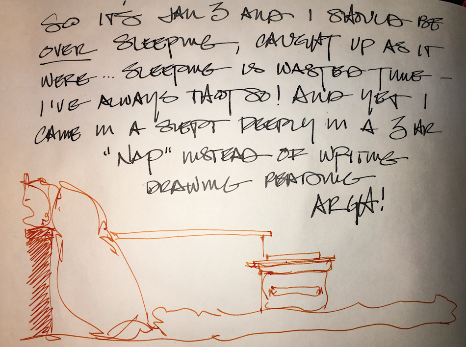
and sleeping my way into every day for a long time.  From January 3 across from this,
is a note about still sleeping my time away instead of being productive:


Anyone who knows me knows it is
hard for me not to be productive…


My favorite “Rose Dore” teacup cheers me!

To hear about classes, follow me on Facebook
or check out my new, improved dkatiepowellart.com

Posted in art journal, creativity, journal, painting, sketchbook, watercolor, writing | Tagged , , , , , , , , , , , , , , , | 21 Comments

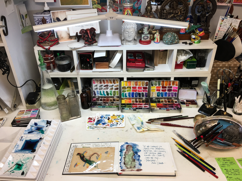
Tools: My First Schminke Palette

Getting new paints, for an artist, is like being 5-years-old on Christmas morning.
It is THAT exciting.
You unwrap the paints, ooh and aah, play with each one,
and discover everything you can do with each color!

My disappointment in the newest Schminke anniversary palette is huge. After I wet each one in the back of my  Nostalgie journal, I didn’t go back to play. Also, palettes are usually specific mixes (beginner’s palettes, primary palettes, etc.) Most of these colors, all new to Schminke, are colors that MOST people would not order unless they had many paint colors and wanted it for a reason.

Or ever…

Case in point, I loved Daniel Smith’s Caput Mortem.
I found it a most excellent mixing color…
but apparently no one else did, because they discontinued it!
No one elses version is close — They are often much more like
Schminke’s Potter’s Pink, a darkish mauve from the 70’s —
or an even darker purple-mauve… excuse me, blech.

BTW, I am willing to trade
or buy DS Caput Mortem from you! Please!

The colors are dull and lifeless,
and many were muddy.  One literally!
You never have to look further than
one color to paint a mud puddle now… Schminke’s Mahogany Brown is
exactly “mud puddle brown!” >>>

In case you are thinking of a Schminke
palette, this is the one I bought,
paint colors above:

  • Mahogany Brown (Opaque, basically mud)
  • Perylene Dark Red Semi-Opaque
  • Perylene Violet Opaque
  • Potter’s Pink (mauve from the 70’s)
  • Saturn Red (an Orange, okay)
  • Yellow Orange (a little like an Indian Yellow but doesn’t  have the same mixing qualities)
  • Rutile Yellow (a mostly-Opaque pale yellow, meh)
  • Phthalo Sapphire Blue (nice)
  • Cobalt Azure (which is a nice name, pretty color, very close)
  • Viridian
  • Perylene Green Opaque (gads please no opaques)
  • Hematite Black (an Umber Green, and oddly, Hematite usually tends to go reddish purple not green… I’ll keep this one)

So a couple of weeks later when
I was in fact so addle-brained, head
stuffed with a cold, and lacked
any creative spunk, I decided to
play with the Schminke paints.
Palettes are not my favorite thing to do —
I am more a messy-mixer of certain
colors (see below).  But I did a palette
with all but the Mahogany Brown
and “Potter’s Pink” — or the mud
and mauve.  I see that this is a
mixing palette, interesting, but still, meh.

The way I tend to “mix” which is only what I am interested in mixing.

I also compared their Hematite with the Daniel Smith Primatek Hematite;
No comparison to the way it mixes.  The Schminke is fine and
the granulation is not what I am looking for in this type of paint —
but some may prefer the fine granulation, so look closely!

Finally, two images done mostly with Schminke, above,
on Hahnemühle postcards, versus other paints on the same paper, below.
There is a dullness or flat quality to the paints that makes me uninterested in choosing them…  though perhaps it is the particular colors in that palette.
I also found going in deeper with a second coat difficult on
the Schminke oranges, (flower) above; perhaps I am not used to these paints?


Schminke also sent me a pan of a color they thought I’d like, above,
after I told them I wasn’t happy with the paints I purchased
but was not asking for a replacement on those, just the bent metal palette.
It is lovely, and I have it in with my Da Vinci palette to see how I like it.
It tells me I may have to swap full pans of a couple of other pigments I love to
see how the paints really play out.  Meantime, comments welcome.

Finally, about the palette debacle (warped and chipped, which means eventual rusting).
Schminke made good on this with me, sending me an empty replacement palette.
Always report damages to a company — good companies will do right by you.

To hear about classes, follow me on Facebook or
check out my new and improved dkatiepowellart.com and sign up for my newsletter!

☾

w16-watercolor-sq w16-8-10-pentalic-middle-night-03-sq w15-inks-sq w16-9-24-pens-color-3-sq w15-ds-paints-sq

Posted in color, review, watercolor | Tagged , , , , , , , | 5 Comments

Tools: Taking Another Artist’s Palette Advice

Continued from Big Changes in My Travel Palette… An aside…

Recently I took the advice of a
USk sketcher I admire and bought a series of
Holbein’s Antique “IRIDORI” Watercolors pigments…
AAACK, bad paints!
Be glad if you didn’t buy them before they discontinued them (I think everywhere).

Cracked into itty bitty pieces in the pan, and dull.
Huge waste of resources (meaning my money!)

Which brings me to this topic: taking another artist’s advice.
*yesh i see the irony in this but take this advice!*

Above are just two of the many colors I bought on a popular artists’ advice —
Cobalt Teal and Buff Titanium.  They don’t work for me.

In the case of Cobalt Teal, it is milky and opaque, and while the color is pretty,
I love — no require — transparent or semi transparent.
I’ve had CT in my palette for a long time trying to work with it,
mostly mixing it with Lapis for skies (it was so thick and dull for oceans) and finally dumped it for a Phthalo or Manganese in my travel palette… both more transparent.
Amazonite is more transparent, a bit sparkly, and mixes in the loveliest manner!

Buff Titanium became the rage (all the hip kids were buying it) and I bought it.
PHFFFT!  What a why-bother color!?
*buff reminds me of navajo white house paint — sorry you either get that joke or not*

I was starting to mix colors in the city and it
was discussed as a great mixing color for urban sketching.
*everyone bought some*
The thing is, for mixing I can still have transparent
and/or have a great color in your palette —
one I might even want to use on its own!
I love Verona Gold, which is semi-transparent,
and the Primateks Goethite and Yavapei,
shown right, which granulate and mix and
settle into such gorgeous patterns.

So here is my caution: If an artist who writes well or has popularity or is
your teacher tells you that this or that color is a necessity in your palette, do two things:
1) Look at their work and see if they paint in a manner to which you aspire!
Bright color palette? Muddy? Realism? Graphic?  Portraits? Landscapes?
We are not talking good or bad art, but their style —
do their colors and style appeal to your creative impulses?
2) Look at the other options in that color range to see if there is one that has
more appeal for you, as there is rarely a gotta-have-that-one-pigment!.

Thankfully I learned this before buying Potter’s Pink!
Gads talk about a color I would never ever use and is easy to mix!
I have at least a dozen tubes of paint I would not have bought had I heeded this advice.
That is some good supply money!  They are not bad colors, just not right for me.
There are painters who would not want my palette — bright transparent pigments!

PS: Beware of Daniel Smith’s so-called designation of “Semi-Transparent”
and ask art friends who like transparent pigments for their recommendations
and look at handprint.com (which you should begin to get to know anywho).
Both Buff and Cobalt Teal are categorized as S-T and I think they are Semi-Opaque.

More in the continuing palette saga to come!

To hear about classes, follow me on Facebook or
check out my new and improved dkatiepowellart.com and sign up for my newsletter!

☾

Da Vinci, MatteoGrilliArt, Sennelier, Holbein,
MGraham, DS Primatek and Daniel Smith Watercolors.

w16-watercolor-sq w16-8-10-pentalic-middle-night-03-sq w15-inks-sq w16-9-24-pens-color-3-sq w15-ds-paints-sq

Posted in color, creativity, review, watercolor | Tagged , , , , , , , , , , , , , | 8 Comments

Christmas Staycation


What happens when you work 10-12 hours 7 days a week for two years
and finally take a much needed staycation?

SLEEP!

I can’t believe how much I slept!
Slept in, took naps, watched silty Santa movies, and did not post much!
Still we have two weeks more staycation, and maybe, maybe I will start posting!

I painted/journaled (always even if not posting, as some of it is now just too personal),
and much of it was about cleaning colors and palettes!
That is a quick way to fill a journal!
Only 1/3 of what I did has been posted (so more to come!)

In the midst of this I also tried to paint our twinkly lights,
which were everywhere at the studio and home.
I laid down some colors where I though the lights would be,
and after drying masked “lights” off,
painted in with Paynes Blue-Grey and Prussian Green.
Not too bad for my first time… I want to do more with this.

I think my comments are working again… finally!  Thanks Dan!

To hear about classes, follow me on Facebook
or check out my new, improved dkatiepowellart.com

Posted in art journal, creativity, journal, memory, painting, pen & ink, process, sketchbook, watercolor, writing | Tagged , , , , , , , , , , , , , , , | 15 Comments

My Comments Are Not Working!!!

ARGH, so sorry —
My ability to comment has not been working and
I just didn’t have it in me to fuss with it over the holiday!

Will figure it out.
It allows me one comment then does a weird thing
where it shows a -1 in red and won’t post.

Posted in art journal | 6 Comments

Happy New year


Wishing you Health,
Prosperity,
Good Neighbors,
and Happiness in 2018!

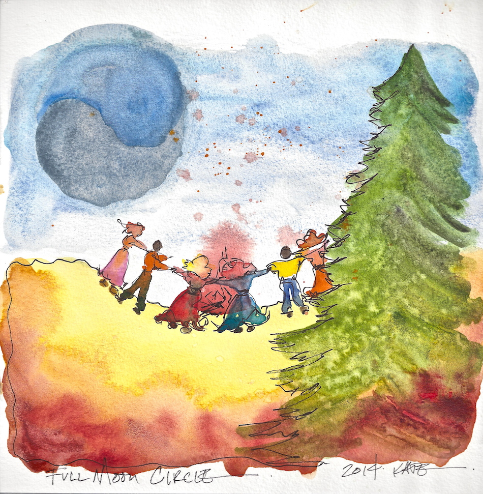
Saying a prayer this Full Moon for Mother Earth.

To hear about classes, follow me on Facebook
or check out my new, improved dkatiepowellart.com

Posted in art journal, creativity, drawing, ink painting, journal, painting, pen & ink, process, sketchbook, watercolor, writing | Tagged , , , , , , , , , , , , , | 6 Comments

Tools: BIG Changes in My Travel Palette

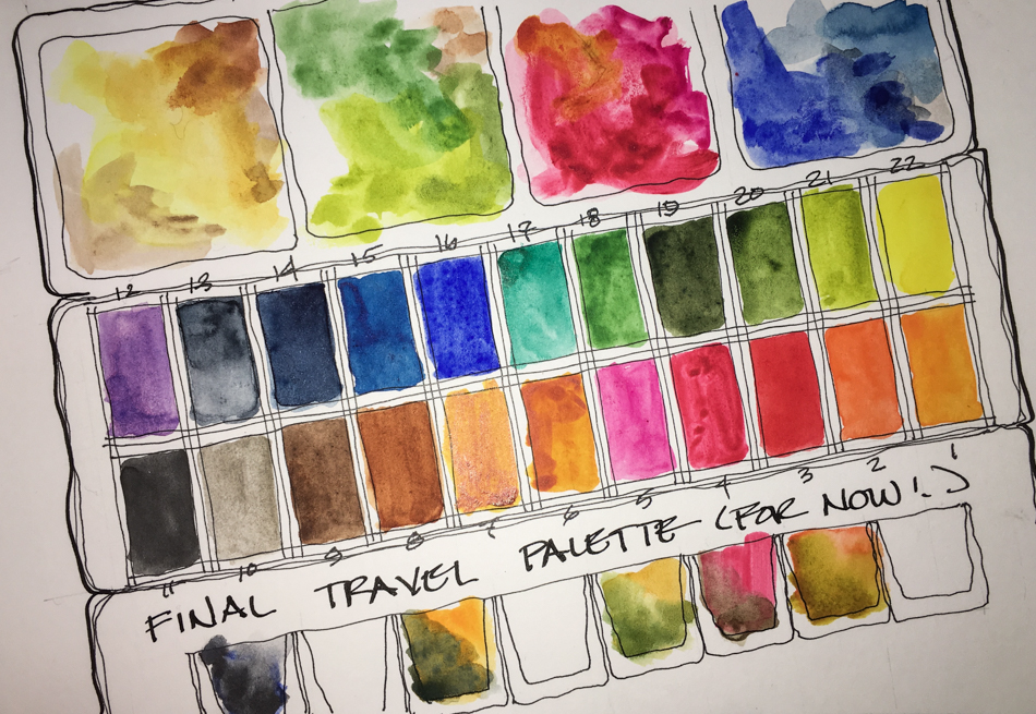
I’ve been asked about my travel palette and here is the primary palette,
though I have others,  which I’ll talk about later.
I have had this basic palette for two years with the exception of adding
Da Vinci’s Rose Dore a couple months ago.

  • Quinophthalo Yellow DS
  • Green Gold DS
  • Sap Green DS
  • Diopside Primatek
  • Amazonite Primatek
  • Cobalt Teal MGraham Opaque, not that happy with…
  • Cerulean Blue DS
  • Prussian Blue Holbein
  • Indigo Blue DS
  • French Ultramarine (so close to Ultramarine I felt gypped) DS
  • Imperial Purple DS
  • Brilliant Orange Holbein
  • Permanent YO Holbein
  • Quin Gold Holbein
  • Quin Burnt Orange DS
  • Yavapei Primatek
  • Hematite Primatek
  • Piemontite Primatek
  • Brown Iron Oxide DS
  • Perelyn Red DS Opaque, not that happy with…
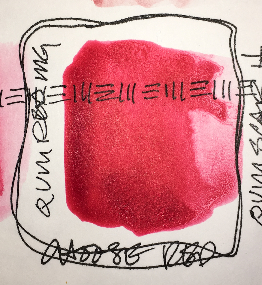
  • Rose Dore Da Vinci (Intense color!)
  • A mix of Opera / Quin Pink DS  (For fun)

I knew I wanted a change, and went in search of a better red, transparent.
*you know how these things get going, tho, and then there is the obsession
and before you know it i was up at midnight thinking about paints…
staring at paints when we were watching the tele*

It hit me.
*WHY did I have the Primateks in my travel palette when I had a great travel palette of my most used Primateks (above, but more on that later)???*


I pulled my Primateks from my Travel palette!
*yes i get geeky happy about these silly things
i stared at the holes and the began thinking about all the possibilities

then began a search for what i might want in an entirely new travel palette…
i know just enough to make this a tough decision
or maybe i am just obsessed with color!*

At first I placed several possible duplicates in my palette to play with, or so I thought,
for a few weeks, maybe over vacation… NOT!  I began to play immediately, testing colors.
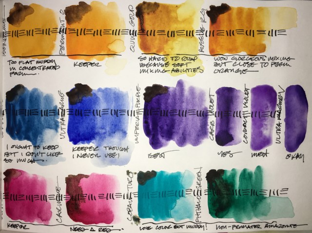
I wanted transparent brilliant colors.

The paints I questioned first, above…  I mixed them with a dab of Brown Iron Oxide (DS) to see their mixing qualities.  Again, I don’t love muddy opaque colors, and so I dropped Cerulean Blue (DS) and the Cobalt Blue from M.Graham
*everyone was in a twitter about Cobalt Blue not too long back and
i bought just because the cool kids were doing it without considering my preferences

and i have so learned my lesson on that this year*

I dropped the Isoindoline Yellow (DS) in favor of  Holbein’s Permanent Yellow-Orange.
Again, clear bright is what I want.  You can always dull down but cannot brighten!

 Aussie Red Gold (DS) and Holbein’s Quinacridone Gold remained —
I love the brilliance of the Aussie but I know what Holbein’s Quin Gold can do —
it is softer and is a better blender than most Quin Golds,
good for skin colors and buildings!

In the end I may dump Permanent Yellow Orange or Aussie Red Gold —
keeping only one…. we shall see!

I kept French Ultramarine (DS).  I don’t use many blues but this is a great clear blue.
After looking at every possible purple I own kept the Imperial Purple (DS),
which has touches of pink in it… I love changling colors!
I kept the Phthalo Green 807 (Sennelier, I need more),
which is a great counterpart to the Primatek Amazonite (DS) in my Primatek’s set!

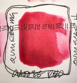
Oh gads, then there is red and pink…
No such thing as a non-pink transparent red!
I ditched the semi opaque reds and went for the Quinacridone Red from M.Graham.
I am also keeping Rose Dore from Da Vinci,
which is a orange leaning softly toward red…
I decided not to keep Matteo Grilli’s Carmine,
for now, and went with Opera Pink (DS
and yes it is fugative but so GORGEOUS!)  I can’t use it for paintings for sale, only journal entries;
I may end up putting the Carmine in its place!

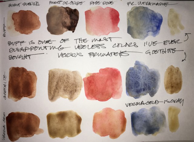
I revisited Buff Titanium (DS), another color I bought because of peer raves.
*i find it a useless color; I think there are better options*
I tested Mixing it against the lovely soft Verona Gold (DS), and Goethite (DS) —
I also could have used Yavapei (DS), which I prefer.
I use these neutrals most often as building or mixing colors.
I mixed them with four colors from my palette, and as you can see,
the Buff muddies more than the Verona Gold
(Titanium white does that), and the Goethite mixes in the most lovely manner!

I decided to not put any of these in my travel palette (I have the second Primatek palette), and even went so far as to offer the Buff up as a trade on Doodlewash!
Banish thee muddy Buff!
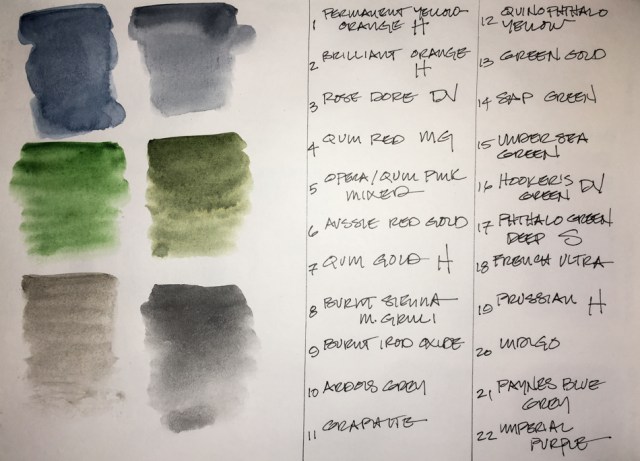
I rounded out my palette with the final choices above, and may swap them out at
some point, but they balance the brights in ways that may save me time.
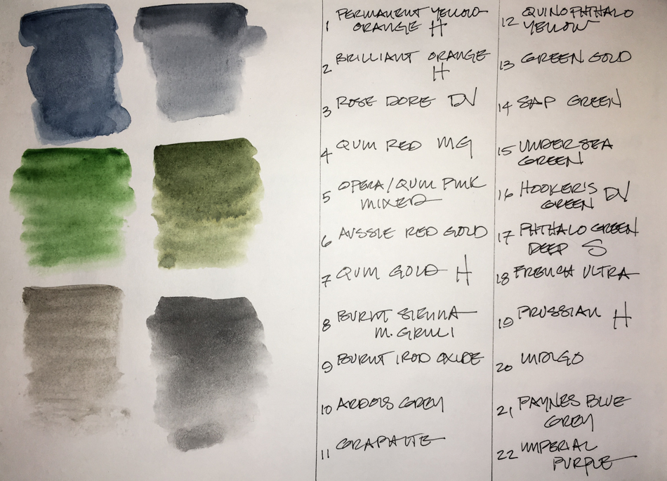
I love Indigo Blue (Da Vinci) and Paynes Blue Grey (DS) may not stay, top left;
Da Vinci Hooker’s Green and Undersea Green (DS), middle left;
and Ardoise Grey (Sennelier) and Graphite (DS, for asphalt!), bottom.


I love my palette!!!!

It is exciting to see how the new palette with the
Primatek traveling palette will effect my sketches.

In a forum topic recently I took part in a discussion on whether brands make a difference.
I say YES, brands make a difference!
I look at pigment, binders, cost per mg, and quality control.
There is also the difference in student grade versus artist grade…
I am only considering artist grade.
My opinions about the brands I’ve tried and use, below and in the next post, part two.

I’ve learned a tremendous amount about paint making from our local oil paint company, Gamblin Artist Colors; I work with oils in our conservation business.
One thing I’ve learned is that in the fully mechanized filling process, versus the hand filling of tubes in conjunction with some mechanization, more air becomes trapped.
My experience shows air trapped means tubes of paint dry in the tube,
and I am seeing a lot of that now with Daniel Smith (DS),
which is not the small company once owned by Daniel Smith.
I just filled a full pan with Buff Titanium (all I will ever want before I trade it)
and it continually popped from trapped air.
I’ve had a couple of newer tubes of DS dry out partially.
Yes I know I can peel the tube off and rewet the insides, but I pay for a tube of wet paint!
I also see separation in paint colors that I did not have separation in previously…

So, I am looking for another go-to brand besides DS now, though I will always be a huge fan of
DS Primateks.,  Yes, separation is one
thing that happens in some of them.
With Sleeping Beauty Turquoise, for instance,
from now on I will empty most into several
full pans, leaving me a little bit in the tube for
my mixing palette.  BTW, Primateks often differ from one batch to the next slightly, as they are basically ground mineral suspended.


I own 2/3’s of the Primateks made — I love them.
There are some I use all the time so I made a Primatek travel pan, above.
A few are not set in stone and I swap them out: Rhodonite, Terre Ecole,
and Hematite Violet are all maybe’s… Monte Amiata (DS) and Goethite (DS)
are both soft Primateks, a bit interchangable.

With this pan and my normal travel palette I have everything I need to travel!

For more about my other “travel” palettes,
including the paints I am now looking to for future,
see my next installment!

To hear about classes, follow me on Facebook or
check out my new and improved dkatiepowellart.com and sign up for my newsletter!

☾

Hahnemühle Nostalgie Sketchbook,
Platinum Carbon Pen with Platinum Carbon ink waterproof cartridges,
Da Vinci, MatteoGrilliArt, Sennelier, Holbein, MGraham,
DS Primatek, and Daniel Smith Watercolors.
w16-watercolor-sq w16-8-10-pentalic-middle-night-03-sq w15-inks-sq w16-9-24-pens-color-3-sq w15-ds-paints-sq

Posted in art, art journal, color, painting, review, sketchcrawl, urban sketchers, watercolor | Tagged , , , , , , , , , , , , , , , | 21 Comments

Santa Candy Container


Mitchell has memories of his Mom’s ceramic Santa filled with Christmas candy.
Santa’s looking much bedraggled (loved) but I restored him to his glory for the image.

HO HO HO!

I also discovered that you cannot mix honey based paints (MGraham) with
non-honey based paints — as least not with Da Vinci!  Odd separation!
*** Update:  I tried other mixes last night and this may not be true!
Flummoxed as to why this happened!***

HAPPY SANTA DAY!

To hear about classes, follow me on Facebook
or check out my new, improved dkatiepowellart.com

Posted in art journal, drawing, journal, painting, pen & ink, sketchbook, watercolor, writing | Tagged , , , , , , , , , , , , , , | 6 Comments

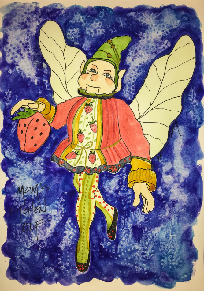
Strawberry Garden Fairy Ornament


He started as an ornament, but became a kitchen fairy!
He hung with the garlic and pots and pans in her Laguna kitchen.
My mom always had a flair for make believe, a belief in the little people and magic…
This rubbed off on me… I’m a believer!

Don’t forget to put cookies and milk out tonight….

To hear about classes, follow me on Facebook
or check out my new, improved dkatiepowellart.com

Posted in art journal, journal, painting, sketchbook, watercolor | Tagged , , , , , , , , , , , , , , , , | Leave a comment

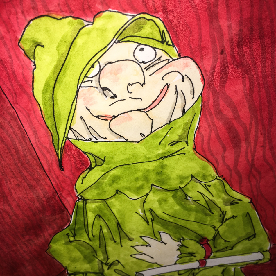
Santa’s Drunken Elf


My mom had this drunken elf for many years after I left home..


He has a list of who’s naughty and nice,
but you get the feeling that the drink has kept him from reporting this to Santa!

To hear about classes, follow me on Facebook
or check out my new, improved dkatiepowellart.com

Posted in art journal, creativity, drawing, ink painting, journal, painting, pen & ink, process, sketchbook, watercolor, writing | Tagged , , , , , , , , , , , , , , , | Leave a comment

Bright Ideas, Picked it Up Again!


In 2016 I made a commitment to finishing off wayward abandoned journals.
I’ve made great headway in that, with only a couple to go.
The Bright Ideas Journal isn’t one of them,
Though I picked it up again (found it in the pile is more like it),
and it was nice to be back to line drawings only (or mostly).
A hundred++++  pages left to go!


The Bright Ideas began as a memory journal,
mostly about objects I am giving away to someone who wants them,
while I retain their memory.


Now I’ve added other object-memories.

I never said all the drawings would be good….
Worst. Shading. Ever.


The Metropolitans looks like Christmas ornaments;
bright shiny metallic colors!!


I memory that cracks me up is the kittens first Christmas tree…
No ornaments but the star on top… cat toys!.  I think we are giving them the wrong idea!

Bright Ideas multi-color journal with Platinum Carbon pen,
Lamy Al-Star with De Atramentis Document black ink, and colored pencils.

w16-5-11-wold-heart-01-sq w16-10-10-bi-stars-too-sq W16 4 21 BI STUPID PHONE 01 SQ w16-5-5-altar-dish-05-sq w16-10-6-bi-rhinestone-stars-sq

I agree to Creative Commons Attribution-Non-Commercial 4.0 International License, which you can learn more about by visiting the site, or,
visit my web page for a more user-friendly summary on my terms.
My images/blog posts may be reposted; please link back to dkatiepowellart.

Posted in art journal, drawing, journal, memory, pen & ink, sketchbook | Tagged , , , , , , , , | 4 Comments

Happy Solstice!


Happy Solstice!

I’m ready for the shift in light!

☾ ☾ ☾ ☾ ☾ ☾ ☾ ☾ ☾ ☾ ☾ ☾

To hear about classes, follow me on Facebook!

☾

W16 7 21 USK PSU BERRY FESTIVAL 02 SQ  

©D. Katie Powell.
My images/blog posts may be reposted; please link back  to dkatiepowellart.

Posted in art journal, gods and goddesses, journal, memory, watercolor | Tagged , , , , | 4 Comments

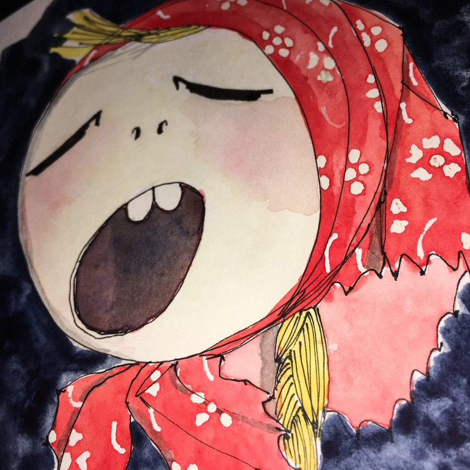
Singing Polish Girl


Another ornament from my college days is the small singing Polish girl made
from a gourd… She is delightful, her expression perfect!

And from that same time, A Lotta Love….

To hear about classes, follow me on Facebook
or check out my new, improved dkatiepowellart.com

Posted in art journal, journal, memory, painting, sketchbook, watercolor | Tagged , , , , , , , , , , , , , | 4 Comments

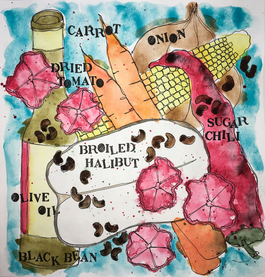
Found: Recipe pages!

I am thankfully finishing up a few journals —
and I found a couple of images I’ve not posted!

I used to create recipe pages for fun which I used on my foodies blog
(which I’ve not been posting too often).

This one is for our smoothies, made any time of day.
We no longer use any kind of juice, which adds to your sugar intake and is unnecessary.  Goat yogurt, fruit (frozen or fresh), Nature’s Life organic soy
(non-GMO) protein powder and water.

YUM.

Halibut is a huge treat for us…
We broil most of our fish and I make a heavenly Mexican inspired
bean dish to go over the top or on the side.
I use lots of cumin on fish with some garlic salt and black pepper.

I dry my own tomatoes, but any dry tomato can go into this and are reconstituted.
You could use fresh tomatoes — a bit different but nice — but no canned!
Broil 1-2 hot chilies (as hot as you like, but this is not a recipe for scorching your mouth).
Chop the chili up or make the recipe below, in which case you use
a couple of teaspoons or more to suit your palette.
Chop a sweet onion and saute in olive oil, add a handful of dried tomatoes, a couple of chopped carrots, fresh shucked corn or frozen corn, and a can o’black beans.
*nod to Tom Robbins*
Same seasoning as the fish, and saute until everything is hot!

I also make a heavenly Black Pepper Pesto,
and we top the halibut with that as well.

Leftovers can be rolled into burritos or tacos!

To hear about classes, follow me on Facebook
or check out my new, improved dkatiepowellart.com

Posted in art journal, journal, painting, sketchbook, watercolor | Tagged , , , , , , , , , , , , , | 6 Comments

Holiday Twinkle Lights

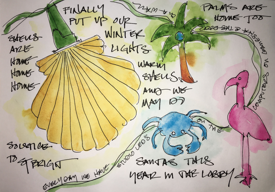
Lights are important to us!
We grew up in Southern California, where there are more daylight hours and more sun.
Portland is a darker climate (8+ hours of light now), and we look for cheer on grey days!
We usually put our lights up in November and they stay into April, sometimes beyond!
Their cheery colorful glow lifts us and makes the studio happy.

Palms wind round our computers.
Blue crabs wind round our huge Ganesha in the entry.
Flamingos and shells adorn the books shelves.

This year they are mostly beach lights.
Shells palms crabs flamingos and we may not be over this…
I have my eye on MORE! (Take my credit card!!!!!)

But Santa’s elves have hit the upholstery studio,
where we are working on our last project to be delivered before the new year!
and the entrance… and they may add snowmen and Santas today!

To hear about classes, follow me on Facebook
or check out my new, improved dkatiepowellart.com

Posted in art journal, creativity, drawing, journal, memory, painting, pen & ink, sketchbook, watercolor | Tagged , , , , , , , , , , , , , , , , , , , , , , , , | 1 Comment

VSW: Gardens by the Bay Singapore


December we had two choices in the Virtual Sketchwalk group
*though this group goes rogue regularly 🙂
but the rules of the group are “as long as it is drawn from a photograph”*

and one of them were the Gardens by the Bay in Singapore.
*the other was any holiday ornament or accoutrement from any tradition*

A challenge even for me, with lots of circles and ellipses and wild tree structures.
I loved it!  I still have deadlines and so had to move quickly —
30 minutes was my goal.


There is a catwalk in the sky that winds round these trees.
I would love to go, just to play around in this area…
*and shop for watercolors, pens, and journals*

Before the end of the month I hope to do one with watercolor only and time it… .

To hear about classes, follow me on Facebook or
check out my new and improved dkatiepowellart.com
and sign up for my newsletter!

☾

☾

Posted in architecture, art journal, challenge, pen & ink, virtual sketching, watercolor | Tagged , , , , , , , , , , , , , , , , , , | 2 Comments

Holiday Gifts


My mom uses heating pads, and has one she’s practically
worn out with lavender and I’m not sure what in it.
I wanted to make her a new one, and also made her some to give to friends.

I don’t sew on a machine.  Ever if I can help it.
But I did do this, making bags and filling them with cherry pits.
They can be heated in a microwave and placed on sore body parts,
aching neck and knees, or tucked into the bed to warm toes.

I wanted to paint some part of this in my journal, but didn’t like the look
of it so I spritzed it with water to give it a softer, printed feel.

I made directions, and some are going to our friends!
Ten years from now I may sew again… We’ll see…

To hear about classes, follow me on Facebook
or check out my new, improved dkatiepowellart.com

Posted in art journal, journal, memory, painting, sketchbook, watercolor | Tagged , , , , , , , , , , , | 7 Comments

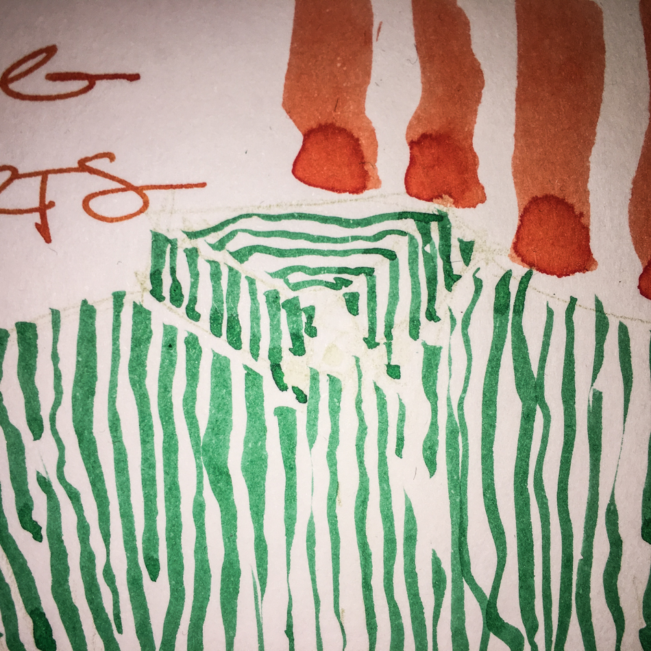
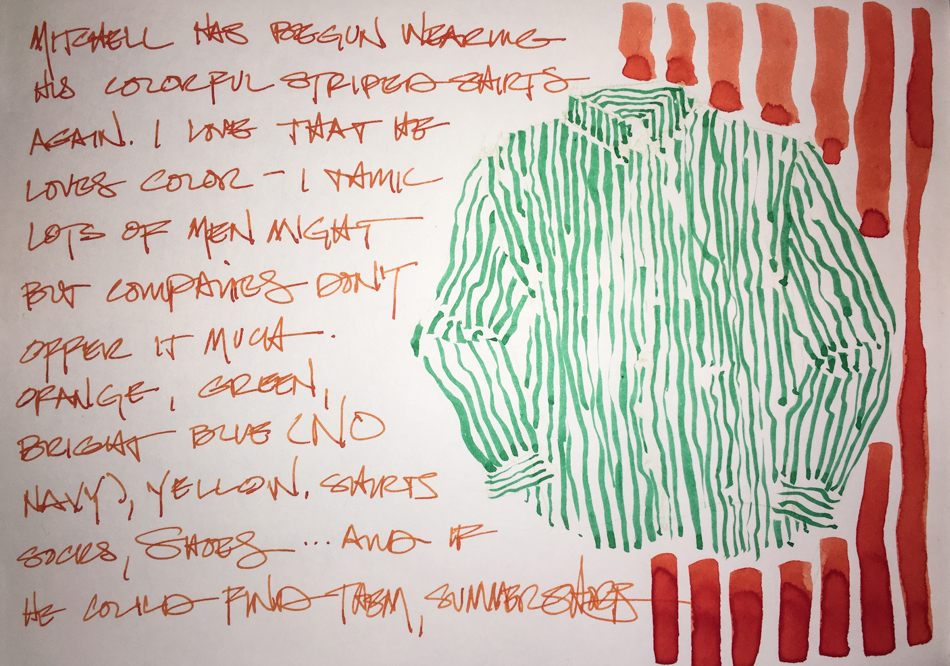
Inking Striped Shirts

Seeing them hanging to dry
I had to try the stripey lines!  What fun! 

Drawn with an inked Pentel Aquash! 

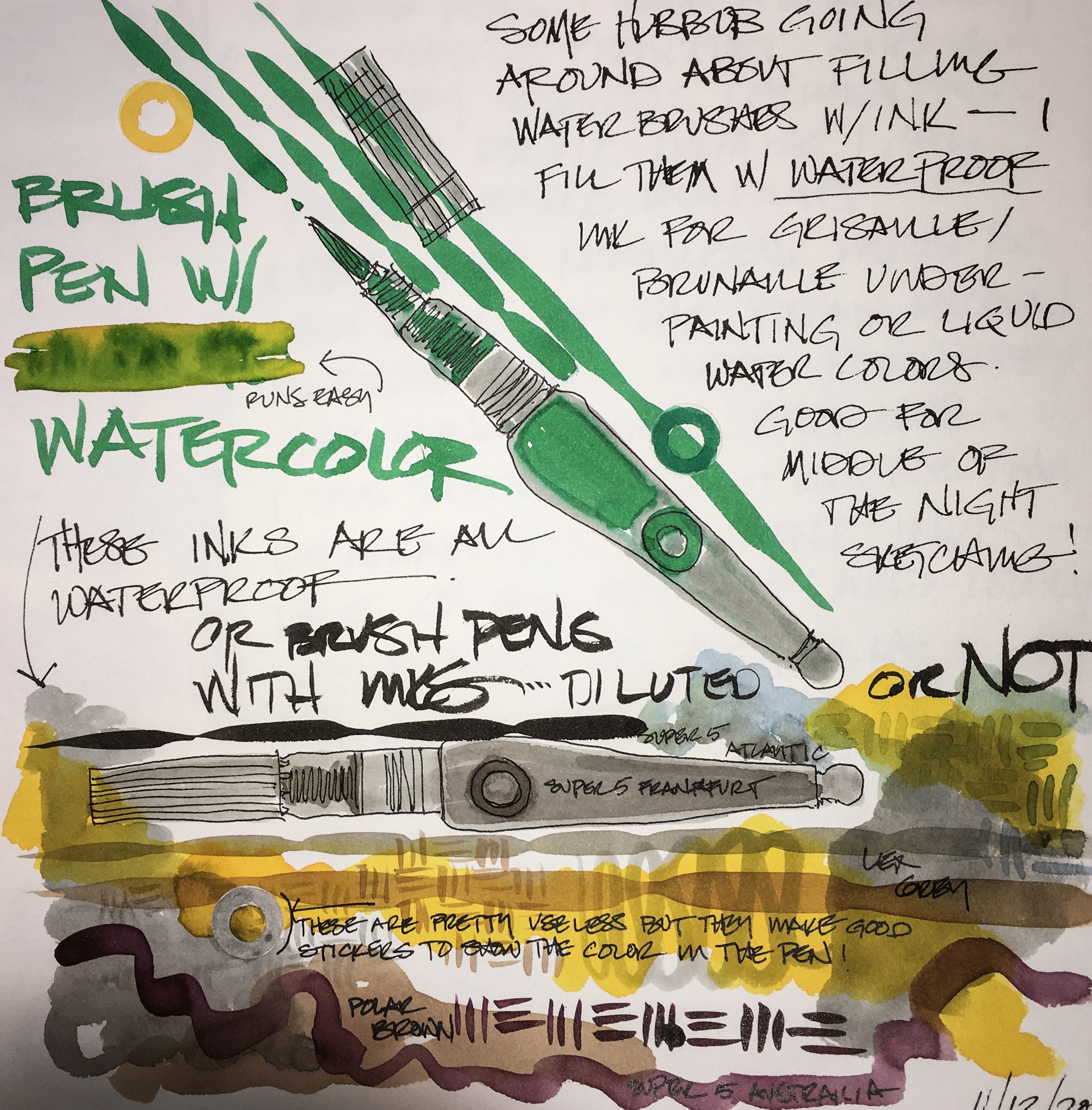
All of a sudden there is a
hubbub about putting inks in waterbrushes… They sell
inked waterbrushes (Pentel and Wink I like best), and I have been doing it since
I received my first ink sample from Goulet!  I did it for easy grisaille work, then expanded from there!
I recommend diluting the ink
a bit, and if you decide to mix ink colors, stay within the same ink brand.
I think it is  a waste of good black ink;
I purchase the Pentel pockets for water-resistent black (with waterbrush!)

I have not tried glittery inks, but I bought Wink metallic colors and they are excellent!


To hear about classes, follow me on Facebook
or check out my new, improved dkatiepowellart.com

Posted in art journal, drawing, ink painting, painting, pen & ink, sketchbook, waterbrush, writing | Tagged , , , , , , , , , | Leave a comment