In Part 1 I tested inks on the papers, creating a simple journal; now I added watercolors
to each Hahnemühle paper: Harmony, Cézanne, and Expression.


Let me cut to the chase. I am probably going to buy these papers in this order:
Harmony (I am very comfortable with this paper)
Cézanne
Expression (partly because it is not readily available yet in the states.)
I am relatively new to watercolor —
I switched in 2014 from huge acrylic canvases to ink+watercolor and
began doing it almost exclusively. I am not interested in realism per se —
I’m interested in art journaling and story telling,
with imaginal images and graphic images.
I adore books, and I will use these papers by creating
small folded journals with just enough pages to explore a story.
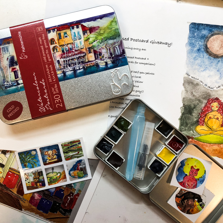
(Check out this link to win a giveaway!
Win a journal by commenting “I want to win!”)
It’s important to know about an artist before you heed their preferences…
Any one can tell you why a paper may be terrible, but to sell you on why you
may like it you should aspire to the kind of art the artist creates!
I’ve nailed one expensive watercolor journal paper because it balled and sloughed
fibers like crazy! I hate the sketchbooks that fall apart halfway through your time with them! But for you to heed another artist’s advice about choices in good papers — and these are all good papers — you need to know if you have the same goals.


I prefer my paper “hard-surfaced” (my word).
It needs to be strong in order to make a good folded journal,
but not too heavy/thick, as it needs to fold.
I prefer textural and so like cold-pressed paper best —
despite the fact that smooth paper would be better for my ink drawings.
I will strike a happy medium!
I want the combination of a well-sized surface —
not too absorbent or linework feathers —
I want it to satisfy both watercolor and linework —
texture but not too textured for my ink lines…
After a month of direct watercolor
(cheating occasionally and using watercolor pencil for guidelines),
I concluded I love line work! Should be no surprise —
I spent years creating amazing Rapidograph pen images as an architect.
One reason I left the business was the move toward computers
for thinking and presentation… I don’t mind the time-saving parts of their use.
Most great creatives need to think with all faculties involved —
that is, eye, sound, physical contact — to be creative.
They draw onsite, get a feel for the land, the views, the weather…
They sketch their ideas.
Maybe that is why I am so disappointed in the built environment now…
Okay, I digress…
That is why I choose Harmony, Cézanne, and Expression in that order.
Cézanne will push me just a bit to be a better watercolorist, and I will enjoy the push!
For my folding journals, though, I think Harmony is a better choice.


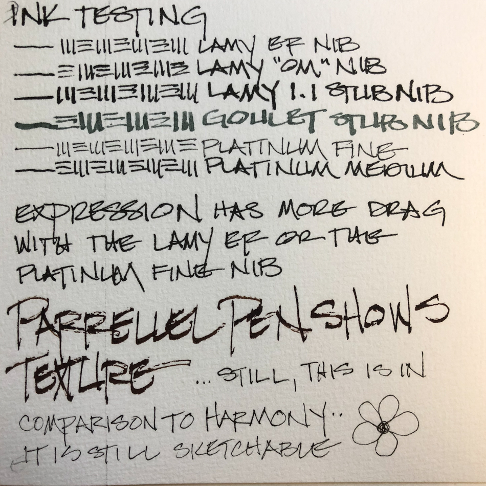
In Part 1 (I tested inks on the papers), I gave you the stats on the papers:
ALL acid free, surface sized, and are 300g/m2 or 140 lbs, intended for watercolor.
All are a lovely natural white (not bleached bright), which I prefer to bright white papers.
Following, some of their anomalies, differences,
and the watercolor test images from the papers in the order I prefer:


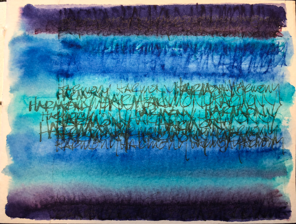
HARMONY
Harmony has a finer tooth Cézanne or Expression, a bit better for finer nibbed pens.
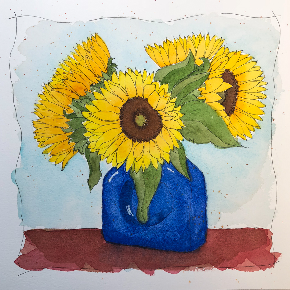
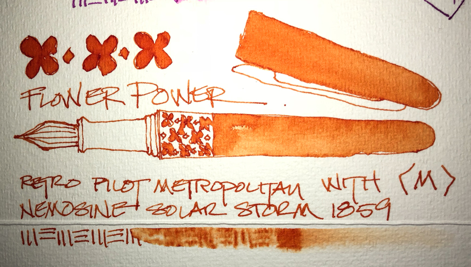
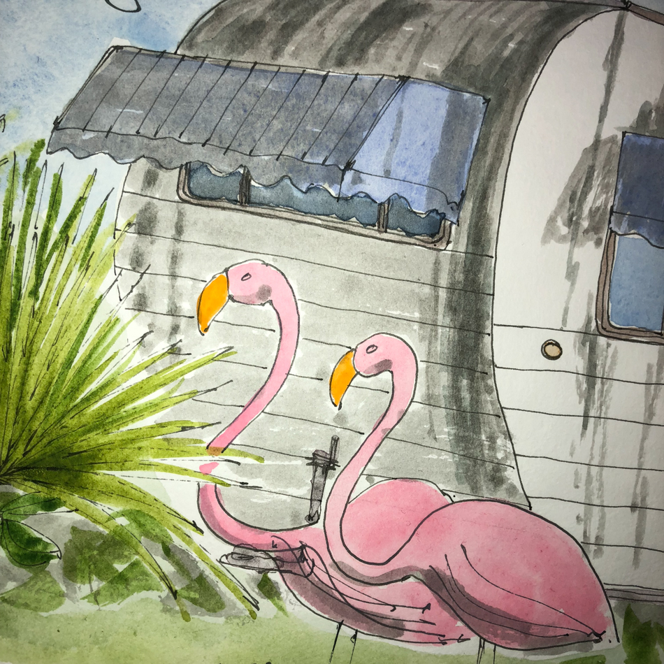
The tests were created using Platinum Carbon Fine Nib (also called Medium nib on some sites) and Da Vinci watercolors, above; Primateks and Iridescent watercolors were added on the folded journal. Of the three papers, the water seemed to sit on top of the Harmony paper a bit longer… making it a bit less absorbent, a slight difference.
This paper is suitable to glazing or layers. Masking fluids and proper masking tape
can be removed without residue; watercolors can be easily lifted without burning holes in the paper or without the paper fuzzing out (a highly technical term!) or balling fiber.
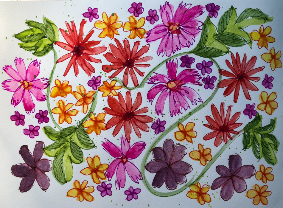
I loved working this paper in the journal on my Mother’s Jewelry Box.
The ink laid down without feathering, and the watercolors were bright, moved well, allowing me enough time to “get it right” before they settled forever where they
wanted to lay. This is very much about me being a newbie to this medium.
I want the paper to support my goals, and I have stories to tell, whereas someone else may want to become the world’s greatest watercolorist.
It is also available in Rough and Hot Pressed,
and unlike the others which are 100% cotton, is acid free/archival alpha cellulose.
It is suitable not only for watercolor, but also for gouache and acrylic.
Harmony can be found at:
Art Materials; Jacksons (UK); and SAA (UK).


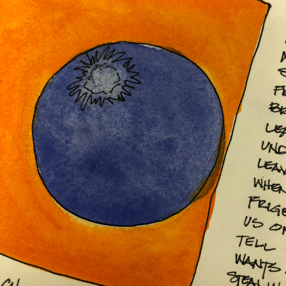
CEZANNE
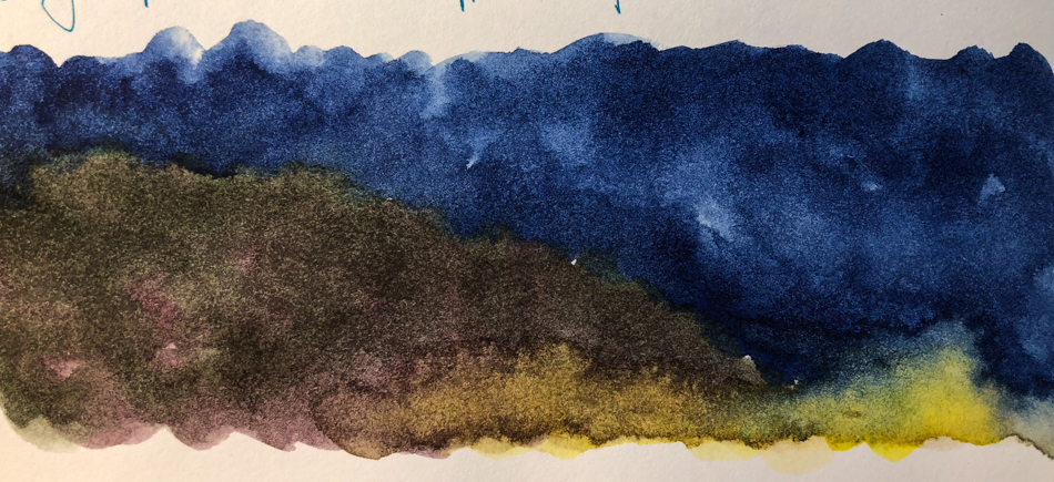
The tests were created using Platinum Carbon Fine Nib (also called Medium nib on some sites) and Da Vinci watercolors, above, with the addition of other watercolors in the sunflowers. This paper is suitable to glazing or layers. I loved how the watercolors moved in the wet-on-wet experiment, as the paper is more absorbent than Harmony.
Masking fluids and proper masking tape can be removed without residue; watercolors
can be easily lifted without burning holes in the paper or without the paper fuzzing out
or balling fiber. I was able to erase MOST of the pencil marks, but the HB or 2B graphite
wanted to hang onto this paper more than the others.
Working on the Cézanne was a challenge for me; I had to
shift as the paper was more absorbent than the watercolor journals I use, or the Harmony.
If I hit the paper with a saturated brush, it sucked it up quickly
and I am used to having a bit more time to move paint.
This is not a bad thing, but it does show my inexperience as a watercolorist, I am sure.
The paper itself is beautiful, and I like the way my colors appear on the paper.
100% cotton, and suitable not only for watercolor, but also for gouache and acrylic.
The matte cold-pressed Cézanne is mold-made; also available in rough and hot-pressed (smooth). Cézanne can be found at: Cheap Joes;
Fine Art Store (I find them frustrating because sizes are often not on the site);
Art Materials; Jacksons (UK); and SAA (UK).


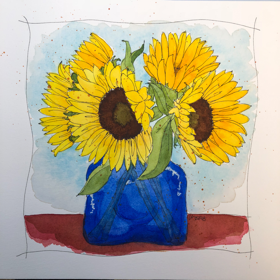
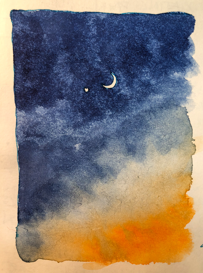
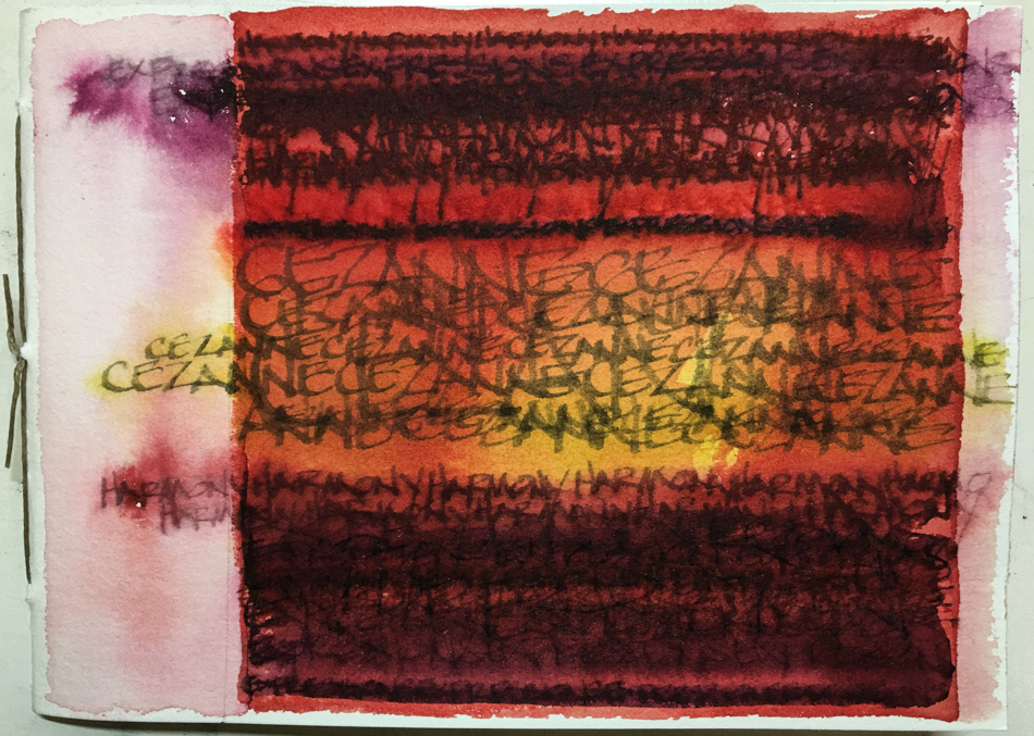
EXPRESSION
The tests were created using Platinum Carbon Fine Nib (also called Medium nib
on some sites) and Da Vinci watercolors, above, with the addition of other watercolors
in the sunflower. This paper is suitable to glazing or layers, and is more absorbent than Harmony. Masking fluids and proper masking tape can be removed without residue;
watercolors can be easily lifted without burning holes in the paper or without the paper fuzzing out (now that is a highly technical term!). Erasing HB or 2B graphite is
a bit more difficult than on Harmony, but all traces were erased.
Working on Expression was easier than Cézanne but not as comfortable as Harmony.
I still had to shift as the paper was more absorbent than the watercolor journals I use.
If I hit the paper with a saturated brush, it still sucked
it up quickly but I had a bit more time to move paint.
I wish this paper was available in the USA; perhaps if it becomes so I will use it as well.
The paper shows off my colors beautifully.
100% cotton, and suitable not only for watercolor, but also for gouache and acrylic. Expression is similar to Cézanne but is not mold-made.
At this time Expression can be found online from European countries:
Jacksons (UK); and SAA (UK).
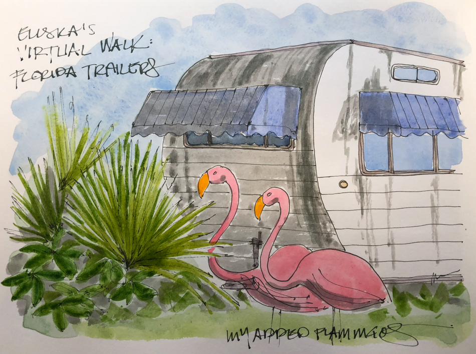
 For an opportunity to test drive one of these papers in a small handmade journal, win one by commenting
“I want to win!” ON THIS LINK!


 To hear about classes, follow me on Facebook
or check out my new, improved dkatiepowellart.com
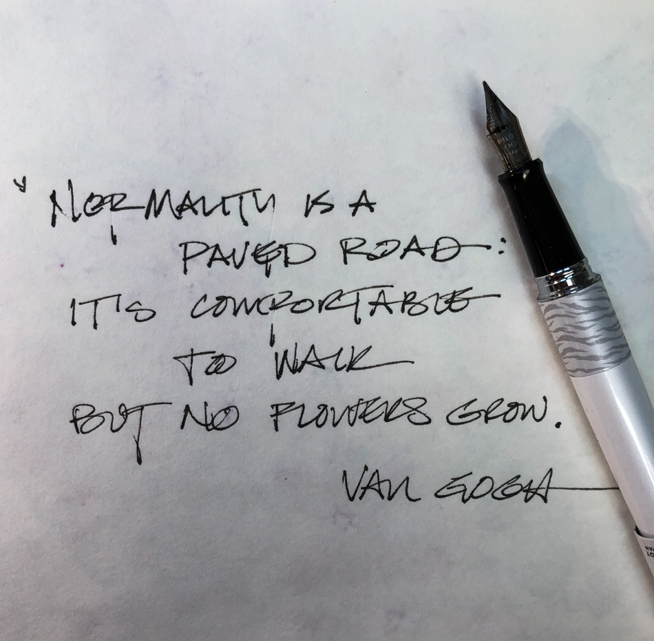
“Memory is more indelible than ink.”
Anita Loos, Gentlemen Prefer Blondes.
“I think not….”
Me… why I journal!
☾
Hahnemühle Cezanne, Hahnemühle Harmony, Hahnemühle Expressions,
Pentalic HB woodless pencil, Fineline Masking Fluid,
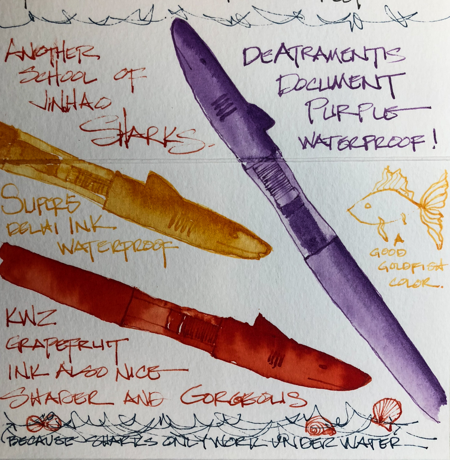
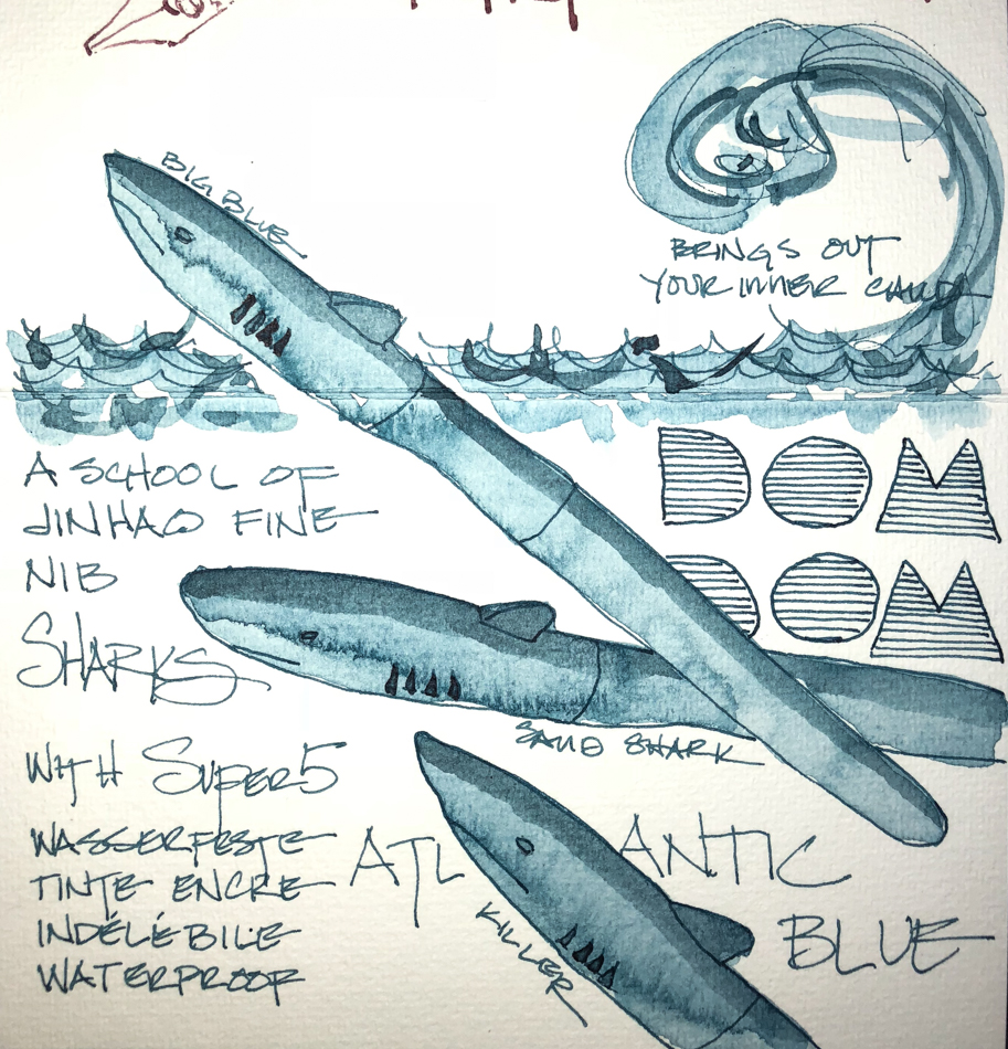
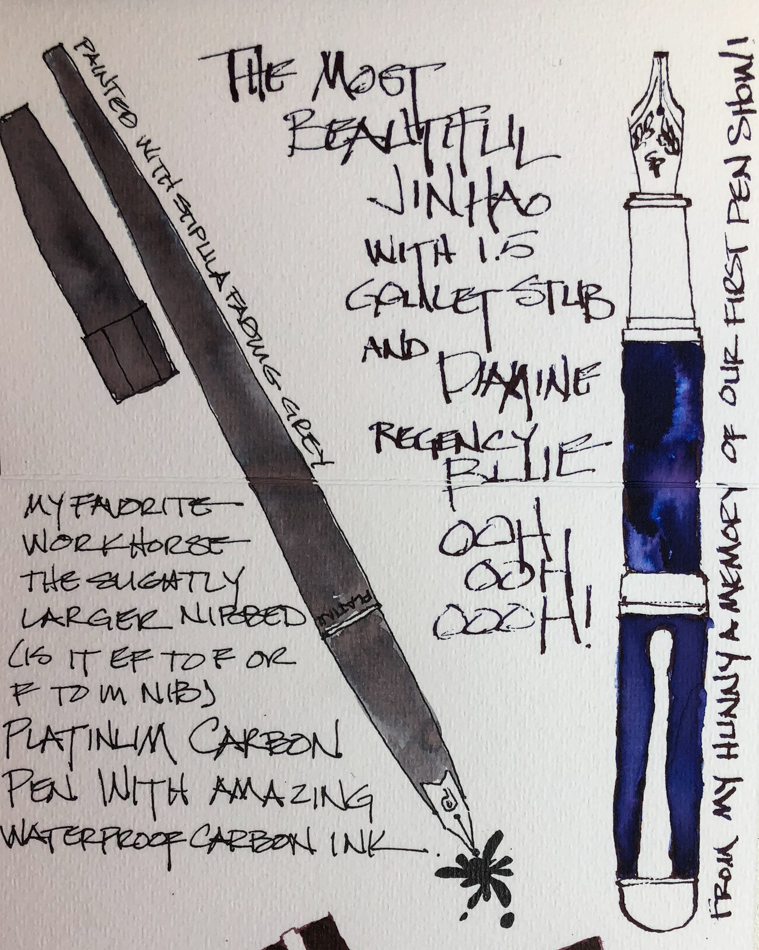
Platinum Carbon pen in medium and fine with De Atramentis Document Brown ink,
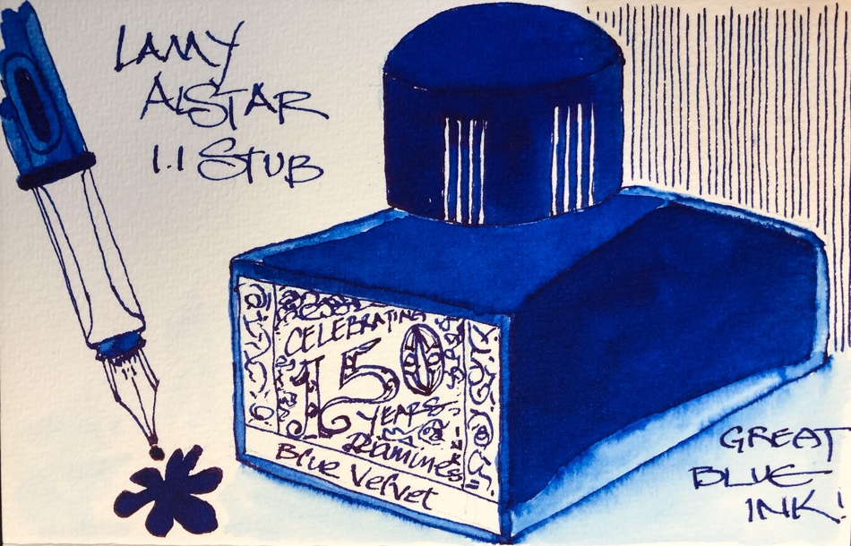
Lamy Al-Star with De Atramentis Document Black ink,
Platinum Carbon Pen with Platinum Carbon ink waterproof cartridges,
Da Vinci, MatteoGrilliArt, JazperStardust, PfeifferArt, Sennelier, Holbein, MGraham and DS Primatek and Daniel Smith watercolors.


©D. Katie Powell
My images/blog posts may be reposted; please link back to dkatiepowellart.
☾
 As my Patreon supporter, you will have
access to some content not on this website,
sneak previews, goodies, discounts on classes.
I teach architectural sketching,
art journaling (art+writing), creativity, watercolors.
That annoying loud-mouth editor/critic in your head? GONE! How great would that be?


 ☾
☾