Shift In Goals: A Post from My Patreon Page

Goals are shifting for me, and instead of rewriting what I posted succinctly to my Patreons, I am sharing it with you, my blog followers.  I am a Patreon to several artists, and have my own Patreons, a modern way of supporting artist.

An Overdue Update…

 
For two years things have been quiet on [my Patreon] page.  Family issues, namely my baby brother and then my mother dying and all that comes with that, got in the way of so much.  I am okay with that; family comes first.  I let go of a lot to juggle my daily work, but did keep sketching/painting.  I apologize for the absence.

During sleepless nights, I had time to think.  I shifted my focus a bit.  Originally I wanted to teach online — I miss teaching tremendously.  When I was a kid I wanted to be a school teacher and my Aunt Elsa, who was a woman who taught high school, became principle, and ended up traveling to study educational systems worldwide before settling down at USC to start their Gerontology department, gave me great advice.  She said, “Go to college for what you love and then teach THAT!”  I taught architecture and design in Los Angeles at UCLA and in the California State college system, and taught writing and creativity in Oregon and California.

I am still open to teaching again, crave it, really, but I am going to let it unfold, to not push the river to do online courses.  I don’t know that online teaching will be as rewarding for me as doing classes in person.  I will wait to see what happens as I continue following my passion.

So where am I heading now?  What has changed?”  Continue reading here.

Posted in architecture, commentary, commission, creativity, ink painting, landscape, making a living, process, writing | Tagged , , | Leave a comment

VSW: Amsterdam 3


Showing process again for my peeps on Virtual Sketchwalk.

If you look at the details you will see a crude sketch, above….


I started again with a horizon line… then before I got too far in my sketch I pulled ink down for the water, and up for the sky (wet area the distance of the pull.)
I wish I’d done this when I had just my horizon line in place, but it still worked.
The image was a foggy grey day across a body of water.


Over the dried ink wash I moved across the horizon line, adding lines for the various windmills and trees and such.  I used two colors, the Robert Oster Midnight Sapphire, and then to warm the banks and wooden structures, Robert Oster Aussie Brown ink.
It is risky laying in two lines of colored inks — I suggest trying it on a test area
so you can see how dark it is getting and how saturated.
A little ink goes LONG way.

Then I used my fine tipped Pentel Aquash waterbrushes to move the inks
carefully and selectively in the sketched areas.

Again, messes can sometimes be cleaned up by coming back
with linework over the dried ink wash.

To hear about classes, follow me on Facebook
or check out my new, improved dkatiepowellart.com

Posted in architecture, art journal, creativity, drawing, ink painting, journal, landscape, pen & ink, process, sketchbook, virtual sketching, writing | Tagged , , , , , , , , , , , , , , , , , | Leave a comment

VSW: Amsterdam 2


Scribbled this lightly in a fine point… really, just noodling around!
Then I began to like it and so came in with a bolder pen and cleaned it up a bit.
Painted with Robert Oster Australian Sky Blue, Robert Oster Emerald,
Robert Oster Green at Night, Robert Oster Midnight Sapphire,
and Robert Oster Aussie Brown inks.

Thanks to my friend Anya Toomre for the image!

To hear about classes, follow me on Facebook
or check out my new, improved dkatiepowellart.com

Posted in art journal, creativity, drawing, ink painting, journal, pen & ink, sketchbook | Tagged , , , , , , , , , , , , , , , , , , , , | Leave a comment

VSW: Amsterdam 1

This is a short how-to on a fast sketching technique with soluble inks…
Done in haste this morning for my peeps on Virtual Sketchwalk.

Finding a way into a complicated sketch is easier than we make it out to be,
and yes, I may make this look easy, but practice (hence sketch) and it will be easy for you.

I apologize for the images — middle of the night!


I start with a horizon or other significant line… keeps me grounded!
this one I started right as that was the edge with boat and windmill…


I moved across the horizon line, adding informational bits as I went:
Houses, more windmills, foliage…  Then began to move out into the water with
the traps or buoys or whatever those thangs are!


Keeping going, do you see how messy messy my lines are?
I set a deadline, the 15-20 minutes before I had to get up to go to work!


Then I used my waterbrush to wash water onto the large body of water (lake?)
to give it some form… I let that dry.

I began to hit the lines selectively with a fine point waterbrush,
moving quickly so as not to lay on too much water
(I don’t even have to squeeze mine) and leaving some areas with no water for definition.  Trust me you will over do this sometimes and end up with a mess.
These messes can sometimes be cleaned up by coming back
with linework over the dried ink wash.

Detail below. 
Don’t think too much, just give it a go…
Be messy!

To hear about classes, follow me on Facebook
or check out my new, improved dkatiepowellart.com

Posted in architecture, art journal, creativity, drawing, ink painting, journal, landscape, pen & ink, process, sketchbook, virtual sketching, writing | Tagged , , , , , , , , , , , , , , , , , , , , , , , , | 8 Comments

Summer Berries, Two


This year the berries are big and still plentiful in August because of the mild summer we are having…. Heaven for us humans too, as August is usually a scorcher.
Peeps who like the BIG perfect strawberries from California are SO missing something.
When I was a kid
*and walked uphill both ways in wet sand*
the best strawberries were not evebearing or big or perfect,
but oddly shaped berries that came and went,
leaving a heavenly scent in Capostranop Valley of berries and salt water.

To hear about classes, follow me on Facebook
or check out my new, improved dkatiepowellart.com

Posted in cards, creativity, drawing, ink painting, memory, painting, pen & ink, watercolor | Tagged , , , , , , , , , | Leave a comment

Mitchell’s Sunny Gift!


My sweetie brings me sunflowers, my favorite!

 To hear about classes, follow me on Facebook
or check out my new, improved dkatiepowellart.com

Posted in art journal, drawing, journal, painting, sketchbook, watercolor | Tagged , , , , , , , , , , , , , | Leave a comment

VSW: Matahorn, 1960


My first trip to Disneyland (I was five) I wanted to go on the overhead buckets and
all the roller-coasters, including the Matahorn.  My mom would not go on any of them.
In fact, no one in my family loves any of these kinds of rides or trams.
*sigh* 
But I remember looking up, and thought it would be fun!


Sketched from an Orange County historic photo circa 1960 with an
Edison Nouveau 1.1 stub nib with Pilot Kiri-same ink.
Came back with a waterbrush and and created the final image.

I am enjoying this Disneyland walk so much — memories!

To hear about classes, follow me on Facebook
or check out my new, improved dkatiepowellart.com

Posted in art journal, challenge, memory, pen & ink, virtual sketching | Tagged , , , , , , , , , , , , , | Leave a comment

Inky Thots: Diamine Ancient Copper

From their website:

“Manufacturers since 1864,
Diamine Inks relocated to this
state of the art factory in Liverpool in 1925, where they successfully carried on using the traditional methods
and formulas for ink production.
Over the years the company
has changed hands and are
now located close to the world
famous Aintree Race Course.”

Liverpool, home to the
Beatles and Diamine!

Diamine Ancient Copper was the ink that pulled me out of thinking inks
were to be waterproof and for sketching under watercolor.


I bought the Lamy Al-Star and looked for an ink to set it off and found this
lovely sketching ink!  It has been paired with this pen forever!

Properties of Diamine Ancient Copper ink:

Diamine Ancient Copper ink writes
crisp on all my papers, even Post-its,
no feathering.  I consider it on the wetter side, but still well-behaved; I have it
in a wet stub nibbed pen, and it dries quickly unless puddled, like my swab, above. Completely water-soluble ink,
no water resistant.  The brush moves
the color, easily, and when scrubbed/rewet it shows all the lovely colors — it is in fact
a good shader when painting.  The shading properties make it lovely with which to paint! I don’t think of it as a sheening ink,
but it does produce a dark brown
sheen when laid in thick, above. when doused with water on a towel, the only color that slightly pulls is yellow.

*Above, watercolors from Daniel Smith and QoR.*

The color  matches several watercolor pigments, listed with their Munsell ranges after: Transparent Iron Oxide (Pr101), Pompeii Red (PBr7), and Van Dyke Brown (Pr101).
*For more info on the munsell system, go to this page.  Knowing the pigments can help you not to duplicate watercolors made of the same pigments.*

I was unable to find out if the inks are lightfast, and have not performed my own tests.
Most artists who use ink are making prints of their work —
But ink-painting is becoming more popular so maybe it is time!


This heart on Strathmore paper shows off the ranges… The piece was drawn, the water used to push the inks, and finally the squiggles and lines were reasserted after.
NO ghosting of the lines made to draw the heart — completely water-soluble!


Lovely Buddha with Moon gives an idea of this ink on watercolor paper,
and the shading that can happen with the touch of a waterbrush.


The ink was one of my favorites to have in my purse in case I had time to sketch in the city.  This sketch of the Native American Student Center in Portland was created in ink. Later a wash of Daniel Smith Lapis and Hematite was used when moving the ink.


Seriously, I went from an all waterproof sketch gurl to a water-soluble sketch gurl.
Diamine Ancient Copper is to blame for the many inks I own!

I bought this ink from Goulet.

To hear about classes, follow me on Facebook
or check out my new, improved dkatiepowellart.com

Posted in art journal, creativity, drawing, ink painting, journal, pen & ink, process, review, sketchbook, tools, watercolor, writing | Tagged , , , , , , , , , , , , , , , | Leave a comment

Tools: Sheaffer Vintage Desk Pen

Finally had success purchasing a vintage pen!
I love this desk pen — beat up, but interesting gold nib that works!
The 14k gold nib bends as if it was dropped — but that is the design.

Right now it holds Akkerman Delfts Blue in it, a gift from Carlein!


Not quite right — nib bends more!

To hear about classes, follow me on Facebook
or check out my new, improved dkatiepowellart.com

Posted in art journal, drawing, pen & ink, sketchbook, tools, watercolor, writing | Tagged , , , , , , , , , , , , , , , , , , | Leave a comment

Karen’s Orchid


When I closed my jewelry business I gave away many many pieces of jewelry to friends.
Karen was one of those friends who chose a lovely Buddha.

You never know how you touch another person, but this time I was gifted back.
Karen came to the studio in Portland and brought us this lovely orchid.
She was dying of cancer, and the Buddha became an important part of her rituals;
she wore it until she died, and we talked a lot that day about death and where she was headed and all the things you can talk about when relative strangers,
art friends, decide to go deep in a moment.

We think of her every time the orchid blooms, and that day’s sharing.


On another note, wow, paints make a difference.
I chose to try a different yellow and it was not my favorite yellow and had
an opaque white quality, and took some of the pop out of the image.

I also tried mixing ink-painting and watercolor, with mixed results….

I think I need to have another go at this!

To hear about classes, follow me on Facebook
or check out my new, improved dkatiepowellart.com

Posted in art journal, journal, memory, painting, pen & ink, ritual, sketchbook, virtual sketching, watercolor | Tagged , , , , , , , , , , , , , , , , , , | 2 Comments

Mom’s Chinese Jar

My mom had this Chinese jar (urn?) for years; now it is mine.
I don’t where it came from; know nothing about the history.
I like it cozied next to a Buddha statue.

I sketched it first with the TWSBI Eco 1.1 with Robert Oster Midnight Sapphire ink, above.  After it was dry I touched the lines with the waterbrush… Always a risk when
you like the final drawing, but this time I liked both.


Finished page — I think of Tracey Fletcher King
whenever I see blue and white pottery, her signature!

To hear about classes, follow me on Facebook
or check out my new, improved dkatiepowellart.com

Posted in art journal, creativity, drawing, ink painting, journal, painting, pen & ink, process, sketchbook, watercolor, writing | Tagged , , , , , , , , , , , | Leave a comment

Mister Rodgers on Crayons

Came across this, too cool not to share!
Betcha learn sumthin!!

Posted in art journal | Tagged , , | 10 Comments

Tennessee Williams


A couple of Tennessee Williams quotes hit me in the heart
and I decided to do a sketch of Tennessee Williams.
*gasp… the 100 peeps in 1 week got to me*

“Try to matter.  Try to care and never be afraid
to admit that you just don’t know
how you’re going to make it.
That’s when the help —
the human and divine help — shows up.”

I’ve been struggling with depression, for good reason —
well, maybe not depression, but despair.
The future doesn’t look good, and the future is not far off.
There is just no good news.


The Pilot Murasaki-shikibu ink feather on my Nostalgie Sketchbook pages…
Don’t like that, and not sure why.

To hear about classes, follow me on Facebook
or check out my new, improved dkatiepowellart.com

Posted in art journal, journal, painting, pen & ink, portrait, sketchbook, watercolor | Tagged , , , , , , , , , , , , , , , | Leave a comment

USk: Client’s View


Tried a new way to sketch on site.
I had several TWSBIs with me, and sketched the Williamette River view
from our client’s home while Mitchell talked to her about her furniture.

After we left, I used a waterbrush to blend the initial sketch,
adding ink to fill the river depth colors.
Then topped it with more sketch lines.  I liked this… will do more.

To hear about classes, follow me on Facebook
or check out my new, improved dkatiepowellart.com

Posted in art journal, creativity, drawing, ink painting, journal, pen & ink, process, sketchbook, watercolor, writing | Tagged , , , , , , , , , , , , , , | Leave a comment

Chair Delivered


Polychrome chair with gilt trims
we conserved for our client…

To hear about classes, follow me on Facebook
or check out my new, improved dkatiepowellart.com

Posted in art journal, creativity, drawing, ink painting, journal, painting, pen & ink, process, sketchbook, watercolor, writing | Tagged , , , , , , , , , , , | Leave a comment

Tools: Sheaffer’s Skrip Red Ink 02


I found a great deal on a vintage ink, and have read that they often are still good.
I bought it because the very cool jar it comes in has an inkwell to the side,
and figured I could always use the bottle if the ink was bad.

Used a Moonman Glass Dip pen (comes in many colors) to write for testing;
but I think it is fine!  I am cleaning pens today and will try out the red ink in a Jinhao Shark pen… A chomping grey or great white shark!

Meanwhile, love the packaging too… a box I will save!

To hear about classes, follow me on Facebook
or check out my new, improved dkatiepowellart.com

Posted in journal, pen & ink, review, tools | Tagged , , , | 4 Comments

VSW: Cinderella’s Chariot

Magic!  Remember when you believed in magic!

I did, then I didn’t — there were explanations for everything and it was all very scientific.

Then, like the Buddhist saying, “Mountain, no mountain, mountain,”
I found magic again… but that is a longer story!


This image was based on a photo for use in the public domain.

I sketched an imaginative version using a watercolor pencil to think
then a Pilot Metropolitan with Super5 Frankfurt ink to line.


Watercolors over ink, and what is unusual is that I used metallic gold watercolor
(maybe a QoR sample?) and topped it with Robert Oster Heart of Gold ink…
I think I need to play with the metallics a bit more to get the hang of them!


A memory of being chosen to pilot the Mark Twain Riverboat.
I think the captain liked my pretty mom!

To hear about classes, follow me on Facebook
or check out my new, improved dkatiepowellart.com

Posted in art journal, challenge, memory, pen & ink, virtual sketching, watercolor | Tagged , , , , , , , , , , , , , , , , , , , , , | 4 Comments

Inky Thots: Robert Oster Fire Engine Red

A couple of years ago I went on a hunt for a perfect red.

Being a primary color, a “perfect red” needs to be neither leaning yellow-orange,
nor to purple-blue… it needs to be that lovely middle color!

My favorite color…
Okay, one of them!

This is one of those perfect reds, and they are a rarity,
because while a light spectrum can make that wonderful color,
inks (like watercolors and other forms of mark-making products) are made of dyes (usually but sometimes pigments) suspended in a carrier or vehicle.
In fountain pens, that carrier is water, though other solvents may be added
to slow drying, change the PH, or to retard bacterial growth.
A good chemist can produce a perfect red, but it must be difficult,
because most “reds” are red-orange, or very pink, leaning blue!
The amazing Robert Oster has done exactly that!

Remember that others review these inks just for writing;
I am also interested in how they are used for ink-painting!


Properties of Robert Oster Fire Engine Red ink:

I am making up my own definitions, and I have been referring to pure colors
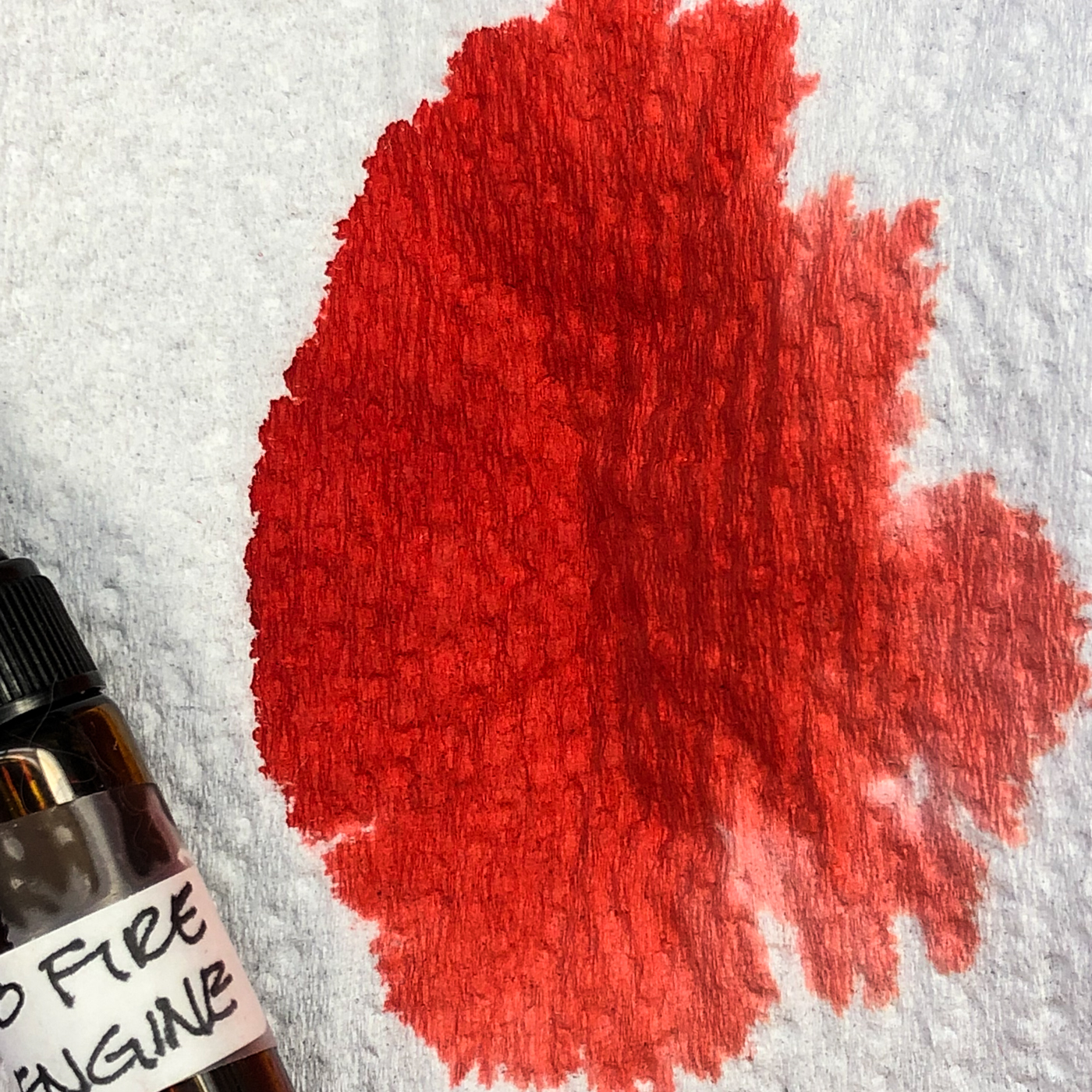
like Fire Engine Red as simple colors, versus the complex colors
we’ve seen where the ink separates into many different hues when wet.
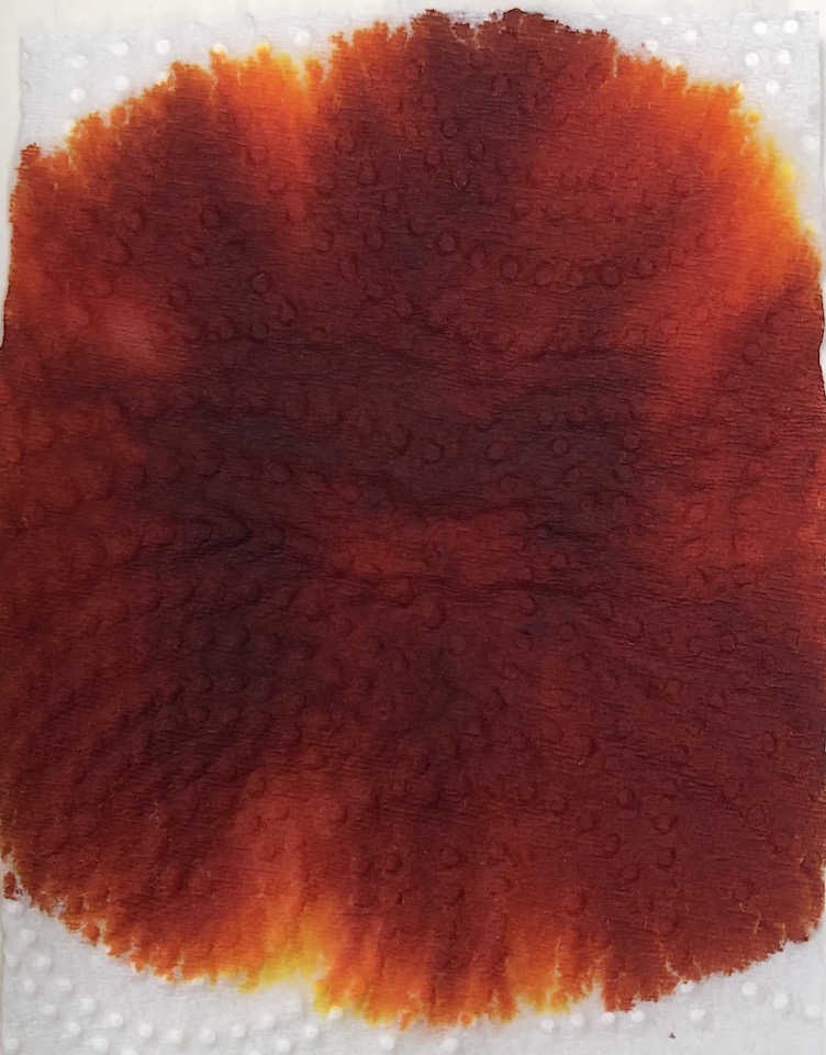
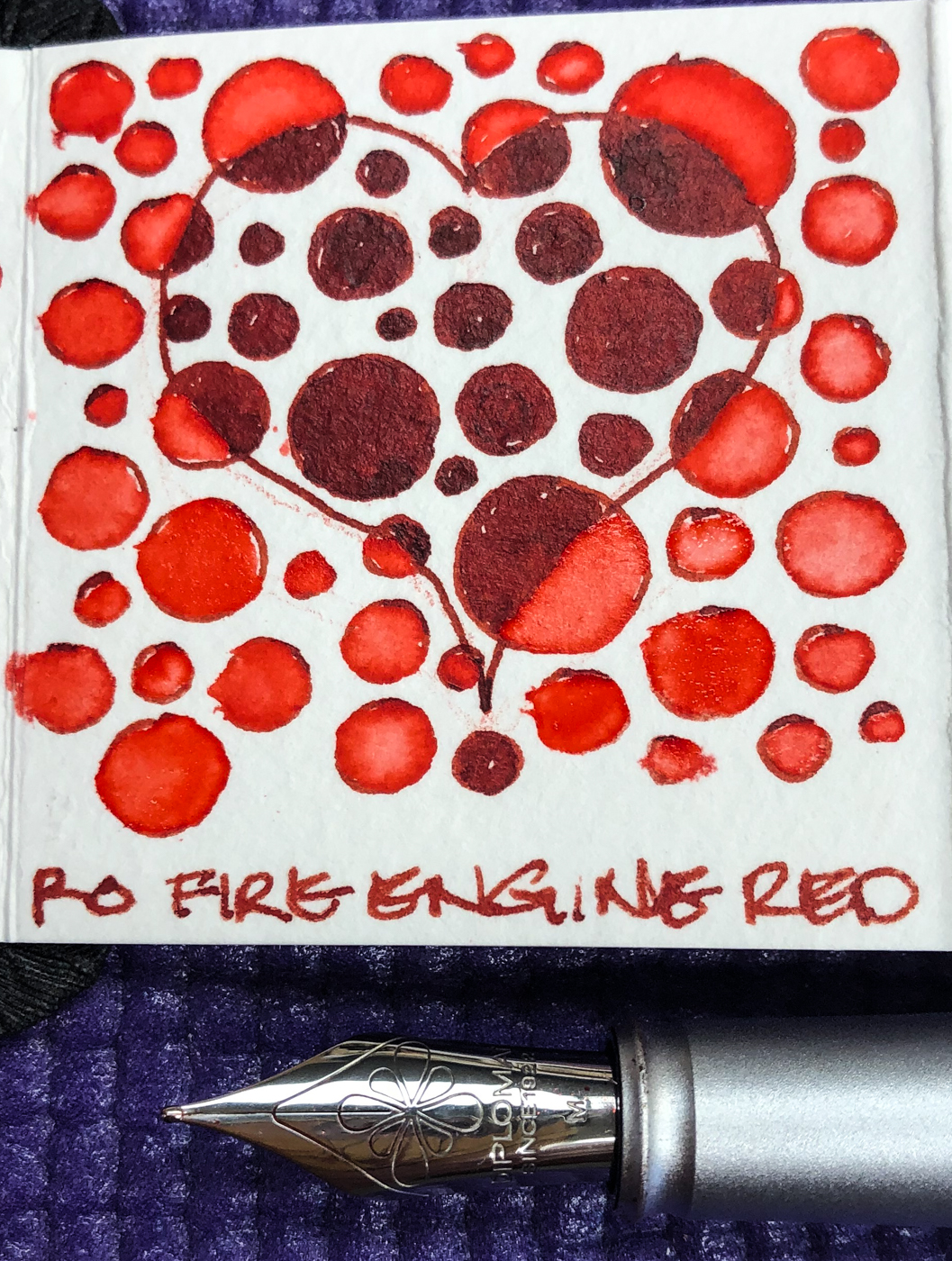
Fire Engine Red dilutes into lighter versions of the same beautiful red.
I see no real sheen, just a dense version of the dye…

Looking at watercolor comparisons for Fire Engine Red, in my palette the colors range from Quinacridone Red (Sennelier), Perylene Red or Scarlet (Daniel Smith).  In watercolors that puts the pigments in the following Munsell ranges:
PR209 / PR178 / PR149.
To understand more about the Munsell system and others,
go to these two wonderful references pages; knowing the pigments can help you not to duplicate watercolors made of the same pigment:

https://www.handprint.com/HP/WCL/vismixmap.html
https://www.handprint.com/HP/WCL/color7.html#munsell

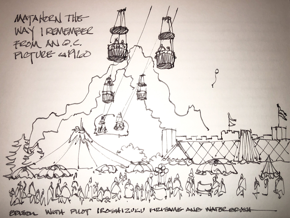
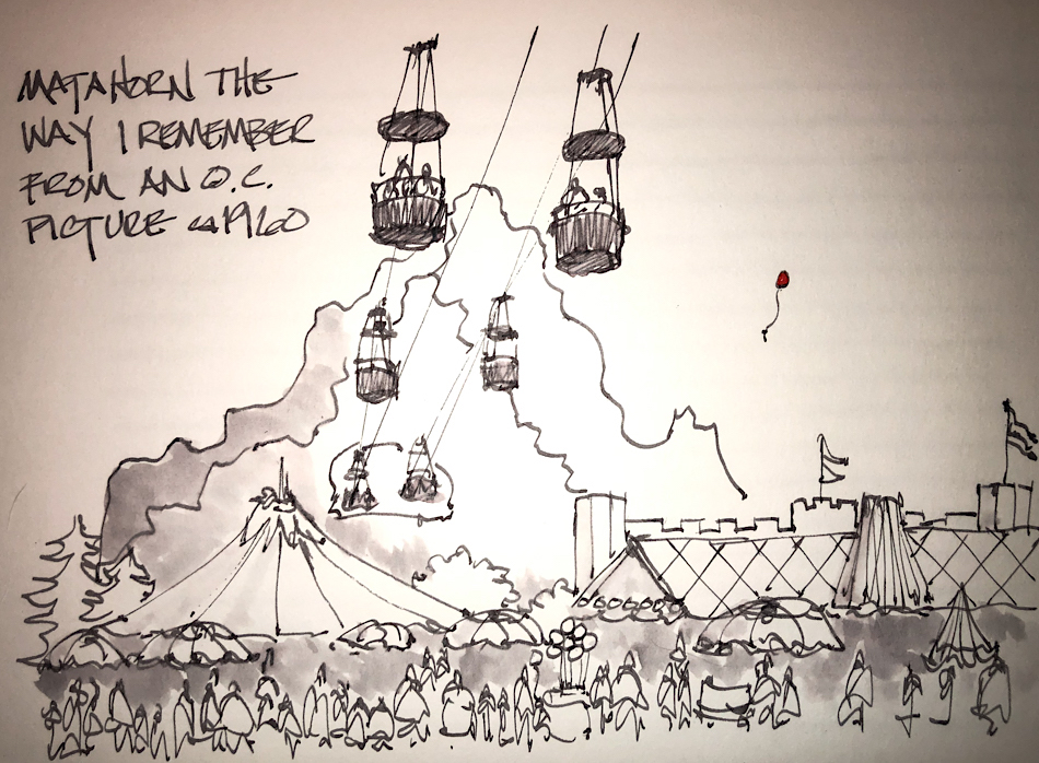
Fire Engine Red ink is
well-behaved.  It is neither
wet nor dry, and does not
feather on any of the papers I
normally use, even Post-its.
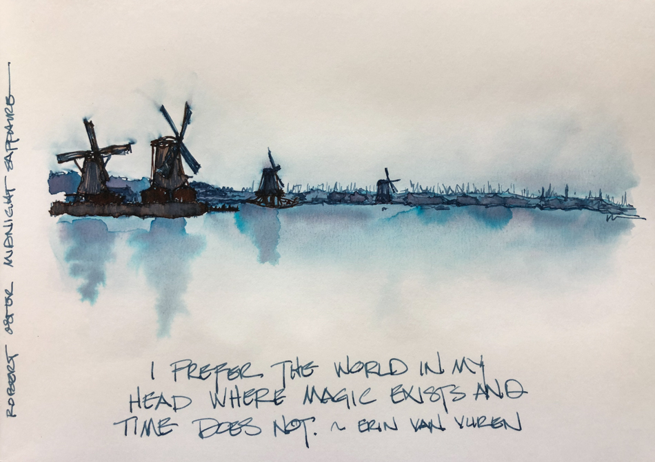
It evaporates quickly
with a wet nib; I’ve not
had smears even with
the wettest sketch, below.
When hit with water it
moves easily with no
resistance or ghosting,
so is not water resistant.
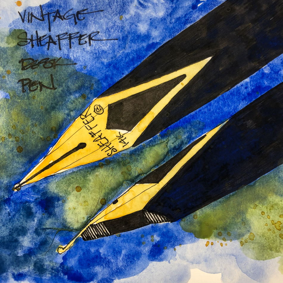
It has a permanent home in
my lovely  Diplomat Aero
with a Medium nib, right.

RO is experimenting and testing light-fast properties…
MOST water soluble ink companies do not pay attention to these things
because most artists who use ink are making prints of their work.


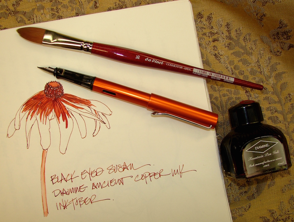
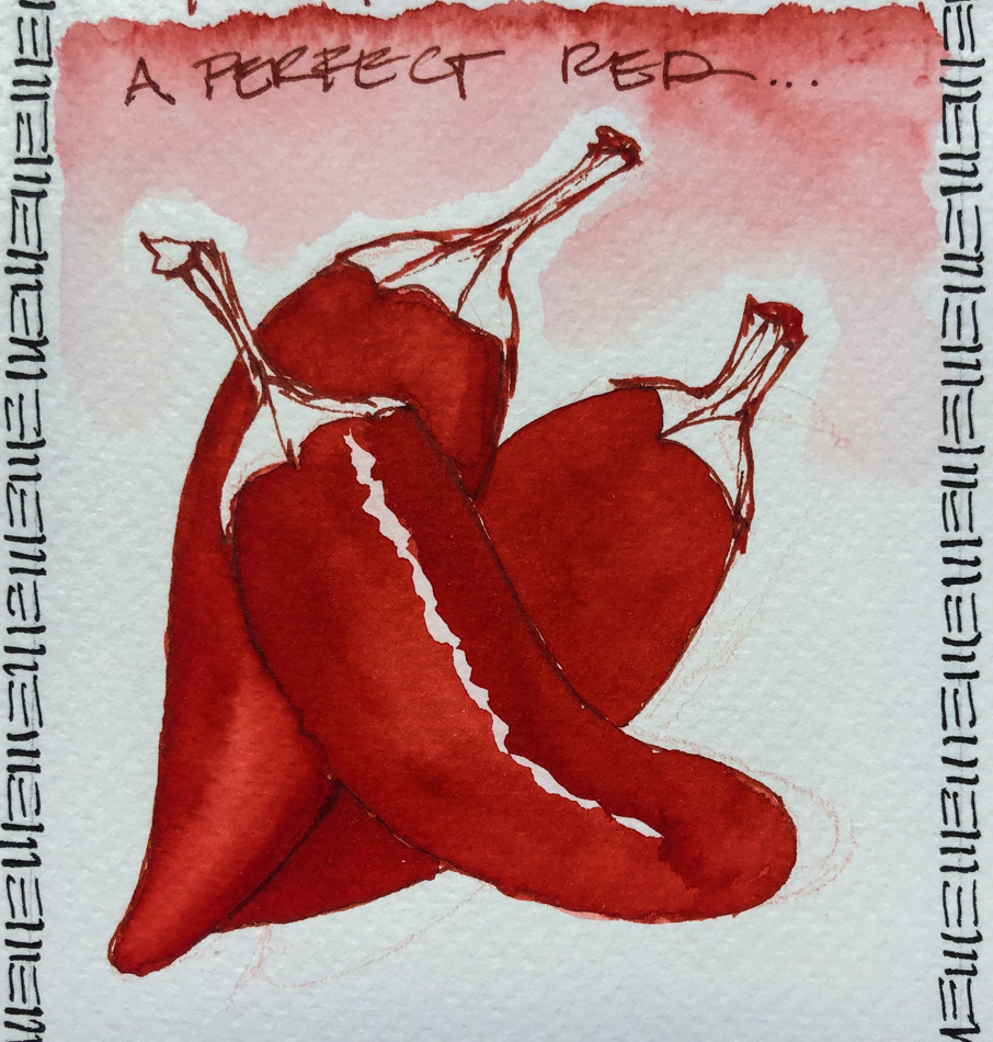
Fire Engine Red is a lovely ink with which to paint.  My chili peppers
were drawn with a Diplomat Aero with a Medium nib on cold press watercolor paper.
In this case I dipped my Pentel Aquash waterbrush into a test vial with the
undiluted Fire Engine Red, and where I wanted a bit lighter red for highlights
I squeezed a little water into the mix.  If you want to try ink painting,
do lots of tests with the inks you want to use to see how they perform.
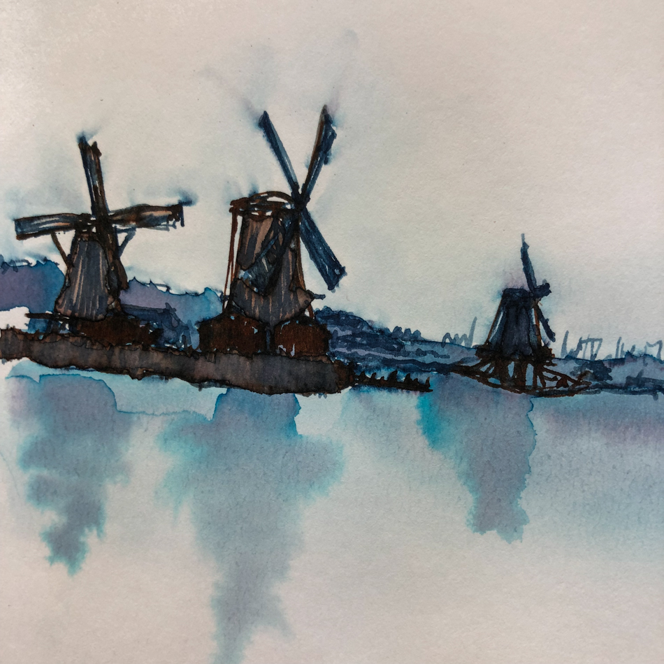
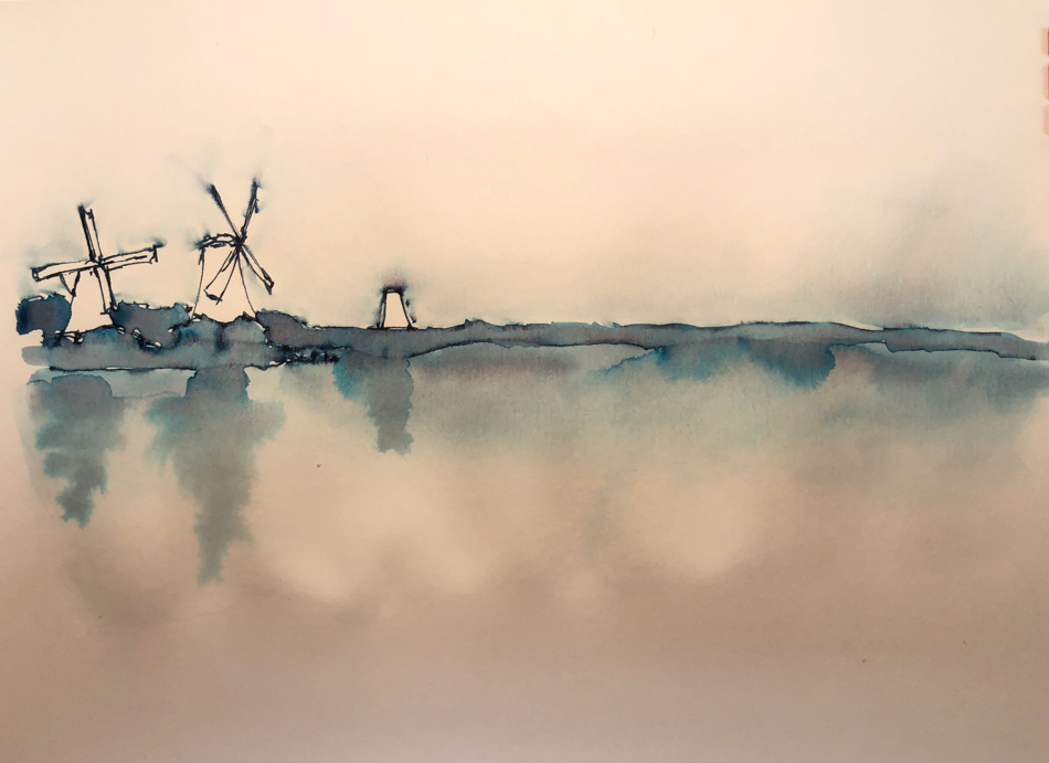
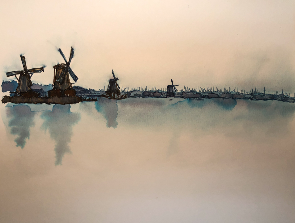
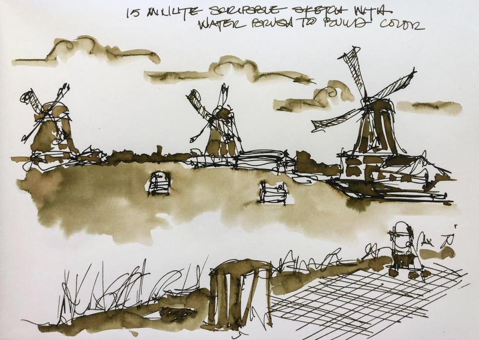
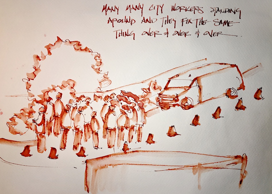
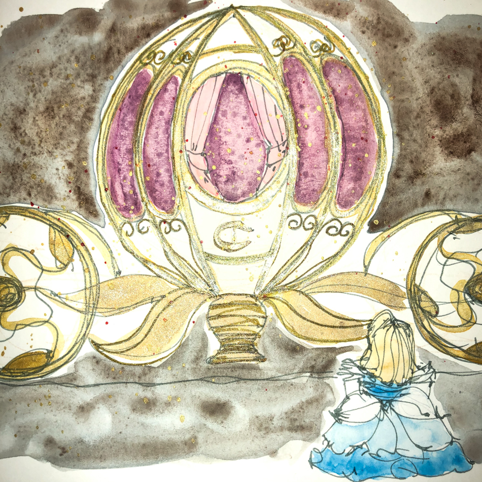
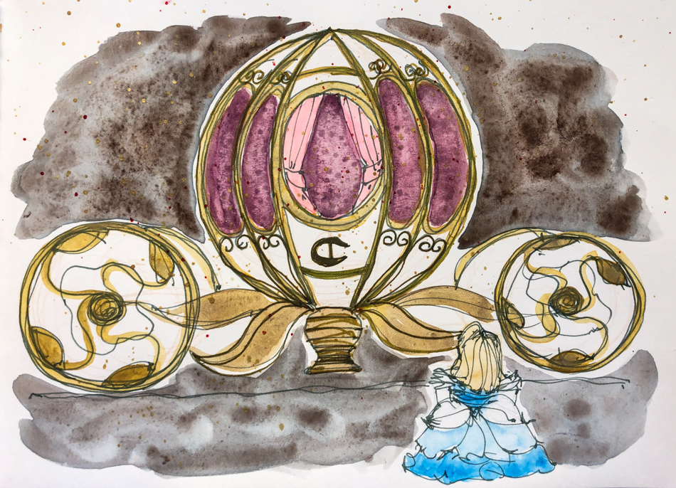
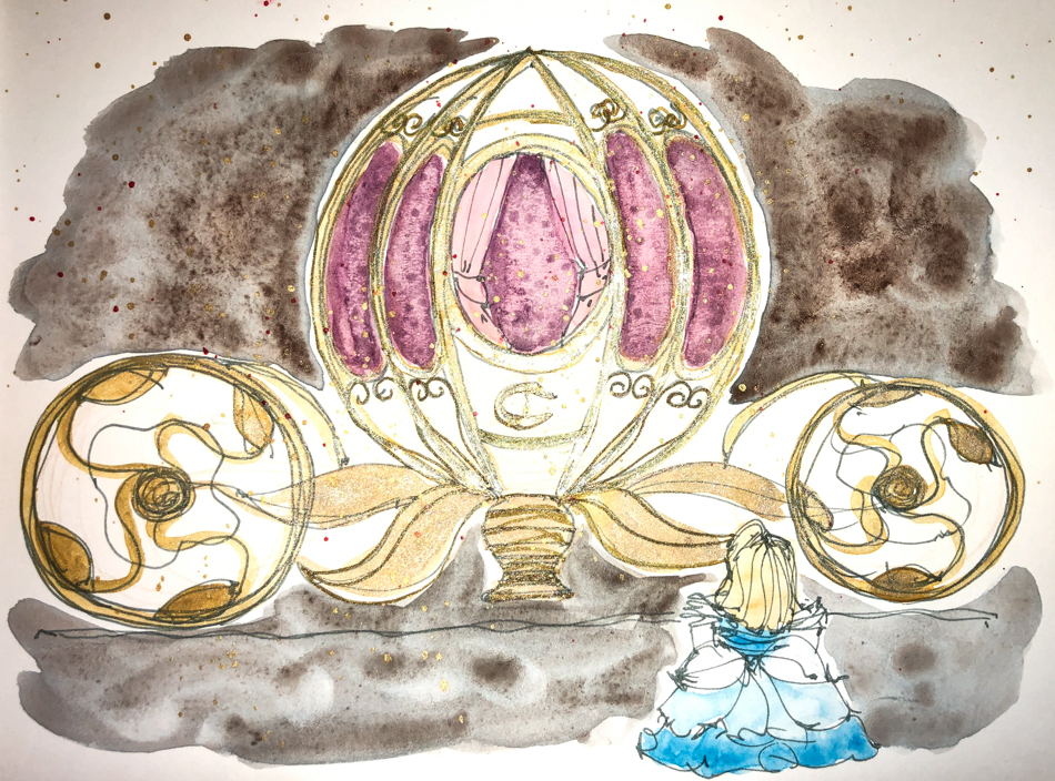
Inks dry quickly compared to watercolors, so once you start you have to move fast,
or you get blooms each time you go back into the image with ink!  I also have to
think a bit more about how I want to paint an image, in what order… again, they dry fast.  Sometimes it helps to get the paper wet before you start inking,
but know that the ink make creep outside the lines you’ve drawn
(I did not do that in the images above or below).
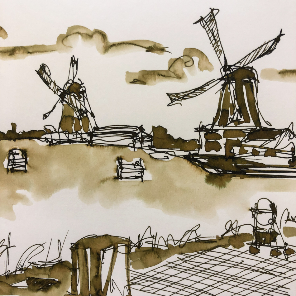
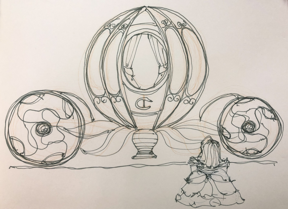
The lines drawn with Fire Engine Red did not stay visible;
they quickly lose themselves in wet color.
The lines were added back in after the water moved the ink and dried!


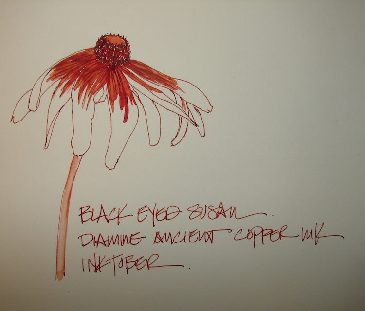
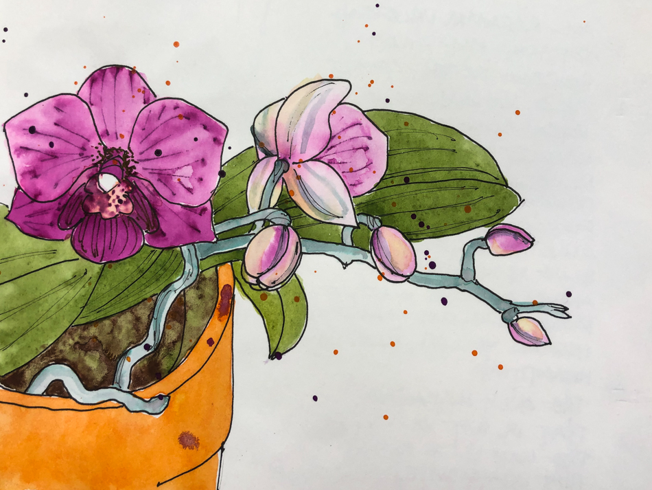
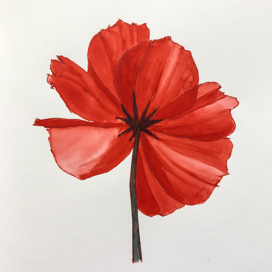
On smooth Hahnemühle Nostalgie
sketchbook
paper I sketched
this bright red flower, above, then
touched the waterbrush to the lines,
sometimes dipping back into
the ink in the fountain pen tip…
such a well-behaved ink
even on smooth paper.

On the very poor quality (but fun)
Bright Ideas multi-color journal pages,
the red ink performed well.
NO feathering even when laying it on thick.


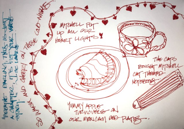
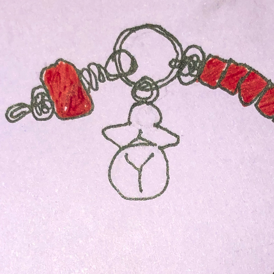
Our Valentines breakfast doodle,
above, drawn on the smooth Hahnemühle Nostalgie Sketchbook  Many hearts drawn on watercolor paper in the Hahnemühle ZigZag Journal for Inktober, right!
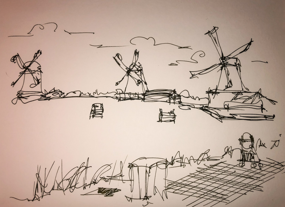
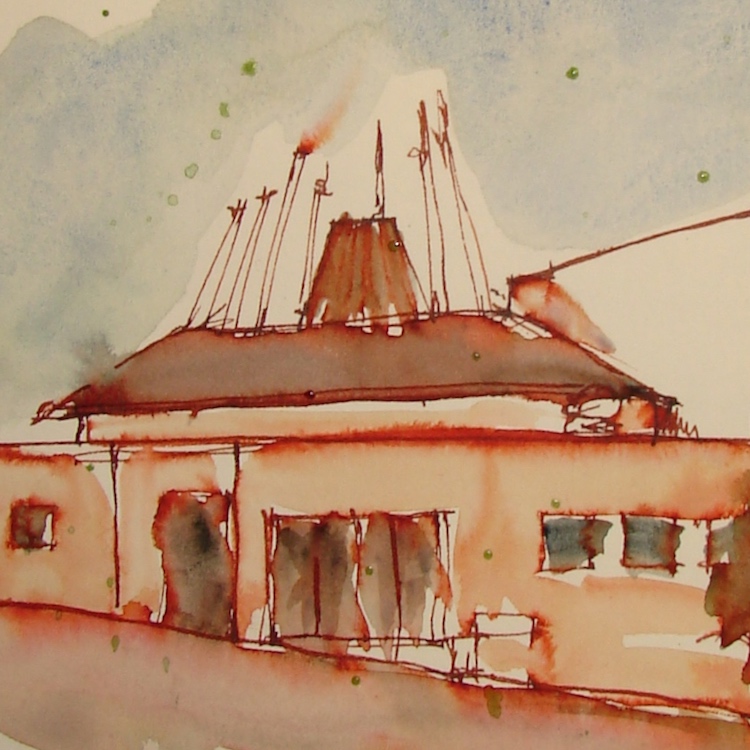
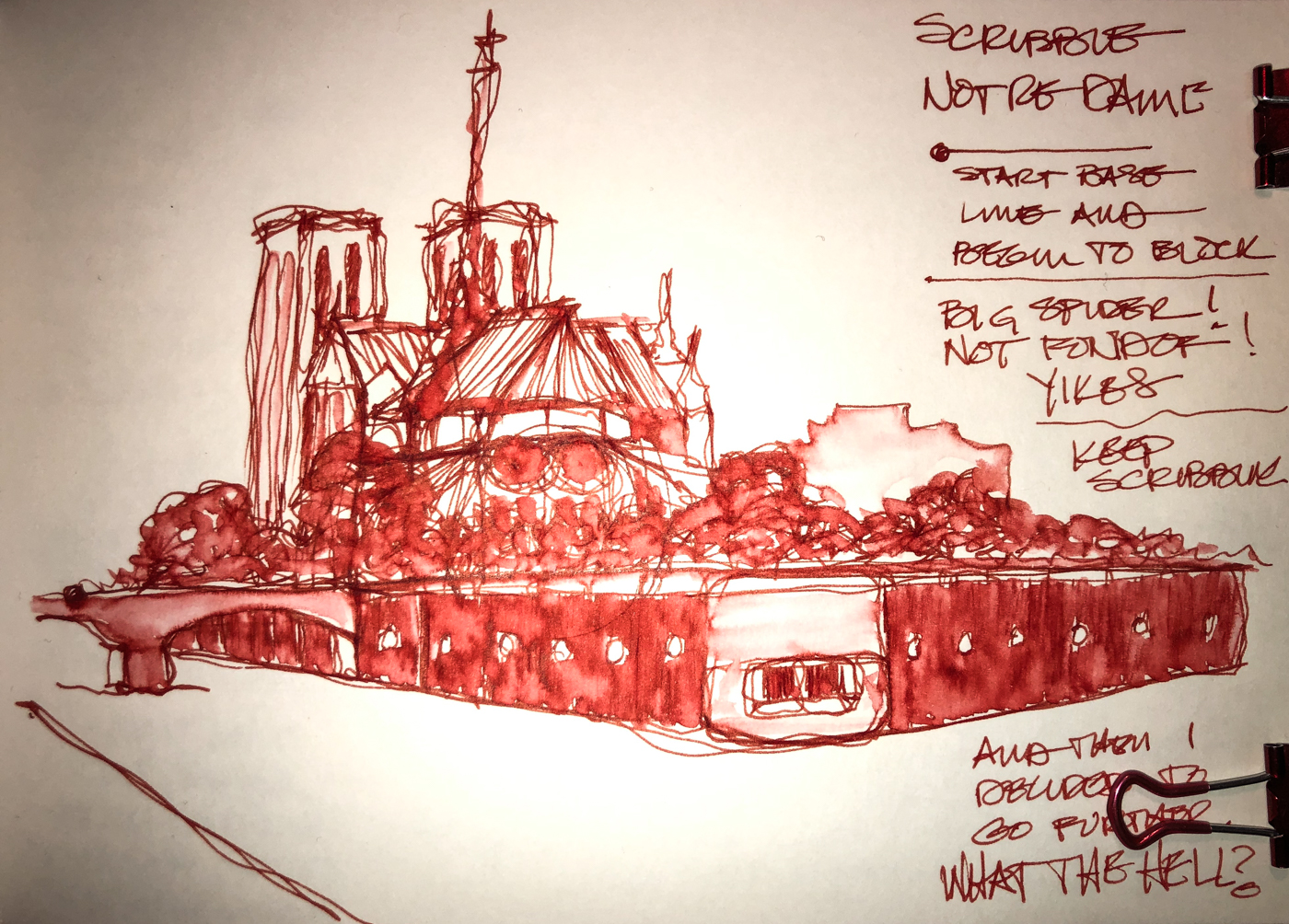
Below, Notre Dame was a demo scribble sketch in the Nostalgie, and just touching lines moved the ink beautifully. A thicker line will lay down more color when wet.

His inks are non-toxic.
I have more Robert Oster inks than
any other maker of ink.  Why?  Because no other brand has the spectacular pigmentation within a color, which gives even his simplest inks such beauty that it is a shame to waste them only writing!


BTW, never ever use any ink that is not meant for fountain pens in your pen.
Dip pens can use just about anything, so make absolutely sure
the bottle says that it is for fountain pens!
Do not listen to the big box sales person, read the bottle or if in doubt, don’t do it!

I bought Robert Oster Fire Engine Red at Vanness;
Jetpens also carries it.

Other Robert Oster Inks reviewed in this manner:
Robert Oster Jade
Robert Oster Thunderstorm

To hear about classes, follow me on Facebook
or check out my new, improved dkatiepowellart.com

Posted in art journal, color, creativity, drawing, ink painting, journal, painting, pen & ink, process, review, sketchbook, watercolor, writing | Tagged , , , , , , , , , , , , , , | 6 Comments