
 I read a mundane op-ed in the NYTimes this morning from a writer I rarely read — and I won’t mention it because he’s a dweeb and I don’t want to be sued. But the upshot is that he believes virtual or electronic activities are overtaking physical activities in most walks of life for various reasons, among them being easy access at all hours of the day and low risk in terms of exposure, and that someday real life activities could be replaced to a great degree by virtual or electronic activities.
Some of his editorial was surprisingly sound, and if it comes to pass that he is right then I am glad I am older and in the last third of my life and happily married. (It seems virtual dating doesn’t work, big surprise there… fewer lasting relationships statistically.)
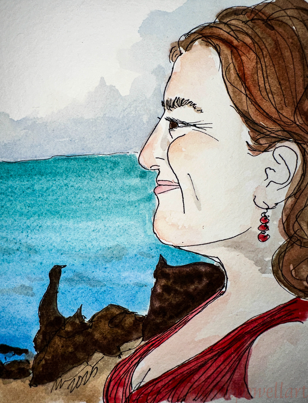
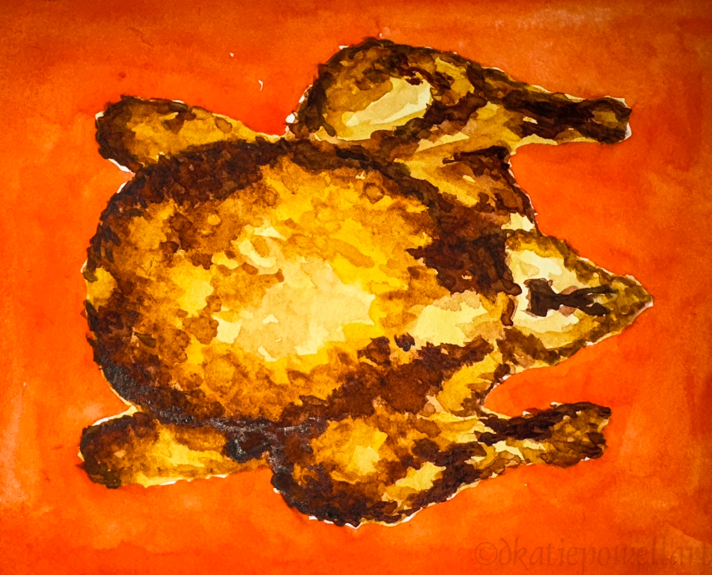
It got me thinking about why I never gravitated to iPad art, not in terms of making it nor in what I’ve seen of it in the hands of artists I admire. In the making of it, I am talking in my case about drawing (pen and ink), watercolor, acrylic, shown below right, and oil on canvas, the latter I now prefer over acrylic.
So here goes, my thoughts today, off-the-cuff!
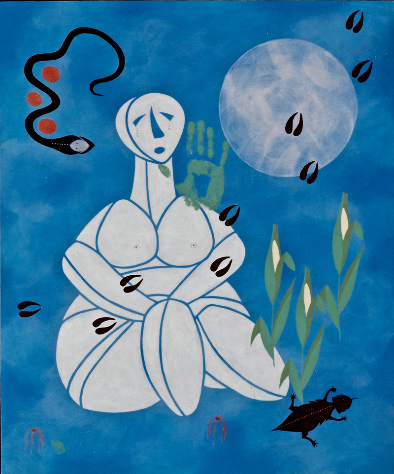
 First, I love the physicality of it. Painting engages my whole body, not just my right-hand clicking parts or wand or finger. Even more so when I have the opportunity to paint BIG on canvas, such as the family series I did, shown right. It challenges me to remember to balance relaxing and holding the brush tight for painting tiny details. I have to get up and stretch, move around, step back.
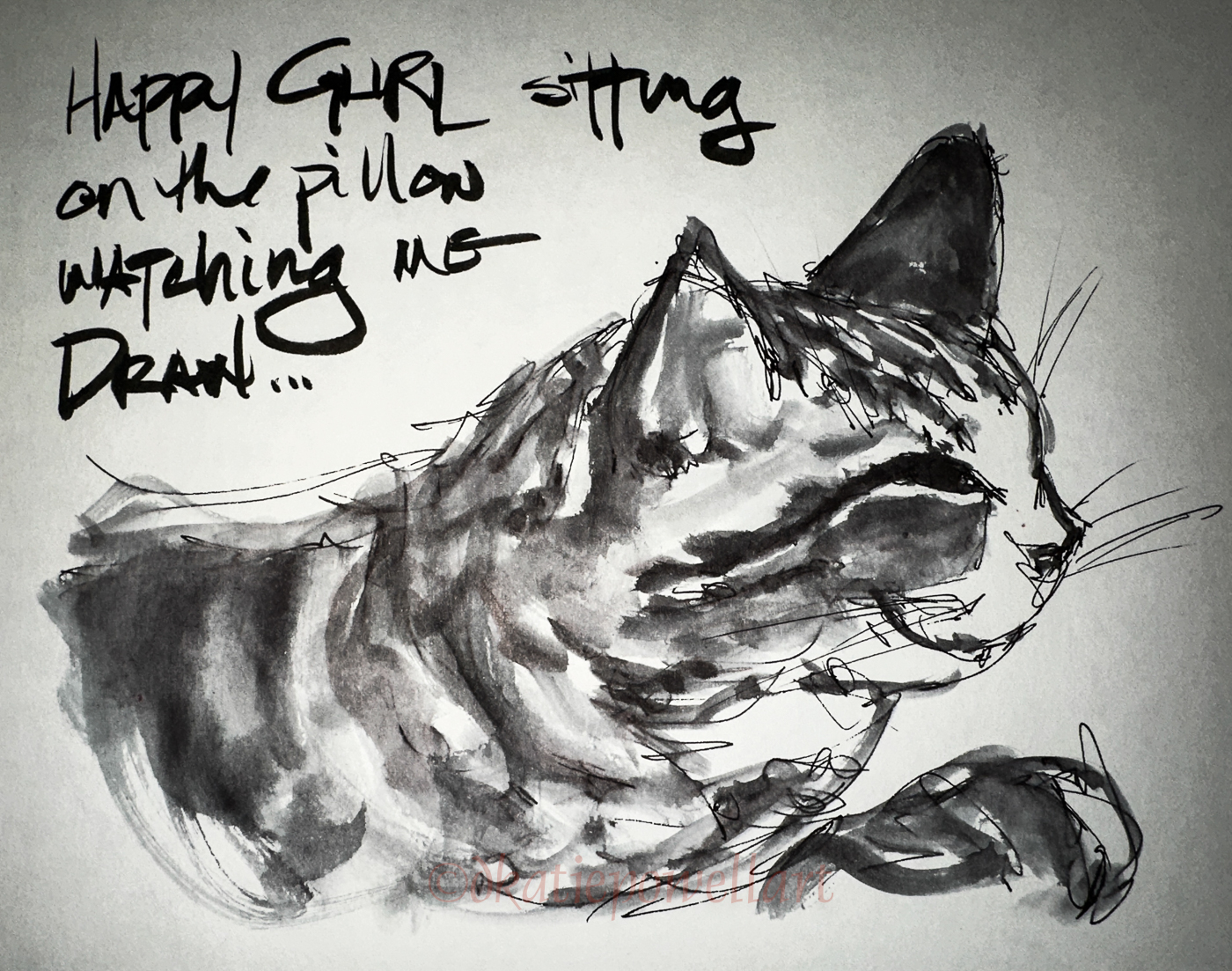
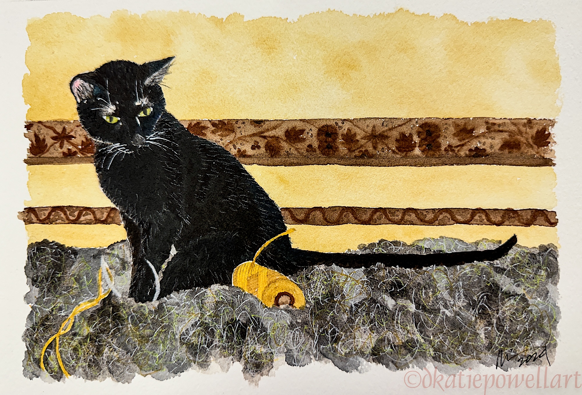
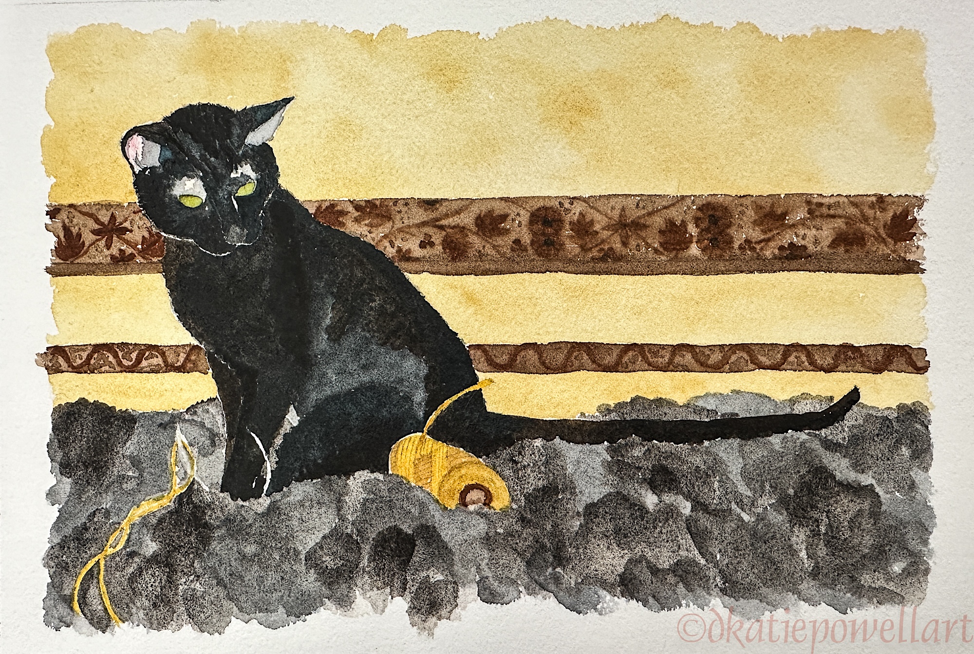
Watercolors are the most difficult medium for me, and also my favorite. They are endlessly challenging, can be carried everywhere so always available, and I always have them with me. I’ve been writing about why I keep a sketchbook, and a lot of it is for emotional reasons, as in memories.
 I am challenged when creating a wash for a sky, making enough wash color, and applying it. Or adding layers without overworking a piece.
I continue to forget ahead of time to choose the right paper, very important in watercolor. I start an image in a smooth-textured sketchbook and am sorry when I decide the image is going to need washes of color, which are better on thicker textured paper. I am lazy about switching out to a watercolor sketchbook or pad.
Watercolors show me a lot about my personality!
The physical challenges are varied and keep me engaged and paying attention. No computer does that for me. I could, in FACT, fall asleep on a keyboard.

Test on silk

Mixing colors…

Oil paint on a previously stripped (damaged) chair.
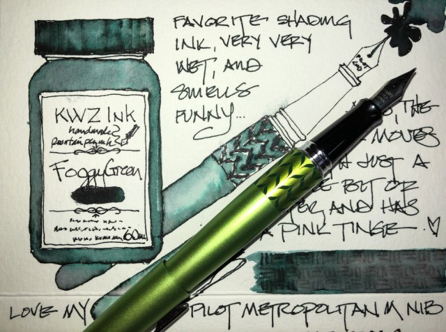
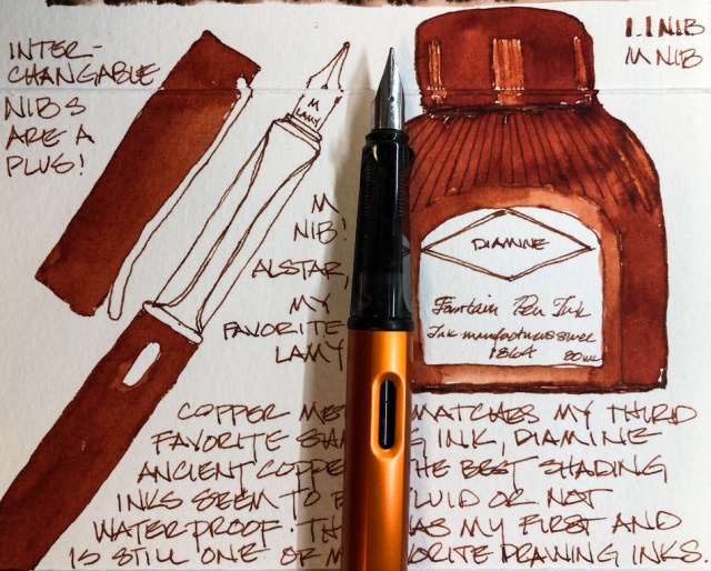
The senses, especially smell, though not so much with watercolor (though I can smell the difference between Daniel Smith and M.Graham, especially when it is fresh out of the tube).
I LOVE the smell of Gamblin oil paints, and thankfully their mineral spirits are odorless! I was introduced to them in our business, through the projects shown above, and have since continued to experiment with them on small boards and thick paper.
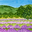
 And then there is the memory of the lovely smell of this field of posies… I had to slow down and enjoy that moment, which was lovely.
Spontaneity, which means I can record life-moments in real time, and along with those moments comes the many emotions that I might or might not remember. Painting and sketching them makes them real and keeps them alive — there is something about the physical act that embeds them in my mind.
 When we moved my mom out of her house, which was the beginning of the end of her life, I made a small folding watercolor journal for the trip, and recorded my impressions of a drive I’ve taken many many times, shown above.
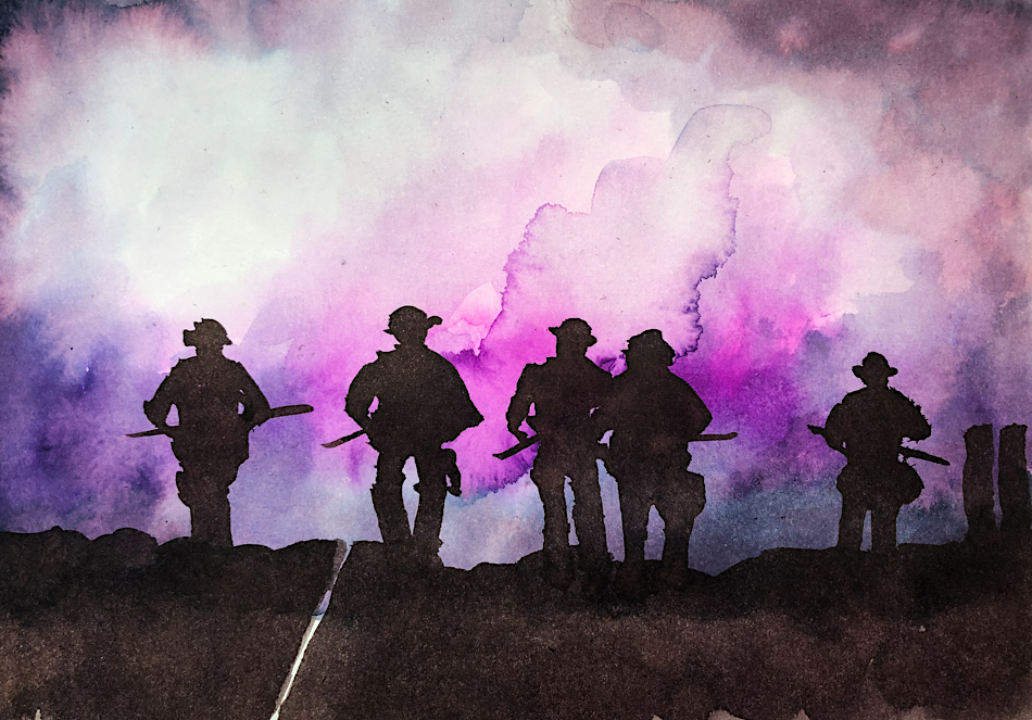
During the Portland riots, which were frightening, an image so strong came up, and it has said it all to me in the years that have followed. Seeing it brings up the memories of that time, including staying in the studio until very late listening with fear to the sounds of anger in the city.
Getting lost in my work is the best part, and I cannot get lost in any creative act on the computer. In fact, when I am writing, and I do a great deal of writing on the computer, I have to jump start my creative process through hand-writing first, then after a certain time I can take it to the computer until I get stuck again.

Hahnemühle Watercolor

Hahnemühle Watercolor
 Finally, I love the tools of the trade, including amazing color you do not get in a virtual image, shown above! Wet glistening paints on a page are the absolute best. If I am stuck sometimes just playing with the colors will move me toward creativity.
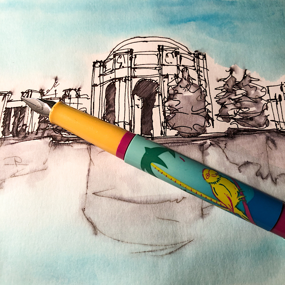
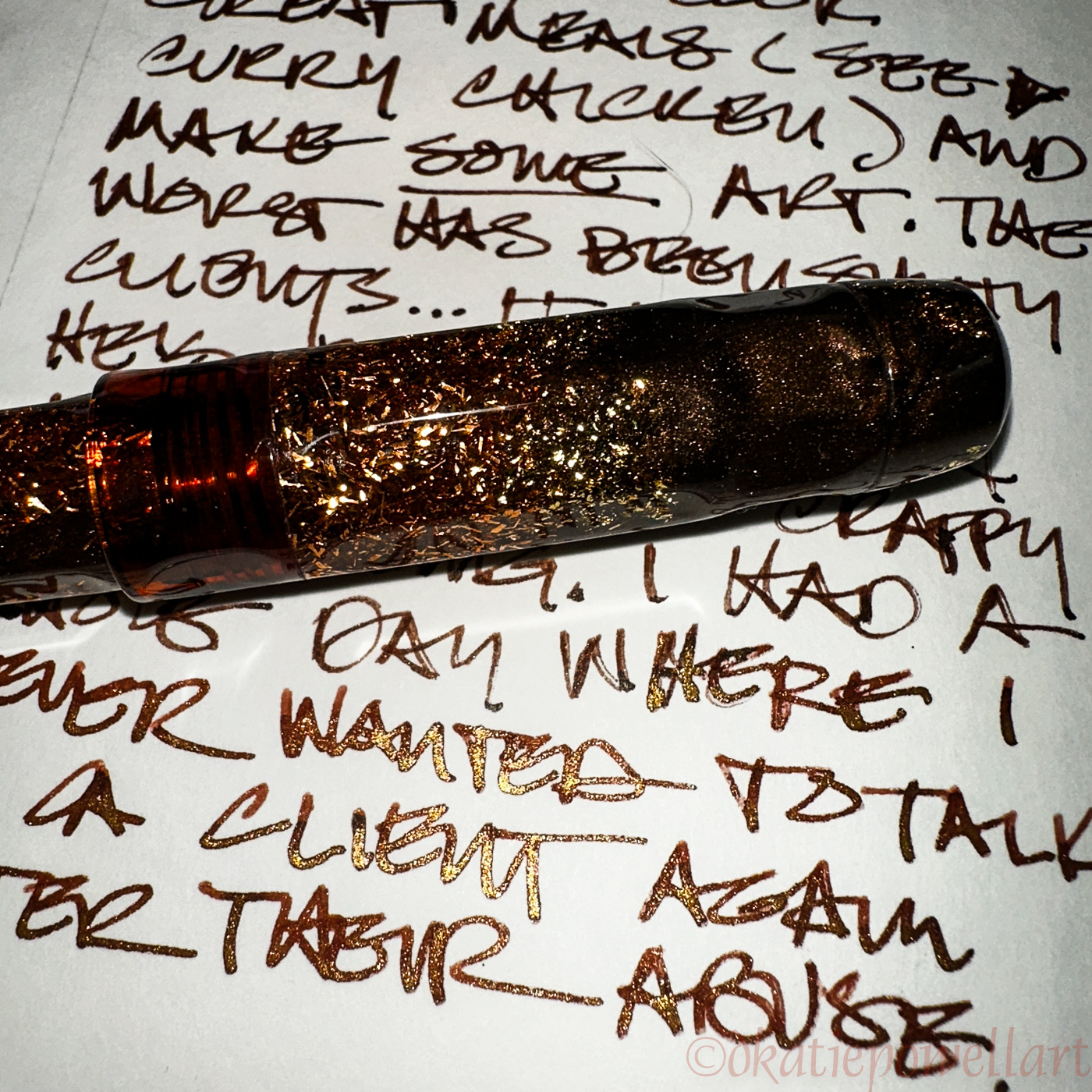
Pens, beautiful and fascinating and endless varieties! Right is a cheap but beautiful vintage Pelikan P20 Twist. I had to have it — it has PARROTS on it!
And below, my beautiful Benu pens… collectible but pricey, so I have to have a reason to use them!
I had to get this out… it was hurting my heart to think
about my processes and how I would be heartbroken
if I could not get my hands on paint and brushes!
☾


©D. Katie Powell.
My images/blog posts may be reposted; please link back to dkatiepowellart.
Note: As an Amazon Associate I earn from qualifying purchases.
To hear about classes, follow me on Instagram and Facebook.
Note: I was banned from IG until October for political postings.
I'd love it if you shared this; please mention my blog name!


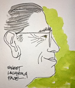
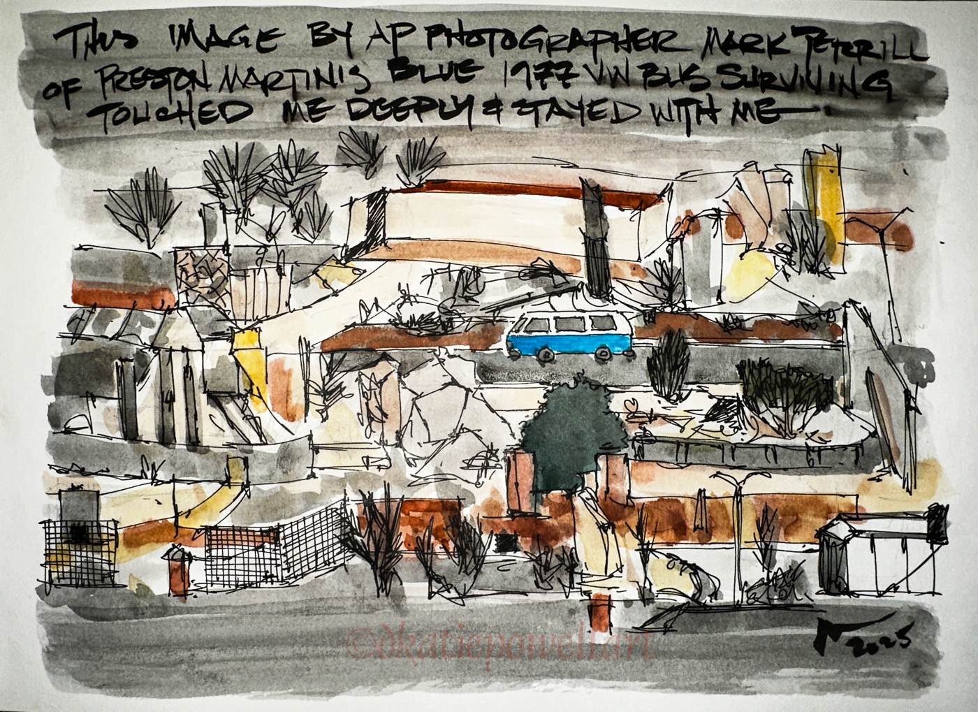
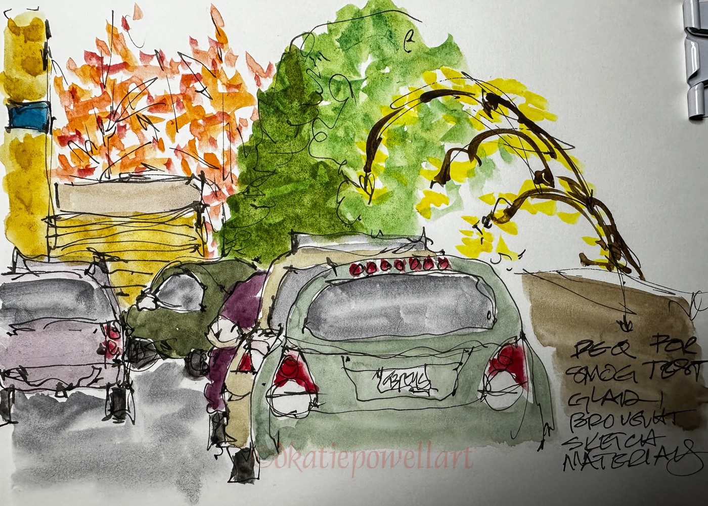
 I began with a good pen and ink sketch, below, and thought about embellishing it with lots of detail and not adding watercolor, but then changed my mind.


2025 1 20 Rump
IMO the flag should be flown upside down and at half-mast for the next four years because we are in distress as a nation. I won’t be stopping these rants anytime soon and if I do, then you should all be really worried. Someone has me gagged and tied.
I read something two nights ago that someone attributed to
“Good Morning Podcast” which I never heard of:
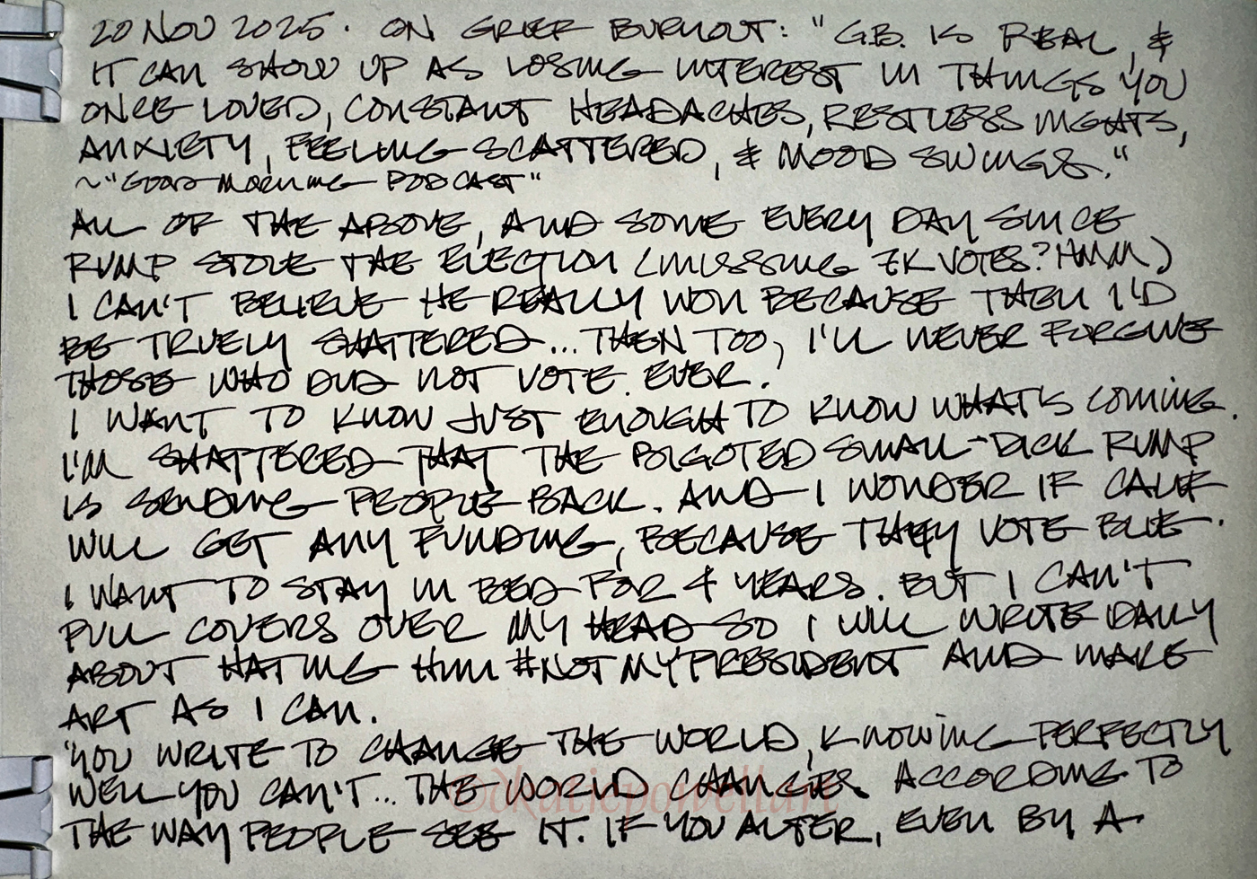
“Grief burnout is real, and it can show up as losing interest in things you once loved, constant headaches, restless nights, anxiety, feeling scattered and mood swings.”
I have had all those things for several months, after # not-my-president somehow ended up being deemed our President. I say this because of the missing votes (is anyone even looking for them), and maybe because if he really won fair and square then I’d be truly shattered, because how is that possible? I would have to consider that a slight majority of those that voted actually wanted him.
And BTW, I will NEVER FORGIVE those that did not vote, nor the students who decided not to vote. I think you should not be allowed to vote ever again. Forfeit.
Yes, I am mad, still.
“You write to change the world, knowing perfectly well you can’t… The world changes according to the way people see it. If you alter, even by a millimeter, the way a person looks at reality, then you can change it.” ~James Baldwin
And I’m heartbroken. I did not know I loved my country this much. I knew I loved the land, but I didn’t think about how much I love the actual laws that we have lived with for so many decades. Perhaps it is because I took them for granted, and now I am seeing that we might lose them forever.
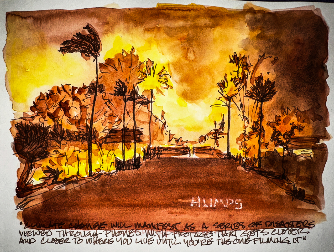
I have had the covers metaphorically pulled over my head for a few weeks, hoping this was all a bad dream. I’ve been worried about lalaland, my home town, and if they would get funding from # not-my-president. I have not made any art for weeks except a couple of burning images of the Palisades. I have stayed away from the news other than about that one issue.
He will never be my President, and by that I mean I won’t call him that, and I will not look to him for any guidance about our country because he will do nothing to make American great. He will never unify. He will never give a rats ass about anyone but billionaires who are also his maggots. He will not help a blue state in the middle of the first huge climate crisis (also happens to be my home town), nor does he believe in the science of that, nor any blue state, nor support women’s issues, nor anyone with disabilities, nor gays/lesbians, trans, immigrants, etc etc. He will start wars if he likes, just to show us how big his member is not.
So now I have to find a way forward. I need to do what I do, make marks about what is going on in our country, and how it is hurting us. I will, as an art teacher said, “Do it when you are crying. Do it when you are mad. Do it when you are tired.”
I will publish more on finding a path forward when I feel I have found it, but one thing I can say now is my art journal is my clearing ground, where everything that is happening to me of importance finds a place (unless no time!). It is even more important now, because when I get my thought on paper they tend to lessen their hold on my psyche, The act of writing it all down let’s my soul feel heard. So, the pages are filled with writing and art, often not shared because besides being an artist i also am a businesswoman.
PS: I wrote to the NYTimes this morning and asked them if they were going to publish his lies without calling them out for the trash they are… I am referring to the BLATANT lies, and he has already started. If they are unwilling then they are going to be dumped from my inbox, along with any publication that does not tell the truth about him.
PS. I still have to decide about Meta, and being on FaceBook and Instagram. On one hand, I want nothing to do with the ass-kissing weenie, but on the other, as friends pointed out, it is the best place to counter every damn lie that is going down, if I have the stomach for it.
Anyone else feel this way? How are you dealing with the upset?
☾
Hahnemühle Nostalgie Sketchbook,
Pentel Aquash waterbrushes with diluted De Atramentis Urban Grey ink,
Robert Oster inks, Birmingham inks,
Platinum Carbon pen with Platinum Carbon ink waterproof cartridges,
White Uniball Signo, Platinum Japanese Art Pocket Brush Pen+.
☾
©D. Katie Powell
My images/blog posts may be reposted; please link back
to dkatiepowellart and drop me a note @dkatiepowell @aol.com.
I'd love it if you shared this; please mention my blog name!