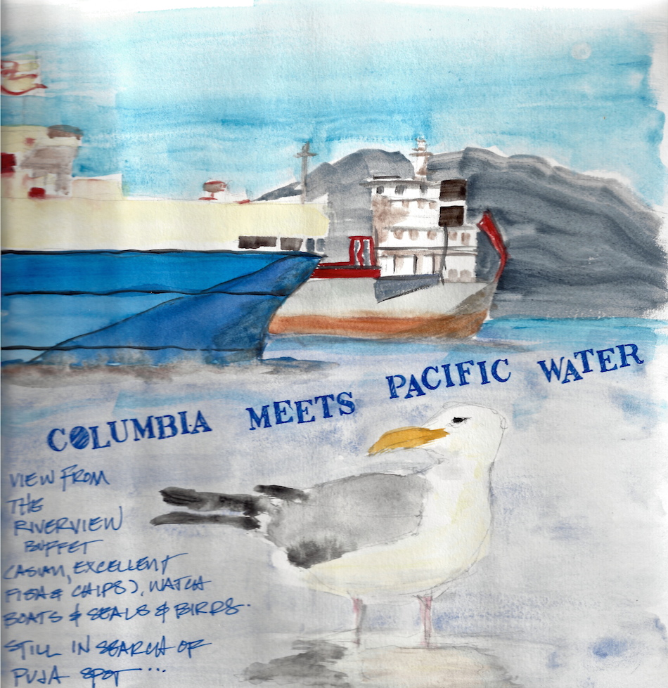
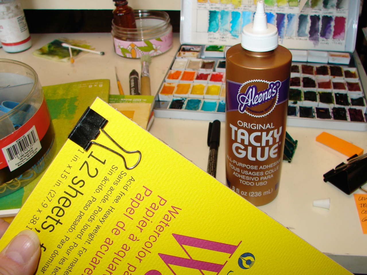
I finally bought nine of Golden’s QoR Modern Watercolors, and I am sold! Golden has by far the best acrylic paints on the planet, and now they have made a line of watercolors that is making me want to ditch many of my favorite Daniel Smith Watercolors (except for the Primatek line of gemstone colors, so yummy.
 I played at both ends with QoR’s silver and Daniel Smith’s Genuine Hematite, and what you see above is the mix. Later I dropped some water in the middle just ot see what happened. I do think that the watercolors have a bit more staying power that normal watercolors, but as I work with them we will see.
I’ve fallen in love with the Terra Green, which I wish I had a dozen time in past, and the Bohemian Green. QoR’s Green Gold is much more what I think a green-gold should look like, as opposed to Daniel Smith’s, which is a beautiful color, a bright lime, but not Grene Gold (I will continue to buy DS’s color, however, as i am in love with it.) QoR’s Van Dyke is richer, and has a bit of a burnt quality to it, not quite as flat, tho that is what VD Brown is in most colors, so be warned this VD Brown has a flare of orange in it.
Drawbacks, only one that I can see: The tubes are small, like Sennelier, which makes them more expensive than, say, Daniel Smith . . .
 What I love best after testing them is that they are intense. I missed the ability to move really intense color in any of my other watercolors, and when I dipped my brush into the Quinacridone Magenta, I was shocked at how far the bold the color was. I quickly wiped my brush, thinking I had put a lot of paint onto the brush, but NO, it was a normal amount of very lovely dense color — and so I went to see just how far that bit of color would go, and after the top left square, you can see that it continued to be thick and lovely, even as I dropped a bit of water on it to stretch it to see the lighter color. Omigoddess! the Indigo and Green Gold also had staying power in intensity, lovely lovely deep color! Yay!
 I came back and added Daniel Smith’s Quinacridone Gold to a few colors: Quin Magenta, Van Dyke Brown, Permanent Green, and Indigo. I always have to see what Hematite and Quin Gold, my go-to mixer colors, do to the paints. Amazing how they held their colors and played nicely.
So, when money allows, more QoR colors. And Daniel Smith Primatek’s. Yummo!

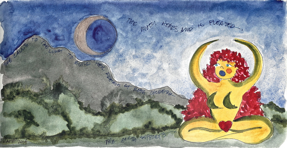
I am now agreeing to the Creative Commons Attribution-Non-Commercial 4.0 International License, which you can learn more about by visiting the site, or, visit my web page for a more user-friendly summary on my terms. My images/blog posts can be reposted; please link back to dkatiepowellart.
0.000000
0.000000
I'd love it if you shared this; please mention my blog name!