
Love this video —
Brenda is an amazing water-colorist!
 My home town seemed a good place to start our walks. This will be a very
short walk up about three blocks on the Pacific Coast Highway, starting at the
historic Main Beach Lifeguard Tower, shown in black on the map above.


I knew where I wanted to take you, but with the Google Streets you can
view the walk you want to take and make choices about what you want to “see.”
The latter is what is such fun about doing a walk together as a group,
because as the the group gets comfortable, what each person’s eye is
drawn to is different and so, the walks are all different!
Yours can be as simple or as complex as you want to make it. Before we go to specifics, I want to give you a bit of an explanation about what you will see from those participating who have a background in architecture, so you understand the basics of how they do what they do — take the mystery out of it, so to speak. AND, you don’t have to do this.
Or you can begin to incorporate some of the elements into your own art. . .
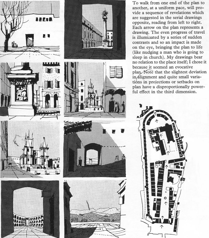 Architect and urban planners learn to
“walk” their real or imaginary sites and buildings, thinking about how the public will experience the three dimensional spaces. Gordon Cullen wrote a book every architect has read, “Townscape,” where he describes, among other things, this process of both looking and presenting for future designers of both buildings and urban spaces.
Architects and urban designers are
presenting the experience of their world and vision and probably forcing you,
the unsuspecting visitor, to experience
what they want you to experience.
A great designer presents the spaces in such a way as to be an art form,
and maybe the visitor never even knows what is happening, but s/he had the delight
of the experience nonetheless. Next time you visit a cathedral or public building
think about how you enter, and what you are seeing.
What might be different if you came through the back door? Side entrance?
For an bit more about this artful manipulation, there is a nice bit of writing (but it may bore you or be over your head and it NOT necessary — but you might want to look at the images! (BTW, I do NOT recommend you buy Townscape. It will probably bore you to death as this is not your focus.) Links:
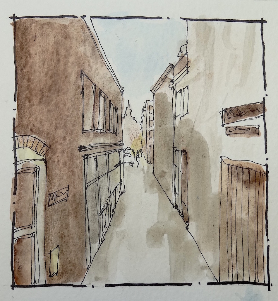
One thing that architects, urban planners, and graphics people know are tricks about unifying diverse elements. Line, shape, color, and graphic style are all simple possibilities. As we walk together you may see some of this in my or another artist’s work. Examples:
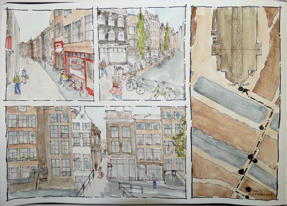
First up, my walk through Amsterdam I used
size (all of my images fit into a gridded format) and
linework (notice I outlined them with the same broken line
that is distinct from the other drawing lines) and
uniformity of color (in this walk I just happened to want to do that — I don’t always!)


In the next published walk I wanted to play with two elements:
colored inks and pushing the boundaries on depth of watercolors.
I pulled them together by choosing three ink colors and spatially having a format.
I was able to change my style and color as I wanted and the pages still looked cohesive.


It isn’t necessary to do any of this, but I want everyone to be able to if they want to do so!
You can also create separate journal entries for each view on your walk:
 I went completely free form and used each page to explore styles and storylines in my month long walk through Italy and France for the International Fake Journal Month.
(Such fun, I highly recommend this happening in April. See the side bar for a link to Roz Stendahl’s page — you also make up a storyline as Carl is doing on our Facebook page.)
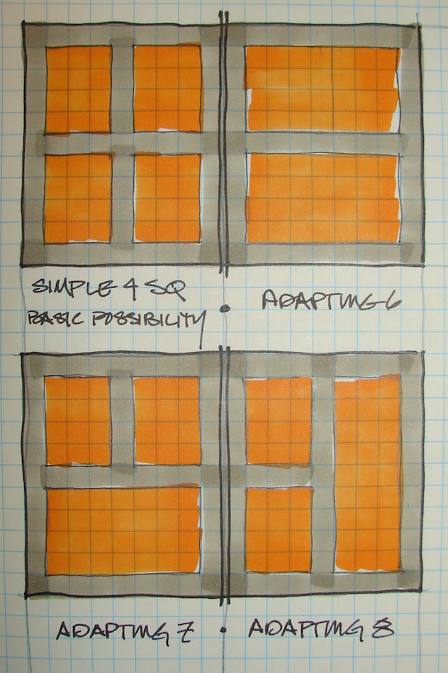
I am using an A4 moleskin, and my basic layout is about like the one below top left.
I leave a 3/8-inch border, then divide the page into six squares with a 3/8-inch division between squares. This basic format allows me endless possibility:
An occasional double square created vertically or horizontally, or even a huge
4-square if I want to create an awesome detailed image of the final destination.

The format does not have to be squares (I have always been a nut for the square shape). If you happen to have a sketchbook like shaped more like a letter page, the same border then division inside can happen, but the resulting format will be a derivative of the page shape.


 As you look through the virtual
images on a Google streetmap, your eye can choose what it wants to draw or emphasize. We are starting at the icon and historic Main Beach Lifeguard Tower, so maybe you want to crop in and draw it without the street view.
On my walks through Europe, I
focused occasionally on statues or
some small detail that thrilled me.

Above, the unedited version of a street view, what the camera records.


But I want to choose the view I want to draw.
I do this with my camera imaging program, but am showing it to you in a
sketch on a printed view. I looked at a corner first that had nice memories for me,
but in the end I liked the second image, incorporating two street-corners.
This is the one I will draw, and you can too.
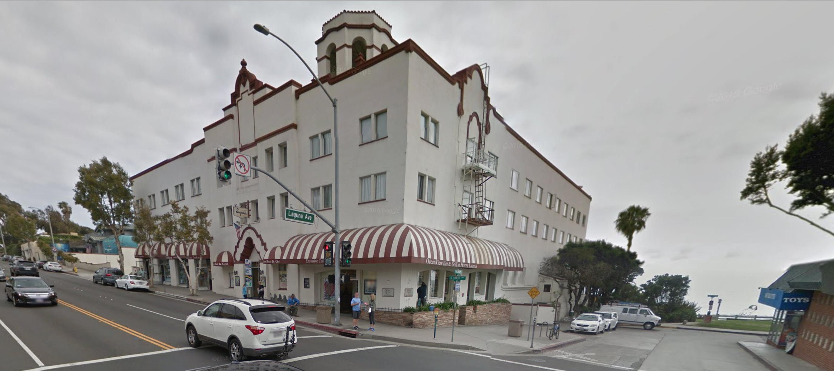 Above, the wide angled photo of the Hotel Laguna.
(My parents honey-mooned there.) I could have made it a double square just as it is.


Then I looked at cropping it to a square as I am fond of squares,
and realized it might also look cool as a vertical double square.
I’m not sure which I will do.
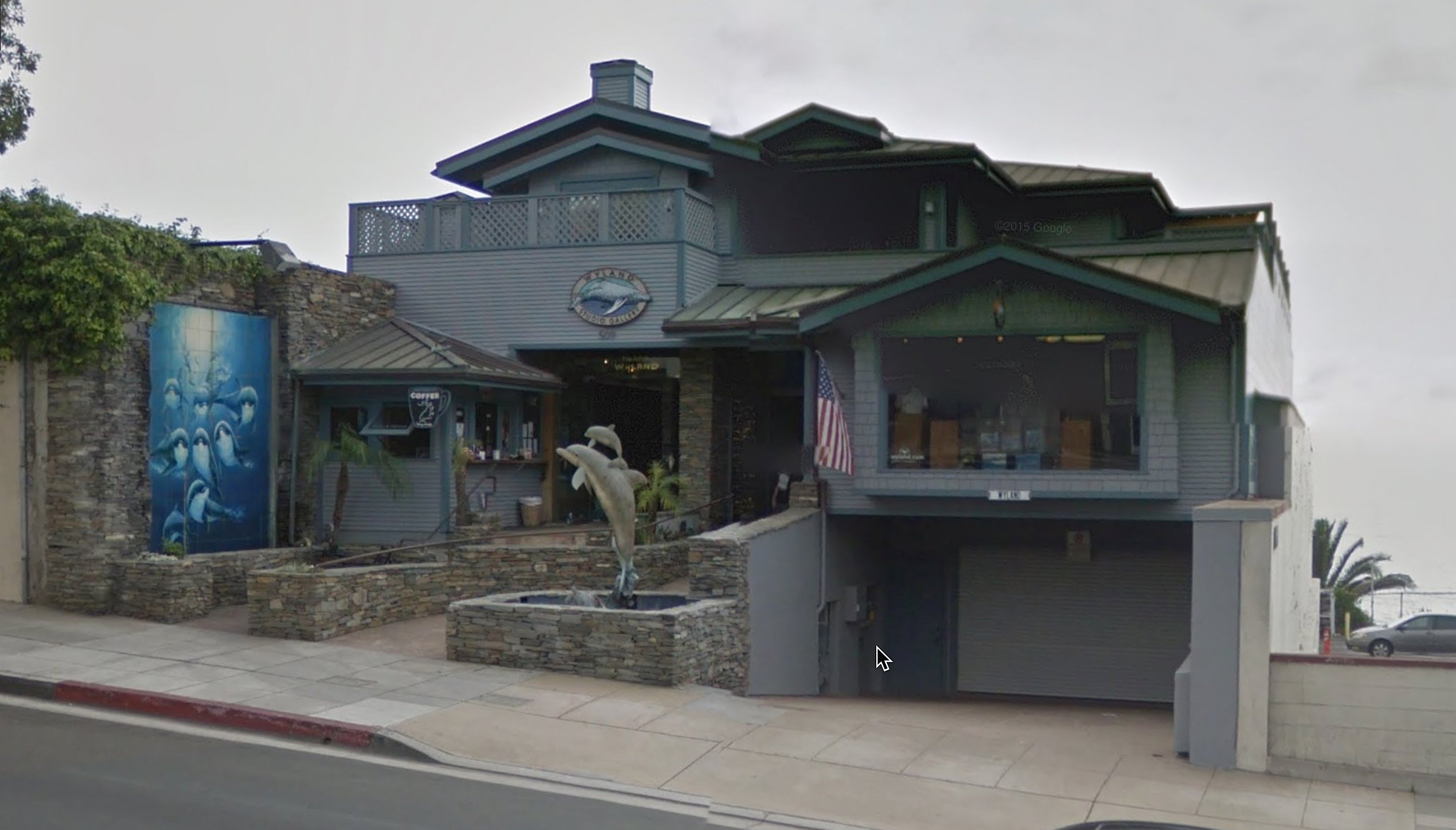
Now you have the hang of it, I will show you the last two as i will do them.
Feel free to simply do the squares I am offering this first time, or look for your own view.
Be sure though, to start where we all are starting on Pacific Coast Highway,
and roughly travel south for about three blocks.


 I will answer questions on the Facebook page (preferred, so everyone can see it.)
You can also open a Flickr account and join us there.
Other pages on the internet with great examples of styles walking through cities:

I started a Facebook group page to allow everyone to comfortably post their virtual sketches, and also where we will, from time to time, take virtual sketch walks. If you want to know more about what a virtual sketchwalk is review my first post.
I also created an accompanying Flickr group!
Come join us if you are inclined!
 Moleskin 8×11 watercolor journal, Pentalic HB woodless pencil, De Artramentis
Document Black ink and Platinum Carbon ink; Daniel Smith and Holbien watercolors.
All my International Fake Journal Month posting are copyrighted.
It is unusual for me to not do Creative Commons but there is a reason.
My images/blog posts may be reposted; please link back to dkatiepowellart.
 Mei Fa Hairstyx have been with
me for my entire adult life.
If an article of clothing (which these are, as they adorn the hair) can be imbued with one’s personality, they are a huge part of who I have been for almost as long as I knew what it meant to me to be feminine, pretty, and sexy.
I collected them, and Mitchell gave me my last pair, the lovely Chinese red fish, just a few years ago.
At a time when I was discovering myself sexually and professionally,
I found them on a business trip in a tiny shop in Haight-Asbury.
The woman who has grown a business around them was just starting out, and we grew together, though I don’t think she was the one selling them behind the counter.
I still have the first pair I bought, a silver bauble atop black wooden sticks.
I dressed conservatively during my first years as a young architect,
and certainly had not found my sense of style. Mei Fa sticks were my secret,
as I put my long (then permed) curly curls hair up with just two sticks.
I knew I could take it down in that world of men and that secret held power.
I never looked at why it held power, just that it did;
some things do not need exploring. Either you get it or not.
Years later other items of clothing would be added to my list of
secret power items in a world of men, but this was my first.
Everyday a couple of sticks went into my hair,
and by the end of the day they might come out and be put into my purse
as I made my way to play at Spago or West Beach Cafe or
72 Market Street or Marina Charthouse or all the way out to the Palomino.
This happened until most of my sticks were in my purse
and I’d have to fish them out to start all over again.
 I knew that someday a man would come along and take my hair down
by tugging gently on the sticks, and he would know all about this side of me.
I never met him in a bar or at a party with my friends.
That man was not my first husband, always in a rush for sex,
but Mitchell, who understood and knew, and I recognized him as my kind of man,
who I’d waited for my whole life for understanding about the sticks.
Mitchell is with me as I grow into the last part of my life.
My already fine hair has been thinning, a family trait, and greying.
I don’t mind the grey that much, though I wish it was a prettier grey.
I have minded that I can’t wear some of my larger sticks.
Then the last year happened and I have lost a LOT of hair.
Putting my hair up has meant I looked a bit like a boy, and frankly,
every damn time I looked in the mirror I was tempted to simply shave it off.
At least then I’d be exotic — I could tattoo my shaved head!
I’d be the wild woman still!
But wait, too many people would think me a cancer patient.
So finally I cut my hair shoulder length.
I don’t think Mitchell knows how much I cried on the way home.
I felt like Sampson, losing a bit of her sexual self.
Shit we lose a lot getting older;
I never considered that I would lose my hair.
I was prepared for sagging, chubby, and grey, but not the family hair!
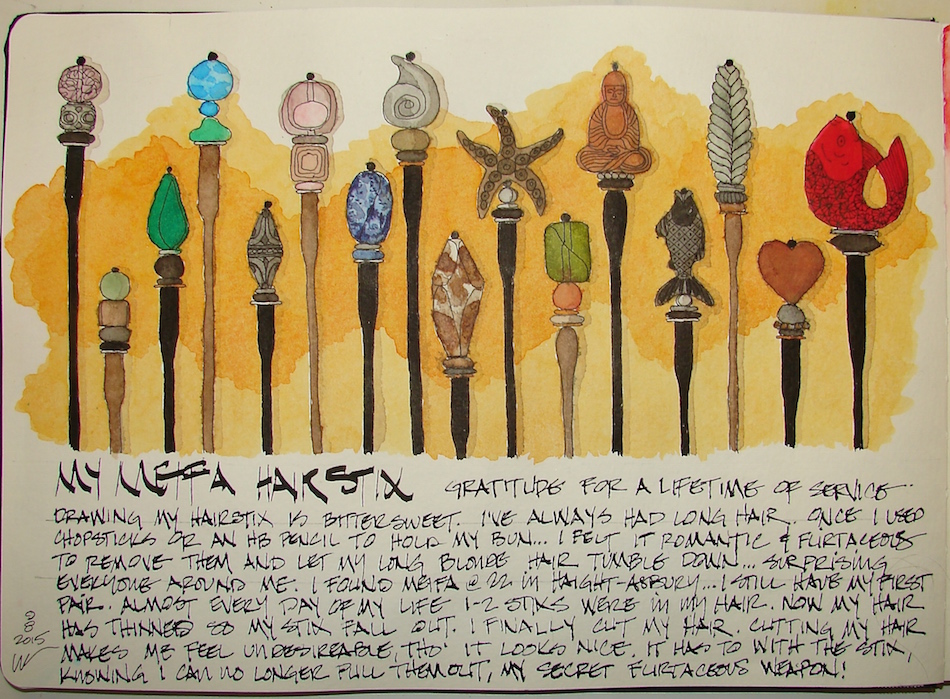 The hair cut is nice.
I have some tendrils and can still get it up, so to speak,
but not with my sticks, and the new cut looks softer around my face.
I will be giving myself some highlights.
My hairdresser says perhaps my hair will grow back in to where it was before the surgery, to give it six months. At any rate, I am not ready to give my sticks away.
I have hope that my hair will grow in thick enough for me to use them again,
even if I have to have a bobby pin to help them along.
Moleskin 8×11 watercolor journal, Pentalic HB woodless pencil,
De Artramentis Document and Super5 ink and Daniel Smith watercolors.

I agree to Creative Commons Attribution-Non-Commercial 4.0 International License, which you can learn more about by visiting the site, or,
visit my web page for a more user-friendly summary on my terms.
My images/blog posts may be reposted; please link back to dkatiepowellart.
This week I did several days in one so that the long skinny items
would not be so itty-bitty that they had no definition.
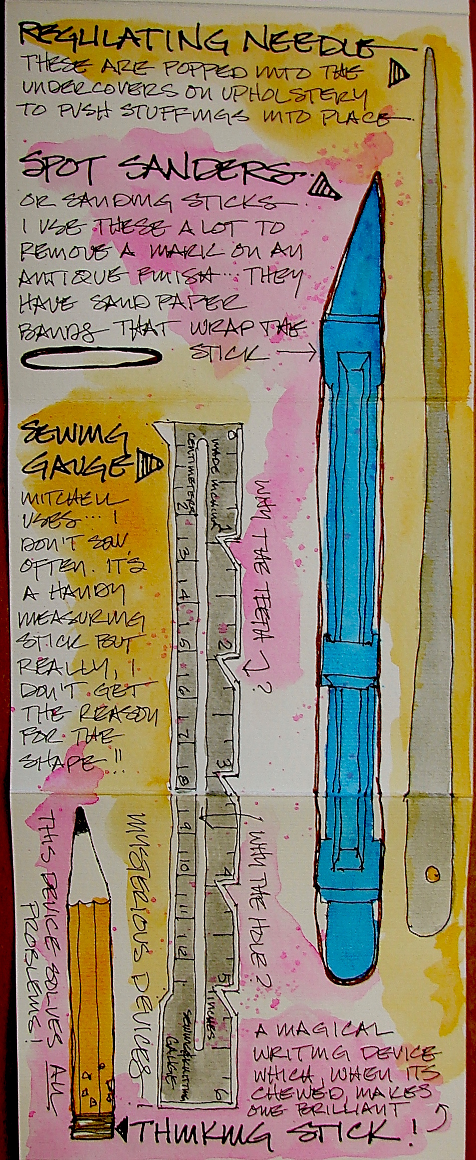
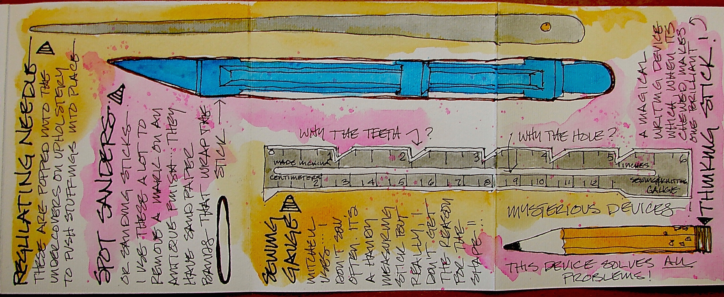
A regulating needle it a very long thick needle with a sharp point
(but not like a sewing needle sharp) and would make a good weapon!
My Sanding Stick is the best invention.
It makes it much easier to remove just one little area for touch-up.
Some are Mitchell’s tools exclusively, and some we share.
I never touch the Sewing Gauge. I hand sew!
Mitchell is the one who uses the Magic Writing tool:
Chew on it and it magically solves all your problems!
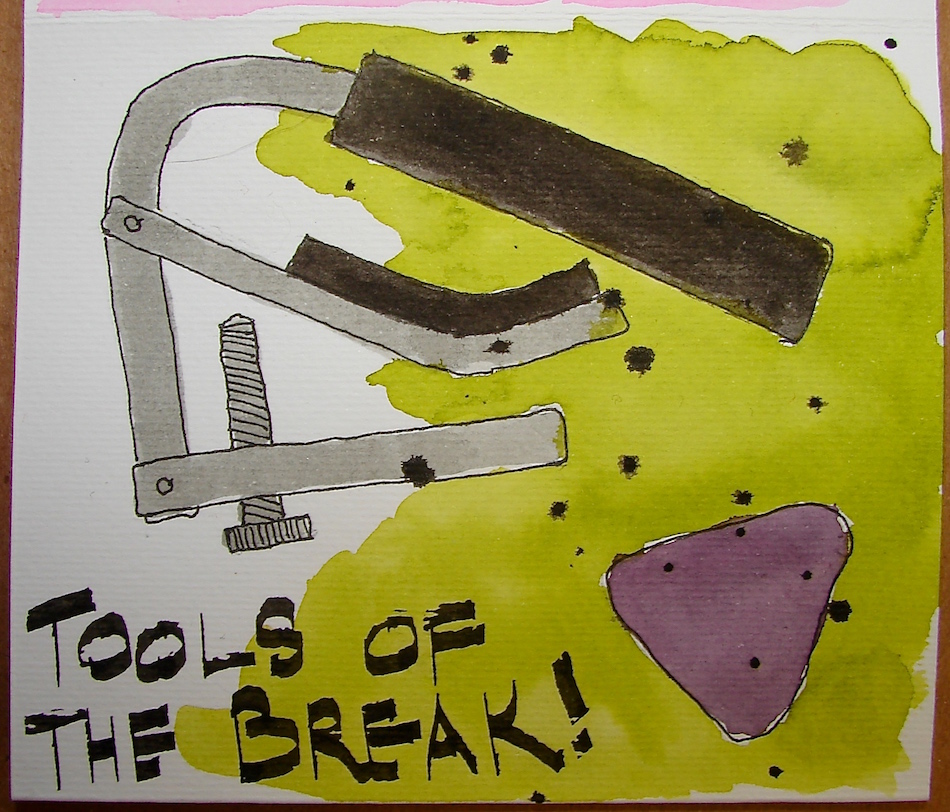
Part of working is taking breaks. I paint, Mitchell plays his guitar.
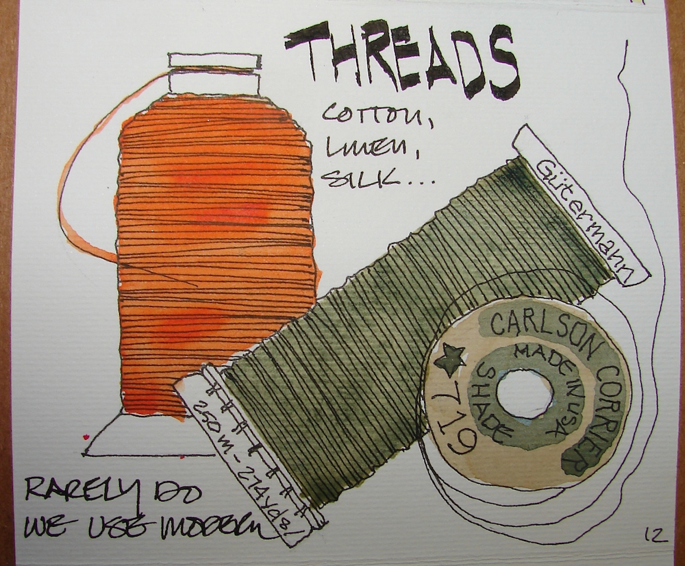
Gads what would the studio be without threads. We have a wall of huge spools that Mitchell uses on the machines, and two bins of tiny spools and treasure trove of very old threads given to us by a nurse whose patient was dying — a very old seamstress. Her old threads have saved the day many times when we needed an older color 100% cotton thread. It is difficult to match the original colors, faded to be what they are today if they are seen. This is one of the most difficult jobs, matching threads!
I tend to do the hand-sewing; Mitchell uses machines.
We have to use historically compatible threads, and so, rarely use polyester threads.
Silk, Cotton, linen, rayon — this is more typical.
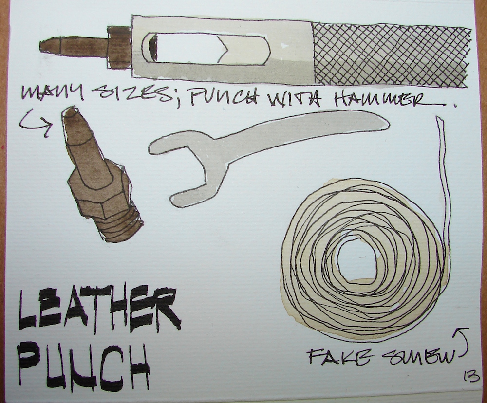
Leather tools, in this case, a hand-held hole punch which couples with a small hammer and you tap-tap-tap the holes. Simple and effective. And sinew for lacing,
which, when I use for making leather bags I usually bead over.
We also have this huge hand-held contraption that but getting it on a teeny page would be a chore — and frankly, even Mitchell tend to use the small easy simple tools!
The punch has removable tips. I could do several pages on leather tools alone!
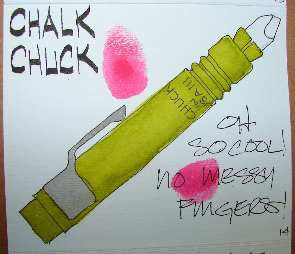
How much chalk could a chalk chuck chuck if a chalk chuck could chuck chalk?
Another beautiful tool. Keeps you from putting chalk all over fabrics!
Drawn on an unknown paper itty-bitty folding journal with (mostly)
the fine point Platinum Carbon pen and Daniel Smith watercolors.
I agree to Creative Commons Attribution-Non-Commercial 4.0 International License, which you can learn more about by visiting the site, or,
visit my web page for a more user-friendly summary on my terms.
My images/blog posts may be reposted; please link back to dkatiepowellart.
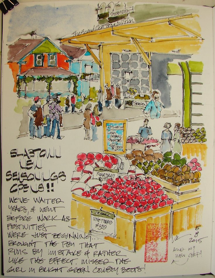 We are so happy to have New Seasons blocks from our studio!
No more driving all around for groceries! YAY!
We went opening day before we opened the studio.
Mostly they were setting up and greeting their new customers,
and everyone was in their best duds.
 Later in the day music was played, and the band was setting up.
The neighborhood is in transition, and the old houses
(which we love) all brightly colored are sitting next to high rises.
New Seasons is in an old converted warehouse, and I took pictures to draw later
(complicated looking up or standing in front of people shopping in tight spaces)
but wanted to post on-site drawings separately.
 The produce is heavenly.
We will still go to Farmer’s Market, especially during berry and peach season,
but so far (keep fingers crossed) New Seasons still is mostly organic.
I, of course, don’t see any reason for them to sell crossover products!
Fred Meyer is down the street a few blocks for your
Bush Beans and Marie Calender’s pies.
Drawn on site, some watercolor on site.
Drawn in an Strathmore Mixed Media journal with Pentalic HB woodless pencil,
various pens and Heart of Darkness Noodlers ink and Daniel Smith watercolors.
I agree to Creative Commons Attribution-Non-Commercial 4.0 International License, which you can learn more about by visiting the site, or,
visit my web page for a more user-friendly summary on my terms.
My images/blog posts may be reposted; please link back to dkatiepowellart.
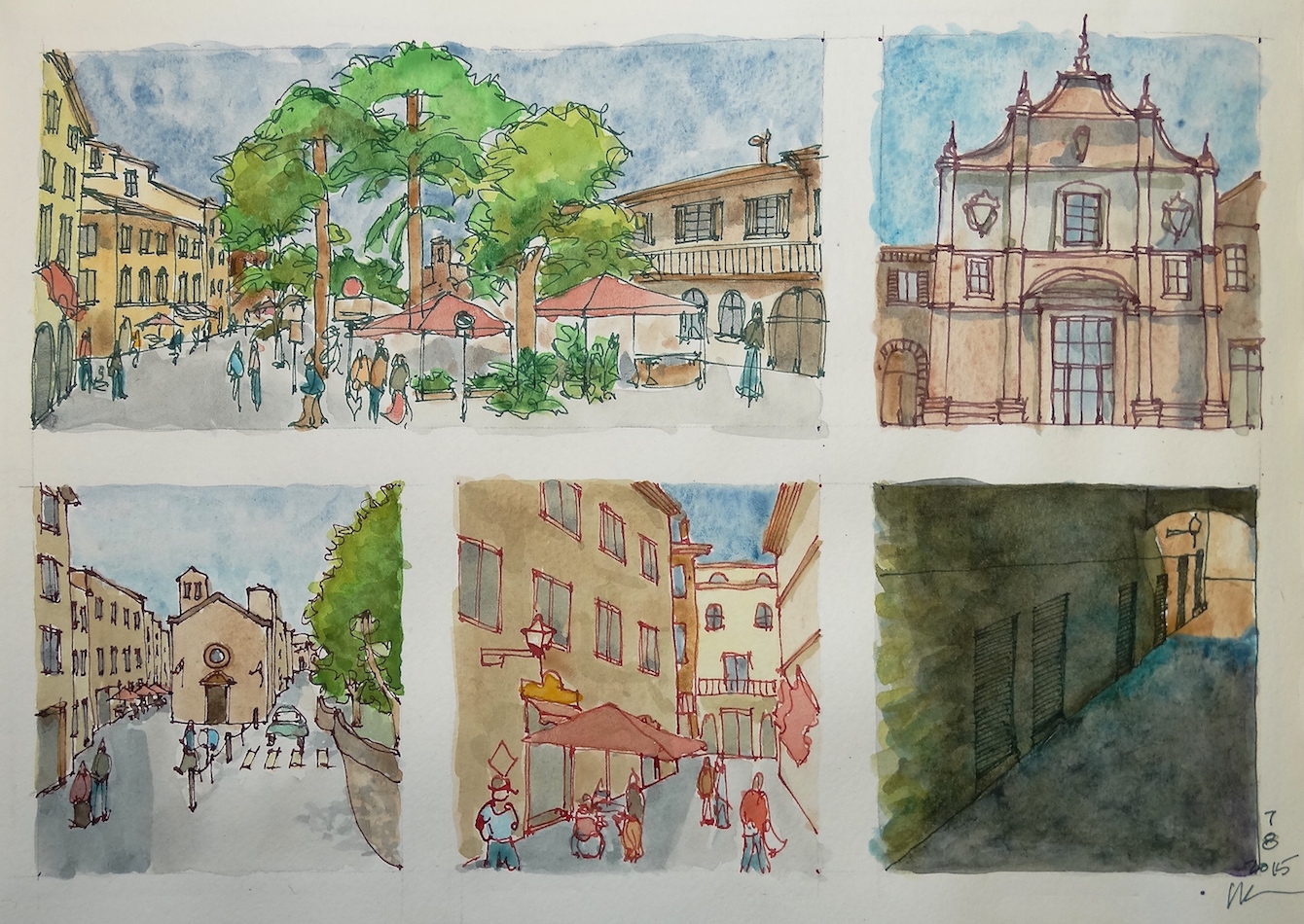
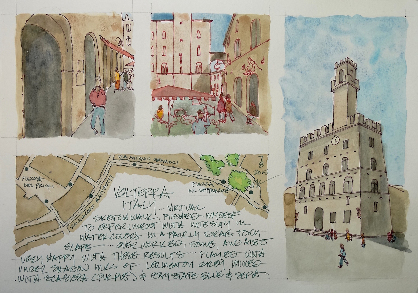
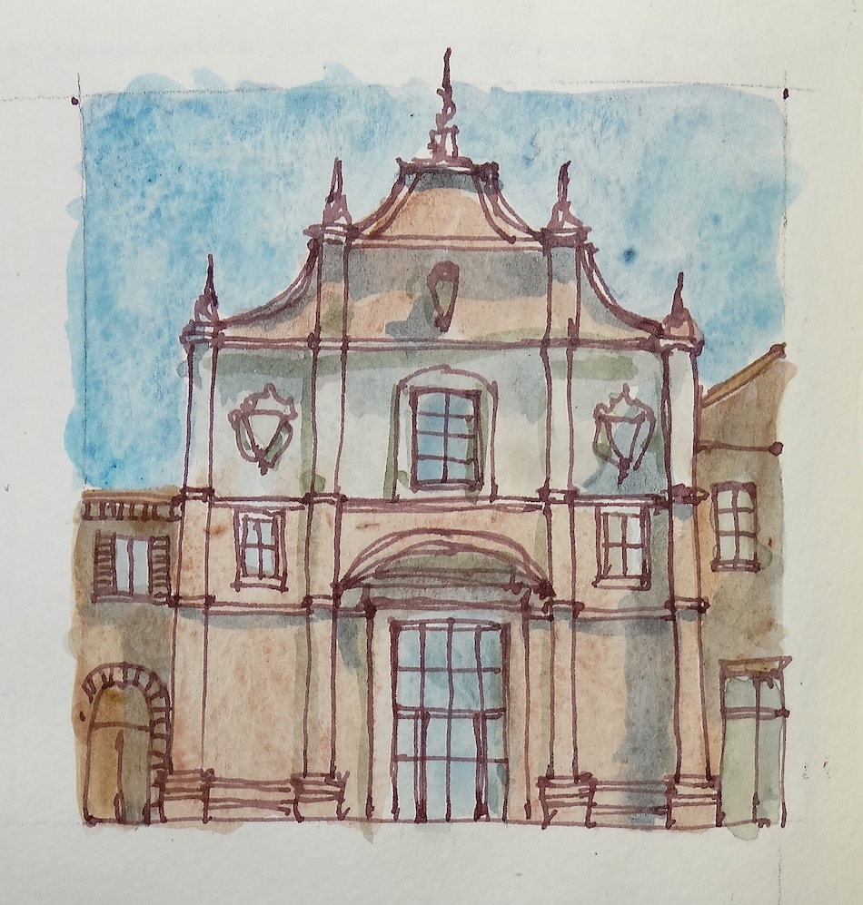
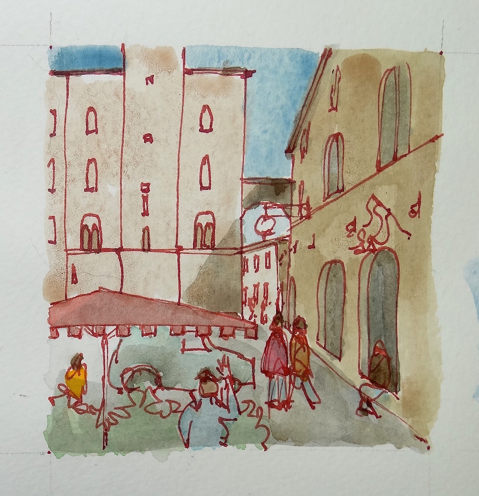
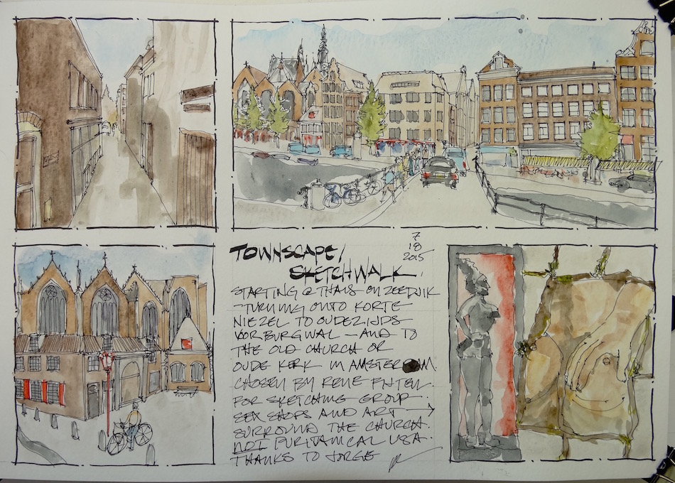
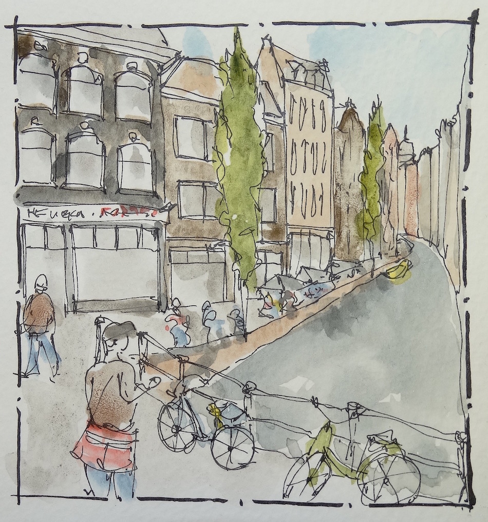
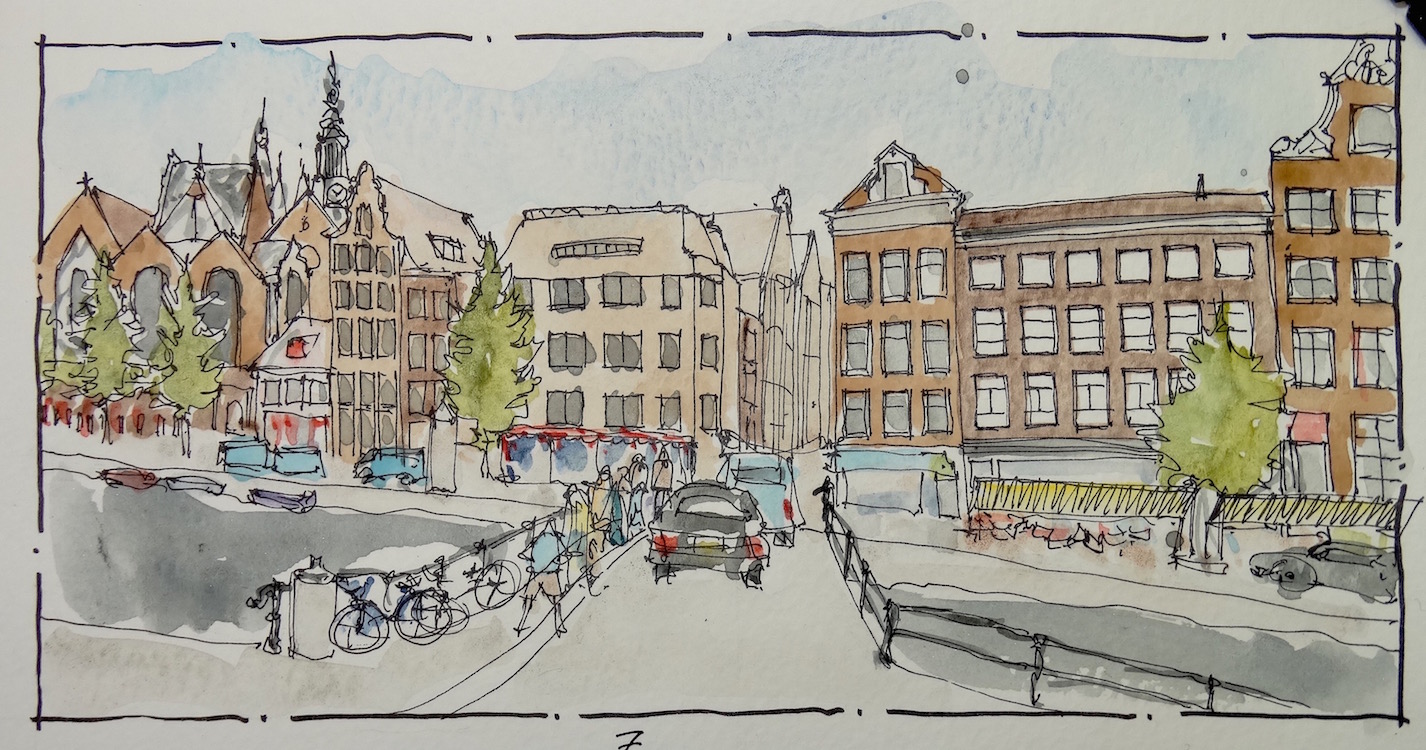
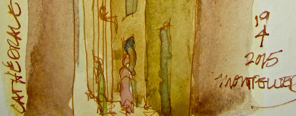
This virtual walk was a group walk with sketching friends from around the world!
There were a couple of routes suggested, and I sketched the one from the
Piazza XX Settembre to the Piazza Del Priori.

 Volterra may have been continually inhabited since the
8th century, BC, built upon a neolithic settlement.
Volterra was the bishop’s residence in the 5th century,
and became an episcopal power in Medieval times.
The Florentines conquered Volterra in the 13th century.
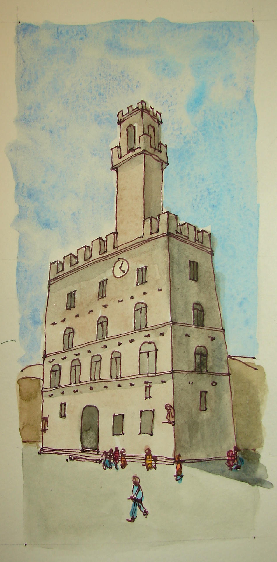
The Palazzo dei Priori is the ancient palace in the
center of Volterra, the Piazza dei Priori.
Teh building broke ground in 1200 and was
completed in the middle of the 13th century.
When Volterra became a Florentine property,
the loggia was demolished and the two lions were applied, a symbol of Florentine rule. The clock was added much later and is a bizarre addition. The tower is not original, and was rebuilt after an earthquake in 1846.
The city buildings are shades of biscuit and warm grey.
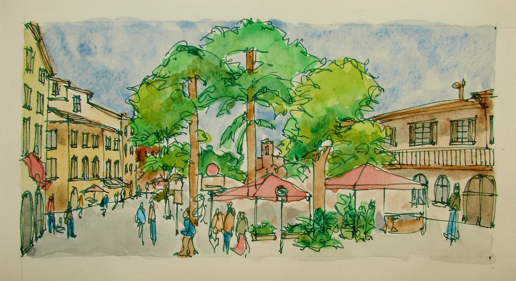 My personal goal with this sketchwalk was to push my comfort zone,
deepen the intensity of color in my watercolors, and present a bold palette.


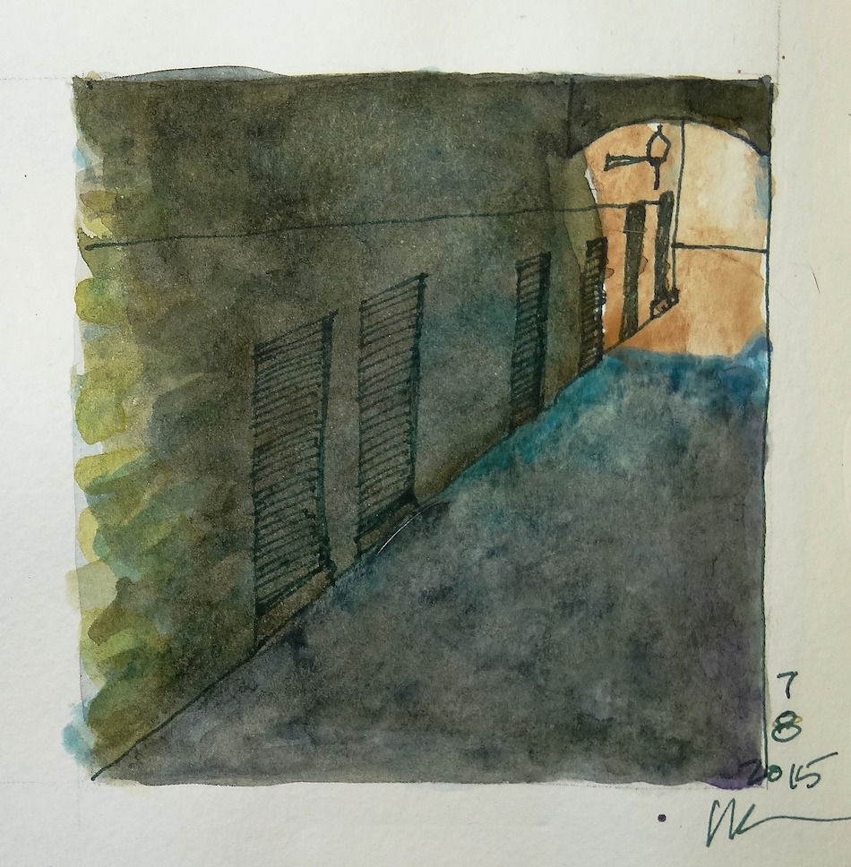
Glad to have the Moleskin, which took my layering of colors well. I overworked the darkened passageway above, but am still happy with it! Trying to find the colors in shadow; surprisingly, there were blues and purples and acid green in the images.


I also am experimenting with colored ink outlines. They pop the sketches!
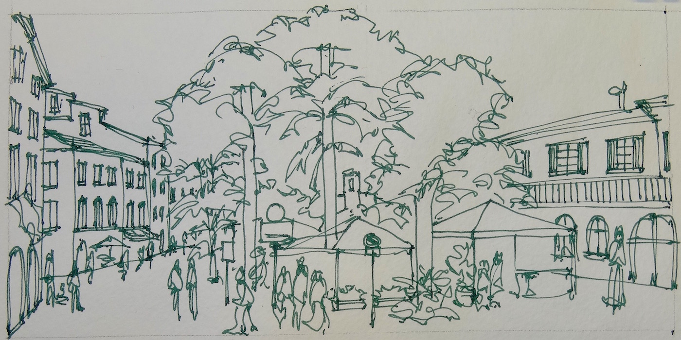
I began with the layout and the inked lines. . .
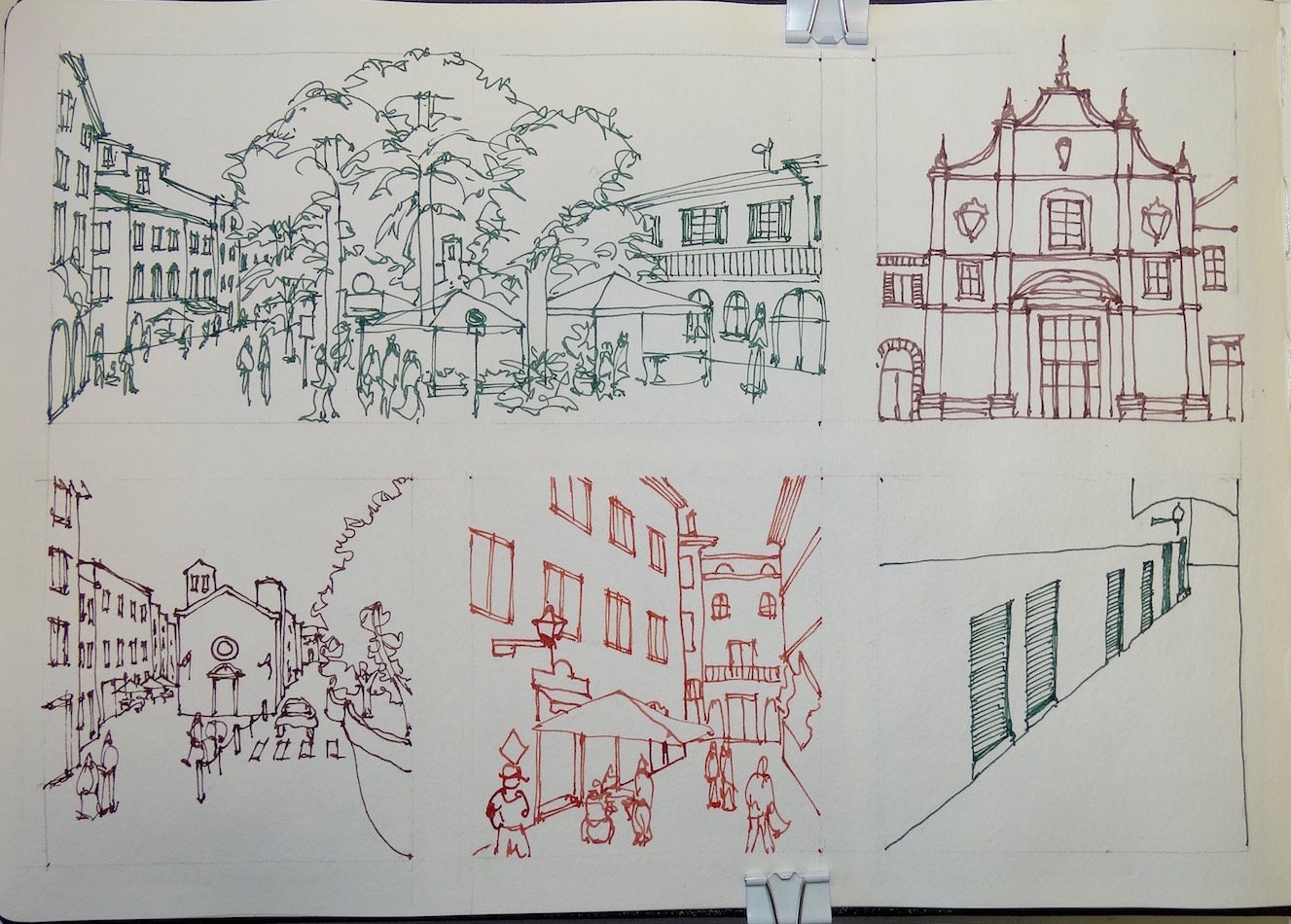
 . . . then began layering watercolor.
I am, by nature, impatient. Acrylics are comfortable because they dry quickly.
Watercolors test my patience.
A virtual sketchwalk should give you an idea of the pathway twists and turns,
and the views you would see if you took this particular walk.
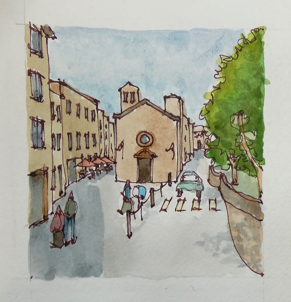
Ours starts our in what seems to be the only green space within the town itself,
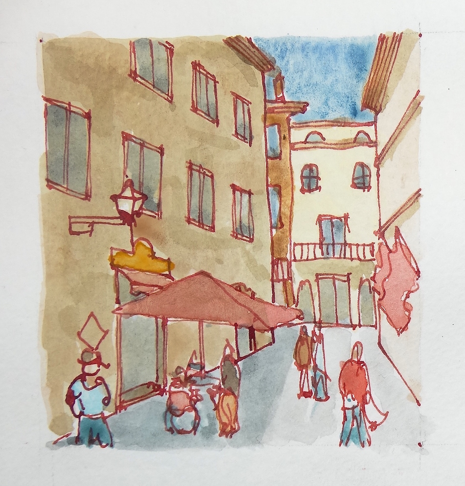
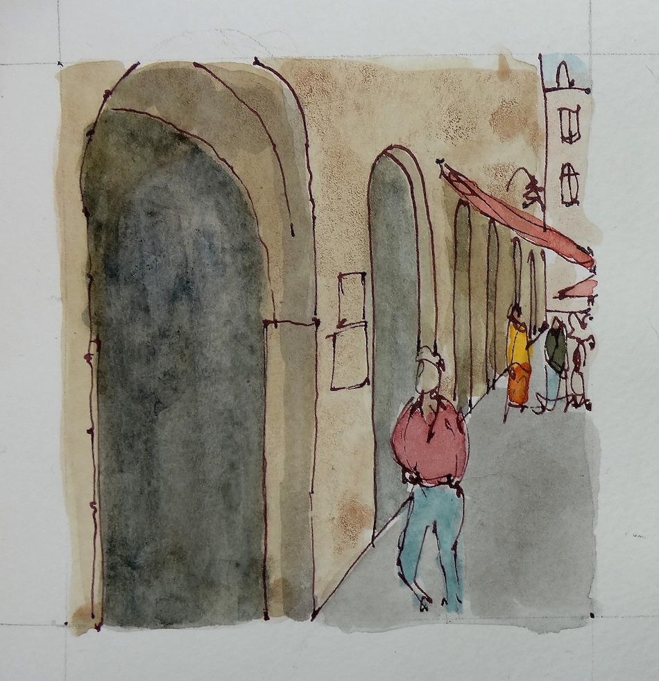
an open plaza with a lovely old church (Chiesa di Sant’Agostino), and, walking north, you take the foot path to the left, down winding narrow streets. From time to time the views are of darker passageways framing another small sunlit plaza, but continuing on, you come to the Piazza del Priori, with the palace buildings on all sides.
I started a Facebook group page to allow everyone to comfortably post their virtual sketches, and also where we will, from time to time, take virtual sketch walks. If you want to know more about what a virtual sketchwalk is review my first post.
I also created an accompanying Flickr group!
Come join us if you are inclined!
Moleskin 8×11 watercolor journal, Pentalic HB woodless pencil, De Artramentis
Document Black ink and Platinum Carbon ink; Daniel Smith and Holbien watercolors.
All my International Fake Journal Month posting are copyrighted.
It is unusual for me to not do Creative Commons but there is a reason.
My images/blog posts may be reposted; please link back to dkatiepowellart.


Jorge Royan died a year ago today. He and Cathy Johnson both had an incredible affect on my path through watercolors, in very different ways. Thankfully, I can tell Cathy how much gratitude I have for her and for the forum she produced.
But Jorge? Can you hear me in the world you now inhabit? The group you put me into with the other 149 people you culled has been a blessing. I’ve made art friends from around the world, and like you, they are mostly giving souls who share and tell it like it is. The influence of the group is exponential in terms of helping me to rediscover and to learn a new path of the last third of my life; watercolors, sketching, a return to architecture, color, color color (though that was not your forte.) I humbly thank you again, as I will again and again.
Thank those who affect you positively. Let them know what a blessing they are. Life is short.
Below, my last conversation with him.
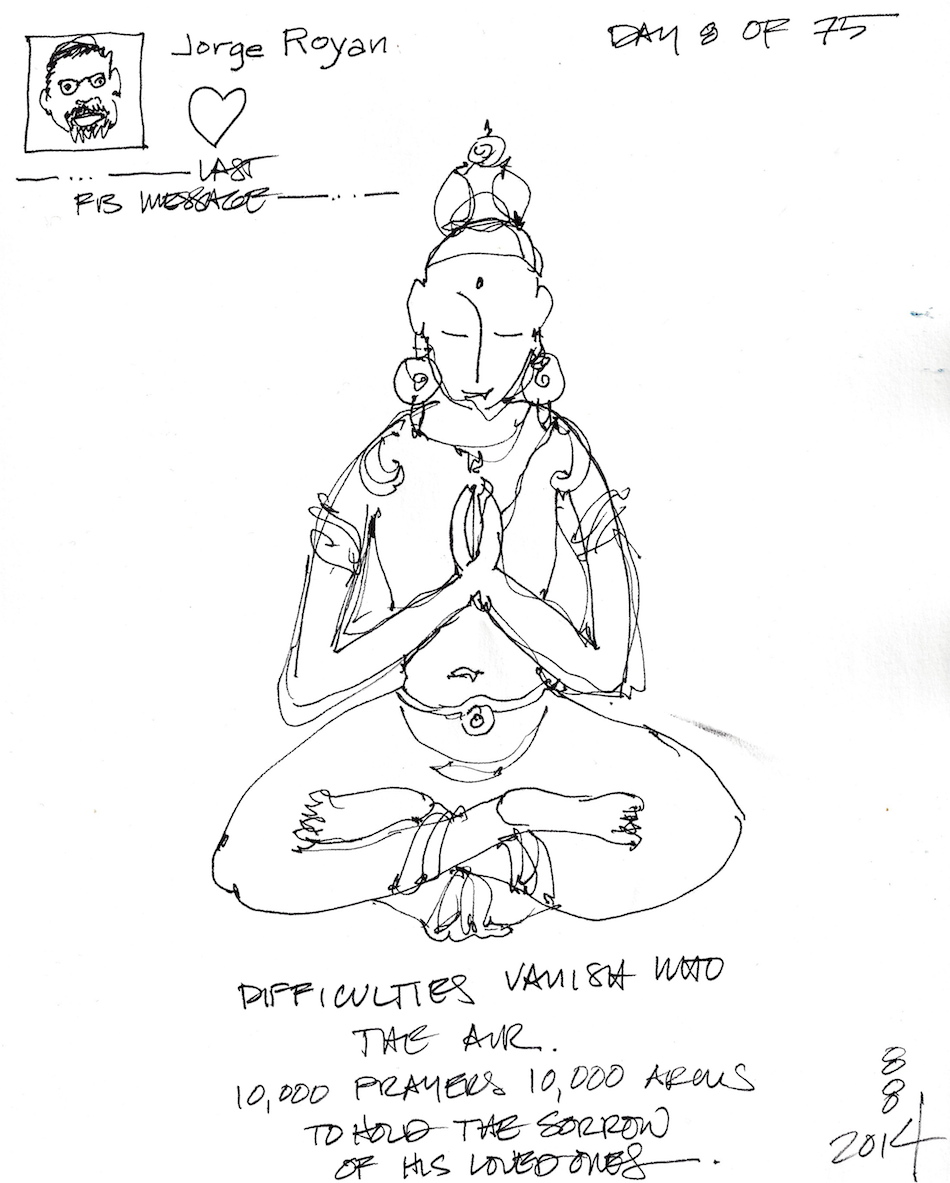
In our last private communication, I told him we were holding energy
for his surgery, and it touched him that I remembered.
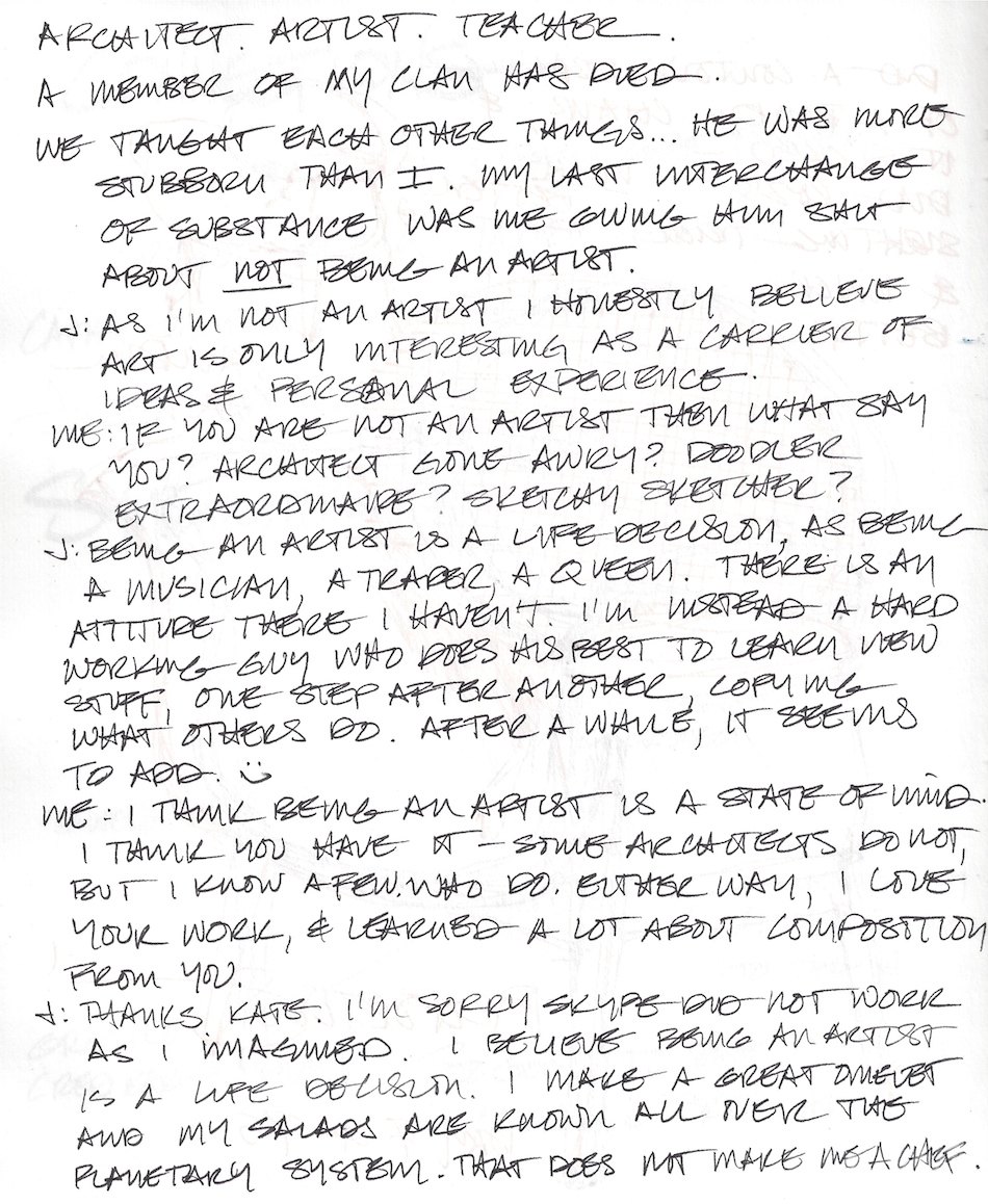
And in my last interaction on the feed, we talked about him not being an artist. As. If.
 Suspending my normal post to pause on Jorge Royan’s death.


I agree to Creative Commons Attribution-Non-Commercial 4.0 International License, which you can learn more about by visiting the site, or,
visit my web page for a more user-friendly summary on my terms.
My images/blog posts may be reposted; please link back to dkatiepowellart.
 This year I am sketching items
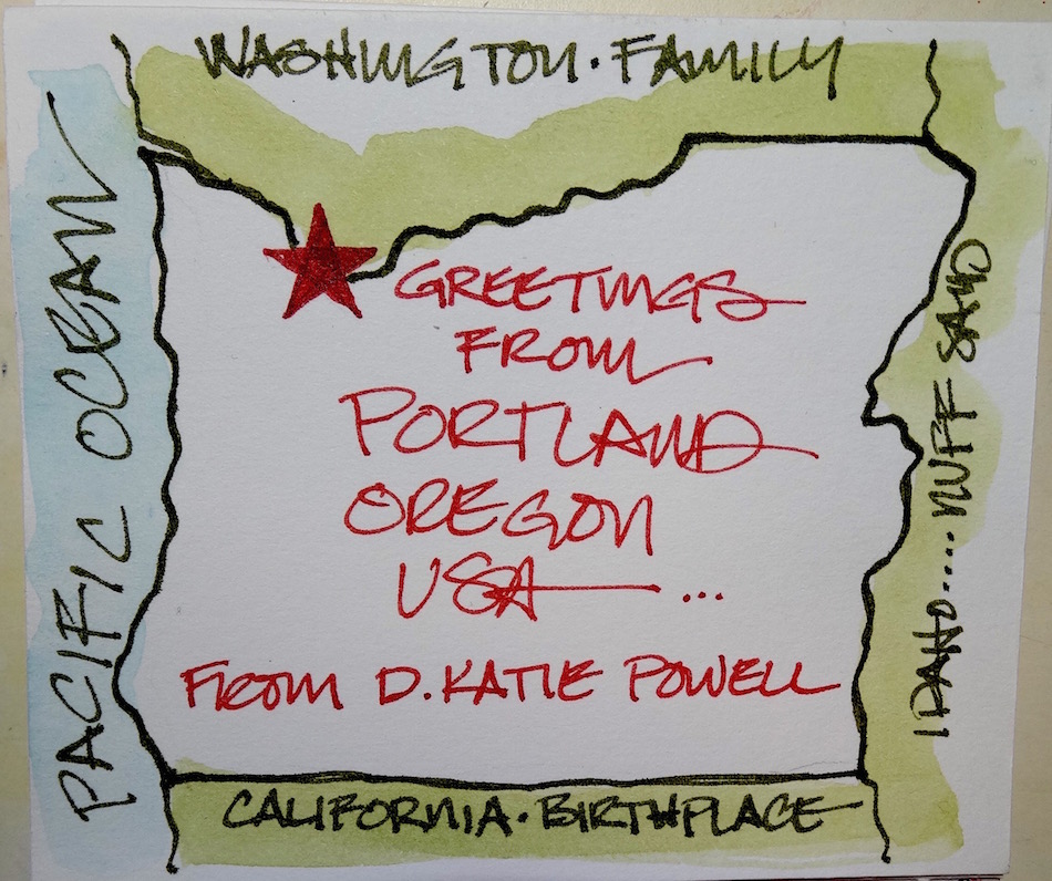

 There is not much to say, just show and let the images tell!
 I just have to show you what I was trying to draw below.
 Drawn on an unknown paper itty-bitty folding journal with (mostly)
the fine point Platinum Carbon pen and Daniel Smith watercolors.
I agree to Creative Commons Attribution-Non-Commercial 4.0 International License, which you can learn more about by visiting the site, or,
visit my web page for a more user-friendly summary on my terms.
My images/blog posts may be reposted; please link back to dkatiepowellart.
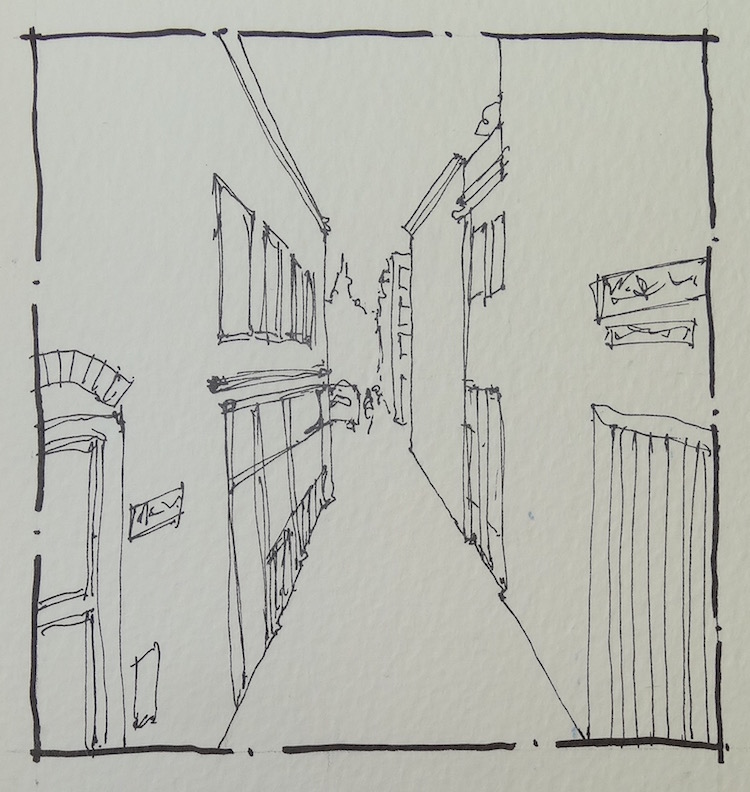
 A virtual sketch walk is one in which
 The opposite of urban sketchers, which is all about sketching your environment
from real life, as a virtual sketcher you are sketching from your own,
another person’s (with permission), or Google map images.
I did my first one during the International Fake Journal Month,
when I took a virtual trip while recouping from surgery.
(Note all the writing was fakery too — part of the game of IFJM!)
All my travel was done from my bed (I was laid up) using Google maps and Google virtual street views, and an occasional Wikipedia Creative commons photograph.
 As an Urban Sketcher, I enjoy getting out and sketching the city or my real travels.
And, I also work full time and often my sketching time is between 4-6am or early evening.
Virtual sketching allows me to continue to enjoy myself, hone my drawing skills, and basically do when I used to sketch at architectural lectures — draw from slide shows!
 (All photographic images from Google maps.)
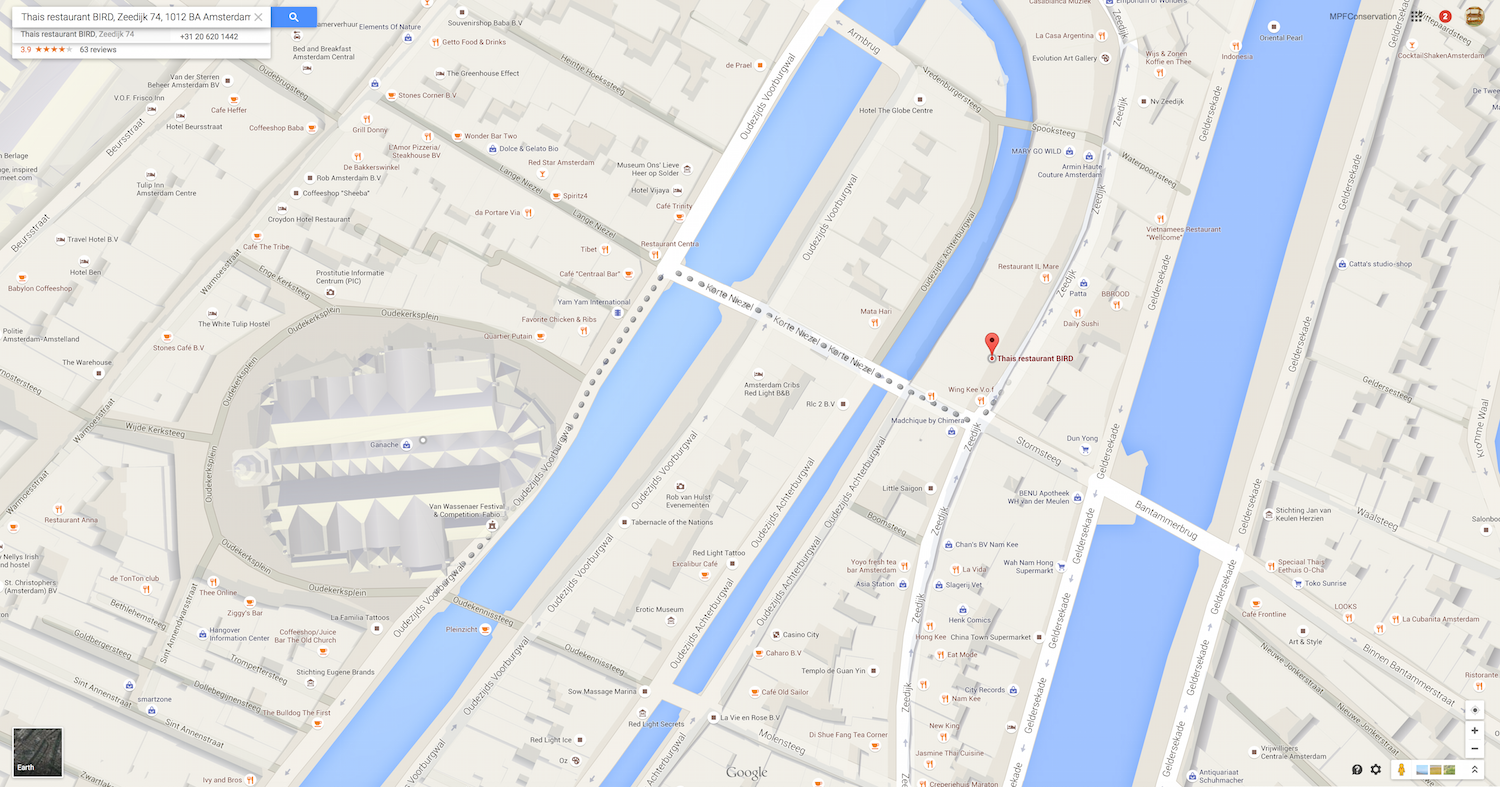
This virtual walk in Amsterdam was mapped by Rene Fitjen, an architect and artist,
and part of a small group of artists who sometimes play alongside each other in
sketching games that allow us to see how we handle the same basic images.
You can take any walk you want anytime you want!
My walk:


They are like a meditation to me, as I draw in pencil and ink.
After I play with watercolor at the end of my more sketching time.


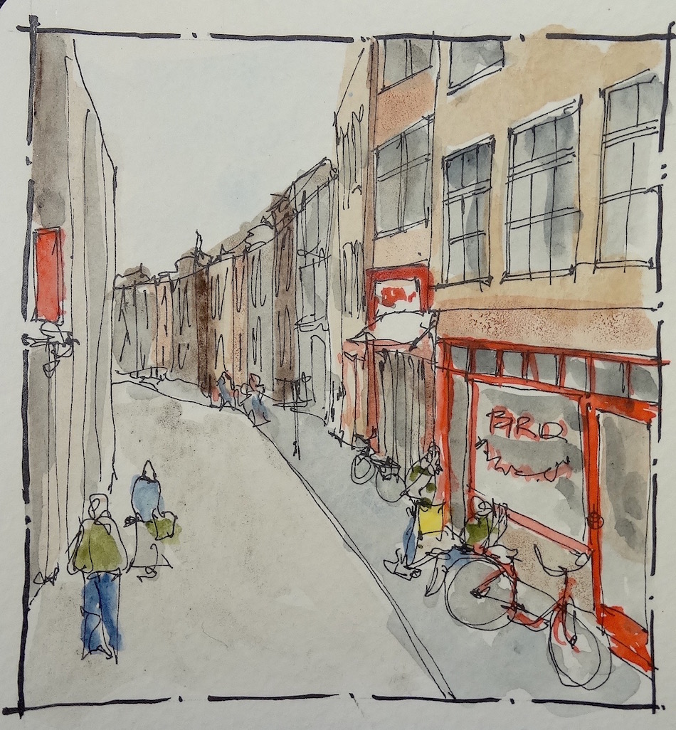 I find a virtual image (this is from Google streets) and
sketch from it as if I am there in real time.
I can also use my own camera on a walk — or have a friend take a walk
and capture what they see — and then sketch it “as if.”


 I map out a page to allow for a certain congruity in my “walks.”
Depending upon the size sketchbook, your images will be small —
mine are in the 3″x3″ range, or double that for the long ones.
The size came out of my Moleskin Journal which is A4 landscape sized.
I lay in a pencil outline — a few lines — or not,
and then use ink, followed by watercolor — or not!
 I also learn about the places I sketch. I knew Amsterdam had Red Light districts,
and the idea that Oude kerk (one of the oldest churches) might be near the red light districts was predictable. However, they had sculptures all AROUND
it that were celebrations of the world’s oldest profession! Whoa!
Made me think about the Puritanical nature of the USA.
First of all, drawing and painting are drawing and painting, period.
You define if you are an artist or not.
 I also heartily encourage everyone to paint and sketch from real life whenever possible.
Images flatten out reality and influence the way you perceive and therefore depict images.
AND, this year I also learned what it is all about to be confined to an inner space,
be it a bed, a wheelchair, or a hospital —
or even keeping someone company daily in that situation.
Three months of virtual painting saved me from
going stir-crazy, as one can only sketch the cats, one’s toes, a stack of books,
one’s art tools and the items next to the bed or the room for so long!


 I started a Facebook group page to allow everyone to comfortably post their virtual sketches, and also where we will, from time to time, take virtual sketch walks. For a short time I am letting the group be public, so anyone can see what this might be about.
Eventually we will be closed to public viewing, and then you must play to view!
Sometimes you want to be able to experiment as an artist and it is nice to know that only the other artists who “have skin in the game” can see your experiments. If you are interested, you can ask to be admitted after the group is closed for privacy.
I also created an accompanying Flickr group!
Come join us if you are inclined!
Moleskin 8×11 watercolor journal, Pentalic HB woodless pencil, De Artramentis
Document Black ink and Platinum Carbon ink; Daniel Smith and Holbien watercolors.
All my International Fake Journal Month posting are copyrighted.
It is unusual for me to not do Creative Commons but there is a reason.
My images/blog posts may be reposted; please link back to dkatiepowellart.

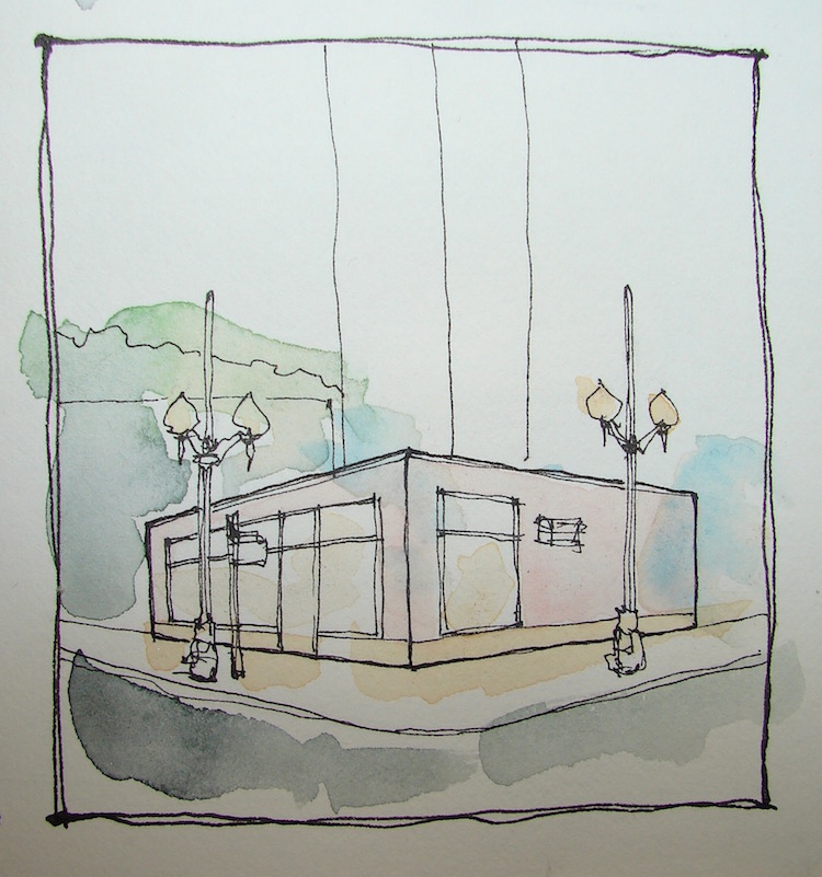
I love Saint Patrick’s Church in NW Portland.
I drive by it all the time as it sits across from our bank.
The Beaux-Arts church looks like it belongs in Italy,
set into cobbled streets surrounded by a park and houses from that era.
It sits nearly under and slammed up against the stupid freeway that was built after it.
All around is blacktop, vast possibilities for parking.
(Image below drawn from Google streets — not live from the freeway.)
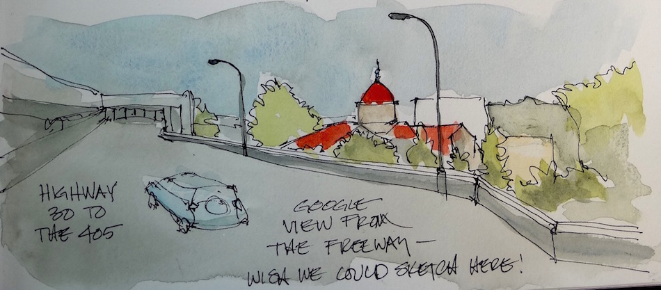 This is the first time I’ve put Steven Reddy‘s suggestion from his Craftsy class to work. While mine is not perfect, I like this manner of adding shadow with a diluted waterproof ink before adding watercolors, and am happy with this first attempt.
You can see the progression below.


 The full spread below.
The sketches were done onsite, the grey shadows were created onsite.
The text, watercolor and the sketch of the Google maps images
(the freeway) were added in the studio.
 And what do you do when you completed go dyslexic (I am)
and spell a word in an unrecognizable way?
Collage! See that itty-bitty photo of the old school? BIG mistake covered.
Drawn in an Strathmore Mixed Media journal with Pentalic HB woodless pencil,
various pens and with Super5 and Carbon Black ink and Daniel Smith watercolors.
I agree to Creative Commons Attribution-Non-Commercial 4.0 International License, which you can learn more about by visiting the site, or,
visit my web page for a more user-friendly summary on my terms.
My images/blog posts may be reposted; please link back to dkatiepowellart.

My fascination with pen and ink goes way beyond addiction to art supplies.
Not that I can’t be pulled in that direction.
 I have used mostly acrylics for my 30 years painting as an adult.
I loved them, and love the way I can create textures and layers and
they dry fast so I can continue to work all day with no breaks.

However, unless you like paying a lot for little itty bitty tubes, or buy cheaper acrylics
(and I have learned my lesson there) they take up a LOT of space.
Moving to Portland nixed my ability to have that kind of space, as our studio
requires us to move things around to accommodate the work that pays the bills.
So I stopped painting for several years.
Then I picked up watercolors because I craved visual creativity.
The watercolors led to pen and ink.

Took me back to my young architectural self, but older and freer,
and certainly uncaring about what “they” all thought and judged.

Took me back to my love of drawing, and that love is what led me to
quitting architecture altogether — I hate what computers have done to the craft.
I don’t mind them for working drawings (what good is drawing the same core a dozen times in a high rise or drawing the same door jamb everywhere) but I believe that the average architect is less creative now. They don’t pick up pen and paper, doodle and think creatively, and they have lost something, becoming so mundane and boring that I barely look at a new building anymore unless it is in disgust. And I look at creative architects whose work I am not found of with admiration because at least there is a dialogue happening between artist-architect — the DESIGNER — and the built environment.

But I digress. I have wandered back into pen and ink with a new love of colored inks and linework. Watercolors are the sideshow for the drawings, and they are a creative meditation. I can de-stress by turning around at my studio desk and picking up the same Pentallic HB pencil I used years ago and begin a layout. I can get lost in the thin lines of the Platinum Carbon pen. I admit to loving not having to clean and fuss with the Rapidograph pens, though I pulled mine out and may pick up some new ink.
I give thanks. Thanks for the Japanese designers and German designers and
anyone who has made these amazing improvements in inexpensive pens!
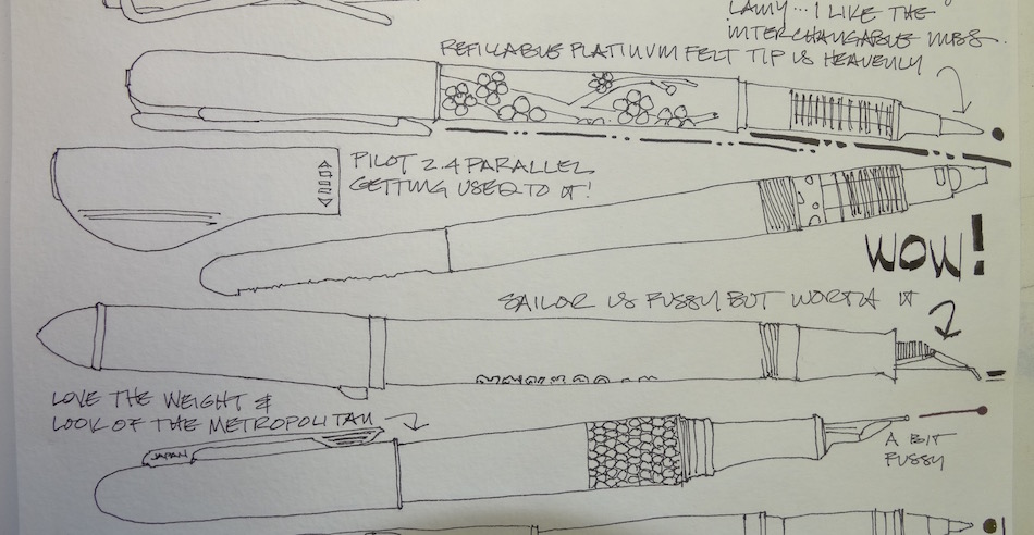
 Finally, a quickie review.
If tomorrow I could only take three writing instruments with me to where-ever,
I would take the Pentalic HB woodless pencil, a Platinum Carbon pen, and
a .5 Preppie pen. No fuss, no muss, they work even if left alone for a week.


Moleskin 8×11 watercolor journal, Pentalic HB woodless pencil,
De Artramentis Document and Super5 ink.
I agree to Creative Commons Attribution-Non-Commercial 4.0 International License, which you can learn more about by visiting the site, or,
visit my web page for a more user-friendly summary on my terms.
My images/blog posts may be reposted; please link back to dkatiepowellart.
 Meriwether’s Restaurant looks like a nice house on a commercial street,
but for the riot of bright yellow echinacea that bloom every summer in front of
lavender and blue hydrangea. Walking between the building and the flowers
you might forget you are in a warehouse district!
The image above is stiff, not my idea of what I want to do.
The old architect-makes-it accurate kicked in. Ho-hum.
So I am trying again. Watercolors added later.
This time with watercolor washes (using my drawing above for the model).
Splashy splashy color first, not too perfect,
about 15 minutes not including drying time between colors.
Quick ink after — sorry I added the ink, frankly.
Still not happy but I just can’t do the architect thang.
 Drawn in an Strathmore Mixed Media journal with Super5 ink and Daniel Smith watercolors.
I agree to Creative Commons Attribution-Non-Commercial 4.0 International License, which you can learn more about by visiting the site, or,
visit my web page for a more user-friendly summary on my terms.
My images/blog posts may be reposted; please link back to dkatiepowellart.
Portland Urban Sketchers did not go on the World Wide Sketchcrawl today.
After weeks of too hot weather this weather was perfect, a bit overcast, some sprinkles
(Oregonians do not care about sprinkles) and cooler temps.
 I had work to do — but wanted to sketch.
Mitchell obliged by hanging with me while I sketched our PSU shopping time;
MOST watercolors added later.
Drawn in an Strathmore Mixed Media journal with Super5 ink and Daniel Smith watercolors.
I agree to Creative Commons Attribution-Non-Commercial 4.0 International License, which you can learn more about by visiting the site, or,
visit my web page for a more user-friendly summary on my terms.
My images/blog posts may be reposted; please link back to dkatiepowellart.
By chance I am keeping a gratitude journal —
and the last two entries are about objects I LOVE —
and this weekend the Cherished Blogfest 2015 is happening!
So will share with that in mind.
I cherish color! I give thanks for color!
Deep brilliant amazing rich earthy gem-like musky shimmering primary!
Deep pure colors at full force!
Look at how they blend!
What great painting goddess thought of THAT!?!
But color is not an object.
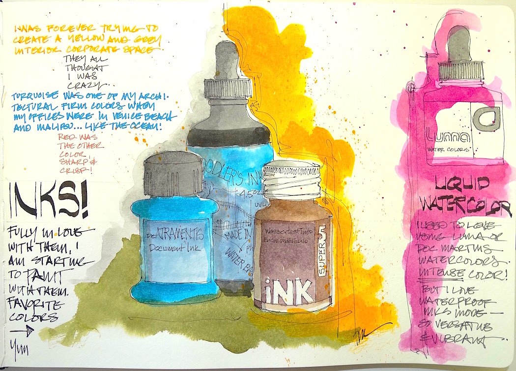
However, bottles of ink are objects!
Brilliantly colored inks from Germany and the USA are changing the way I create.
Colorful waterproof line-work,
ink washed onto the lines, all sepia and greys and greens and blues.
I want to watch the colors run into each other.
Artists have strange habits — I splash it around just to see how it mixes!
Sometimes I will do this even if I know how it mixes.

I now have red ink and can’t wait to try it out ever since I saw
Rueven Dattner do his wonderful urban landscapes in red and yellow ink!
The playfulness and inventiveness of Noodler’s and Super5’s names are delightful:
Heart of Darkness (inky smokey no light penetrates this killer ink),
Lexington Grey (like the aircraft carrier, black with white and no hint of blue or red),
Delhi (the color of turmeric), Australia (the color of the red earth).
De Atramentis may lose business if they don’t get busy picking better names!
How does “Document Turquoise” entice me to buy when I can buy
Black Cherry, Apache Sunset, Vampire Red, Blue Ghost or Ancient Copper?

 Gratitude Journal (top) is Moleskin 8×11 watercolor journal using
Pentalic HB woodless pencil,
Noodler’s, De Atramentis Document and Super5 ink.
Oops, and the now Defunct Luma Watercolors.
I agree to Creative Commons Attribution-Non-Commercial 4.0 International License, which you can learn more about by visiting the site, or,
visit my web page for a more user-friendly summary on my terms.
My images/blog posts may be reposted; please link back to dkatiepowellart.

This gallery contains 16 photos.
Originally posted on Zenkatwrites's Blog:
When I look at my Buddha Ball I see the long path of my spiritual life. I first saw a Buddha ball on day one of a week-long meditation conference held by Brugh Joy.…
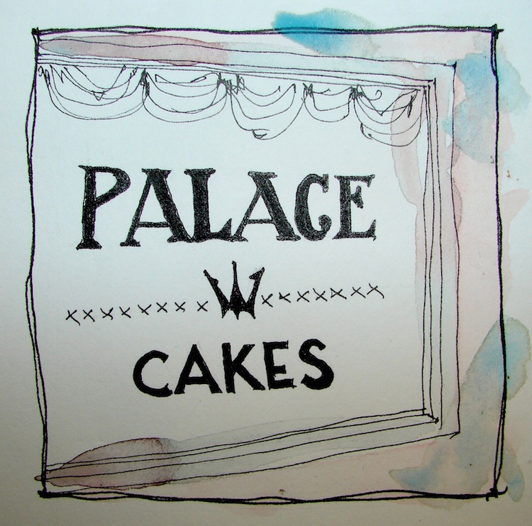
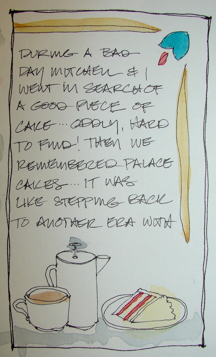
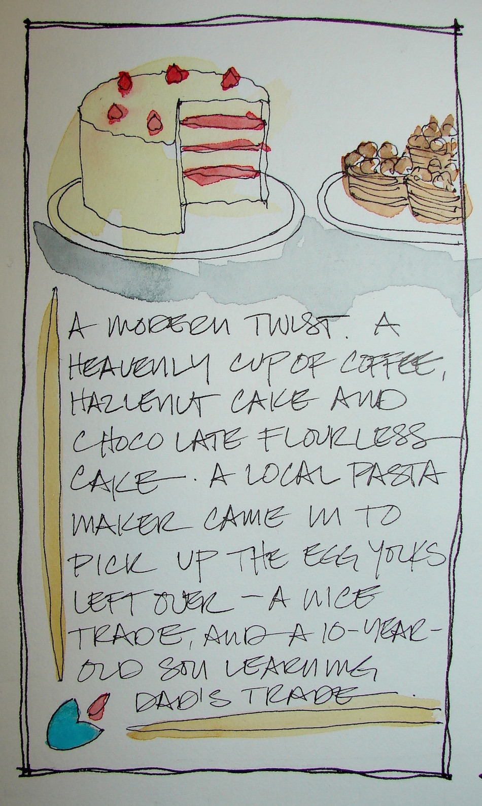
 A bad day saved by Palace Cakes in Portland!
Drawn in an Strathmore Mixed Media journal with Pentalic HB woodless pencil, Platinum Carbon Pen, Preppie Pen, De Artramentis Document ink, and Daniel Smith watercolors.
I agree to Creative Commons Attribution-Non-Commercial 4.0 International License, which you can learn more about by visiting the site, or,
visit my web page for a more user-friendly summary on my terms.
My images/blog posts may be reposted; please link back to dkatiepowellart.
 I missed Ani Pema Chodron’s talk with K.D.Lang due to the medical debacle.
I kept praying that they would allow us to go back and see it.
I sketched while listening to it. I was pleasantly surprised to find that K.D.Lang was more than a celebrity; she knew Buddhism well and humbly shared. Fascinating.
Meanwhile, I sketched my gratitude that Mitchell is playing the guitar again.
(I am not good at portraits!) I love it when he noodles around or makes music!
Mitchell shares a drop or two of ice cream or yogurt with the beggar boy.
Grateful for the moments of silliness with Govinda. He was named after Govinda and certainly lives up to the story of Krishna (Govinda) and the Gopi gurls. He is also a lover…
Moleskin 8×11 watercolor journal, Pentalic HB woodless pencil, De Artramentis
Document and Super5 ink, and Daniel Smith, Holbien, and QoR watercolors.
I agree to Creative Commons Attribution-Non-Commercial 4.0 International License, which you can learn more about by visiting the site, or,
visit my web page for a more user-friendly summary on my terms.
My images/blog posts may be reposted; please link back to dkatiepowellart.
 My beloved brown inks. How did I ever live without them. I bought the De Artramentis Document (DeA Doc for short) Brown because I read that Lamy pens have problems
with Noodler’s ink, but I prefer the darker Noodler’s Polar Brown ink.
But my new love — swooning — in Super5’s Australia, which is a bit plummy.
The lower two are from samples through Goulet Pens (a good idea), and while I LOVE the Diamine Ancient Copper (it really looks coppery without metallics) I am not sure I will buy it — a luxury, to be sure, a rich lovely ink that runs easily! NOT waterproof!
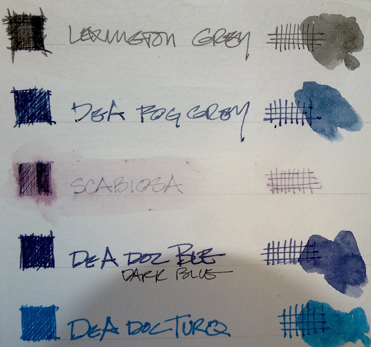 I love drawing in a dark grey, and Noodler’s Lexington Grey is neutral,
not blue or red, if that is possible. I had DeA Doc Dark Blue, and love it.
Then I had heard such amazing things about DeA Doc Fog Grey —
and am SO disappointed.
Sorry, I grew up with daily fog over the ocean and it is not like this. This is BLUE.
Now I am set for blues for life, as I rarely use them — or I will mix them up a bit.
I have used a lot of the DeA Doc Turquoise — it is surprisingly versatile and after having it as a sample. I bought it. I think I will enjoy using it in architectural sketches.
Scabiosa was a sample, and interesting, but not my kinda ink —
which is why samples for a buck are a good idea. I thought it would be like Australia!
Water resistant and waterproof is what you look for when you are reading
technical specs and want a waterproof ink. Bulletproof or eternal categories has to do with counterfeiting, and while bulletproof often has staying power,
it is not waterproof on all papers.
From Noodler’s site: ““Bulletproof” refers to any Noodler’s Ink that resists all the known tools of a forger, UV light, UV light wands, bleaches, alcohols, solvents, petrochemicals, oven cleaners, carpet cleaners, carpet stain lifters, and of course…
they are also waterproof once permitted to dry upon cellulose paper. Some inks are more bulletproof than others – generally in descending order (most bulletproof with the most testing – to less bulletproof): blacks, blues, yellows, invisible (“blue ghost” and “White Whale”), greens, browns, purples, reds…. all are equally bulletproof with one exception: the resistance to strong industrial bleaches to the point where the paper structure itself decomposes. Reds are prone to more fading when exposed to strong bleaches (sometimes fading to a yellow) than the other colors.
Check out Goulet’s info video on Bulletproof versus Eternal inks, below.
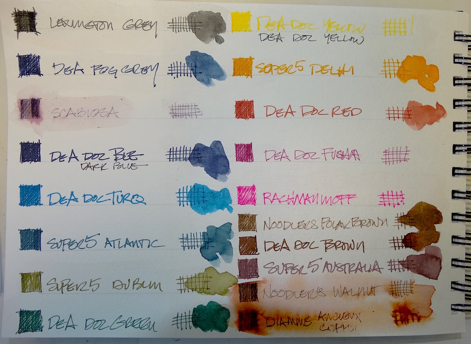 Current ink supply, above. The two other favorites for sketching are Super5 Delhi (that lovely turmeric color) and Super5 Dublin. How cool are their names?
I am experimenting with painting with inks as well.
Will post them when I like them — such bright clear colors!
Tested in a Pentalic Field Book.
I agree to Creative Commons Attribution-Non-Commercial 4.0 International License, which you can learn more about by visiting the site, or,
visit my web page for a more user-friendly summary on my terms.
My images/blog posts may be reposted; please link back to dkatiepowellart.


