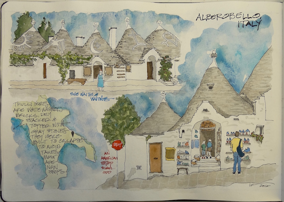
Presenting how I SEE a scene, from both the perspective and detail aspects,
might be interesting. I drew on the google image for you, not that I do this, but to show you where my eyes go — studying before I draw, whether in person or from an image.
If you are sketching from an image I think studying the lines using pens is good —
Anything that helps you learn to see is a great tool.
Eventually you won’t need the lines!
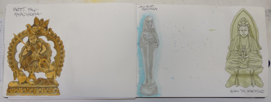
 This drawing took two squares in my Moleskin format,
which I wanted to use for this set. I’m using #4, below, discussed here.
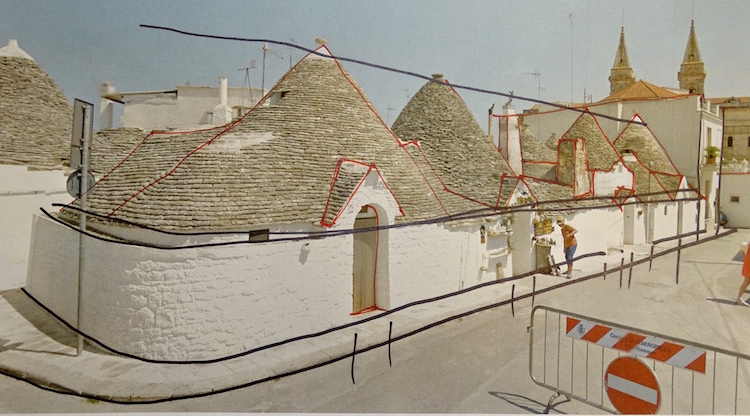
First, the basic perspective — the black lines.
 I don’t use technical points when I am
sketching — even though technically this is
more of a two point perspective, if that means something to you. I have a history of being
an amazing technical artist for buildings,
but in sketching, I want to see what my eye sees, not what geometry tells me to see, so I let go of it. NOT saying that doing it that way is bad —
there is no BAD! But understand vision is very subjective, and so I feel drawing what I SEE is more important than being technically correct, which is what makes it ART. No two people sitting in the same spot will draw the same image! I let go on knowing what the object is, and draw this line, then that line, and so it goes until I have a recognizable object in front of me.
In this image eye level is about 2/3 up the image. Eye level is a horizontal line.
I blocked my buildings using the four black lines running the length of the street in pencil (see below) and then blocked the rhythm of the doors. (See the door rhythms in the short black lines on the curb, above?). A secondary set of blocking lines are outlined in red above. The red is trying to understand the various roofs, entrances, chimneys,
and other structures that make up the row of Trulli houses.
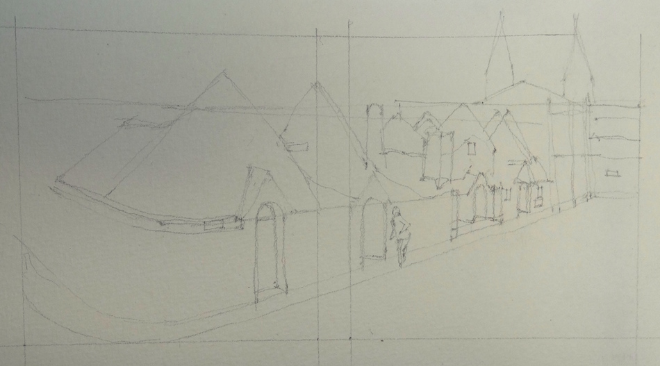
 Once the pencil blocked out the basic shapes, I begin to let my fine-line pen wander as my eye does, making marks as I correct details and create a line drawing of the image.
 Grisaille laid in toned shadows,
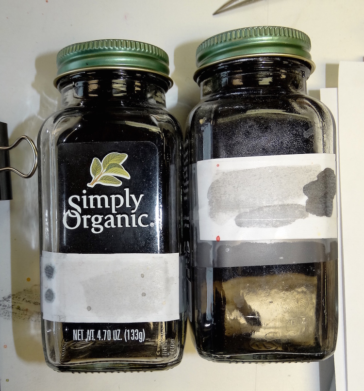
Noodler’s Lexington grey.
I premixed two levels, one a bit lighter,
which is what I used here.
I chose this image because of the
juxtaposition of the Trulli homes backing
up to the grand Italian Catholic church
and the more modern business section of town. How does it make that transition?
Why don’t we do this in our country more often, let the older history stay next to the modern in a way that enhances both?
 Watercolors and inks as color,
not shadows, were added next, using
the first brush: More Lexington Grey
for the rooftops in wiggly lines and
a diluted wash for the street.
Daniel Smith Primatek Lapis (right)
and Cerulean Blue make the sky. Granulating Lapis makes for wonderful skies, with added colors changing the tones from night (Indigo) to turquoise blues. Clouds can be created with white or simple adding water while the sky is still wet, or using a cotton swab to remove color!

 Then details, using the last two brushes.
Finished another!
Virtual sketchwalk in Italy thanks to google!
This piece was created in conjunction with 30 paintings in 30 days challenge.
Moleskin 8×11 watercolor journal, Pentalic HB woodless pencil, Platinum Carbon pen
inks that behaved: Noodler’s, De Atramentis Document, and Super5,
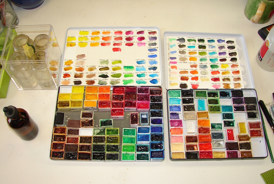
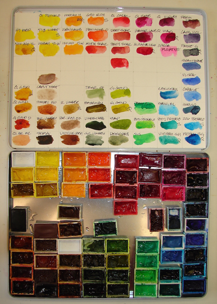
and Greenleaf & Blueberry, Daniel Smith , Holbien, and QoR watercolors.

I started a Facebook group page (you must join to view) to allow everyone to share their virtual sketches, and also where we will, from time to time, take virtual sketch walks together. Come join us On Facebook if you are inclined!
If you want to know more about what a virtual sketchwalk is review my first post.
There are a few more notes/pointers on our first walk through Laguna Beach, California.
I also created an accompanying Flickr group!
I agree to Creative Commons Attribution-Non-Commercial 4.0 International License, which you can learn more about by visiting the site, or,
visit my web page for a more user-friendly summary on my terms.
My images/blog posts may be reposted; please link back to dkatiepowellart.