Copyright, Chagall Card, Riffs, WTH?

 I am breaking with my normal posts to say this timely bit regarding copyright, and
the lawsuit against Led Zep over the riff.  I don’t give a toss about any of it, but the topic is under my skin.  I understand the GOOD AND TRUE reasons for copyright,
so am not going to list the obvious reasons for having a copyright.
Yes, IF a company stole my image and was making money with it I’d sue.  People making money off an actual copy of a thang is serious business.

But how do you copyright an idea?  A style?  How do you copyright a few chords, or brushstrokes, or still life  arrangements of a certain type (many look the same to me)?
W14 12 19 BOOBY GURL MIRROR OLD 5 BANNERW14 7 13 One Day Full Moon Circle 300dpi RB
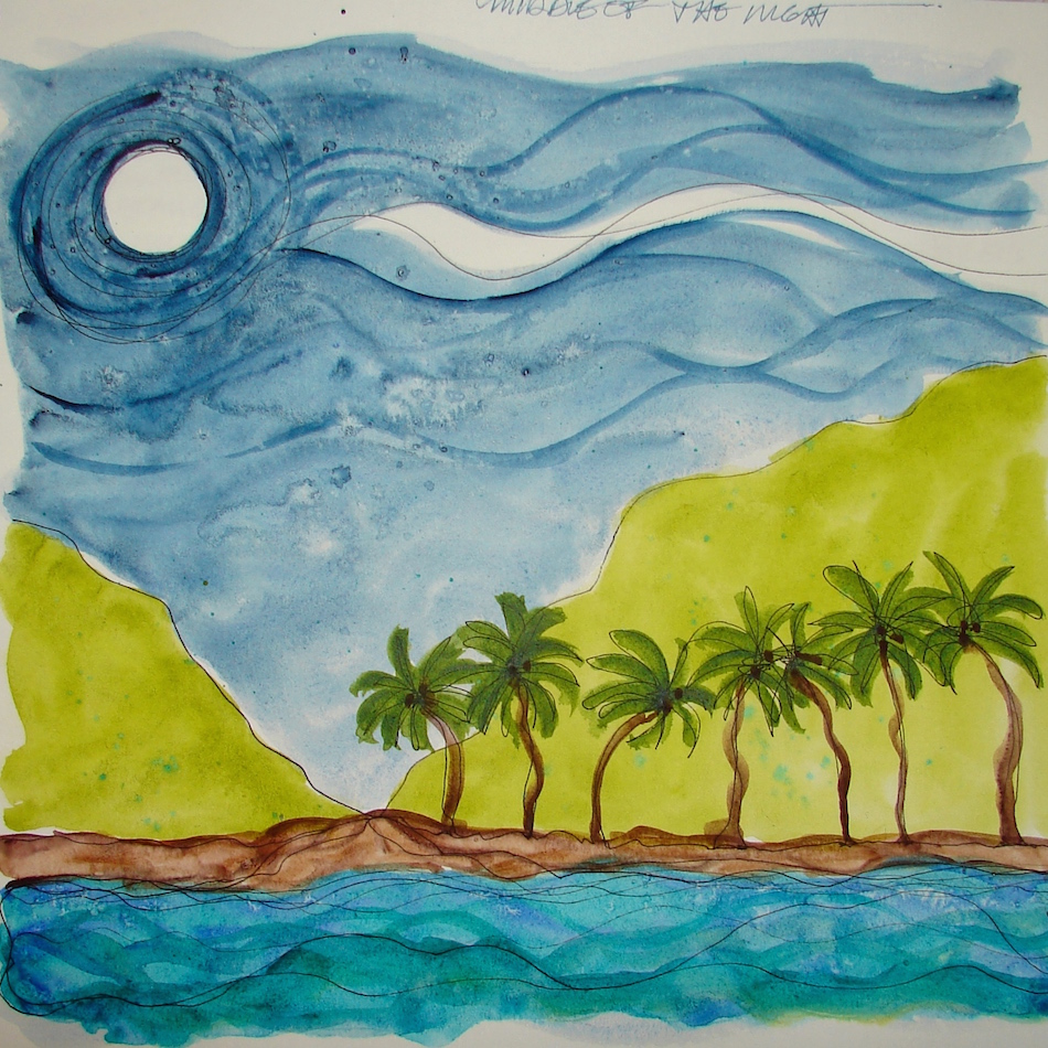
Van Gogh has an iconic moon with swirls
around in a night sky.  Should every person
who ever swirls their sky around the moon have to
pay Van Gogh’s estate for the IDEA?  I think not,
but if so, BTW, I am sure I came up with the yin-yang moon (even named it), right, so I hereby copyright that from 20 years ago (I have the sketches) so it is mine. Shouldn’t a copy be recognizable
by everyone for the entire thing it is?

This and this and this are the same idea, right?
But have you ever drawn a naked whirling dervish gurl?
Did you steal the idea from me?  Does she have red hair?
Is there a crescent moon up above?
DID YOU COPY ME?

(oh.
i hereby copyright the spelling of gurl.)

Do you see where I’m going with this?  I can’t always describe porn,
but I know it when I see it.  And I know a copy when I see it or hear it.
So where do we draw the line and why is this important?

 Creatives have dialogues in different ways than word people.  Artists “copy” (mimic, borrow, try out) the tricks of those that influence them and that is a dialogue between artists, a nod to the influence.  If they are honest or aware (sometimes they are not aware) they should mention the name of the artist they are “nodding” to as influencing.
Artists KNOW that from time to time they steal ideas.  Recently I am running with some images influenced by Pat Southern-Pearce, a friend and amazing artist.  I love how she uses colored paper and layout to achieve her wonderful journal entries.  I don’t want to copy her, and as I find my way into my version of her lovely style, playing with
elements I like, I also might be mistaken for her to the untrained eye (above).
I can name two other artists who are “copying” elements of her style.
They, too, will take it in their own direction.

The dialogue between creatives is important, and it can be a bit of this or that, and from my ability to hear music (not a musician myself) I hear melodies that remind me of others, some very old, some classical, and yet it isn’t the same song.  Take away the dialogue and the sharing between creatives, and you begin to stifle creativity.  Too many lawyers…

I wrote a bit about how I bought art cards long before I met Mitchell and apparently they were all for him as never gave them to anyone else (some are 30 years old) because
I saved them for the love of my life.  I am talking about Chagall here and yup, that quick little rooster and sun and sky is an homage as I am “painting” that card that I gave his yesterday as I remember where I bought it, and how I saved it for someone very special.
Is that stealing?  I see the red rooster, the watery sun, the bright blue sky…

W16 4 9 PENATALIC 1 CHAGALL 2
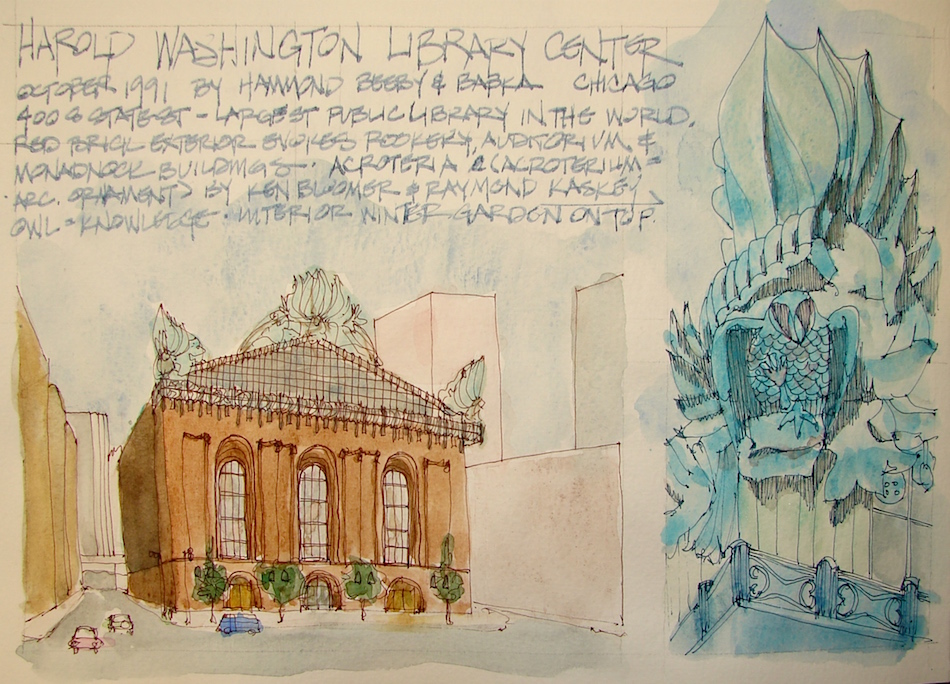
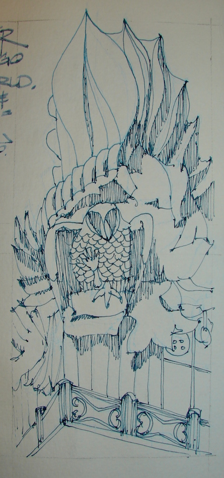
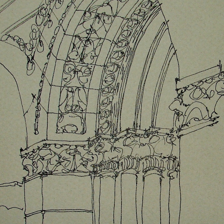
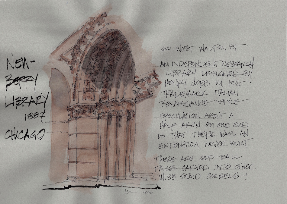
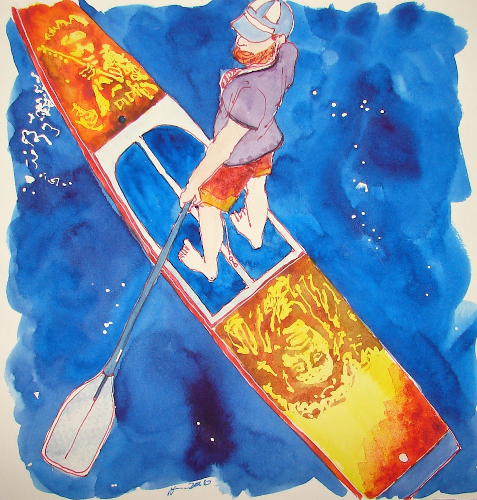
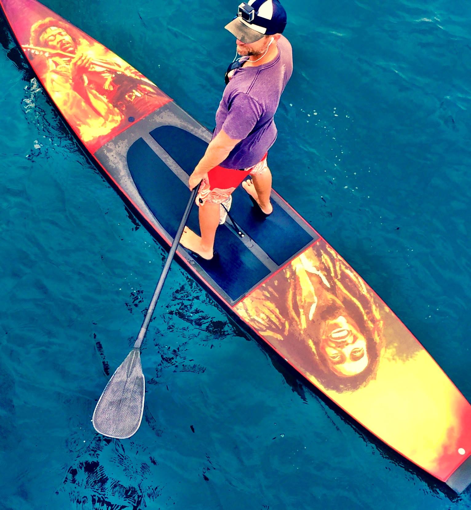
Pentalic Aqua Journal, Lamy Al-Star, De Atramentis Document ink,
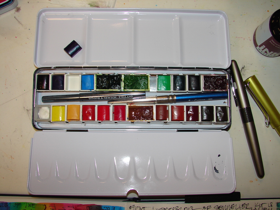
and Sennelier pan watercolors.


I agree to Creative Commons Attribution-Non-Commercial 4.0 International License, which you can learn more about by visiting the site, or,
visit my web page for a more user-friendly summary on my terms.
My images/blog posts may be reposted; please link back to dkatiepowellart.
No, on second thought,

 ©D. Katie Powell.  So there….

Posted in art, art journal, copyleft, creativity, meditation, process, sketchbook, watercolor | Tagged , , , , , | 10 Comments

VSW: Harold Washington Library, Chicago, 2 Watercolors

W16 4 11 VSW HAROLD WASH LIBRARY CHICAGO 001 W16 4 12 VSW HAROLD WASH LIBRARY CHICAGO 002

I added a wash coat of color and a bit of detail to the ink sketches.
Being a line-work gal, not sure which I like best…  You?

Moleskin 8×11 watercolor journal,
watercolor pencils and Pentalic HB woodless pencil,
Platinum Preppy pen, Sheaffer calligraphy pens;  inks that behaved:
De Atramentis Document and Super5 inks;
and Greenleaf & Blueberry, Daniel Smith , and Holbein watercolors.

NELIPOT IFJM NELIPOT IFJM NELIPOT IFJM

I started a Facebook group page (you must join to view) to allow everyone to share their virtual sketches, and also where we will, from time to time, take virtual sketch walks together.  Come join us On Facebook if you are inclined!
If you want to know more about what a virtual sketchwalk is review my first post.
There are a few more notes/pointers on our first walk through Laguna Beach, California.

I also created an accompanying Flickr group!

NELIPOT IFJM NELIPOT IFJM NELIPOT IFJM

I agree to Creative Commons Attribution-Non-Commercial 4.0 International License, which you can learn more about by visiting the site, or,
visit my web page for a more user-friendly summary on my terms.
My images/blog posts may be reposted; please link back to dkatiepowellart.

Posted in architecture, art journal, calligraphy, challenge, creativity, pen & ink, process, sketchbook, virtual sketching, watercolor | Tagged , , , , , , , , , , , | 10 Comments

VSW: Harold Washington Library, Chicago, 1Ink

I look at my pages now that my comfort with fountain pens and watercolors
— my materials — to move my eye to design a pleasing page.

W16 4 11 VSW HAROLD WASH LIBRARY CHICAGO 001I love this postmodern building and had little knowledge of it so this was a gorgeous surprise.  I will want to sketch this again and again, interior details and rooms too.

DSC05866I started with a pencil layout of how I wanted to set my page,
more formally as I usually do, shown above, then of course found the parts of the grid I wanted to fill with overall and detail sketches.

I used watercolor pencils in a rust tone and blue tone because I know
I will create a wash eventually on these pieces.  I added the ink, also in brown and blue,
for the same reason.  The owl has so many distinctive shadows due to the
undulations of the owl and feather acroterium (architectural form) that I decided
to shade in with the pen to begin shadow.   Shown in the details, above.

W16 4 11 VSW HAROLD WASH LIBRARY CHICAGO 007I love the owls.  Amazing metal work.
I have to find out for my husband why buttons on the outside motif….

W16 4 11 VSW HAROLD WASH LIBRARY CHICAGO 003Color will come next, later today!

Moleskin 8×11 watercolor journal, watercolor pencils and Pentalic HB woodless pencil, Platinum Preppy pen, Sheaffer calligraphy pens;
inks that behaved: De Atramentis Document and Super5 inks.

NELIPOT IFJM NELIPOT IFJM NELIPOT IFJM

I started a Facebook group page (you must join to view) to allow everyone to share their virtual sketches, and also where we will, from time to time, take virtual sketch walks together.  Come join us On Facebook if you are inclined!
If you want to know more about what a virtual sketchwalk is review my first post.
There are a few more notes/pointers on our first walk through Laguna Beach, California.

I also created an accompanying Flickr group!

NELIPOT IFJM NELIPOT IFJM NELIPOT IFJM

I agree to Creative Commons Attribution-Non-Commercial 4.0 International License, which you can learn more about by visiting the site, or,
visit my web page for a more user-friendly summary on my terms.
My images/blog posts may be reposted; please link back to dkatiepowellart.

Posted in architecture, art journal, calligraphy, challenge, drawing, pen & ink, sketchbook, virtual sketching | Tagged , , , , , , , , | Leave a comment

Tools: Sennelier Watercolor Pan Kit and Pentalic Aqua Journal

It seems that when I get my watercolors in order and say “I need nothing,” I end up buying something new.  Blick’s is having an amazing sale which I came across looking for a replacement tube; I had put my travel metal pan on a back burner and then I saw this sale on Sennelier French Artists’ Watercolor Set, while they last, $60 for 18 pro colors.

How could I not?

Thing is, I’ve not used pan watercolors since I was a kid — always tubes.
I’ll share the first couple days of playing around with them and then later will tell you how I liked them after getting used to them — and they will take getting used to!  The case is well-made, and it is the case I’ve been waiting to buy — a good metal travel case.

WHY?

W16 4 7 MIXING PANS 02W14 11 14 LS COLOR 27I’ve enjoyed my metal home-made cases,
but the thing is, they no longer work for me.
This is one part of the learning curve;
I came from acrylic world where
I mixed paints in baby jars.
For the longest time I bought the water colors I liked and didn’t mix much except on the paper
(which is what many artist’s do.)
Then I began perfecting my washes…
and needed to mix it up…
and lo and behold, began to need a mixing space.  (See that messy thang above?)
My home-made tin didn’t have
but one mixing space (under the color palette.
Not good enough!
So now I have a grown-up travel container!

W16 4 SENNELIER 1First impressions, the watercolors fall out of their containers.  The blue one above is an example.  (The small pans are Sennelier, the large pans are my Daniel Smith tubes in containers, which I’ve already added, because I CANNOT live without quin gold and piemonite and sap green and green gold.)

I like full pans even though it means fewer pigments.

I  like filling my own pans, heaping the paint up on one side and letting there
be a place for a bit of water to muddle about in and make a baby wash space.
I doubt I keep this together in this form for more than a month or two;
then I will lift the metal insert out and put my own pans in that place.

(Nope, I am already having an internal argument to remove the tray and put my own pans in. My muse is saying,”Why push to try it? You can keep the tray to the side and play with the paints if you like….”  So much for my willingness to try this!
We’ll talk tomorrow.)

I like the mixing areas, and I like that it has a thumb-holder underneath.
But the paints falling out is a problem!

W16 4 SENNELIER 3This shows the colors with my added pigments, unmarked.

The colors are not my favorites, as they are Crayola crayon colors, not nuanced.
They are not as transparent as Daniel Smith’s colors, and they are matte, quite flat.
The paint, however, is excellent quality — they are Sennelier, after all — and so it is fun to play with more new colors, things I might not buy, in small quantities.
They also layer well, below, and do not move easily once dried, even the non-staining pigments.  Perhaps for the time I am in this book I will use them.

W16 4 SENNELIER 2
A note about where I am headed now, creativity-wise.

I’ve learned enough about watercolors to make them my own now,
even though I am still in a couple of groups where I can still continue to learn, always.  This means I want to go back to my own crazy-arse journaling and silly sketches, and may not publish those as much.  Maybe I’ll do a day where I post what I am comfortable with in my sketchbook, I’ll have to see where this new direction is taking me.  And I am paint/writing a book, and not willing to share all those images with the internet.

Then there is the journal….

I tried a book as a very-good-deal, and have, in past, enjoyed Pentalic Nature series sketchbooks, ring-bound.  This journal is meant to compete with Moleskin and Fabriano.  So how to I get excited when I open it and it falls apart?
Yup.  Back opened up when I laid the book flat —
and they are designed to be laid flat so you can paint on them.
I am unimpressed so far.  Pentalic should skip the penholder and the envelope at the back and create a better binding.  I am going to make it work for this round…
And will contact them and see what they are willing to do.
Moleskin stand behind their bindings IF you can tell them where you got the journal.

Cannot Recommend!

W16 4 PENTALIC BRAND NEW 1 W16 4 PENTALIC BRAND NEW 2Pentalic Aqua Journal, Platinum Carbon pen, Lamy Al-Star with
De Atramentis Document Black and Sennelier Watercolors.


I agree to Creative Commons Attribution-Non-Commercial 4.0 International License, which you can learn more about by visiting the site, or,
visit my web page for a more user-friendly summary on my terms.
My images/blog posts may be reposted; please link back to dkatiepowellart.

Posted in art journal, journal, paper, review, watercolor | Tagged , , | 7 Comments

A common surprise

Oh yes, sketcher-woman who also has my heart, loving the history and trying to catch it as it disappears for what? Crapity-crap-crap, usually (the last is my editorial, not hers.) Follow her, she is great!

Suhita Shirodkar's avatarSketch Away: Travels with my sketchbook

It’s becoming more and more common: someone will email me telling me about an interesting sign in San Jose that I haven’t sketched. I’ll go out to sketch it only to find something quite different from what was described to me.

Just a couple of weeks ago, I added this sign for the Bold Knight (photo by Dave on flickr) to my list. But when I went there today, I found a huge green tarp around the perimeter of the lot, meaning something was being demolished. And this. A big hole where the quite-flamboyant lettering should have been.

bold_knight_blindingbold_knight_vintage_sign

I wonder how long it will be before the sign is gone. Glad I got there, even if it was a bit late. So many hidden and almost forgotten landmarks in the city, so many stories, all disappearing quicker than I can get to them…

View original post

Posted in art journal | 10 Comments

VSW: Chicago, 1, Newberry Library

W16 4 1 NEWBERRY LIBRARY 002Nice to have Sue lead the Virtual Sketchwalk
in Chicago this month.  I’m taking the opportunity to play on Canson Colored papers, ink and watercolor on grey paper! The watercolor buckled the paper,
but it stood up to it — several layers — And did not bleed through! Caput Mortem mixed with Mummy Bauxite and Shungite for grainy stonework.
It is VERY hard for me to loosen up and just give the illusion of the place in a short time.  I was a detail woman at  heart, and line-work was my thing!

W16 4 1 NEWBERRY LIBRARY 005Canson paper loose to be tipped into my Moleskin 8×11 watercolor journal,
Pentalic HB woodless pencil, Platinum Carbon pen, Lamy Al-Star which did not work well on this paper De Atramentis Document Black, Pentel Pocket Brush Pen,
and Greenleaf & Blueberry, Daniel Smith , Holbein, and QoR watercolors.

NELIPOT IFJM NELIPOT IFJM NELIPOT IFJM

I started a Facebook group page (you must join to view) to allow everyone to share their virtual sketches, and also where we will, from time to time, take virtual sketch walks together.  Come join us On Facebook if you are inclined!
If you want to know more about what a virtual sketchwalk is review my first post.
There are a few more notes/pointers on our first walk through Laguna Beach, California.

I also created an accompanying Flickr group!

NELIPOT IFJM NELIPOT IFJM NELIPOT IFJM

I agree to Creative Commons Attribution-Non-Commercial 4.0 International License, which you can learn more about by visiting the site, or,
visit my web page for a more user-friendly summary on my terms.
My images/blog posts may be reposted; please link back to dkatiepowellart.

Posted in architecture, art journal, challenge, drawing, pen & ink, process, series, sketchbook, virtual sketching, watercolor | Tagged , , , , , , , , , , , , , , , | 2 Comments

Black HUB IPA Can

W16 4 2 TFK HUB IPA 001Okay, first off, do NOT sketch in a black watercolor pencil when your first coat will be an Indian Yellow or Quin Gold.  Dumb.  I tried to wet and wash it off;
alas, it did not work well.  Also, the reason my sketch is off to one side is that I will be using this for a recipe IF my risotto turns out tonight, bacon and beer, yum.
(It turned out amazing, Recipe here!)

Did this for the last of Tracey’s Delicious Paint Class where we were to try to do underpainting with a black can or black box.  I used an Organic IPA from HUB in Portland Oregon, and built it up with:
underpainting of Indian Yellow,
pop of the oranges,
masking fluid,
underpainting of Paynes grey + Indigo,
coat of Shungite + Sepia,
removal of masking fluid, final touch up with pen an Quin Gold.

I like the quality of the black I get with the underpainting!

W16 4 2 TFK HUB IPA  015 BANNERAnd here is is fully finished!
Hub IPA-Bacon-Sugar Chili Risotto

W16 4 2 TFK HUB IPA  019

Aquabee Super Deluxe Journal, Platinum Carbon pen, Pentel Pocket Brush Pen,
and Greenleaf & Blueberry and Daniel Smith watercolors.

Always organic or non-GMO, humanely raised.  It matters!

54 1 54 9 54 12 54 10 54 3 54 11 54 2 54 6

I am now agreeing to the  Creative Commons Attribution-Non-Commercial 4.0 International License, which you can learn more about by visiting the site, or, visit my web page for a more user-friendly summary on my terms.
My images/blog posts can be reposted; please link back to katwritesfood.
Images courtesy Dkatiepowellart. (Me too!)

Posted in art journal, class, pen & ink, recipe, watercolor | Tagged , , , , , , , , | 14 Comments

VSW: Chicago, 2, Fourth Presbyterian Church

W16 4 2 VSW 4TH PRES CHURCH 1Continuing the Virtual Sketchwalk in Chicago drawing on colored paper,
this time ink and colored pencil on grey paper, with a nod to Pat Southern-Pearce!

Canson paper loose to be tipped into my Moleskin 8×11 watercolor journal,
Pentalic HB woodless pencil, Platinum Carbon pen, Lamy Al-Star which did not work well on this paper with De Atramentis Document Black,
Pentel Pocket Brush Pen, and various colored pencils.

NELIPOT IFJM NELIPOT IFJM NELIPOT IFJM

I started a Facebook group page (you must join to view) to allow everyone to share their virtual sketches, and also where we will, from time to time, take virtual sketch walks together.  Come join us On Facebook if you are inclined!
If you want to know more about what a virtual sketchwalk is review my first post.
There are a few more notes/pointers on our first walk through Laguna Beach, California.

I also created an accompanying Flickr group!

NELIPOT IFJM NELIPOT IFJM NELIPOT IFJM

I agree to Creative Commons Attribution-Non-Commercial 4.0 International License, which you can learn more about by visiting the site, or,
visit my web page for a more user-friendly summary on my terms.
My images/blog posts may be reposted; please link back to dkatiepowellart.

Posted in architecture, art journal, pen & ink, pencil, series, virtual sketching | Tagged , , , , , , , , , , , | 5 Comments

Creativity: Stumbling Blocks + Play

Creatives get blocked.
Creatives need play time!

W14 6 1 Salmon with Garlic Greens 2
It has been a long time since I’ve been involved in a project —
I’m not talking about recipes or art challenges but real projects —
a couple of years of learning watercolors, and before that, a few years of hard work during this recession making sure our business stayed on track.
(I am a finish conservator in our business, working (mostly) on furniture.)

WEB BLANK PAGES 084Being driven toward making dollars is a very different mental state
than simply creating, and then selling what you created in that state.
Ask any artist commissioned to paint how different the two processes are:
In one, you have tight parameters within which you are creating, and in the other,
it does feel a bit more (at least to me) like pure play,
though you might have the parameters of materials, size, etc.

I’ve been struggling to get my project mojo back, and forgot that this, too, involves play.  For example, I’ve painted a couple of silly journal entries, memories for Mitchell and I, and in the process, inducted my playful side.  This playful side is necessary for one of the two projects I am moving forward, and always gives me more time in watercolors
(which is still necessary for me) and so, playing with Bunnies and Cake (below)
helps me in the bigger theme of telling the story I must tell!

There is a larger type of play creatives need to do,
seriously,
with dedication.

NOODLING!

W15 5 5 MAY SKETCHBOOK 001Mitchell does it on the guitar. 

He screws around with keys or chords or whatever he calls it, and I can tell when he is doing that versus playing a song.  We’ve talked about him noodling around on the guitar, and how it builds confidence, makes him at ease with the instrument, etc.

web arco axoAs an architect, besides sketching buildings during lectures and so forth,
I always started a project with the plot of land or skin of the building (if I was creating an interior layout) by playing in it — drawing walkways, entries, trees, structural layouts, windows, views, line-work, lot of line-work, and that aimless noodling was a kind of physical thinking that led, eventually, to an idea.  If I was truly blocked, however,
I went for a walk on Venice Beach or the boardwalk, read a short story of
Sherlock Holmes, or played with the cats, vegging out.  Especially if I was familiar with the project on the boards, this vegging out time was time when somewhere, the project was generating ideas because my Muse was working behind the scenes.

W16 6 30 LEMON CAKE 001In the same way, drawing or falling in love with a pigment and
playing with color or making marks going nowhere-in-particular lead to making me a better creative when I finally do get down to the business of a project.
(Lately it has been every shade of orange and coral….  and blue.)

I don’t think most businesses understand that play time that leads to good ideas and brilliant layouts.  They push for billable time.  I’ve been my own taskmaster, feeling the  pinch of time, the billable hours of my own mind imprisoning me.
Mitchell and I talked about it this morning and it all became clear to me, again.

And then there was cake…

Aquabee Super Deluxe Journal, Caran D’ache watercolor pencil, Platinum Carbon pen,
and Daniel Smith, Holbein, and QoR watercolors.

W16 6 30 LEMON CAKE SQ W16 6 30 LEMON CAKE SQ W16 6 30 LEMON CAKE SQ W16 6 30 LEMON CAKE SQ W16 6 30 LEMON CAKE SQ

©D. Katie Powell.
My images/blog posts may be reposted; please link back  to dkatiepowellart.

Posted in art journal, creativity, making a living, process, watercolor | Tagged , , , , , , , , , | 12 Comments

Convergence: Grief, Books, Life

This gallery contains 10 photos.

Originally posted on joy murray art~stories~life:
I belong to a book club where, at 55, I’m the youngest member.  The oldest member is 92 and there is another member who turned 90 this year.  I’m reluctant member of…

More Galleries | 12 Comments

Gratitude Journal: Chocolate Bunny

W16 3 30 GRATITUDE JOURNAL 001
What is it about the power of a chocolate bunny?

And more importantly, we’ve had SO many years without them because
we stopped eating non-organic sweets!  If we are going to fill our bellies with sugar
and all means of “bad” things, then at least we are going Non-GMO.

We’ve been through a LOT in the past year.  Surgery, bad doctors cutting me during surgery, crazy bad tenant in our building, and a project from hell (the ups and downs of historic objects) that was — and is — part of a murder!

We were looking for a sign.  And lo and behold, there was one.

I found Mitchell an
ORGANIC CHOCOLATE BUNNY!*

AND, Organic Caramels, omigoddess I am in heaven!**

(Not to knock my toucan socks.  They are pretty cute!)

Spring is here, and we’ve received a sign that things are gonna change….

(And omi, I forgot the bee, endless hours of cat-chasing fun!)

the bee(For my Christian friends and Catholic family, this is in no way meant to impugn or denigrate the religious meaning of Easter.  It’s just a chocolate sign from the Universe.)

Moleskin 8×11 watercolor journal, Pentalic HB woodless pencil, Platinum Carbon pen,
and Greenleaf & Blueberry, Daniel Smith, Holbein, and QoR watercolors.

W16 3 30 GRATITUDE JOURNAL 001 SQ W16 3 30 GRATITUDE JOURNAL 001 SQ W16 3 30 GRATITUDE JOURNAL 001 SQ W16 3 30 GRATITUDE JOURNAL 001 SQ W16 3 30 GRATITUDE JOURNAL 001 SQ W16 3 30 GRATITUDE JOURNAL 001 SQ

 ©D. Katie Powell.
My images/blog posts may be reposted; please link back  to dkatiepowellart.
*Lake Champlain Organic Bunny
** One Fork Farm Organic Caramels

Posted in art journal, color, gods and goddesses, journal, memory, pen & ink, sketchbook, watercolor | Tagged , , , , , , , , , , , , | 7 Comments

Electric Pencil: A Sketchbook from an Asylum

It speaks for itself, fascinating.

From this posting:  http://www.electricpencildrawings.com/EPrevealed-english.html

I love this kind of thing….

Posted in journal, sketchbook | Tagged , , , | 6 Comments

Laguna Starfish

W16 3 27 STAR 01From a photo, middle of the night, watercolor pencil, splashing paint, no ink.
Missing the ocean, need to dip my toes in sand and sea soon….

Aquabee Super Deluxe Journal, Caran D’ache watercolor pencil,
White Uniball Signo, and Daniel Smith watercolors.


I agree to Creative Commons Attribution-Non-Commercial 4.0 International License, which you can learn more about by visiting the site, or,
visit my web page for a more user-friendly summary on my terms.
My images/blog posts may be reposted; please link back to dkatiepowellart.

Posted in art journal, sketchbook, virtual sketching, watercolor | Tagged , , , , , , | 4 Comments

How I Make Creative Decisions

Sometimes it is hard to pick a project, or say no to an opportunity.
April is arriving, and I have two art projects on my board in addition to
making a living (conserving antiquities —
this is what I am working on in our restoration business):

Then there is a challenge I’ve found fun in past which is full of deadlines, daily commitments, etc.  I thought I’d do it, but then this nagging feeling began.

At first I assumed it was because of an unfortunate experience I’d had with
the creator of the challenge: you know how a fixed idea is hardest to change?
X had made an assumption about something that had
no relationship to anything I felt or thought, and from there, ran with it.
Literally pulled it out of the air, as i had responded to an email from her.
No matter how many times I said, “I don’t feel that, never did feel that,
am perfectly happy with you and your class structure, etc.,”
X had made up her mind and no new information could penetrate.
Of course, had to give up on X, and so no longer happy with her class structures.

Well, I’d have to interact a LOT with X on this opportunity.

Creativity should be fun, dammit!

But then I felt into it a bit more and decided it had little to do with that aspect.

Sometimes I have to go through each layer to see what is going on….

Finally I realized the only way I’d know is to move forward
on the challenge and
see how it felt as I was doing it.
So I “broke the rules,” which are always meant to be broken if this is your challenge
and your process — it is not a law, just an art challenge —
and this is part of the problem X has with me.
I began early, to see how it felt.
Sure enough, I felt sluggish, sleepy, bored, and then, tell-tale sign,
I got a STOMACH ACHE.  Seriously, these are all telltale signs for me,
and they do NOT happen when I am painting.  EVER, (unless I am really sick.)

So I am passing on the challenge this year.
I need to honor my feelings though I have no idea
the reasons behind them and move on, working my projects,
enjoying a couple of classes run by friends, and making money in our business.

This is the results of my sleepy effort yesterday, and the paint and experience still stands.

Blackfriar Pub in London

Moving from sketch to ink layers (grisaille) to underpainting
(using Tracey‘s tips to brighten) to final coats.

Unfortunately, sometimes when you are integrating a new tip, it doesn’t quite work out.
In this sketch of St. Paul’s Cathedral in London, I followed the same basic steps.
The under-painting was too strong for the rest of the image, which had muted tones.
The red for the double-decker bus was a new paint by M.Graham,
a bit too deep and opaque, though it was supposed to be transparent.  Ooop1
The greens became overpowering and brilliant as well.  The overall effect was not to my liking.  I decided to give a go at removing some paint, also a Tracey tip.  This helped considerably, and balance was struck when I deepened the street greys.
That helped to “ground” the sketch.

St. Paul’s Cathedral in London

NELIPOT IFJM NELIPOT IFJM NELIPOT IFJM

©D. Katie Powell.
My images/blog posts may be reposted; please link back  to dkatiepowellart.

Posted in architecture, art journal, challenge, creativity, drawing, journal, painting, pen & ink, sketchbook, virtual sketching, watercolor | Tagged , , , , , , , , , , , , | 12 Comments

Midnight Palm Full Moon

Been so stressed for so many reasons.
Middle of the night drawing.  Moons on my mind.
Watching Mitchell breath while painting ocean and palms and moon in her fullness,
all calming. I almost woke him bringing salt back to bed to douse the sky.
I wrote quite a lot on the facing page, not sharable.

W16 3 19 Midnight Palm Moon 002Aquabee Super Deluxe Journal, Platinum Carbon pen, and Daniel Smith watercolors.


I agree to Creative Commons Attribution-Non-Commercial 4.0 International License, which you can learn more about by visiting the site, or,
visit my web page for a more user-friendly summary on my terms.
My images/blog posts may be reposted; please link back to dkatiepowellart.

Posted in art journal, journal, pen & ink, waterbrush, watercolor | Tagged , , , , , | Leave a comment

Tools: Watercolors

Last week I was asked what my favorite watercolors were over a half-dozen times.

I’m thinking it is a sign, so am using it as a prompt!

I have favorite brands overall (Daniel Smith — DS — and assume a pigment I name is DS unless I say otherwise), and favorite colors (turquoise / red / green gold / orange).
Just look at that delicious dive-into-it color from two years ago, above,
when I first switched from acrylics to watercolors.  Oddly, the colors I love are not necessarily the colors I paint with again and again.
I think what is most important, what most people want to know, is the latter,
what do I use to paint with over and over and over again.  Everyone can find their “favorite” color, but that may not be the watercolor pigment you use.

W16 3 8 WATERCOLORS 001
These are the colors I replace most often.

 I don’t use pink or purple hues often, but I thought to include them
because if I was to reach for them these are the ones I would use:
Quin Magenta (QoR), Quin Coral, and Carbazole Purple.  My favorite color pink is Opera Pink, but it is so fugitive (fades fast).  My favorite purple is Imperial Purple but it is one of the odd paints from DS that separates and does interesting things on paper with pinks showing and I can’t just use it when I need a pink or purple.
Oddly, bright red is one of my favorite colors, but I rarely paint with it.

W16 3 8 WATERCOLORS 008W16 3 8 WATERCOLORS 007 copyTwo colors, left & right, I use so often, yet I am not fond of either. I use them in buildings and even landscapes.
I am devastated that Daniel Smith is discontinuing Caput Mortem or Cate D’ Azure; if anyone has any I will buy them from you!  Windsor Newton is simply not the same.

W16 3 8 WATERCOLORS 007hematiteLet’s talk about pure ground pigment Primateks from DS (and I may write a post on them by themselves.)
I love them, though some have been a bust in terms of depth of color.  They are indispensable to me.  All but the Shungite (Greenleaf & Blueberry) above are Primateks from Daniel Smith.  Shungite is like painting with graphite; it may not stay my favorite.  It currently replaces Hematite as my go-to-gray, which
is a wonderful and versatile paint, but I am trying it
for a bit, as I love to paint with graphite!

Look at what can be done with Yavapei and Piemontite
when mixed with my travel palette, below.

W15 8 VSW VOLTERRA ITALY 2 004Lapis makes for lovely skies;
here Yavapei created the “ground” in this quick sketch.

 W16 3 8 WATERCOLORS 005While we are at it, let’s talk about paints called the same thing when they are not the same color, like the two Quinacridone Golds from DS and Holbein, right, and including some that are wildly different, like the Indian Yellow from DS and M.Graham, or the Green Gold from QoR and DS, shown above. I’ve been seduced by names!

I got tired of buying various Quinacridone Reds (Omigoddess, so many variations of, but really, most are the same.)  Then I learned from Handprint about pigments, hues, values, the Munsell System (actually I learned about the latter in an art class but Bruce MacEvoy made me understand why I might want to grok it) and now I rarely buy the same color with different names.  Notice the nomenclature below the Quin Golds, “PO49″ and PO48,PY150”? This is the hue and value for each paint color, and by paying attention, and even organizing your paints around it, you can learn a lot (and take your notes with you next time you are on a buying spree!)  I love my two Quin Golds, so this was a happy accident, as I love the Holbein for mixing skin tones, and the DS is a deep wonderful gold!

 Handprint is an education!

I printed out most of his site because it is a great “book” on color!
Here is a PDF to print of his small image, below.

HANDPRINT cwheel06

W16 3 8 WATERCOLORS 010Mostly I love transparent (right) color versus opaque (left, with Primateks and
some mixed colors for the local Painted Ladies) in my current messy paintboxes, above.
I almost never reach for opaque colors and wish I’d known about that preference because I bought quite a lot of paints in my first few months switching from acrylics, where it really doesn’t seem to matter much because I mixed glazes in huge batches.
I don’t care if they are staining or non-staining.

W14 11 14 LS COLOR 27Cost is a consideration.  I buy
artist grade, which is more expensive than student grade, but worth it.  It is much better to buy fewer colors and buy artist grade, though there are good student grade paints.  The reasons I don’t bother with QoR is that the tubes are smaller and close to the same price, as if we would not notice the size of the tube.   List price for QoR Quin Gold is $19 for 11ml; Daniel Smith is $20 for 15ml. I don’t see QoR as worth it!

Finally, there is travel-ability
I love M. Graham colors but they don’t dry well in Portland Oregon.  This is fine if I am only using them in my studio, but if I want to take them traveling they tend to migrate even if “dry” and once wet in the field they don’t dry well after use.

W15 12 NEW MOON CLEANING 007
My tin I use daily, mostly transparent colors with
a few Primateks, when it was shiny clean, above.
I use the central area to throw colors in and out.

Below, my secondary tin, left to right, with
Painted Lady mixes, then opaques, then Primateks.

W15 12 NEW MOON CLEANING 009

Daniel Smith, Holbien, QoR, Sennelier, and Greenleaf & Blueberry watercolors.


I agree to Creative Commons Attribution-Non-Commercial 4.0 International License, which you can learn more about by visiting the site, or,
visit my web page for a more user-friendly summary on my terms.
My images/blog posts may be reposted; please link back to dkatiepowellart.

Posted in color, review, tools, watercolor | Tagged , , , , , , , , | 11 Comments

Recipes, and Taking Classes!

I post this with recipe on my foodie blog, but this is a thanks to
Tracey and a commentary about taking classes.
I am taking an online class by my favorite Aussie,
Tracey Fletcher King, called Delicious Paint.

A class is worth it if even one great thing is a takeaway.
One thing that you really incorporate makes the difference in your artwork,
and unless you happen to have a friend who paints alongside you and has exactly what you need, a class is the way you acquire those little tweaks that make the difference.
I’ve taken several online classes, and while in most I didn’t learn what many were there to learn (I know how to draw, and was a practicing architect so perspective, rendering, scale, etc are under my belt) a few people have taught me one or more things.

Online classes mean I can take them at 3am in my cowgurl jammies.  Heaven.

In Tracey’s class I finally learned how to go from this:

W16 1 7 FUDGE 001To deeper, brighter colors that glow, when I want them to,
like this (BTW, Organic Fudge recipe here):

W16 3 15 Rice Beans Recipe 1I don’t always want my colors to jump off the page, but when I want my colors to glow, Tracey’s how-to make my images vibrate with saturated color — because her images glow!

Steven Reddy showed me one little thing, the use of waterproof inks in grisaille underpainting… Now I have that option in my bag-o-tricks, and am expanding the idea, making it my own!  I use this all the time, in grey and brown and blue underpainting.

Marc Holmes gave me great tips on sketching people, and I look forward to
more with Suhita Shirodkar (I need help with sketching people fast!)

Point is, good artists take classes, and learn new things!  I look for classes online I can “own” because I take them as I can, and sometimes want to return to look at this or that.
I recommend Delicious Paint, courses by Cathy Johnson (DVD and YouTube), as well as Craftsy classes by Marc Holmes, Shari Blaukoft, Steven Reddy, and Suhita Shirodkar.

And soon I will be teaching!

The two top images are in Aquabee Super Deluxe Journal, with a Pentalic HB woodless pencil; White Uniball Signo pen, Platinum Preppie Pen, De Atramentis Document and Super5 inks; and Daniel Smith, Holbein, and QoR watercolors.

54 1 54 9 54 12 54 10 54 3 54 11 54 2 54 6

I am now agreeing to the  Creative Commons Attribution-Non-Commercial 4.0 International License, which you can learn more about by visiting the site, or, visit my web page for a more user-friendly summary on my terms.
My images/blog posts can be reposted; please link back to katwritesfood.
Images courtesy Dkatiepowellart. (Me too!)

Posted in art journal, class, drawing, pen & ink, recipe, sketchbook, watercolor | Tagged , , , , , , , , , , , , | 4 Comments

Rich German on his Board

W16 3 13 RICH GERMAN BOARD 004
1001Took on foreshortening and portrait (EEEK!)
and lions and tigers
and bears, oh my!
I’m pretty happy
with the turnout!
The suggestion of
Marley’s and Hendrix’s portraits was done
with masking fluid over yellow, then splashy splashy!  I’m pretty
happy with them —
they were the “scary”
part — how much
detail to show?
Image of Rich German right;  I don’t know who exactly took the image.

I am taking an online class called Delicious Paint by my favorite Aussie,
Tracey Fletcher  King.  What I am learning about deepening brilliant glowing colors helped me with deep and brilliant blues and yellows and reds….

I used Daniel Smith Masking Fluid, White Pitt pen, salt, and any other trick to create the illusion of water — but mostly wet and puddling!
Primatek Lapis under-painting helped with moody water.
Aquabee Super Deluxe Journal with a Pentalic 2B woodless pencil,
Platinum Preppie pen with De Atramentis Document Red and Noodler’s Scabiosa ink,
and Daniel Smith, Holbein, and QoR watercolors.

I can’t thank Rich enough for allowing me to use his images.
You can, by visiting his page and joining his cause.
(BTW, follow him on FB and see great videos!)
Rich also sells his photographs and paintings,
with a portion of the proceeds benefiting the ocean.


 ©D. Katie Powell, except for photographs ©Rich German.
My images/blog posts may be reposted; please link back  to dkatiepowellart.

Posted in art journal, virtual sketching, watercolor | Tagged , , , , , , , , , , , , , , , , , | 14 Comments