Whats on Your Workdesk? Wednesday

I don’t know if I’ll do What’s On Your Workdesk? Wednesday
as a regular thang, but here I am on humpday wanting to post about
my new space and I happen upon this weekly challenge…..

When not painting
*sigh*
I wish that were so….

W16 BALL
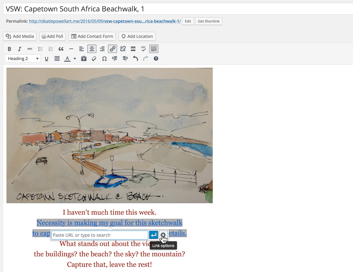
Okay, back to reality.  When not working in a business I actually like which is
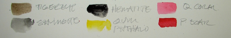
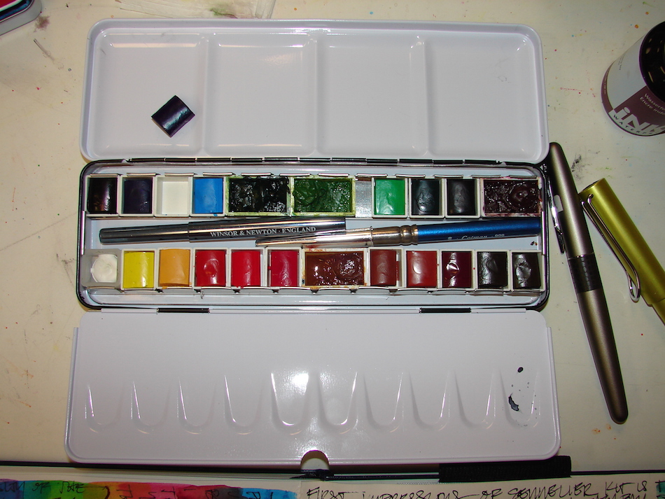
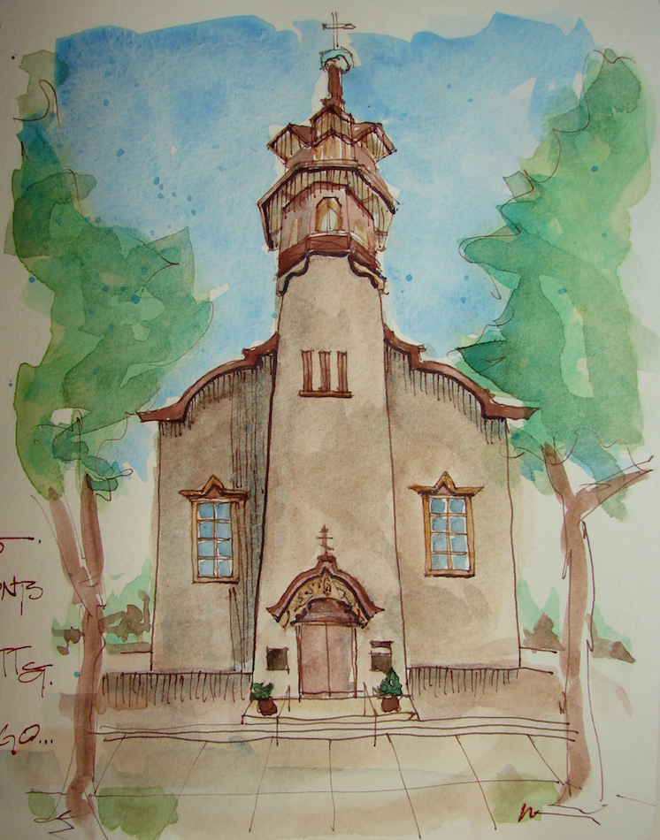
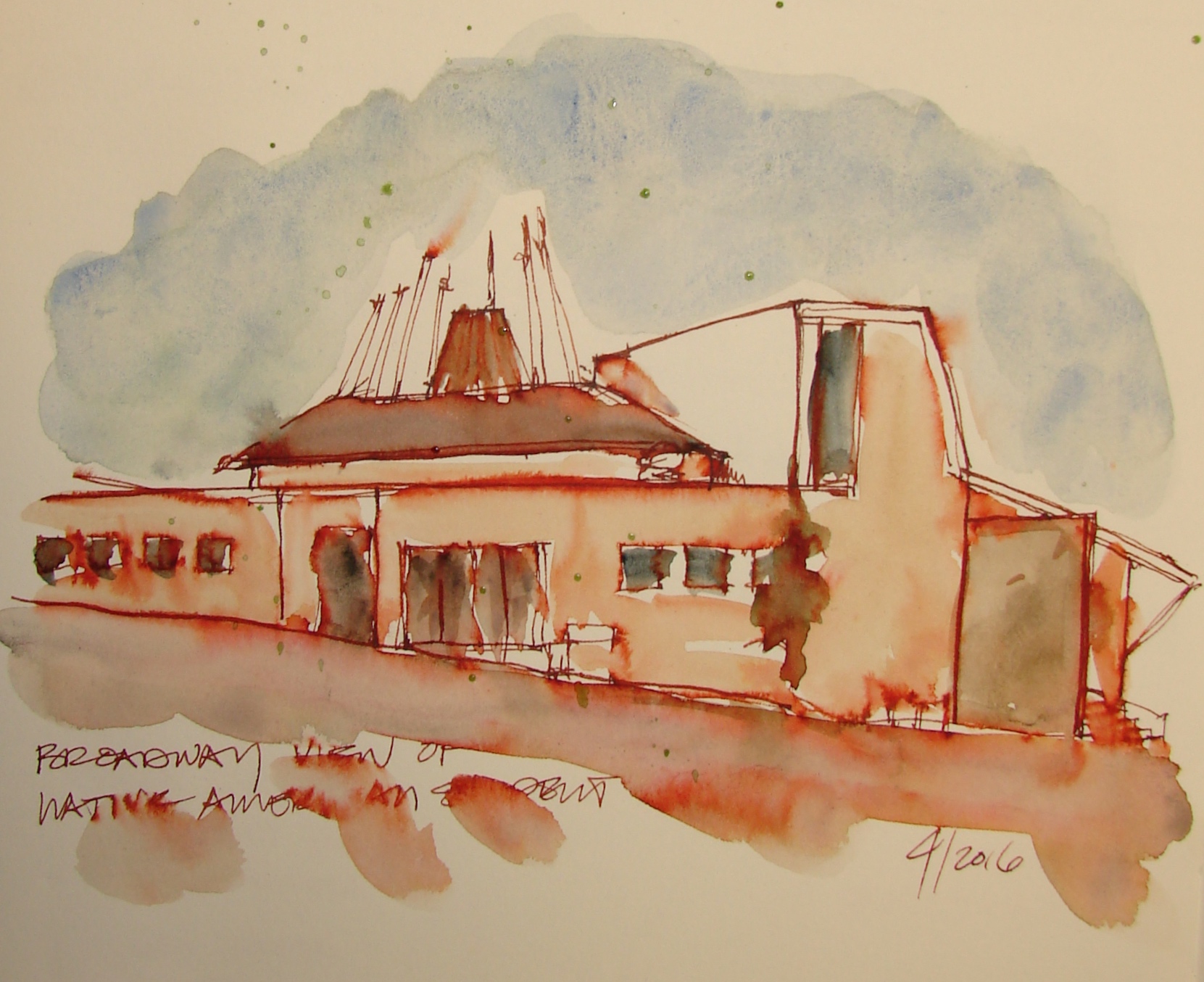
conservation of objects
, above, where I also get to paint using traditional finishes and oils, I paint for myself, mostly watercolors, ink sketches, and the occasional throwback acrylic.  I paint on breaks, sketch on breaks, and can get to the studio early to paint
seven days a week to get in a few hours before the “real” day starts.

2016 4 WALLS2
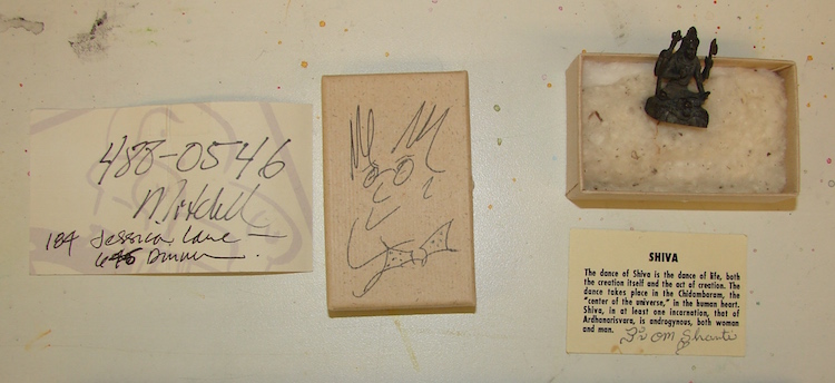
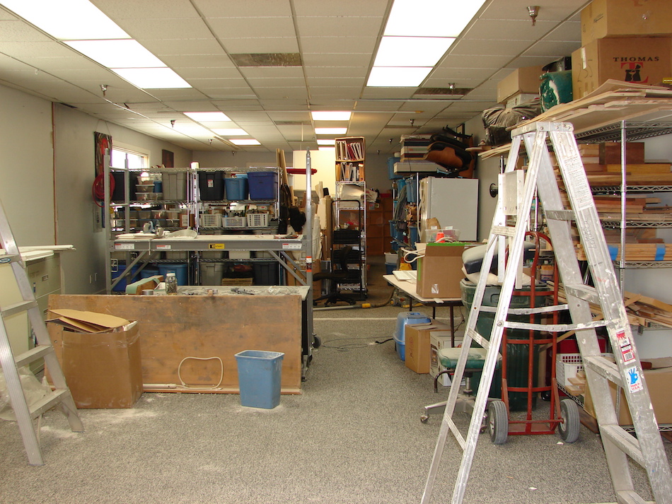
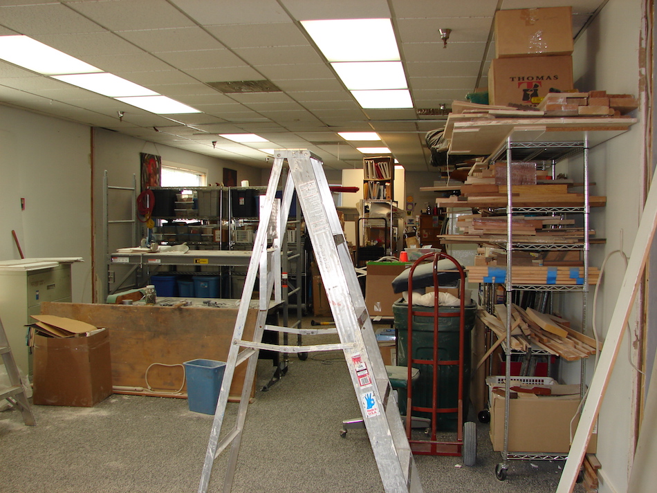
Our space in our studio was not efficient or enjoyable….  Mitchell spent so much time walking between rooms.  Finally our landlady let us remodel.

w16 4 out my new windowLast month we blew out two walls in
our space in four days and made the upholstery/textile room one BIG space.
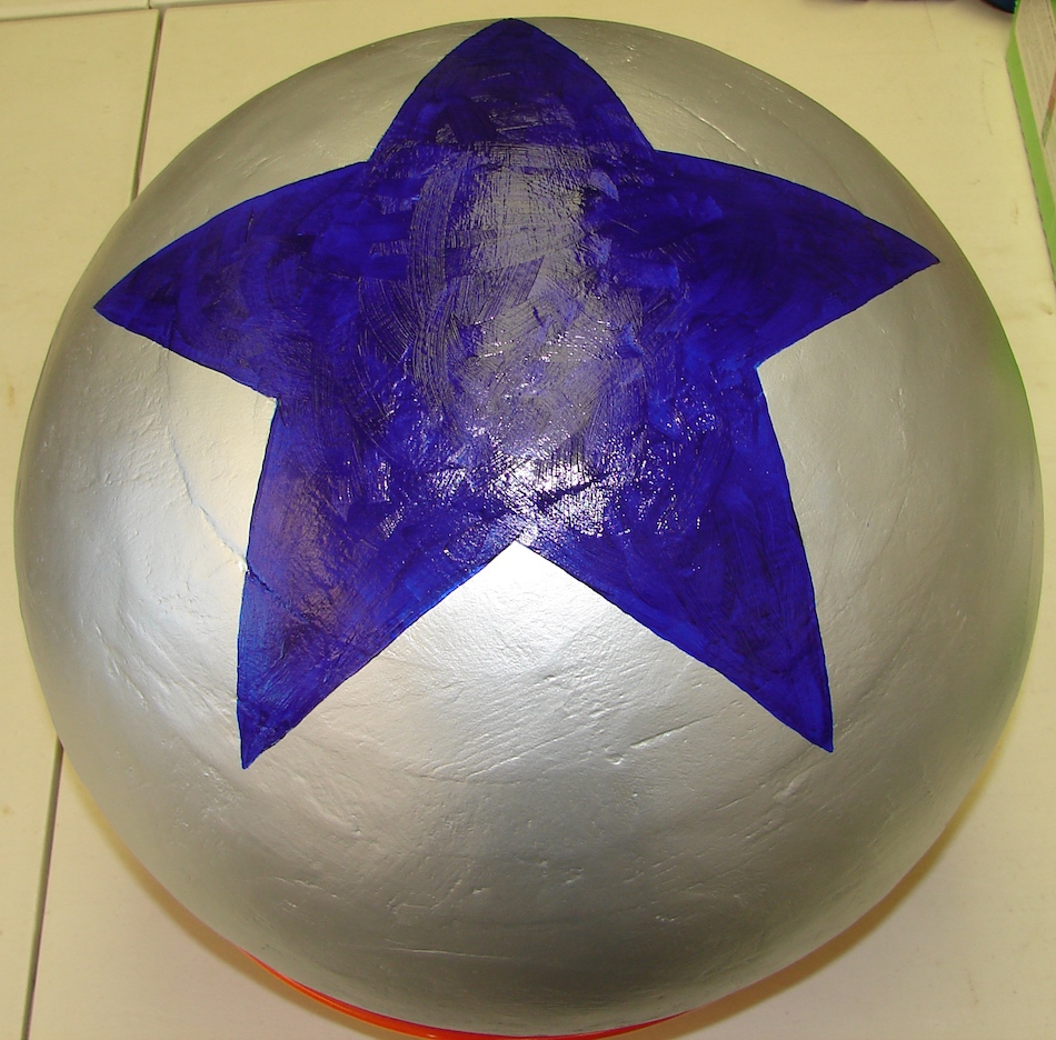
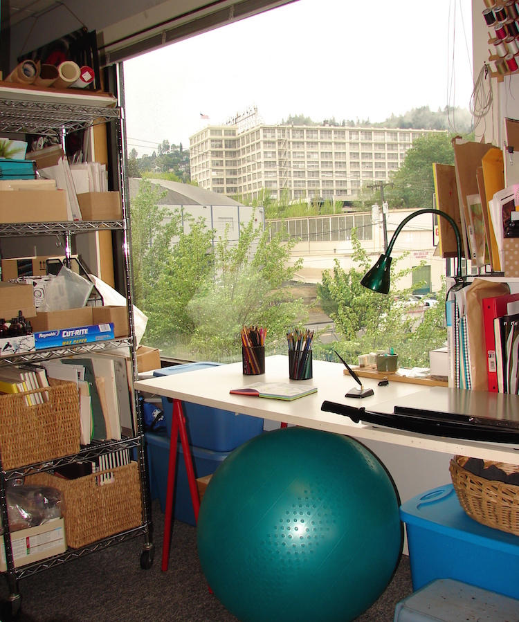
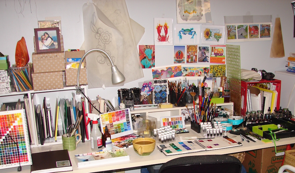
I now have 12-feet of desk space that is totally dedicated to paint, WOW! It means I have a larger main desk space where everything is within reach, below.  Right, the secondary space, where I sit on the ball and get a bit of a workout too…  I have a tall rolling cart for extra journals and shellac and STUFF — and nearby I still have a shelf of large paper and my own handmade paper. I have a second great window view, right, of trees and the northwest hills and the old Montgomery Ward building.

2016 5 desk 1

Tracey Fletcher King and Jennifer McLean are on the walls over my head
(the kitchen art never made it to the kitchen, gurls)
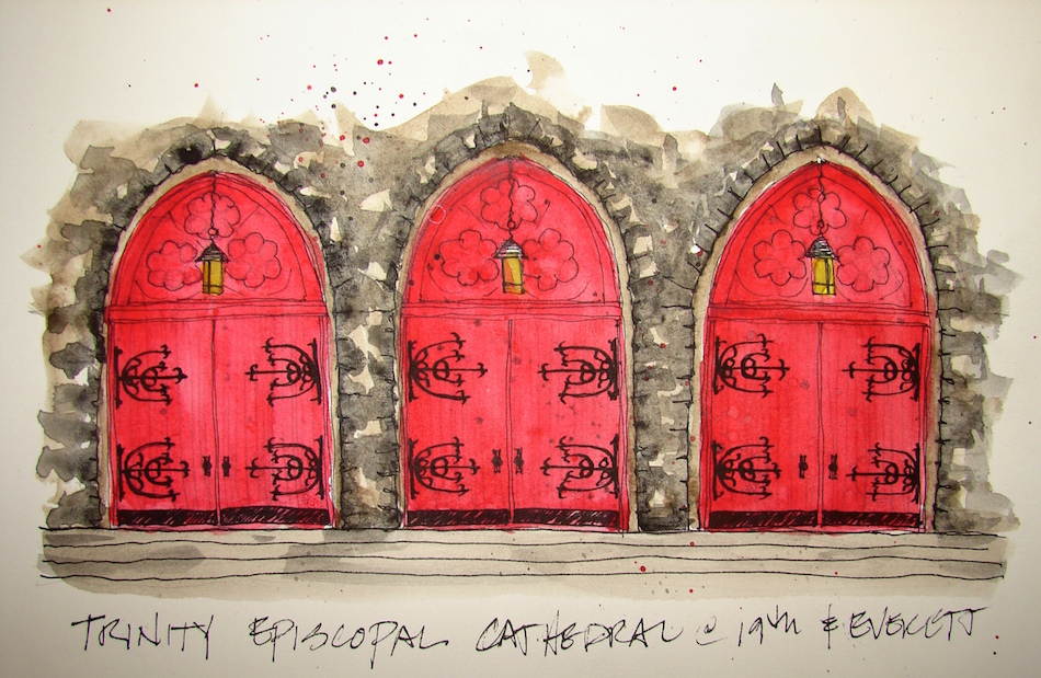
along with a few pieces of my own, inspiration and sentimental stuff.

A glimpse down the whole long space, where you can see my textile work area next to Mitchell, then the upholstery area where we can now have two projects on the tables
(I came so close to saying “on the boards” a throwback to my architectural days), the cutting tables, and at the end, the woodworking area with hand-tools and glue up stand.

And every paint studio needs a rock-and-roll guy….

2016 5 desk 2WOYWWversion2WEB TIP-INS 002 SQUARE  WEB TIP-INS 002 SQUARE  WEB TIP-INS 002 SQUARE  WEB TIP-INS 002 SQUARE  WEB TIP-INS 002 SQUARE

I agree to Creative Commons Attribution-Non-Commercial 4.0 International License, which you can learn more about by visiting the site, or,
visit my web page for a more user-friendly summary on my terms.
My images/blog posts may be reposted; please link back to dkatiepowellart.

Posted in dunno, making a living, painting, tools | Tagged | 22 Comments

Video on Location: The Alvor Demo

Marc Taro Holmes abilities are what I aspire to,
even if I don’t intend to apply it to realism. My favorite Craftsy instructor….

W15 9 4 GRATITUDE JOURNAL LINE

Marc Taro Holmes's avatarCitizen Sketcher

16Apr15_Algarve_UrbanSketches (15)

This just in: During this back alley demonstration painting in Alvor, sketcher Anne-Laure Jacquart was able to get quite a good recording oft my painting in progress.

She’s cut together a 12 minute video, showing it from pretty much start to finish – (skipping the boring drawing part at the beginning 🙂 – even managing some great close up shots of brushwork in action.

Impressive what she’s captured looking over my shoulder!

Thanks Anne-Laure!

View original post

Posted in art journal | Leave a comment

Palms Waves Sand Surf = Home

Longing for home,
the one I can’t go back to…
It is never the same as when we were kids.

An all-class reunion was this week.
Part of me would love to have gone, part of me never ever wants to go….
I think it has little to do with the people and more to do with the
Laguna Beach I loved and what it has become.

W16 4 10 PENATALIC 1 BEACH 2
I loved the small beach town, the friendliness, the innocence —
even with the drug culture and 60’s sex happenings, it was a very innocent free place.
Now it is McMansions (gads they are everywhere) and mostly the über wealthy,
with a smattering of kids who were lucky enough to become wealthy enough to stay
or had their parents homes given to them so they had a home first.
It is chain stores on Main street, not family owned shops of distinction.

I hate that… it’s everywhere.

Give me the water, the sand, shell hunting and creature spotting,
body surfing and wet toes in sand.  The palms and eucalyptus and avocado and coral
and magnolia and jacaranda, strawberry fields and corn fields and Laguna Canyon,
the wildness all around our corner of the world, rock and roll.

I think I’ll always be busy that first weekend in May….

Pentalic Aqua Journal, Lamy Al-Star, De Atramentis Document ink,
and Sennelier pan watercolors.


I agree to Creative Commons Attribution-Non-Commercial 4.0 International License, which you can learn more about by visiting the site, or,
visit my web page for a more user-friendly summary on my terms.
My images/blog posts may be reposted; please link back to dkatiepowellart.

Posted in art journal, memory, watercolor | Tagged , , , , , , , | 6 Comments

Software Geeks Who Change Things Just Because They Can

Screen Shot 2016-05-09 at 7.31.12 AMRemember when life was much easier at WP?
For instance, remember when all you had to do was click
on the little chain-linky-symbol to do it all, above?
You’d highlight the link phrase,
then hit that chain-linky-symbol,
choose your I-want-it-to-open-in-another-page,
and then it stayed that way
until you were done with your session.

(BTW, I may be blonde-now-grey,
but do not mistake my silliness for stupidity.
I’ve been using a computer for 40 years.)

Screen Shot 2016-05-09 at 7.27.20 AM

Then the other day I clicked on the chain-linky-symbol,
and this “shortcut” came up.  Okay, I’m game
IF THE CHANGE IS A GOOD ONE so I played along, however,
I did this skeptically, because I am finding on
my new Mac the software designers created shortcuts
and ended up also taking out the ways that actually work,
which is a problem for those of us who are not just
sending texts to friends but real honest-to-goddess work,
so I’ve been burned by the new software designers
who seem to not do any work outside cyberspace
or talk to real people who actually use their stupid changes.

Yup, there was no option for me to open-in-another-page.

I don’t know about you,
but I consider the readers of my post may not be techies
(many are artists who know only basic computer-eeze),
and so I always open-in-another-page,
so if they decide to check out my helpful link,
they can still find me.

The point is for them to read my posts.
OBVIOUSLY.

Screen Shot 2016-05-09 at 7.27.49 AMI looked at this new thang, and thought,
“Oh, how cool, there are link options.
That is where I’ll find this bad boy.”

WRONG.

IT TOOK ME BACK TO THE
EASY WAY IN THE FIRST PLACE.

Screen Shot 2016-05-09 at 7.28.59 AM Screen Shot 2016-05-09 at 7.29.10 AMAnd there I was able to open-in-another-page —
after several other steps.

I asked WP to change it back,
that I write several posts for several blogs
and this is annoying.

But here is the thing,
soft-ware designers who won’t listen to me at WP:
DO YOU HAVE ANY IDEA HOW MANY PEOPLE
DO NOT KNOW COMPUTERS WHO BLOG?
Your software should be assisting them with
connecting with their readers,
building readership,
having dialogues,
selling product
whatever they actually do
so open-in-another-page is essential for that.

I can’t tell you how often I’ve opened a link
in someone’s blog which stayed on the same page,
and led to something else which was really cool,
and I never got back to the original post again.
Sometimes that is okay —
the original post was read and I knew them or whatever
— but sometimes I wanted to and had to back out of it.

ANNOYING. 

Software design is not just simply writing html
or whatever the hell you are using these days,
but understanding the real world too —
ALL OF THE REAL WORLD,
not just the world of techie-geeks.
Shortcuts are often longer these days,
and cut out useful tools along the way.
I have my conspiracy theories on that one,
especially after watching my beloved Apple lose the most basic
(“save all”) and wonderful aspects (and they CHANGED it to do this)
because either MS software programmers were hired
(why I left MS in the first place)
OR they are designing for teenagers on a phone.

I hate to tell you,
the world doesn’t revolve around teenagers on a phone. 

And only other teenagers think it does.

Screen Shot 2016-05-09 at 7.25.11 AMAnd a final apology to my fellow bloggers
who haven’t heard from me at all.

Do you know how many times I’ve gone in and
set my deliveries at WP like this,
and then hit save
(trust me I doubted myself in the beginning thinking
I was having a senior moment)
only to come back when my favorite posts
were not showing up to find the “Block Emails” checked?

I’ve reported it and I get inane emails back.

Maybe they’ll read this post.

WP, this has been going on for a YEAR.

As has the publishing glitch for those of us who sometimes
write several posts in succession but wait until we feel like posting them.
OH, you didn’t think about that…

Here is the news on that too —
You should be designing for us,
not making us work around you.
If I wanted to do that I’d be at blogspot.  (Ouch.)

*Head hitting desk*

Please, feel free to reblog this rant.

W16 4 2 TFK HUB IPA 018 BANNER


Posted in dunno, making a living | Tagged , , , | 19 Comments

Bright Ideas, Week 3

All these images are sketched in the Bright Ideas journal.
I can’t stop loving this crazy colored journal!

W16 5 5 ALTAR DISH 02
I spent time color mixing this week… fewer Bright Ideas…
But I did realize what this book is all about,
and it chose me rather than me setting out to do THAT,
which is those odd objects that fill a home which, when you die,
NO ONE will understand their meaning.
This book will be about the objects and their meaning…
Maybe it is because we had deaths enter our family this week.
Someone is dying.  It does make you think….
And then there was the tragic death of a young urban sketcherman…

This drawing is the one where it became clear what this journal was to become…

W16 5 6 BI MRP 1ST DATE SHIVA 02 W16 5 6 BI MRP 1ST DATE SHIVA 04
2015 8 SKETCHPACK PROJECT 006 007In a few days Mitchell and I celebrate the 18th
anniversary of our meeting — May is the month we met,
fell in love (at first sight — seriously we just knew)
and married…  I pulled out this little box last night to
remind Mitchell what a complete sentimental sap
I am for him, as it contains the business card with
his home number from our first meeting, and his address (added later as he had me over for dinner on our second date, and I wrote his address on the card he gave me).
This is also the first gift he ever gave me, that magical week, a tiny Shiva statue with one of his little characters and
his om doodles I was to find drawn on everything in our studio over time!  It touched him deeply to see it again.

W16 5 1 BI FAV PENS 02
So much geekie pen talk on the new FB page I joined of people who
draw with fountain pens…  I am not a collector.
My pens must perform or they get cleaned out and passed on.
So what is my criteria for favorite pens?
1) They MUST perform so that when Muse inspires she is not put on the
back burner because some stupid pen has to be fiddled with…
2)  They are beautiful to look at, sweet in your hand, good design.
If I had to choose one pen to take with me on a desert island, it would be
Platinum Carbon with an unlimited supply of ink cartridges.
My second favorite these days is the Lamy Al-Star, little fuss IF it has a broader pen nib, such as a 1.1 or a medium… And gorgeous in copper and another in green metals.

W16 4 25 BI SILVER BUDDHA 001
Tiny Buddha, 2-inches high, from my altar,
he  has a life of his own here, sitting under the tree ….

Bright Ideas multi-color journal with Platinum Carbon pen,
Lamy Al-Star with De Atramentis Document black ink,
White Uniball Signo pen, Fat white Pitt pen, and colored pencils.

W16 3 30 GRATITUDE JOURNAL 001 SQ W15 10 MAY SKETCHBOOK 001 SQ W16 4 21 BI STUPID PHONE 01 SQ MITCHELL'S BUNNY SQ W15 10 MPR DKP STAYCATION OM SQUARE SMALL W15 11 MAY HAIR SQ

I agree to Creative Commons Attribution-Non-Commercial 4.0 International License, which you can learn more about by visiting the site, or,
visit my web page for a more user-friendly summary on my terms.
My images/blog posts may be reposted; please link back to 

Posted in art journal, Buddha, creativity, drawing, gods and goddesses, pen & ink, pencil, sketchbook | Tagged , , , , , , , , , , , , , , | 10 Comments

USk: Trinity Episcopal Church’s Red Doors, Alphabet District

web 687px-Trinity_Episcopal_Cathedral,_Portland_OregonTrinity Episcopal Church, at the corner of 19th and Everett, across from where the NW Outdoor Market is often held.   I rarely see it like the image right (Wiki) —
trees obscure the lovely old building except when it is coldest. I am not inclined to sit outside
and sketch in the middle of winter!  However, the three doors around the side are amazing, and seen clearly!  I sketched Sunday, added some colors in the field, then finished in studio.

W16 5 1 USK EPISCOPAL TRINITY CHURCH 02
They are shocking high-gloss bright red.
I can imagine these doors glow in the dark, if you are visiting the church at night, with their bright happy color illuminated by the overhead lanterns.
This is also posted for Thursday Doors.
(Check out Norm’s amazing doors, and others, here!)

W16 5 1 USK EPISCOPAL TRINITY CHURCH 03
Colors used, above, mixed on the page:
Stone is Tigereye, Shungite, and Hematite;
Doors are undercoat with Quin Coral and overbushed with Perylene Red.

Strathmore Journal, with a Pentalic 2B woodless pencil, Platinum Carbon pen, Lamy Al-Star w/De Atramentis Document black  ink;
and Greenleaf & Blueberry (Shungite) and Daniel Smith watercolors.


I agree to Creative Commons Attribution-Non-Commercial 4.0 International License, which you can learn more about by visiting the site, or,
visit my web page for a more user-friendly summary on my terms.
My images/blog posts may be reposted; please link back to dkatiepowellart.
Thanks to Wikipedia for the image, in their article.

Posted in architecture, art journal, challenge, pen & ink, sketchbook, urban sketchers, watercolor | Tagged , , , , , , , , , , , , , | 14 Comments

Travel Palettes and Color Mixing Charts

Prepare for a total geek posting.
I’ve finally created an entire mixing chart.

Who knew what I might learn!

W16 4 SENNELIER 1W16 4 9 PENATALIC 1 CHAGALL BANNERW16 5 3 TRAVEL PALETTE MIX 11 I wrote about finding a great deal on a
Sennelier travel palette
with pan watercolors, above.  I’ve not owned pan paints since I was a kid, but thought I’d use them and see how I liked them, with additions — I can’t live without Diopside, Piemonite and Yavapei.  My resolve lasted two days.  I wasn’t fond of the Sennelier pigments.  I took the Sennelier pan colors out and put them into my old travel palette, right.  How cool that they fit perfectly, with a
couple extra, including white gouache?
Sennelier colors are very gouache-y!
I made my perfect travel palette (until I change it), below, of Daniel Smith watercolors.
I may change out the Cobalt Teal or the
Imperial Purple; I may put in Buff Titanium, or prefer Cobalt Purple.  I mixed the pinks, a Quinacridone Rose with Opera Pink, for a perfect pink, and lots of Primateks!

W16 5 3 TRAVEL PALETTE MIX 10
Then a friend in Italy, did  a color mixing chart.
I’ve never done one.
Everyone says you should and in 35 years I’ve never done one.

ALL the cool kids do them.  Okay, Okay…

I’ve done my own explorations, exploring how Daniel Smith Primateks (DSP) mixed
with colors, or how they reacted in holding a brush stroke, etc.
I’ve explored two colors, or one color mixed with several, especially the Primateks,
but never the whole palette, methodically. I mean, I went to architectural school
and took lots of art classes, I know color theory, so why should I?
Because so many are so stoked about it…

I decided to do TWO this week, one for my actual travel palette,
which is full of my favorite paints, Mostly Daniel Smith (DS) with one Holbein
(Quin Gold, amazing creamy stuff) and one for the Sennelier colors.
And I learned unexpected things about the colors!

W16 5 3 TRAVEL PALETTE MIX 05
I came to understand why I dislike Sennelier pan paints, on the right and on the bottom right in all these images.  They are flat, dull, lifeless, muddy — even the so-called brights — when compared to Holbein or Daniel Smith, on the left or the top of the triangles.
Look at the two oranges alone, above —
the DS orange is clear and bright, and the Sennelier is dull and lifeless.

W16 5 3 TRAVEL PALETTE MIX 09 BANNERW16 5 3 TRAVEL PALETTE MIX 08
I was methodical, adding the same number of drops of water to both palettes, so density or thickness of the paint wasn’t an issue.  The Sennelier mixes into unbelievably dark flat colors, crayola colors, which is fine in a waxy crayon but not what I want in watercolors.

I don’t like muddy colors.
I like bright transparent colors,
even in the browns and greys.

Bright is about clarity, not bling.

W16 5 3 TRAVEL PALETTE MIX 02W16 3 8 WATERCOLORS 007w16 serpentine green apatite
hematitePerhaps if I ever get to mastery over this crazy medium I will feel differently, but for now, I like the textural quality of the mixed Daniel Smith colors, even if they are not Primateks.
(Of course, I also played with all the textural paints Golden Acrylic had to offer.  I like texture.)
The Primateks can be seen in the dark green and watery turquoise vertical rows (Diopside and Amazonite), and the soft blue rows vertical and horizontal (Lapis, makes wonderful billowy skies) and the “black” which is Hematite.  (I tried Greenleaf & Blueberry’s Shungite — above — for a long time, but I come back to the subtle black-red-asphaltum look of Hematite, right.)  Primateks are much more granular, but also, some colors, like Serpentine or Green Apatite, separate interestingly when mixed with regular paints.

W16 5 3 TRAVEL PALETTE MIX 01Here is the whole chart. 

My mixed travel palette, top left, and the Sennelier travel palette bottom right, above.
The amazing variation in the colors I mixed with just 20 pans of paint is awesome!
I understand why the pros say, “mix your own greens” — I mean, just look at this chart.  NO green I own (and I buy greens) compares with these.
And really, that is true for many of the colors — blues, reds, browns.

W16 5 3 TRAVEL PALETTE MIX 03 I am blown away by the lovely colors,
and now want to just mix colors all day. 

Total geekdom, pointless, probably;
and I want to dive into these paints!

ProArt watercolor journal, with a Pentalic 2B woodless pencil,
and Daniel Smith, Sennelier, and Holbein watercolors.


I agree to Creative Commons Attribution-Non-Commercial 4.0 International License, which you can learn more about by visiting the site, or,
visit my web page for a more user-friendly summary on my terms.
My images/blog posts may be reposted; please link back to dkatiepowellart.

Posted in art journal, color, process, sketchbook, watercolor | Tagged , , , , , , , , | 21 Comments

I love this artist: Kathy Bradford

Worked long time before she was “discovered” — an inspiration!

Posted in art journal | Leave a comment

USk: Vaughn St and 18th Street

W16 4 30 USK VAUGHN 18TH 002
Near Lindy Ltd., Vaughn curves into 18th and there is a lovely set of older buildings.
I’ve seen chickens in the street in this odd quiet part of the city.
Quick studies, not that happy with outcome — trees are overworked —
I need to get more paint on my brush and less watery washes.

W16 4 30 USK VAUGHN 18TH 003
Continuing on around the curve, Pomarius Nursery with two of
the chickens out front pecking around, I-5 and The Castaway in the background.

Strathmore Journal, Pentalic HB woodless pencil,
Platinum Carbon pen, Lamy Al-Star with De Atramentis Document black ink;
and Greenleaf & Blueberry, Daniel Smith, and QoR watercolors.


I agree to Creative Commons Attribution-Non-Commercial 4.0 International License, which you can learn more about by visiting the site, or,
visit my web page for a more user-friendly summary on my terms.
My images/blog posts may be reposted; please link back to dkatiepowellart.

Posted in art journal, pen & ink, sketchbook, urban sketchers, watercolor | Tagged , , , , , , , , , , , , , | 2 Comments

Bright Ideas, Week 2

All these images are sketched in the Bright Ideas journal.
Having such fun with these little doodle-ly sketches.
I don’t know where this going; just drawing…

W16 4 25 BI DAFFY-DILL 02
Springtime, dandy-lions, and soon wishes!
Most see them as weeds.  They are good in salads, happy strong flowers,
and then when they are ready to fly and spread their seeds
they grant you a wish for helping them along….

W16 4 25 BI RUTH KITTY 01
Silly sweet memory, a good luck charm from Ruthie…

W16 4 25 BI HRICAK BASKET 001
Sometimes things survive relationships….
Hricak is long gone, but I have two baskets and
his mom’s amazing recipes that live on with me!

W16 4 25 BI PARVATI 002
I think we rescued Parvati from a garage sale…

W16 4 24 BI GANESHA 002
Tiny bronze Ganesha holds a memory of a day spent dinking
around with Mitchell in Mount Shasta City.

W16 4 27 BI RESIN HANUMAN 001
Hanuman holds up Mount Meru and our building too!

Bright Ideas multi-color journal with Platinum Carbon pen,
Lamy Al-Star with De Atramentis Document black ink,
White Uniball Signo pen, Fat white Pitt pen, and colored pencils.

W16 3 30 GRATITUDE JOURNAL 001 SQ W15 10 MAY SKETCHBOOK 001 SQ W16 4 21 BI STUPID PHONE 01 SQ MITCHELL'S BUNNY SQ W15 10 MPR DKP STAYCATION OM SQUARE SMALL W15 11 MAY HAIR SQ

I agree to Creative Commons Attribution-Non-Commercial 4.0 International License, which you can learn more about by visiting the site, or,
visit my web page for a more user-friendly summary on my terms.
My images/blog posts may be reposted; please link back to dkatiepowellart.

Posted in art journal, creativity, drawing, gods and goddesses, pen & ink, pencil, sketchbook | Tagged , , , , , , , , , , , , , , | 2 Comments

USk: Pro Photo Supply, 18th and Marshall, NW Portland

W16 4 23 USK PRO PHOTO 002Had little time to sketchcrawl last weekend, but found a great corner near us in NW.
Around the corner from the main Pro Photo shop on 19th is the new-old building, where they’ve taken a dull green-grey corner at 18th and Marshall and brightened it up.
I used deep colors, with layered dark colors on top and tried a deep shadow.
Not to bad, running colors (I like) and fine for the field.

This entry used to be unnoticeable; the colors all around it have popped it and made the entire entry cheery and inviting.  I thought of this as I am a red door lover!

 Strathmore Journal, with a Pentalic woodless pencil, Platinum Carbon pen,
Noodler’s Lexington Grey ink grisaille (not nearly dark enough), White Uniball Signo pen, and Greenleaf & Blueberry, Daniel Smith, and Holbein watercolors.


I agree to Creative Commons Attribution-Non-Commercial 4.0 International License, which you can learn more about by visiting the site, or,
visit my web page for a more user-friendly summary on my terms.
My images/blog posts may be reposted; please link back to dkatiepowellart.

Posted in architecture, art journal, drawing, pen & ink, sketchbook, urban sketchers, watercolor | Tagged , , , , , , , , , , , , , , , , , | 12 Comments

VSW: Holy Trinity Russian Orthodox Cathedral, Chicago

Loving this virtual walk in Chicago,
I found a lovely Louis Sullivan church I’d not known about.
Chicago has to be the Queen City of Architectural Monuments!

W16 4 23 VSW ORTHODOX CHURCH 011
Playing in virtual sketching gives me the ability to try techniques, and here I tried
a different way to shade — and ended up overworking it a bit, trying too many techniques to make myself happy.  Sometimes it is best to simply start over!
I am happy this was done much faster…  That helps when I am onsite sketching.

W16 4 23 VSW ORTHODOX CHURCH 004W16 4 23 VSW ORTHODOX CHURCH 006
The doors on this church are no big deal, but the header and portico above the doors
is lovely, with a nod to Russian architecture then a lovely carved (assuming wooden)
and then painted Art Nouveau decorative element.  To paint it as if I was on the street,
I took a tip from a friend, and make the image full screen then sketch from about
10 feet away.  It gives you a different feel to what you capture.
On one side I used pen to lay down detail, on the other, just color.

w16 4 Holy_Trinity_Orthodox_Cathedral_Chicago_2015-80 copyW16 4 23 VSW ORTHODOX CHURCH 001 W16 4 23 VSW ORTHODOX CHURCH 003w16 4 opposite street
They tore down this Lovely old Gothic church that sat across from the Sullivan church to put up these condos.  I would have saved the old church and put living quarters IN it!  But “nobody” designed it so nobody was compelled to save it, and that includes all the brick within, the but maybe they put up a LEEDS certified condo?


Moleskin 8×11 watercolor journal, Pentalic HB woodless pencil,
Platinum Carbon pen with inks De Atramentis Document brown ink:
and Greenleaf & Blueberry, Daniel Smith, and Holbein watercolors.

NELIPOT IFJM NELIPOT IFJM NELIPOT IFJM

I started a Facebook group page (you must join to view) to allow everyone to share their virtual sketches, and also where we will, from time to time, take virtual sketch walks together.  Come join us On Facebook if you are inclined!
If you want to know more about what a virtual sketchwalk is review my first post.
There are a few more notes/pointers on our first walk through Laguna Beach, California.

I also created an accompanying Flickr group!

NELIPOT IFJM NELIPOT IFJM NELIPOT IFJM

I agree to Creative Commons Attribution-Non-Commercial 4.0 International License, which you can learn more about by visiting the site, or,
visit my web page for a more user-friendly summary on my terms.
My images/blog posts may be reposted; please link back to dkatiepowellart.

Posted in architecture, art journal, challenge, color, creativity, painting, pen & ink, sketchbook, virtual sketching, watercolor | Tagged , , , , , , , , , , , , , , | 2 Comments

Bright Ideas, Week 1

All these images are sketched in the Bright Ideas journal.
I am trying to sketch faster, draw more without an agenda, and also to play again
with colored pencils.  I used to work with them as an architect and it turned me off
to them as an artist — but I want to revisit before I give them away!

W16 4 17 BI NEEDLES 01
A commitment to work with my acupuncturist to clean up from the medications
given to me during and after the surgery one year ago, and to come off the Prilosec.

W16 4 19 BI GANESHA 001
Resin Ganesha had to be one of my first entries into a new journal;
New Beginnings and he is the wise scribe….

W16 4 21 BI STUPID PHONE 01
I love my stupid phone, because it keeps me in the moment and because people cannot text me stupid things and clients cannot bother me when I am not in the studio.
Anonymous messages asking for pricing is not what we are about….
AND, I want to away from technology sometimes!

W16 4 20 BI GLASSES 02
Old glasses were better made than new glasses, whose plastics quickly break down.

W16 4 24 BI MALACHITE BUFFALO 001
Tiny sculptures hold memories; this one of Brooke Medicine Eagle.

W16 4 18 BI KAMALA LOVES HER DADDY 01
Kamala doesn’t hold still, as you ALL know, but caught her as she reached for her beloved.

Bright Ideas multi-color journal with Platinum Carbon pen,
Lamy Al-Star with De Atramentis Document black ink,
White Uniball Signo pen, Fat white Pitt pen, and colored pencils.

W16 3 30 GRATITUDE JOURNAL 001 SQ W15 10 MAY SKETCHBOOK 001 SQ W16 4 21 BI STUPID PHONE 01 SQ MITCHELL'S BUNNY SQ W15 10 MPR DKP STAYCATION OM SQUARE SMALL W15 11 MAY HAIR SQ

I agree to Creative Commons Attribution-Non-Commercial 4.0 International License, which you can learn more about by visiting the site, or,
visit my web page for a more user-friendly summary on my terms.
My images/blog posts may be reposted; please link back to dkatiepowellart.

Posted in art journal, creativity, drawing, journal, pen & ink, pencil, sketchbook | Tagged , , , , , , , , , , , , , , , , | 4 Comments

USk: Out my New (Studio) Window

w16 4 out my new windowI have more space in my studio,
and a new window.  It is pouring.
My urban sketch today was out my new window looking east on NW Nicolai!
All the spring greens against the evergreens,
a riot of green and blue and grey.

I also have this colorful fun journal
(suitable for sketches only) called
the Bright Ideas journal.
It has a dozen different colored papers
and while it won’t take watercolor
it is fun to draw on colored papers,
and it is giving me a chance to
remember how to use a colored pencil.

W16 4 22 BI USK NEW VIEW 01Bright Ideas multi-color journal with Platinum Carbon pen and colored pencils.

WEB TIP-INS 002 SQUARE  WEB TIP-INS 002 SQUARE  WEB TIP-INS 002 SQUARE  WEB TIP-INS 002 SQUARE  WEB TIP-INS 002 SQUARE

I agree to Creative Commons Attribution-Non-Commercial 4.0 International License, which you can learn more about by visiting the site, or,
visit my web page for a more user-friendly summary on my terms.
My images/blog posts may be reposted; please link back to dkatiepowellart.

Posted in architecture, drawing, landscape, pen & ink, pencil, urban sketchers | Tagged , , , , , , , , , , | 10 Comments

Thursday Doors: South Doors Washington Legislative Building

W16 4 STUDIO REMODEL 1Because we are in the middle of expanding our business studio space (and yes, I get a bit bigger art space to boot) I am pulling up old images with a new twist for Thursday Doors, (Check out Norm’s amazing doors, and others, here!)

W14 10 22 WA CAP SYMMETRY 16W14 10 22 WA CAPITOL TIFFANY GLASS 21Most of us don’t think about how
doors affect us because most
modern developers of buildings (not architects) often slap a door wherever.  Designers of older buildings, especially formal buildings. knew how to move a person through a space to allow them to experience the building and the
landscape as they wanted them to see it.  In the case of the Washington State Legislative Building, the central entry doors, locked (they have a hinge problem that needs to be repaired), are a key to experiencing the building, the portico, and the views.  From the rotunda, you can see the door I drew below, right.

W14 10 22 WA CAP SYMMETRY 5W14 10 22 WA CAP SYMMETRY 6W14 WA CAP IMAGES BLOG 3

Leaving the building through the
beautiful bronze doors,
you move into a formal portico.
Overhead is a majestic hanging
lamp and carved floral motifs
(which may be dogwood)

This is the door the Governor
was likely to use, as the
mansion is a stones throw up the hill.

I sketched what I saw directly
under the hanging lamp, below.

W14 10 22 WA CAP SYMMETRY 4 BANNERW14 WA CAP IMAGES BLOG 2

Leaving the portico you walk
down the central axis through the
arches to a path which leads you
to the Prichard Building, right,
the south end of the campus.

The formality is meant to guide
you to what is important, to force your eyes to see what the architects and clients thought to be important.

I sketched my view in October, below, when the leaves were changing.

W14 10 22 WA CAP SYMMETRY 2Stillman & Birn Journal, with a Pentalic 2B woodless pencil, Platinum Preppie Pen,
Noodler’s ink, and Daniel Smith, Sennelier, and Holbein watercolors.


I agree to Creative Commons Attribution-Non-Commercial 4.0 International License, which you can learn more about by visiting the site, or,
visit my web page for a more user-friendly summary on my terms.
My images/blog posts may be reposted; please link back to dkatiepowellart.

Posted in architecture, art, art journal, pen & ink, sketchbook, urban sketchers, watercolor | Tagged , , , , , , , , , , , , , , , | 12 Comments

Curating, the truth….

How about you like what you see?
BTW, I curated a FAB-ulous show of the Monkees when I was 11.  Swoon.

Hahahahaaaa….

This came up also in relation to people being the “architect” of this or that.  A legal term, it pisses me off too…..

Posted in art | Tagged | Leave a comment

USk: Native American Student Center PSU

W16 4 USK NATIVE AMERICAN STUDENT BLDG 2Above, a quick sketch (with Diamine Ancient Copper ink in a Lamy Al-star)
of the Native American Student Center at the south end of the PSU campus, off the park.  Watercolor wash moved the inks: three colors were used: Yavapei, Lapis, and Shungite, with a bit of leftover mixed green for the tree which was overshadowed by the Ancient Copper ink, which runs like crazy…. Below, pushing my comfort zones, using
watercolor pencils, no inked lines (absolutely out of my comfort zone), and watercolor washes on site.  Back in studio added to the washes a bit,
and may have overworked it.  Watercolors are SO in the moment, unforgiving!

W16 4 USK NATIVE AMERICAN STUDENT BLDG 3I am not fond of much of the modern architecture in Portland because it is boring,
not adventurous, but this building is complicated and evokes the Native American traditions beautifully.  I knew what it was before I heard the name.
It is both modest and strong, reflecting the tradition it houses.

Strathmore Mixed Media journal with Diamine Ancient Copper ink in a Lamy Al-star,
and Greenleaf & Blueberry and Daniel Smith watercolors.


I agree to Creative Commons Attribution-Non-Commercial 4.0 International License, which you can learn more about by visiting the site, or,
visit my web page for a more user-friendly summary on my terms.
My images/blog posts may be reposted; please link back to dkatiepowellart.
Posted on Portland Urban Sketchers.

Posted in architecture, art journal, color, pen & ink, sketchbook, urban sketchers, watercolor | Tagged , , , , , , , , , , , | 10 Comments

VSW: Getty Tomb by Sullivan

W16 4 14 VSW GETTY TOMB CHICAGO 08Thanks to a tour of Chicago + Louis Sullivan, I found the Getty Tomb in Graceland
(which the name always makes me think of Elvis, of course.)
I couldn’t get the Getty Tomb out of my head.
Best to get it on paper.
The colors are pretty garish, but they somehow work.  Isn’t that the way with color?
The doors were originally bronze; they say they are patinated, but they almost look painted…  and so often people do paint bronze.  No idea.
I think these mausoleum doors should be entered in the Thursday Doors, a first for me.
(check it out, Norm’s amazing doors.  There are others, and you can follow them!)

I use my sketchbooks to play with techniques and ideas.
I still am far from where I want to be in my watercolor abilities;
I am not concerned about my ability to draw should I put my mind to it.
(Someday I will show drawings from my portfolio.)

I enjoyed playing a bit with drawing without linework (how else do I wean myself from detail?) and so sketched loosely then went in with color.  I love the second image.
I want to find a way to combine the two techniques but when I start linework
I tend to get into the drawing groove… So perhaps for a bit no lines!

I wonder why the oriental theme, the mandalas, the starburst and beehives embedded into the concrete on the upper half of the structure.  Wiki doesn’t cover my questions, and I may have to go back into Architectural books (storage) to see if it is mentioned.
The Getty family in California was quite flamboyant — thinking of the Getty Museum in the Villa in the Palisades.  I’ve tried to find out about the family, if they two were
related in a quick search, but no luck.  Will keep digging.

I could write this all out, or lift Wikipedia’s writing, which is adequate to the task:

“The [Carrie Eliza] Getty Tomb has been said to be the most significant piece of architecture in Graceland cemetery and the beginning of Sullivan’s involvement in the architectural style known as the Chicago School.”
(I had no idea.)
“The tomb… is composed of limestone masonry construction. Roughly a cube in shape, the bottom half of the tomb is composed of large, smooth limestone blocks. The upper half is composed of a rectangular pattern of octagons, each containing an eight-pointed starburst design.  The cornice is banded with smooth limestone above intricate spiraling patterns below, and the top-edge of the roofline is straight and horizontal on the front and back and scalloped in a concave fashion on the sides.  When approaching the tomb, the obvious focus is the ornate doorway.  An intricately ornamented bronze gate and door, patinated green over time,  are spanned by a broad semi-circular archway. The voussoirs, emanating radially in long thin wedges, share alternating plain and intricately carved concentric bands. The twin gates as well as the door behind share a combination of geometric and floral details that incorporate the starburst seen in the upper patterned walls. The three other sides of the tomb house semi-circular, bronze-clad
windows that mimick the arch and door details of the front. “

I know I rarely show the photos I worked from, but these are exceptional photos
by David Gleason; I appreciate his allowing them to be used, from… Wikipedia.

I’ve made a temporary square for the Thursday Doors to tell people about it.
It is NOT authorized by the creator of the challenge, Norm.
I’ll work on a better one…  Then ask him if he wants it.

W16 THURSDAY DOORS SQMoleskin 8×11 watercolor journal, Platinum Carbon pen and misbehaving Hero pen
with De Atramentis Document Brown ink,
and Greenleaf & Blueberry, Daniel Smith , Holbein, and QoR watercolors.

NELIPOT IFJM NELIPOT IFJM NELIPOT IFJM

I started a Facebook group page (you must join to view) to allow everyone to share their virtual sketches, and also where we will, from time to time, take virtual sketch walks together.  Come join us On Facebook if you are inclined!
If you want to know more about what a virtual sketchwalk is review my first post.
I also created an accompanying Flickr group!

NELIPOT IFJM NELIPOT IFJM NELIPOT IFJM

I agree to Creative Commons Attribution-Non-Commercial 4.0 International License, which you can learn more about by visiting the site, or,
visit my web page for a more user-friendly summary on my terms.
My images/blog posts may be reposted; please link back to dkatiepowellart.

Posted in architecture, art journal, challenge, pen & ink, process, sketchbook, virtual sketching, watercolor | Tagged , , , , , , , , , , , , , | 22 Comments