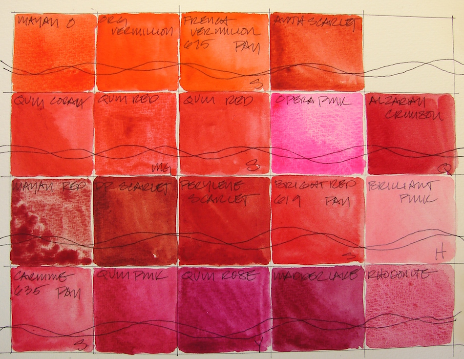
Each Sunday for the next few weeks I am looking at my paint “collection.”
OOPS. I HIT PUBLISH BY MISTAKE AND NO ERRORS. HOW OFTEN DOES THAT HAPPEN? SO THIS WEEK’S WILL BE PUBLISHED NEXT WEEK!
Because of this mistake, I am revising this post, pulling some of the
pinks-violet into the post on violet-purples coming later.
Last NEXT week: Tools: Watercolors, 1, Yellow-Orange.
Before we get started, there are colors for mixing other colors — I’d never use them
on my own — and then favorite colors. Skin tones, stones, shadows —
all these take some odd mixing colors. Odd for me at least!
NOTE: All paints Daniel Smith (DS) unless it says otherwise — including the Primatek colors.
First, let’s talk colors that look the same,
have the same pigment structure, or are called by the same name out of the way:
Sennelier makes a beautiful Quinacridone Red, PR209;
MG makes a muddier version, also PR209. The muddiness must be the honey binder.
There is also Quinacridone Coral, PR209.
Note these are all a bit different but all PR209!
You don’t want to work with fugitive
paints — paints which are not
light-fast. Still, I can’t walk away from Opera Pink, Quinacridone, PR122, though it is fugative. You’ll see, there is
no other bright clear pink like it!
I’ve bought several Quinacridone pinks looking for it: while they are lovely,
they are not HOT PINK!
To see references on RED and MAGENTA from handprint, click through.
The Keepers:
Which are keepers? I love Quinacridone Coral and Sennelier Quinacridone RED 679, though both are supposedly PR209. Anthraquinoid Scarlet, PR168, has a muddy side, but is an excellent brick and building pigment, as is Perylene Scarlet, PR149. Perylene Red, PR178, is quite opaque, but beautiful, a true red. If only it were transparent! Love our first Primatek, Rhodonite, a grainy textural, lovely coral color!
Pale pinks are useful because of skin tones, and of course, Painted Ladies. Holbein Shell Pink, PO73-PW6, is a mainstay part of skin tones.
I am undecided about Holbein Brilliant Pink, PO209-PW6.
The Rarely or Never Agains:
CARMINE
Sometimes it is a matter of what I will use. Some I’ve discussed. MG’s Quinacridone Red, PR209, is muddy and slow drying in the pan. Sennelier Bright Red 619, a pan color, and Sennelier Carmine 635 PAN are both blah. I might buy Deep Scarlet, Benzimidazole, PR175, because it is a good brick color. Greenleaf & Blueberry’s Mayan Red reminds me of Victorian wallpaper: very grainy and swirly, but not in a good way. Mayan Orange I probably won’t buy again, as it is very close to Vermilion.
In a future next post I will talk about the Mayan Colors…
What they are, what I like and dislike about them.
Must build the collection to discuss!
Pentalic Field Journal, Platinum Carbon pen, and Greenleaf & Blueberry,
Sennelier, Holbein, QoR, M.Graham and Daniel Smith watercolors.
Ink drawing, shadow inks (grisaille), then watercolors.
Moleskin 8×11 watercolor journal, Platinum Carbon pen,
Lamy Al-Star with De Atramentis Document Black, Noodler’s inks,
and Daniel Smith , Holbein, and QoR watercolors.
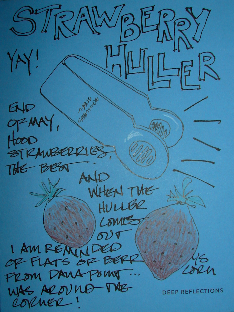
I had to use Freshly Minted Suggestions
for the best designed bottle cap opener thangy ever!
If you don’t have one of these 50+-year-old gadgets then you haven’t lived.
And the memories of the fields of strawberries in Dana Point,
pies my mom made, jam she tried once or twice, and bowls of fresh berries? YUM.
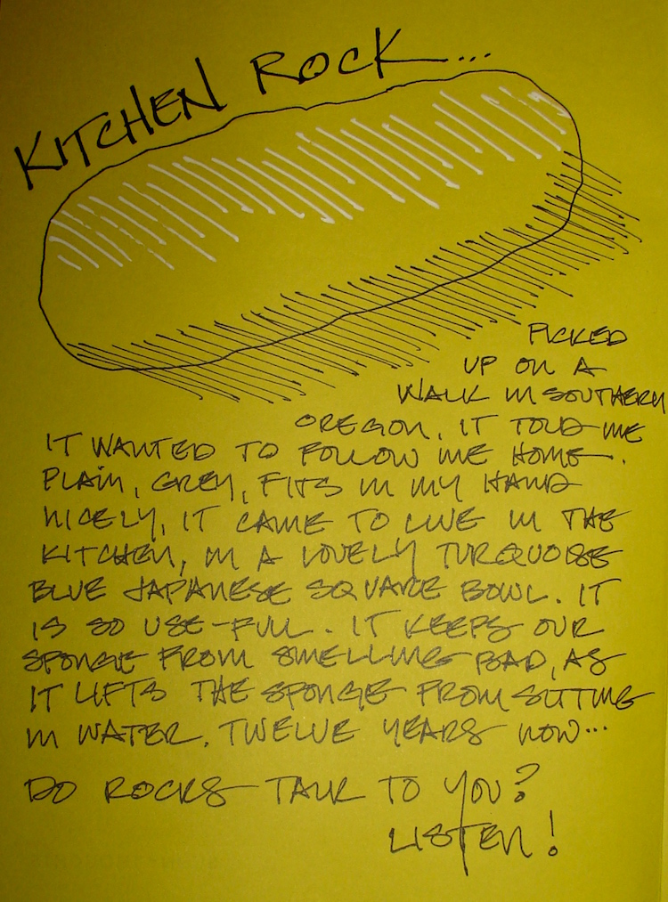
There will be more strange rock stories.
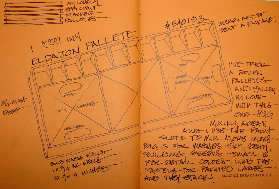
Okay, so they spelled Pallete this way then I did too but it kept bothering me
and then I found it is palette… oh well.
I couldn’t resist showing how much I use and love these pieces of plastic that stack.
I admit it, better than porcelain because they stack.
You have to understand how much a part of our lives the Dyson is…
Between upholstery at the studio and cats at hoe and the studio…
my husband is a madman.
30 years. Nine years is when I stopped collecting tokens.
I went with my brother….
It never took for him, and we cremated him four years ago.
Bright Ideas multi-color journal with Platinum Carbon pen,
Lamy Al-Star with De Atramentis Document black ink,
White Uniball Signo pen, Fat white Pitt pen, and colored pencils.
Experimenting with color after taking a class…
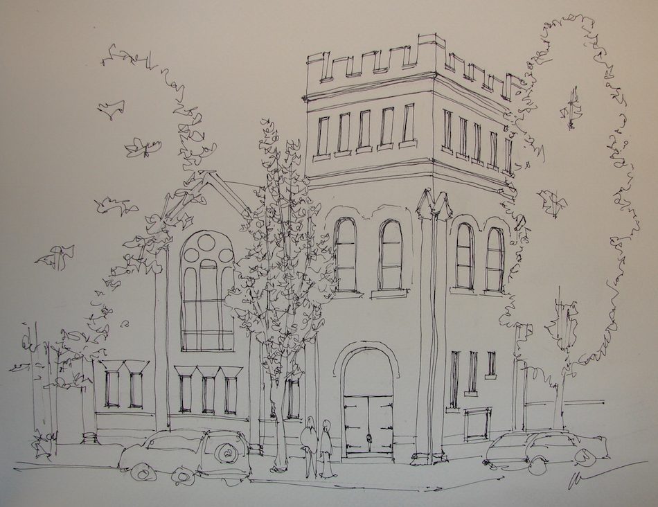
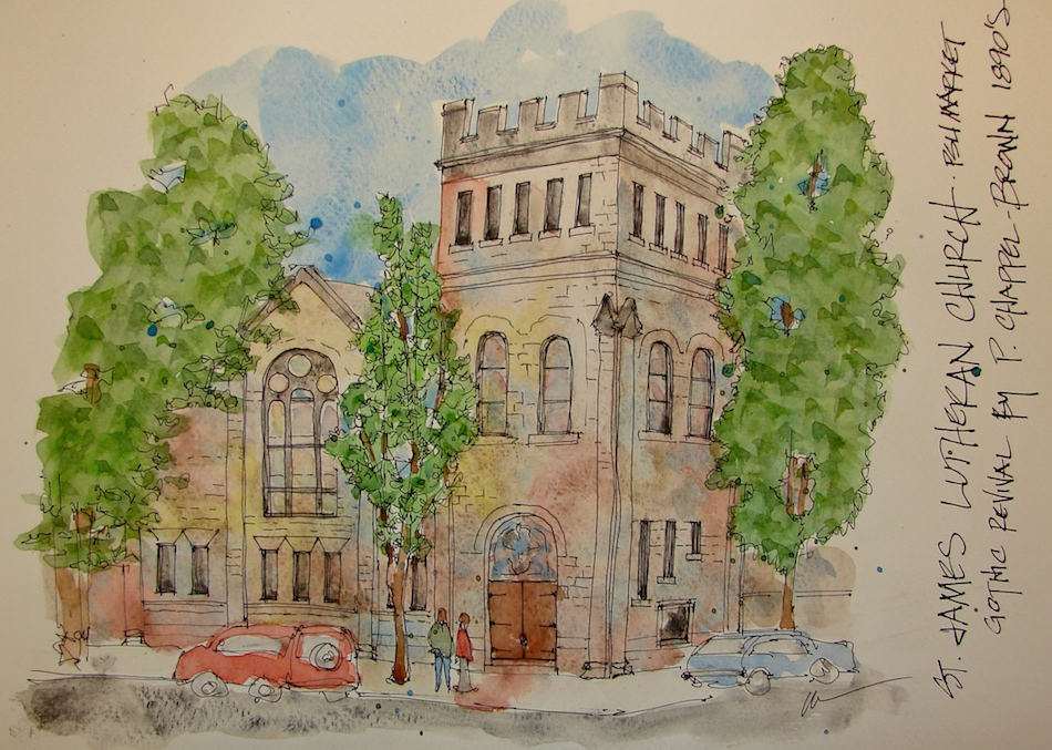
I am often bored by stone buildings, but several interesting water-colorists
use what-ever color where-ever they want. This is one of the stone churches we pass
on our way to the Saturday Market at PSU. It has lovely doors with stained glass,
from which I drew my colors. I am happy with this as a first try…
Fabriano Watercolor Journal, with a Pentalic HB woodless pencil,
Platinum Carbon pen, Lamy Al-Star w/De Atramentis Document black ink;
and Holbein, M Graham, and Daniel Smith watercolors.
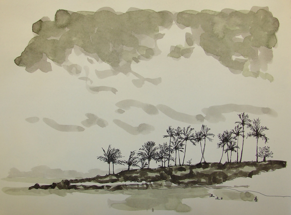
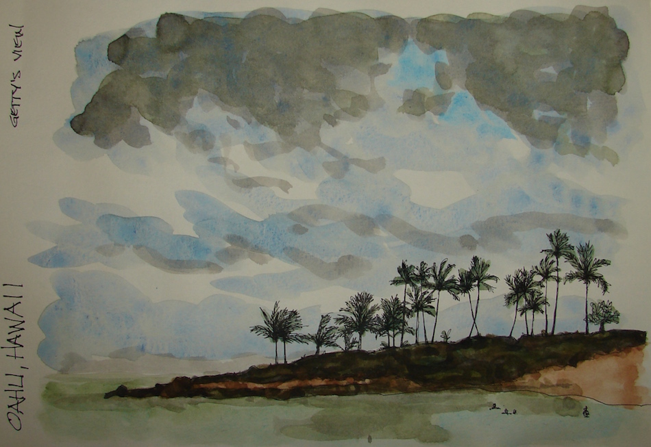
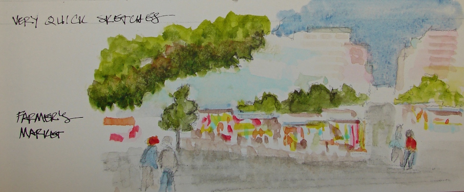
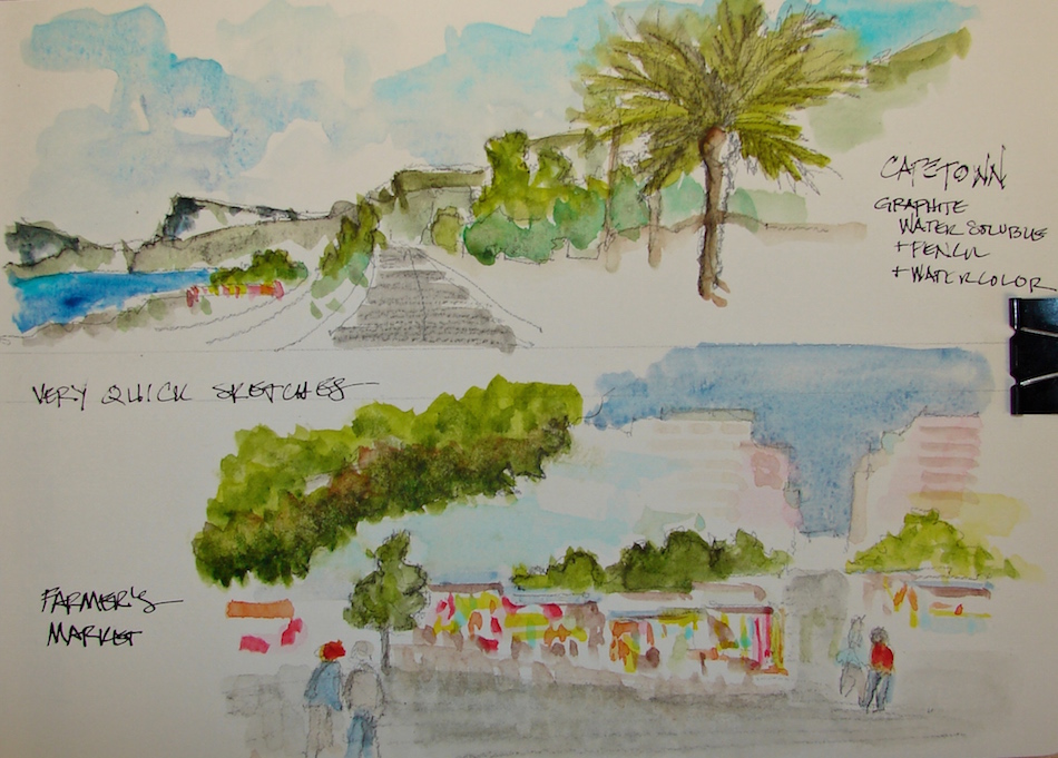
Necessity is the mother of fast sketches. I barely finished these by the end of our month on Capetown!
I used a water-soluble graphite fat pencil and splashed watercolors over the sketches. From beginning to end in about 15 minutes each!
Spread for this month below!
Click to see the first page…. Moleskin 8×11 watercolor journal, water-soluble graphite,
Lamy Al-Star with De Atramentis Document Black,
and Daniel Smith , Holbein, and QoR watercolors.
Dan recently blogged about failures: “So many people try to hide failure.
Sometimes, they want to hide it out of embarrassment and sometimes they want to hide it out of fear. I don’t want to fail, but when I do, I want to learn from failure.”
My dialogue with Dan continued in my head: failures teach so much, so why do so many teachers try to hide them? I thought about West Wing, Galileo, when it fails, and they decide to continue with the press conference so the kid who fails in school can see that even high-stakes enterprises fail, and we pick up and learn from it and try again….
I’ve taught design+creativity most of my
life to all age groups. I taught about failures
and creative blocks and being stuck and
all the real things creatives go through.
One phenomena I noticed teaching design
at UCLA, was that anytime I had a particularly difficult project that was uninspiring or
I was stuck, creative blocks or
where-one-gets-ideas was always the
what the students would ask about during critiques. We teach most what we need to learn, though many of us don’t know it at the time.
I always told the truth: when stumped I read Sherlock Holmes, a chapter from Pooh,
went for a walk on the Venice Beach boardwalk, or made a big beef stew from scratch.
Backsplash for Monterey desk
I get paid for my brushstrokes every day in our business
(oil paint, shellac, traditional finishes on objects, above), and I am always learning, pushing the boundaries, taking on tasks I’ve never had the pleasure to treat!
Sometimes I have failures, and have to repair my own work. I am redoing a failure on the circus ball above as we speak. I tried a shortcut using Gamblin’s FastMatte oil paint without knowing there is a trick to layering: it’s all in the fats….
I started this blog when I switched from acrylics to watercolors.
I was 100% out of my depth, learning on the fly, by myself, no teachers.
It’s been two years. Posting my struggles and experiments has been good for
many readers, and I don’t feel so isolated in my explorations.
I’ve published a lot of “failures” and struggles.
I don’t rip out the failures from my sketchbooks.
This first
page (left) is not one of my favorites….
It’s a mess,
especially
the drawing of the refillable felt-tip pen.
GAAACK.
I believe success in any creative endeavor is a combination of equal parts:
time spent with tools and materials daily;
the willingness to fool around, play, or experiment — invoking the child and giving the ego/critic something else to do;
trusting your own direction once you have some skills;
natural abilities or “talent.”
This means anyone can be an artist.
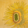
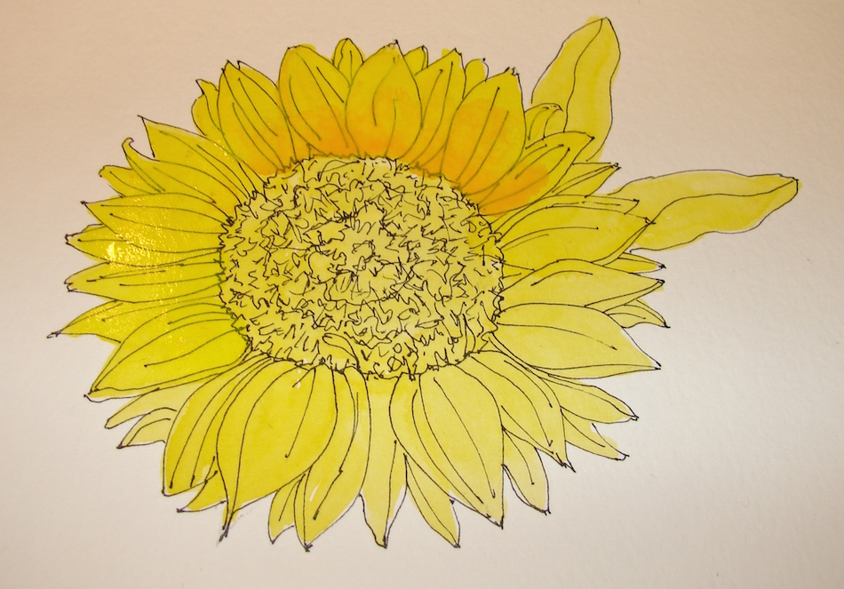
This week I tackled the buildup of yellows, which I find difficult.
I tried Tracey’s method of building up with under-colors: first yellow layer.
That is where I might have stopped before.
Second layers as I am painting, wet on dry, (that is wet bubbling paint on the left)
with the addition of a marigold yellow. Note the deep color.
I also did a two-layer green also for the leaves.
However, I think the sunflower is overworked.
I HATE the background, my first outing with Cobalt Violet.
I am not impressed with the depth of the color, though I like the granulation.
My juicy wash went awry, and I’m not sure why!
GAAACK.
Pentalic Aqua Journal, with a Pentalic HB woodless pencil, Platinum Carbon pen,
Lamy Al-Star with De Atramentis Document black Ink, and Daniel Smith watercolors.
This week I’ve taken care of business — my jewelry business,
as I am hoping to wind it down and close shop this year.
(If my readers fall in love, note the 40% off using the code “SPECIAL”. Shameless plug.)
I want to make marks and work in our business and write…
This week I also repaired Mitchell’s necklaces, and created a new mala for myself.
Two weeks ago I drew my old mala, with the broken bee wing, below.
When I made that mala I chose rose quartz to open my heart to compassion, hematite for spiritual grounding, and clear quartz and turquoise to round out the directions.
This week’s BI journal was hardly touched BUT,
I had to take the time to draw my new mala, below.
Mitchell bought me the brilliant red hand-blown African whitehearts
for our anniversary, which means they are special to me.
As my old mala was near to breaking, I took it apart and used a few of the beads.
A mala is a counter for keeping track of prayers.
I grew up with a mother who said the rosary daily, often in the car when driving,
which was why her crystal rosary stayed in the car.
As a zennie I never needed a mala, but when accepted Chagdud Rinpoche as my root teacher, and despite my resistance to his processes (we negotiated my practice), I finally succumbed to doing the Guru Rinpoche prayers as a result of his saying I lacked faith.
“Whaaaa? FAITH? I don’t think so.”
But I was having a spiritual crisis of sorts, and so, I went along with this very non-zen ritual. And oh, I learned a lot! As I was counting in the one-thousand mantra range, I found myself saying, “Hail Mary, full of Grace….” I wept.
I remembered loving Guadalupe so,
so much as a child, lighting candles
in her small shrine at the Mission San Juan Capistrano, and praying to her
for comfort and guidance.
This was before I met the awful bigot
and hateful priest who drove me out, straight into Buddhas waiting arms.
I through the baby out with the bath water, and turned my back on G-O-D. Buddhism is a better fit, extremely
clear, and in the beginning I had no
need to discuss G-O-D, as it was all
about mindfulness and mediation.
When one bowed to Buddha we were bowing to the Buddha nature within,
and the path was one anyone can step on and achieve. It was a long time before I could even say the G-O-D word again.
But there I was, that summer day, weeping with the child who loved
the virgin mother. I placed the crystal statue (right) on my altar, and soon
began painting lovely goddesses
from cultures around the world.
I have a Tibetan-Zen Buddhist practice now,
with the occasional dip into my religion of birth,
and a shared practice in the Vedic traditions with Mitchell.
My new mala has special meaning for me, and is different because I am different, having grown spiritually from the time I made my first mala.
I yearn for patience, not compassion, because I see impatience as my worst trait.
Yes, I still work on anger and compassion and wisdom and and and…
But as an elder I need fire to warm me, and the red beads do that.
They are a pleasure to touch, and the turtle is about patience, and my love for our earth and its living things, of which I am terribly concerned.
It would be sad for the human race to be wiped out.
It would be a travesty for us to take sea creatures and winged creatures
and woolly warm blooded creatures and desert creatures
and tree creatures and all manner of living beings out too.
My new mala and prayers will be for human beings to come to their senses….
And then there is my favorite movie, with Sarandon at her best:
Bull Durham “I gave Jesus a chance…”
All these images are sketched in the Bright Ideas journal with Platinum Carbon pen,
Lamy Al-Star with De Atramentis Document black ink,
White Uniball Signo pen, Fat white Pitt pen, and colored pencils.
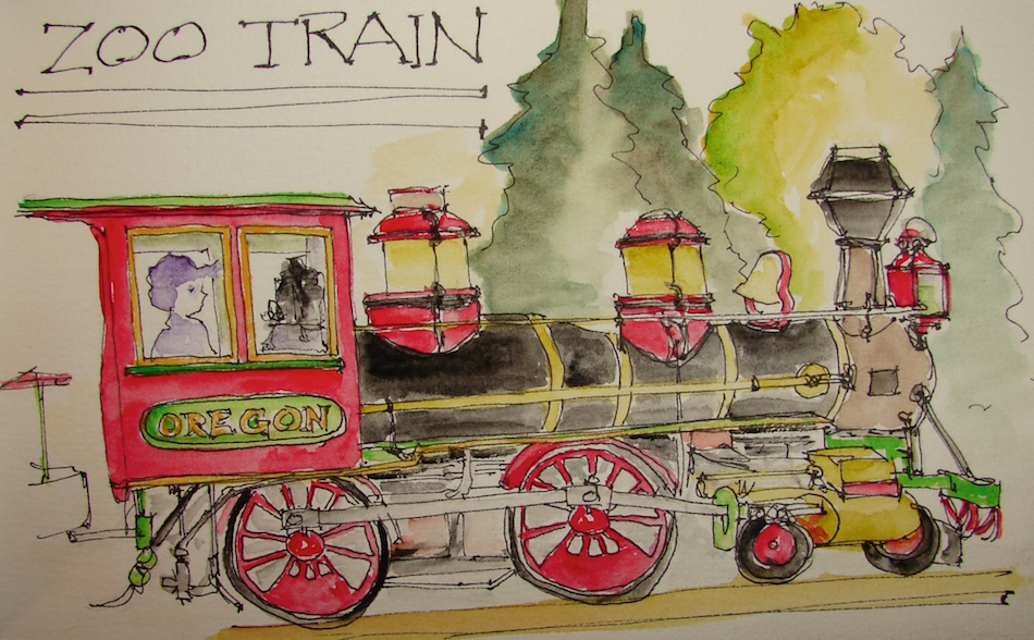
Middle of the night drawing of the Oregon Zoo train. Dan now you are forever linked to trains, along with my girlfriend who I used to ride trains with, and a crazy boyfriend who once picked me up on a train in front of my brother (which takes heuvos, doncha’ think?)
It is also a chance for me to thank Dan and a few others (Tracey, Jilanne, Susan,
Cathy, Northern Liz, Sammy), who have brought joy into my life by introducing
me to other great blogging friends. This from the kid who would not write the
Russian girl my Aunt Elsa May Smith said would be a great pen-pal…
A gratitude post…. Middle of the night!
Pentalic Aqua Journal, Platinum Carbon pen, Lamy Al-Star,
De Atramentis Document black ink, and Sennelier and Daniel Smith watercolors.
My sketch, above of the unpainted and beautiful doors in the Doe Library.
The Doe Library in Berkeley still has
the solid redwood doors, covered in
thick hides with brass details.
We were hired to assess the doors,
and explain to them how to properly conserve and restore them to their
original beauty. The details of the
doors are interesting and beautiful,
each bit designed thoughtfully in a time when pride in design mattered in
all aspects of the built environment.
In half the Library the doors were repainted a dull, lifeless brown or
recovered in a poorly chosen leather. They are not my favorite doors.
The doors in one part of the library have not been repainted,
and they are beautiful as they are, rotting, layers, deeply rust colored.
I took hundreds of detailed images.
Note that I am having problems with the paper in my new
Fabriano Watercolor sketchbook and discuss it at the end of the post…
Oh, and both my Hero and Platinum (shocking, so reliable) pens gave me grief!
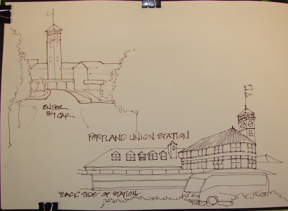
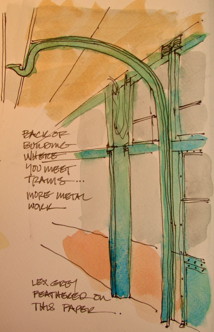
Finishing up my sketches from over a week ago, this is a thumbnail (you can see
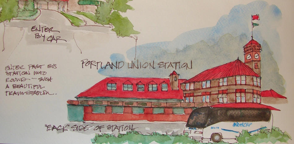
below the size on the full page) of the view as you drive into the entrance.
The building is beautiful from all sides — this is the “backside” in some ways,
looking more industrial and shuttered as opposed to the entrance and the train side.
Still, the attention to the details create an elegance even to the working sides.
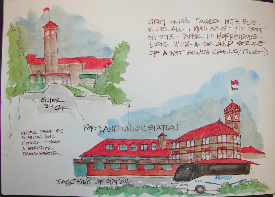
Sketched on site, blue skies added but trouble with sketchbook evident.
Watercolor added in studio.
Around the corner near the tracks is another structure, possibly offices or maintenance — has the round shape of the main building. I will have to sketch it too sometime, and the view from the bridge (below) looking down onto the station and the tracks.
So much to sketch!
Guy Clark died this week; here is his sad train song appropriate for the day!
A couple of notes about the Fabriano Watercolor Journal embedded below. I usually use a Moleskin, but wanted to try the Fabriano. This one did not perform well, pilling and lifting paper when just a soft watercolor brush was used in ways that I often use a brush to move skies around or blend a mistake. I am in touch with them and they are responding.
UPDATE: They were distressed and are sending me replacements.
I will write about what is sent…
Fabriano Watercolor Journal, with a Pentalic HB woodless pencil;
Platinum Carbon pen, Hero Pen, DeAtramentis Document Brown ink;
and Daniel Smith, Sennelier, and Holbein watercolors.
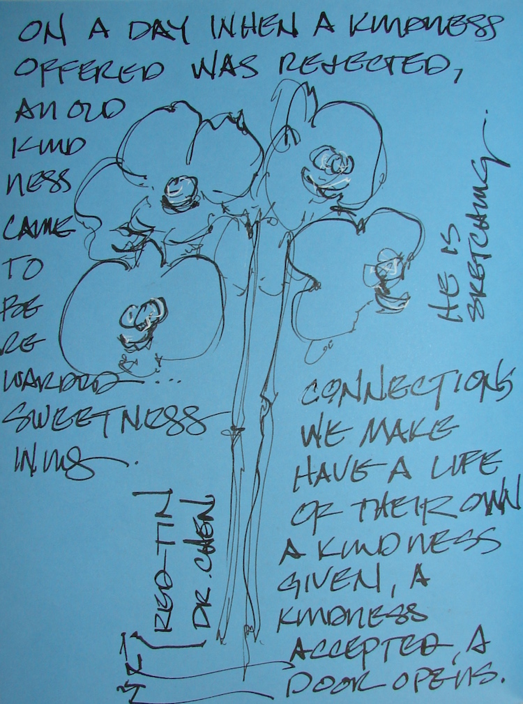
A tough week; on top of our Kamala being sick, the astrological forces
(Mars retrograde or whatever is going on) have conspired to make some of the
people in my life complete arseholes. Fortunately, none are very close to me.
On the other hand, the nastiness came
out of the blue, when I had little sleep (Kamala), and was in a place that usually offered happiness, which means I was undefended. In response to my offering to
do a good deed — to send an art friend a small and inexpensive object which she
could not get in her country — I did
something inadvertently that made
her mad. She would not accept my
apology, offered even though it was just a misunderstanding. Art folks are usually helpful and sweet — I’ve had them do the same for me — yet I walked away from the experience wondering why I would ever ever want to do a nice anything for anyone again. This was the place I was in when I walked into my acupuncturist’s office.
A reminder to know you never know what is happening
in another person’s life when you are an ass.
The back story on my acupuncturists is that he once caught me drawing
in his waiting room; he wanted to look. He told me he wanted to take art lessons
as a child but they could not afford it. I made him a sketching kit for Christmas:
travel watercolors, a waterbrush, a fountain pen (+ cartridges), and a small sketchbook. He was delighted! However, no sketches have been shared to date.
I gently bother him about it about once every couple months.
“Have you sketched?” I ask. “No. I need to practice outside the book.”
“No, that is what the book is for — it is not so precious.”
I gave him a book that talked about no judgement
and told him doing it even 15 minutes a day, pen to paper, would change his life.
But today he came into show me his sketchbook! I was on my back with needles
in my hand, stomach (it took him months to get me to do that), knees and feet. It filled
my heart to bursting to see his joy and willingness to share. Mitchell always tells me, “You never know what’s around the corner.”
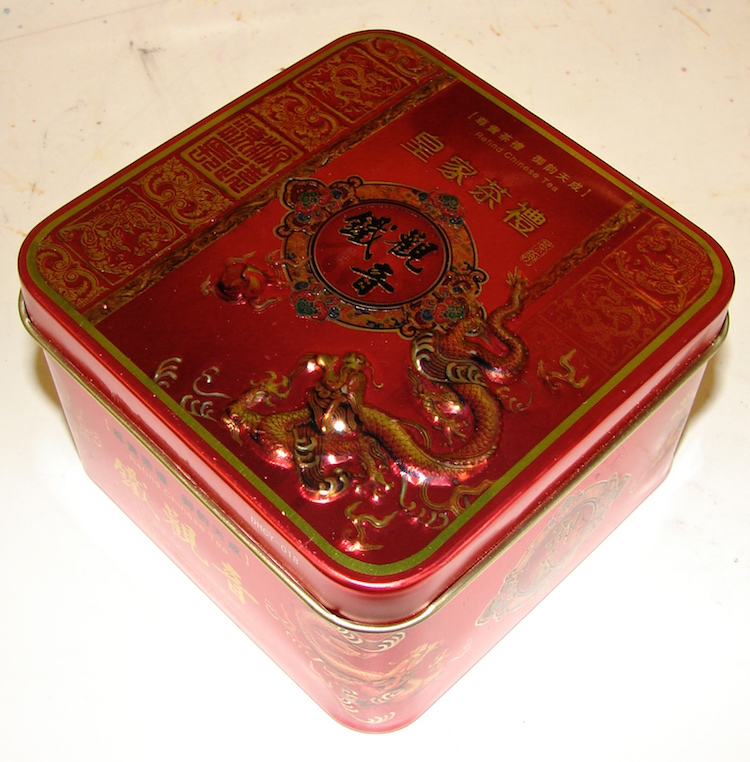
Then he also gave me a lovely gift, an empty dragon tea tin which I will use, and I told him I can use more! Friends of mine will be gifted with the beautiful tins, and so, the circle came round to opening my heart back to giving.
You never know when a gift or a smile will change a life.
All these images are sketched in the Bright Ideas journal with Platinum Carbon pen,
Lamy Al-Star with De Atramentis Document black ink,
White Uniball Signo pen, Fat white Pitt pen, and colored pencils.
Our little girl got sick, and while we now know it is from her new condition and the meds for hypothyroidism, it was a hard week, staying up all night with her, worried, et all.
I practice gratitude — looking for it, contemplating the things I am grateful for —
and this week has had many hits as well as Helpful People.
(The latter need to be read as if in a Pooh Book.)
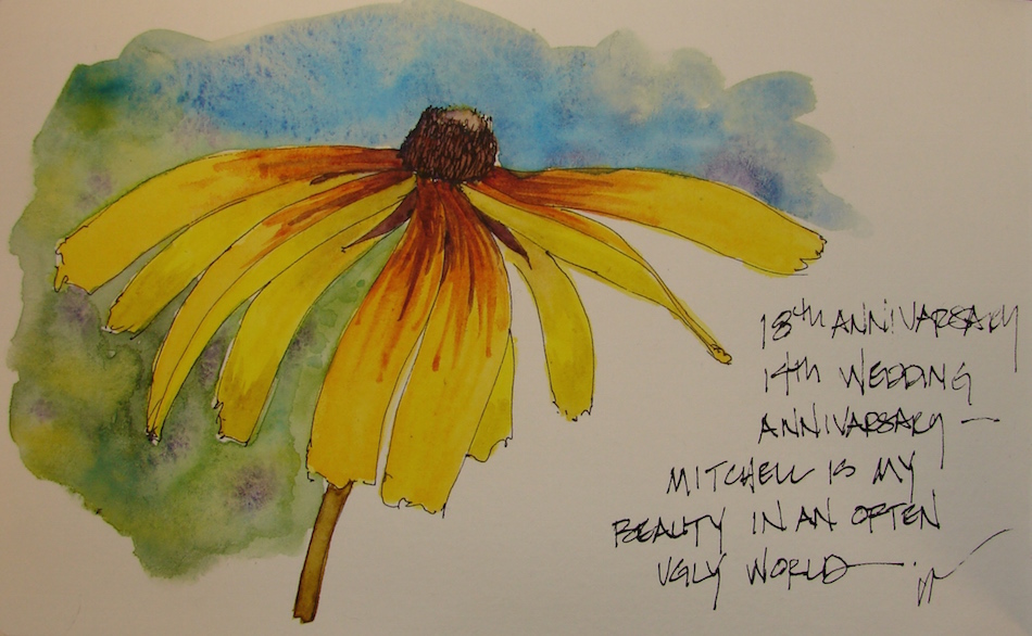
When I tell people this week was my anniversary — of meeting /first date / marrying my Mitchell — they think it was about having our anniversary ruined.
Nope.
It was about sheer exhaustion, trying to go to work and worry.
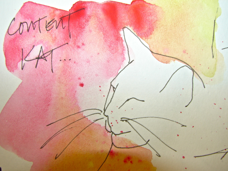
They are our kids, these cats!
Pentalic Aqua Journal, with a Pentalic HB woodless pencil, Platinum Carbon pen,
Lamy Al-Star with De Atramentis Document black and Diamine Ancient Copper Ink,
and Greenleaf & Blueberry, Sennelier, Holbein, QoR and Daniel Smith watercolors.
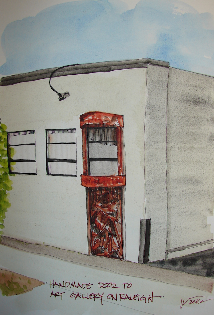
There is this amazing rusty metal door going into the art gallery on Raleigh.
It is a wild thing, all twisted and colorful and rough and organic.
I did my best; but gads, what a door.
It pops out of its concrete flat warehouse building and announces itself!
If I had time I’d go back and do it up close and personal…
But, this week sick cat came first before all things, and then there is that pesky work!
I haven’t much time this week.
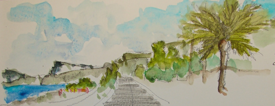
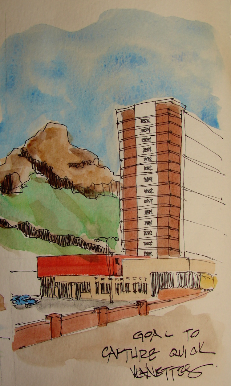
Necessity is making my goal for this sketchwalk
to capture the essence of the view, let go of details.
What stands out about the view?
the buildings? the beach? the sky? the mountain?
Capture that, leave the rest!
These each took less than a half-hour to sketch
and add color to make them pop!
Moleskin 8×11 watercolor journal, Pentalic HB woodless pencil, Platinum Carbon pen
inks that behaved, Lamy Al-Star with De Atramentis Document Black,
and Greenleaf & Blueberry, Daniel Smith , Holbein, and QoR watercolors.
When I think of trains I think of my first trips on trains,
which were out of Los Angeles Unions Train Station
(possibly the most beautiful station),
heading south to San Juan Capistrano Depot to see family or a boyfriend,
or north, when my girlfriend and I decided to take the train to San Francisco on a whim. When I recall both the Los Angeles Union Train Station
and the Los Angeles Airport I have the same visceral experience: home.
Not the wonderful smells,
like the Pacific Ocean when you are at the water’s edge in winter, all foggy and salty,
or the smell of the Santa Anas, or Eucalyptus or orange groves or horse stalls,
all home home home.
No, this is the smell of coming home, and I can call it up,
a bit of salt air and smog and diesel fuel and the cram of crowds in a hurry.
I’ve not taken a trip out of
Portland Union Station but I love the building, one of the most beautiful
in the Pearl in NW Portland.
We see it from many angles
as we pass it when we go over the bridges. In honor of Dan’s request
I wanted to do much more,
but work got to me. Details and impressions and a portrait, above.
I made a mistake in the portrait,
though most won’t catch it.
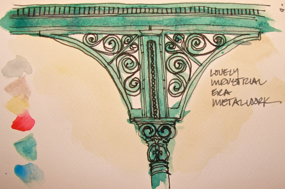
The rhythm of the building exterior
and the lovely rounds remind me
of the Hotel Del in Coronado.
The building was built when the industrial age was fascinating,
and so, exposed tendrils of metal
adorn the building, so much more beautiful than anything built today.
*sigh*
I want to go back in time.
This is my first time out with the Fabriano journal. I have mixed reaction to the paper — inks that don’t normally feather, feathered… watercolors floated a bit due to sizing, I assume. I will write more as I work more with it as it is my new USk journal.
PS I have two more drawings in me for sure… will post and link to them eventually.
I’m concerned about having drawn my mala because after drawing my thirty-year-old basket the handle broke. But maybe after all these years it is time to replace my
broken-winged unconventional mala bead with a different bead…
Okay, yes, I addedRED ink color. Rules are meant to be broken.
I am a complete sentimental slob when it comes to the things my husband
gives me. Seriously, I have several boxes after 18 years, and perhaps even he doesn’t know why I love this or that. Most of all, I’ve saved silly post it notes…..
I’ve tried finding where Marilyn Wold ended up; I can’t find her,
and don’t even know if she is alive. Amazing paper maker, amazing teacher.
I spent several weeks with her and it changed my art.
Rocks tend to follow me home. You can see them trailing behind me as I walk.
One of two of the most beloved cats ever, Toes aka Trouble aka Lucifer.
On any day you could hear me yelling “Do you have a death wish?” as he was the most deliberately trouble=making cat anywhere, smart as a whip, and my best buddy.
Saved my life too. Another story for another time. This was his favorite fetch toy.
All these images are sketched in the Bright Ideas journal with Platinum Carbon pen,
Lamy Al-Star with De Atramentis Document black ink,
White Uniball Signo pen, Fat white Pitt pen, and colored pencils.
We see these sweet homes on the way to our vets, and on walks.
They are no where near special enough to be saved when the bulldozers come,
which they will because way laid back Portlandiars won’t fight to save the NW Industrial corridor, and so very soon the ugliest high rises in the world will be sitting here….
They will be horrified. Too Late.
These are not grown up Painted Ladies,
they are teeny bungalows, so charming, a slice of history.
They probably started out much like the center one,
with little trim applied and no fancy front porch.
Over time they were painted different colors,
one added a bigger porch, and two a LOT of trim…
But they kept the RED DOORS! They’ve been repainted so the reds are
a bit different, ranging from orange-red to brick red, but they are all still red!
I am charmed, and would love to have one — I’d fight to save it when the bulldozers came, chain myself to the porch and make them drag me kicking and screaming into the street. Trust me, the stuff they are building here in NW Portland is SOOOOOOO BAD.
That one in the center is our house,
with the clear red door and the prayer flags…


 Moleskin 8×11 watercolor journal, water-soluble graphite,


USk: Painted Girls, Alphabet District
They are no where near special enough to be saved when the bulldozers come,
which they will because way laid back Portlandiars won’t fight to save the NW Industrial corridor, and so very soon the ugliest high rises in the world will be sitting here….
They will be horrified. Too Late.
These are not grown up Painted Ladies,
they are teeny bungalows, so charming, a slice of history.
They probably started out much like the center one,
with little trim applied and no fancy front porch.
Over time they were painted different colors,
one added a bigger porch, and two a LOT of trim…
But they kept the RED DOORS! They’ve been repainted so the reds are
a bit different, ranging from orange-red to brick red, but they are all still red!
I am charmed, and would love to have one — I’d fight to save it when the bulldozers came, chain myself to the porch and make them drag me kicking and screaming into the street. Trust me, the stuff they are building here in NW Portland is SOOOOOOO BAD.
That one in the center is our house,
with the clear red door and the prayer flags…
Strathmore Journal, with a Pentalic 2B woodless pencil, Platinum Carbon pen,
and Greenleaf & Blueberry and Daniel Smith watercolors.
I agree to Creative Commons Attribution-Non-Commercial 4.0 International License, which you can learn more about by visiting the site, or,
visit my web page for a more user-friendly summary on my terms.
My images/blog posts may be reposted; please link back to dkatiepowellart.
I'd love it if you shared this; please mention my blog name!