
 “Mayan” watercolors began appearing as a fad name a few years ago. Loving Primateks, I wanted to try them…
Cut to the chase, I was disappointed.
Originally Mayan blue was developed by the Maya people, who ruled Mesoamerica from 290 to 900 C.E. Blue was the color of the Mayan Sky Gods, and so it was used for ritual objects and murals, a bold, beautiful and durable pigment. It is a remarkably stable pigment created from indigo embedded in a special clay mineral called palygorskite.
The blue is perhaps the most striking color used by Maya artists, a color so extraordinary that it generated much research and debate among scientists for more than 50 years. Despite long exposure to light and high humidity for centuries, it hardly fades. It defies exposure to alkalies, acids and chemical solvents.
Scientists speculate the Mayans developed a preparative technique that was not limited
to Maya blue and preceded the future modern syntheses of organic–inorganic hybrid materials. They surmise the hue depends on how long the Maya heated their formulation, allowing the pigment to variations of the addition compound formed by the indigo compounds and the mineral. The researchers further conjecture that the Maya were also able to produce yellow and green pigments from indigo-based pigments. The yellows were based on both ochre and also a yellow derived from the indigo plant during preparation. The red is an iron oxide. All were mixed with palygorskite.
Today’s “Mayan” pigments, depending upon the manufacturer, are a mixture of both inorganic (paylgorskite clay) and organic (blue dye) elements — however, no known organic pigments today can come close to the stability of the original Mayan Blue.

So why the disappointment with regards to the “Mayan” paints?
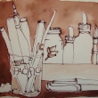
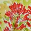
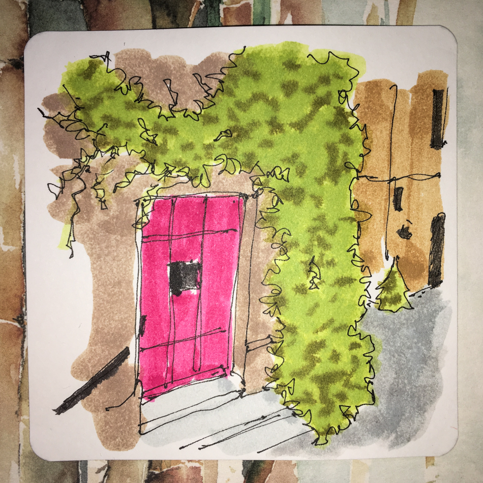
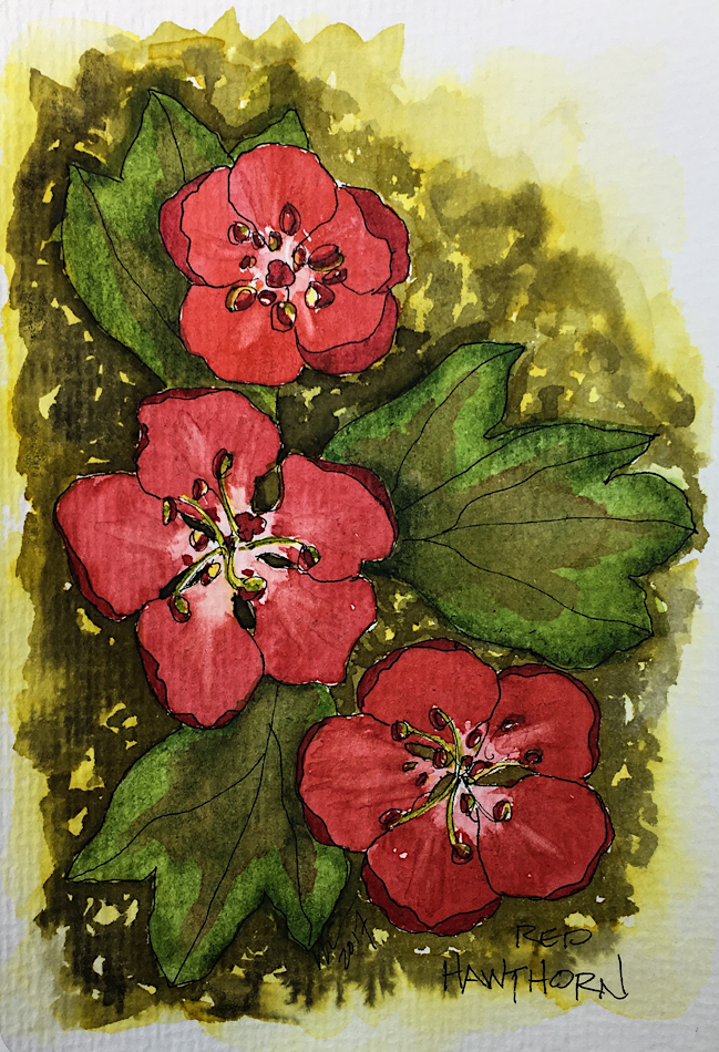
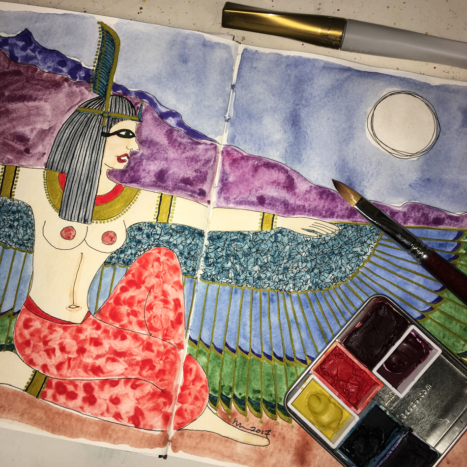
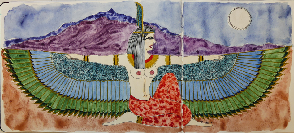
To use them to their fullest capacity it is best to use them out of the tube as a thick mixture… almost like an acrylic. With acrylic paints, you have to learn to use them in ways that creates washes by using additives — otherwise, they are a thick matte or glossy paint out of the tub. Watercolors, on the other hand, are rarely used in a thick manner, such as shown in the first image left, in the lips (Mayan Red) and the necklace (Mayan Orange.)
“Mayan” watercolors are very hard to move, unlike the primateks. They don’t suspend in a wash and drop in a lovely manner on the paper even if you don’t try to manipulate them (see the sky, Lapis Primatek, and the earth, Minnesota Pipestone Primatek, above.) With no tricks, the two Primateks fail into a pleasing pattern on the rippling wet paper. The “Mayan” paints, on the other hands, take a lot of manipulation if you don’t use them thick out of the tube… note the streaky Mayan Violet mountains, and her Mayan Orange pants.
IF I wanted the thick colors, I would go back to acrylics.
Finally, it is a bit of a gimmick. Many opaque paints react in much the same way.
French Ochre, Iron Oxide, Vermilion, WN Caput Mortem — all are very claylike watercolors. The difference is, while I may prefer transparent watercolors for their brilliance, I can manipulate these paints easier than the “Mayan” paints.
Perhaps those of you who enjoy opaque watercolors will enjoy them —
I will pass. Mine are up for sale! Interested parties email me!

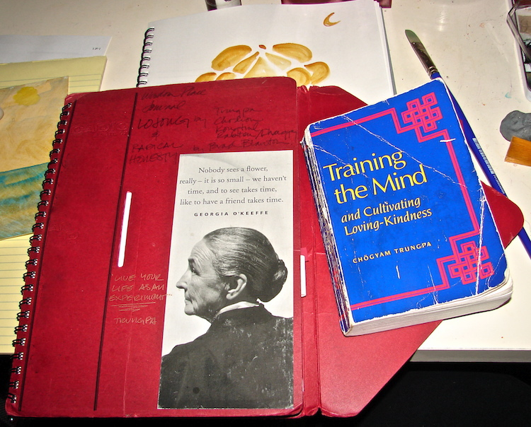
MAYAN VIOLET

MAYAN BLUE
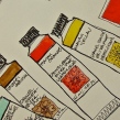
Daniel Smith made the Mayan Violet (very pinkish), Orange, Yellow, and Blue.
Greenleaf & Blueberry made the bluer Mayan Violet and Mayan Red.
Ancient Maya Dyes is an interesting blog post about the Mayan dyes. From their post, I’ve found pictures in Wikipedia (I like seeing the actual plants and minerals) below. It is a great post!

Brazilwood made a red…

… as did Annatto.

The leaves were used to make yellow.

Indigo was used in blues and yellows.

This mollusk was said to make the purple.
")
Used for their black…

The flower of the genipa has the same colors.

They even thought Cacao was used in making pigment…
To hear about classes, follow me on Facebook or
check out my new and improved dkatiepowellart.com and sign up for my newsletter!
☾
Greenleaf & Blueberry, DS Primatek watercolors, and Daniel Smith Watercolors.


©D. Katie Powell.
My images/blog posts may be reposted; please link back to dkatiepowellart.
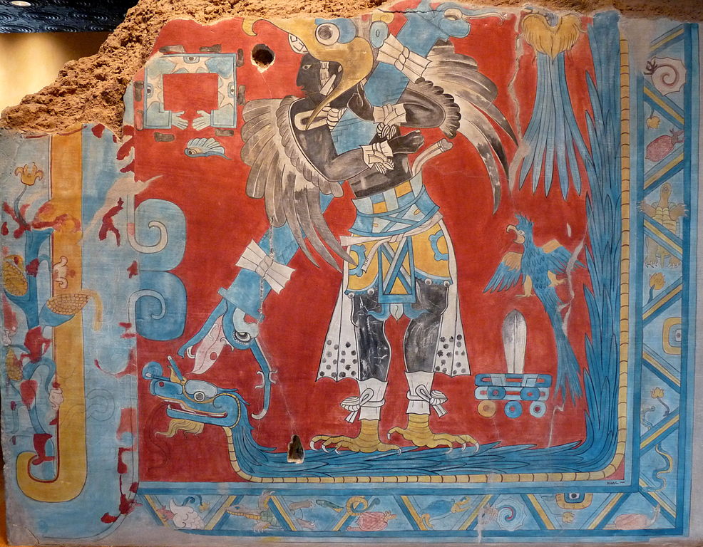
Image from https://commons.wikimedia.org/wiki/File:El_hombre-p%C3%A1jaro.JPG.
☾
 As my Patreon supporter, you will have
access to some content not on this website,
sneak previews, goodies, discounts on classes.
I teach architectural sketching,
art journaling (art+writing), creativity, watercolors.
That annoying loud-mouth editor/critic in your head? GONE! How great would that be?
I'd love it if you shared this; please mention my blog name!

 Braving another go at a video,
 Note: two different blue inks… and I can’t remember
 ☾
☾


