My “Business” Sketchbook: The Rotunda

W14 10 21 WA CAPITOL ROTUNDA 52014 10 21 WA CAPITOL ROTUNDA 1
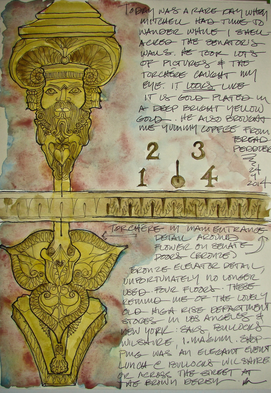
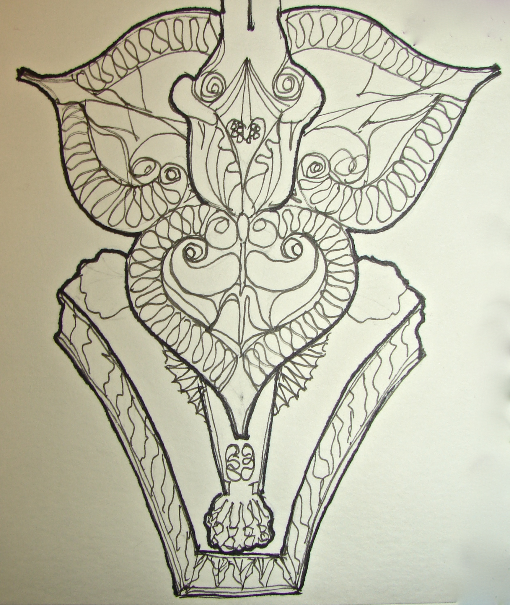
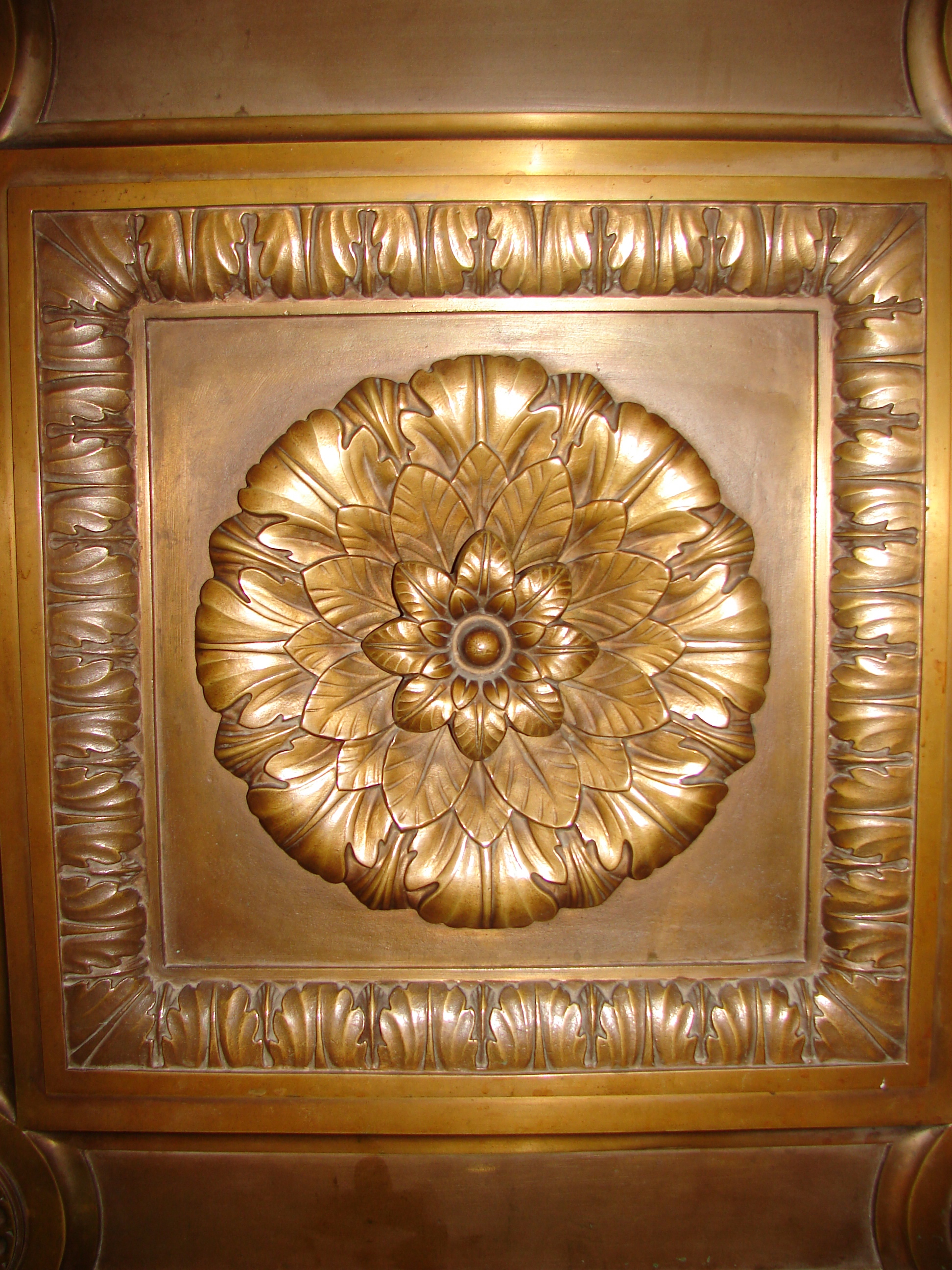
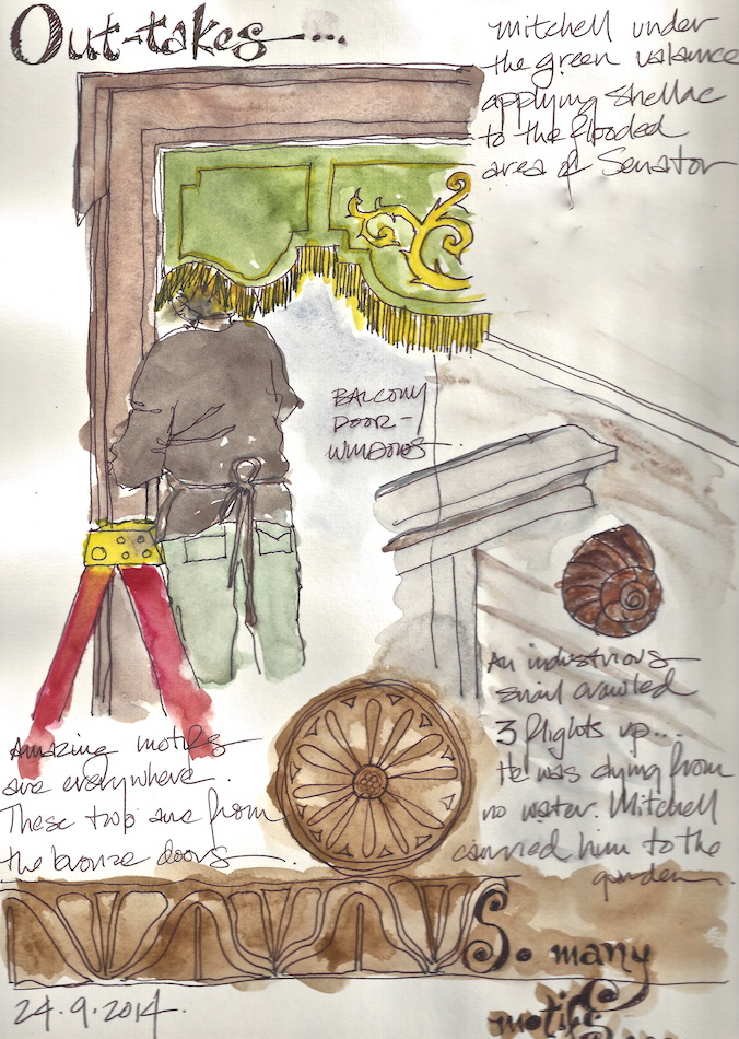
This week at the Washington State Legislative
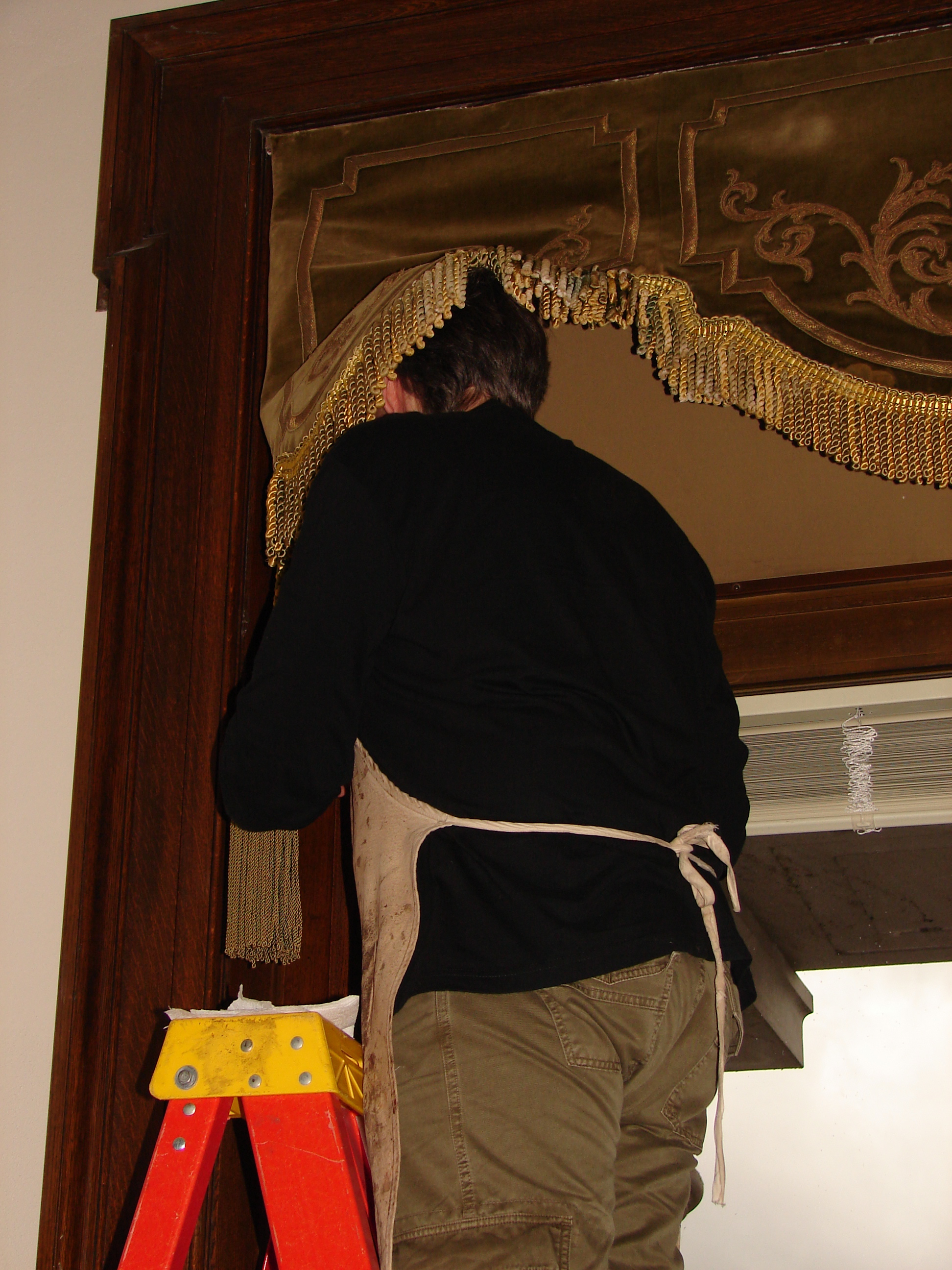
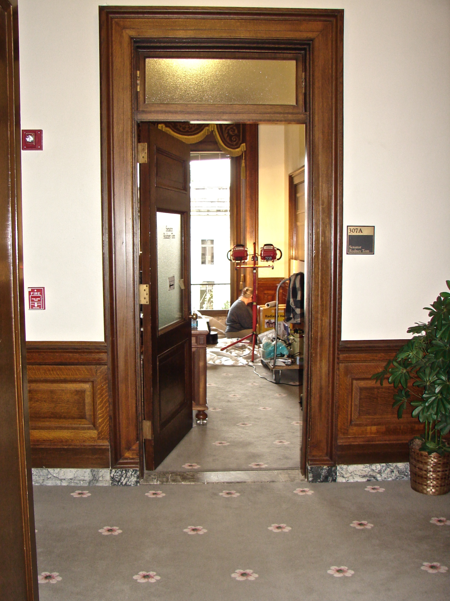
Building I had a good deal of free time, as it was Mitchell doing the lion’s share of the work on the Senator’s offices.  In the middle of a dark downpour, (the building was dark inside) I sketched all over the building.

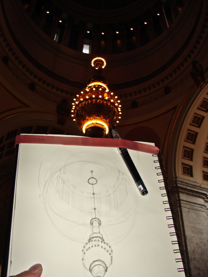
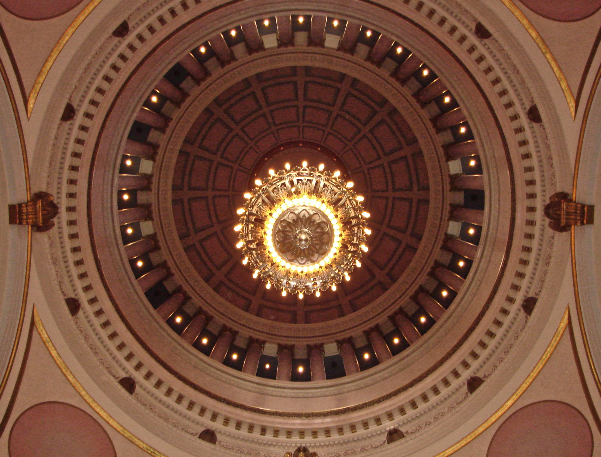
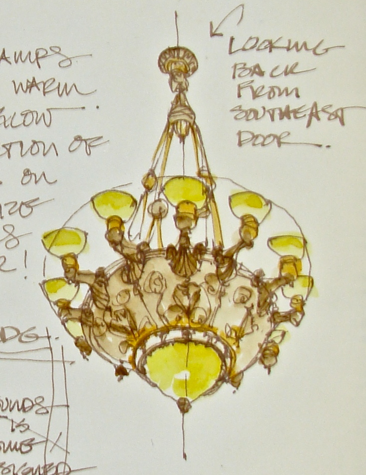
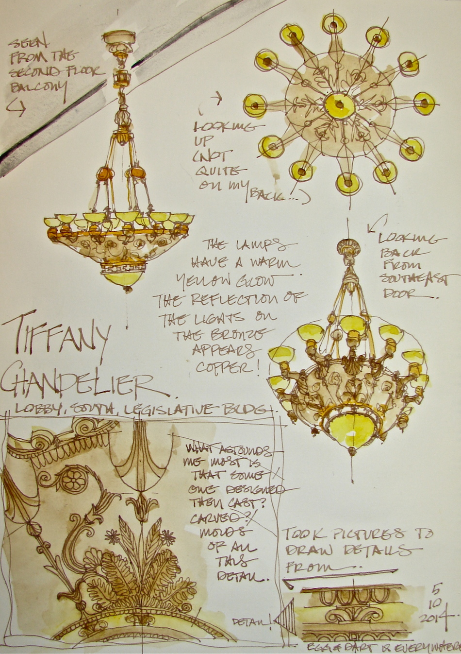
I started in the Rotunda, with the beautiful dome overhead and the Tiffany chandelier, because it thoroughly intimidated me.  I figured if I was able to do even a halfway decent drawing, I could do anything!  The steps were cold, and people came to look over my shoulder and talk to me, more than normal.

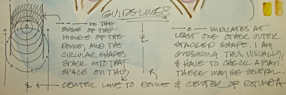
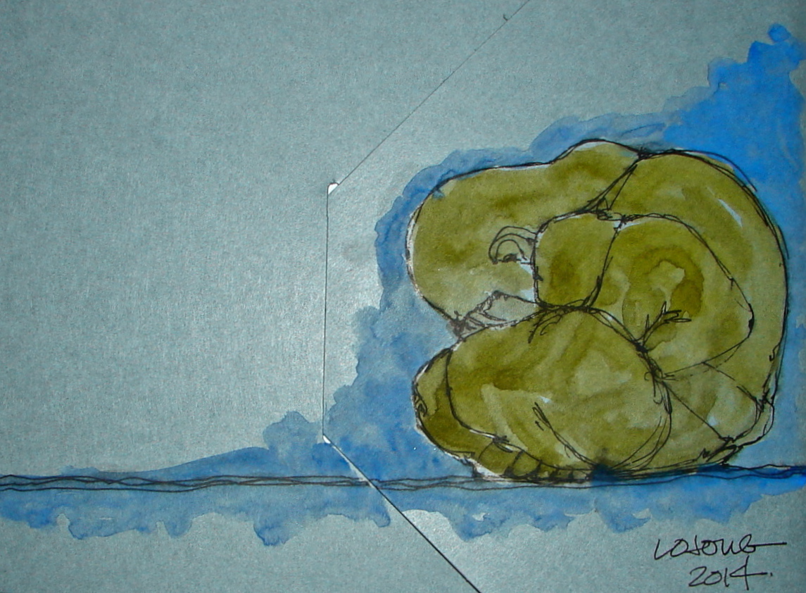
I began by understanding the geometry of what I was drawing, which I think is even more important in symmetrical buildings.  If a building is wonky to begin with, then your mistakes may not be noticeable.  But with formal symmetry, if things are off they jump out at you.  I did a pencil sketch roughly like the drawing below (the underlines were eventually erased), understanding that the dome was going to be a series of stacking circles along the center line of the drop of the chandelier, except many would be cut off from view.  There were several other circles stacking on the center line which correlated to the circular balcony at the top of the dome (I MUST find a way to get up there sometime).  As we reached the area where the cruciform plan of the rotunda reached out under arches in four directions, I would let the drawing go, so as not to make it too complicated.

Even with all the planning, I lost about three feet in the dome structure.  Next time!

W14 10 21 WA CAPITOL ROTUNDA 18 BANNER
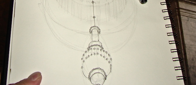
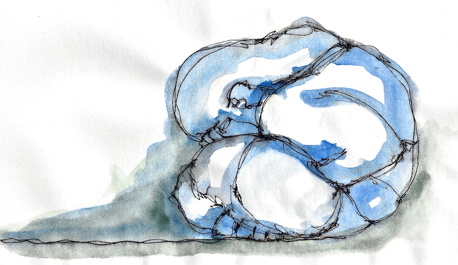
After the geometric guidelines, I began inking in stages, building definition and detail.

2014 10 21 WA CAPITOL ROTUNDA 1 copy

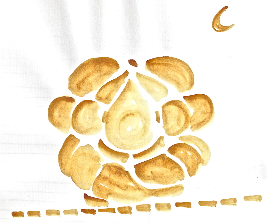
The chandelier was made by Tiffany Studios in NYC, of bronze and bulbs, highly detailed and elegant, stately but certainly not glitzy like the crystal chandeliers nearby.  It cost one dollar per pound (what an odd way to charge) and so was $10,000.  The body of the chandelier is twenty-five feet tall, eight feet wide, and hangs on a hundred foot chain.  204 bulbs circle top, middle and bottom, with an added matching lamp in the dome.

W14 10 21 WA CAPITOL ROTUNDA 19Watercolors were added in the studio.
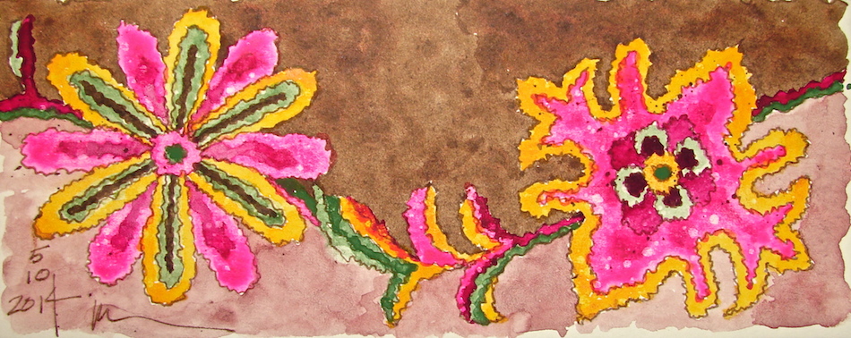
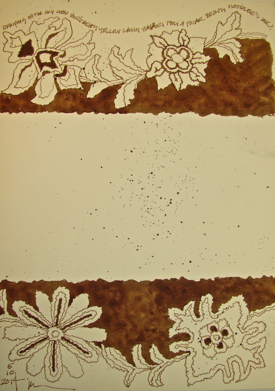
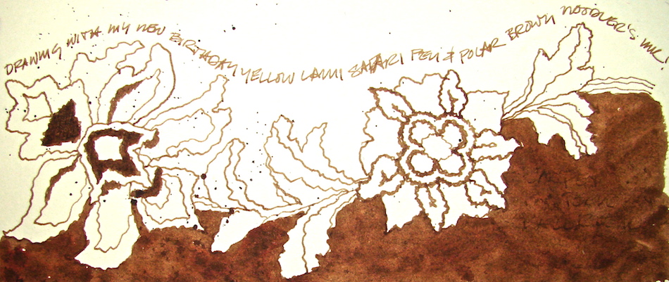
Drawn in an Stillman & Birn Delta journal with a Noodlers giveaway pen,
Lexington Grey ink, and Daniel Smith (quin gold, Indian yellow, tigereye, indigo), Sennelier (quin red, raw umber, phthalo blue 807, Chinese white),
and QoR (bohemian green) watercolors.

DSC00149


I agree to Creative Commons Attribution-Non-Commercial 4.0 International License, which you can learn more about by visiting the site, or,
visit my web page for a more user-friendly summary on my terms.
My images/blog posts may be reposted; please link back to dkatiepowellart.

Posted in architecture, art, drawing, history, journal, painting, pen & ink, process, sketchbook, urban sketchers, watercolor | Tagged , , , , , , , , , , , | 19 Comments

How to Draw a Perfect Circle

This is so easy, by Dave Hax.  Thanks Cathy!

Posted in class, drawing | Tagged , | 2 Comments

My “Business” Sketchbook: North Entrance Details

More drawings of the North entrance, with beautiful Corinthian columns,
the dome with flanking “tomes”, and many details.
Sketched onsite, and watercolors added later.
The column was drawn looking up from the edge of the East side of the steps.

w14 10 5 WA Capitol North Details 9Lamy Safari pen with Noodlers Lexington Grey ink;
Daniel Smith Primatek (Lapis and Hematite) +
QoR (Terre Verde and a grey) watercolors.


I agree to Creative Commons Attribution-Non-Commercial 4.0 International License, which you can learn more about by visiting the site, or,
visit my web page for a more user-friendly summary on my terms.
My images/blog posts may be reposted; please link back to dkatiepowellart.

Posted in architecture, art, drawing, history, painting, pen & ink, sketchbook, urban sketchers, watercolor | Tagged , , , , , , | 1 Comment

My “Business” Sketchbook: Washington Capitol Popular View

W14 10 5 WA Capitol Popular View 3It started with a popular view of the Washington State Capitol Legislative Building.
This is a view that is on all the postcards, all seasons, which I
sketched in early October while we were working in the building.
It’s a wonky sketch, but a nice sketch.

I found it boring.  I wanted to play with the forms.
In my studio I added the watercolor.

About halfway through I thought I had made a mistake.  Then I thought,
“What the hell?!  I ruined it — I might as well mess with it some more!”

Now I like it.  I wish I had an image halfway through to show you!

W14 10 5 WA Capitol Popular View 9Lamy Safari pen with Noodlers Lexington Grey ink;
Daniel Smith + Sennelier watercolors then Pitt pen to bold it . . .


I agree to Creative Commons Attribution-Non-Commercial 4.0 International License, which you can learn more about by visiting the site, or,
visit my web page for a more user-friendly summary on my terms.
My images/blog posts may be reposted; please link back to dkatiepowellart.

Posted in architecture, art, color, creativity, india ink, painting, pen & ink, sketchbook, urban sketchers, watercolor | Tagged , , , , , | 9 Comments

Weeping Buddha, One

2014 0 LOJONG COVER 3 copyI fell in love with Balinese Buddha when I first saw him.
The monks carve them as meditations.
Mine has been on my altar for 20 years, and has a beautiful patina from being held.
People call him Humble Buddha, but more often, Weeping Buddha.
I call him Buddha Ball.
2014 7 LOJONG  copy

2014 10 LOJONG  copyI like to create variations of the same object or image.
I am not sure why and I don’t want to question it,
but the subject came up as Mitchell asked me “why?” the other day.

2014 3 LOJONG 300dpi copy 2

W14 11 LOJONG_22014 0 LOJONG INSIDE1 copyMany of these were created for a series of posts I wrote on my Lojong practice.
These are all my sketches of Buddha Ball to date (I have larger paintings.)
More to come!


I agree to Creative Commons Attribution-Non-Commercial 4.0 International License, which you can learn more about by visiting the site, or,
visit my web page for a more user-friendly summary on my terms.
My images/blog posts may be reposted; please link back to dkatiepowellart.

Posted in art, Buddha, creativity, drawing, gods and goddesses, india ink, journal, lojong, meditation, painting, pen & ink, series, sketchbook, watercolor | Tagged , , | 3 Comments

My “Business” Sketchbook: Tiffany Chandeliers South Entrance

W14 10 5 WA Capitol Chandelier 30 DTLThe chandeliers are a crowning point in the Washington State Capitol Legislative Building.  The architects felt the most important fixtures were those in the north portico, in the rotunda, and in the entry in the south porte cochere, as well as the large gathering rooms.  They went all the way to New York City to have Louis Comfort Tiffany create the fixtures (no one here in this wild wild west was competent), which, along with the six bronze doors, cost the state $158,000.  They were designed by Carl Moser.

DSC00171I love the chandeliers in the entry in the South Porte Cochere.
The warm glow of the glass hits the delicately detailed bronze and
colors it nearly copper in places, so the lamps look like they are on fire.

W14 10 5 WA Capitol Chandelier 12I started with sketches to understand the construction.
I didn’t lie on my back to sketch the underside because my architectural training allows me to see in plan anything I look at — building plans, drawings of the cars I sit in, etc.
I am glad, because I really would have looked ridiculous sprawled on the stairs.
This is so helpful, to look and do some sketches that allow you to see, in this case,
the twelve knobby “arms” that attach to the bowl with a decorative shell motif,
and look much like hand-held candle torchéres.  Or the hanging mechanism,
which consists of chains hanging from a pendulum to four medallions before opening
and attaching inside the fixture, so they do not mar the exterior decorative bowl.
I was able to draw it from the side because the second floor balcony looks
straight into the light, and you are also closer to the fixtures.

 I cheated when it came to the details.  I took a close-up and sketched at home.
I wanted to be able to see the sweet floral designs that I only hinted at
(because it is so far away) in the two side views.  The bottom band, just above the large glass lamp at the base, has the teeny tiny egg-and-dart motif found everywhere.

W14 10 5 WA Capitol Chandelier 31 copyAll drawn in an Stillman & Birn Delta journal (rich ivory paper)
with my new Lamy Safari pen, a Noodler’s giveaway pen, Polar Brown Noodlers ink.

When I returned to the studio (running around inside the building on carpet with watercolors is not appreciated) I added color with raw umber from Sennelier, quinophthalone yellow from Daniel Smith and nickel azo yellow QoR watercolors.


I agree to Creative Commons Attribution-Non-Commercial 4.0 International License, which you can learn more about by visiting the site, or,
visit my web page for a more user-friendly summary on my terms.
My images/blog posts may be reposted; please link back to dkatiepowellart.

Posted in architecture, art, drawing, history, journal, making a living, painting, pen & ink, process, sketchbook, urban sketchers, watercolor | Tagged , , , , , , , , , , | 21 Comments

Disney Plum Job

This is a great article with wonderful imagery about animation and sketching!

waltdisneysouthamerica33

Walt Disney’s South American Research Trip

By   5th Jun, 2014

saludos amigosYou know you have a pretty cool job when your boss offers you a ten week tour around South America and sketch inspiration for your next cartoon as you visit beautiful beaches, exotic cultures and remote landscapes. In 1941, before America entered the war, Walt Disney took a group of sixteen of his best animators and composers to Brazil, Argentina, Chile and Peru, as part of a goodwill tour commissioned by the United States Department of State. As well as exercising the Good Neighbour Policy, the trip was intended to lead to a new animated movie that could be shown in Central and South America to celebrate (and secure) their friendly relationship. The film would be called, Saludos Amigos.

waltdisneysouthamerica5

Let’s tag along with LIFE photographer Hart Preston, who was sent to document these ten weeks and the wonderful animations that they inspired…

Here’s hoping MessyNessy will love the folks I send over!


Posted in animation, art, history of sketching | 3 Comments

Visiting a museum . . . Art appreciation

This post was inspired by this article in the NYTimes about visitors to museums feeling tired and worn out from running to tag every piece of noteworthy art, rather than slowing down and enjoying what they find interesting.

I grew up in So Cal and had “done” LACMA with my mom and with school trips, as well as other kinds of museums.  School trip instructors told me why I needed to like this or that, and I always felt I was missing something, because I didn’t see the play of light on the baby Jesus’ face having subliminal meaning, or the way the trees were placed as indicating, well, whatever.  I was, in short, bored.

I had the same reaction in my art courses in college.  I never felt the way they said I should feel.

Claude_Monet_-_The_Water_Lilies_-_Morning_-_Google_Art_Project(Image can be seen full-size at Wikimedia)

When I was 20 I was at a two-week managerial retreat in upstate NY and had a weekend off.  I went alone into NYC in August, when the city is about as deserted as it gets, not knowing what to expect.  I spotted Diane Keaton, who I loved, and stalked her for a while.  I figured she knew NYC, and I didn’t.  It was all a bit intimidating.  She arrived at the MET, where they had the Monet exhibit.  I walked into a relatively empty room after Keaton, and on the wall was a room-sized waterlily painting.  I did not leave for two hours, forgetting  Keaton altogether.  I was entranced.  In that lovely large hall the painting floated on a wall soaring a bit overhead, if I remember. I also bought my first art tome, and now I could see the other paintings in the book as well.  It was a bit like having sex the first time; it forever changes you.

During my early years practicing architecture, I had the pleasure of facing one of Billy Al Bengston’s Draculas (Iris), which sat across the aisle from my drawing table at Gensler.  Again I fell in love with the subtleties of the painting in a way I would never have if I walked by it on the wall.

Eight years later I walked into the Jeu de Paume in Paris for a second exhibit that changed my life and the way I saw paintings.  This was also Monet, and it featured his haystacks and the Rouen Cathedral.  I spent the afternoon looking at a dozen paintings and understood that he was not painting the haystack or the cathedral, but the light.

When I started painting I had no qualms about painting the same image over and over, because it was not about the image, which I used as a way into exploring other interests. Monet and Bengston changed my life as an artist.

Now I rarely visit any museum with anyone who is not my soul mate in terms of seeing only what each of us wants to see, splitting up if need be, and taking all the time we have on any one thing if we like.  I go to art galleries and museums on off days, and often spend time in front of one or two images — or walk through and leave if the curator’s presentation doesn’t speak to me.  Curators have incredible power to make the viewer experience objects.  I was not a Picasso fan until I saw an exhibit in Paris at the Centre Georges Pompidou, of several painters who were painting at the same time.  Seeing Picasso along with Manet, Monet and other contemporaries allowed me to see him as the renegade thinker he was — which was lost on me when they droned on about it in art classes.

I recommend taking one’s time in a museum, as the article suggests.  It is not Disneyland, where you want to hit all the rides for the whole experience.  Art museums are like offerings at a banquet; you choose what appeals to you and savor the experience.

BTW, I HATE SELFIE TAKERS.  I want to go nab their stupid phones out of their hands much like I want to turn a speedboat over on a reflective lake.  Just saying.


I agree to Creative Commons Attribution-Non-Commercial 4.0 International License, which you can learn more about by visiting the site, or,
visit my web page for a more user-friendly summary on my terms.
My images/blog posts may be reposted; please link back to dkatiepowellart.
Thanks to Wikipedia for many images;
The second and third images are from Slifex and Grufnik, on their Flickr sites.

Posted in art, history, meditation, memory, museum | Tagged , , , , , , | 5 Comments

My “Business” Sketchbook: Ballroom Rug

W14 10 5 WA Capitol Ballroom Carpet 15DSC00188_2Posting a page I am not 100% happy with.
I may even try again . . .  We’ll get to that!

The carpet in the State Reception Room floored me.
It is so oddly modern when in fact it is a century old.

Meandering big bold flowers in electric wool
colors appear from the tropics!
Not even the touch of mauve against eggplant
bothered me because somehow it all works.

Until recently, this was the largest rug in the world.
Now a Saudi public building has that distinction.

I wanted to give you context on this amazing carpet in the room!

W14 10 5 WA Capitol Ballroom Carpet 5The State Reception Room is closed except to tours (free);  Mitchell snapped images from which to draw.

Initially I intended this to be a sepia page which would hold writing, right.  Watercolors leapt to the page of their own accord.  This is where I got into trouble.

It is SO easy to overwork a watercolor.
I wanted the colors to be as bold as they were in the State Reception Room. The watercolors were not vibrant enough, coming through as pastel version, so I added second and third layers.

*Sigh* Muckity muck muck MUCK.

W14 10 5 WA Capitol Ballroom Carpet 8 copy

Unfortunately, this is also a case where the colors are pretty accurate but the whole does not appear the correct palette.   My palette is simply too bright, too orange, too pink!

Since I was unhappy, I felt I had nothing to lose.   I used the middle of the page to
sketch a faster impression of the carpet in watercolors.  Quickly.  This impression is closer to the feeling of the carpet when you are in the State Reception Room.

Then to save the overworked watercolor, I first tried spritzing a paper towel and blotting the overworked watercolor.  I lifted a lot of paint, which helped, but it still looked all wrong.  Then I tried spritzing the water-colored borders and blotting directly.  This resulted in the mottled effect below.  NOT what I was going for, but an improvement!

I really love this carpet — odd for me — and may have another go at it!
Maybe I can sit on the floor outside the glass doors!

W14 10 5 WA Capitol Ballroom Carpet 12 copyDrawn in an Stillman & Birn Delta journal  with my bright shiny new yellow
Lamy Safari pen, a Noodlers’ giveaway pen, Polar Brown Noodlers ink.
Daniel Smith (Opera Pink, new Gamboge, Chrome Green — big mistake as it is opaque — Perelyne Maroon), Sennelier Quinacridone Red, and QoR Terra Verte watercolors.


I agree to Creative Commons Attribution-Non-Commercial 4.0 International License, which you can learn more about by visiting the site, or,
visit my web page for a more user-friendly summary on my terms.
My images/blog posts may be reposted; please link back to dkatiepowellart.

Posted in architecture, art, art journal, color, furniture, journal, painting, pen & ink, process, sketchbook, watercolor | Tagged , , , , , , , , | 8 Comments

My “Business” Sketchbook: Outside Torchéres

The outside lighting at the Capitol is another one of those parts that must be overlooked
by visitors during the day, who are not drawn to the various sconces and torchéres
because the light does not draw their eyes like the sparkling light of the Tiffany lamps
in the interior spaces.  They are every bit as beautiful, and highly detailed.

I drew onsite, and added water-color in the studio.
I am still overworking my watercolors a tad bit, but I don’t care —
these are all opportunities for learning and I like the effects of the Sleeping Beauty Turquoise and Minnesota Pipestone and Hematite by Daniel Smith.
The deep green-blue is Phthalo Blue by Sennelier.

Drawn in an Stillman & Birn Delta journal
with a Pitt pens and Daniel Smith / QoR watercolors.
Happy Paint Party Friday and Friday Sketches!


I agree to Creative Commons Attribution-Non-Commercial 4.0 International License, which you can learn more about by visiting the site, or,
visit my web page for a more user-friendly summary on my terms.
My images/blog posts may be reposted; please link back to dkatiepowellart.

Posted in art, art journal, journal, painting, pen & ink, sketchbook, urban sketchers, watercolor | Tagged , , , , , , | 27 Comments

HyperAllergic: Hong Kong’s Umbrella Movement in Pen and Ink

 Artists Mobilize to Capture Hong Kong’s Umbrella Movement in Pen and Ink

by Laura C. Mallonee in HyperAllergic, October 6, 2014

A drawing of Causeway Bay by Alvin Wong (Image via Facebook)

Art has played a role in the Umbrella Movement since day one, from public art installations like Stand By You: ‘Add Oil’ Machine to a Facebook competition to design the movement’s logo. Less well-known are two urban sketching groups which, armed with pen and paper, have been doing their best to document the protests.

Both Urban Sketchers Hong Kong (USHK) and Sketcher-Kee were formed in 2013 with the goal of preserving in ink the city’s ever-evolving urban environment. Today its members are camped out in the Causeway Bay, Admiralty, and Mong Kok areas of Hong Kong, posting expressive drawings of that same landscape over-run by umbrellas, yellow ribbons, and students demanding political freedom. Their work is risky; a recent post by USHK co-founder Alvin Wong on the group’s Facebook page advised members to “get a sketch buddy” and to sit near a wall so “no one can surprise you from behind.”

Continue to read the article and see many images of the protest!

Posted in sketchbook, urban sketchers | 6 Comments

My “Business” Sketchbook: Torchére

W14 9 24 WA CAPITOL TORCHEREMitchell took great images of object details around the Legislative Building, and the torchére caught my eye.  Not the same as painting in front of it, but fun nonetheless.
I began with a detailed sketch, and almost left it alone, but color is my thang so
I took the risk.  I like the gentle washes and think they add to the page.

2014 9 24 WA CAPITOL TORCHERE 3And the images these details came from:

door to the senate

Drawn in an Stillman & Birn Delta journal
with a Brown-Black Uni-ball pen and Daniel Smith / QoR watercolors.


I agree to Creative Commons Attribution-Non-Commercial 4.0 International License, which you can learn more about by visiting the site, or,
visit my web page for a more user-friendly summary on my terms.
My images/blog posts may be reposted; please link back to dkatiepowellart.

Posted in architecture, art, art journal, color, drawing, furniture, journal, painting, pen & ink, sketchbook, urban sketchers, watercolor | Tagged , , , , , , , , | 4 Comments

A Very Old Sketchbook

s0063I wish I could tell you more, but this is a very old sketchbook on display at the Flandrica Museum, in, I believe, Belgium.

To move through the images page by page (again, assuming that this is what we are doing, but whatever it is, they are so interesting) you can see them here, and even download them.  Fascinating.  Does anyone know how to translate?

rs0009


Posted in art, history, history of journal, history of sketching, journal, memory, sketchbook | Leave a comment

My “Business” Sketchbook: Urban Sketching at Capitol Park

Last Saturday we infilled missing color to the historic shellac.  It is one of the few times when Mitchell had time to play a bit more than I did, and he took great images of the details around the Legislative Building (which I will paint!)  On our way out we took a drive to Capitol Park, a lovely park below the Washington State Capitol.  I had just enough time to paint the Capitol on an early autumn day before heading back home.

2014 9 28 WA CAPITOL FROM PARK WC JRNL 2The first time through I sketched then laid in color, above.
The second watercolor I simply dropped colors quickly.
I have my favorite of the two — do you?

2014 9 28 WA CAPITOL FROM PARK WC JRNL2 1Drawn in an Stillman & Birn Delta journal
with a Brown-Black Uni-ball pen and Daniel Smith / QoR watercolors.


I agree to Creative Commons Attribution-Non-Commercial 4.0 International License, which you can learn more about by visiting the site, or,
visit my web page for a more user-friendly summary on my terms.
My images/blog posts may be reposted; please link back to dkatiepowellart.

Posted in architecture, art, art journal, drawing, journal, painting, sketchbook, urban sketchers, waterbrush, watercolor | Tagged , , , , , , , , , | 18 Comments

Printable Cheat Sheet for Tea, Milk and Honey Workshop

Marc Taro Holmes is one of my favorite artists to follow. Here is a small cheat sheet on his Tea Milk Honey in order to create fast watercolor sketches. Yummy too.

Marc Taro Holmes's avatarCitizen Sketcher

I’ve done up a little ‘cheat sheet’ for my class at the USk Symposium in Paraty. It’s a single page (folded) booklet crammed with notes about my watercolor field sketching process.

Naturally it’s meant as a companion to the workshop, but even if you can’t make it to Brazil, it can still be a handy guide.

I find, once I dive in to a sketch, it goes by in a blur. So it’s good to have a plan in the back of your mind. Maybe tuck the booklet into your sketchbook, and just glance over it before you begin – kind of a refresher about strategy.

TMH_Booklet_Teaser

You can download THIS PDF FILE, (also found on my Downloads page. Send this link to friend). Then print it and fold it: in half lengthwise, and in half again shortwise – to make the booklet. It’s set up for Letter size (8.5×11″) and uses the entire…

View original post 57 more words

Posted in class | Tagged | Leave a comment

My “Business” Sketchbook: At the Capitol

We’ve been working to the point where I’ve had little time to paint or
even sketch, however, we’ve been in a place I wanted to sketch:
we’ve been repairing historic shellac on the wainscot of two offices in the Legislative Building in the Washington State Capitol complex.

W14 9 24 WA CAPITOL 307:309 1 copy_2 DSC00113I had two opportunities to sketch
last weekend — about twenty minutes each.

Mitchell’s ladder was blocking the
wainscoting I needed to repair;
I took advantage and sketched him on the ladder.

I took images in order to add
watercolor back in the studio; I didn’t dare attempt watercolors in the Senate area

DSC00127The carpets are so beautiful:
Rhododendrons and Dogwoods.
Dogwoods are one of my favorite flowers;
they remind me of my grandma.

The details in the doors, ceilings
and lamps are amazing.
I’ve not seen such a beautiful building in a long time.  Graceful and tasteful, just enough glitz!

Mitchell also caught me working
in the senator’s office.

W14 9 24 WA CAPITOL 307:309 copyDrawn in an Stillman & Birn Delta journal
with a Brown-Black Uni-ball pen and watercolors.

URBAN SKETCHERAnd I joined the ranks of urban sketching!


I agree to Creative Commons Attribution-Non-Commercial 4.0 International License, which you can learn more about by visiting the site, or,
visit my web page for a more user-friendly summary on my terms.
My images/blog posts may be reposted; please link back to dkatiepowellart.

Posted in architecture, art, art journal, drawing, furniture, journal, painting, pen & ink, sketchbook, urban sketchers, watercolor | Tagged , , , , , , , , , | 15 Comments

Odile, Palms, Oceans in Autumn

Heating up in Portland.
Today I want to be on a deserted beach, as long as it is not in the path of Hurricane Odile.
We must work — and give thanks for air conditioning.

58 of 75 SKETCH

Drawn in an OE Cadic sketching journal with a Brown-Black Uni-ball pen and watercolors.


I agree to Creative Commons Attribution-Non-Commercial 4.0 International License, which you can learn more about by visiting the site, or,
visit my web page for a more user-friendly summary on my terms.
My images/blog posts may be reposted; please link back to dkatiepowellart.

Posted in art, art journal, journal, memory, pen & ink, sketchbook, watercolor | Tagged , , , | 3 Comments

75 Day Challenge: 48 To 57

Brenda Swenson has a drawing challenge to draw every day for 75 days.
We are supposed to use a black or blue pen, but I know I will not do that one.
Still, I play along because challenges are fun when done with others, and it keeps me doing at least one dang drawing a day even when I am slammed at work.
To see all the 75-day images go here.

Booby Gurl has been majorly unhappy with accounting toward taxes.
I tossed my brush far away for a few days while tearing my hair, then retrieved it to give me a carrot dangling and every time I finished another part I got to draw!

49 of 75 SKETCH

The end of summer coincided with the end of the journal I started for this challenge.

54 of 75 SKETCH

Never fear, a had a half-finished journal that I went back to, and horses began appearing.  And I finished a Buddha and called it one of the numbers!

 All are done in an OE Cadic sketching journal or in a Stillman & Birman Beta journal
with Cocoiro or Pitt pens or Uni-ball pen, and with watercolor when so moved!


I agree to Creative Commons Attribution-Non-Commercial 4.0 International License, which you can learn more about by visiting the site, or,
visit my web page for a more user-friendly summary on my terms.
My images/blog posts may be reposted; please link back to dkatiepowellart.

Posted in art journal, Booby Gurl, Buddha, challenge, drawing, journal, painting, pen & ink, process, sketchbook, watercolor | Tagged , , , , , | 5 Comments