
 ☾
☾
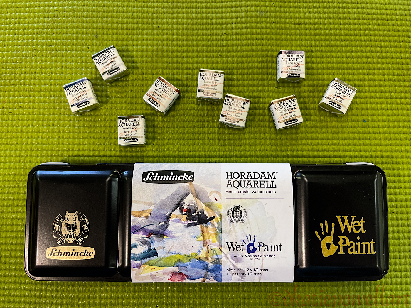
I wanted to try Schminke’s Supergranulating paints. I liked the idea of two or more pigments that separate through granulation when painted.
I bought nine of them, along with Schminke’s pan set “Wintertide”
of 10 basic colors, plus two pearlescent paints, White Gold and Blue Pearl
(neither of the latter are being reviewed here), but I will say
both pearlescent paints are nice “come-withs” in the Wintertide palette.
(You will see them on several images below.)


☾
Unboxing, I have to admit I toss the metal holder thangy (technical term)
because I like to add many more half and full pans of paints to a travel set;
you can see the final palette at the bottom of this post.
I rarely buy half-pans, but as I was already buying a set of Schminke half-pan paints,
I decided to save myself money and purchase the Supergranulating paints in half-pans.
Normally I buy tubes, but the tubes are $19.59 a tube,
and as they were an untried product, I’m glad I bought the pans,
as I could purchase more colors at $9.31/half-pan, and see if I like them.
 ☾
☾
These are in my pan, and all are Schminke but for the three glittery colors top left, above.
Both the Blue Pearl and White Gold, bottom left, are gorgeous!
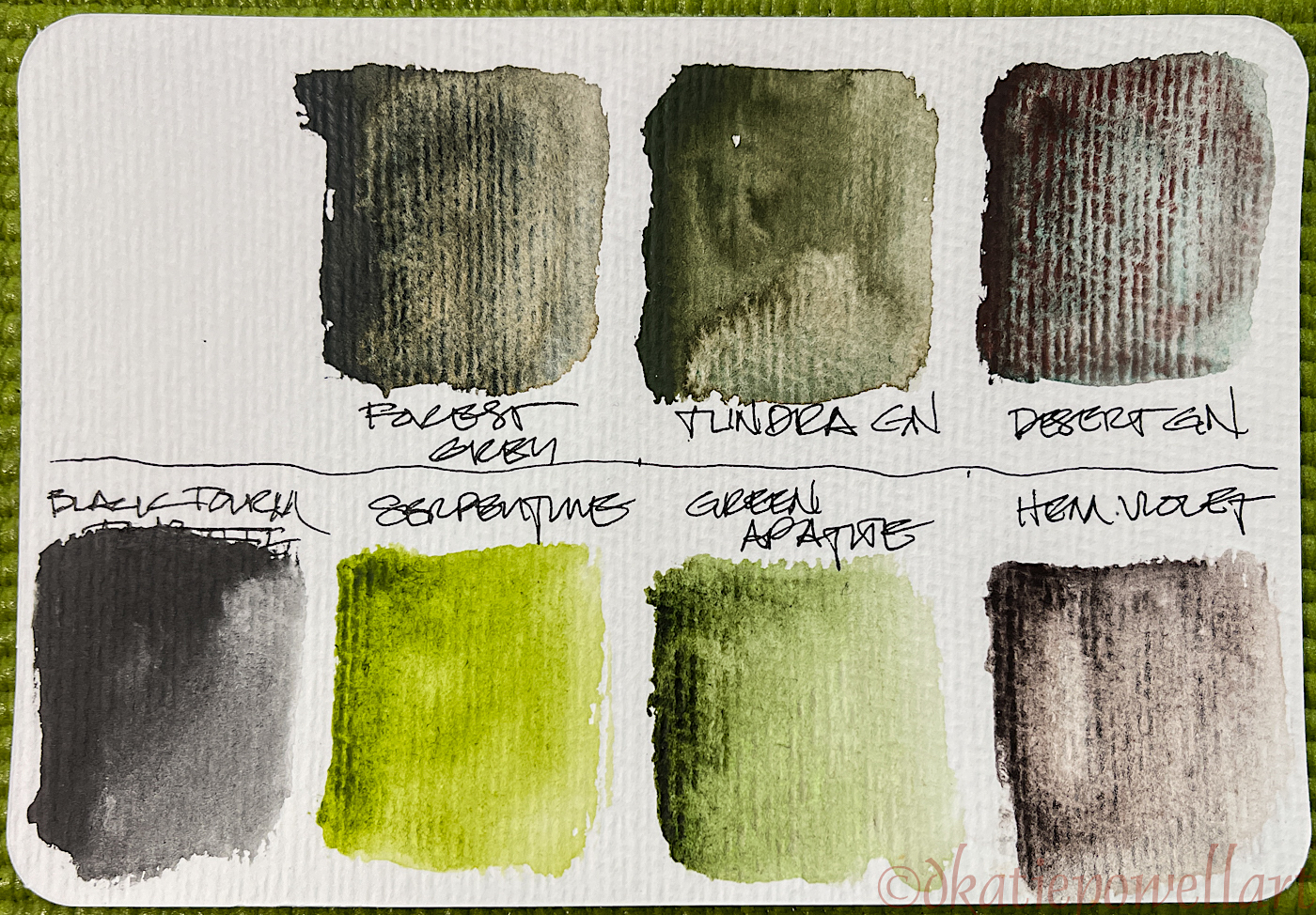
This was the first time getting them wet, and the top row from #964 to #983, above,
are the Supergranulating colors. I was disappointed.
 ☾
☾
I took a page and slopped a on good amount of paint to see how they worked on the smooth paper in a Hahnemühle Nostalgie Sketchbook, which is my go-to everyday sketchbook. More disappointment, though the Desert Green (top left) was interesting. Tundra Violet (top right) had a little bit of possibility, but really, “meh”! They granulated, but I had chosen colors which, as they said, were made
of two pigments which would separate nicely… I hardly see that!
 ☾
☾
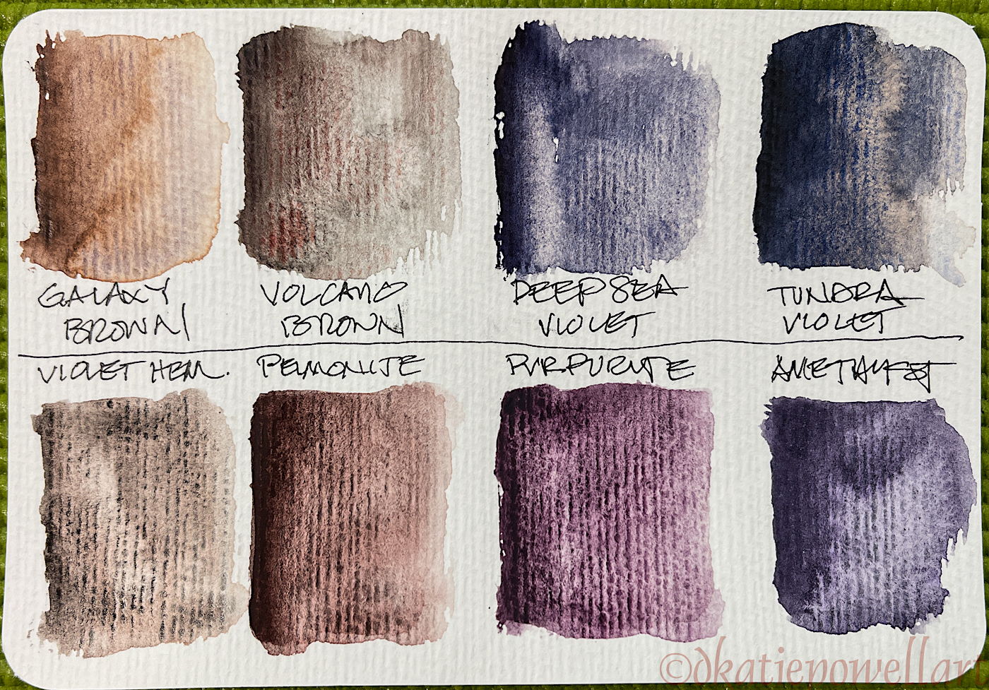
I then compared the Supergranulating paints with Daniel Smiths Primatek paints (also can be purchased at Wet Paint, and my review link here and below), which I admit, I adore. I choose the toothy watercolor paper on Hahnemühle Post Cards.
The Supergranulating colors are above the line in these trials, above,
while the Primateks that might compare are below.
On the Green test card, above, the toothy paper allowed the Forest Grey
to work a bit better though the “two colors” are weak visually,
whereas the Desert Green really lives up to its sales pitch.
 ☾
☾
On the Hahnemühle Post Cards, the Volcano Brown is a bit more interesting, but both browns are weak in pigment compared to the Violet Hematite and Peimonite from Daniel Smith. Tundra Violet was much more interesting on the toothy watercolor paper.
 ☾
☾
The four shown here all performed a bit better on the toothy paper. The color separation was nicer, except for the Glacier Black. On the other hand, the Primateks which are shown below the line are lovely paints, and equally interesting.
So, bottom line, what do I think?


☾
Schminke’s Supergranulating paints do not appear to be as pigmented as Daniel Smiths Primatek paints, the latter which also work beautifully on the smooth paper of Hahnemühle Nostalgie Sketchbook, above. Supergranulating paints seem to work best on textured papers, whether Hahnemühle Post Cards (link to my review) or Cold Pressed papers, but not Hot Pressed papers like the Nostalgie sketchbook.
Below, I offer additionally my original reviews of Daniel Smith Primateks,
of Hahnemühle Post Cards and a video Wet Paint offered
for the Wintertide palette paints on their website.
Finally, this is the way my “Schminke” palette looks today.
It will probably become a bedside palette, where I have lots of little colors to play with,
and can further test the Supergranulating colors.
When I produce some sketches using mostly those paints I’ll share!
 ☾
☾
 To hear about classes, follow me on Facebook
or check out my new, improved dkatiepowellart.com
“Memory is more indelible than ink.”
Anita Loos, Gentlemen Prefer Blondes.
“I think not….”
Me… why I journal!


©D. Katie Powell.
My images/blog posts may be reposted; please link back to dkatiepowellart.
Note: As an Amazon Associate I earn from qualifying purchases.
☾
 As my Patreon supporter, you will have
access to some content not on this website,
sneak previews, goodies, discounts on classes.
I teach architectural sketching,
art journaling (art+writing), creativity, watercolors.
That annoying loud-mouth editor/critic in your head? GONE! How great would that be?


Well, I’m disappointed that you’re disappointed. But glad you went the less expensive route.
LikeLike
Yes… I will love using them on highly textures paper but I won’t probably bother in my everyday sketchbook.
LikeLiked by 1 person