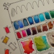
I’ve been asked about my travel palette and here is the primary palette,
though I have others, which I’ll talk about later.
I have had this basic palette for two years with the exception of adding
Da Vinci’s Rose Dore a couple months ago.
- Quinophthalo Yellow DS
- Green Gold DS
- Sap Green DS
- Diopside Primatek
- Amazonite Primatek
- Cobalt Teal MGraham Opaque, not that happy with…
- Cerulean Blue DS
- Prussian Blue Holbein
- Indigo Blue DS
- French Ultramarine (so close to Ultramarine I felt gypped) DS
- Imperial Purple DS
- Brilliant Orange Holbein
- Permanent YO Holbein
- Quin Gold Holbein
- Quin Burnt Orange DS
- Yavapei Primatek
- Hematite Primatek
- Piemontite Primatek
- Brown Iron Oxide DS
- Perelyn Red DS Opaque, not that happy with…
- Rose Dore Da Vinci (Intense color!)
- A mix of Opera / Quin Pink DS (For fun)
I knew I wanted a change, and went in search of a better red, transparent.
*you know how these things get going, tho, and then there is the obsession
and before you know it i was up at midnight thinking about paints…
staring at paints when we were watching the tele*
It hit me.
*WHY did I have the Primateks in my travel palette when I had a great travel palette of my most used Primateks (above, but more on that later)???*

I pulled my Primateks from my Travel palette!
*yes i get geeky happy about these silly things
i stared at the holes and the began thinking about all the possibilities
then began a search for what i might want in an entirely new travel palette…
i know just enough to make this a tough decision
or maybe i am just obsessed with color!*
At first I placed several possible duplicates in my palette to play with, or so I thought,
for a few weeks, maybe over vacation… NOT! I began to play immediately, testing colors.
 I wanted transparent brilliant colors.
The paints I questioned first, above… I mixed them with a dab of Brown Iron Oxide (DS) to see their mixing qualities. Again, I don’t love muddy opaque colors, and so I dropped Cerulean Blue (DS) and the Cobalt Blue from M.Graham
*everyone was in a twitter about Cobalt Blue not too long back and
i bought just because the cool kids were doing it without considering my preferences
and i have so learned my lesson on that this year*
I dropped the Isoindoline Yellow (DS) in favor of Holbein’s Permanent Yellow-Orange.
Again, clear bright is what I want. You can always dull down but cannot brighten!
Aussie Red Gold (DS) and Holbein’s Quinacridone Gold remained —
I love the brilliance of the Aussie but I know what Holbein’s Quin Gold can do —
it is softer and is a better blender than most Quin Golds,
good for skin colors and buildings!
In the end I may dump Permanent Yellow Orange or Aussie Red Gold —
keeping only one…. we shall see!
I kept French Ultramarine (DS). I don’t use many blues but this is a great clear blue.
After looking at every possible purple I own kept the Imperial Purple (DS),
which has touches of pink in it… I love changling colors!
I kept the Phthalo Green 807 (Sennelier, I need more),
which is a great counterpart to the Primatek Amazonite (DS) in my Primatek’s set!

 Oh gads, then there is red and pink…
No such thing as a non-pink transparent red!
I ditched the semi opaque reds and went for the Quinacridone Red from M.Graham.
I am also keeping Rose Dore from Da Vinci,
which is a orange leaning softly toward red…
I decided not to keep Matteo Grilli’s Carmine,
for now, and went with Opera Pink (DS
and yes it is fugative but so GORGEOUS!) I can’t use it for paintings for sale, only journal entries;
I may end up putting the Carmine in its place!
 I revisited Buff Titanium (DS), another color I bought because of peer raves.
*i find it a useless color; I think there are better options*
I tested Mixing it against the lovely soft Verona Gold (DS), and Goethite (DS) —
I also could have used Yavapei (DS), which I prefer.
I use these neutrals most often as building or mixing colors.
I mixed them with four colors from my palette, and as you can see,
the Buff muddies more than the Verona Gold
(Titanium white does that), and the Goethite mixes in the most lovely manner!
I decided to not put any of these in my travel palette (I have the second Primatek palette), and even went so far as to offer the Buff up as a trade on Doodlewash!
Banish thee muddy Buff!
 I rounded out my palette with the final choices above, and may swap them out at
some point, but they balance the brights in ways that may save me time.
I love Indigo Blue (Da Vinci) and Paynes Blue Grey (DS) may not stay, top left;
Da Vinci Hooker’s Green and Undersea Green (DS), middle left;
and Ardoise Grey (Sennelier) and Graphite (DS, for asphalt!), bottom.

I love my palette!!!!
It is exciting to see how the new palette with the
Primatek traveling palette will effect my sketches.
- Quinophthalo Yellow DS
- Green Gold DS
- Sap Green DS
- Da Vinci Hooker’s Green
- Undersea Green (DS)
- Phthalo Green 807 (Sennelier
- French Ultramarine (DS)
- Prussian Blue Holbein
- Indigo Blue (Da Vinci)
- Paynes Blue Grey (DS)
- Imperial Purple (DS)
- Holbein’s Permanent Yellow-Orange.
- Holbein’s Brilliant Orange
- Rose Dore Da Vinci
- Quinacridone Red M.Graham
- Opera Pink (DS
- Aussie Red Gold (DS)
- Holbein’s Quinacridone Gold
- Burnt Sienna Matteo Grilli
- Brown Iron Oxide (DS)
- Ardoise Grey (Sennelier)
- Graphite (DS)
![]() In a forum topic recently I took part in a discussion on whether brands make a difference.
In a forum topic recently I took part in a discussion on whether brands make a difference.
I say YES, brands make a difference!
I look at pigment, binders, cost per mg, and quality control.
There is also the difference in student grade versus artist grade…
I am only considering artist grade.
My opinions about the brands I’ve tried and use, below and in the next post, part two.
I’ve learned a tremendous amount about paint making from our local oil paint company, Gamblin Artist Colors; I work with oils in our conservation business.
One thing I’ve learned is that in the fully mechanized filling process, versus the hand filling of tubes in conjunction with some mechanization, more air becomes trapped.
My experience shows air trapped means tubes of paint dry in the tube,
and I am seeing a lot of that now with Daniel Smith (DS),
which is not the small company once owned by Daniel Smith.
I just filled a full pan with Buff Titanium (all I will ever want before I trade it)
and it continually popped from trapped air.
I’ve had a couple of newer tubes of DS dry out partially.
Yes I know I can peel the tube off and rewet the insides, but I pay for a tube of wet paint!
I also see separation in paint colors that I did not have separation in previously…
 So, I am looking for another go-to brand besides DS now, though I will always be a huge fan of
DS Primateks., Yes, separation is one
thing that happens in some of them.
With Sleeping Beauty Turquoise, for instance,
from now on I will empty most into several
full pans, leaving me a little bit in the tube for
my mixing palette. BTW, Primateks often differ from one batch to the next slightly, as they are basically ground mineral suspended.

I own 2/3’s of the Primateks made — I love them.
There are some I use all the time so I made a Primatek travel pan, above.
A few are not set in stone and I swap them out: Rhodonite, Terre Ecole,
and Hematite Violet are all maybe’s… Monte Amiata (DS) and Goethite (DS)
are both soft Primateks, a bit interchangable.
With this pan and my normal travel palette I have everything I need to travel!
For more about my other “travel” palettes,
including the paints I am now looking to for future,
see my next installment!
To hear about classes, follow me on Facebook or
check out my new and improved dkatiepowellart.com and sign up for my newsletter!
☾
Hahnemühle Nostalgie Sketchbook,
Platinum Carbon Pen with Platinum Carbon ink waterproof cartridges,
Da Vinci, MatteoGrilliArt, Sennelier, Holbein, MGraham,
DS Primatek, and Daniel Smith Watercolors.
©D. Katie Powell.
My images/blog posts may be reposted; please link back to dkatiepowellart.
Image from https://commons.wikimedia.org/wiki/File:El_hombre-p%C3%A1jaro.JPG.
☾
 As my Patreon supporter, you will have
access to some content not on this website,
sneak previews, goodies, discounts on classes.
I teach architectural sketching,
art journaling (art+writing), creativity, watercolors.
That annoying loud-mouth editor/critic in your head? GONE! How great would that be?








This sounds like a great palette! I’d never heard of the Quinophthalo Yellow and it sounds like one I should try.
LikeLike
It is the clearest most transparent yellow I have seen.
LikeLike
One can never obsess about color too much! Best wishes for a healthy New Year!
LikeLike
Never! Happy 2018!
LikeLike
Thank you for this information. What a great palette!
LikeLike
You are welcome! I am loving it! Happy 2018!
LikeLike
Wow, what a wonderfully complex and thorough rundown! I’m hoping to get back to some acrylics myself and haven’t done much with watercolor, but I really appreciate you sharing your process as you quest for just the right colors. Beautiful diagrams, sketching and handwriting too.
LikeLike
Thank You! When I write these things I sometimes wonder if I am just a bit obsessed… then I realize so are other painters! Happy 2018!
LikeLike
you certainly have a knowledge of what you write!! So many paints, so many colors!! I know the colors I like best and do prefer the transparent but I use only a small number of paints, its easier for me to mix my own colors,, I am drooling at your array of colors,, beautiful! Amazing!!
LikeLike
Hi Laurie…
SOME of how I obtained so many paints is that I didn’t know what I was buying two years ago…
Now i am very careful, though I’ve obtained oranges by guessing at what might really be transparent!
However, I’d own nearly every Primatek (except the Lunar colors) if I could!
LikeLike
I always find looking at others pallets inspiring and I love you colors and especially the yellows tones. Quin Pink is a must
LikeLiked by 1 person
I agree! Happy 2018!
LikeLiked by 1 person
Wonderful post. I am interested in that yellow too. Always looking for a very pale yellow. Wishing you and yours a very bright and happy 2018!
LikeLike
It is a great nearly transparent yellow! Happy 2018!
LikeLike
I think our subconscious likes little puns, or suggestions of puns, such as “I made a Primatek travel pan…A few are not set in stone” when referring to watercolors made from stone (minerals). Thank you for taking the time and effort to explain all this; it’s a great kindness.
LikeLike
hahahaaaa I didn’t hear that!
LikeLike
I am amazed about the tubes drying out before using them up. Not a lot of things are what they used to be. It’s a shame. I love how you came to your colors in the travel palette . . thanks for sharing. Blessings, Janet
LikeLike
I’ve been surprised at the DS paints… but i also love many of their colors and will buy!
LikeLiked by 1 person
Pingback: Tools: Taking Another Artist’s Palette Advice | D.Katie Powell Art
Pingback: Tools: Studio Palette, Two | D.Katie Powell Art
Pingback: Tools: Travel Palette, Three | D.Katie Powell Art