
Part 3, on other palettes and changing brands!
Continued from Big Changes in My Travel Palette…

Okay, remember when I said that I was going to stick with December’s travel palette?
I lied… I’ve changed it up twice and think I may have colors to stay with for awhile.


So here are the new colors, which I’ve worked with for a month:
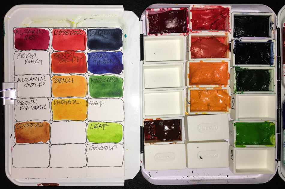
 DS Burnt Iron Oxide * DS Sepia
Holbein Quin Gold * QoR Ardoise Grey (until I use it up)
DS Opera * DS Imperial Purple
MG Quin Red (the clearest transparent red) * DS Carmine
DV Rose Dore * Holbein Brilliant Orange
DS Quinophthalone Yellow * Holbein Permanent Yellow Orange
DS Sap Green * DS Green Gold
DS Terre Green (can go soft or deep) * DV Hooker’s Green
Sennelier Phthalo Green Deep #807 * DS Perylene Green
Holbein Prussian Blue * DS French Ultramarine
DV Indigo * DS Graphite
I’ve been considering paint companies after swearing by Daniel Smith (DS) for years.
I still will buy DS (especially Primatek, which I LOVE),
but I am also trying other paint companies. Why?
DS has grown BIG and been purchased from the original owner.
I see more air pockets in the paint tubes which can lead to paint drying in the tubes.
I have also seen more separation in the newest batches.
Who to move on to of the many companies?
Here is my take on the ones I love so far and the ones I am “meh” about<
not necessarily in order of preference. Bottom line,
I will buy more Da Vinci and Sennelier and MGraham, in that order..
My bias is that I love clear transparent colors, I want to know the light-fast rating.
These are all artists grade paints; and none of these are handmade paint companies.


I tried Holbein paints early, and may try more.
I can’t say they are my favorite paint company,
and I am not sure why, but I love many of their paints.
They make a Quin Gold that I will always have in my palette
(and always make sure I have a couple in storage as I’d die without it)
as it is a softer QG and it makes wonderful skin tones…
I love their Prussian Blue, Permanent Yellow Orange and
their brilliant orange is amazing.
The colors I have are all creamy and have good pigment.


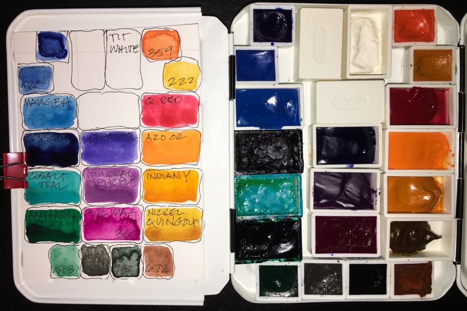
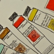
I’ve tried several Da Vinci (DV) paints (above) and I am buying more through a trade —
replacing many Daniel Smith pigments with them as I empty tubes.
They are wonderfully creamy when rewetted in pans,
with amazing high pigment content (look at the colors above!)
I’ve only found one color I am so-so about, the Benzimida Orange DEEP.
I have a dozen colors in my cart and when I have spending cash they will be mine!
The palette above will soon be a Da Vinci palette filled from my trade and new tubes!
I love MGraham (MG, a Portland Oregon company) but they don’t dry
completely or quickly in my end of NW Portland Oregon,
so I don’t use more of them in my travel palette.
Heavenly paints, the richest color. I love all that I’ve bought except the Mineral purple, which is dull dull dull (above, the one between the purple and pink).
I intend to buy more of them for the studio,
though because they stay tacky is a bit of a challenge.
I have a cat hair and fuzz problem: my studio is in our upholstery room and
bits of cotton and airborne fabric from cuttings tend to stick even in MG’s “dry” state.
 Right now they are sharing
a palette, above, with Schminke (half pans) but as I acquire
more they will end up in their own palette. I wrote a review of
the Schminke set. I am so repelled by the muddy colors I don’t
know if I will get back to them.
The pigments that
came in the last set were disappointing… However, several others swear by them and I am getting to try a couple other clear colors out in my trade, so we will see. I can’t recommend.


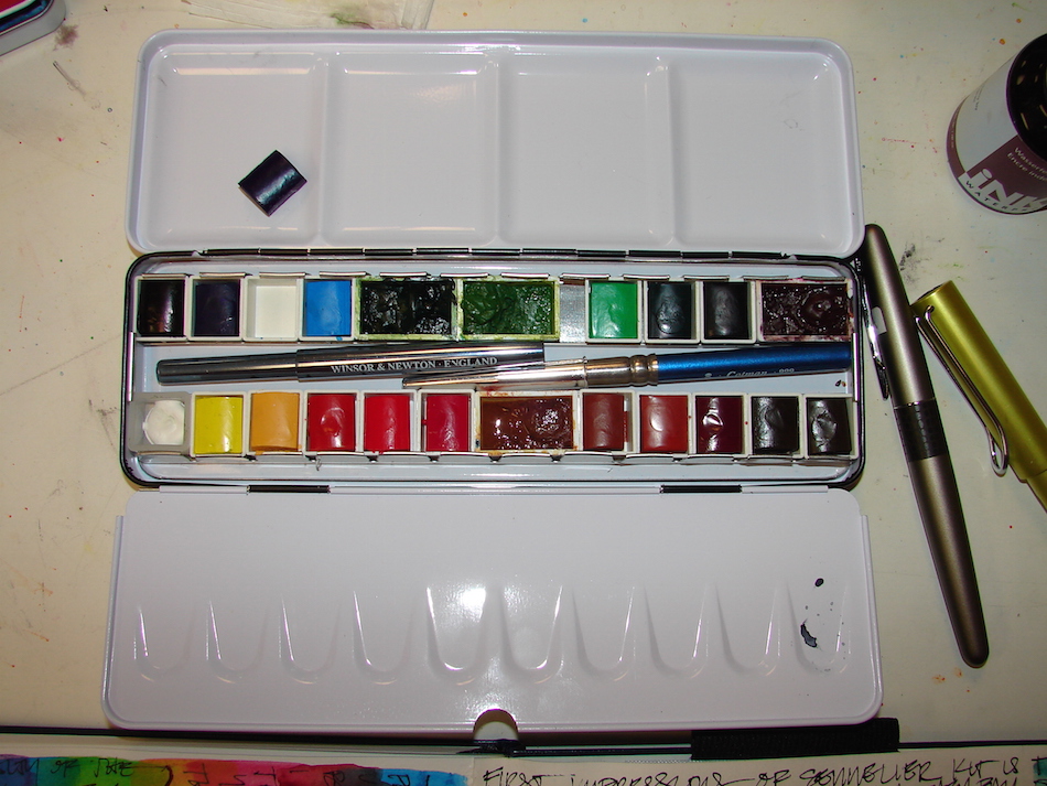 Sennelier is excellent, a bit more expensive. I love their paint.
I bought some in tubes early on, and wish they were a bit less expensive.
My first pan set was Sennelier, and this deal is still on at Blick’s
(shown above as I used it for a time with some additional pans).
I frankly HATE half-pans, which is why I’ve not used the half-pans,
and I’d love to figure a way to rectify that, as the paint is great!


Personally, I have never found a favorite in Windsor Newton (WN).
I know some people love them but I find them to be pricey and meh.
QoR is outrageously priced (smaller tubes for higher prices)
and just don’t get it the draw for the price, though I have two colors I buy from
them because I love them — Green Gold and Bohemian (an umber-y green)
though if I found the same in DV or Holbein I’d stop buying them altogether.


I have travel palettes for specific things.
My painted ladies palette sits at the bottom of my travel bag.
Colors I rarely use, except when out to sketch Victorians in Portland.


And though I own almost all the DS Primateks, I have 9 I use constantly,
and so have another travel pan (below) which houses a dozen colors.
I switch out the Rhodonite, Monte Amiata, and Terre Ecola.


Above are my five go-to “travel” palettes,
and all but the Painted Ladies palette sits bedside.
For info on all my colors, go here…
Finally, I was thinking of doing a post on how to use dot cards
but someone sent me this and when it is done perfectly why redo it?
I give you a (long) perfect explanation of dot cards use!
To hear about classes, follow me on Facebook or
check out my new and improved dkatiepowellart.com and sign up for my newsletter!
☾
Da Vinci, MatteoGrilliArt, Sennelier, Holbein,
MGraham, DS Primatek and Daniel Smith Watercolors.


©D. Katie Powell.
My images/blog posts may be reposted; please link back to dkatiepowellart.
Image from https://commons.wikimedia.org/wiki/File:El_hombre-p%C3%A1jaro.JPG.
☾
 As my Patreon supporter, you will have
access to some content not on this website,
sneak previews, goodies, discounts on classes.
I teach architectural sketching,
art journaling (art+writing), creativity, watercolors.
That annoying loud-mouth editor/critic in your head? GONE! How great would that be?


Did you ever find a transparent yellow? I tried leaving a comment on your blog, but wasn’t allowed to do so…not sure why.
LikeLike
So sorry — there were some glitches going on and maybe they’ve cleared.
Quinophthalone Yellow by Daniel Smith is my favorite yellow. They say Semi-Transparent but I find it to be the most transparent, and low staining. Itis also a clean yellow, with no trace of orange or green!
LikeLike
Beautiful colors! I’ve been enjoying your artwork and can’t wait to see what you come up with in the future.
LikeLike
Thanks Sandra!
LikeLike
I too detest half pans. At one point, I had a half pan I wanted to use, so I gouged out the paint, smooshed it up on a plate with water and a drop of glycerin, then put it in a full pan. Not elegant, but I didn’t waste the paint by not using it, either.
LikeLike
Thanks for that Susan! I hate wasting the paint — and yet I simply avoid them like the plague!
LikeLike
love your luscious colours. Can you recommend a simple palette that is easy to travel with? It’s not the colours I’m wondering about but the palette that carries them?
LikeLike
Yes, going one of two ways… though you are in NZ.
One is that there is a inexpensive palette that I bought from Amazon called Prima… nothing fancy, the colors are student grade, but they are not bad little palettes and I can get 12 full pans in one and there are two mixing wells. I like the tropical… I gave the paints to a kid I know and enjoyed the palette so much I bought another.
Sennelier makes a nice palette and the paints are excellent. I am not a fan of half-pans, but this is a good buy — if you can get it there. They are offering 18 colors — and it is a GREAT pan. Twice as big as the other.
A lot of people swear by Medeen palettes. The price is right — I am assuming that at this time you are nto interested in spending a coule hundred dollars on a palette (I know I am not.) They come in many configurations — but I’ve not tried them.
Sorry I didn’t get back to you this week — an intense week of deadlines moved up and I was swamped.
LikeLike
Thank you so much for your comprehensive answer Katie
LikeLike
Thank you for another really informative post.
LikeLike
You are welcome — hope that helps you a bit!
LikeLiked by 1 person
I’m taking notes!
LikeLike