As my Patreon supporter, you will have
access to some content not on this website,
sneak previews, goodies, discounts on classes.
I teach architectural sketching,
art journaling (art+writing), creativity, watercolors.
That annoying loud-mouth editor/critic in your head? GONE! How great would that be?
I'd love it if you shared this; please mention my blog name!
She gets into goofy moods and has her way with my Uggs.
When she has had her head in my boots for awhile she looks
a bit like she is on drugs…
same as with my out-of-the-box wool slippers!
Wool sniffing! All the cats are into it these says…
we try to keep them off the wool but they insist!
As my Patreon supporter, you will have
access to some content not on this website,
sneak previews, goodies, discounts on classes.
I teach architectural sketching,
art journaling (art+writing), creativity, watercolors.
That annoying loud-mouth editor/critic in your head? GONE! How great would that be?
I'd love it if you shared this; please mention my blog name!
I’ve studied through the slogans a dozen times in my life;
these are my musings on the slogan currently, not a formal interpretation.
For that reason they are less about straight Buddhist teachings,
and I think able to be shared with most practitioners of other faiths or no faith
(unless yours doesn’t allow you to read any other tradition.) If you have time and the inclination, I published the WHOLE thang here!
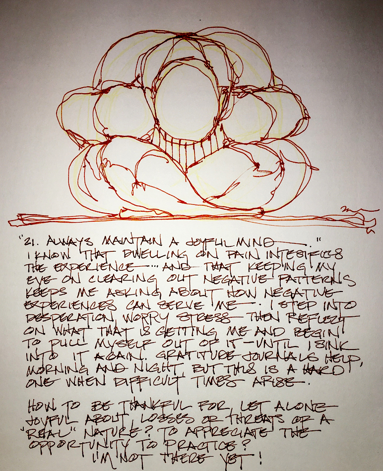
“21: Always maintain a joyful mind.”
I know that dwelling on pain intensifies the experience.
I’ve lived with it since I hurt myself in a dance/horseback riding injury at 17.
If I don’t talk endlessly about it, but maybe acknowledge it to
Mitchell on my worst days, then focus on other things, it seems to mitigate
it more than if I dwell on the pain itself like I did in my 20’s.
I know that when worry and stress or even desperation arise I now tend to ask myself
“What does this worry do for me?” I try to let it go, though I have to ask that again and again in seriously trying times, like bringing my mind back to the breath when I am distracted in meditation. Worry is not the same as problem solving, or checking on something for reassurance. Worry is filling your mind with repetitive negative thoughts.
Gratitude practice helps me tremendously, whether it is writing down one line
of something I am grateful for morning, noon, and night, or upon waking/before sleep writing or drawing gratitude. It may have saved my life.
But to be joyful for the trials of life
as an opportunity to practice? I’m not there yet!
Okay, maybe only in hindsight. Honestly, while walking through piles of
horse shit I am not gleefully happy there must be a pony in here somewhere…
Yellow watercolor pencil with Diamine Ancient Copper.
I was going to wet it and let the ink run a bit but I liked the sketch so let it be..
For now!
In this weekly commentary on the lojong, I am not open comments becoming a debate for people to nitpick Buddhism or my interpretations of Buddhist concepts. (There are lots of places for debates.) I am more interested in hearing about YOUR life or how the lojong affected you or your practice awakening in some manner.
☾
As my Patreon supporter, you will have
access to some content not on this website,
sneak previews, goodies, discounts on classes.
I teach architectural sketching,
art journaling (art+writing), creativity, watercolors.
That annoying loud-mouth editor/critic in your head? GONE! How great would that be?
I'd love it if you shared this; please mention my blog name!
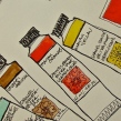
Jazper’s Cortillion is the star, oozing with color!
(BTW, if he doesn’t have it posted ask him!)
It is synthetic pigment (haven’t asked him yet)
and doesn’t respond to water the same way as the blue…
I love the deep brilliant CLEAR red — Yay!
Let’s look at the reds first, because I’ve been looking for a perfect clear red:
It is semi-transparent!
The bottom three were contenders on the web views
(Holbein, Daniel Smith and DaVinci)… I was hopeful…
seemed like they might fit the bill… but not quite.
Trying Pfeiffer Arts and Jazper’s, the clear (pun intended) winner is Jazper’s.
Looking at Pfeiffer’s Lavender Blue against Da Vinci’s and Daniel Smith’s
similar colors, it is lovely and intense! Very Blue!
I started the way all my doodles start…
The architectural earth symbol and the heart!
then added my other favorite doodle symbol, the star!
One is winging its way to a friend, and the other is up on my wall!
As my Patreon supporter, you will have
access to some content not on this website,
sneak previews, goodies, discounts on classes.
I teach architectural sketching,
art journaling (art+writing), creativity, watercolors.
That annoying loud-mouth editor/critic in your head? GONE! How great would that be?
I'd love it if you shared this; please mention my blog name!
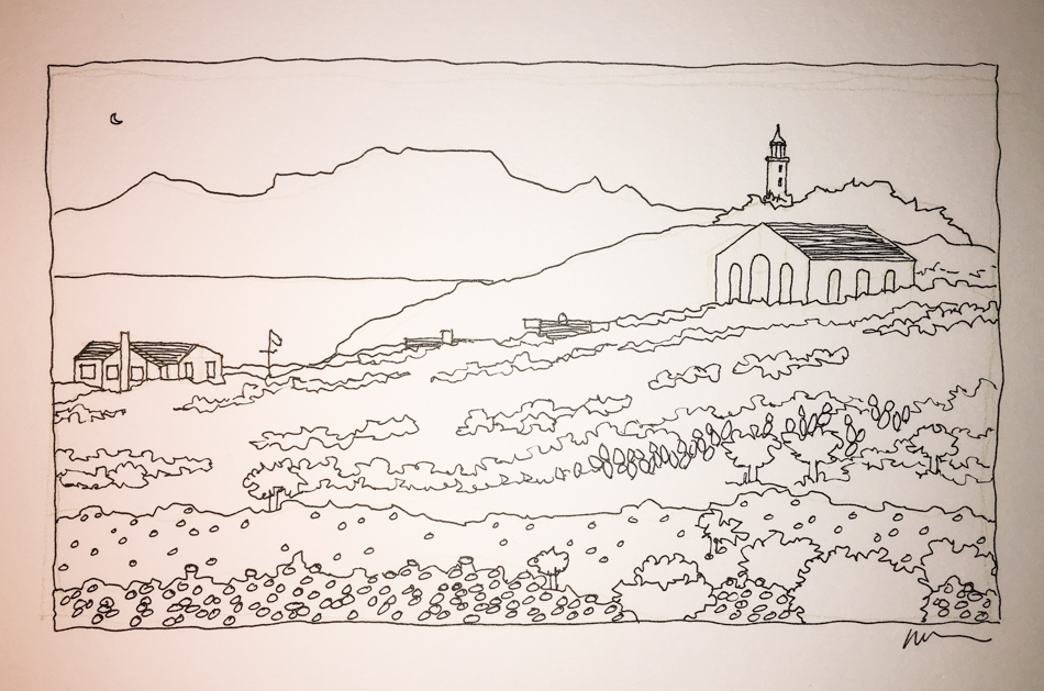
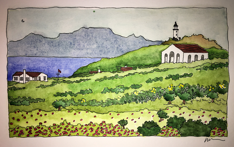
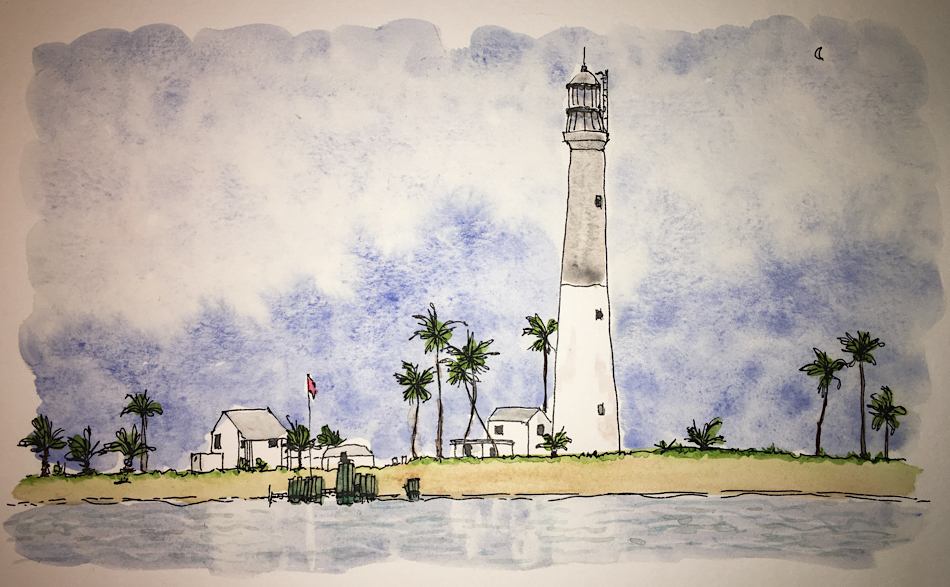
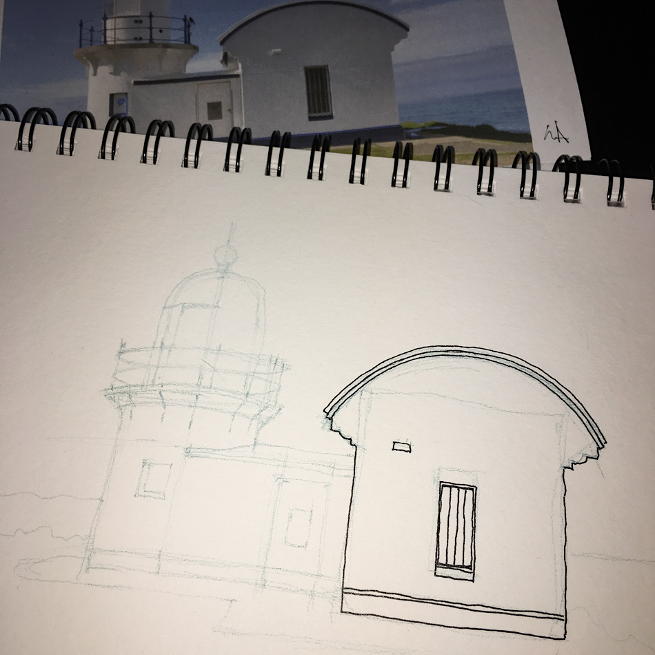
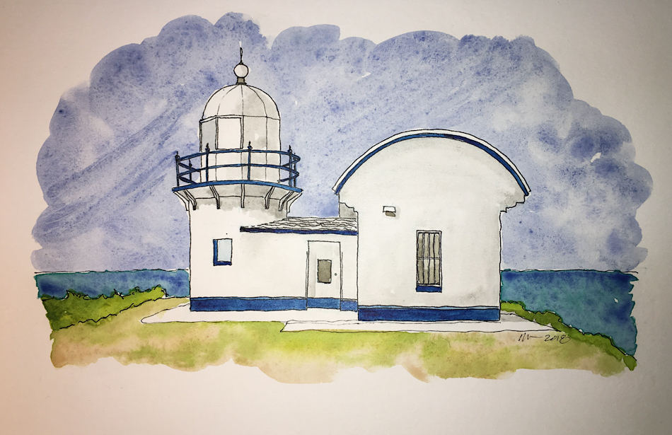
I almost always use a light watercolor pencil to give me guidelines before I ink!
I cannot imagine why anyone would tell anyone NOT to do so unless you
only have a couple of minutes to get an image down…
In this case, as the building is so white, I washed the
entire image with a wet brush before using watercolor.
I love the very modern shape of this Australian lighthouse.
It looks a bit like it is winking at us, no?
To hear about classes, follow me on Facebook or
check out my new and improved dkatiepowellart.com
and sign up for my newsletter!
As my Patreon supporter, you will have
access to some content not on this website,
sneak previews, goodies, discounts on classes.
I teach architectural sketching,
art journaling (art+writing), creativity, watercolors.
That annoying loud-mouth editor/critic in your head? GONE! How great would that be?
I'd love it if you shared this; please mention my blog name!
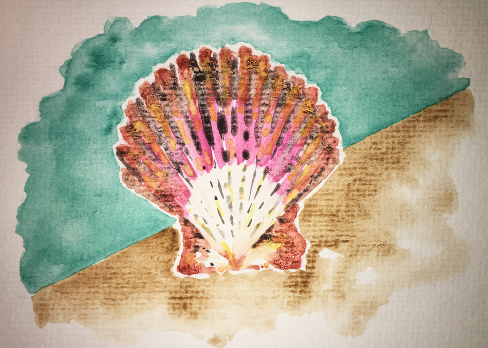
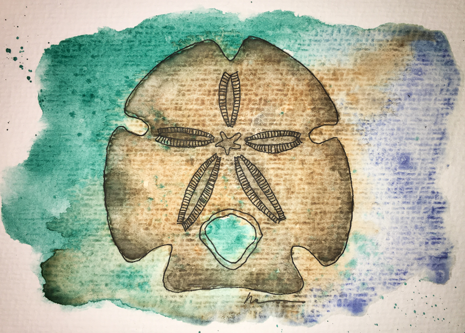
The sand-dollars are from my brother Patrick when he was living on Pismo Beach.
Except this one… from another state altogether!
Sending this one off to my mom…
She saved some great magazines for me to peruse,
and marked great recipes for crab cakes and other seafood dishes! *i can post these because she doesn’t know how to find my blog post!*
To hear about classes, follow me on Facebook or
check out my new and improved dkatiepowellart.com
and sign up for my newsletter!
As my Patreon supporter, you will have
access to some content not on this website,
sneak previews, goodies, discounts on classes.
I teach architectural sketching,
art journaling (art+writing), creativity, watercolors.
That annoying loud-mouth editor/critic in your head? GONE! How great would that be?
I'd love it if you shared this; please mention my blog name!
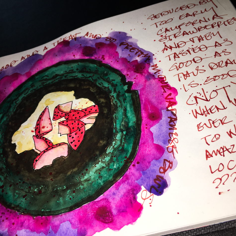
After the month we’ve had, when Valentine’s Day came around all we wanted to do was completely veg out and not see a single human being except each other all day!
We also didn’t want to mess with our bodies in term of lots of sugar and wheat and cream… Health over treats!
Mitchell brought a bouquet from the coop for me
We strung lights (we are nuts for twinkle and kitschy lights!
We turned the ringers
off on the phones,
slept late,
stayed in our pajamas,
binged on old movies,
napped,
I painted more cards and finished this spread,
(did I say napped),
and even had time to read!
Our new favorite lunch is garbanzo beans (chickpeas) roasted in a little olive oil (or bit of juice leftover from a curry chicken) with curry, cumin, salt and pepper.
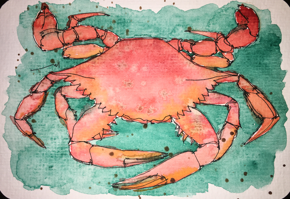
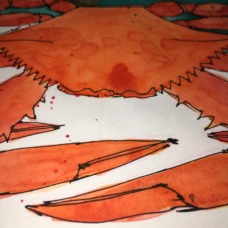
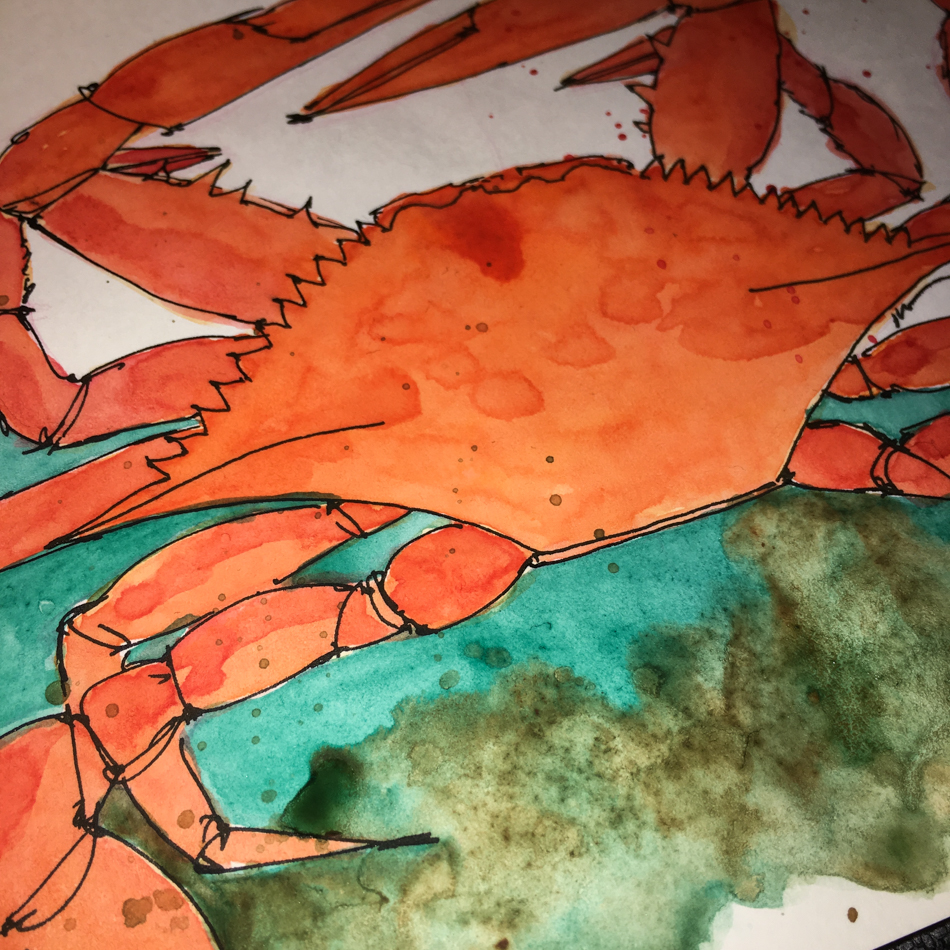
I cleaned the Oregon crabs…
In season they are affordable!
They are a lot of work
but so sweet!
The cats fought us for bites…
we spoiled them as a little goes a long way toward
greatest human points!
We ate dinner on trays watching movies… still in pjs!
Dessert were AlterEco’s
Velvet Truffles and
Black Truffles… the best!
Especially curled up binging on Inspector Lewis!
As my Patreon supporter, you will have
access to some content not on this website,
sneak previews, goodies, discounts on classes.
I teach architectural sketching,
art journaling (art+writing), creativity, watercolors.
That annoying loud-mouth editor/critic in your head? GONE! How great would that be?
I'd love it if you shared this; please mention my blog name!
I’ve studied through the slogans a dozen times in my life;
these are my musings on the slogan currently, not a formal interpretation.
For that reason they are less about straight Buddhist teachings,
and I think able to be shared with most practitioners of other faiths or no faith
(unless yours doesn’t allow you to read any other tradition.) If you have time and the inclination, I published the WHOLE thang here!
A slogan that has many layers for me…
My Buddha ball was sketched loosely (I sometimes make a circle in a watercolor pencil to start but sometimes sketch the entire Buddha loosely). I inked with Robert Osterman’s Jade and a 1.1 stub nib; then DS Sap green finished the his green color.
“20: Of the two witnesses,
hold the principal one. “
This slogan is one I step back into whenever someone accuses me
of feeling or thinking something that is simply not true in my heart/mind.
I find it to be comforting, and calming, which means I can act much more rationally.
False accusations seem to come up more now that people are so fearful and
on edge about politics and our collective futures and
protecting their religious beliefs and right to bear arms and abortion and
whatever the media is whipping people into a frenzy about this week…
all that crazy-making stuff that can bring out the best and worst in anyone.
When I am not particularly angry, it allows me to go soft instead of defensive
in the face of anger and be vulnerable if that is possible
(I am mindful of another persons harmful energy in the moment and may draw boundaries) or at least be open-hearted to see what is going on before I act.
It doesn’t save all situations, and I still can lose a friend if they decide to go that way,
but I can be clear and reflect honestly on what I said, check to see if I contributed to the situation even without intention to cause a ruckus, or if this is a product of
someone else’s imagination… which happens to the best of us when we are in fear.
In this weekly commentary on the lojong, I am not open comments becoming a debate for people to nitpick Buddhism or my interpretations of Buddhist concepts. (There are lots of places for debates.) I am more interested in hearing about YOUR life or how the lojong affected you or your practice awakening in some manner.
☾
As my Patreon supporter, you will have
access to some content not on this website,
sneak previews, goodies, discounts on classes.
I teach architectural sketching,
art journaling (art+writing), creativity, watercolors.
That annoying loud-mouth editor/critic in your head? GONE! How great would that be?
I'd love it if you shared this; please mention my blog name!
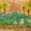
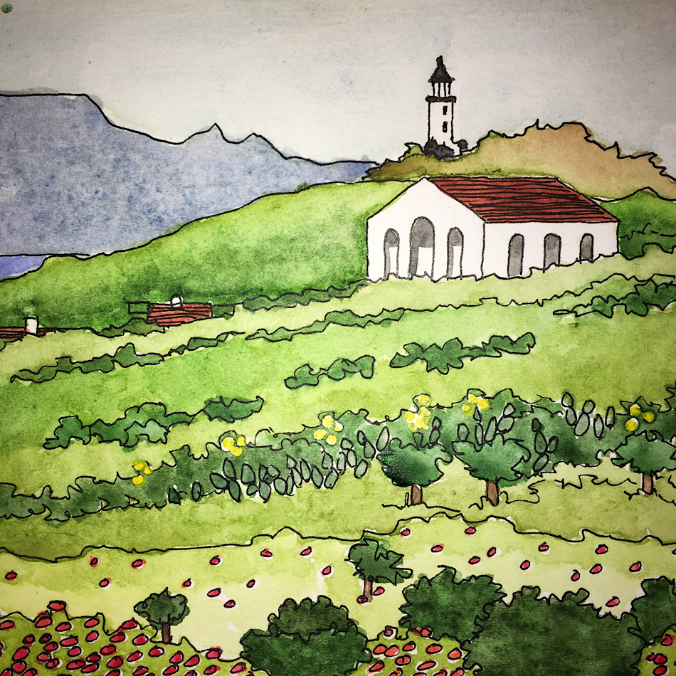
These are my happy place doodles…
Not quite California but reminiscent of a less crowded California!
I had no idea when I began playing with the Hahnemühle Post Cards
that I would love them so much!
I wanted to mitigate the possibility of smudging when sending my postcards, so I coated them with a thin coat of Gamblin’s Cold Wax Medium, using my fingers to apply.
It darkens the colors just a bit — barely noticeable.
Don’t rub too much or you may rub your watercolor, though I have not yet.
Just remember that after you use this, you can’t use your fountain pens
over the top of the wax — so write on the front before you apply!
As my Patreon supporter, you will have
access to some content not on this website,
sneak previews, goodies, discounts on classes.
I teach architectural sketching,
art journaling (art+writing), creativity, watercolors.
That annoying loud-mouth editor/critic in your head? GONE! How great would that be?
I'd love it if you shared this; please mention my blog name!
My favorite thing to do with the Hahnemuhle’s YouTangleart Tiles it to make notes to leave for Mitchell to find: in his calendar, on his computer, on his toothbrush!
They are not built for watercolor, but if I clip the corners down and
they can take a lot of water and straighten out fine!
However, the watercolor doesn’t behave like it does on watercolor paper…
It soaks into the paper and so I need to hit it twice to get the color to pop!
As my Patreon supporter, you will have
access to some content not on this website,
sneak previews, goodies, discounts on classes.
I teach architectural sketching,
art journaling (art+writing), creativity, watercolors.
That annoying loud-mouth editor/critic in your head? GONE! How great would that be?
I'd love it if you shared this; please mention my blog name!
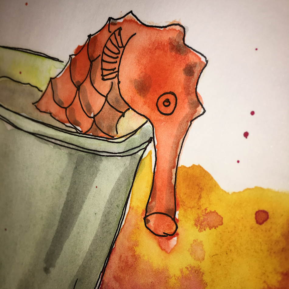
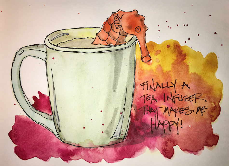
I’ve looked around NW Portland stores for a great tea infuser.
I bought one with some tea and while it might be good, it either doesn’t fit my teapot,
is not great as a cup infuser, and it doesn’t clean well.
Americans, it seems, are all BORING when it comes to our kitchens!
I’ve seen what my Aussie friends use and the infusers are funny or cute or pretty!
I finally went online and looked and came up with two;
this seahorse was taken out first and oh my, I love it!
It makes me happy to see it floating in my cup!
It is really the color of Rose Dore, a watermelon orange,
and it takes me to the ocean when I use it… *0r sometimes I think of Nessie, the Loch Ness “Monster”*
As my Patreon supporter, you will have
access to some content not on this website,
sneak previews, goodies, discounts on classes.
I teach architectural sketching,
art journaling (art+writing), creativity, watercolors.
That annoying loud-mouth editor/critic in your head? GONE! How great would that be?
I'd love it if you shared this; please mention my blog name!
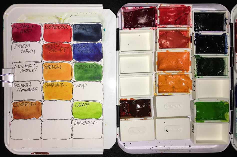
Okay, remember when I said that I was going to stick with December’s travel palette?
I lied… I’ve changed it up twice and think I may have colors to stay with for awhile.
So here are the new colors, which I’ve worked with for a month:
DS Burnt Iron Oxide * DS Sepia
Holbein Quin Gold * QoR Ardoise Grey (until I use it up)
DS Opera * DS Imperial Purple
MG Quin Red (the clearest transparent red) * DS Carmine
DS Terre Green (can go soft or deep) * DV Hooker’s Green
Sennelier Phthalo Green Deep #807 * DS Perylene Green
Holbein Prussian Blue * DS French Ultramarine
DV Indigo * DS Graphite
I’ve been considering paint companies after swearing by Daniel Smith (DS) for years.
I still will buy DS (especially Primatek, which I LOVE),
but I am also trying other paint companies. Why?
DS has grown BIG and been purchased from the original owner.
I see more air pockets in the paint tubes which can lead to paint drying in the tubes.
I have also seen more separation in the newest batches.
Who to move on to of the many companies?
Here is my take on the ones I love so far and the ones I am “meh” about<
not necessarily in order of preference. Bottom line,
I will buy more Da Vinci and Sennelier and MGraham, in that order..
My bias is that I love clear transparent colors, I want to know the light-fast rating.
These are all artists grade paints; and none of these are handmade paint companies.
I tried Holbein paints early, and may try more.
I can’t say they are my favorite paint company,
and I am not sure why, but I love many of their paints.
They make a Quin Gold that I will always have in my palette
(and always make sure I have a couple in storage as I’d die without it)
as it is a softer QG and it makes wonderful skin tones…
I love their Prussian Blue, Permanent Yellow Orange and
their brilliant orange is amazing.
The colors I have are all creamy and have good pigment.
I’ve tried several Da Vinci (DV) paints (above) and I am buying more through a trade —
replacing many Daniel Smith pigments with them as I empty tubes.
They are wonderfully creamy when rewetted in pans,
with amazing high pigment content (look at the colors above!)
I’ve only found one color I am so-so about, the Benzimida Orange DEEP.
I have a dozen colors in my cart and when I have spending cash they will be mine!
The palette above will soon be a Da Vinci palette filled from my trade and new tubes!
I love MGraham (MG, a Portland Oregon company) but they don’t dry
completely or quickly in my end of NW Portland Oregon,
so I don’t use more of them in my travel palette.
Heavenly paints, the richest color. I love all that I’ve bought except the Mineral purple, which is dull dull dull (above, the one between the purple and pink).
I intend to buy more of them for the studio,
though because they stay tacky is a bit of a challenge.
I have a cat hair and fuzz problem: my studio is in our upholstery room and
bits of cotton and airborne fabric from cuttings tend to stick even in MG’s “dry” state.
Right now they are sharing
a palette, above, with Schminke (half pans) but as I acquire
more they will end up in their own palette. I wrote a review of
the Schminke set. I am so repelled by the muddy colors I don’t
know if I will get back to them.
The pigments that
came in the last set were disappointing… However, several others swear by them and I am getting to try a couple other clear colors out in my trade, so we will see. I can’t recommend.
PHTHALO 226
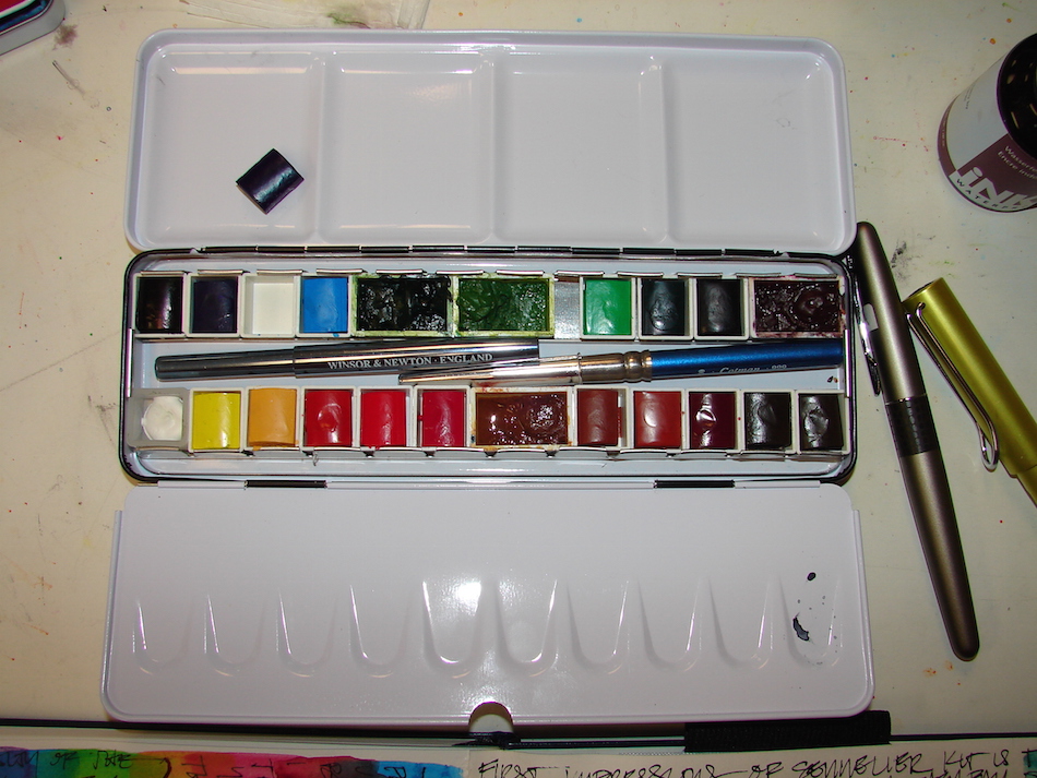
Sennelier is excellent, a bit more expensive. I love their paint.
I bought some in tubes early on, and wish they were a bit less expensive.
My first pan set was Sennelier, and this deal is still on at Blick’s
(shown above as I used it for a time with some additional pans).
I frankly HATE half-pans, which is why I’ve not used the half-pans,
and I’d love to figure a way to rectify that, as the paint is great!
Personally, I have never found a favorite in Windsor Newton (WN).
I know some people love them but I find them to be pricey and meh. QoR is outrageously priced (smaller tubes for higher prices)
and just don’t get it the draw for the price, though I have two colors I buy from
them because I love them — Green Gold and Bohemian (an umber-y green)
though if I found the same in DV or Holbein I’d stop buying them altogether.
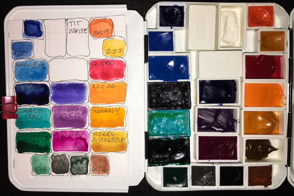
My painted ladies palette — for Victorian homes.
Victorian Homes on Glisan.
I have travel palettes for specific things.
My painted ladies palette sits at the bottom of my travel bag.
Colors I rarely use, except when out to sketch Victorians in Portland.
And though I own almost all the DS Primateks, I have 9 I use constantly,
and so have another travel pan (below) which houses a dozen colors.
I switch out the Rhodonite, Monte Amiata, and Terre Ecola.
My current travel palette
Primateks I use all the time
Da Vinci
M Graham + Schminke
My painted ladies palette — for Victorian homes.
Above are my five go-to “travel” palettes,
and all but the Painted Ladies palette sits bedside.
Finally, I was thinking of doing a post on how to use dot cards
but someone sent me this and when it is done perfectly why redo it?
I give you a (long) perfect explanation of dot cards use!
To hear about classes, follow me on Facebook or
check out my new and improved dkatiepowellart.com and sign up for my newsletter!
As my Patreon supporter, you will have
access to some content not on this website,
sneak previews, goodies, discounts on classes.
I teach architectural sketching,
art journaling (art+writing), creativity, watercolors.
That annoying loud-mouth editor/critic in your head? GONE! How great would that be?
I'd love it if you shared this; please mention my blog name!
Nothing quite says home like the flowers I used to see in spring in California!
Behold the California Poppy! *i think i gave her a bit of an art nouveau feel*
As my Patreon supporter, you will have
access to some content not on this website,
sneak previews, goodies, discounts on classes.
I teach architectural sketching,
art journaling (art+writing), creativity, watercolors.
That annoying loud-mouth editor/critic in your head? GONE! How great would that be?
I'd love it if you shared this; please mention my blog name!

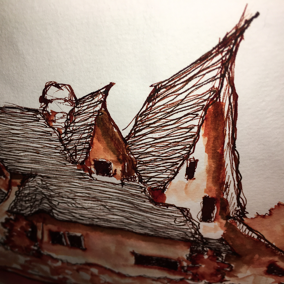
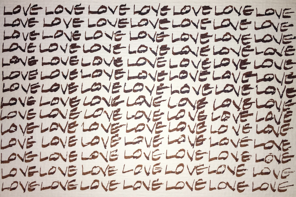
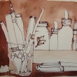
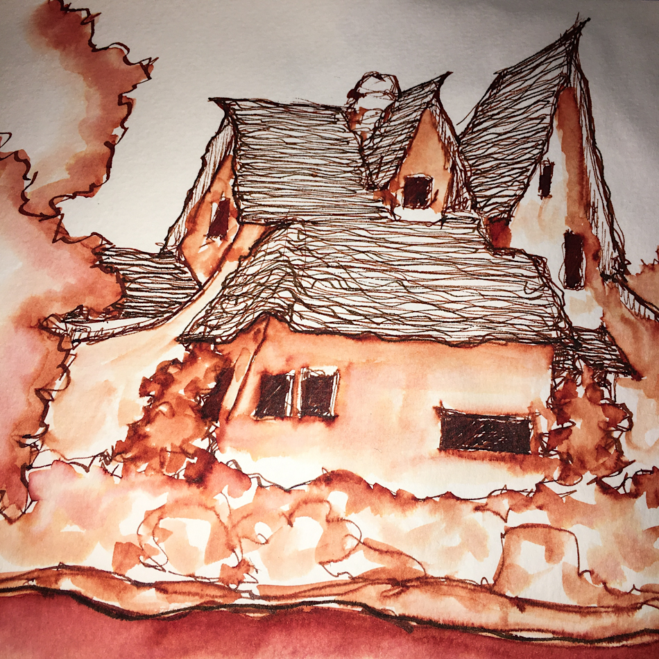 I used all inks on this one…
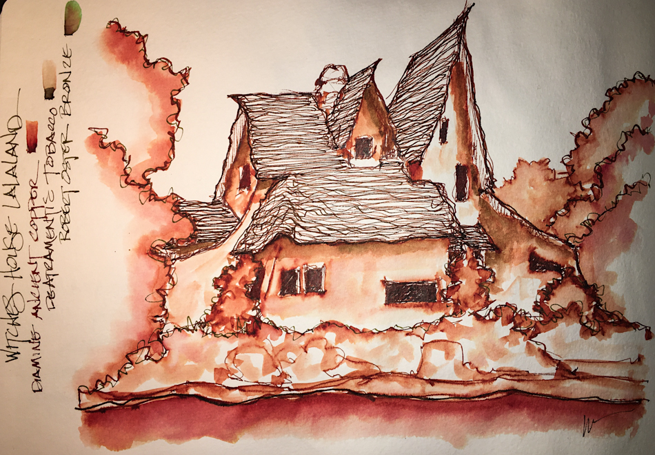 I finally added both De Atramentis Tobacco and Robert Oster Bronze and am happy…
 To hear about classes, follow me on Facebook or
 As my Patreon supporter, you will have


