


Yesterday I played with MGraham Ultramarine Violet (left)
and Daniel Smith Cobalt Blue Violet (right) here.
Today I am showing you my mainstream (not small manufacturers) purples,
and talking about why I choose certain paints as KEEPERS…
Keepers have a permanent place in my main travel palette or a secondary palette.
Some paints are effected by climate (MGraham/honey base) and I live in a wet cool climate, so consider that when someone else has a great experience with a paint.
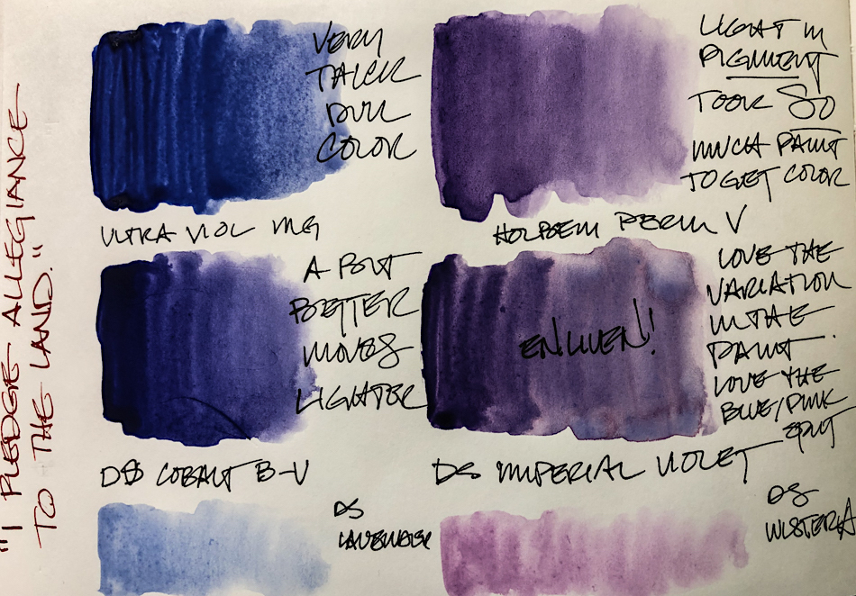
MGraham Ultramarine Violet is never going to be a keeper.
Ultramarine is a lovely transparent pigment so I am flummoxed as to
why this paint is so clay-like in texture. I’ve used it with both little water and
lots of water (wash) and it really doesn’t get better.
KEEPER: Daniel Smith Cobalt Blue Violet is much more lively and transparent!
It is a good violet and I will keep it in rotation in my travel palette.
Both Daniel Smith Lavender and Daniel Smith Wisteria are pastels and
herein is a lesson in good paintmaking — These pigments make for an opaque paint yet Daniel Smith gives them vibrancy and life, so KEEPERS! These both live in my
Victorian palette and I do reach for them, but in limited situations.
KEEPER: Daniel Smith Imperial Violet is one of my favorite purples.
Lively color for a deep purple, and I love the slight color separation into blues and pinks.
This one is in my regular travel palette and is not in rotation. FAVORITE!
Holbein Permanent Violet I consider a good student grade paint.
I recommend it as such, not an as artist pigment. Why? It took a LOT of paint for me to get the deep wash you see here — twice as much as Imperial Violet — but at least I could get a deep wash! Student grade paints are such a disappointment when you are starting out because one thinks it is technique, not paint, that causes poor washes!

Da Vinci Mauve and Da Vinci Permanent Magenta are both rich pigmented colors,
but they feel a little flat to me (of course neither are favorite colors anyway.)
I keep them in a DaVinci Travel palette but can’t recommend them.
DS Primatek are all KEEPERS! I love them — I use them for so many effects.
I tend to use Purpurite much more often than Amethyst but enjoy them both.
I also have a travel palette of only Primateks…
KEEPER: Holbein Bright Violet is a great pigmented color, closer to magenta…
It has a place in my palette when I want this color — it is lovely and creamy smooth!


 To hear about classes, follow me on Instagram, Facebook
or check out my new, improved dkatiepowellart.com
“Memory is more indelible than ink.”
Anita Loos, Gentlemen Prefer Blondes.
“I think not….”
Me… why I journal!
Hahnemühle Nostalgie Sketchbook,
Platinum Carbon Pen with Platinum Carbon ink waterproof cartridges,
Da Vinci, Holbein, MGraham, DS Primatek and Daniel Smith watercolors.


©D. Katie Powell.
My images/blog posts may be reposted; please link back to dkatiepowellart.
Note: As an Amazon Associate I earn from qualifying purchases.
☾
 As my Patreon supporter, you will have
access to some content not on this website,
sneak previews, goodies, discounts on classes.
I teach architectural sketching,
art journaling (art+writing), creativity, watercolors.
That annoying loud-mouth editor/critic in your head? GONE! How great would that be?


