


Changes in my travel palette!
Autumn I tend to clean more than spring, and reorder…
Getting ready for painting season, as I like to paint outdoors
more in the months that are not HOT.
In Spring I tried the double Derwent palette above.
The truth is that it is great travel storage if you were staying in a place
and could take a mixing palette, but otherwise, not so good for travel.
I was seduced by so many color options…
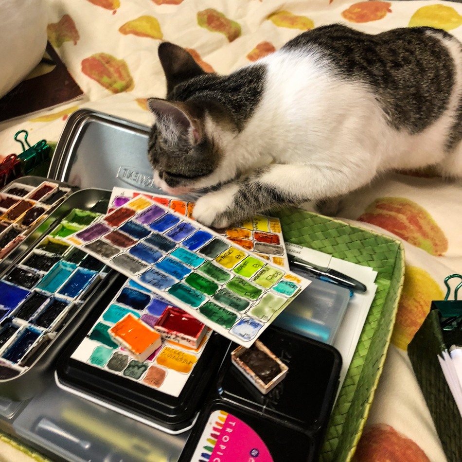
I stayed in bed one day and reorganized my travel palettes
into a way I actually will use them.
I had lots of help…
Below are my new (reorganized old) travel palettes,
including my all time favorite colors (bolded).
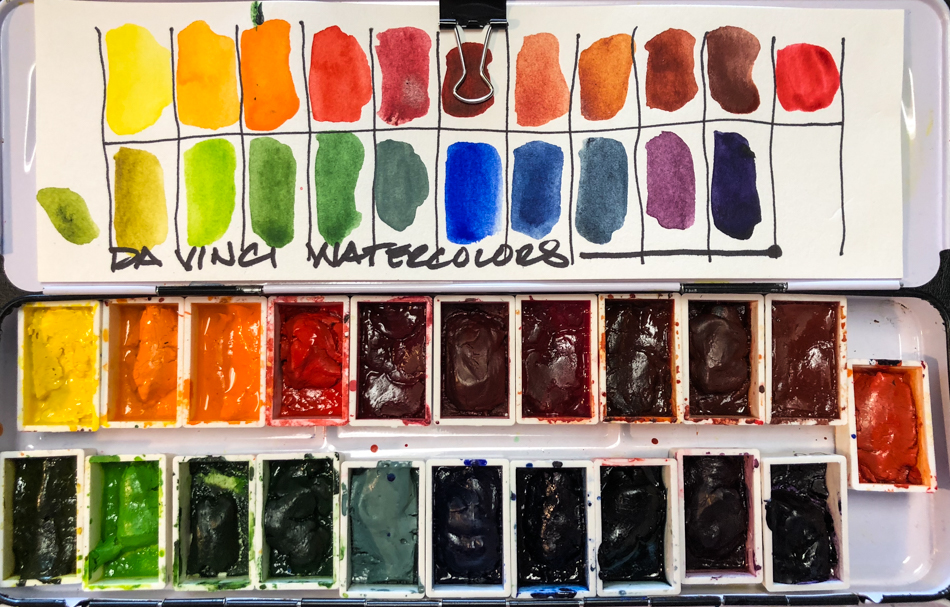
 My Da Vinci palette is above,
and can hold all my pigments from
Da Vinci. There is room for me to substitute four colors far right in case I take only one palette into the field. This palette did not change much, and holds
these favorites: Rose Dore,
Alizarin Red, Alizarin Gold,
Green Gold, Quin Gold, Sap Green,
Indanthrone Blue, Indigo Blue.
If I was to take one palette it would be
this one with four DS Primateks
substituted at the end. If I am painting all day then I take the first three pallets,
which fit nicely in my Harbor Freight bag with my pens, brushes, journal and water.
(I painted it bright yellow orange.)


“I can help here too… Maybe even fit in this bag!”
*btw don’t buy from amazon… twice as much. harbor freight is $11.*


I reserved another medium mixing palette for the Daniel Smith Primateks, above.
I am lost without them. I go through a tube a year of the following “Genuine” pigments: Hematite, Piemonite, Yavapei (1.5 per year, infinitely more versatile that Goethite), Lapis (1.5 per year), Amazonite, Serpentine, Diopside.
I usually don’t use the pinks and purples but decided to pop them in
for a change to see if they become important to me.


I set aside a second medium palette for other favorite and mixed colors:
Savitri’s Siamese cat colors, mixed paints in her fur colors,
a few favorite bright Daniel Smith or Holbein or Sennelier colors:
- DS Ultramarine Violet
- Holbien Permanent Violet
- DS Imperial Violet
- DS mix of Opera Pink and Quin Rose
- Holbien Benzimida Orange
- Holbein Permanent Yellow Orange
- DS Quinophthalone Yellow (my favorite yellow)
- Holbein Quin Gold (My favorite Quin Gold, soft and creamy)
- Sennelier Hookers Green
- Sennelier Phthalo Green 807
- Sennelier Phthalo Blue Green 324
- Holbien Prussian Blue
- DS Paynes Blue Grey
- DS Monte Amiata (Savitri)
- DS mix Ardoise Grey and Monte Amiata (Savitri)
- DS Ardoise Grey (Savitri)
- DS Sepia (Savitri)
- DS Nickel Quin Gold (Savitri)


The third palette is MGraham, a couple of Schminke colors, plus a few handmade paints:
MatteoGrilliArt, JazperStardust, PfeifferArt.
The latter may be added as I want them. No favorites here, but colors I am trying out.


I left my Painted Ladies palette intact — The one I use to paint Victorians!
No favorite colors, but when you need to paint a Victorian home, these colors are amazing.
Now that I’ve got all these watercolors sorted:
Tomorrow, Inktober!
 To hear about classes, follow me on Facebook
or check out my new, improved dkatiepowellart.com
“Memory is more indelible than ink.”
Anita Loos, Gentlemen Prefer Blondes.
“I think not….”
Me… why I journal!
Da Vinci, MatteoGrilliArt, JazperStardust, PfeifferArt, Sennelier, Holbein,
MGraham and DS Primatek and Daniel Smith watercolors.


©D. Katie Powell.
My images/blog posts may be reposted; please link back to dkatiepowellart.
☾
 As my Patreon supporter, you will have
access to some content not on this website,
sneak previews, goodies, discounts on classes.
I teach architectural sketching,
art journaling (art+writing), creativity, watercolors.
That annoying loud-mouth editor/critic in your head? GONE! How great would that be?


