


Loving the options of the two types of Hahnemühle Post Cards!
Cold pressed on the left, above, and rough on the right.


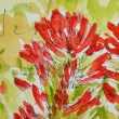
I found a way in to painting without line-work
through a fellow painter, Tom Brudzinski… His is more my style than Marc Holmes!
He articulates graphic shapes not lines…. And color!
I tried the posies and felt good about them…
The rough texture or the smoother cold press offer options!


And they leave for their destinations!


To hear about classes, follow me on Facebook or
check out my new and improved dkatiepowellart.com
and sign up for my newsletter!
 ☾
☾
Hahnemühle Post Cards, Da Vinci and MGraham watercolors.


©D. Katie Powell
My images/blog posts may be reposted; please link back to dkatiepowellart.
☾
 As my Patreon supporter, you will have
access to some content not on this website,
sneak previews, goodies, discounts on classes.
I teach architectural sketching,
art journaling (art+writing), creativity, watercolors.
That annoying loud-mouth editor/critic in your head? GONE! How great would that be?


These flowers are lovely. Happy PPF!
LikeLike
Thanks!
LikeLike
Luv your flowers tgey look like stenciled forms
Much♥️love
LikeLike
Thanks Gilena!
LikeLike
Wow I really love these. They look so free and open, if that makes any sense at all.
LikeLike
It does… Thanks Nicole.
LikeLike