I am also a conservator, and we have the charge to recreate the first flag of the
State of Washington. I will be creating the painted medallion on the flag, and doing the hand stitching (endless), and Mitchell is recreating the pattern for the flag.
I thought you all might like to see the other painting I do!
From our MPF Conservation blog:
I created test sheets for oil versions of George.
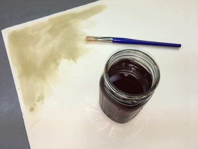
Two coats of shellac seals the paper for the oil paint.
It is nice to use old shellac which can no longer be used on furniture!
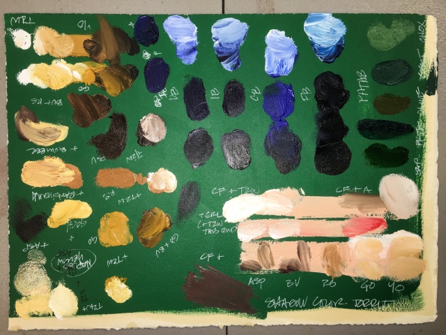
Phthalo Green and Chromium Oxide Green mixed match the green silk.
I want to paint the paper I am doing trials on green, because paints will change considerably when painted on bright white, cream, or the lovely green of the silk.
 I also painted a sheet to go behind my mixing tray. I tore the rectangular sheets so
they created the squares on which I would paint George’s face, leaving me test papers.
I am mixing the paints today, and they will completely dry before I venture close
to the historic flag with the sample sheets. NO chances are taken, ever!
It appears the darker colors will be the ones I want to double-check
against the historic flag, because the darker blues and greens and browns
tend to change radically when a flash hits them, shown above,
and I am mixing against images, not the historic.
A side note: I had a color blind friend who decided that he wanted to please himself in his apartment, instead of having someone else pick paint colors for his friends to see.
I won a bet against my whole tribe of architectural buddies that I could match exactly the hideous salmon pink paint color he painted his kitchen! This is to say I am fairly confident I will come close in these colors, to blending the right mixes for George.
I have a few zones of color to explore in matching and blending:
coat (collar and body, buttons and epaulets); hair; skin; background, which is a green
that changes over the body of the medallion from a greyed-green to a blue-green.
The collar is a blend of Naples Yellow, moving to a creamier version with the Titanium-Zinc White, and going darker with Raw Sienna, Asphaltum, or Burnt Umber. I will want to hold up the darker mixtures to double-check them against the original flag.
The buttons and epaulets demand brilliance with added Gold Ochre.
(Gold Ochre is the second from the bottom; Yellow Ochre below is too dull.)
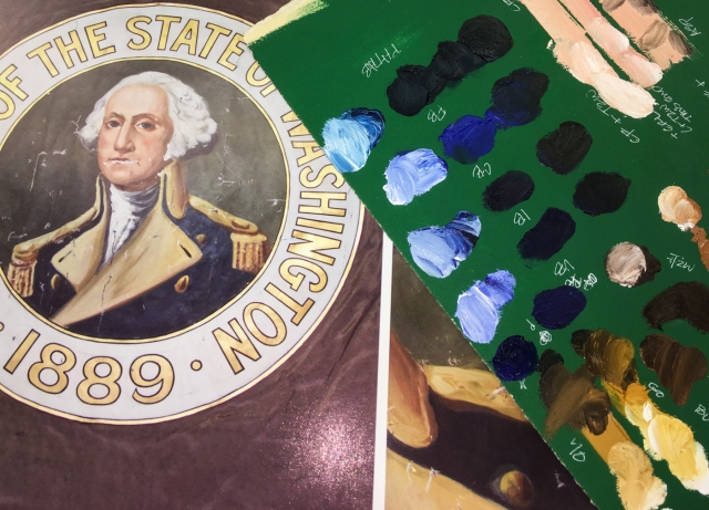 The blues were hard to see when looking at the images.
I see the body of the uniform as an Indanthrone or Prussian base,
with Cobalt Blue added to either to mix. The blue is not one color,
but changes across the uniform as the light and shadow play.
 I was prepared to mix George’s skin tones, but Gamblin’s Caucasian Flesh was a
such a good base match from which to mix. George’s face is a challenge to reproduce, because I am not adept at portraits, and his is full of color! I am looking it not as if it is a face, but a landscape to reproduce. For the slight blush or ruddy skin tone it will be Cadmium Red Light or Medium. Gold Ochre plays into areas around the eyes
and just above the eyebrow. I played with the d=shadow, adding Asphaltum,
Burnt Umber, and Raw Sienna… none were quite right. I remembered Robert Gamblin talking about Torrit Grey, and squished all my palette paint leftovers together,
and mixed them into a grey — THAT GREY looks like the right shadow color!
The green background moves from a darkened Phthalo Green (slightly blue)
to Chromium Oxide Green highlighting his face, lifting your eyes up.
The greens chosen to mix (bottom of the blues) are the second, fourth, and fifth —
with a little Naples Yellow thrown in!
George’s hair is not pure white, though he has a good deal of white in it.
I see touches of grey, and Gamblin’s Warm Grey or a blend of Naples Yellow and Titanium-Zinc White. In shadow at the bottom of the curls is Paynes Grey.
I cannot hope to create an exact replica, but I am attempting to recreate
the painted medallion with the types of strokes and colors and looseness
the original artist used when s/he painted George.
To begin at the beginning, visit Washington State Flag, 1.
MPFC will be posting from time to time as we make interesting progress to share;
sign-up for posts if you are interesting in following the progress.
Visit our next post, Washington State Flag 9, when published!
©MPF Conservation. May be printed for your own use.
May be reposted if our url + copyright is used as reference.









Your precise eye for colour is impressive as is your dedication to getting this project perfectly right. I look forward to seeing the next step.
LikeLike
I have a good natural eye for matching color…. Now we get to see if I can paint with oils in this venue! AAAACK!
LikeLiked by 1 person
What an amazing duo you are Kate.
LikeLike
You think so? We like to think so!
LikeLike
It’s a wonderful project Katie. I can imagine you taking a very deep breath before you commence!
LikeLike
Oh yes. Tomorrow is actual paint day!
LikeLike
Oh my gosh! Maybe a bit jealous that you get paid to do this. I’ve long admired your free-time art, but I didn’t know that you also had such a glamorous daytime existence. Love that you shared this glimpse of the working girl. 🙂
LikeLike
Today, also with a cold, I am venturing into the wild world of oil on silk. Quite a bit nervous… if the cold gets me I may wait one more day. Any excuse!
LikeLike