
Our Virtual Sketching group was led this month by Toni,
who took us to the island of Angra do Heroísmo.
 I went back to push the boundaries of using inks and watercolors,
wanting to sketch impressions of Angra do Heroísmo.
Saturated colors, palms and monkey pines, lots of trees in a beach community,
which reminded me a lot of home, So Cal.
To relieve the problems I was having with some of my inks feathering, I decided to stick to just one ink, no mixed inks, and let them completely dry between applications. I had another disaster, and published, finally why, and how I found out about that!
 Pencil sketch to loosely figure out where I would put my impressions.
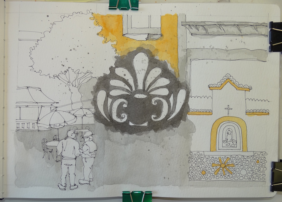 Laying in Noodler’s Lexington Grey and Super5 Delhi.
The grey figure is from a street corner, and I think it looks like a headdress on a dancer!
 De Atramentis Document Turquoise added.
 Super5 Dublin and Australia, De Atramentis Document Red and Green,
ALL laid in separately and full drying time in between layers.
Note the double layers of Super5 Delhi around the window above,
and then below, when I add watercolors.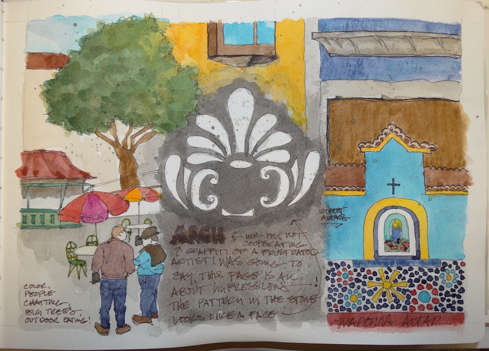 Inks done, I began topping with watercolors. One thing I see after all this is that the watercolors are infinitely more vibrant than the inks. Above, the yellow of the window pops with DS Hansa Medium. The blues saturate with DS Cerulean, and
Greenleaf & Blueberry Mayan violet. In each case, I was able to really saturate the colors to the bold I saw on the streets. I don’t know if I will ever be able to do that with inks.
But I will keep playing with them because I love their effects for some things. It is all about knowing what you want, I think, and when to choose what medium.
In my next post I will talk about the feathering inks. ARGH!

 Moleskin 8×11 watercolor journal, Pentalic HB woodless pencil, Platinum Carbon pen
AND Noodler’s, De Atramentis Document, and Super5 inks, behaving well until the end.
Daniel Smith and Greenleaf & Blueberry Watercolors, .

I started a Facebook group page (you must join to view) to allow everyone to share their virtual sketches, and also where we will, from time to time, take virtual sketch walks together. Come join us On Facebook if you are inclined!
If you want to know more about what a virtual sketchwalk is review my first post.
There are a few more notes/pointers on our first walk through Laguna Beach, California.
I also created an accompanying Flickr group!
I agree to Creative Commons Attribution-Non-Commercial 4.0 International License, which you can learn more about by visiting the site, or,
visit my web page for a more user-friendly summary on my terms.
My images/blog posts may be reposted; please link back to dkatiepowellart.


The addition of the watercolors really makes the colors more vibrant. Nice!!
LikeLike
Yes, so much so!
LikeLike
Oh love the ‘headdress’ design! And the yellow and turquoise combo is fab 🙂
LikeLike
Thanks, yes to color! I think I was born Mexican, really. I love the random colors of Angra and Mexico and Tibet. I remember when I was teaching at UCLA I overheard a design instructor teaching color and saying that yellow and purple don’t go together. The following week I brought her Johnny Jump-ups (a type of pansy, yellow and purple-blue). ‘Nuf said!
LikeLiked by 1 person