Robert Oster Signature Inks is having their 7th Anniversary,
and have created three special inks for their celebration:
Their first true black, a beautiful purple storm, and a shimmering green-gold jewel:
Let’s look at each anniversary ink.
Remember that others review these inks just for writing;
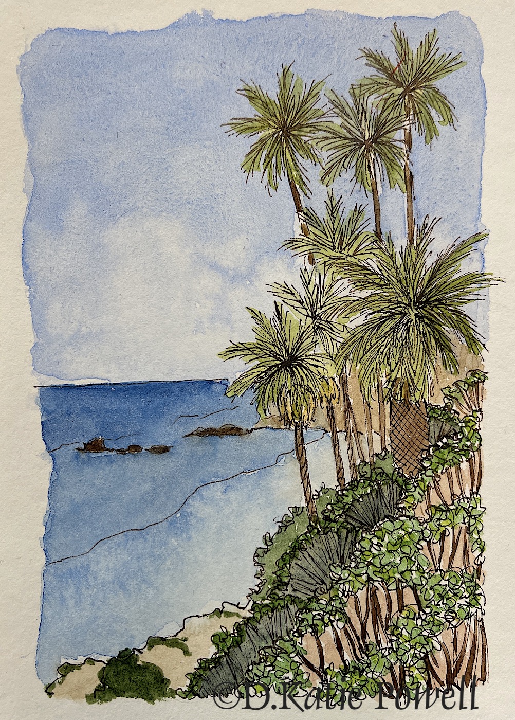
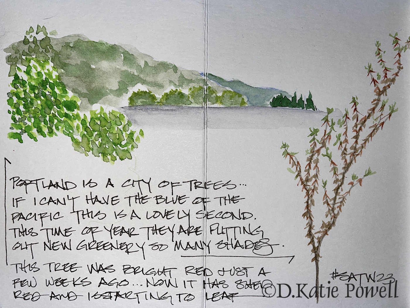
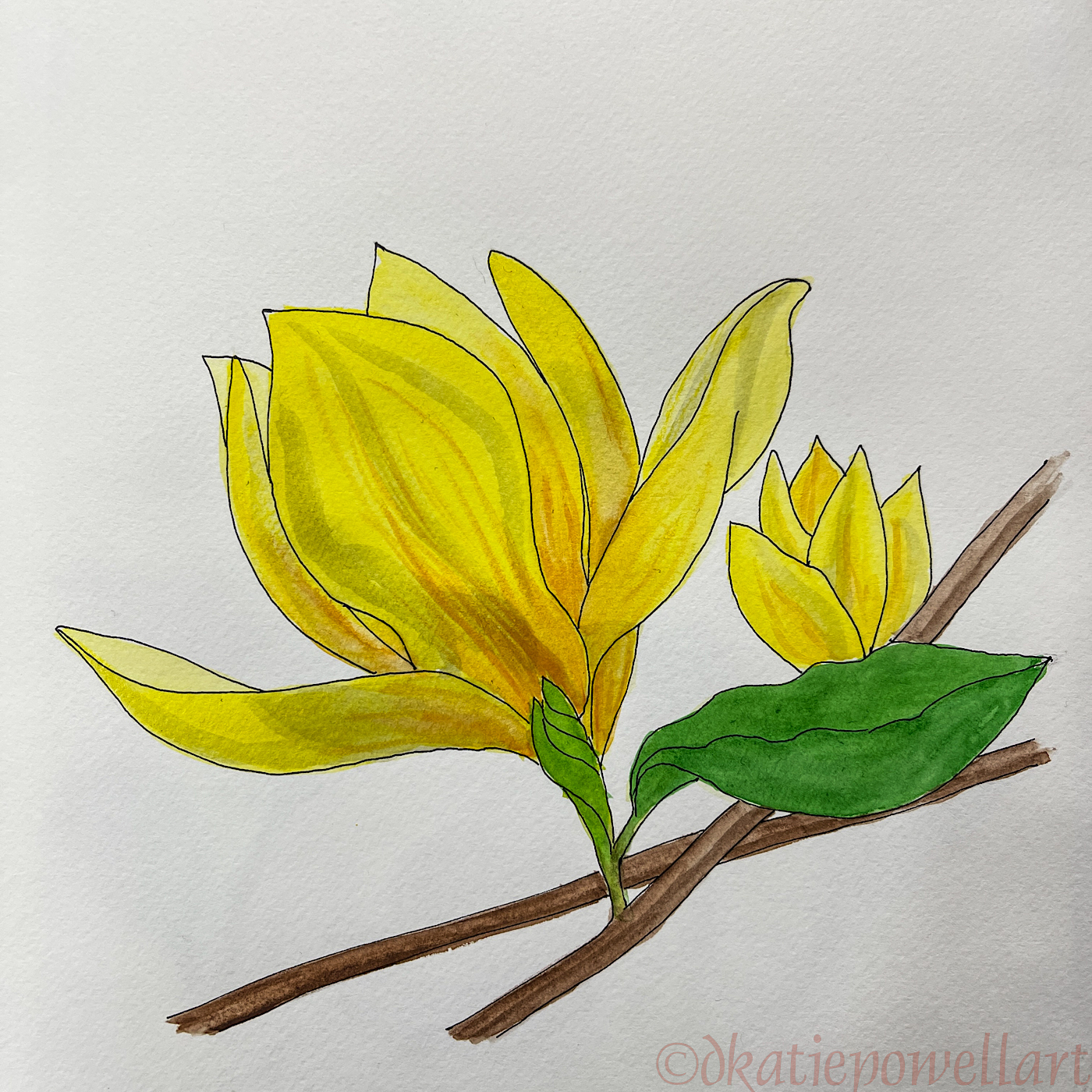
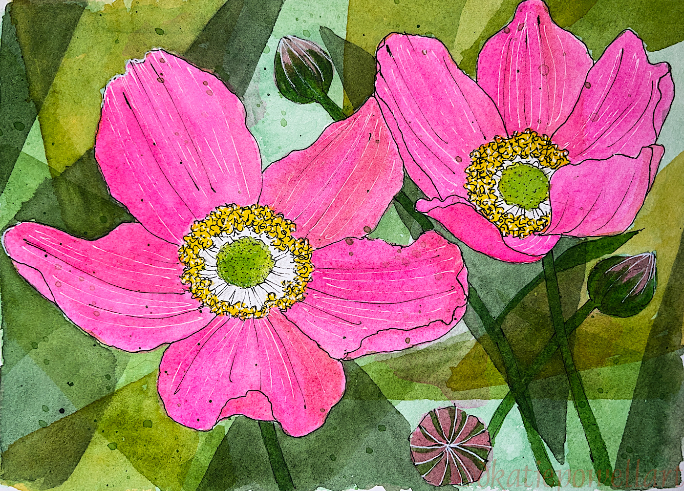
I am also interested in how they are used for ink-painting!
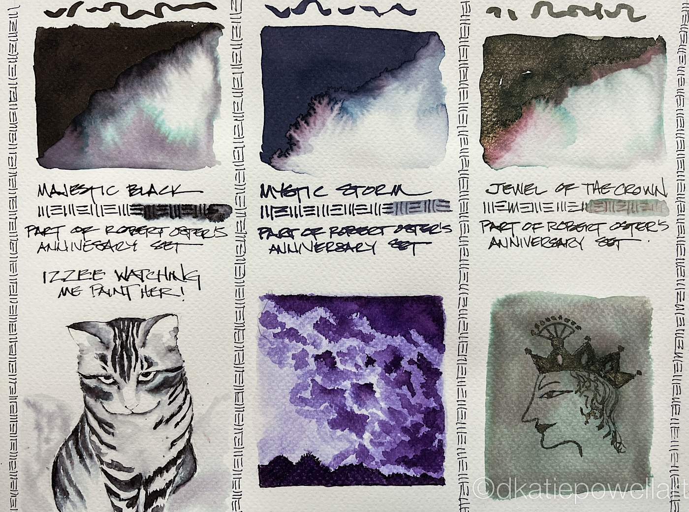
Majestic Black
Majestic Black is the first black created by Robert Oster.
It is a tribute to his family history. Of course, no black is just black,
and while appearing a perfect deep black,
this ink moves into purples and even blues when hit with of water. NO sheen.
 This ink is well-behaved, and does
not feather on any of the papers I
normally use, even Post-its, right.
I consider it a medium ink,
neither wet nor dry.
It evaporates quickly with a wet nib.
It did not smear on me during
test sketches.
When hit with water it moves easily
with no resistance or ghosting.
It is not water resistant.
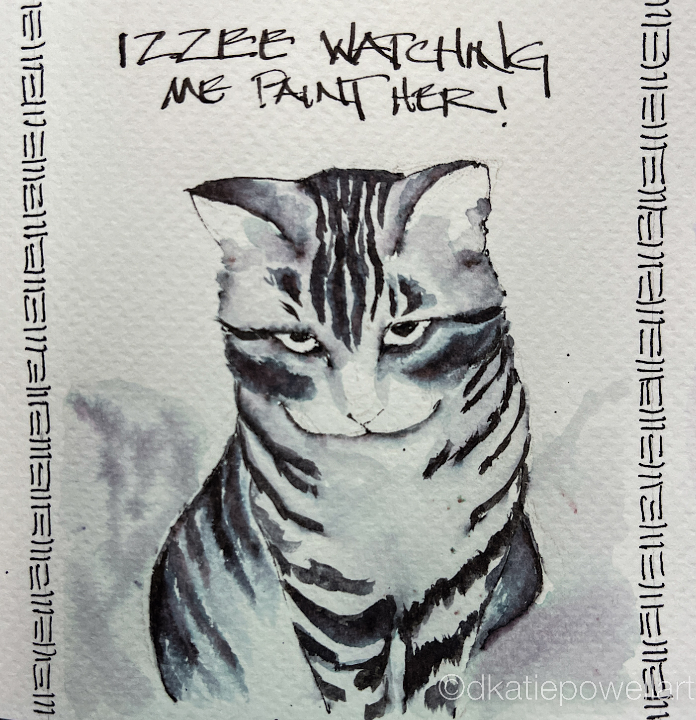
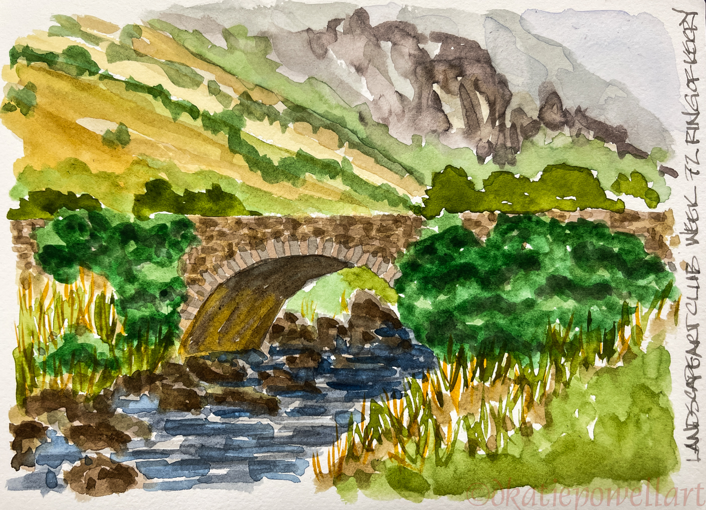
Izzee watched me while I was testing Majestic Black, so it was natural for me to sketch her coy looks. She was drawn with a Pilot Metropolitan Fountain Pen with a stub nib on cold press watercolor paper, The lines were touched with water using a Pentel Aquash waterbrush until I had the desired background color. The lines do not stay visible but quickly lose themselves in purplish-blue wet color. The lines were added back in after the wet diluted ink dried!
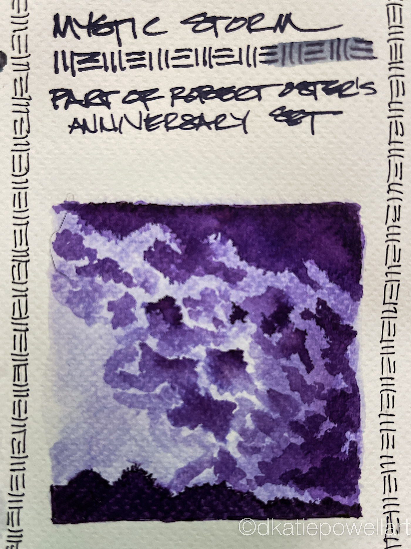
Mystic Storm
 Mystic Storm is a changeling ink that moves from a deep purple-blue-gray to bright purple and turquoise when hit with water. The turquoise did not surprise me; the brighter purple moving into a light lavender seen in the sketch left was a surprise!
This ink is also well-behaved, and I saw no feathering. It is neither wet nor dry, did not smear on me at any time. It too is not water resistant; when hit with water it moves easily with no resistance or ghosting.
I immediately filled a pen for this purple!
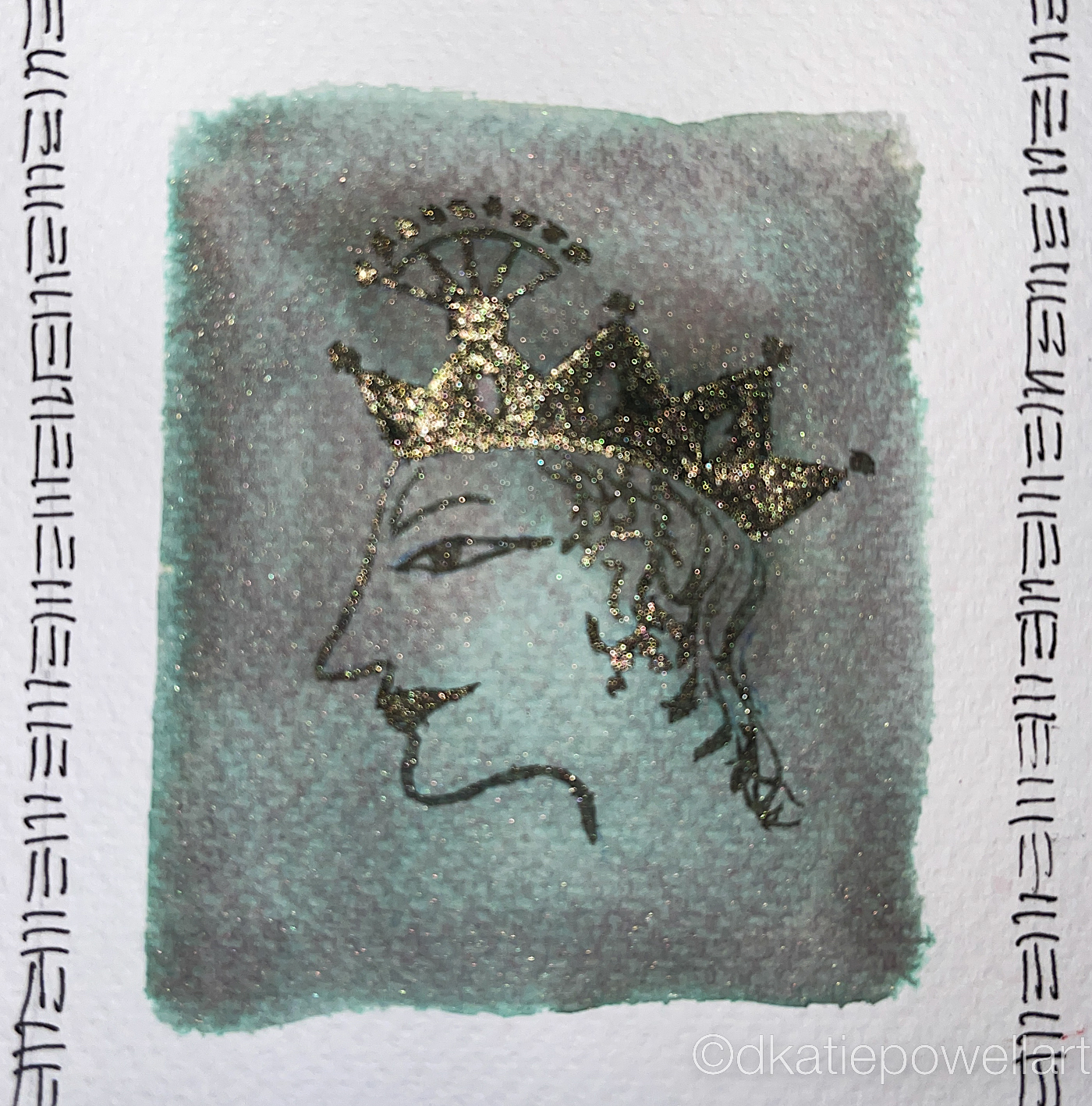
Jewel in the Crown
A shimmer ink that is a green-tinged gold with undertones of smokey purple and emerald green. How is that possible? In each of these sets of images below, I show the gold with a flash and no flash — so you can see how it sparkles!
 The ink did feather slightly when I was
painting on slightly damp paper; I stopped
to let the background completely dry.
This is an ink I will only “paint” with
as the last ink on the image,
for highlights and gilt touches,
such as the crown for Krishna, right.
This is how I usually work with glitter inks so it is not a big surprise. I usually use them as final touches on a painting when I want that bit of bright sparkle.
While not waterproof, there is a slight resistance
to movement of the diluted ink when wet…
I am not sure you can see it on the image right in the background.
The glittery gold parts move, but the diluted inky background colors
was difficult to move once it hit the dry paper.
In future if I wanted to use the diluted ink I would wet the paper thoroughly
before using the diluted ink, and this will help it to move.

Robert Oster is always experimenting and testing lightfast properties, but I would not count on any ink being lightfast.
MOST water soluble ink companies do not yet pay attention
to these properties because unlike watercolors or
other paints, most artists who use ink are making prints
of their work.
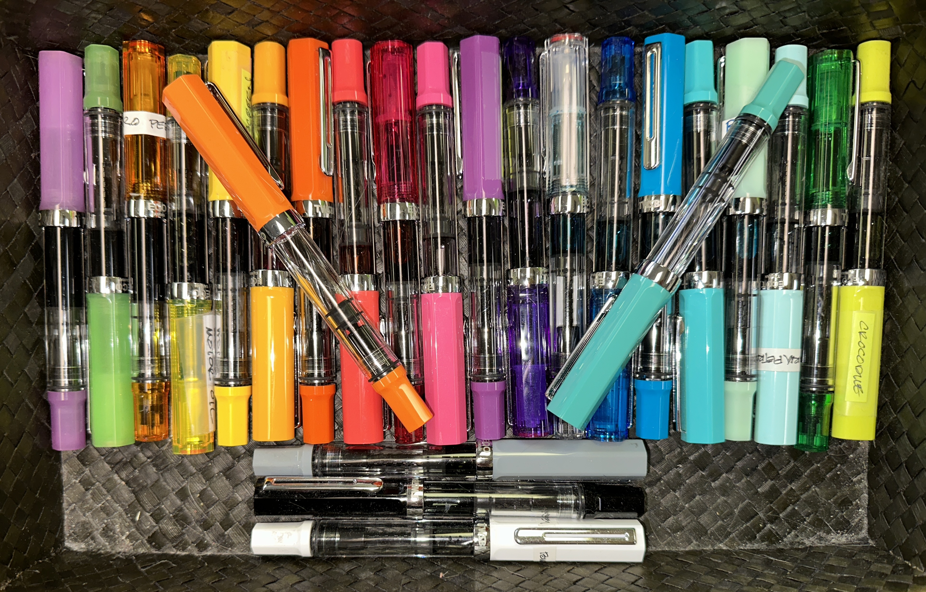
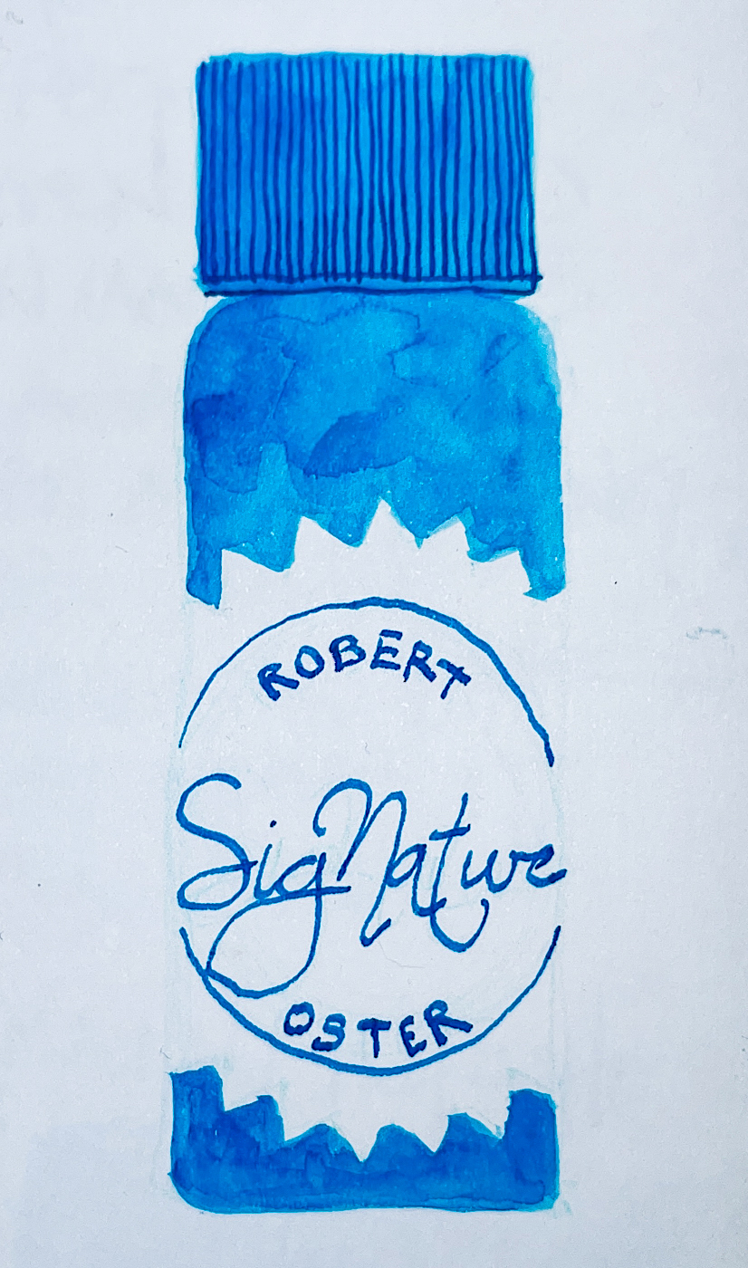
His non-toxic inks come in 50ml plastic bottles that are environmentally friendly, shown left, made of recycled plastic.
The ink bottle mouth is wide, and all my pens fit easily into the bottle opening to fill. They can be tippy, so I usually put them in a more stable container while dipping a pen into the bottle to fill,
or if I am dipping a CLEAN brush into the bottle.
I dedicate my brushes to use with either inks or watercolors
so no watercolors migrate into the inks.
I was sent Robert Oster‘s anniversary inks to review.
As Robert Oster says:
“Having the time of my life.
Celebrate with us.”
Other Robert Oster Signature Inks reviews can be found here.
 To hear about classes, follow me on Instagram, Facebook
or check out my new, improved dkatiepowellart.com
“Memory is more indelible than ink.”
Anita Loos, Gentlemen Prefer Blondes.
“I think not….”
Me… why I journal!


©D. Katie Powell.
My images/blog posts may be reposted; please link back to dkatiepowellart.
I'd love it if you shared this; please mention my blog name!