Kill Winter with Orange

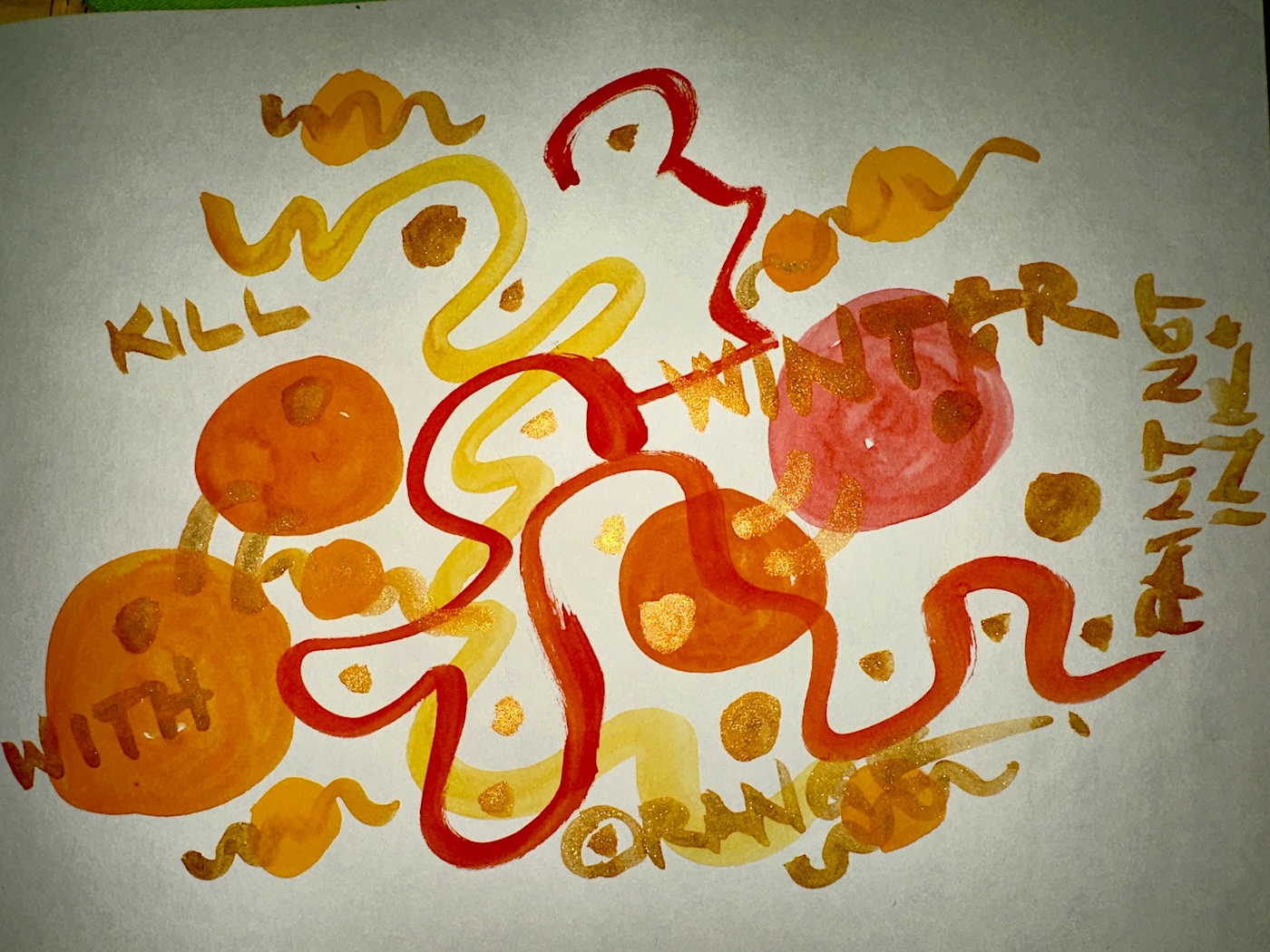
“KILL WINTER WITH ORANGE!”

For those of you not involved in the fountain pen community, this is a rallying cry that begins in February, and many posts of orange pens are posted.

I’ve been thinking about this concept in a bigger way. 

Part of this, for me, is about living in a Northern climate.  Growing up at the beach in sunny Southern California colors were rich and vibrant year around.  Blues and greens of the ocean, bright blue skies, and flowers blooming year around.  I had this notion drawn to my attention when I dated a man from Alaska, who spoke of us all taking color for granted.  Though I listened, I had no experience of this and so, could not relate. 

But here, in Portland Oregon, colors mute in winter.  Few flowers bloom. 
The skies are usually quite grey, though not as grey as Seattle, and certainly, like yesterday, we have some blue skies.  We appreciate them… Mitchell and I take a minute to marvel at a bright blue sky in winter.

Today I pulled out every orange paint I own and splashed it around willy-nilly in my sketchbook.  This mess felt good!

I instinctively begin to reach for bright colors to wear, especially in Winter!  Oregonians commented on my bright wardrobe my first years here, and not in a good way.  It felt like they wanted me to dull it down to fit in… keep to those safe dark greens, blues, maroons and muted reds.  But I didn’t!

To hell with them!
Instead, I cherish my bright colored tees and sweaters and even shoes, when I wear them (once a beachgurl, always barefoot).  Yay! Rainbows in my closet! 

We leave bright colored twinkling lights up in our home and studio year round: not just for Christmas anymore!

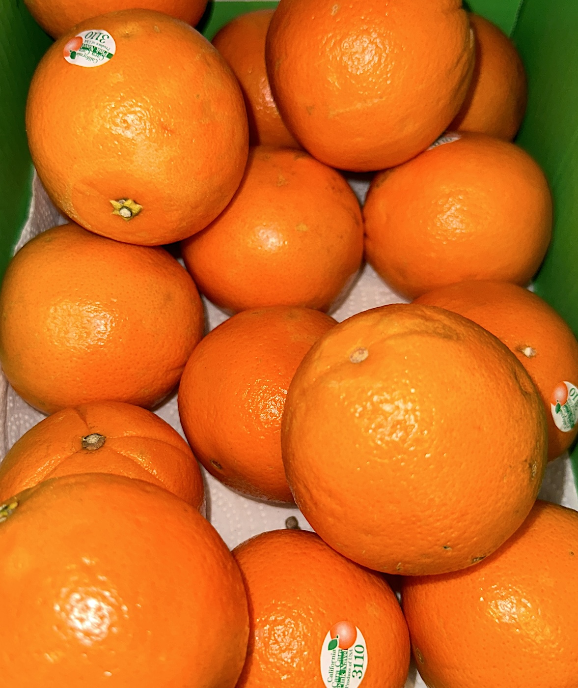
Orange is the cheeriest color of them all, reminiscent of sunshine and tastes like Spring should taste!  Maybe oranges were a gift from the gods to mitigate the darkness of Winter.

And Chocolate…
Never forget the power of rich gooey espresso walnut fudge in winter!

Posted in art journal, painting, pen & ink, virtual sketching, watercolor | Tagged , , , , , , , , , , , , , , , , , , , , , , , , , , , , , , , | 4 Comments

Happy Halloweeny

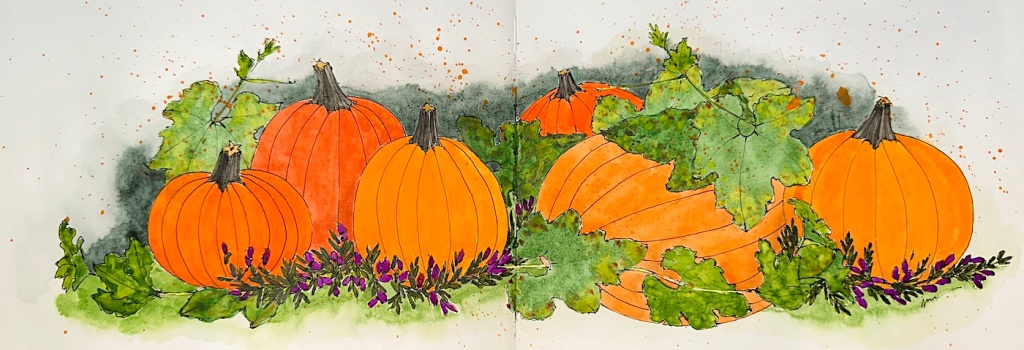
I’ve been crazy busy and recovering, but this is a recent effort of cheer!
I LOVE October colors!

BTW, I did not add the stars… Why can’t they make things simple!?

Posted in art journal | 1 Comment

HANDBOOK: Robert Oster and TWSBI Eco

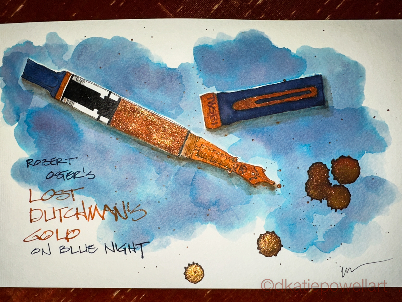
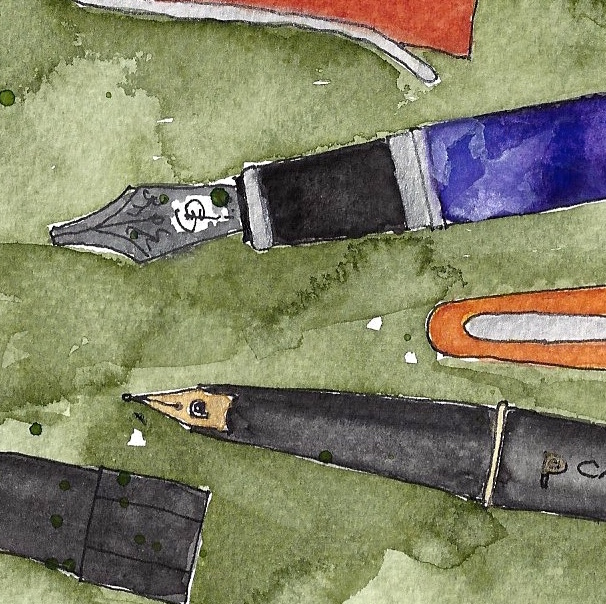
I sketched my newest TWSBI Eco, a beautiful blue with gold trim
— gold trim is not my usual (I love silver) but this is stunning —
and matched it up with Robert Oster Signature ink’s Lost Dutchman’s Gold
(a special shimmer ink from Pen Chalet) and Blue Night.

I am working in a Handbook A5 journal, shown below, not my usual journal.  I am using up older journals before ordering more sketchbooks.  This journal is supposed to be an A5, but as you can see below, it is smaller by about an inch from the Hahnemüle A5.

After I work in it for a bit I will publish a review.

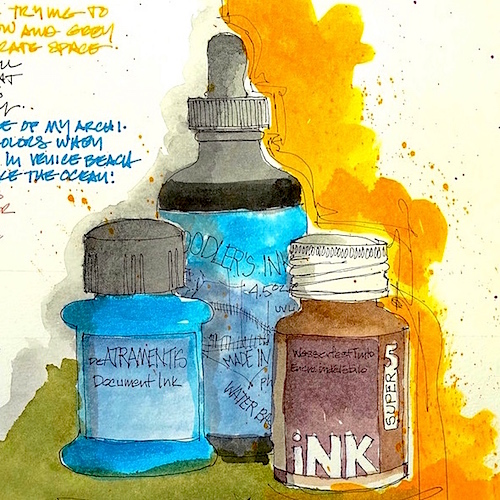
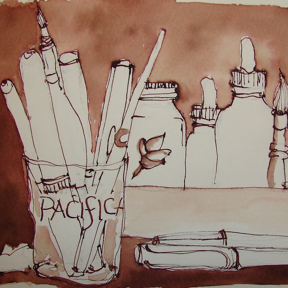
  w15-inks-sq w16-8-10-pentalic-middle-night-03-sq w16-9-24-pens-color-3-sq

Posted in art journal, color, ink painting, journal, painting, pen & ink, sketchbook | Tagged , , , , , , , , , , , , , , , , , , , , , , | 5 Comments

Tools: New Watercolor, a Test Palette

I’ve been a little depressed lately, some for “good” reasons but some because I-don’t-know.  The world has gone mad, and I’ve been journaling about it to get to the truth of it.  I think talking about it helps others and so I mention it.

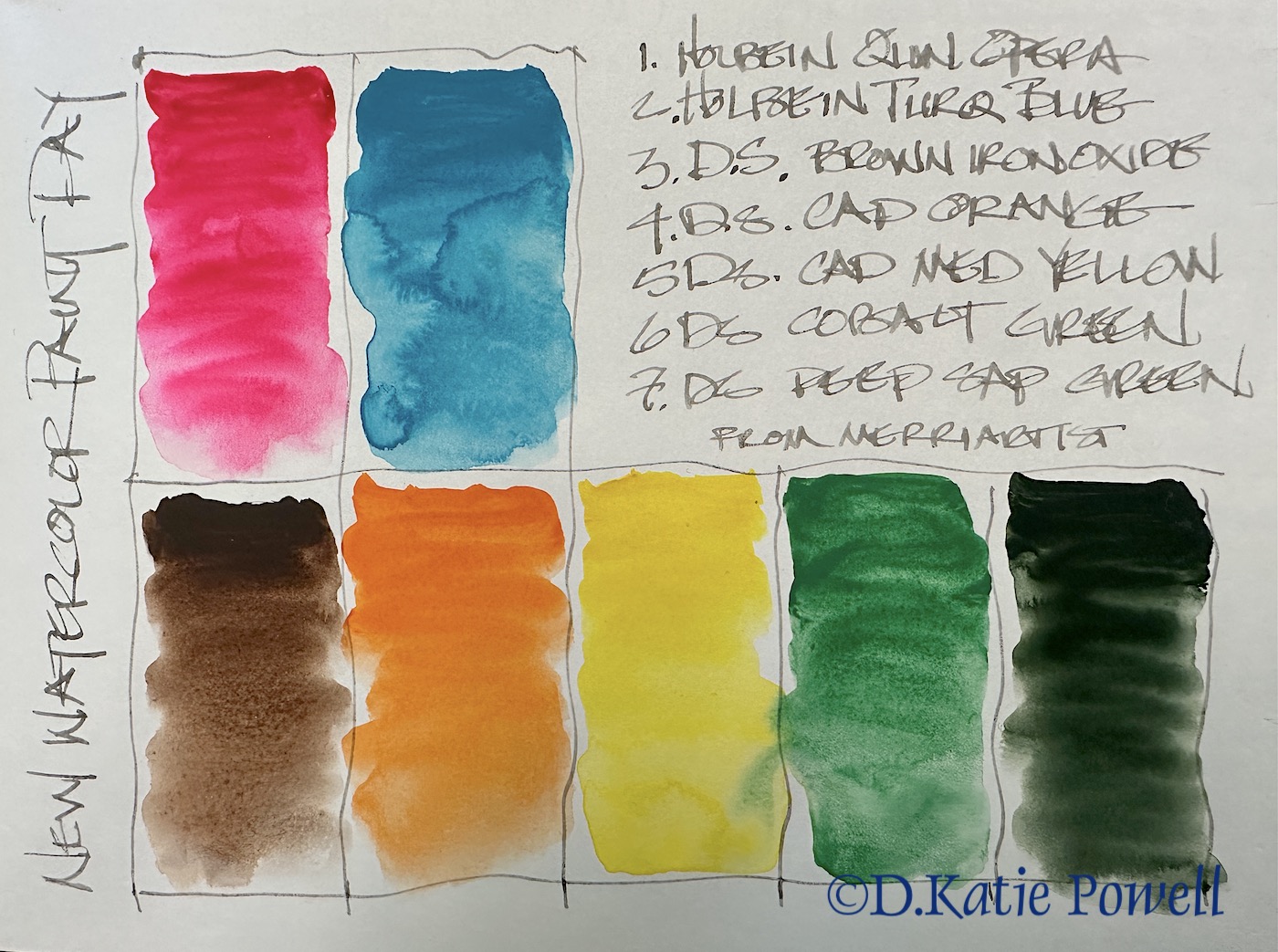
I bought new colors, the first I’ve bought in a long time, from The Merri Artist, an Oregon company.  (I like supporting small businesses whenever possible.) Above, the new palette colors from Holbein and Daniel Smith.  I have never bought many cadmium colors so tried a couple of those.

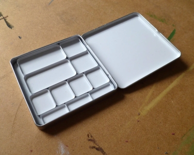
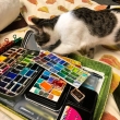
Above, my palette as it has been since September 2022, and right, my temporary test palette with many of the new colors.  I say test because it is likely I will choose between the two yellows, and also choose between two of the pinky colors, giving me space to grab a couple of other colors. Below, the Woodward and Father pans, which I LOVE, because they give me extra mixing space in the long palette box.

WoodwardAndFather Pan Packs:  I love these mixing areas.  I started with the Limited Palette Pan Pack, shown right (sold without the container), and after using them asked if they sell a custom set of the sizes I actually wanted.  I like the larger pans which fit perfectly in the palettes I love the most.  I can create a large juicy mix that will cover a lot of pages in a journal.

Above, other palettes used daily.

Posted in art journal, color, creativity, drawing, journal, painting, process, sketchbook, watercolor, writing | Tagged , , , , , , , , , , , , , | Leave a comment

TWSBI Eco Fountain Pen Review

I LOVE TWSBI Ecos.  Well made, good price point, and they hold a lot of ink.  They are my go-to sketching pens, and the only pens where I have all the variations inked up.  (See bottom.)

The when the two new pens arrived (a gift) I was shocked at the color.  As you can see, it is not a “new” color.

In the design business, and probably many other businesses, slight color variations in fabrics are due to dye lots.  As these two “new” colors are almost identical to colors from a couple of years ago, they look more like a dye lot shift.

They were a gift, I’m keeping them, especially as the company that sold them did not know this.  But what manufacturer does that?  TWSBI shame on you for (nearly) duplicating the color under another name, especially.with all the wonderful colors you could have made, such as a transparent grey, new solid red, clear pink, browns, more greens (endless variations), or a solid purple plus others….  off the top of my head.

And to those who say, “but what about those of us who missed these colors?” I say, oh well. I had to hunt down my orange pen, which is why I don’t have a stub. I bought it secondhand. I had ot have orange! But if TWSBI wants to rerelease colors they are welcome to do that — just OWN IT.

Posted in art journal, color, pen & ink, review | Tagged , , , , , | Leave a comment

Laguna: Cliff Drive


Continuing my sketchbook on early memories of moving to Laguna Beach, California.

The first place we lived IN Laguna was in the gold apartments on Cliff Drive, which was above the Chevy Dealership off the Main drag from the Canyon.  That summer was grand, as we had friends visit every weekend who were applying to the Peace Corps.  The guys brought sleeping bags and threw them on the floor, and we cooked great meals (fried chicken was a big hit) and walked to Main Beach everyday.

We also went to this little happening in the canyon, a festival of craftspeople selling their wares, which is now a HUGE happening, the Sawdust Festival.  It was, at the time (and may be still) an antidote to the Art Festival which was considered snooty.

Posted in art journal, journal, painting, pen & ink, ritual, series, virtual sketching, watercolor | Tagged , , , , , , , , , , , , , , , , | Leave a comment

Inky Thots: Robert Oster Anniversary Inks


Robert Oster Signature Inks is having their  7th Anniversary,
and have created three special inks for their celebration:
Their first true black, a beautiful purple storm, and a shimmering green-gold jewel:
Let’s look at each anniversary ink.

Remember that others review these inks just for writing;
I am also interested in how they are used for ink-painting!

Majestic Black

Majestic Black is the first black created by Robert Oster.
It is a tribute to his family history.  Of course, no black is just black,
and while appearing a perfect deep black,
this ink moves into purples and even blues when hit with of water.   NO sheen.

This ink is well-behaved, and does
not feather on any of the papers I
normally use, even Post-its, right.

I consider it a medium ink,
neither wet nor dry.
It evaporates quickly with a wet nib.
It did not smear on me during
test sketches.

When hit with water it moves easily
with no resistance or ghosting.
It is not water resistant.

Izzee watched me while I was testing Majestic Black, so it was natural for me to sketch her coy looks.  She was drawn with a Pilot Metropolitan Fountain Pen with a stub nib on cold press watercolor paper,  The lines were touched with water using a Pentel Aquash waterbrush until I had the desired background color.  The lines do not stay visible but quickly lose themselves in purplish-blue wet color.  The lines were added back in after the wet diluted ink dried!

Mystic Storm

Mystic Storm is a changeling ink that moves from a deep purple-blue-gray to bright purple and turquoise when hit with water.  The turquoise did not surprise me; the brighter purple moving into a light lavender seen in the sketch left was a surprise!

This ink is also well-behaved, and I saw no feathering.  It is  neither wet nor dry, did not smear on me at any time.  It too is not water resistant; when hit with water it moves easily with no resistance or ghosting.

I immediately filled a pen for this purple!

Jewel in the Crown

A shimmer ink that is a green-tinged gold with undertones of smokey purple and emerald green.  How is that possible?  In each of these sets of images below, I show the gold with a flash and no flash — so you can see how it sparkles!

The ink did feather slightly when I was
painting on slightly damp paper; I stopped
to let the background completely dry.

This is an ink I will only “paint” with
as the last ink on the image,
for highlights and gilt touches,
such as the crown for Krishna, right.

This is how I usually work with glitter inks so it is not a big surprise.   I usually use them as final touches on a painting when I want that bit of bright sparkle.

While not waterproof, there is a slight resistance
to movement of the diluted ink when wet…
I am not sure you can see it on the image right in the background.
The glittery gold parts move, but the diluted inky background colors
was difficult to move once it hit the dry paper.
In future if I wanted to use the diluted ink I would wet the paper thoroughly
before using the diluted ink, and this will help it to move.

Robert Oster is always experimenting and testing lightfast properties, but I would not count on any ink being lightfast.
MOST water soluble ink companies do not yet pay attention
to these properties because unlike watercolors or
other paints, most artists who use ink are making prints
of their work.

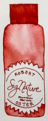
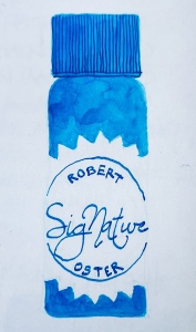
His non-toxic inks come in 50ml plastic bottles that are environmentally friendly, shown left, made of recycled plastic.
The ink bottle mouth is wide, and all my pens fit easily into the bottle opening to fill.  They can be tippy, so I usually put them in a more stable container while dipping a pen into the bottle to fill,
or if I am dipping a CLEAN brush into the bottle.

I dedicate my brushes to use with either inks or watercolors
so no watercolors migrate into the inks.

I was sent Robert Oster‘s anniversary inks to review.

As Robert Oster says:
“Having the time of my life.
Celebrate with us.”

 Other Robert Oster Signature Inks reviews can be found here.

To hear about classes, follow me on Instagram, Facebook
or check out my new, improved dkatiepowellart.com


Posted in animals, architecture, art, art journal, Cat, color, ink painting, painting, pen & ink, review | Tagged , , , , , , , , , , , , , , , , , , , , | 2 Comments

Seehof Castle: 30X30 Direct Watercolor

The month of June is when many watercolorists around the world participate in the 30×30 Direct Watercolor Challenge, created by Marc Homes and Uma Kelker.
Rules are simple:  Each day post one watercolor, but no sketching,
no inking, no pencil, just straight watercolor.

I particularly like this challenge, but sadly work is keeping me from participating.
Someone needs to pay our bills!

I chose to use the images
from IG’s @landscapeartclub
to play with direct watercolor,
or as it is known on Facebook and IG,
@30x30directwatercolor.

This poppy image, left,
is from an earlier post.

Posted in animals, architecture, art journal, challenge, color, flowers, food, furniture, painting | Tagged , , , , , , , , , , , , , | Leave a comment

Seehof Bamberg Poppies: 30X30 Direct Watercolor

The month of June is when many watercolorists around the world participate in the 30×30 Direct Watercolor Challenge, created by Marc Homes and Uma Kelker.
Rules are simple:  Each day post one watercolor, but no sketching,
no inking, no pencil, just straight watercolor.

I particularly like this challenge, but sadly work is keeping me from participating.
Someone needs to pay our bills!


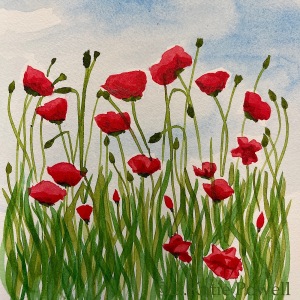
The image I used for this #directwatercolor was
from @landscapeartclub on IG.


Posted in animals, architecture, art journal, challenge, color, flowers, food, furniture, painting | Tagged , , , , , , , , , , , , , , , , | 4 Comments

Inky Thots: Robert Oster Australian Opal Grey

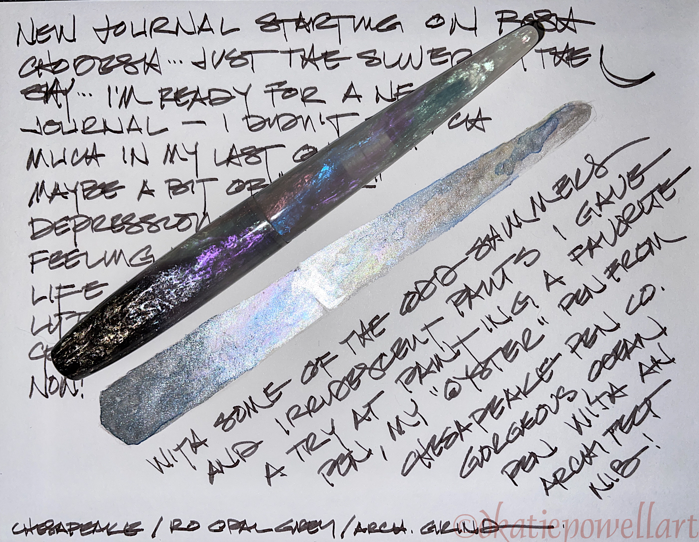
Robert Oster’s Australian
Opal Grey ink
is one of
my favorite greys, leaning
into turquoise and blue when touched with water.

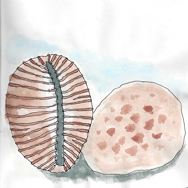
My delicate shell (that I
have carried around since
high school) was painted
in a Hahnemühle Nostalgie Sketchbook with a
Pentel Aquash waterbrush.

Remember that others review these
inks just for writing; 
I am also interested
in how they are used for ink-painting!

Properties of
Robert Oster’s Australian Opal Grey ink:

This ink is well-behaved, and does
not feather on any of the papers
I normally use, even Post-its.  It has found a permanent home in my favorite Chesapeake pen with an architectural nib.

I consider it a medium ink,
neither wet nor dry, and it evaporates
quickly with a wet nib.  It has never
smeared on me during a sketch.
NO sheen, and as you can see right,
the ink is a deep charcoal-ish grey which
shows it’s turquoise undertones
when hit with water.

It moves easily with little ghosting,
and is not water resistant.

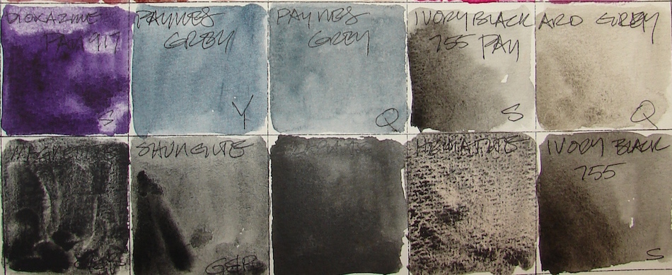
*Above, watercolors that are comparable.*

I was asked why I show watercolor matches.  Simply, sometimes you want to use an ink to sketch and then fill the object with the matching watercolor, and this gives artists some possible matches.

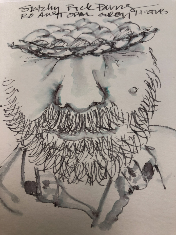
On @hahnemuehle_global Bamboo Carnet de Voyage pad I sketch of a  bearded man peeking out from under his hat.

Below, two images of my favorite grey tee, both using Robert Oster’s Australian Opal Grey ink as a base, the right being more accurate as my old tee is covered with bits of oil paint.

Below, a page in my Hahnemühle Nostalgie Sketchbook where I clearly screwed up a sketch.  I don’t like leaving pages undone in my journals, and so this one I continued to play with until I had some sort of satisfactory outcome, a beautiful heart!

Below, showing Australian Opal Grey
next to several other Robert Oster
greys for comparison.

Many look similar when seen in a
written sample, right, but when hit with
water or used in an ink-painting
can be quite different.

Other Robert Oster Inks reviewed in this manner to date can be seen here.

RO is experimenting and testing lightfast properties… MOST water soluble ink companies do not yet pay attention to these properties because most artists who use ink are making prints of their work.

His non-toxic inks come in 50ml plastic bottles that are environmentally friendly, using recycled plastic. They can be tippy, so I usually put them in a more solid container to decant. The ink bottle mouth is wide, and all my pens fit easily into the bottle opening to fill.

I bought Robert Oster’s Australian Opal Grey ink at JetPens.

To hear about classes, follow me on Instagram, Facebook
or check out my new, improved dkatiepowellart.com


Posted in architecture, art journal, color, direct watercolor, ink painting, pen & ink | Tagged , , , , , , , , , , , , , , , , | 2 Comments

Favorite Grey Tee

I have a favorite grey tee shirt from Bass & Co that is as old as my marriage.
It is on its last legs, and I am grieving.  I cannot find another one like it ANYWHERE and it is so sad because I love grey heathered cotton long-sleeve tees.

I created the sketch above in Robert Oster’s Australian Opal Grey ink, the perfect match for the actual color.  The two images are due to flash and no flash.
Mitchell loved it and told me not to do any more to it…
Okay, but there is more, so I did another.
I tease him and tell him I always do as he says, but this time it is true.

What was missing was the paint on the shirt.
There, see, now it is a likeness of my actual tee.


Posted in art journal, painting, pen & ink, virtual sketching, watercolor | Tagged , , , , , , , , , , , , , | 2 Comments

An Opal Grey Face

He was looking down, and the bit of his face under the hat intriguing.  I used Robert Oster’s Australian Opal Grey ink, which was also a good match for his grey hair.


Posted in art journal, painting, pen & ink, virtual sketching, watercolor | Tagged , , , , , , , , , , , , | Leave a comment

Canal du Midi: 30X30 Direct Watercolor

The month of June is when many watercolorists around the world participate in the 30×30 Direct Watercolor Challenge, created by Marc Homes and Uma Kelker.
Rules are simple:  Each day post one watercolor,
but no sketching, no inking, no pencil, just straight watercolor.


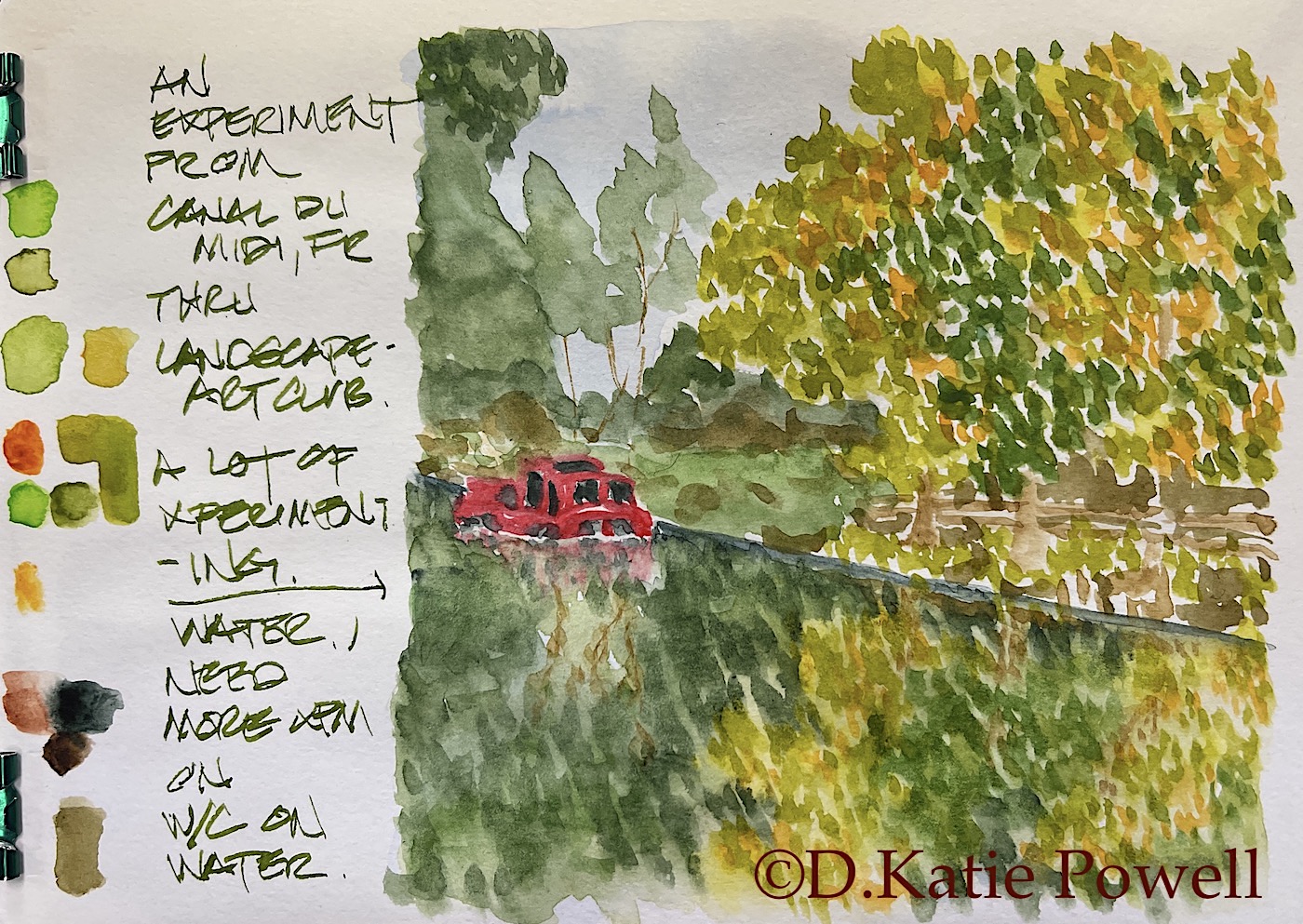
Here is the entire page.  I often show my color mixes on the side
or on the page across from my watercolor sketches.

I did the sketch on the left, but decided to have some fun with this @landscapeartclub image—changed things up. I wanted a bright red instead of the white boat.

I also pushed to experiment with how to paint the canal water, so after I completed it I came back and doused the entire canal area to make the water kind of runny.  Not completely happy with it but as with many sketch-book thangs it is an experiment.
I will continue to try it until I get the hang of it.

 ©D. Katie Powell.
My images/blog posts may be reposted; please link back  to dkatiepowellart.


Posted in animals, architecture, art journal, challenge, color, flowers, food, furniture, painting | Tagged , , , , , , , , , , , , , , , | Leave a comment

Laguna: Overlook


Continuing my sketchbook on early memories of moving to Laguna Beach, California.

My mom and I took walks along the cliffs overlooking Main Beach and also the rocky “beaches” below the cliffs, some of which had dirt paths down tot hem.  At low tide you could walk from Main Beach around to the smaller areas, but we did not do that.  I did this many years later when my boyfriend and I swam/walked as far as we could in one day from Main Beach south to many other beaches.

Laguna was so different from Dana Point, where we first landed when we left Woodland Hills.  More bohemian, lively, hippies everywhere, and the whole thing was very exciting.  I wanted to go to the board walk and eat at the pot lucks but Mom said no, and when I petitioned my brothers to support me I had more NOs.  Completely unreasonable people.

This sketchbook will be filled in below as it lays out.

Other posts in this series:

Laguna: Crystal Cove

Folding journal made of Hahnemühle Bamboo Carnet de Voyage,
Pentalic HB woodless pencil, White Uniball Signo,
Platinum Carbon pen with Platinum Carbon ink waterproof cartridges,
Sennelier, Holbein, DS Primatek watercolors, and Daniel Smith Watercolors.

Posted in art journal, journal, painting, pen & ink, ritual, series, virtual sketching, watercolor | Tagged , , , , , , , , , , , , , , , , | 1 Comment

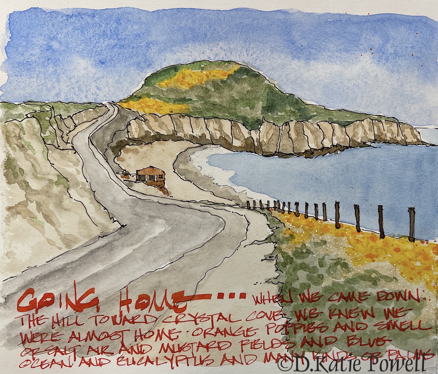
Laguna: Crystal Cove


When I was a kid, and then later when I was at college,
I knew I was almost home when Crystal Cove came into view.
Depending upon the season
(yes, California has seasons but you have to be a Californian to know them)
you might get this colorful late Spring early Summer view or a different set of colors:
foggy greys, bright greens, or golden fields.

This was long before it became Crystal Cove State Park —
this was when it had locals living in not-fancy houses and
horses were ridden on the beach and it was a lovely wild place.
I’m not sad that it became a park —
better than a private gated community of McMansions!


Posted in art journal, journal, painting, pen & ink, ritual, series, virtual sketching, watercolor | Tagged , , , , , , , , , , , , , , , , , , | 4 Comments

Sleepy Izzee


Izzee at her most peaceful, asleep on a chair on a fuzzy.

Usually she is a force of movement, always investigating, causing trouble, pushing where she doesn’t belong.  I would never characterize her a sweet — though she has her moments and is loving with us and also with Gibbs. Independent almost to a fault — but then, she was found way up in a tree by herself, so there is that.  She probably had to be a cunning kitten in order to survive.

Right now she is ONE OF the gurl cats causing trouble with Yaman’s healing (more on that soon — I am drawing the sketches now — he is okay).  .

 ©D. Katie Powell.
My images/blog posts may be reposted; please link back  to dkatiepowellart.


Posted in animals, art journal, Cat, drawing, journal, memory, painting, pen & ink, sketchbook, virtual sketching, watercolor | Tagged , , , , , , , , , , , , , , , , | 3 Comments

USk: Studio View


I recently participated in something on IG and won’t participate with that group again.  For those who run groups, and I do, it is important to make sure everyone in a group you run gets feedback from you (unless no one is getting feedback.)  I find this is less important in an In-person class, but online you have only feedback online. To feel part of feedback is important.

If I am painting on my own with my muse as my guide I often do not feel a need to share.  My creative process has a life of its own and I can go days without sharing anything I am doing.  But participating in a class or group is different; commentary matters.

Direct watercolor.


Posted in art journal, challenge, painting, pen & ink, watercolor | Tagged , , , , , , , , , , | Leave a comment

California Poppies

Home, home, home…
Cheery orange poppies used to cover the hills in Laguna Beach.
I love them.  Maybe cuz I am a native California gurl
Maybe cuz they are one of my favorite colors.

Posted in art journal, flowers, journal, painting, virtual sketching, watercolor, writing | Tagged , , , , , , , , , , , , , , , , , , , , , | 4 Comments