
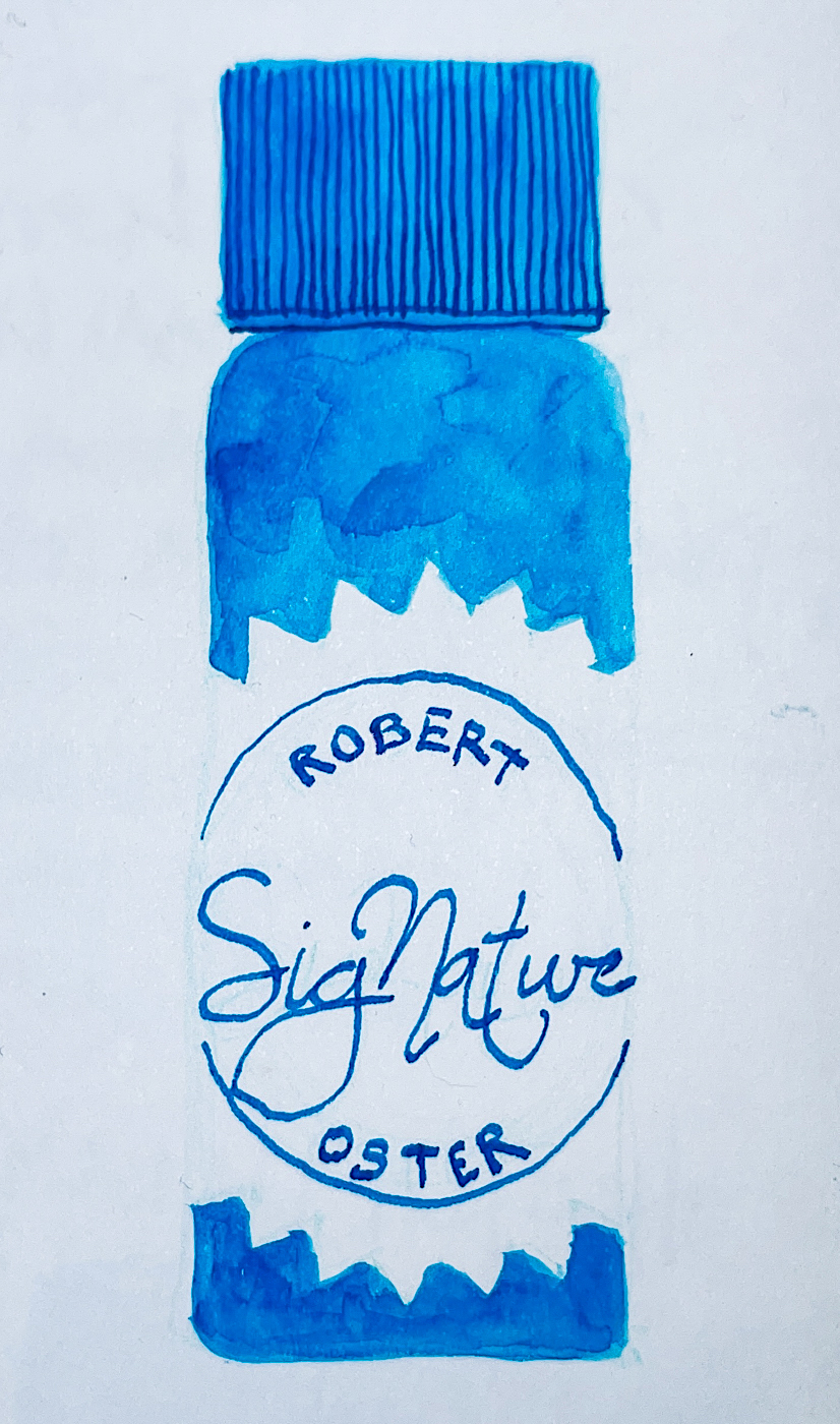
 Robert Oster’s Australian
Opal Grey ink is one of
my favorite greys, leaning
into turquoise and blue when touched with water.
My delicate shell (that I
have carried around since
high school) was painted
in a Hahnemühle Nostalgie Sketchbook with a
Pentel Aquash waterbrush.
 Remember that others review these
inks just for writing; I am also interested
in how they are used for ink-painting!
Properties of
Robert Oster’s Australian Opal Grey ink:
This ink is well-behaved, and does
not feather on any of the papers
I normally use, even Post-its. It has found a permanent home in my favorite Chesapeake pen with an architectural nib.

 I consider it a medium ink,
neither wet nor dry, and it evaporates
quickly with a wet nib. It has never
smeared on me during a sketch.
NO sheen, and as you can see right,
the ink is a deep charcoal-ish grey which
shows it’s turquoise undertones
when hit with water.
It moves easily with little ghosting,
and is not water resistant.
 *Above, watercolors that are comparable.*
 I was asked why I show watercolor matches. Simply, sometimes you want to use an ink to sketch and then fill the object with the matching watercolor, and this gives artists some possible matches.
On @hahnemuehle_global Bamboo Carnet de Voyage pad I sketch of a bearded man peeking out from under his hat.
Below, two images of my favorite grey tee, both using Robert Oster’s Australian Opal Grey ink as a base, the right being more accurate as my old tee is covered with bits of oil paint.


Below, a page in my Hahnemühle Nostalgie Sketchbook where I clearly screwed up a sketch. I don’t like leaving pages undone in my journals, and so this one I continued to play with until I had some sort of satisfactory outcome, a beautiful heart!


 Below, showing Australian Opal Grey
next to several other Robert Oster
greys for comparison.
Many look similar when seen in a
written sample, right, but when hit with
water or used in an ink-painting
can be quite different.


 Other Robert Oster Inks reviewed in this manner to date can be seen here.
RO is experimenting and testing lightfast properties… MOST water soluble ink companies do not yet pay attention to these properties because most artists who use ink are making prints of their work.
His non-toxic inks come in 50ml plastic bottles that are environmentally friendly, using recycled plastic. They can be tippy, so I usually put them in a more solid container to decant. The ink bottle mouth is wide, and all my pens fit easily into the bottle opening to fill.
I bought Robert Oster’s Australian Opal Grey ink at JetPens.


Hahnemühle Watercolour Journal, Hahnemühle 100# Cotton Watercolour Book,
Hahnemühle Nostalgie Sketchbook, Hahnemühle Bamboo Carnet de Voyage pad,
Chesapeake Opal pen (no longer selling), Robert Oster’s Australian Opal Grey ink.
 To hear about classes, follow me on Instagram, Facebook
or check out my new, improved dkatiepowellart.com
“Memory is more indelible than ink.”
Anita Loos, Gentlemen Prefer Blondes.
“I think not….”
Me… why I journal!
![]()


![]()


©D. Katie Powell.
My images/blog posts may be reposted; please link back to dkatiepowellart.
☾
 As my Patreon supporter, you will have
access to some content not on this website,
sneak previews, goodies, discounts on classes.
I teach architectural sketching,
art journaling (art+writing), creativity, watercolors.
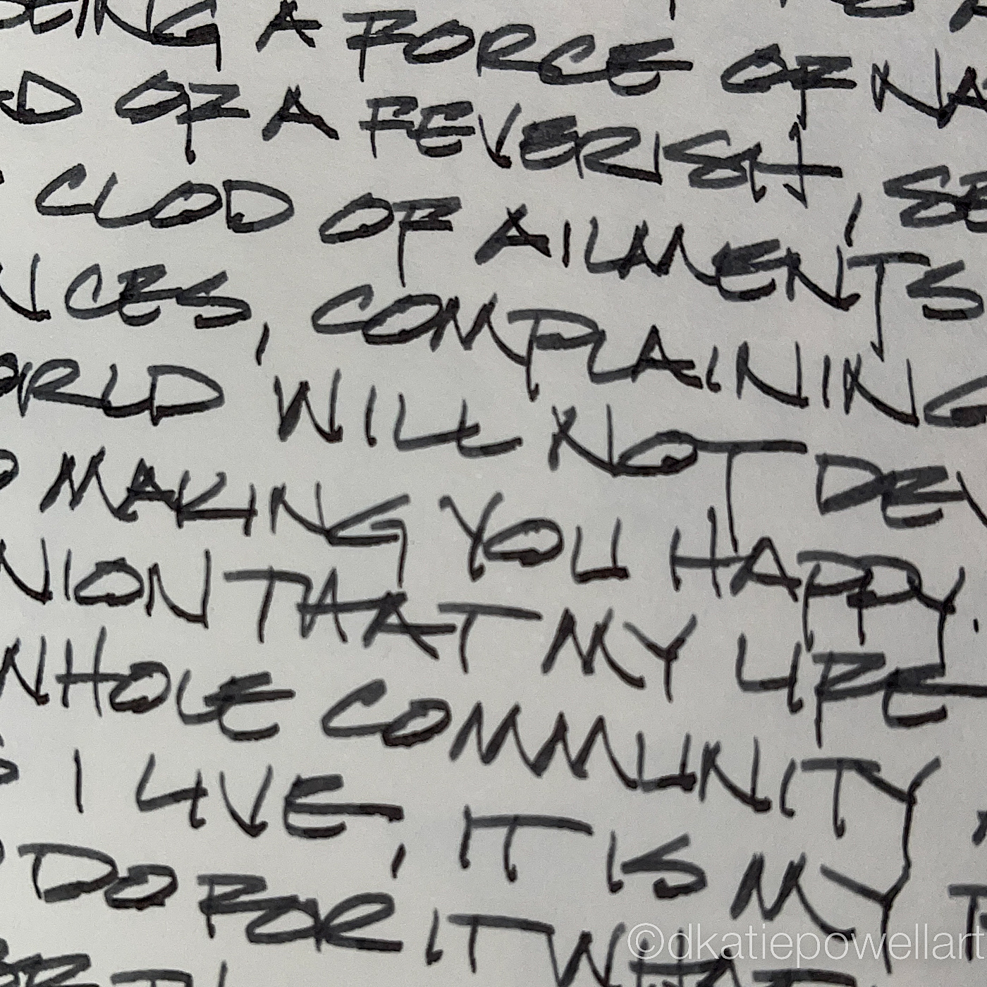
That annoying loud-mouth editor/critic in your head?
GONE! How great would that be?


This is a great review, Kate. I love all the different undertones of this beautiful grey.
LikeLike
This is one of my favorite greys of all time.
LikeLiked by 1 person