
Okay, you KNOW I am not big on self-criticizing…
But gads the green got away from me.
I think this is a good lesson in not just planning from a sketching point of view,
but from a color point of view, as this became green on green on green!


We left the sketch, ready to color.


Grisaille and skies, and the yellow in the tiles…


Then as I moved into detail / color everywhere, I was
overwhelmed by green and dark and *ARGH* how to save??
I liked the tiles from Christ Church at the bottom —
and took liberties with the color as some were black and white.


I like some of the vignettes.

And hated some of the areas where the planning was
not thought out. Lettering saved it some… It looked good in B + W!
Layout is so important!

To hear about classes, follow me on Facebook!
☾
Moleskin A4 Watercolor Journal, with a Pentalic HB woodless pencil,
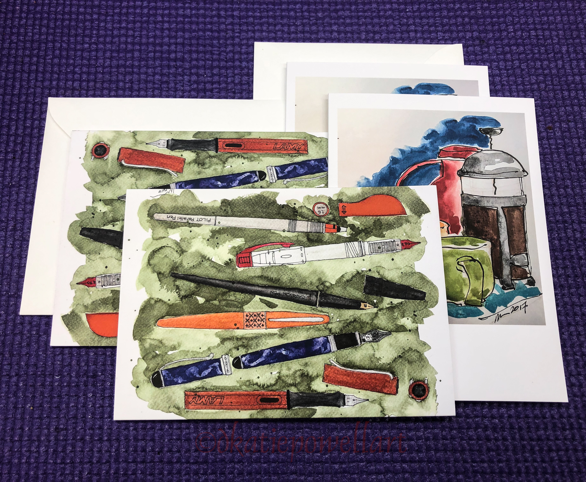
Noodler’s Lexington Grey Ink, Super5 Frankfurt (Amazon when they have it or buy from Europe), Lamy Al-Star with De Atramentis Document Black ink, Platinum Carbon Pen with Platinum Carbon ink waterproof cartridges, White Uniball Signo, Sennelier, Holbein, and DS Primatek watercolors, and Daniel Smith Watercolors.
☾

I started a Facebook group page (you must join to view) to allow everyone to share their virtual sketches, and also where we will, from time to time, take virtual sketch walks together. Come join us On Facebook if you are inclined!
If you want to know more about what a virtual sketchwalk is review my first post.
There are a few more notes/pointers on our first walk through Laguna Beach, California.
I also created an accompanying Flickr group!
☾
I agree to Creative Commons Attribution-Non-Commercial 4.0 International License, which you can learn more about by visiting the site, or,
visit my web page for a more user-friendly summary on my terms.
My images/blog posts may be reposted; please link back to dkatiepowellart.


The greens are all pretty but I really do love the splatters!
LikeLike
The splatter saved it I think!
LikeLike
I love the green and the design below adds so much. Good work Kate.
LikeLike
Thanks Fran!
LikeLike
Ths looks great Kate but I want to view it again at home on a larger screen.
LikeLike
Especially since I did that one long image…
LikeLike
wonderful post…and text etc…very very impressive and the colors are sooooo great looking..!
LikeLike
Thank Winna — that means a lot coming from you! I still need some space to get perspective!
LikeLike