
 Small business owners rarely get to really take time off. You can’t ignore a new client
(or they may go elsewhere) and you can’t ignore the absolutely only time for a delivery,
in our case. Crater Lake is one of those areas where weather plays a huge part in when things happen. In this case, Our CCC Table was completed for a long time but two factors had to fall into place: the curator’s new space had to be readied and weather.
I will post more about the conservation of the
CCC (Civilian Conservation Corps) Table here, on the MPF Conservation blog.
I sketched the delivery, all from photographs, because we did a one day turnaround. Photographs were all I had time for — we drove 6 hours up, 5 hours back.
Less table weight and carefulness for the table, we made better time coming back!
 Choosing to sketch the trip was mostly because I rarely paint landscapes, and am taking a class by Marc Taro Holmes on Travel Sketching. The sketching in black then gradual buildup of grisaille (layers of waterproof ink) then watercolor was fun, combining Marc’s tips and Steven Reddy‘s tips on how to do an underpainting in ink.
 For those of you who want the skinny on my steps, here is process below,
on the toughest one for me the image of the North Umpqua River.
 I started with a single line sketch with a Platinum Carbon pen,
and yes, I used a few pencil lines.
(Can’t take the graphite away from the architect.)
 I came in with a Pentel Pocket Brush Pen and darkened areas that
appeared near black in the photo, deep shadow.
 I added the grisaille in greys I mixed from waterproof inks.
 Watercolors, blues first, and wow, not in my comfort zone to try to create realism!
Daniel Smith Cerulean and Lapis (latter is a Primatek paint.)
 Various bright colors of autumn, yellows and bright greens, and first layers of the sand or dirt. I was impatient and did not let each color dry, and so, greens overtook the yellow.
Too many greens and fall colors to mention; ask me if you need to know.
 Final layers of dark greens, more layers of “dirt” using Greenleaf & Blueberry‘s
Cote de Azure — very much like a Primatek, grainy with undertones of purple.
This is about as good as I will ever get with realism for landscape journal purposes.
It is not my thang, as they say, but I want to be able to add to our personal travel journals with some landscapes, so thank you to Marc and Steven!
More comfortable with furniture and buildings, same principles!
The table before delivery:


Crater Lake and Wizard Island or Skell Island (Mitchell addition):


The table just before we say goodbye:


And finished, with pictures that were used:


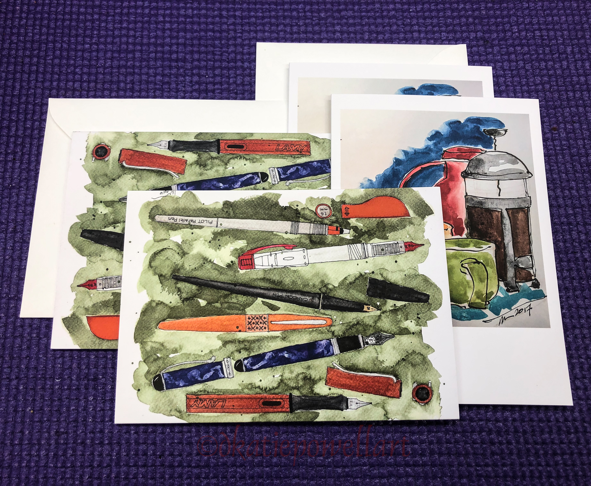
Inked sketches in a A4 Moleskin Watercolor journal, with (mostly)
Platinum Carbon pen and Pentel Pocket Brush Pen, the using a brush with
Noodler’s, Super5 or De Artramentis Document inks;
Daniel Smith Watercolors with a few Greenleaf & Blueberry, Holbien and QoR’s.

I agree to Creative Commons Attribution-Non-Commercial 4.0 International License, which you can learn more about by visiting the site, or,
visit my web page for a more user-friendly summary on my terms.
My images/blog posts may be reposted; please link back to dkatiepowellart.


It looks like you guys did a wonderful job on the table. I look forward to reading more about that process Kate. It’s interesting to see your drawings alongside some of the photos. It really illustrates the sense of closeness that your drawing bring to the scene. All very nice.
LikeLike
Thanks Dan. You should subscribe to the MPF Conservation blog (link is up on this page) so you see the post when I post it.
LikeLiked by 1 person
Thanks Kate.
LikeLike
Pingback: Inktober, Week Four | D.Katie Powell Art