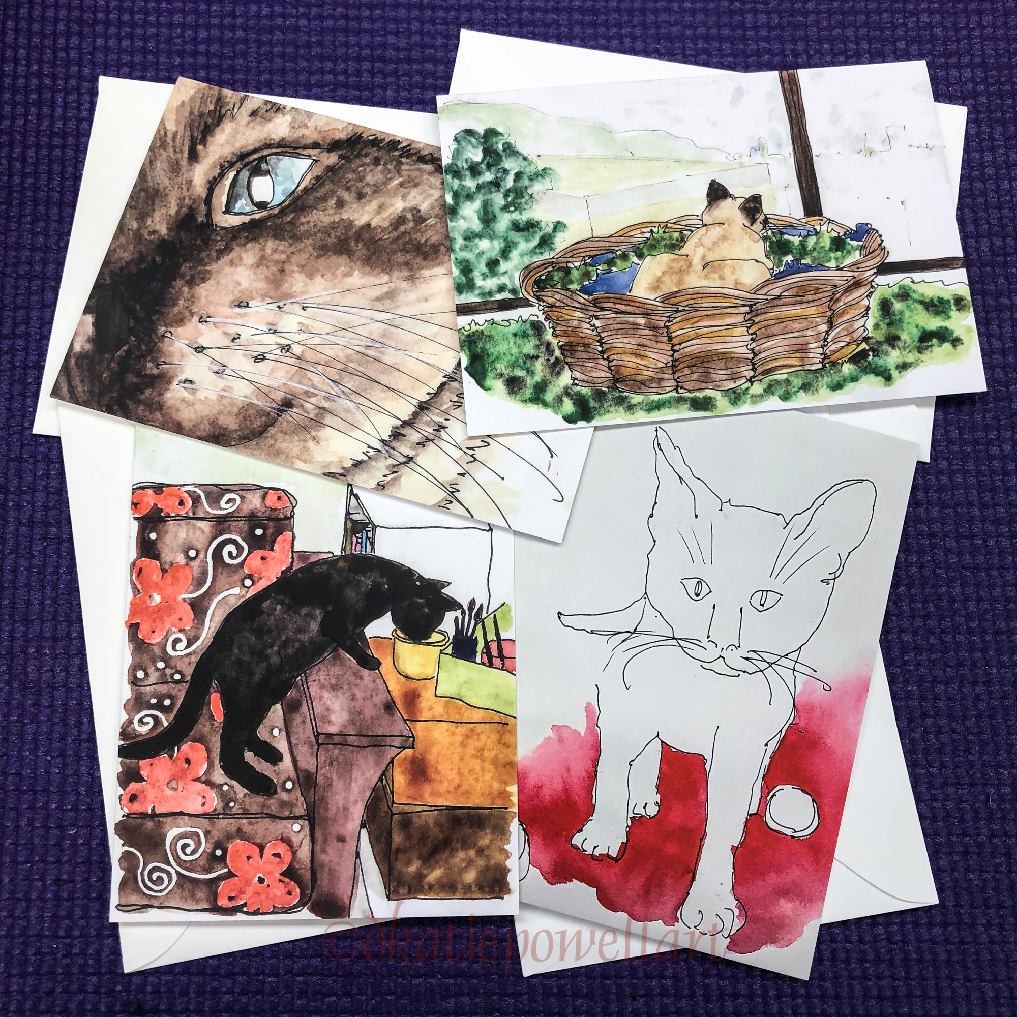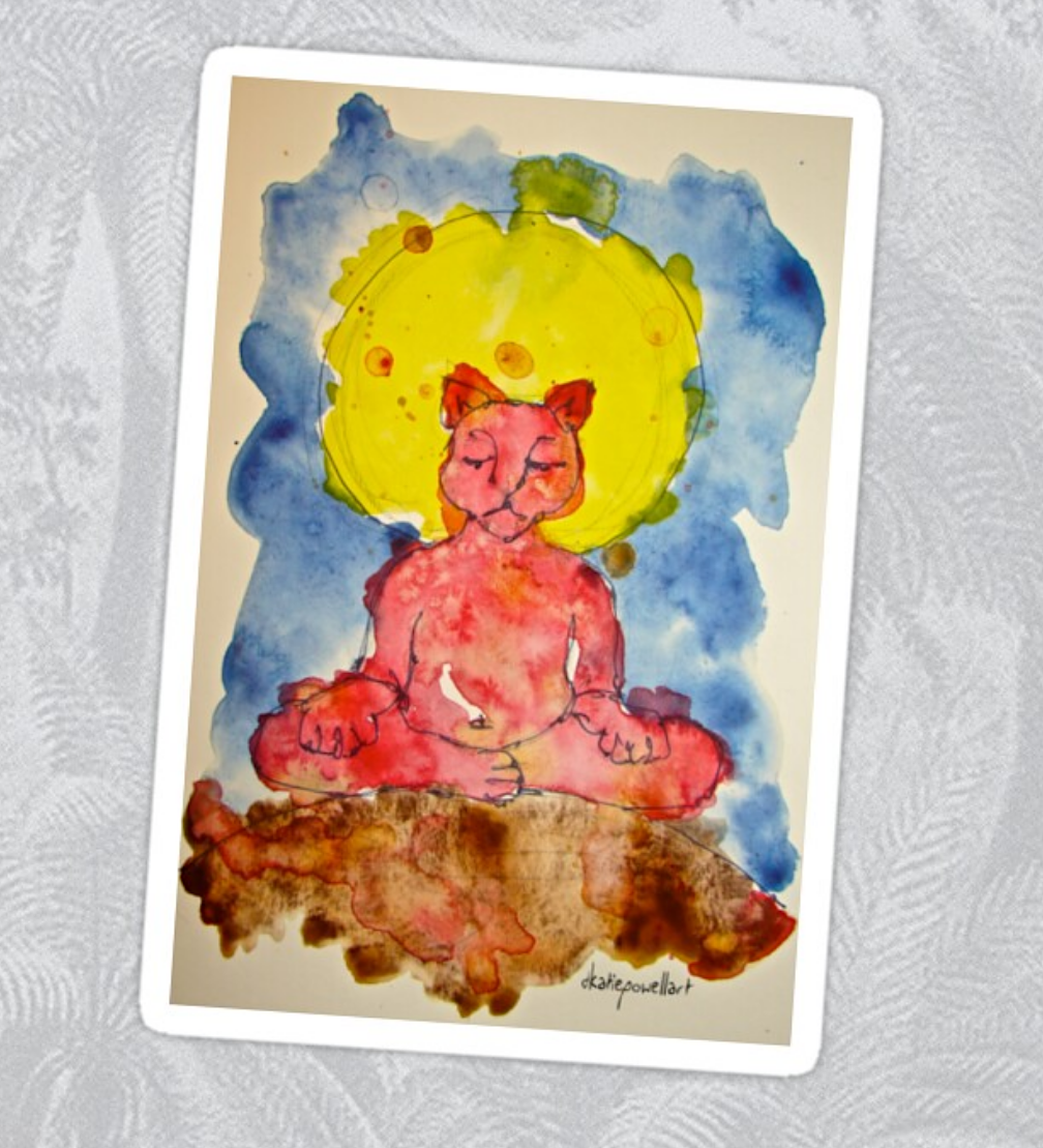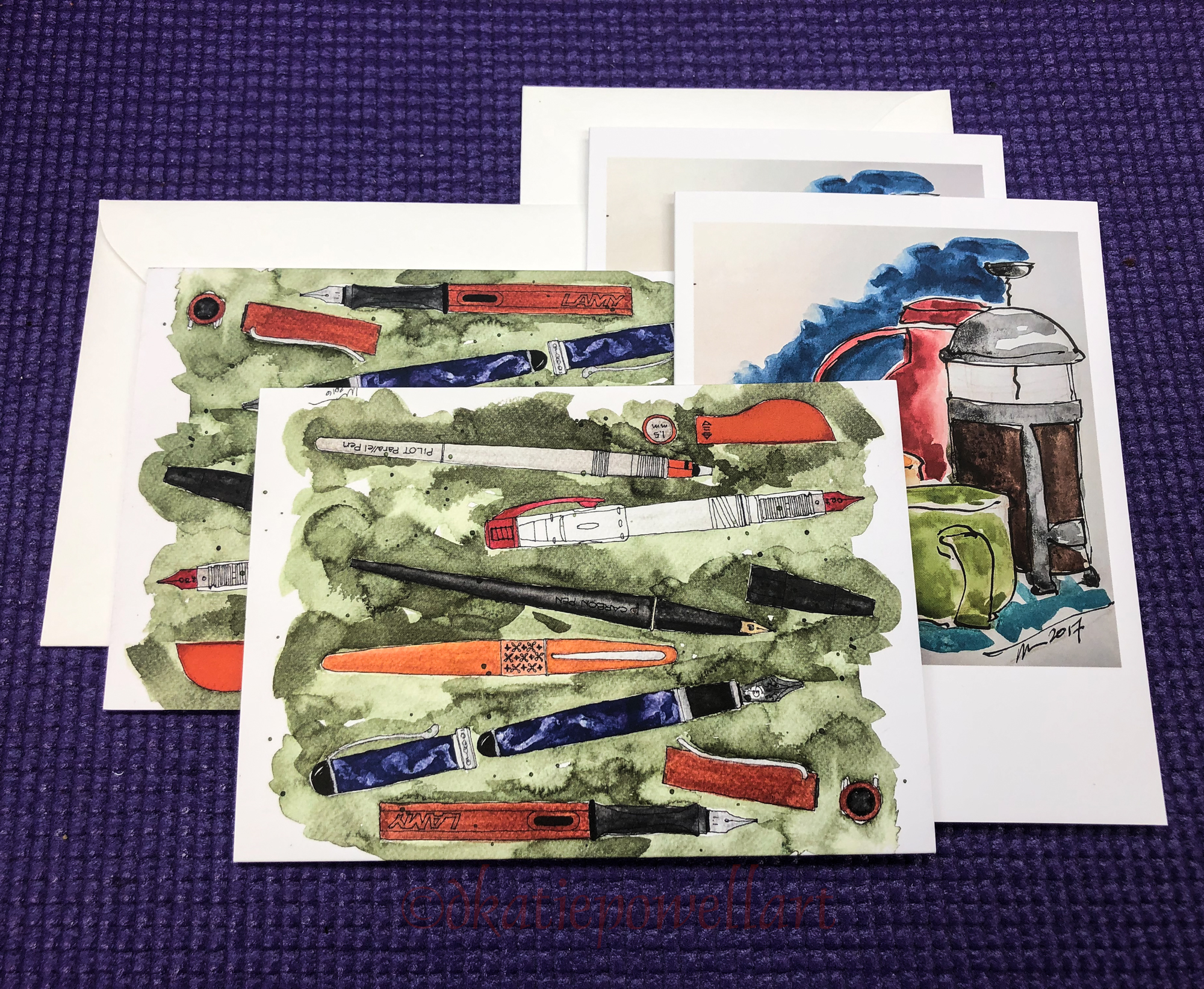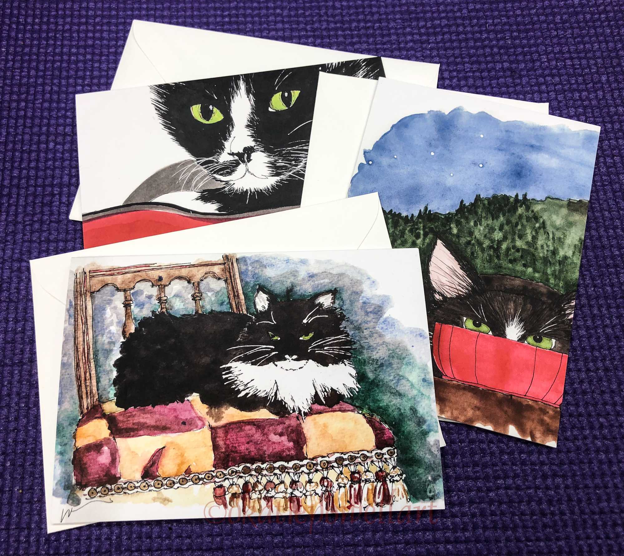
Why do I always like them better cropped into squares!?
One of the last images in my Hahnemühle Watercolour Journal…
wobbly paper makes for a wobbly sky wash… cropped it is interesting,
but larger looks like a bad wash! Let’s call it Wobbly skies!
Every so often I forget how much I don’t like opaque watercolors and give
MG Cobalt Turquoise another try… It is a perfect color, if only transparent.
I’ve been using inks so much I’m needing to switch to my watercolor mindset again>
This was painted fast, as a sketch in about 15 minutes (without drying time).
 Bay of Fires, Australia.
 To hear about classes, follow me on Facebook
or check out my new, improved dkatiepowellart.com
“Memory is more indelible than ink.”
Anita Loos, Gentlemen Prefer Blondes.
“I think not….”
Me… why I journal!
Hahnemühle Watercolour Journal, watercolor pencil,
Lamy Al-Star with Diamine Ancient Copper ink,
TWSBI Eco 1.1 with Robert Oster Australian Sky Blue,
MGraham and DS Primatek watercolors, and Daniel Smith Watercolors.
☾


I started a Facebook group page (you must join to view) to allow everyone to share their virtual sketches, and also where we will, from time to time, take virtual sketch walks together. Come join us On Facebook if you are inclined!
If you want to know more about what a virtual sketchwalk is review my first post.
There are a few more notes/pointers on our first walk through Laguna Beach, California.
I also created an accompanying Flickr group!
☾


I agree to Creative Commons Attribution-Non-Commercial 4.0 International License, which you can learn more about by visiting the site, or,
visit my web page for a more user-friendly summary on my terms.
My images/blog posts may be reposted; please link back to dkatiepowellart.
☾
 As my Patreon supporter, you will have
access to some content not on this website,
sneak previews, goodies, discounts on classes.
I teach architectural sketching,
art journaling (art+writing), creativity, watercolors.
That annoying loud-mouth editor/critic in your head? GONE! How great would that be?


