
It’s been ages since I have pulled out my watercolors for anything more than a splash.
You know that I don’t artists criticizing their work, but in this case, I am sharing with you a process of my own, as I learn to risk and push my own boundaries, and as such it is a reflection of my critique in order to grow as an artist.
In sharing I intend to show the kindness I offer to my processes, because without risking I can’t grow, and yet I can still have a critical eye to what I strove for and what I created.

This was a huge push for me, as the items I wanted to place into my journal were the many vibrant pillows I’ve been hand-stitching for the business for weeks.
Fingers to the bone from stitching, my hands had little ability to do much more than soak in Epsom salts! I’ve not had it in me to do much at the end of a stitching day.
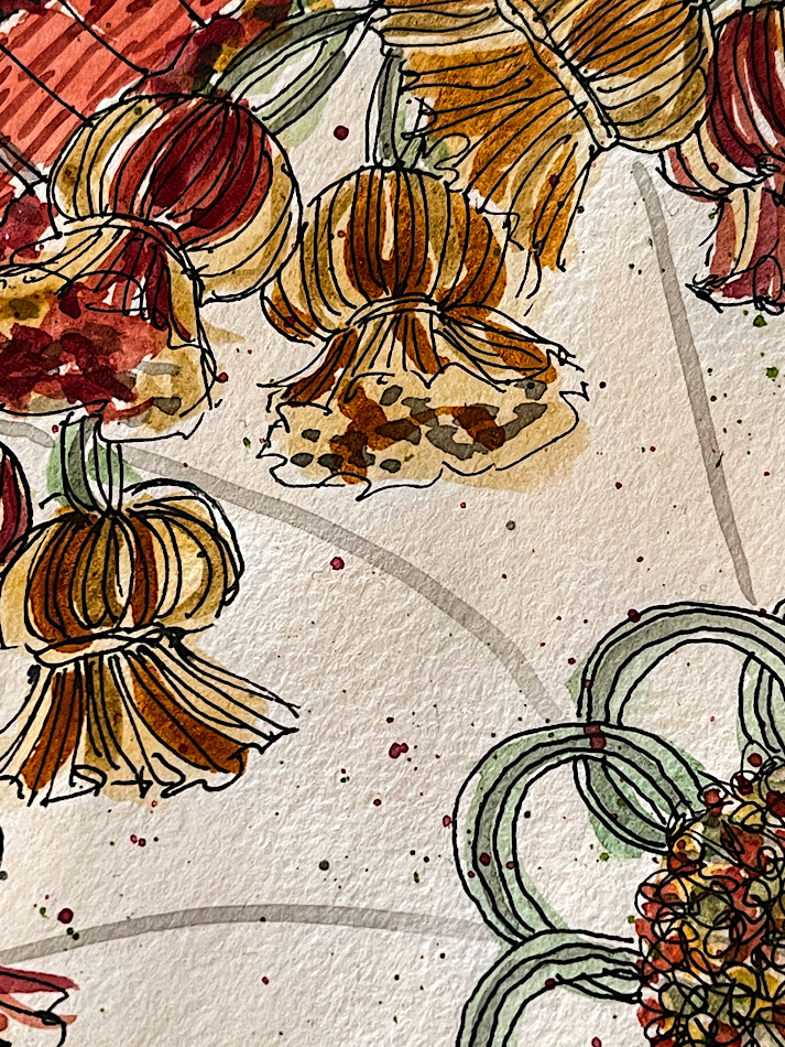
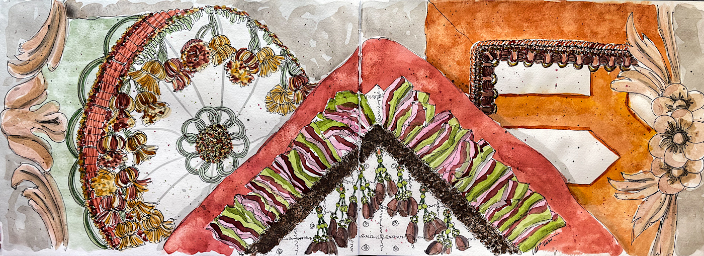
The pillows are shot silk, which is a shimmering material, rich deep colors as only silks can produce. I am sharing images of the pillows below so you can see the reality of what I was trying to capture.
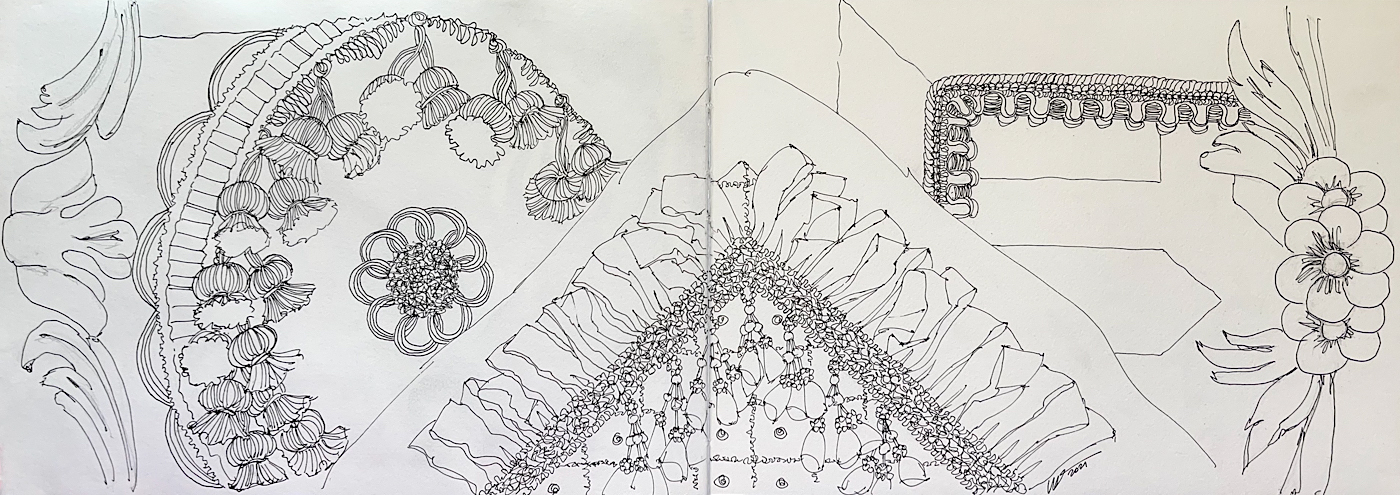
 I loved my pen sketch (see below), created with Platinum Carbon ink. I almost chickened out on moving forward with the watercolors.
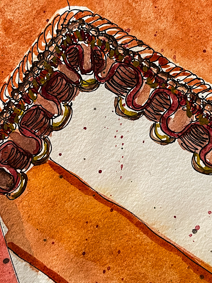
I used a diluted waterproof grey ink to lay in some shadows, my own, not “accurate” to reality, but accents where I knew I wanted the grey ink to shift the watercolors on top. See below for grey ink images.
It was nice to have the bits and bobs of gimp trims in front of me as I was afraid to be near the finished pillows with watercolors — one spill would cost me days.
 The washes I created were sometimes mixes of various Quinacrodone golds with Daniel Smith Primateks, such as Rhodonite, Amethyst, or Terre Ecole. This allowed the base colors to shift slightly as I laid layers of color onto the paper.
My challenge was to layer deep colors one on top of the other without them getting muddy. Muddy is where watercolors go to die! As you can see from the details above, I did pretty well. Waiting for the colors to dry thoroughly then topping the next layer quickly so as not to activate the dry watercolor below was key, and I am pretty happy!
Another challenge — to mix enough of each wash to cover the area.
This is always a push for me — I never quite seem to have enough and so you can see below where I had to mix more (or maybe you can’t, but I can.)
So my final critique is such a surprise — I don’t like my layout!
The balance of colors bothers me, which apparently I didn’t take into account as I was sailing along sketching details! So I did another thing I have never done —
I lifted paint (lower right-hand corner) and added paint after I was finished.
It is still problematic to me, but better than before.
In truth, I should have placed the round pillow in the middle both due to the shape and the color, separating the vibrant red-orange pillows in both color and shape.
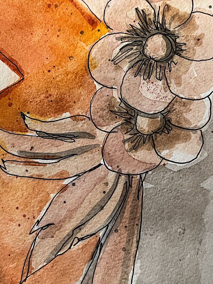
BTW, the floral peachy details along each edge are details from
the French Louis XIV Settees, which our client has us paint instead of restoring
to the original shellac with gilt accents on the flowers; as the pieces were previously stripped (by others), we were open to doing something unconventional.
In the end. I’ve learned so much from pushing myself to try this layering of deep colors, trying not to muddy but pushing to add complexity with watercolor.
It is so much easier with acrylics!
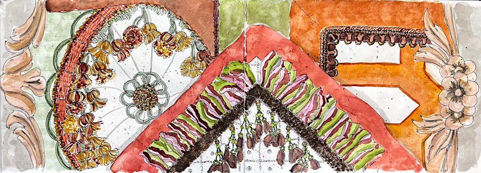 Above, the revised finished spread versus what I thought was finished, below.
Grey inked spread, then the inked spread.

 It drives me crazy when I can’t scroll through images but have to open each independently, so that is why I often end with all the images.
A couple of details of the actual pillows, below,
and I also added the original sketches we showed the client.
Also, as this project was in our studio for a long time, I have other posts:
Mitchell on the Louis XVI Sofa
Sketching for Presentations: French Sofa
Sketching for Presentations: Pair of Louies


 To hear about classes, follow me on Instagram, Facebook
or check out my new, improved dkatiepowellart.com
“Memory is more indelible than ink.”
Anita Loos, Gentlemen Prefer Blondes.
“I think not….”
Me… why I journal!


©D. Katie Powell.
My images/blog posts may be reposted; please link back to dkatiepowellart.
Note: As an Amazon Associate I earn from qualifying purchases.
☾
 As my Patreon supporter, you will have
access to some content not on this website,
sneak previews, goodies, discounts on classes.
I teach architectural sketching,
art journaling (art+writing), creativity, watercolors.
That annoying loud-mouth editor/critic in your head? GONE! How great would that be?


You did some excellent work here, Kate. Starting with needle and thread! I love following along with the process. I laughed at “muddy is where watercolors go to die.”
LikeLike
Tis true…. There are whole tutorials on mixing colors (which I’ve not read of course) and it is soooo easy to slip into muddy!
LikeLiked by 1 person
I love the work Kate……loose, but detailed just enough. We’re our own worst critics. We have to push ourselves, that’s just a given, but I think sometimes we’re too brutal with our analysis of the finished work. Great job with the sketches and the pillows, I know just how much work you put in on them.
LikeLike
Thanks Steven!
LikeLike
I really enjoyed this post!
>
LikeLike
I am so glad!
LikeLike
Thanks for sharing your process! I love your work, and I especially loved the first few detail shots here. Remarkable ink & wash details; delicious colors.
LikeLike
Thank you!
LikeLike
These are beautiful, both the paintings and the real thing. But I like the paintings better. You are so hard on yourself!
LikeLike
No,not really. I don’t walk around saying I am a bad artist…. I don’t have that voice. This was meant to show artists how to b productive when they don’t like their work by how they talk to themselves.
And thank you!
LikeLiked by 1 person
Ah, that makes sense.
LikeLike
🙂
LikeLike