

I use a journal MOST of the time, mostly because right now I am still working full time.
But I have lovely watercolor blocks from Hahnemühle, and they were bought or given to me (full disclosure) to review. I finally found a great way to review them, because I made a simple journal to allow me to fully play with each page using watercolors or inks…
I can take my small handmade journal to bed with me and experiment in the middle-of-the-night, and I have a great little reference tool for future!


The various watercolor papers in this review are Cézanne, Harmony, and Expression.
* i keep wanting to say expressions, not expression without the ‘s’ *
This is Part One of the review, on using ink pens and painting with inks.
Part Two will be using Watercolors.
☾
COLD-PRESSED (“NOT”),
HOT PRESSED, AND ROUGH PAPER
Before I go further, I am reviewing only the cold-pressed versions of these papers.
(“NOT” is the European term for Cold Pressed, meaning the paper is NOT hot pressed.)
I prefer cold-pressed papers, or possibly rough — I like tooth and texture!
Hot pressed is a smoother paper, but doesn’t fit my mark-making/watercolor style as well.
I like to give watercolors and inks, who seem to have a mind of their own, their head resulting in happy accidents (and sometimes unhappy accidents).
Because I love Daniel Smith’s Primateks and small independent watercolor makers
who often have more texture in their pan paints
(MatteoGrilliArt, JazperStardust, PfeifferArt),
cold-pressed texture furthers my intentions in mark-making.
But let’s talk about how these textures are made… simplistically.
Being a paper maker I could say lots more but let’s keeps it simple!
Hot Pressed Paper is rolled between heated glazing rollers with great pressure.
This pressured rolling creates a smooth, almost polished finish.
Artists who prefer hot-pressed like heightened brush detail and bright crisp color.
If the paper is quality, it usually tolerates a certain amount of lifting.
Smooth combined with surface sizing results in a surface which resists paint absorption; the paint tends to stay on the surface. Of course, hot pressed papers are
more welcoming to fountain and dip pens as well, as they are smooth!
Cold Pressed Paper or “NOT” Paper (and let’s also include Rough Paper)
are made by hanging the sheets to dry or by rolling the sheets with light pressure
through felt covered metal rollers (mould made papers).
Cold pressed papers can have varying levels of texture from different manufacturing houses. If the paper is quality, it usually tolerates a certain amount of lifting,
and is congenial to almost any style of painting.
Cold-pressed is usually less absorbent than rough sheets.
Watercolor paper is also sized to alter its absorbancy.
“Internal sizing” is added to the pulp before the sheet is created and bonds to the fibers. “External sizing” is applied to the surface of the finished sheet after it has dried,
usually by dipping the sheet into a vat of sizing solution.
*you can re-size paper and I am testing this now*
The term “acid free” usually means the paper was made of cotton, linen, or wood cellulose; never bleached; and contains no aluminium sulphate (alum) in the sizing. Archival Papers meet these standards.
Note: Paper should last for centuries if stored properly, that is,
sealed so that it is kept away from the environment.
Acids attach themselves to papers that are not properly stored, though I would not worry about this if you have a paper block that you are using in a relatively short time.
Otherwise, keep your final pieces and your back stock in a sealed plastic tub
or in sealed plastic bags to prevent them from absorbing acid.
Acid is a particularly destructive hazard to paper.
☾
The Hahnemühle papers reviewed below are
ALL acid free, surface sized, and are 300g/m2 or 140 lbs,
intended for watercolor and other mediums.
 CEZANNE

I tested matte cold-pressed Cézanne; it is a mold-made paper.
It also is available in rough and hot-pressed (smooth).
It is a lovely natural white (not bleached bright), which I prefer to bright white papers.
I want to see how it plays with INK!

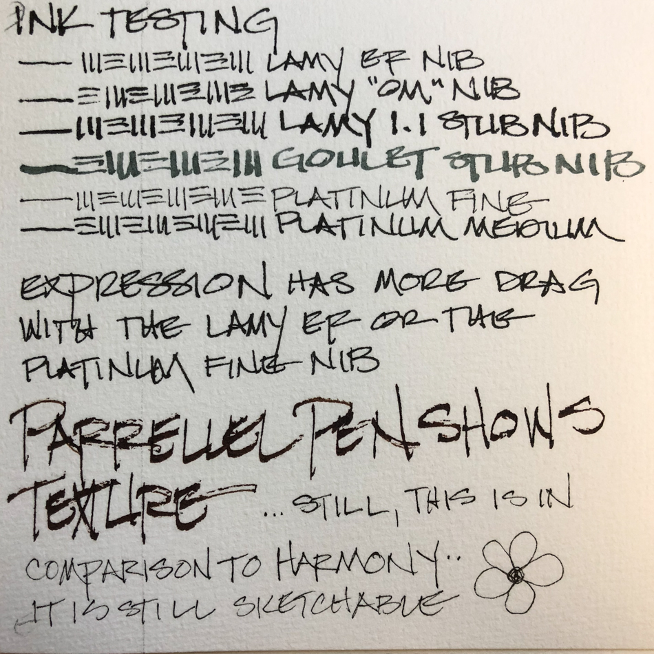
On each of the samples, I tested using my daily use pen, stub types, and ink combos.
The reason? Different inks, pens, and stub types run dry, or very wet.
This dry and wet combo is a good way to test the paper.
Platinum Carbon Extra Fine Nib (also called Fine nib on some sites) is going to be the most “scratchy” of my pens, because it is the finest nib with drier ink.
The Lamy and Goulet stub nibs with the De Atramentis Document and
Super5 inks (both waterproof) are wetter inks.
Cézanne had a nice surface for the inks to grab onto, no skipping, but does give a bit of feedback (scratching noise) on the finest nibs, which may bother some people.
As long as it doesn’t interfere with the ink flow, I am okay with feedback.
Like all these papers, cold-pressed has enough tooth that
using fine or extra fine nibs might bother some who prefer
hot-pressed or Bristol papers (the latter are extremely smooth).
Note: The OM Lamy nib appears a bit scratchy…
This is an oblique medium nib, and the scratchiness
is due to it being my first time using it, not the paper!
My next ink test for Cézanne was to see how it reacted to
multiple layers of inks and lots of water layered over the inks!


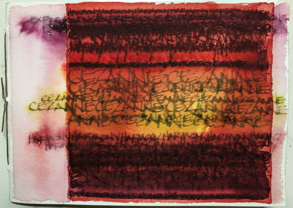
Inks with a water wash to move the inks; fairly heavy water wash on top of the semi-waterproof and waterproof inks.
On top of the base of waterproof ink, writing in both waterproof
and non-waterproof inks was layered heavily using Pilot Metropolitans in medium or the calligraphy (small stub) nibs and the Lamy with 1.1 stub nib.
At no time did repeated layers of ink on ink cause lifting of the paper or
begin to drill a small hole: this is a sturdy paper.
 I used the Platinum Classic ink line, which has a some water resistance, and found this ink used with the stub nibs feathered just a bit on the Cezanne… not a problem in this application, but as with every paper, test before proceeding with any new ink or color! I do this at the back of each journal.
Finally a clean water wash went over the entire cover to move the semi-waterproof inks.
As you can see, I tend to clip my papers, but there was little buckling on this lovely paper.
The inks when washed did not sit on top of it but moved and
interacted with the other colors very much like a watercolor.
I will love using this paper for ink painting.
Cézanne can be found at: Cheap Joes;
Fine Art Store (I find them frustrating because sizes are often not on the site);
Art Materials; Jacksons (UK); and SAA (UK).
 Cézanne ready for watercolor washes!
 EXPRESSION

Expression is similar to Cézanne but is not mold-made.
It is cold-pressed, or at they refer to it, “NOT Paper”, or not hot pressed!
 Expression pulled a bit on the extra fine
fountain pen points. I rarely use fine points
in my work, preferring mediums and stubs,
and so is not problematic for my use.
I was curious about how the Platinum
Parallel pen (right) would play on a textured paper. There is a lot of scratchy texture!
Remember the Parallel is primarily a lettering pen… I had little to no drag using the
Lamy 1.1 stub or the Goulet stub nibs,
and both are lovely for lettering.


In in the wet ink painting test, I used mostly Pilot Metropolitans in medium
or the calligraphy (small stub) nibs for the colored inks,
and the Goulet stub in the Jinhao for the fat writing.
At no time did repeated layers of ink on ink cause lifting of the paper or
begin to drill a small hole: this is a sturdy paper.
DeAtramentis, Super5, and Diamine Ancient Copper ink behaved well on the paper.
The Diamine Chocolate tended to feather (last line), but it is a very wet ink with a wet nib, which I think catches on every little bump in the textured papers.
The inks when washed across the paper loved the paper, and did not sit on top of it but moved and interacted with the other colors very much like a watercolor.
I will love using this paper for ink painting.
At this time Expression can be found online from European countries:
Jacksons (UK); and SAA (UK).
 Expression ready for watercolor washes!
 HARMONY

Harmony is also natural white, but the tooth is finer than than Cézanne or Expression.
It is also available in Rough and Hot Pressed.
It is acid free/archival alpha cellulose.
I learned something about Hahnemühle’s papers and also with other papers:
if it does not indicate Cotton or Bamboo its Alpha Cellulose.

From a nib/ink point of view, this is the best of the three papers for ink.
Extra-fine nibs glide over this paper with no hang-ups.
Also, there must be a bit more sizing and/or the pulp content allows for less feathering.
Please excuse my pen on the last line; running out of ink during testing!

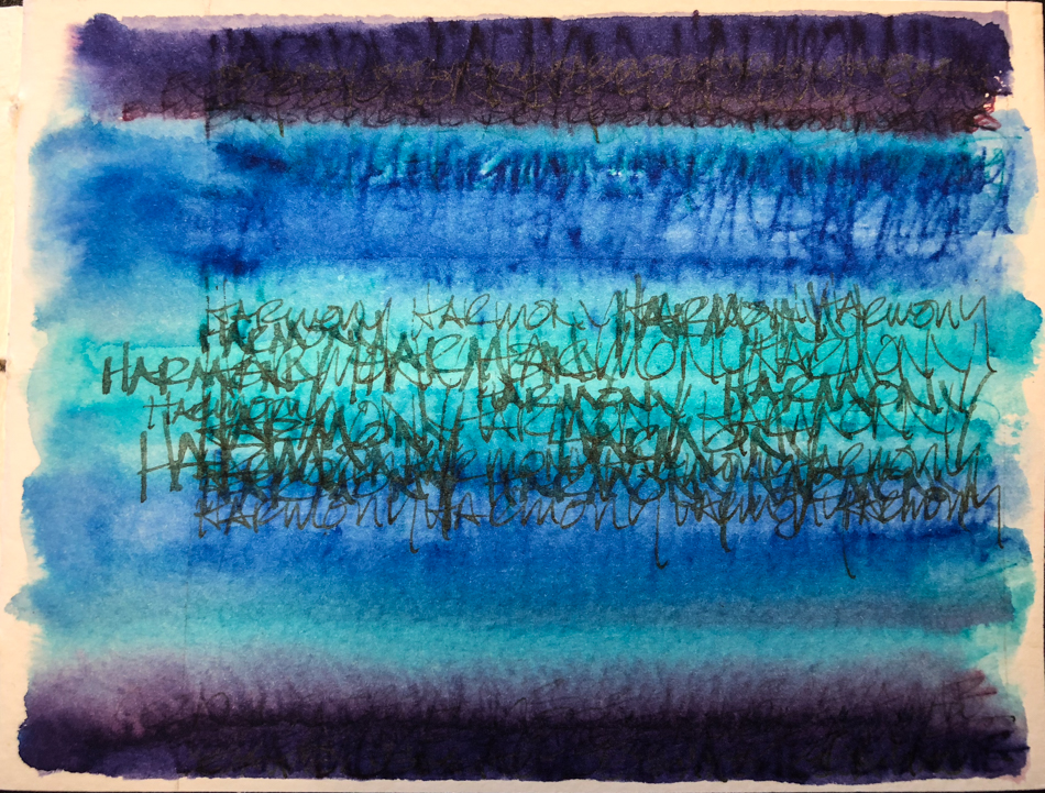
I used Pilot Metropolitans in medium or the Lamy 1.1 stub nibs for the colored inks,
and the Goulet stub in the Jinhao for the fat grey waterproof lettering.
At no time did repeated layers of ink on ink cause lifting of the paper or
begin to drill a small hole: so again, strong paper!
Super5, Platinum Cassis Lavender, Robert Oster Jade and Diamine Blue Velvet ink behaved well on the paper, almost no feathering even in very wettest inks.
The inks when washed across the paper loved the paper, and did not sit on top of it
but moved and interacted with the other colors very much like a watercolor.
I will love using this paper for ink painting.
Harmony can be found at:
Art Materials; Jacksons (UK); and SAA (UK).
 Harmony ready for watercolor washes!
SUMMARY
I would use any one of these papers for ink, but if I was drawing
a highly detailed drawing before adding watercolors (or for an ink drawing)
would probably choose Harmony for that endeavor.
If I was to use exclusive extra fine or fine nibs I also might stick with Harmony.
However, all the papers behaved well with inks overall.
Next, I test with watercolors!
 For an opportunity to test drive one of
these papers in a small handmade journal,
win this and handmade papers by
commenting “I want to win!” on this blog post:
Hahnemühle: Cezanne, Harmony, and Expression Giveaway!


 To hear about classes, follow me on Facebook
or check out my new, improved dkatiepowellart.com
“Memory is more indelible than ink.”
Anita Loos, Gentlemen Prefer Blondes.
“I think not….”
Me… why I journal!
☾
Hahnemühle Cezanne, Hahnemühle Harmony, Hahnemühle Expressions,
Pilot Metropolitan with Platinum Cassis Black ink,
Lamy Al-Star with Platinum Citrus Black ink,
Lamy LX pen with De Atramentis Tobacco ink,
Pilot Preppy pen with Noodler’s Lexington Grey Ink,
Lamy Al-Star with Diamine Ancient Copper ink,
Lamy Al-Star with Robert Oster Jade ink,
Lamy Al-Star with Diamine Ancient Copper ink,
Lamy Al-Star with Diamine Blue Velvet ink,
Lamy Al-Star with Diamine Grey ink,
Lamy Al-Star with De Atramentis Document Black ink,
Platinum Carbon Pen with Platinum Carbon ink waterproof cartridges,
Sennelier, Holbein, and DS Primatek watercolors, and Daniel Smith Watercolors.


©D. Katie Powell
My images/blog posts may be reposted; please link back to dkatiepowellart.
☾
 As my Patreon supporter, you will have
access to some content not on this website,
sneak previews, goodies, discounts on classes.
I teach architectural sketching,
art journaling (art+writing), creativity, watercolors.
That annoying loud-mouth editor/critic in your head? GONE! How great would that be?


Good Morning:
Thanks so much for this thorough review!
Iâm so grateful for all your support.
Let me know whenever I can assist you with product.
Best regards
Carol Boss
Marketing Services Manager
Hahnemühle USA
380 N. Terra Cotta Rd.
Unit G
Crystal Lake, IL 60012
Phone: 815-502-5880 ext 102
Fax: 815-502-5879
carol@hahnemuhleusa.com
LikeLike
You are welcome! These packets are creative fun!
LikeLike
I want to win. Thank you for this wonderful information.
LikeLike
You are entered on the proper site as well!
LikeLike
Wow great post. Lots of good info with wonderful art.
LikeLike
Thanks Nicole!
LikeLike
Lovely art thanks for the info.
LikeLike
You are welcome Christine!
LikeLike
Pingback: Hahnemühle: Cézanne, Harmony, and Expression Papers with Watercolor | D.Katie Powell Art