

I often see this face when I am just waking up…
She finds ways to get up over my head and stare down…
A cheery cheery face.

Painting Savitri is pushing me to learn and experiment, especially when it comes to color. I’ve tried so many mixes and they are all wrong.


Finally I spent time just mixing until I came up with a good base color,
and figured some of the deep colors that I can add.
QoR has a lovely transparent grey called Ardoise Grey, and that was a base, and I added Daniel Smith’s Primatek Monte Amiata, though probably many ochres would do.
I mixed it in with the grey in roughly a 1:2 ratio. A little of the Primatek goes a long way.
I also use the grey by itself in areas, and add Sepia and occasionally Yavapei.
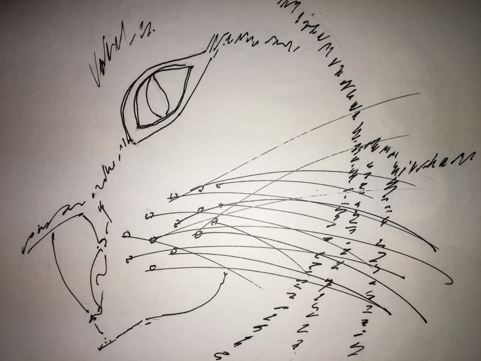
Sketch…
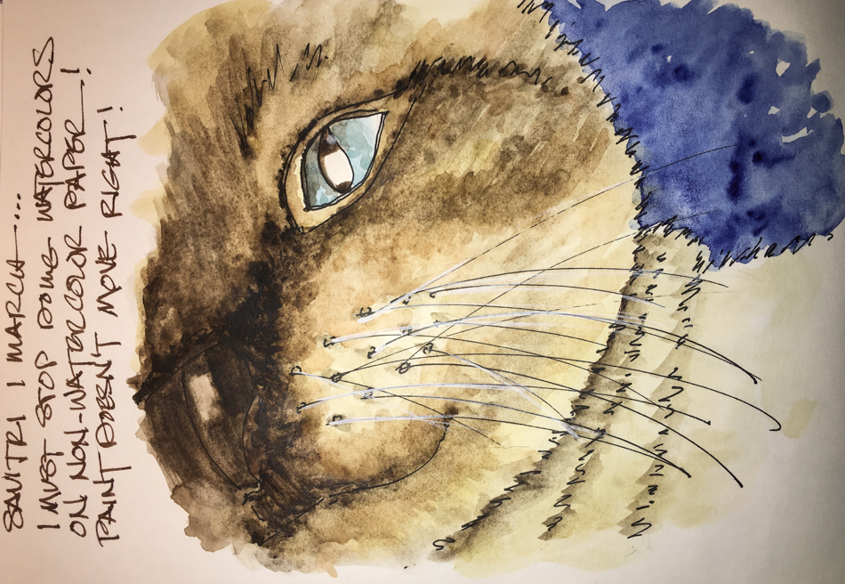
Grey went over the blue of her eyes also.
What I must stop is trying to work a nice watercolor in the Nostalgie journal,
especially when I have amazing Hahnemuhle Watercolour journals too!
Her nose area needed to be worked and if the paper had been watercolor
it would have been fine… But finally the paper said, ENUF!
I’m basically happy with it — a good trial test of the colors!
 To hear about classes, follow me on Facebook
or check out my new, improved dkatiepowellart.com
“Memory is more indelible than ink.”
Anita Loos, Gentlemen Prefer Blondes.
“I think not….”
Me… why I journal!


©D. Katie Powell.
My images/blog posts may be reposted; please link back to dkatiepowellart.
☾
 As my Patreon supporter, you will have
access to some content not on this website,
sneak previews, goodies, discounts on classes.
I teach architectural sketching,
art journaling (art+writing), creativity, watercolors.
That annoying loud-mouth editor/critic in your head? GONE! How great would that be?


I love this post! My little fur ball girl wakes me up everyday at 4:30am with a lick on the face and although it feels like sand paper I’m still grateful for the lovin 🙂
LikeLike
Yes, always! You should send me a picture of your furball!
LikeLike
More pigments to add to my drool list! Love your paintings of Savitri.
LikeLike
The QoR is one of the few colors I love in their line — it is a fairly transparent grey. I am out and need more — but I can put a half-pan of the other to dry for you for when we MEET!!!!
LikeLike
you have captured the cats nature very well here
LikeLike
Thank you!
LikeLike
She made me smile…
LikeLike
Savitri thanks you!
LikeLike
lovely work!
LikeLike
Thanks Christine!
LikeLike
What an adorable kitty, I love your painting! It is beautiful.
LikeLike
Savitri says thanks!
LikeLike
You got it! a perfect color for your beautiful cat!
LikeLike
Thanks Gloria!
LikeLike
I enjoyed seeing your cat painting. Lovely use of the colours.
Blessings
Janis
Paint Party Friday #51
JanisCox.com
LikeLike
Thanks Janis!
LikeLike