


It is such fun to try handmade paints from JazperStardust and PfeifferArt.
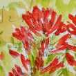
I played with them in posies on Hahnemühle post cards…
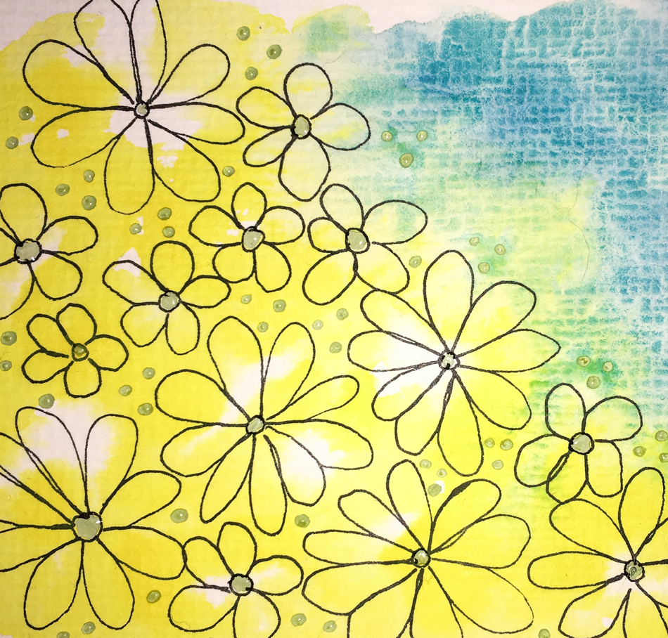
I use masking for ease, and to get the white dots at the end…
Jazper’s Lapis up against DS Quinophthalone Yellow as a base.

JazperStardust‘s Lapis, Goldfish, Sunray, and Coral star with other colors mixed in…
I had problems so removed a bit of color — Jazper’s paints can go on thick and rich — and maybe a bit too rich so I need to get used to more pigment than a Daniel Smith paint.
I simply went in with a damp paper towel, and was fine with the slight impressions it left — I like texture! Still not quite happy, I took a cotton swab and dabbed on DS Sap Green.
Once the masking was removed, I was happy!


PfeifferArt‘s Lavender-Blue played nicely with Jazper’s Lapis and Goldfish.
Working with handmade paints takes getting used to the differences…
More pigments usually, meaning you have to do less of a dip
into the wet paint to get a wash going.
The heavy texture of the Hahnemühle Post Cards adds to the variation!.
☾
 To hear about classes, follow me on Facebook
or check out my new, improved dkatiepowellart.com
“Memory is more indelible than ink.”
Anita Loos, Gentlemen Prefer Blondes.
“I think not….”
Me… why I journal!
Hahnemühle Post Cards, watercolor pencil,
Platinum Carbon Pen with Platinum Carbon ink waterproof cartridges,
JazperStardust, PfeifferArt, and Da Vinci, Holbein, and Daniel Smith Watercolors.


©D. Katie Powell
My images/blog posts may be reposted; please link back to dkatiepowellart.
☾
 As my Patreon supporter, you will have
access to some content not on this website,
sneak previews, goodies, discounts on classes.
I teach architectural sketching,
art journaling (art+writing), creativity, watercolors.
That annoying loud-mouth editor/critic in your head? GONE! How great would that be?


We just had another snowy day so these posies give me hope that spring will be here soon 😉
LikeLike
I keep waiting!
LikeLike