Continued from Big Changes in My Travel Palette…
After the travel palette sort, and after successfully trading some paints I didn’t want,
I began to look at the paints that have ended up on the sidelines, and wondered about my ability to handle those now that I’ve played with watercolor paints three years.
Wow, only 3 years! Come a long way with near daily practice!
I bought many pretty opaque watercolors
early on which I ended up hating!

These musings lead to an evening where
I pulled pans out I never used and began sorting
*why does this happen late at night?*
I emptied my last two Hahnemühle Postcard tins of their postcards
and turned them ALL into palettes!
 As I was brushing colors and playing with the old new colors,
this of course led me to notice strange things about what I owned.
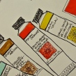
Like notice the various shades of Indian Yellow above?
Yellow, oranger, orangest….
Playing with the opaques I found I handle some,
like the Perinome Orange which I hated before….
So while I prefer transparent, I can handle semi-opaque.

 As I sorted, tested and played,
I noticed there were huge
differences in various brands of
the “same” single pigment colors.
I’m not just talking about
variations in pigmented color
paints due to heating a pigment
(Burnt Umber versus Raw Umber),
or various formulas for Quin Gold, (which is another story).
Look at the row of Prussian, Indanthrone, and Indigo above.
MatteoGrilli’s Prussian is saturated pigment compared to Holbein,
which I love and use all the time.
Da Vinci’s Indanthrone is a richer pigment content than Daniel Smith.
Ultramarines on the bottom row: the one by MatteoGrilli is intense pigment,
creamy and gorgeous, whereas Daniel Smith is meh by comparison!
*all paints were equally moistened prior to swatching*
*this is making me reconsider whether i will reach for daniel smith all the time…
hmmm…more on that and paint quality later…*


 So many quinacridones!
I am addicted! I will buy them all! Just say the name quinacridone,
whether in the pink/purple tones right, or the gold tones left,
and I want them!
Lovely transparent, brilliant!
*btw, i think one
of my pale pinks is also
a quin with titanium…*
I’m starting to buy the occasional purple, but I am so not a purple gurl.

Early on I was seduced by Daniel Smith’s descriptions of Italian and Southwestern earth colors… They all look quite similar to me, and thankfully, now I read pigments!
The Hahnemuhle Postcard tins are perfect for me… I love the postcards
and have no trouble buying them and stealing the tin immediately.
I can also stack them in a small space when I want to clear my desktop for some other activity… Which is better than having a big wheel for me.
*btw, i don’t buy them from Amazon because
I often find things I want from Jackson’s and with a certain amount
there is a reduction in overseas shipping
— but they do sell them at Amazon… and so far no where else in the states!
HINT HINT!*

My Primateks, are still in the same pan.
However, I bought Purpurite and when it gets here then I will have to deal with that too!
I also have had to reschuffle and add a tin because I did some massive trades
and have more Da Vinci paints! It only took a couple more to put me over!

Then, of course, I had to paint ALL the colors…
It hangs above my studio desk!
Finally, or at least with this post today,
I was thinking of doing a post on how to use dot cards
but someone sent me this video, below, from Hajra Meeks.
When it is done perfectly why redo it?
I am also following her videos — a new perspective!
I give you a (long) perfect explanation of dot cards use!
To hear about classes, follow me on Facebook or
check out my new and improved dkatiepowellart.com and sign up for my newsletter!
☾
Da Vinci, MatteoGrilliArt, Sennelier, Holbein,
MGraham, DS Primatek and Daniel Smith Watercolors.



©D. Katie Powell.
My images/blog posts may be reposted; please link back to dkatiepowellart.
Image from https://commons.wikimedia.org/wiki/File:El_hombre-p%C3%A1jaro.JPG.
☾
 As my Patreon supporter, you will have
access to some content not on this website,
sneak previews, goodies, discounts on classes.
I teach architectural sketching,
art journaling (art+writing), creativity, watercolors.
That annoying loud-mouth editor/critic in your head? GONE! How great would that be?








I love how organised you are with your palettes and paint charts. May I pose you a question? I had to donate my tube paints when we emigrated as the shipping company wouldn’t allow them. I am at the stage now where I want to upgrade my watercolour paints and would like to invest in tube paints again. I cannot decide which brand to try out though – I will only be able to afford a few tubes at a time. I like transparent paints that are still punchy with colour and like paints that separate and dry in interesting ways, with great blooms and separations, and gradations. So my question is, given your experience with many brands, which brands do you think it would be best for me to try?
LikeLike
I emailed you but it may not have gotten through. I am going to write one more of these posts very soon and talk about the brands I like best aand my favorite palettes. Spoiler: Da Vinci, MGraham, Daniel Smith (still) and Holbien in major name brands. Also Laura I can’t remember if you joined Doodlewash the site (NOT FB but an actual site https://doodlewash.com/members) because there aer so many great discussions about watercolors under favorite supplies. https://doodlewash.com/forums/forum/share-your-art-tools/
LikeLiked by 1 person
Thank you so much for that information. I did join Doodlewash but have not spent a great deal of time perusing the forum as I don’t properly paint in watercolour (as opposed to using it for colouring in illustrations) frequently enough to feel like I would be contributing anything to the community. But that is a good reminder to check out relevant posts there. I have been leaning towards M Graham and Daniel Smith. I have some time before I can splurge so I will keep researching but appreciate you pointing me in the right direction.
LikeLike
You don’t have to contribute to the community but can take from for now… if you play you will learn a lot and eventually you will share this or that. Some of the folks properly paint in watercolor, but many are like me, doing pen and ink and watercolor drawings, or mixed media — as long as it uses watercolor it can be posted. And I will post my notes on my preferences (why) soon…
LikeLiked by 1 person
Thanks for the encouragement. I tend to use watercolour in the same way I use ink, for “colouring in” illustrations. I’m definitely not painterly.
LikeLike
What a huge project! I’d like to sit down and do something like this, but it’s a way down the list of things that need to be done. You’ve done a fabulous job. The Hannemuhle YouTangle.art tile tins are quite nice as palettes too. The paper isn’t great for watercolor though – really light wash only.
LikeLike
I’ve tried pinning the edges down but they are just a tad too light for watercolor….
LikeLike
You can purchase these wonderful tins from Rochester Art Supply inc. 1150 W. Main St., Rochester NY 800-836-8940 and they list it on their website :http://www.fineartstore.com/p-12260-hahnemuhle-watercolor-postcards-in-metal-tins.aspx
LikeLike
Other Dealers in the US that also have the post cards for sale but not listed on their websites yet are listed below. I invite everyone to contact those dealers and ask them to list it on their websites for you 🙂 ARCH SUPPLIES – San Francisco, CA- Ph 415-433-2724,
ARTISAN / SANTA FE INC – Ph 505-954-4179
CALIFORNIA ART SUPPLY – San Mateo, CA – Ph 650-350-1990
FLAX ART & DESIGN – San Mateo, CA – Ph 510-867-2324
JERRY’S ARTARAMA – NJ – Ph 973-669-0995
LENZ ARTS, INC – Santa Cruz, CA 831-423-1935
LikeLike
Whoa — This is great! I’m buying mine from Jacksons in the UK! I will post this with my next postcard blog post.
LikeLike
Pingback: Tools: Travel Palette, Three | D.Katie Powell Art