
Continued from Big Changes in My Travel Palette… An aside…


 Recently I took the advice of a
USk sketcher I admire and bought a series of
Holbein’s Antique “IRIDORI” Watercolors pigments…
AAACK, bad paints!
Be glad if you didn’t buy them before they discontinued them (I think everywhere).
Cracked into itty bitty pieces in the pan, and dull.
Huge waste of resources (meaning my money!)


Which brings me to this topic: taking another artist’s advice.
*yesh i see the irony in this but take this advice!*
Above are just two of the many colors I bought on a popular artists’ advice —
Cobalt Teal and Buff Titanium. They don’t work for me.
In the case of Cobalt Teal, it is milky and opaque, and while the color is pretty,
I love — no require — transparent or semi transparent.
I’ve had CT in my palette for a long time trying to work with it,
mostly mixing it with Lapis for skies (it was so thick and dull for oceans) and finally dumped it for a Phthalo or Manganese in my travel palette… both more transparent.
Amazonite is more transparent, a bit sparkly, and mixes in the loveliest manner!
Buff Titanium became the rage (all the hip kids were buying it) and I bought it.
PHFFFT! What a why-bother color!?
*buff reminds me of navajo white house paint — sorry you either get that joke or not*


 I was starting to mix colors in the city and it
was discussed as a great mixing color for urban sketching.
*everyone bought some*
The thing is, for mixing I can still have transparent
and/or have a great color in your palette —
one I might even want to use on its own!
I love Verona Gold, which is semi-transparent,
and the Primateks Goethite and Yavapei,
shown right, which granulate and mix and
settle into such gorgeous patterns.
So here is my caution: If an artist who writes well or has popularity or is
your teacher tells you that this or that color is a necessity in your palette, do two things:
1) Look at their work and see if they paint in a manner to which you aspire!
Bright color palette? Muddy? Realism? Graphic? Portraits? Landscapes?
We are not talking good or bad art, but their style —
do their colors and style appeal to your creative impulses?
2) Look at the other options in that color range to see if there is one that has
more appeal for you, as there is rarely a gotta-have-that-one-pigment!.
Thankfully I learned this before buying Potter’s Pink!
Gads talk about a color I would never ever use and is easy to mix!
I have at least a dozen tubes of paint I would not have bought had I heeded this advice.
That is some good supply money! They are not bad colors, just not right for me.
There are painters who would not want my palette — bright transparent pigments!
PS: Beware of Daniel Smith’s so-called designation of “Semi-Transparent”
and ask art friends who like transparent pigments for their recommendations
and look at handprint.com (which you should begin to get to know anywho).
Both Buff and Cobalt Teal are categorized as S-T and I think they are Semi-Opaque.
More in the continuing palette saga to come!

To hear about classes, follow me on Facebook or
check out my new and improved dkatiepowellart.com and sign up for my newsletter!
☾
Da Vinci, MatteoGrilliArt, Sennelier, Holbein,
MGraham, DS Primatek and Daniel Smith Watercolors.


©D. Katie Powell.
My images/blog posts may be reposted; please link back to dkatiepowellart.
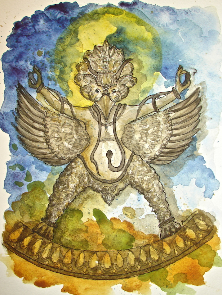
Image from https://commons.wikimedia.org/wiki/File:El_hombre-p%C3%A1jaro.JPG.
☾
 As my Patreon supporter, you will have
access to some content not on this website,
sneak previews, goodies, discounts on classes.
I teach architectural sketching,
art journaling (art+writing), creativity, watercolors.
That annoying loud-mouth editor/critic in your head? GONE! How great would that be?


Oh hee hee. I bought buff titanium a few years ago and used it once or twice. It looks like…bread dough. I don’t get it. I don’t live near beaches or adobe houses, and I keep meaning to pull it out of my palette. I am glad somewhere shares my apathy towards this oddly popular color.
On the other hand, I love cobalt teal and see it everywhere, like in many of these pictures: https://imgur.com/gallery/NOosk. It’s not wildly useful, but I like having it around.
LikeLike
I do paint beaches and adobe and still can’t see the use of it! I’ve traded my Buff (kept one full pan) for other colors, but am hanging on to my Cobalt. I will use it eventually too… splash it around an orange teacup!
LikeLike
Great advice! Not every tool will work for every artist!
LikeLike
Yuppers! 🙂
LikeLiked by 1 person
Thanks for the warning about the semi-transparent designation on the DS paints. I love the look of that cobalt teal colour but I am definitely someone who prefers transparency in watercolour paints.
LikeLike
Yes… I know it is hard to quantify this but I just do not think that either of these are semi=transparent!
LikeLiked by 1 person
You really have to wonder why would they say to buy this in the first place?
LikeLike
They paint differently than I do, or vice versa!
LikeLike