


What do you do when you have the flu?
Sick, fuzzy-brained, I was seduced by the new line of Daniel Smith watercolors!
I say seduced because I did not do what I should have, which is check the
the Munsell numbering System to see how close they might be to what I already own.
I don’t have unlimited funds so this is important… Ah well.
I am going to talk about the colors I have and the ones I am glad I bought…
(If you don’t understand the Munsell system see the bottom of the article.)
The colors I bought:
I tested them all over Noodler’s grey ink, to see the color shift over grisaille.
Reading the sides allows you to mix the paints if you prefer.
Also, you can get most of the info here by reading the paint tubes of artist grade paint.
In fact, one way to know that they are not artist grade is by the info on the tube.
 Verona Gold Ochre is made from Yellow Ochre PY43.
I like how transparent it is for an ocher! I own a sample of Ochre from QoR, above,
and it is very thick and muddy, as is raw ocher. I rarely use it because I love transparency in watercolors. Monte Amiata (a Primatek, Sienna PBr7) is quite close
(it is the long strip above the Verona Gold), and I think I like the Primatek a
bit more, but the test with this paint will be using it.
Note that Monte Amiata and Verona are different pigments : PBr7 versus PY43,
UPDATE: It is a color I won’t buy again. Just too *meh* for me, but for someone who paints golden fields far far away… Maybe.

Burnt Sienna Light is a keeper!
Made of Transparent Red Oxide PR101 + Quinacridone Gold PO48,
I love how it is both a deep hue and yet transparent.
BTW, Transparent Red Oxide; PR101 (the tiny vertical rust to the left)
is NOT transparent as far as I am concerned!
Some comparisons: Pompeii Red (made from Burnt Sienna PBr7) is an excellent comparison, but it is quite opaque, and so I like the Burnt Sienna Light better.
Terre Ercolano (Primatek, Raw Sienna PBr7) does not granulate quite as shown —
the scan was wonky — but I rarely use it because it is such a pale paint.
I may mix it with the Burnt Sienna Light.
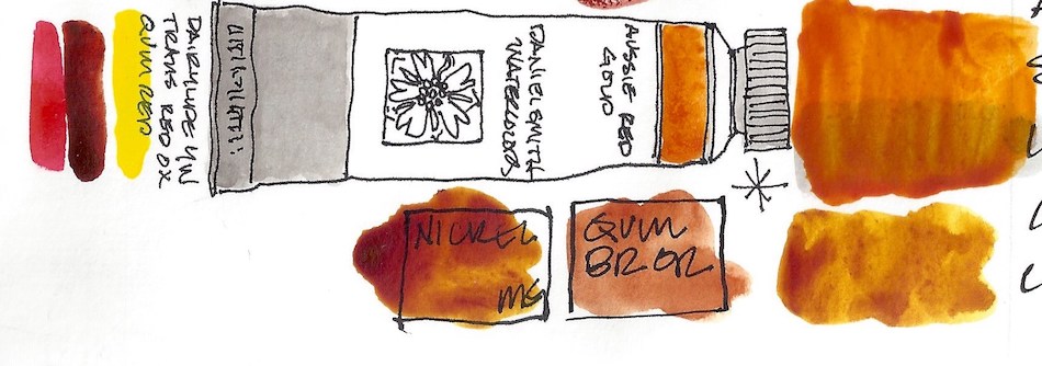 Aussie Red Gold is a lovely color, made from Diarylide Yellow PY83 +
Transparent Red Oxide; PR101 + Quinacridone Red PV19.
(I have shown M.Grahams which is PR209.)
M.Graham Nickel Quinacridone is the best comparison (Nickel Azo PO48 + Quinacridone Orange PY150), then DS Quinacridone Burnt Orange (Quinacridone Gold PO48).
M.Graham Indian Yellow (Isoindoline PY110) is a bit yellow.
If I were inclined to buy this color again
(I’m not as I use Holbein and DS Quin Gold all the time)
I’d replace M.Graham’s, only because of the drying time in the field.
Not a good buy… I bought it for the NAME!
UPDATE: I love this color!!!! It has an underlying brilliance none of the others have — I take it all back!
 Paynes Blue Grey is a keeper! Made with Indanthrone PB60 + Lamp Black PBk6, it is unnecessary — I mean, you cn add a bit of blue to Paynes Grey — BUT,
I will not bother to buy DS Paynes Grey again (Ultramarine Blue PB29 +
Ivory Black PBk9) because I like the smokey blue shadow color.
This will end up in two of my travel palettes.
 Okay, Quinacridone Lilac is just a sales snow job! It is Quinacridone Magenta PR122. Compare it to QoR’s Quinacridone Magenta PR122… same dang color!
 Rose Madder Permanent is a lovely color (Quinacridone Coral PR209 +
Quinacridone Red PV19 + Quinacridone Magenta PR202). These pinks are totally frivolous, but so pretty. To my eye this is not really a Rose Madder, as it is a bit bright — but on the plus side it is permanent, and true Rose Madder, like Opera Pink, is fugitive.
In my palette it is not close to any other color, and I am not inclined to mix pinks.
I admit to owning a dozen pink-coral colors and enjoy them all.
 I enjoy painting Victorian homes, or “Painted Ladies.” I have mixed quite a few of the Victorian paint colors in pans to carry with me, and this is one that I would keep. Lavender (made from Titanium White PW6 + Ultramarine Violet PV15 + Ultramarine Blue PB29) is close to Greenleaf & Blueberry’s Mayan Blue PB82. I love their paints, but they fill them to overflowing in the pan, and so I rarely use them — they are not convenient to my way of painting. I would probably buy this once every five years!
 Finally, Wisteria, made of Titanium White PW6 + Quinacridone Magenta PR122. Again, an excellent color for Painted Ladies and orchids and…
Not necessary, but quite pretty.
I do not think Daniel Smith is telling the truth about the pigments, however, because Quinacridone Magenta and White do not make this color…
There must be a blue in there! Just saying.
Keepers? Yes, a few…
But I would not have bought half of them
had I not been feverish!
☾
Note: To understand the initials after the colors you may need to read my post about learning not to buy unnecessary paints and how you can duplicate paints easily (different names for the same color), and eventually, you should visit and become familiar with handprint. I printed quite a bit of it so I can read in bed late at night… More info than you will ever need BUT dip into it and soon you will be amazed at how differently you look at your paints and make your choices. NOT while delirious in bed…
Here is another good article on palette, not color of paints!
 ☾
☾
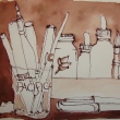
Nostalgie Journal by Hahnemühle,
Platinum Carbon Pen with Platinum Carbon ink waterproof cartridges,
and Daniel Smith Watercolors with a few others as comps.


©D. Katie Powell.
My images/blog posts may be reposted; please link back to dkatiepowellart.
☾
 As my Patreon supporter, you will have
access to some content not on this website,
sneak previews, goodies, discounts on classes.
I teach architectural sketching,
art journaling (art+writing), creativity, watercolors.
That annoying loud-mouth editor/critic in your head? GONE! How great would that be?


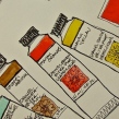
I love the way you draw the tubes of paint. It’s so much more personal than a photo.
LikeLiked by 1 person
Thanks — and I get the colors and my sketching in!
LikeLiked by 1 person
Wow, Kate. What a great comparison. Sorry for the flu but thanks so much for the $$$ saver.
LikeLike
You are welcome. That system has saved me money when I bothered to look. There are some :colors” worth having from different manufacturers — like I love Holbein’s Quin Gold, a cheaper variety, because it does soft skin pigments, whereas Daniel Smith kicks butt in deep tones.
LikeLiked by 1 person
I love your knowledge and intense focus on colour! Glad you are better x
LikeLike
I am glad too…
Two internet thangs changed my color understanding.
Handprint (the link is in the text) is an overwhelming site but like a college course. Focuses mostly on watercolors but the info is good I think for oils as well — just no this links. Explains color systems which I snoozed at in classes as an architect. I appreciate him because he saves me money… and now I find it a bit interesting!
Also, again a watercolorist, Jane Blundell is nuts for tubes of paint, and writes well on color. She doesn’t rally post her watercolors much, but her blog is all about paint… I hope I am the bridge between these two!
LikeLiked by 1 person
Have you tried mixing Quinacridone Lilac with white and seeing if you get Wisteria? If you do, that explains how both Quin Magenta and Quin Lilac can be PR122 but not the same color.
LikeLike
Actually, most of these colors could be easily mixed! (I blame my buying them on my fever!) But the thing about the Quins is that other factors also go in to making them vary when they are the same Munsell number. Dang where did I read about this!? It was a cool article but did not share easily.
LikeLike
Pingback: Tools: Da Vinci Watercolors | D.Katie Powell Art
I loved this post, was searching about how to make Quin Gold. I used to follow an artist and do all her tutorials on you tube. Each tutorial she would talk about her new ‘favorite’ color and I used to think I just had to get it. After buying Verditer Blue and finding out it was just cobalt blue, and many others, and thinking -that’s just like – fill in the blank – I began to realize she was actually getting a percentage from the paint company on every tube of paint she sold. Now I just find out what is in the mix – like Aussie Red Gold – and mix it myself, Great blog!
LikeLike
Thank you!
I did some of the same until someone turned me on to the Munsell system. And I still will say this — that sometimes they do SOMETHING that gives the mix a zing that I can’t seem to get mixing — are they leaving out an ingredient? Hmmm… Aussie Red is one of those. And yes, I think my aha moment was buying French Ultramarine and laying it side by side with Ultramrine and thinking wait a minute — that is a $15 mistake! For that it needs to talk to me in French!
And alas, I am on no one’s payroll though I am sent products to review by companies from time to time.
LikeLike
Having a boring day and this just turned it around: “…For that it needs to talk to me in French!…”. Love it. Made me laugh out loud to no-one but myself in a silent studio.
LikeLike
I am thrilled!
LikeLike