

I like doing full images more than a hundred…
THAT’S what I learned from #oneweek100people.
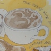
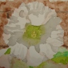
I did this from a picture of Mitchell laying on a fully re-tied spring set.

I’m happy with the way it turned out, and wish our camera had not gone out on us
(buying a new one) as this one is a bit so-so on color… the colors are quite nice.


I still hate the Fabriano A4 Watercolor journal, and am sorry I did this nice sketch in it.
The paper hates watercolors… seriously. I made it look like the splotchiness was intentional, but this should not have done that and it is all about the worst-paper-ever.
I will finish it with sketches without watercolors.
To hear about classes on art journaling, follow me on Facebook!
☾
Fabriano A4 Watercolor journal, Lamy Joy with De Atramentis Document black ink and Platinum Carbon pen with Platinum Carbon ink;
Noodler’s Lexington Grey; Sennelier, Holbein, and Daniel Smith watercolors.
©D. Katie Powell.
My images/blog posts may be reposted; please link back to dkatiepowellart.
☾
 As my Patreon supporter, you will have
access to some content not on this website,
sneak previews, goodies, discounts on classes.
I teach architectural sketching,
art journaling (art+writing), creativity, watercolors.
That annoying loud-mouth editor/critic in your head? GONE! How great would that be?


I agree, full images are much more fun. I wouldn’t know the paper is bad – you made it work – and I like the scene you’ve done.
LikeLike
I think the Fabraino journals here must be different than overseas. The paper lifts and doesn’t take watercolors well, unfortunately. I complained to Fabraino and they weregracious and sent me more journals, but they are all the same.
LikeLike
Wonderful sketch! And the detailing, wow.
LikeLike
Thank you Susan!
LikeLike
Wonderful illustration Kate. You made the paper work for you.
LikeLike
Thanks Nicole! Yes… When splotchy is what is happening then make splotchy your friend!
LikeLike