
 You might remember the sketch
I did of this door and “blue” tiles
at a home the other day >> It wasn’t the first time I’d drawn the house. I’m drawn to it: it is close to the studio, the form reminds me of so many homes in Los Angeles, and because of the tiles…
I’d studied the house’s form early on a walk with Mitchell. First studies were about the building, notes to myself in case I didn’t finish it onsite (I didn’t.) Studying a building helps me but it can
also help someone who doesn’t have the architecturally trained eyes to catch perhaps quickly the language the building is using towards it grace or grandeur.
 Human scale noted. The steps were eye level —
this reminds me about the angles up and down (video coming),
and what I am seeing on shadows and balcony ceilings and lighting.
I look for symmetry and exceptions, though in this case, exceptions only in landscaping.
I discovered, by putting pencil to paper, what was so versus what I had assumed about the roof in this building! Sketching-thinking allowed me to study what I think I am looking at then check it to the actual building. You can see my initial block, which is higher than the actual roof, which is a bit oriental and steps down due to our viewpoint.
I then blocked it in brown pencil. These sketches in an Aquabee sketchbook.
 When I went back my point of view changed a bit (higher) and I finished a pencil sketch in the moleskin. This is about as detailed as I get in a sketch before inking, below
 Inked. At this point in my moleskin journal I went home to paint —
but not before taking pics for color.
 Art Nouveau Tiles!

 The steps leading up to the doors in this and the buildings next door (matching, built by the same architect) have the most gorgeous Art Nouveau tiles! The “plain green” is multi-hued, jewel-tone emerald- green but moving in lime and blue directions;
there is an amazing watercolor-glazed effect.
I used the tiles patterns creatively in the
page layout for the building. I still have space
on the opposing page and have not decided what
I want to place there — perhaps lamp details or notes from our walk or some other discovery. I drew them initially in a sketch book onsite but then I wanted
this cool border (below) to frame the layout.


Finally without my writing, below!


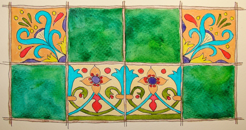 The lovely green is Diopside Green by Daniel Smith with touches of Spring green, if I remember. I also used some of the cheapy Prima colors for the first time…
Not terrible. I have no idea if they are lightfast — no rating — SO, only in sketchbooks.
I am playing in the group Thursday Doors, led by Norm 2.0, with others, here!
Have you got a door in your sketchbook?
Moleskin 8×11 watercolor journal, with a Pentalic HB woodless pencil,
Lamy Al-Star with De Atramentis Document Black ink,
Platinum Carbon Pen with Platinum Carbon ink waterproof cartridges,
Sennelier, Holbein, Prima, DS Primatek watercolors, and Daniel Smith Watercolors.

©D. Katie Powell.
My images/blog posts may be reposted; please link back to dkatiepowellart.
☾
 As my Patreon supporter, you will have
access to some content not on this website,
sneak previews, goodies, discounts on classes.
I teach architectural sketching,
art journaling (art+writing), creativity, watercolors.
That annoying loud-mouth editor/critic in your head? GONE! How great would that be?


My eye is really drawn to the aqua, purple and red in the tiles. So pretty and such a lovely home! I can understand why your artistic hand is so willing to recreate the house, door and tiles.
LikeLike
I LOVE this house. I’d paint it a different color… not gold. I tend to walk around the neighborhood seeing certain buildings in different colors!
LikeLiked by 1 person
That first sketch really highlights the graceful look of the approach to the house and the tiles are glorious!
janet
LikeLike
Thank you!
LikeLike
Lovely doors, Kate. I like your comments about making notes about the building’s form. I do that with furniture and with buildings I notice while walking. I like when exterior elements telegraph aspects of the construction. The tiles are beautiful, too!
LikeLike
I love the exposed structural elements too. I fell in love with Frank Gehry’s early work when everyone was poo-pooing it.
LikeLiked by 1 person
That’s very pretty – nicely done 🙂
LikeLike
Thanks Norm!
LikeLiked by 1 person
Beautiful green indeed! My favorite color. 🙂 Great walk-through of your process. Looking forward to the video.
What does Mitchell do while you’re sketching? He-Man would continue on walking and leave me in the dust I fear.
LikeLike
Mitchell likes architecture. Sometimes he walks around the block, but he is also endlessly able to amuse himself just being.
LikeLiked by 1 person
I always enjoy your additions to Thursday Doors, but this one, ooh, the tile! Lovely!
LikeLike
Thanks Joey. BTW, I will be doing a Santa soon….
LikeLiked by 1 person
🙂
LikeLike
So you ink first and then apply watercolor? I love the entire process you showed us, Kate. So much to watch and learn.
LikeLike
Most of the time, yes, pencil-ink-watercolor. But not always. Occasionally I will slop a LOT of color on a page then ink over it.
LikeLike
Love this lesson. Going to save it.
LikeLike
So glad I can help!
LikeLike