
Each Sunday this summer I am looking at my paint “collection”:
Tools: Watercolors, 1, Yellow-Orange;
Tools: Watercolors, 2, Red-Pink
Tools: Watercolors, 3, Greens to Yellows
Tools: Watercolors, 4, Blues to Greens
I hated pink and purple as a girl; I was a tomboy.
I wanted a purple bike as a kid for about five seconds, but, well, tomboy…
Purpley-pink was just so GURLIE! I’ve never navigated to purple, don’t remember ever buying but maybe one purple piece of clothing. As hit my teens, of course, I found out how amazing a tan blonde girl looks in soft pink, and so I liked it for clothing…
and later hot pink or magenta as an adult: it was shocking, sexy, and intense.
Violet? Purple?


Maybe I never liked purple / magenta because I like truth and on some level
I intuited that purple was a trick of the eye! (Just kidding.) Unlike violet, which exists in the light spectrum as red moved to blue, purple isn’t real in the color spectrum of light photons. Our brains make it up! In terms of what the colors suggest in our world —
when you say purple it is the color closer to red, between crimson and violet.
Violet is closer to blue, and is usually less saturated than purple.
On the other hand, I need purples to paint with occasionally —
and am having a hard time finding one I love,
coming to watercolors from acrylics, where the colors are intense.

 NOTE: All paints Daniel Smith (DS) unless it says
otherwise — including the Primatek colors.
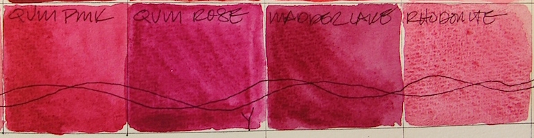
Included in this posting are magenta-purpley pinks, as opposed to
the peachy pinks from the posting on Red. Some were painted first in the Reds palette.
First, let’s talk colors that look the same,
have the same pigment structure,
or are called by the same name out of the way:


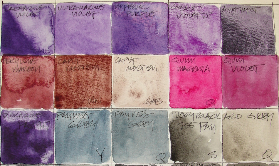
Greenleaf & Blueberry Caput Mortem is not the Caput Mortem I want (which is DS Caput Mortem, much less purple, and also discontinued, far right.) I am bringing together all the Caput Mortems, even though I put the DS version into the brown posting because it really has no tinge of purple. Windsor Newton Caput Mortem, PR101, is an intense mauve that I really hate…. but I had to try it to see if it would take the place of DS.
BTW, if anyone has Daniel Smith Caput Mortem
I’d be eternally grateful and happily pay for it!
To see references on VIOLET and MAGENTA from handprint, click through.
The Keepers:


Which are keepers? In the purple ranges, I will keep
Sennelier Dioxazine Purple 917 PAN, PV25 — though I will move to the tube version — and Carbazole Violet, Dioxazine, PV23(RS). Both are dioxazines…
I love Imperial Purple, Quinacridone + Ultramarine, PV19 / PB29, but it has its limitations because it separates into lovely pinks and purpley-blues.
Still, I’m not a realist, and so, I am keeping it because it is beautiful.
Cobalt Violet Deep, PV14, I am keeping only because I need the hue, but I will keep looking for a deeper color, because it is sort of wishy-washy.
I am disappointed in some of the quinacridone magentas, and I have a half-dozen!
I will keep these, because they are clear and bright: QoR Quinacridone Magenta, PR122 (more lightfast that Opera pink and just as brilliant.) Quinacridone Pink, PV42, is more pink than shown on my screen. Yarka’s Quinacridone Rose is a bit muddy, but for now, I’m using it a lot so I will keep it until I find a better version.
Greenleaf & Blueberry Caput Mortem is such fun to use sometimes
in purpley stonework. Perylene Maroon, PR179 is SO not a favorite color of mine,
but it fills the need in some mixes, and so it stays.
The Rarely or Never Agains:


To me, these really are losers. I just don’t like them, and ought to trade them with someone NOW. Why? Ultramarine Violet, PV15 is Blah, wishy-washy, flat. Quinacridone Violet, PV19, flat. Yarka Madder Lake is muddy and should pop.
Windsor Newton Caput Mortem, PR101, ugly.
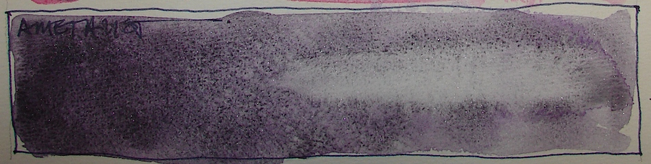 Primatek Amethyst, unfortunately, while a responsive solid Primatek,
probably loses out because it is expensive and I am not a purple gurl!
I don’t think I’ve ever used it! Tomboy still?
Pentalic Field Journal, Platinum Carbon pen, and Greenleaf & Blueberry,
Sennelier, Holbein, QoR, M.Graham and Daniel Smith watercolors.

I agree to Creative Commons Attribution-Non-Commercial 4.0 International License, which you can learn more about by visiting the site, or,
visit my web page for a more user-friendly summary on my terms.
My images/blog posts may be reposted; please link back to dkatiepowellart.
What object do you cherish?
Paint it and enter it in Cherished Blogfest July 29, 30, 31!

Tell us the story you tell about one of your cherished objects. Tell us what your object is, post a painting / drawing / photo, and tell us why you cherish it. 500 words, pictures, posted on the July 29th, 30th or 31st. Help us spread the word: save (right-click, save image) the badge, right, and place it on your sidebar. Tell your friends on social media. Hashtag: #cherishedblogfest.
When the Cherished Blogfest goes live on the 29th, enter your blog post entry into the Linky List.


I had to laugh at the title. This is the worst region of the spectrum for my color blindness. I mean Violet AND Purple? You really know how to live Kate 🙂
LikeLike
I am so sorry…. I thought of the color blind folks when I posted this. Greens, Reds, and purples…
LikeLiked by 1 person
It’s OK. I wouldn’t normally mention it, but I feel like I know you well enough that you know I’m not trolling for sympathy. I just thought you might be interested. Some of the comparison squares really look identical to me. But, I see more than enough colors to fill my world.
LikeLike
I really understand. I have a dear friend who is sooooo color blind, an architect. Once he decided to paint his apartment to his liking rather than conventionally, and it ended up in shades of (seriously no other word for it) baby-shit brown. Pea poop, apricot poop, bloody poop. We all cam over and repainted the dang thing. But I also won a bet with him. I bet him I could pick his color perfectly standing in a paint store, and I did! Not sure how that worked — how I saw the colors he w=saw when I am not color blind. And I also think there is truth to the rumor that only men are color blind? Women can loose intensity of perception (which is akin ot being color blind) but they don’t see color shifts. I call it the decorating gene. I think there is a post in here…. Dedicated to Dan and Paul.
LikeLiked by 1 person
Yeah, I’m not allowed to pick paint colors. I think about 8% of men are colorblind to some degree. The rest have no excuse for the bad choices they make.
LikeLike
hahahaaaa — even Mitchell is just a bit.
LikeLiked by 1 person
Love your comparison of colors. I don’t use watercolor much but am going to try to change that habit in July. I have discovered that painting with watercolor inks is a lot of fun. Looking forward to the Cherished objects Blogfest.
LikeLike
I too, love painting with inks. If you oput ink into my search tools you might find some posts about it. I especially love using waterproof inks as the shadowy greys before i go into paint with watercolors. Grisalle…
LikeLike
Pingback: Tools: Watercolors, 6, Browns and Golds | D.Katie Powell Art
Pingback: Tools: Watercolors, 7, Black, White, Grey and Sparkly Colors!! | D.Katie Powell Art