
Prepare for a total geek posting.
I’ve finally created an entire mixing chart.
Who knew what I might learn!
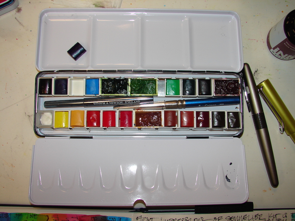

 I wrote about finding a great deal on a
Sennelier travel palette with pan watercolors, above. I’ve not owned pan paints since I was a kid, but thought I’d use them and see how I liked them, with additions — I can’t live without Diopside, Piemonite and Yavapei. My resolve lasted two days. I wasn’t fond of the Sennelier pigments. I took the Sennelier pan colors out and put them into my old travel palette, right. How cool that they fit perfectly, with a
couple extra, including white gouache?
Sennelier colors are very gouache-y!
I made my perfect travel palette (until I change it), below, of Daniel Smith watercolors.
I may change out the Cobalt Teal or the
Imperial Purple; I may put in Buff Titanium, or prefer Cobalt Purple. I mixed the pinks, a Quinacridone Rose with Opera Pink, for a perfect pink, and lots of Primateks!

Then a friend in Italy, did a color mixing chart.
I’ve never done one.
Everyone says you should and in 35 years I’ve never done one.

ALL the cool kids do them. Okay, Okay…


I’ve done my own explorations, exploring how Daniel Smith Primateks (DSP) mixed
with colors, or how they reacted in holding a brush stroke, etc.
I’ve explored two colors, or one color mixed with several, especially the Primateks,
but never the whole palette, methodically. I mean, I went to architectural school
and took lots of art classes, I know color theory, so why should I?
Because so many are so stoked about it…
I decided to do TWO this week, one for my actual travel palette,
which is full of my favorite paints, Mostly Daniel Smith (DS) with one Holbein
(Quin Gold, amazing creamy stuff) and one for the Sennelier colors.
And I learned unexpected things about the colors!

I came to understand why I dislike Sennelier pan paints, on the right and on the bottom right in all these images. They are flat, dull, lifeless, muddy — even the so-called brights — when compared to Holbein or Daniel Smith, on the left or the top of the triangles.
Look at the two oranges alone, above —
the DS orange is clear and bright, and the Sennelier is dull and lifeless.

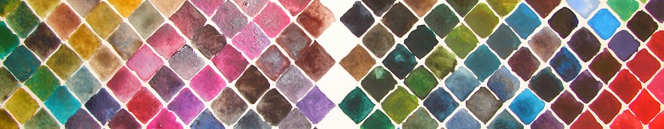
I was methodical, adding the same number of drops of water to both palettes, so density or thickness of the paint wasn’t an issue. The Sennelier mixes into unbelievably dark flat colors, crayola colors, which is fine in a waxy crayon but not what I want in watercolors.
I don’t like muddy colors.
I like bright transparent colors,
even in the browns and greys.
Bright is about clarity, not bling.

Perhaps if I ever get to mastery over this crazy medium I will feel differently, but for now, I like the textural quality of the mixed Daniel Smith colors, even if they are not Primateks.
(Of course, I also played with all the textural paints Golden Acrylic had to offer. I like texture.)
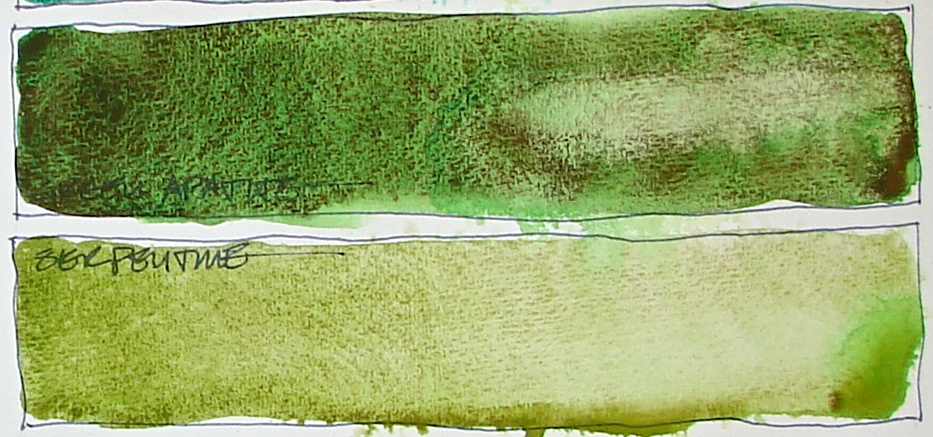
The Primateks can be seen in the dark green and watery turquoise vertical rows (Diopside and Amazonite), and the soft blue rows vertical and horizontal (Lapis, makes wonderful billowy skies) and the “black” which is Hematite. (I tried Greenleaf & Blueberry’s Shungite — above — for a long time, but I come back to the subtle black-red-asphaltum look of Hematite, right.) Primateks are much more granular, but also, some colors, like Serpentine or Green Apatite, separate interestingly when mixed with regular paints.
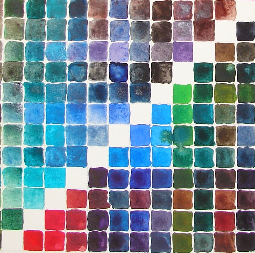
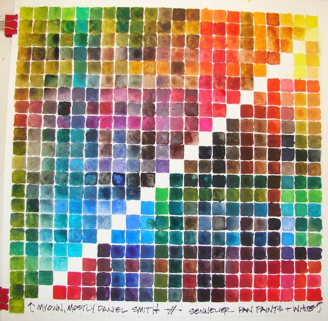 Here is the whole chart.

My mixed travel palette, top left, and the Sennelier travel palette bottom right, above.
The amazing variation in the colors I mixed with just 20 pans of paint is awesome!
I understand why the pros say, “mix your own greens” — I mean, just look at this chart. NO green I own (and I buy greens) compares with these.
And really, that is true for many of the colors — blues, reds, browns.
 I am blown away by the lovely colors,
and now want to just mix colors all day.
Total geekdom, pointless, probably;
and I want to dive into these paints!

ProArt watercolor journal, with a Pentalic 2B woodless pencil,
and Daniel Smith, Sennelier, and Holbein watercolors.

I agree to Creative Commons Attribution-Non-Commercial 4.0 International License, which you can learn more about by visiting the site, or,
visit my web page for a more user-friendly summary on my terms.
My images/blog posts may be reposted; please link back to dkatiepowellart.


I love that you are still exploring and learning. So many people reach a point where they lose the desire to learn new things, and not just in creative endeavors. Learning is so important!
LikeLike
Deciding to step into watercolors was such a huge step for me… I am just beginning to “get it” and feel a bit confident….
LikeLiked by 1 person
I’m not a painter (though if I were I’d choose watercolors…) and I loved reading about and seeing all these colors! I love color- certain colors make my body happy.
Looking forward to seeing what’s next!
LikeLike
Mine too — although what is odd is the colors that are actually my favorite are not necessarily the colors I paint with. I love red and turquoise blue bestest….
LikeLiked by 1 person
Oh my! What yummy colors and color pallets you have created. This would make any artist drool. Thanks for sharing and I wish you a creative week ahead using all that color!
LikeLike
Thanks Lynn — by the way, yours is one of the pages that will not let me post — amazing maniacal drawing week you’ve had! People faces, yay!
LikeLike
Really fascinating! My watercolor teacher had us do some of the mixing colors and making charts, but nothing like the extent to which you have gone. Some gorgeous colors evolved here..
LikeLike
I love the multi-shaded Daniel Smiths… yumm!
LikeLike
I wish I could be so disciplined and dedicated to my artistic expression. For me it is a bit of hit and miss.
LikeLike
It has been in some ways for me — working on a sketch every day, being disciplined that way is not a problem. But this color-mixing I thought would lead no where, because I mean, we have Jane Blundell (http://janeblundellart.blogspot.com/) and handprint (http://www.handprint.com/HP/WCL/water.html) and many books on the subject, so why bother? Oh, bother, it was enlightening — especially with your small travel kits!
LikeLike
These are artworks I their own right, beautifully constructed. And I can tell from your words how much more you engaged with your media so this is a massive jumping off point into your next chapter as an artist. I so look forward to seeing what comes next as a result!
LikeLike
Yes I think so. And I have another post in me that has changed how I look at mixing and watercolors, coming soon….
LikeLiked by 1 person
I have SO much to learn about watercolors but do love delving into that medium sometimes. Really awesome color charts-I think I said it before-they stand alone as art !! Thanks for sharing your experiences. Happy PPF!
LikeLike
Linda I wonder fi anyone ever becomes expert at watercolors. They are the zen medium of paints, I am sure. I learn to let go and let it be so often — very good for me, the impatient perfectionist!
LikeLike
Such an interesting post…as a lover of colour this is amazing! So much vibrant beauty in these mixes! Thanks for sharing!
Hugs Giggles
LikeLike
I knew lovers of color would enjoy! How can you not?
LikeLike
Love it! Some of those charts would make great fabric patterns. I can see summer dresses in the bright colours.
LikeLike
Yes, I’d love that. I think I had a dress like that in my 20’s….
LikeLike
Pingback: Tools: Watercolors, 1, Yellow-Orange | D.Katie Powell Art
Thank you for sharing your experience. I’ve been trying for months to achieve deep granulation aka Naomi Tydeman.
Is it a specific paint?
LikeLike
I think one thing that helps with granulation is Daniel Smith’s Primateks. If you go to the middle of the post you will see the tube of Hematite — and some of my other favorites are Serpentive and Piemontite and Yavapei and Green Apatite. Lapis is my least favorite — the granular blue is a bit blah.
LikeLike