
Last week I was asked what my favorite watercolors were over a half-dozen times.
I’m thinking it is a sign, so am using it as a prompt!


I have favorite brands overall (Daniel Smith — DS — and assume a pigment I name is DS unless I say otherwise), and favorite colors (turquoise / red / green gold / orange).
Just look at that delicious dive-into-it color from two years ago, above,
when I first switched from acrylics to watercolors. Oddly, the colors I love are not necessarily the colors I paint with again and again.
I think what is most important, what most people want to know, is the latter,
what do I use to paint with over and over and over again. Everyone can find their “favorite” color, but that may not be the watercolor pigment you use.

These are the colors I replace most often.
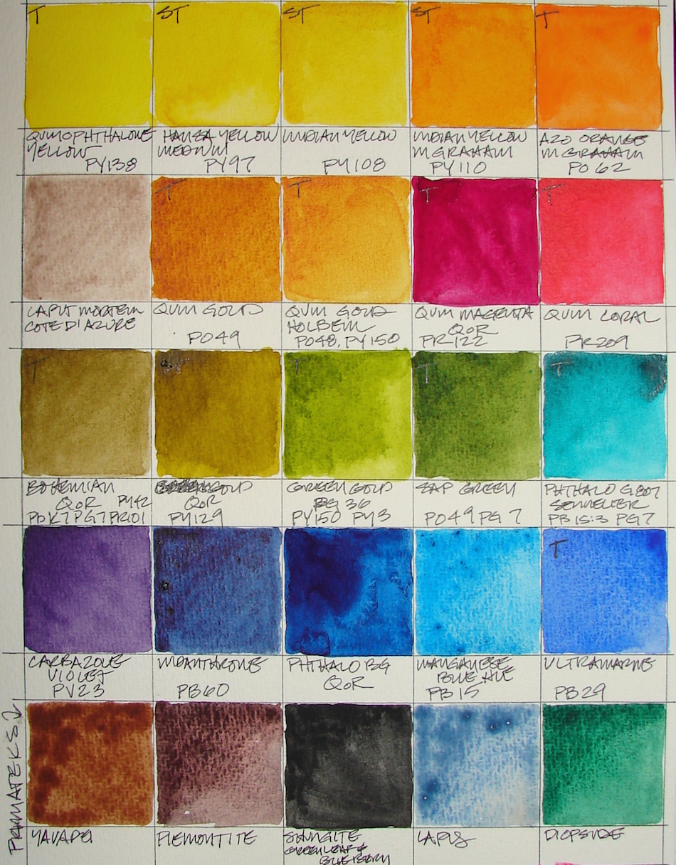
I don’t use pink or purple hues often, but I thought to include them
because if I was to reach for them these are the ones I would use:
Quin Magenta (QoR), Quin Coral, and Carbazole Purple. My favorite color pink is Opera Pink, but it is so fugitive (fades fast). My favorite purple is Imperial Purple but it is one of the odd paints from DS that separates and does interesting things on paper with pinks showing and I can’t just use it when I need a pink or purple.
Oddly, bright red is one of my favorite colors, but I rarely paint with it.

 Two colors, left & right, I use so often, yet I am not fond of either. I use them in buildings and even landscapes.
I am devastated that Daniel Smith is discontinuing Caput Mortem or Cate D’ Azure; if anyone has any I will buy them from you! Windsor Newton is simply not the same.
 Let’s talk about pure ground pigment Primateks from DS (and I may write a post on them by themselves.)
I love them, though some have been a bust in terms of depth of color. They are indispensable to me. All but the Shungite (Greenleaf & Blueberry) above are Primateks from Daniel Smith. Shungite is like painting with graphite; it may not stay my favorite. It currently replaces Hematite as my go-to-gray, which
is a wonderful and versatile paint, but I am trying it
for a bit, as I love to paint with graphite!
Look at what can be done with Yavapei and Piemontite
when mixed with my travel palette, below.


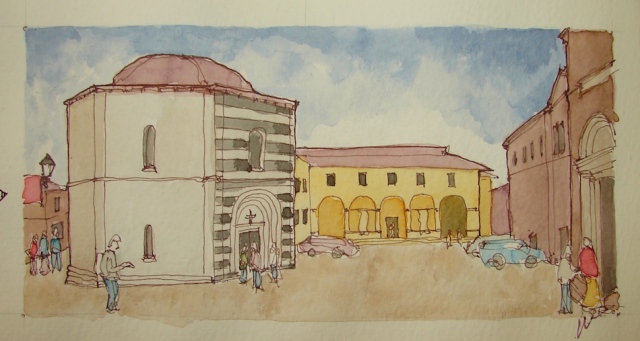 Lapis makes for lovely skies;
here Yavapei created the “ground” in this quick sketch.


 While we are at it, let’s talk about paints called the same thing when they are not the same color, like the two Quinacridone Golds from DS and Holbein, right, and including some that are wildly different, like the Indian Yellow from DS and M.Graham, or the Green Gold from QoR and DS, shown above. I’ve been seduced by names!
I got tired of buying various Quinacridone Reds (Omigoddess, so many variations of, but really, most are the same.) Then I learned from Handprint about pigments, hues, values, the Munsell System (actually I learned about the latter in an art class but Bruce MacEvoy made me understand why I might want to grok it) and now I rarely buy the same color with different names. Notice the nomenclature below the Quin Golds, “PO49″ and PO48,PY150”? This is the hue and value for each paint color, and by paying attention, and even organizing your paints around it, you can learn a lot (and take your notes with you next time you are on a buying spree!) I love my two Quin Golds, so this was a happy accident, as I love the Holbein for mixing skin tones, and the DS is a deep wonderful gold!
Handprint is an education!
I printed out most of his site because it is a great “book” on color!
Here is a PDF to print of his small image, below.

 Mostly I love transparent (right) color versus opaque (left, with Primateks and
some mixed colors for the local Painted Ladies) in my current messy paintboxes, above.
I almost never reach for opaque colors and wish I’d known about that preference because I bought quite a lot of paints in my first few months switching from acrylics, where it really doesn’t seem to matter much because I mixed glazes in huge batches.
I don’t care if they are staining or non-staining.
 Cost is a consideration. I buy
artist grade, which is more expensive than student grade, but worth it. It is much better to buy fewer colors and buy artist grade, though there are good student grade paints. The reasons I don’t bother with QoR is that the tubes are smaller and close to the same price, as if we would not notice the size of the tube. List price for QoR Quin Gold is $19 for 11ml; Daniel Smith is $20 for 15ml. I don’t see QoR as worth it!
Finally, there is travel-ability…
I love M. Graham colors but they don’t dry well in Portland Oregon. This is fine if I am only using them in my studio, but if I want to take them traveling they tend to migrate even if “dry” and once wet in the field they don’t dry well after use.

My tin I use daily, mostly transparent colors with
a few Primateks, when it was shiny clean, above.
I use the central area to throw colors in and out.
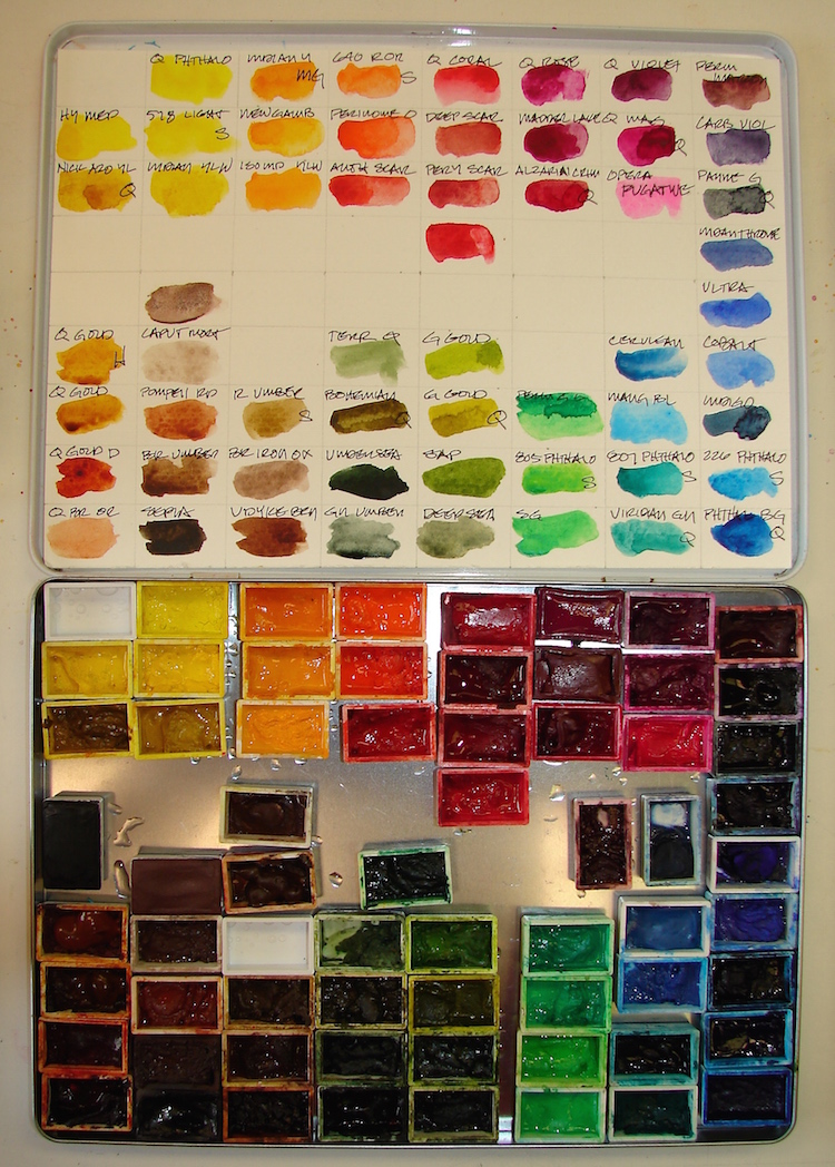
Below, my secondary tin, left to right, with
Painted Lady mixes, then opaques, then Primateks.

Daniel Smith, Holbien, QoR, Sennelier, and Greenleaf & Blueberry watercolors.

I agree to Creative Commons Attribution-Non-Commercial 4.0 International License, which you can learn more about by visiting the site, or,
visit my web page for a more user-friendly summary on my terms.
My images/blog posts may be reposted; please link back to dkatiepowellart.


Interesting post Katie. I like seeing what other artists prefer.
LikeLike
So do I — a bit of a voyeur about paints and studio set-ups!
LikeLiked by 1 person
Yes, I’ve picked up some good tips along the way.
LikeLike
Great post! I love how you change out your pigments in the pans. I do something similar and label each pan with a marker.
LikeLike
I do too — mark them. Being able to switch them out is great!
LikeLike
Love this post! I have been working my way through Handprint since you mentioned it on your blog a few months back, and have been meaning to thank you for that tid bit! I have heard such marvelous things about M Graham, but living in Florida had concerns about the honey in our humidity. If it won’t dry in Portland it surely won’t dry here! Guess I’ll skip them, thanks for saving me the money!
LikeLike
Great — Handprint taught me so much.
They are lovely paints, but I can only really use them in my studio due to their unreliable ability to stay wet! That is the problem!
LikeLike
I love this! Can you tell me what tins you have your paints stored in? I love the square size and the large mixing area above. Thank you so much!
LikeLike
One is an older Caran D’ache pencil tin — held 30 pencils — I love it. It will actually hold 80 full pans.
The other is a QoR tin — but I hate it. It should be great — the little scoops would make great mixing areas — but they made it so that if you push on the wrong thing the tin flies — and so does all the wet paint sprayed paint drops! AAACK!
LikeLike
Pingback: Travel Palettes and Color Mixing Charts | D.Katie Powell Art
Pingback: Tools: Daniel Smith Watercolors | D.Katie Powell Art